2 Comments

Halloween Costume Tutorials

Another year means another roundup of costume-related projects and tutorials! With almost 3 weeks left until Halloween you’ll still have plenty of time to make any of the projects below.

Easily my most popular post (with almost 140,000 impressions on Pinterest in the last 60 days alone!), here’s a step-by-step tutorial on how to make Minecraft Steve & Creeper heads.

Next up (with almost 50,000 impressions) is a similar tutorial, this time for making a Minecraft Enderman head along with a diamond block trick-or-treat box.

Both projects include full charts for game-accurate colors and the exact hex codes for perfect color matching!

If your idea of fantasy is less block-based and more magical, here’s a free knitting pattern for an easy scarf in the Gryffindor house colors.

If training a dragon is more your thing, here’s how to make a viking vest.

If you prefer Pokemon to Night Furies, here’s an easy, last-minute Pikachu costume idea.

If your friends-group themed costume runs more Grease than Greninja, here’s how you can make a super simple Poodle skirt.

Finally, if you’ve got enough knitting time on your hands, you can knit my Baby’s First Superhero Costume pattern as-is with cute designs for boys and girls, or convert the chart and the colors to create your superhero of choice.

Find more tips and tutorials on my How-To page!


1 Comment

Same-Size Fondant Balls Trick

It’s National Cake Decorating Day today so I’ve decided to share a project from my personal archives along with a tip to help you level up your cake decorating skills.

A few years ago I made this baby shower cake for one of my sister’s friends.

I didn’t take too many progress pictures so I can’t share a visual step-by-step, but the process is pretty similar for most of my cakes. A few days before the event I bake the cake(s) and then wrap them in saran while still warm to trap in the moisture while they cool down.

I’ve already shared a full post breaking down every step of baking a cake and getting it ready to decorate, and I followed the same steps for this cake except I covered the layers with fondant instead of icing.

The step that took the longest with this cake was to create the fondant topper. The dad-to-be is a hockey player so I was asked if I could create a baby ice skate for the top. It’s fully fondant except for the lace, and I made it about a week in advance so it would have plenty of time to dry out and harden before the party. I wanted the skate on a long skewer to make it easy to slide securely into the cake after delivery so I put the skate and blade together while soft so I could slide the skewer in and make sure the holes were lined up, but then I took them apart to dry separately. I didn’t want the weight of the skate to distort the blade before it was fully set up.

When there is going to be a lot of weight on a cake it’s important to have enough support in the lower layers so the cake doesn’t sag. First I covered the lower layer in a base of baby blue and then I broke a dowel into 5 pieces to create a support to hold the weight of the upper tier. I didn’t want to take a chance on any splinters getting into the cake so there’s a cut length of straw around each dowel. I also made a note for the recipient letting them know how many supports there were so there would be no chance of a guest receiving more than they bargained for on their plate.

I don’t have progress pics of the decoration itself but it’s fairly simple – the base tier was covered in strips of fondant in various shades of blue and white and then topped with a disk of gray on top to clean up the edges and hide the supports. The top tier was covered with white fondant and then fondant circles of blues and gray in assorted sizes. To get the smaller circles I used an assortment of cookie cutters as well as straws of varying thicknesses.

This is where the tip comes in! When creating a fondant pearl border for the cakes the easiest way to make sure you get all your balls the same size is to use a cutter to cut out identical pieces of fondant before rolling. You can use a straw for really small pearls or a cookie cutter like I did to get larger ones, or any size in between! It’s super fast and easy and eliminates the guesswork of judging how large a piece of fondant you’ll need to roll. You can use the same tip for clay work as well!

As you can see with my pearls, there’s still a tiny bit of variance. This is because I didn’t roll my fondant to the same thickness each time. I’d advise using guide rings on your fondant roller to get the same thickness every time.

I added 2 more circles of blue on top to give a contrast for the skate, and then the cake was ready for pick-up.

My box wasn’t tall enough for the cake so I used 2 skewers to hold the lid in place, and set the skate in a bed of paper towel in the plastic container from a package of strawberries. The holes in the plastic were perfect to slip the skewer that was inserted in the skate through.

Here’s the finished cake. I’m really pleased with how it turned out!

I also really love this image I was sent of the cake in place among the other desserts at the shower. ♥

Here’s an easy-to-pin reference image for those who don’t already follow me on Pinterest. 🙂

Hopefully this little trick will help out the next time you’ve got to make a whole bunch of identically-sized fondant (or clay) balls!

Note: Today is also World Mental Health Day. This year’s Mental Health campaign is focused on showcasing the efforts various countries have made to bring mental health care to their populations, especially during the pandemic. For more information about the campaign, please click here, and if you’d like to donate to the World Federation for Mental Health you can do so here.

This post may contain affiliate links. This means I might make a small commission on purchases made through the links, at no cost to you.


2 Comments

Bowling Cookies

It’s National Homemade Cookie Day in the USA today, and even though I live in Canada, who could say no to cookies? They’re tasty, versatile, and in these mid-pandemic days, a great way to provide individual portions per person.

Here’s an easy way to make a set of fun bowling cookies that you could even bowl with!*

I made these a few years ago for Father’s Day, as bowling has been a family sport since I was a kid. My dad was on a league through until Covid, and most of my siblings and I were on leagues at various times as well.

Back in the blogging heyday I used to follow a handful of cookie decorators (Sweetopia, The Bearfoot Baker and SweetSugarBelle were 3 favorites) and a big lesson I learned was how to use cookie cutters in creative ways. After deciding on “bowling cookies” I went through my bin of cookie cutters and pulled out 3 that would be perfect for this project.

The square cutter is from a nesting set similar to this one. Using it to create the lanes, choose the size that works best to fit as a multiple on the serving tray you plan to use. Rectangles would also work just fine. In my case I used the roughly 2″ square. The circle cutter is from a set similar to these. Used for the bowling balls, choose a size that looks appropriate on your size lanes. Mine is roughly 1″ in diameter. As for the bowling pin, this is where you have an opportunity to be creative! They do make actual bowling-themed cookie cutters, but I don’t have any so I used a Christmas bulb from a set similar to this one.

Step 1: Bake your cookies. You can use your preferred recipe of choice; I used my standard sugar cookie recipe adapted to taste years ago from this old Martha Stewart recipe. You want to avoid your cookies spreading while baking so be sure to chill your dough (before cutting works but after cutting is even better). Make enough squares (or rectangles) to fill the shape of your bowling lanes, plus a few extra to account for breakage. Bowling uses 10 pins so you’ll need to make at least that many, plus again extra to account for breakage. Finally, use the rest of your dough to make as many round cookies as you’d like. You really only need one to be the bowling ball, but I was serving a crowd so I made as many as I could with the dough that remained.

Step 2: Fondant toppers. If you prefer royal icing you could certainly line and flood the cookies and decorate them that way, but I find fondant a quick and easy way to get them done faster. Another example of this technique is here, where I used fondant to turn round cookies into records for a music-themed set.

Roll out white, ivory or cream fondant and use the same square and pin/bulb/etc cutter that you used for the cookies to cut a topper for each one. Moisten the back of the fondant (or the top of the cookie) with a bit of water and press the fondant into place, one topper on each cookie.

The bowling balls are a great place to use up leftover scraps of fondant. Roll out some black fondant then tear little pieces of your other colors and place them randomly on the black. Then roll over it some more to blend out the colors. Once you have it looking the way you like, use the same circle cutter to cut out enough toppers and place them on the ball cookies in the same way as above.

Step 3: Turn your base cookies into lanes. Start by using a yellow, orange or brown edible marker and a straight edge to draw stripes down your lanes to represent the individual planks of wood. I used a yellow Wilton FoodWriter and the edge of my transparent cutting mat. I generally prefer these AmeriColor edible markers so I tend to save them for when I’ll be needing to draw details because the Foodwriters are more broad-tipped.

Step 4: Wood grain, part 1. Using a paintbrush that’s ONLY ever used for food, dip it into a pot of brown icing gel color and blot onto a paper towel to get most of the globs of gel color off. Cheap plastic paintbrushes like what come in childrens’ art kits are perfect for this, but it’s super important that the brushes are reserved strictly for food use. Don’t worry about the messy bristles- the messier the better for this technique! Splotch the brown gel color directly onto the fondant cookie toppers. Try to pounce in a direction in line with the stripes you’d drawn so your wood grain goes in the proper direction. Repeat until you’ve done one full vertical row. In theory you could repeat this process on all the cookies and then move on to the next step, but I didn’t want to take a chance on the gel drying too much to reactivate so to be safe I did one strip at a time.

Step 5: Wood grain, part 2. Dip the same scrappy paintbrush into water and then brush lightly over the cookie to reactivate the brown tint and spread it across the fondant. Ensure to always brush in a vertical direction to create a faux woodgrain texture. Make sure to thin down the color just enough so that the stripes you’d painted earlier just barely show through.

Once you’ve completed the entire vertical stripe, repeat steps 4 and 5 on the remaining stripes of cookies.

Here’s the final look.

If you’re a longtime follower of this blog you’ll remember I’ve used this technique before, to make the hot tub for the Betty Boop cake for my mom’s birthday.

Step 6: Marker details. Use a red edible marker to add the characteristic stripes on the bowling pins…

…a black marker to add three dots to represent holes on the bowling balls…

…and the red marker again to add the triangular lane markers onto the lanes.

And that’s it! Assemble your pins into place at the top of the lanes and your set of bowling cookies is complete! I added a quick fondant ribbon sign to mark the occasion but that’s completely optional.

*Can bowl with them: If you take “bowl” to mean “stand up the pin cookies and flick a ball cookie at them, hoping to not get caught on the lip of one of the lane cookies”

This post may contain affiliate links. This means I might make a small commission on purchases made through the links, at no cost to you.


1 Comment

Cartoon Girls Trio – UPDATE (19WIPtoFO2019)

Back in January 2019 (!) I posted 19 projects I was determined to complete in 2019.  Spoiler alert – I failed – but I have made significant progress on about half of the projects on the list. Inspired by the recent Masters of the Universe and Suicide Squad remakes, here’s the current progress on my trio of 80s cartoon girls.

What I said: I’ve never shown these before, except for the odd glimpse in the background of Instagram pics.  I started this trio of plastic canvas portraits when I moved in August 2017.  While I love how they look in black and white (and blue), I designed them to be in full color and I’d love to see them complete.

What I did: Quite a bit of progress! 

I’d never shown them on the blog prior to that post, so here’s a look back at how they got to where they are now.

I’d moved in 2017 and was really excited to be able to fill my space with all the crafty, nerdy little things that make me who I am. 

Every shelf and table has some item that references my varied interests, and I’ve even used some previous projects as home décor – see the Minecraft heads from my tutorials peeping from above the kids’ desk, along with an as-yet-unshown secret project hidden among the books – so I was really excited to fill a blank wall space in my dining room with a handmade project.

First I purchased three of the largest plastic canvas sheets I could find. When looking for inspiration for what to stitch on them I really didn’t need to look very far. There are Archie comics in nearly every room in my house, thanks to my kids enjoying them as much as I do. In addition to the coloring book from my last post, I’ve drawn Betty on the blog here before, and Henri had drawn Archie a few years back. (He was even an Archie comics character for Hallowe’en last year, and I’ll be sharing that project here in October.) So clearly, Betty Cooper would be one of my cartoon trio.

Initially I drafted up Betty, Archie and Veronica, and planned out a triptych of the three of them, but the more I thought about it the more I realized it was Betty specifically that I like, and that I didn’t care if I saw Archie and Veronica daily, so I scrapped them and looked around for more inspo. As soon as I had the freedom to look beyond Riverdale I knew Harley Quinn HAD to be one of them. I’ve adored her for decades, and she’s featured in assorted places around my house, including in two different spots on this one shelving unit:

Finally, it wasn’t hard to decide on Teela as my third girl. I grew up watching He-Man and playing with the toy sets along with my younger brothers. I don’t know if it’s that she’s a strong, independant woman or if it was because she often wore a cobra headpiece and had a snake staff, and I’ve always adored snakes… but either way she had to be the one to complete my cartoon trio. I’ve shared Teela and a portion of my 80s toy collection on the blog before, and they’ve now found a home in a cabinet along with other childhood relics:

The hard part done, the next step was to create charts for each character. Instead of doing it the easy way and importing reference images into a stitch software, I decided to go the hard route and chart them myself in Excel. I found reference images for each character, adjusted the Excel cells to be square and marked off an area with the same stitch count as my total canvas size. From there it was just a matter of redrawing each girl, pixel-art style, and tweaking the design until they looked right. I’d originally planned to use continental stitch to save time, but quickly realized the angles would be skewed and that cross-stitch would be best, using one stitch for every pixel/cell in my chart.

I ordered a bunch of yarn from Knit Pics, then got started.

Here you can see the initial stages. I didn’t want to have to refer to the charts throughout the entire stitching process so decided to start with the black outlines first, so I could then later fill them in, coloring-book-style. Plus I didn’t know how long they would take to complete into full color and wanted to be able to hang them on the wall in the meantime. Considering I started these in 2017 and I’m typing this post in 2021, I’m glad I had that foresight!!

After finishing most of Betty I moved on to chart HQ next. I bet you’re wondering why I left Betty mostly done instead of finishing the rest of her border? Took me a moment to remember too lol but it’s because I left myself things to work on that didn’t require concentration, so when I had more time I would work on HQ and follow my charts, and when I had the kids with me or was watching something that required more focus I could work on Betty’s border that didn’t require much thought or any chart reference. Basically it was the cross-stitch equivalent of having knitting or crochet projects of varying difficulty levels.

Once the outlining was all done I worked on each of their eyes, as I thought it would look better on the wall, and truthfully HQ was a bit creepy without them. Then, while I still had the blue out, I added Betty’s shirt. Her top was red in my reference image but blue is my favorite color so I swapped it out, plus I liked having a color that was in each of the 3 images, to help tie them together. The middle pic above is the one posted on the blog back in 2019, and where they sat for basically most of the last 3 years. At some point I filled in their mouths and got started on Betty’s skin, and that’s where I’d stopped and moved on to other projects.

Eventually I started working on them again. I’d always had it in mind to work on equal parts of each, so as they hung on the wall they’d look similar in completion. First Betty had the slow progress on her face and neck…

…and then this past summer Teela got the same treatment, using stash yarn so she wouldn’t have the exact same skin tone as Betty’s.

Technically I should have done Harley’s face next, for them to all match, but these sheets are large and get folded up against my body or resting under my arm as I work. Since Harley’s face is white, and clearly a focal point of the image, I decided to hold it off for last so it wouldn’t get dirty or faded, and work on her costume instead.

At that point I was on a roll! The new Netflix Masters of the Universe had just come out, and it was kinda cool to start working on Teela’s tiara while watching the premiere. In fact, I got so into it that I kept watching until I found I’d binged the whole first season!

Spoiler-free take: ignore the men complaining about the show. It’s awesome to see the old gang again, even Stinkor! (Man I can still remember the smell of that toy!) I love the focus on Teela and magic vs tech. Made me think about Skylanders and my girl Sprocket – guess I’m always drawn to my tech girls! Also, as a big Buffy fan, with Sarah Michelle Gellar as the voice of Teela, it’s fantastic to hear Buffy kicking butt again. ♥

This is where the girls are now. I’ll be working on HQ’s white bib and pompom next, to complete her outfit, and that will put me into the home stretch with only 2 sections left on each girl. At the end I’ll have to do one run of border around each one, as the edges are currently unfinished, and then finally attach rings for hanging them properly, as I’m currently holding them to the wall with thumbtacks.

I know it’s not conventional wall art for an adult woman, but I love them.


2 Comments

Use sandpaper to improve the tooth of coloring book pages

Today, September 14th, is National Coloring Day. Of course coloring isn’t limited to coloring books, but over the last few years they’ve definitely become more prevalent! Whether they’re your preferred place to apply color or something you only do with kids, you’ve likely noticed that the paper quality can vary greatly. From thick cardstock to what’s basically printer paper, the type of paper will affect everything from what media you can use in the book to if you can actually color both sides of the same page.

On average, most adult coloring books use a slightly thicker-weight white paper that can handle all dry media as well as water-based markers, with some bleed-through if you press too hard or go over the same spot repeatedly. Crayons and colored pencils will lay down pretty evenly as the paper has little-to-no tooth, but if you’re the kind of artist who prefers to work with a more textured paper, here’s a tip that can help transform the books you already own – sandpaper!

I’ll demonstrate this in my copy Archie’s Coloring Book (and there’s a video demonstration at the end of the post).

This is a great book that is jam-packed with tons of images of Archie and the gang, showcasing everyone from the core trio to side characters (Dilton, Moose, Cheryl, Sabrina, Josie and the Pussycats, Miss Grundy, Mr. Weatherbee), to the ‘Lil Archie gang. Even Jughead’s dog Hotdog appears in all his shaggy glory!

I first thought about this back in 2017 after watching one of SuperRaeDizzle’s videos on dollar store art supplies. If you don’t follow her you really should – she’s a fantastic artist who does a lot of art supply reviews and draws/paints with incredible realism. In the linked video she uses a sanding block to rough up a sheet of inexpensive Bristol board to give it a better drawing surface.

I thought it was really cool but didn’t think it applied to me – until I started wondering if the same technique would work in what I was using a lot of at the time – coloring books. In theory it seemed like it should work but with the paper so much thinner than Bristol board I didn’t know if it would work. Would it tear the paper? Would it destroy the printed outlines? Would the ink bleed?

I had to try it for myself. To make the results as clear as possible I chose a page that allowed me to clearly divide the page into two halves.

I left the Veronica side of the page untouched and sandpaper I had on-hand to lightly rough up the Betty side of the page.

Here you can see the before (left) and after (right). There’s no obvious distress to the page though if you look closely at the black line of Betty’s shirt near the guitar you can see faint striae where the ink was removed.

To hold the book open while I worked I used my pants hanger hack. Still highly recommend!

I then set about coloring the page with Faber-Castell Polychromos colored pencils. I was careful to color in both girls the same way, using the same colors and applying the same amount of pressure.

Right away you can see a difference! Coloring on the Veronica side was exactly like coloring with colored pencils on computer printer paper (though I think this paper is slightly thicker). It’s super smooth and flat without any tooth or texture at all, and the colored pencil glided over the page really easily. On the Betty side I could feel the roughened-up surface of the page and it gave the colored pencil something to grab to, making coloring a very different experience.

It’s difficult to put the feeling into words but coloring the Veronica side felt like I had to concentrate more, because my natural tendency was to use more pressure to get more color payoff, whereas on the Betty side the same amount of barely-there pressure gave a richer color payoff.

Coloring on the super-smooth side made me very conscious of trying to not color too hard because it took more work to lay color down. On the flip side, coloring on the textured side of the page made color application a breeze, to the point where I had to concentrate on not applying too much and losing any highlights.

Both sides are colored the exact same way, using different colors for shading. I didn’t want to do anything too fancy because this was only a test; it was more about seeing if the sandpaper would ruin the book or any attempts to color vs me trying to get a professional-looking result.

I’d sanded the guitar evenly down the middle and thought there would be a more obvious difference between the two sides but I’d say it’s pretty subtle. Again- the sanded side has more depth and more color payoff while using the exact same pressure as the unsanded side.

I was also curious if sanding the paper would affect marker application, so decided to fill in the music notes with a mix of sparkle and metallic gel pens, in black and charcoal. I was really happy to see that there didn’t seem to be any effect on how the gel ink applied, and that both sides had the same amount of glitter and shine in the light.

Finally I wanted to see if there would be any issues coloring on larger open areas, so I picked two colors and experimented with blending them to each other. In my first layer of color (2nd image from the left) you can see that both sides are streaky but the funny thing is it’s for different reasons!

Veronica’s side is streaky because I struggle with laying down barely any color…though I probably didn’t have a proper point on my pencil, which didn’t help. Whereas Betty’s side is streaky because that’s the grain from the direction I’d sanded. You can see it better in the image below (though I sort of like the streaky look on her jeans because it makes them look more like real denim LOL)

The last test that I did was to compare the difference that burnishing would make on either side. I went over both sides of the guitar with my beloved Prismacolor Premiere colorless blender and really tried to smooth any grain down and move the color to fill any remaining white areas. I have the page open in front of me as I type this and while my fingertip can tell the difference between the two sides it is SLIGHT, and definitely not as much of a contrast as the rest of the page halves.

(And truthfully I’m not completely convinced that I’d feel a texture difference there at all if I hadn’t sanded too hard in that spot, as you can see by the diagonal lines of indentation on the lower right of the guitar)

Here’s the completed page. If I didn’t know that one side had been sanded I would think that I’d colored harder on the right side, and possibly used a different color for Betty’s jeans and background, as I do feel that there’s a visible difference in this closeup.

I don’t find the difference is as obvious in this image, though I’m not sure if it’s because the black background is causing a distraction.

After trying this once I’m a convert! I have a large collection of coloring books and I think this technique opens up a world of possibilities for getting different effects and results with colored pencils, crayons, and pastels. The opportunities expand even further if you experiment with different grits of sandpaper!

Imagine coloring a fantasy scene and sanding a grassy area with one grade of sandpaper, bricks of a castle with another, and the bark of a tree with a third… you could get a whole range of textural effects within the image all before even laying down any color!

Other notes: in the video below you’ll see a little bit of ink smearing. That was due to pressing too hard with the sandpaper, so it’s avoidable but something to watch out for. I was happy to see that there was no consequence to the back of the sanded page, nor any texture transfer on the facing page.

Here’s a graphic for those of you who like to pin my posts, and as promised above, here below is a video showing this technique in action.

This post may contain affiliate links. This means I might make a small commission on purchases made through the links, at no cost to you.


1 Comment

Happy Birthday Sweet Seventeen

Seventeen years ago, on September 7 2004, I started this blog. Yes, this creative passion project of mine is officially old enough to be in college and donate blood. It began on Blogger in the boom of knitting/craft blogs that fed blogrolls and Yahoo swaps and RAOK groups.  We’ve seen the onset of Ravelry and Worldwide Knit In Public Day, and welcomed pattern sources like Knitty, Craftsy, Twist Collective, St Denis Yarns and others before having to say goodbye to some of them.

With YouTube, Instagram and TikTok flooding the internet with video-based creative content, running a blog feels almost antiquated. I’ve been asked by friends and family why I don’t switch to another format but the truth is… I don’t want to. I love video tutorials. I follow a TON of craft-content YouTubers, and have saved a huge amount of “try one day” crafty TikToks to my favorites list too, so it’s not a critique of the other formats. They absolutely have their place, especially for some techniques or tutorials that can really only best be shown in video. That said, I still think there’s a place for blogs and photo-based project/pattern support.

My “blogaversary” this year falls on the first day of Rosh Hashana, which is the Jewish New Year.  I think that makes it perfect timing for a long-overdue blog restart. (I know, I know, I’ve said this before. Shhhh!) Coincidentally I was born on was erev (eve) Rosh Hashanna (we won’t say how long ago!) so Happy birthday to the blog, happy sort of birthday to me, and happy Jewish New Year!

To celebrate 17 years in the public craft domain I’ve scoured the site, my notes, folders, and metadata and picked 17 fun, interesting or long-forgotten items from my blogging history.

1-7

Numbers 1-7 are from the archives.  These are posts even I forgot about!  Some are helpful tips, some are free patterns/tutorials, and all are added to the How To section above.

8

Even when I don’t post regularly I get a steady stream of visitors (thanks!) and I’m always curious to see what search terms bring people my way.  So number 8 is my top referrer keywords from back in my Blogger days.  Funny enough it’s a tie between two completely random things that have almost nothing to do with my site: “cute japanese cartoons” & “hangman”.  I’m guessing the former is related to the time I knit a Japanese boy band, but the latter?  NO idea.

9

Number 9 is the results of my top search terms after migrating the blog to WordPress.  Unfortunately/fortunately Google has been encrypting the vast majority of search terms since 2013 so 9771 of my results are “unknown”.  Of the list that remains the top three terms are: “Toothless”, “pocketbook slippers”, and “pocket book slippers”, likely linking back to these two projects (Toothless, slippers).  Wanna know the lowest search result that brought someone my way?  “Long hair cut feet”.  I wonder how disappointed the searcher was to find my post was literally about a long hair transformation??

10

Number 10 is a really cool fact- I’ve had visitors from 170 different countries!  The majority are, unsurprisingly, from Canada and the United States, but rounding out the top 20 are the UK, Australia, Germany, Brazil, the Netherlands, Mexico, France, Iceland, Spain, Italy, the Philippines, Israel, New Zealand, Poland, South Africa, Argentina, Hungary and Denmark.

11-14

Numbers 11-14 are my the top 4 posts since switching to WordPress.  I had a hunch what these were because they keep Pinterest flashing up on my phone.  What I didn’t expect was that the top post would outrank second place by more than double!

15

I’ve spent the last few months poring over my unshared projects and planning out a blog schedule for the year.  For number 15 I thought it would be fun to look through my folders and see just how old my oldest unshared project truly is. There was a lot to wade through but I found it!  Coming in at over a decade old a crafty hack that you’ll see on the block next year dates all the way back to February 2010!

16

Looking through all those projects was a fun trip down a creative memory lane.  As number 16 here’s a little teaser of a post I can’t wait to share in full…

Any guesses?

17

And finally, for making down this far: number 17 is a picture of me at the same age as this blog.

Whether you’ve been here since day 1 or day 6204, thanks for being a part of my creative adventures. I run this blog for me, but I love sharing it with you. ♥

*All search terms and other totals above were accurate as of the date of preparing this post.


15 Comments

How to Bake a Cake and Prepare it for Decorating

Henri’s 10th* birthday party was last weekend, and while I’m not a professional by any means, I have made enough cakes by now (not to mention the 40 or so ones I’ve yet to post) that I often get asked for tips or help.  So I decided to put together a step-by-step guide on how I prepare a cake for decorating.** 

I’ll get more into the “how to bake a cake” part in a future post, as there are a lot of little tweaks and tips for the baking part itself…but this post will cover specifically how to prepare a basic cake for decorating.

Note #1- I typically bake my cakes 1-2 days prior to when I plan to decorate, which – depending on the desired outcome – is 1-2 days prior to the cake’s due date. (IE: if the cake is for Sunday, I’ll bake it Thurs or Fri night, then decorate Saturday night. If it’s a very involved, sculptural cake, I might bump those dates back a day each to leave more time for decorating.)

Before you can bake the cake, you need to prepare your pan. This step ensures you’ll be able to remove the cake from the pan once it’s baked. Some people line their pans with parchment, but I use this method:

  • Grease the pan’s bottom and sides with either Pam, margarine, or butter
  • Drop a tablespoon of flour onto the greased pan
  • Over the sink (I learned the hard way) slowly rotate and tilt the pan until the flour fully coats the bottom and sides, tapping if necessary to move things along
  • Make sure it’s fully covered, touching up bare spots if necessary
  • To remove excess flour, hold pan upside-down over the sink and smack the bottom of the pan a few times. The loose flour will fall into the sink.

Note #2- They make a ‘baker’s’ version of Pam that has flour mixed in already.

Note #3- I’ve heard of, but never tried, using Pan Grease in lieu of the above. I’m planning to try it out sometime when I don’t have a deadline looming 🙂

  
Pan Grease

1 cup shortening
1 cup flour
3/4 cup vegetable oil

Mix well with electric mixer and store in airtight container. Does
not need refrigeration.

Note #4- It doesn’t matter what kind of flour you use. One time I’d bought the wrong kind of flour for a recipe and had no use for it, so I used that one for preparing pans until it had been all used up. Ever since I use all-purpose, but you can use whatever you’d like, including nut-based and gluten-free flours. I’ve also seen people use cocoa powder when preparing pans for chocolate-based recipes.

Note #5- Don’t try to tap out the excess flour over a garbage can unless your pan is small enough to hold lower than the rim of the can. I learned this the hard way…

Once the pan is ready, you can prepare your batter, then pour it in. Some cakes need to be left alone, but for my regular birthday-type cakes, I drop the pan on the counter a few times so the air bubbles in the batter can raise to the surface and pop.

Once the cake is ready to come out of the oven, a very important step is to let the cake set in the pan for about 10 minutes. Try to remove it too soon and it will fall apart, but wait too long and it will get very difficult to remove. My standard is to set my oven timer for 10 minutes and use that time to get out the items I’ll need for the wrapping step coming up.

Once 10 minutes are up, your cake is ready to remove from the pan. Loosen around the edges with a knife. I also like to sort of “tuck” the knife under the cake and give it little test lifts to help ease it from the bottom of the pan.

The photos above show how I used to remove the cakes from the pan- I’d flip the pan over onto a flexible cutting board, then use a 2nd board to flip it back to right-side up, before sliding it onto a tray to allow it to cool overnight.

However- I don’t do this method any more. Instead I remove the cake from the pan and place it immediately onto a long length of Saran Wrap, which I then fold over to seal. Then I turn the cake 90 degrees, place it onto a 2nd long length of Saran, and wrap it again, so the 2nd layer covers any gaps in the 1st. I do this immediately after the 10 min rest in the pan.

Once the cakes are wrapped in Saran, you can leave them to cool. I’ve done this up to 5 days in advance of serving, and the cakes still came out perfect. In fact, I’d recommend this even more for cakes made in advance- unlike my previous method of leaving them uncovered, the Saran traps the heat and steam into the cake, leaving them dense and moist and delicious instead of dry and crumbly.

Leave the Saran-covered cakes somewhere dry and cool where they won’t be disturbed. (Don’t leave them stacked as the top one might sag, I only did this when I took the photo as I was trying to estimate how tall the finished cake would be).

Allow the cakes to cool at minimum overnight. A cake might feel cool on the outside but still have residual heat trapped inside, and icing and decorations will slide right off.

Once cooled, you’re ready to level and tort. (Tort is just a fancy word for “cut the cake in half, horizontally). For best results, use a knife long enough to fit across the narrowest edge of the cake.

Slowly and evenly cut off the rounded cake dome, starting at one corner then easing your way across until you can go straight down along the cake. Keep your hand steady and try to hold the knife as flat and parallel to the table as you can. Once you’ve cut all the way across you can remove the scraps for eating or other uses. I always like to have a storage container handy as well to hold the cake scraps which I use later with any leftover icing to make cake pops for my kids.

In the demo cake shown here, I didn’t tort, but if I would have it would have been at this step. Using the same knife as above, cut the cake horizontally into two layers.

Note #6- I recently picked up these cake level guides and OMG they’re perfect! I clipped one to my knife and held it flush against the table as I cut and I’ve never had a cake turn out as perfectly level before. I <3.

Before you can begin decorating, you must consider your base. Is the cake to be moved? Is it going to be heavy, and need a cake board? For the cake shown, I iced, decorated and transported it on the white tray, and I would use the same method with any other tray or cake stand. If this was a tier in a larger cake, however, I’d be using a cake board.

Put a dollop of icing into the center of where your cake will go. This will “glue” your cake to the tray/board and keep it from sliding around. Center the cake into place and give it a little push down to adhere.

Fill your cake. Do a border of icing around the edges of the cake and then fill it with more icing, jam, whatever you’d like. Then place your other layer on top and press down lightly. I often flip it so the flatter bottom of the cake layer becomes the top of the cake, but this 9×11 was a bit too large and thin for me to feel comfortable flipping without risking breaking. I’m a klutz after all…

Before I begin to ice the outside of the cake, I protect the tray/stand/surface with parchment paper or wax paper. Cut off a narrow piece and then cut that into pieces to fit around the edges of the cake. For a rectangle or square cake I’d cut 4 narrow strips, if it was a round cake I’d cut the full-size strips into thirds and slightly overlap them to surround the cake with a hexagon of paper.

See the crumbs on the parchment? That’s why it’s there- to protect the base from crumbs and icing. The crumb coat (shown) isn’t part of the decorative exterior, it’s used (and named) to capture any loose crumbs that would otherwise fall off as you work. Ice the cake on the top and all sides, but don’t worry about covering every inch of the cake. The main thing is to trap the crumbs and fill in any gaps in between the layers of the cake.

Note #7- Mine is sloppy. Both the crumb coat and the upcoming icing. This cake was for fun. If you are planning to cover the cake in fondant later OR planning to have smooth or knife-edge sides, then you should make sure your crumb coat is smooth as well, or it will be more difficult later.

After the crumb coat I like to put the cake in the fridge to set the icing. This isn’t completely mandatory, so don’t stress if you don’t have room in your fridge. Place the cake somewhere cool and undisturbed for about 30 minutes, or until the icing crusts over.

Once the crumb coat is done you’re almost ready to decorate. The cake just needs one more layer of icing. If I’ll be covering with fondant, I put a thinner layer. It’s more to smooth the top/sides and give the fondant something to ‘stick’ to vs a layer of icing to eat. If I’ll only be using icing, then I put a thicker layer, making sure to cover the cake completely.

For the cake in these examples, it was just for fun and I wasn’t going to be adding decorations, so I gave it a quick layer of thicker icing. I made it even but didn’t spend any time trying to make it smooth.

Whether or not I’ll be adding fondant, or additional decorations, this is the point at which I’ll remove the parchment/wax paper strips. Gently lift them away, making sure not to drop any icing blobs onto the cake or tray. If necessary, use a sharp knife to break the seal of any hardened icing that is connecting the papers to the cakes.

Note #8- Even if the icing on the strips looks clean, I don’t add it back in with any remaining icing to re-use. It’s more likely than not that there are cake crumbs within.

And here’s the baked, iced cake, ready for topping with fondant decorations, candies, candles, or anything else you have in mind.

Hopefully this basic instructional was helpful! If you have any questions that weren’t answered, leave them in the comments and I’ll update it with my answers.

*I know, Henri is 10 already!  Can you believe it? 

**This is only how I do things, after the last 10 years of trial and error.  I’m not saying it’s the only way, nor even that it’s necessarily the right way.  It’s just my way, and if it helps you, it can be your way too 🙂


4 Comments

Quick Crafty Tip: Using Pants Hangers

I don’t have a ‘Crafty Compilation’ for either of the last two weeks as I’ve spent them working primarily on some sample knitting that I’m not sure if I can talk about yet.  So, instead, here’s a quick tip for those of you who enjoy coloring: pants hangers are your friend.

tip color with clips 02

Yup.  Actual hangers that you use to hang up your pants.  (Or your kids’ pants, in my case).
tip color with clips 05

I’ve been using binder clips with my Art of Coloring: Disney Villains book ever since I got it.  I’ve been using a lot of water media in it and I’ve taken to clipping the book shut whenever I’m not using it to minimize most of the page warping.  Because this book has thick cardboard covers it stays open pretty flat on its own, though I tend to pop the clip onto my working page mostly so I don’t misplace it until I need it again.  With other books I’ve taken to working on a clipboard for both the hard surface as well as the ability to clip the book open to my current page.  For the most part, that worked perfectly.

tip color with clips 04
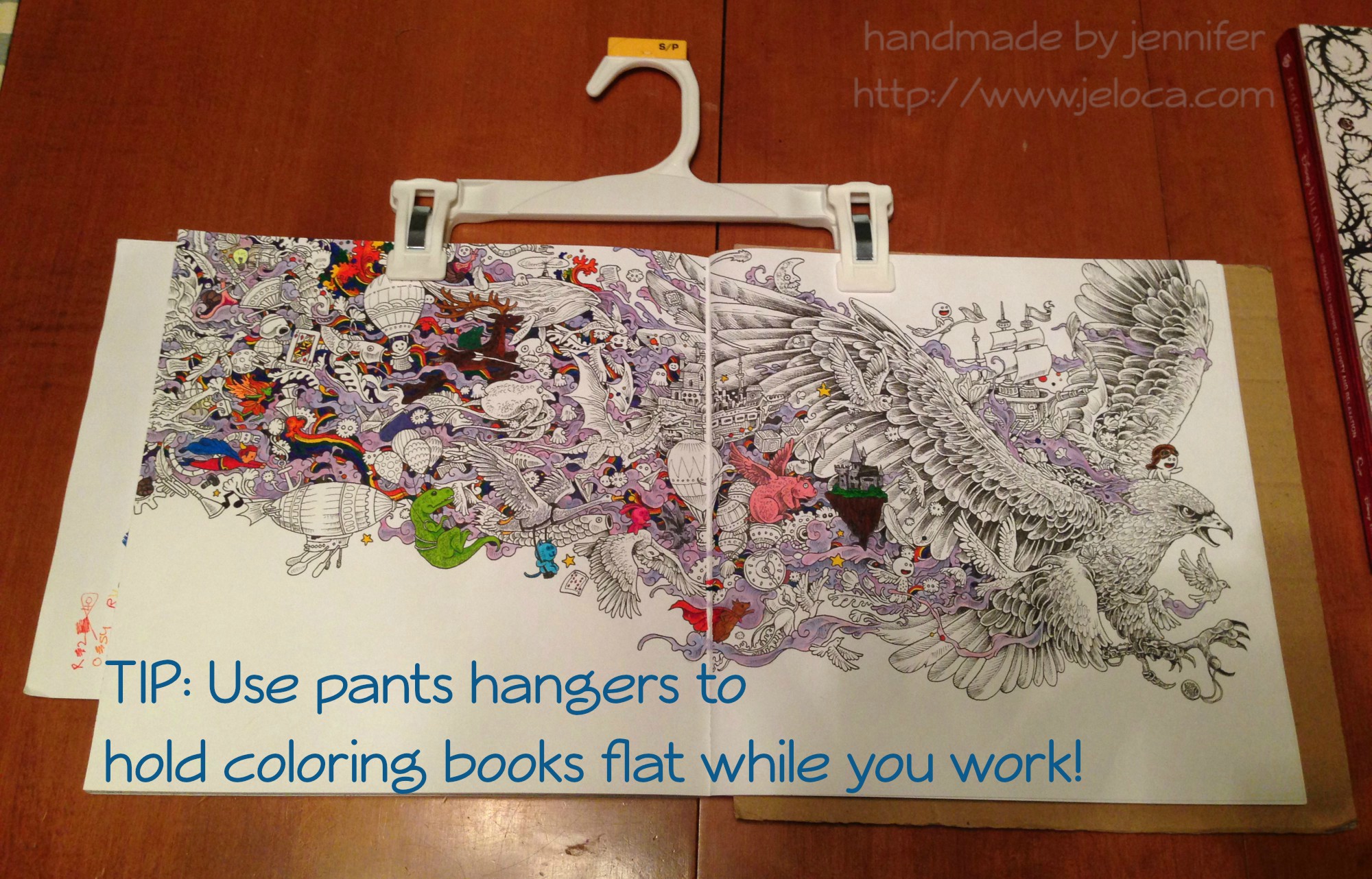
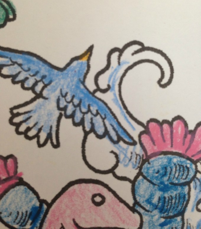
Then one day I was laying on my belly in bed coloring the page above (the Eagle image in Kerby Rosanes’ imagimorphia).  It was held down by my clipboard on the far right of the right page but I kept getting frustrated at the left-side page flipping shut every time I reached over for my coloring supplies (Stabilo 88 and Staedtler Triplus fineliners, as well as Caran D’Ache Neocolor II watercolor crayons for the purple wisps).  I’d been laying on my belly and constantly raising up onto my elbows to brace the page between color changes was starting to hurt more than the coloring itself soothed.

Henri had had a similar problem holding open his Pokemon books so he could sketch from them, and I’d lent him my cookbook stand.  It was a great solution but now that I needed it I didn’t have the heart to steal it back for myself.  That’s when I remembered the image going around Facebook a while ago in a list of kitchen tips: using a pants hanger to hold your recipe up and out of the way, by hanging it from an upper cabinet doorknob.  I had no need to hang my coloring book, but it would be perfect for what I needed too!

tip color with clips 03

And it was!  The two clips hold the pages down on either side, but the stiff bar that connects them keeps them open flat, where the book could otherwise still slip shut.  (The above wip image is also from imagimorphia, and the background wash was done with the Neocolor IIs).  After you’ve finished coloring the page, the hanger can then be used to clip the book shut as it dries to minimize any warping from the wet pages.

If you wanted you could also store your books from the hangers, sideways along a bar similar to needlepoint sets.  (Ooooh now I’m picturing a dry cleaner-style conveyor holding all my coloring and craft books… that would be awesome!!)

tip color with clips 01

And for an easy reminder to pin:

tip color with clips titled

That’s all for now.  Hopefully this tip could be handy for some of you!

This post may contain affiliate links. This means I might make a small commission on purchases made through the links, at no cost to you.


1 Comment

Creative Coloring Througout the Year Gratitude Journal

I had an idea the other day that I’d love to share with anyone interested in coloring, journaling or scrapbooking.  It’s something I definitely plan to do over the upcoming year, and I’d be so happy if anyone else made it their habit as well.

One of the gifts I received at our family Christmukkah Day (Christmas/Hanukkah/Birthday) gift exchange this past weekend was this Creative Coloring Throughout the Year 2017 desk calendar.  It’s one of those ‘page-a-day’ type, like the knitting calendar I’ve had a pattern published in in the past.

color-page-a-day-journal-01

The top two-thirds of each page contains lineart to color in, below which is the date and a small lined section for making note of appointments, or birthdays, etc.  The images are detailed enough to have fun with but not too large so as to be daunting at the thought of ‘having’ to complete an entire one per day.  They’re sized perfectly for fineliners or sharpened colored pencils, though I found I was able to use the broader nib of gel pens in mine without too much fuss.

Now, when I first opened it I was initially really tickled at the prospect of a small bit of coloring I could look forwards to daily.  I even thought it might be fun to bring to work, to perhaps have a little something to scratch at with my ballpoint pens during lulls in the day.  Then it hit me- I don’t want to throw out something I’ve spent time and effort creating (and don’t let anyone tell you differently- coloring in is still creating).

color-page-a-day-journal-02

But what could I do with the pages?  Of course, being a crafty person, ‘scrapbooking’ was one of the first ideas that came to mind.  However one insanely expensive all-out scrapbook in the past was enough to convince me I am so not interested in scrapbooking, which my wallet is quite thankful for.  So keeping the pages merely for the sake of keeping them was out, especially since I’m trying to pare down this year, not accumulate more clutter. So I wondered: was there anything I could do to make them useful?

And then it hit me…an idea that’s simple enough for children to do and yet so sweet that I hope others will like and benefit from it as well: a gratitude journal.

The plan is simple.

After I color each day’s page I’m going to use the notes area to jot down something I’m thankful for on that day, or a few things that made me happy.   Then I’m going to glue them down into a scrapbook (in my case the 80-page sketch book from my local Dollarama).

I’m so excited about this.  At the end of the year at worst I’ll have a bunch of pretty pictures to look at and at best I’ll have some great memories to treasure.

color-page-a-day-journal-05

As you can see I’ve only got a few images colored so far, so I’m already behind, but my aim for coloring each day’s lineart is way more therapeutic than technical, so I’m not trying to create any mini masterpieces.  As such I’m planning to get through the outstanding days’ pages as quickly as I can so I can start properly and keep it current.

I would really prefer to have two days per page instead of three as shown above.  With four images per sheet (two on the front, two on the back) the 80 pages the scrapbook holds would only give me the ability to store 320 days…not quite enough for one full year.
color-page-a-day-journal-06

I’ve got more of these books, though, so at some point I plan to swipe the missing pages from another sketch book and ease them into this one so I can have the entire year together.
photo-2017-01-17-8-34-02-pm

Above you can see the days I’ve already colored, and here below is a sneak peek at January 4th.  The others were done using fineliners and gel pens, but this one I’m doing with colored pencils and using varying amounts of pressure to get different shades within the image.  For example, the frog was colored with only one pencil, pressing harder in some spots and lighter in others.  Same for the flower, and I’ll be completing the image the same way.

color-page-a-day-journal-08

As you can see it’s not about the media nor the execution, it’s merely about the process.  The act of putting color to paper while letting your mind wander… letting the day roll off your back and allowing yourself to focus only on the wonderful memories that you want to commit to paper.

page-a-day-square-titled-site

I do hope you liked this idea and if anyone plans to start their own coloring calendar journal please let me know in the comments, I’d love to see it!

pinterest-stack-sited-coloring-page-a-day-gratitude-journal

And here’s the full plan in an image for my fellow Pinners.


3 Comments

Playing with Caran D’Ache Neocolor II watercolor crayons in Kerby Rosanes’ imagimorphia

I’d been researching watercolor pencils a little while ago, and while reading review sites I came across a few mentions of the Caran D’Ache Neocolor II watercolor crayons.  They looked interesting and were lauded for their bright, vibrant colors and creamy texture, so I made a note to look up more reviews.  In the meantime, I remembered that at some point during my creative history I’d owned a set of, what my memory told me, were kid’s-quality twist-up watercolor pencils.  I could picture the set, and knew there was only one place in my home-office they could be, so one morning I went downstairs and took a look.

I found the twist-up colored pencils right away… and was disappointed to see they were just that- colored pencils.  Nothing water-soluble about them.  It was frustrating to have been mistaken but I figured I’d just continue my research… and then I peeked through the rest of the drawer just to see what other drawing supplies I’d collected over the years and had forgotten about.

neocolor 01

What a discovery!  I think I squee’d out loud when I saw the white edge of the tin under an old pencil case of charcoal and blending stumps.  Not only had I forgotten I owned these but clearly I’d barely ever used them when I got them, because they were all still full-sized and touching the sponge strip running the top of the case.

Immediately I brought them upstairs to try out.  I’d been stuck in bed, resting my legs due to a really bad bout of sciatica, so I put together a little portable watercolor kit that I could use in bed without making a huge mess: a tiny tupperware of water, a fine-tipped paintbrush, and a folded handtowel for blotting and cleaning my brush, all contained within another small tupperware that I could close up and store with my craft supplies.neocolor 11

I made pages for them to add to my swatch book.  I didn’t want to use water in that pad itself because the paper is so thin, so I folded a sheet of cardstock in half and tore it into two papers that each fit on my swatch book’s pages.  I scribbled a little bit of each color onto the paper and then activated each with a tiny bit of water.  These colors are so rich and the crayons dissolve so easily that a SUPER tiny amount of water is all that is needed.neocolor 12

After the swatches dried I labeled them with the color names from the Caran D’Ache site and then used a glue stick to affix them into the swatch book.  Now- onto the coloring!

My first test was the inside cover page of Kerby Rosanes’ imagimorphia, which I have been loving lately.  I colored the page pretty quickly, not bothering to fully fill in all areas (like the cut area of the tree, for example) because I knew once wetted, the color would spread.  I did some minimal color mixing and shading on the leaves, deer and dino, all using the crayons as crayons to color.  Sadly they’re old enough that they became fragile, and two colors broke in half as I worked.  They’re still usable, but I was disappointed.  More evidence of their age is the (removable) white bloom on some of the darker colors, as well as how the lightest brown dried out to the point of looking like a Flake chocolate bar inside its wrapper.  😦

neocolor 02

The crayons applied color wonderfully but, as to be expected of crayons, they didn’t have points sharp enough to work into the fine areas of the image.  I was able to use the edges of the points to get into fine spots like the rays’ tails and such, but I didn’t bother trying to color the butterflies, knowing I’d just make a mess.  In some areas, like the pom-pom-looking little dudes, I only colored the center, planning to move the color outwards later, once I activated the paint.neocolor 03

The very first spot I activated were the clouds in this image.  I set a sheet of cardstock behind the page to protect it from any bleed-through or water damage, but it really took such a tiny amount of water that I doubted there would be any actual problems on the reverse-side pages.

neocolor 04

You can see in this enlargement of the lower edge what the clouds looked like before the water was applied, as well as the rough, uneven coloring job I did.  I’d cringe, except it was deliberate.  After seeing how vibrant the colors were and how much they spread, I didn’t want to waste any of the crayon filling in any more densely.

neocolor 05

This is the final result.  I can’t get over the difference, and how smooth and rich the colors turned out!  I did manage to achieve some subtle shading and depth to the colors, and if I’d wanted to color over-top and re-wet I’m sure I could get even more effects.  The largest difference for me is in the tree, the deer and the dino, but I’m charmed by all of it.neocolor 05 back

I was super-pleased (but not surprised) to see that there was NO bleed-through on the other side of the page.  This means I can use these crayons throughout the book without worry, which makes me really happy.neocolor 06

Here’s a side-by-side to really compare the before and after images.  Besides blending out the patchy scribbles, the colors (which were pretty vibrant before) didn’t fade out and some became even brighter.  They blended beautifully and dried really quickly, but not too fast that I couldn’t move around soft watercolor washes.neocolor 07

For the facing page (above) I decided to try using the crayons in a different fashion, as if they were individual little sticks of paint.

neocolor 08

I wetted the brush, blotted most of the water off, and then dabbed it against the tip of the crayon, picking up some color, which I then applied to the image as paint, just as if I’d picked the color up from a palette.  You can see some of the peach on the tip of my brush, as well as on the face and hands of the little girl I’d just painted.

neocolor 10

This is the finished image after painting.  In contrast to the side where I colored first, I think this side has a softer, almost dreamier application.  However it is slower to keep re-dabbing the brush to the crayon, and it makes mixing colors more difficult as the paint dries much faster when using this method.  I greatly recommend it for areas where you need more control or a finer application than you’d get with the stubby crayon.

This method also made me realize that my broken crayons were not a loss, nor was my flakey, dried-out tan.  I can put a small piece of the color in one of my palette wells and activate it to use as paint, meaning that no part of these (expensive!) crayons will ever be wasted.  🙂

neocolor 10 back

Here’s the back, showing again that there was no bleed-through or ghosting.

I’m really glad I found these crayons in my stash, and I can’t wait to play around with them more in this and other books.  The colors are incredible and they activate so easily and beautifully, I really recommend them.  Mine have broken and dried out, but they are also over 15 years old (!!!) and still work as well as if they were brand new.  I would wholeheartedly recommend these.

 
This post may contain affiliate links. This means I might make a small commission on purchases made through the links, at no cost to you.