There are 4 more sleeps until Halloween, and that’s plenty of time to make most of the costume and prop tutorials I’ve been sharing over the last few weeks. Today’s post is so quick and easy that you can make it in under an hour and probably have all the materials you need already!
Back in 2019 Henri couldn’t wear his actual Halloween costume to school because the Neighbor outfit (from Hello Neighbor) had a mask. It didn’t take any time to come up with a school-safe alternate idea for my little brunette food-machine – Jughead! Henri’s a voracious Archie comics reader and we joke that his favorite food is “food” so combining the two was a no-brainer.
The costume is really simple because you can wear any school-appropriate outfit that a teenager would wear. The main key to get the look is Juggie’s trademark hat, and then as a bonus you can include a burger to really sell it.
We went with the comics version, not the Cole Sprouse version from Riverdale, mostly because I didn’t feel like knitting the whoopie cap.
Step 1: A burger. If we’d had a toy or squishy burger I’d have used that, but since we didn’t I went with an easy thought bubble because Mr Jones is always daydreaming of his favorite food.
You can find free clipart online and prepare the image in any software that will allow you to manipulate images. My preference is Excel but you can also use Word, BeFunky, Photoshop, etc. You can also draw the image digitally in something like Procreate or draw it outright on cardstock and color it in with any art supplies you have already. You want to scale your final image to fit as large as possible on a single sheet of paper (if printing it) or can go as large as you like if drawing it on something larger like a Bristol board.
I’ve included the image I used here as a free download. For best results print directly onto cardstock or print onto computer paper and then glue it onto cardstock or cardboard. A panel from an old cereal box or shipping box from the recycling bin is perfect.
To finish the prop and protect it, laminate it with packing tape! I like to cut the image out first so when I laminate I can have a thin edge of tape just past the paper, so no moisture can get in. Cut out your image and lay strips of packing tape evenly across the front of the image, smoothing down any bubbles as you go. Next, flip the image over and repeat the process. Use your fingers to make sure the seal around the edges of the image is tight, and then trim away the excess tape. Finally, tape a stick of some kind to the back. I used a wooden chopstick from takeout sushi that I covered with white electrical tape.
Step 2: The whoopie cap. If there’s ANY key piece for a Jughead cosplay, it’s his unique hat. Cut a strip of cardboard the height of the cap, and long enough to go around the wearer’s head with about an inch of overlap. If you want to paint it gray do that now, though we didn’t bother. Cut the top into points and then try it on the wearer again to make sure it fits and that the points line up where the seam will be.
Draw or paint on the iconic buttons Juggie always has. I used permanent markers and White-Out. Finally, staple or tape the edges together.
That’s all there is to it! So quick and easy it can be ready for school the next day without keeping you up into the late hours of the night.
Today, September 14th, is National Coloring Day. Of course coloring isn’t limited to coloring books, but over the last few years they’ve definitely become more prevalent! Whether they’re your preferred place to apply color or something you only do with kids, you’ve likely noticed that the paper quality can vary greatly. From thick cardstock to what’s basically printer paper, the type of paper will affect everything from what media you can use in the book to if you can actually color both sides of the same page.
On average, most adult coloring books use a slightly thicker-weight white paper that can handle all dry media as well as water-based markers, with some bleed-through if you press too hard or go over the same spot repeatedly. Crayons and colored pencils will lay down pretty evenly as the paper has little-to-no tooth, but if you’re the kind of artist who prefers to work with a more textured paper, here’s a tip that can help transform the books you already own – sandpaper!
I’ll demonstrate this in my copy Archie’s Coloring Book (and there’s a video demonstration at the end of the post).
This is a great book that is jam-packed with tons of images of Archie and the gang, showcasing everyone from the core trio to side characters (Dilton, Moose, Cheryl, Sabrina, Josie and the Pussycats, Miss Grundy, Mr. Weatherbee), to the ‘Lil Archie gang. Even Jughead’s dog Hotdog appears in all his shaggy glory!
I first thought about this back in 2017 after watching one of SuperRaeDizzle’s videos on dollar store art supplies. If you don’t follow her you really should – she’s a fantastic artist who does a lot of art supply reviews and draws/paints with incredible realism. In the linked video she uses a sanding block to rough up a sheet of inexpensive Bristol board to give it a better drawing surface.
I thought it was really cool but didn’t think it applied to me – until I started wondering if the same technique would work in what I was using a lot of at the time – coloring books. In theory it seemed like it should work but with the paper so much thinner than Bristol board I didn’t know if it would work. Would it tear the paper? Would it destroy the printed outlines? Would the ink bleed?
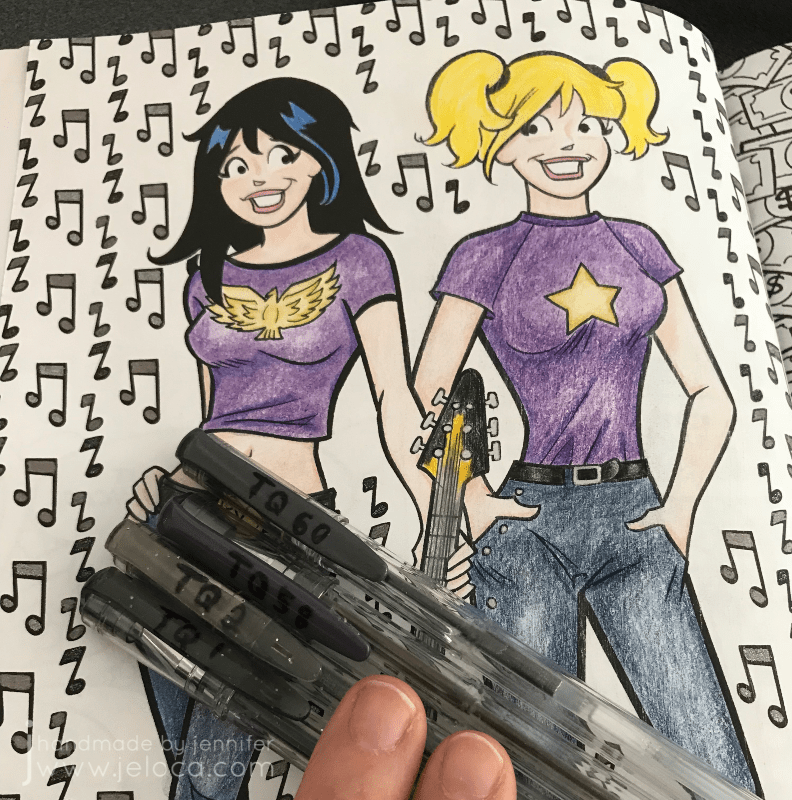
I had to try it for myself. To make the results as clear as possible I chose a page that allowed me to clearly divide the page into two halves.
I left the Veronica side of the page untouched and sandpaper I had on-hand to lightly rough up the Betty side of the page.
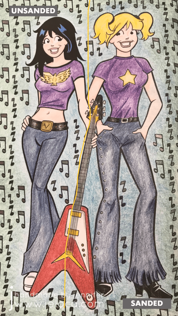
Here you can see the before (left) and after (right). There’s no obvious distress to the page though if you look closely at the black line of Betty’s shirt near the guitar you can see faint striae where the ink was removed.
To hold the book open while I worked I used my pants hanger hack. Still highly recommend!
I then set about coloring the page with Faber-Castell Polychromos colored pencils. I was careful to color in both girls the same way, using the same colors and applying the same amount of pressure.
Right away you can see a difference! Coloring on the Veronica side was exactly like coloring with colored pencils on computer printer paper (though I think this paper is slightly thicker). It’s super smooth and flat without any tooth or texture at all, and the colored pencil glided over the page really easily. On the Betty side I could feel the roughened-up surface of the page and it gave the colored pencil something to grab to, making coloring a very different experience.
It’s difficult to put the feeling into words but coloring the Veronica side felt like I had to concentrate more, because my natural tendency was to use more pressure to get more color payoff, whereas on the Betty side the same amount of barely-there pressure gave a richer color payoff.
Coloring on the super-smooth side made me very conscious of trying to not color too hard because it took more work to lay color down. On the flip side, coloring on the textured side of the page made color application a breeze, to the point where I had to concentrate on not applying too much and losing any highlights.
Both sides are colored the exact same way, using different colors for shading. I didn’t want to do anything too fancy because this was only a test; it was more about seeing if the sandpaper would ruin the book or any attempts to color vs me trying to get a professional-looking result.
I’d sanded the guitar evenly down the middle and thought there would be a more obvious difference between the two sides but I’d say it’s pretty subtle. Again- the sanded side has more depth and more color payoff while using the exact same pressure as the unsanded side.
I was also curious if sanding the paper would affect marker application, so decided to fill in the music notes with a mix of sparkle and metallic gel pens, in black and charcoal. I was really happy to see that there didn’t seem to be any effect on how the gel ink applied, and that both sides had the same amount of glitter and shine in the light.
Finally I wanted to see if there would be any issues coloring on larger open areas, so I picked two colors and experimented with blending them to each other. In my first layer of color (2nd image from the left) you can see that both sides are streaky but the funny thing is it’s for different reasons!
Veronica’s side is streaky because I struggle with laying down barely any color…though I probably didn’t have a proper point on my pencil, which didn’t help. Whereas Betty’s side is streaky because that’s the grain from the direction I’d sanded. You can see it better in the image below (though I sort of like the streaky look on her jeans because it makes them look more like real denim LOL)
The last test that I did was to compare the difference that burnishing would make on either side. I went over both sides of the guitar with my beloved Prismacolor Premiere colorless blender and really tried to smooth any grain down and move the color to fill any remaining white areas. I have the page open in front of me as I type this and while my fingertip can tell the difference between the two sides it is SLIGHT, and definitely not as much of a contrast as the rest of the page halves.
(And truthfully I’m not completely convinced that I’d feel a texture difference there at all if I hadn’t sanded too hard in that spot, as you can see by the diagonal lines of indentation on the lower right of the guitar)
Here’s the completed page. If I didn’t know that one side had been sanded I would think that I’d colored harder on the right side, and possibly used a different color for Betty’s jeans and background, as I do feel that there’s a visible difference in this closeup.
I don’t find the difference is as obvious in this image, though I’m not sure if it’s because the black background is causing a distraction.
After trying this once I’m a convert! I have a large collection of coloring books and I think this technique opens up a world of possibilities for getting different effects and results with colored pencils, crayons, and pastels. The opportunities expand even further if you experiment with different grits of sandpaper!
Imagine coloring a fantasy scene and sanding a grassy area with one grade of sandpaper, bricks of a castle with another, and the bark of a tree with a third… you could get a whole range of textural effects within the image all before even laying down any color!
Other notes: in the video below you’ll see a little bit of ink smearing. That was due to pressing too hard with the sandpaper, so it’s avoidable but something to watch out for. I was happy to see that there was no consequence to the back of the sanded page, nor any texture transfer on the facing page.
Here’s a graphic for those of you who like to pin my posts, and as promised above, here below is a video showing this technique in action.
This post may contain affiliate links. This means I might make a small commission on purchases made through the links, at no cost to you.
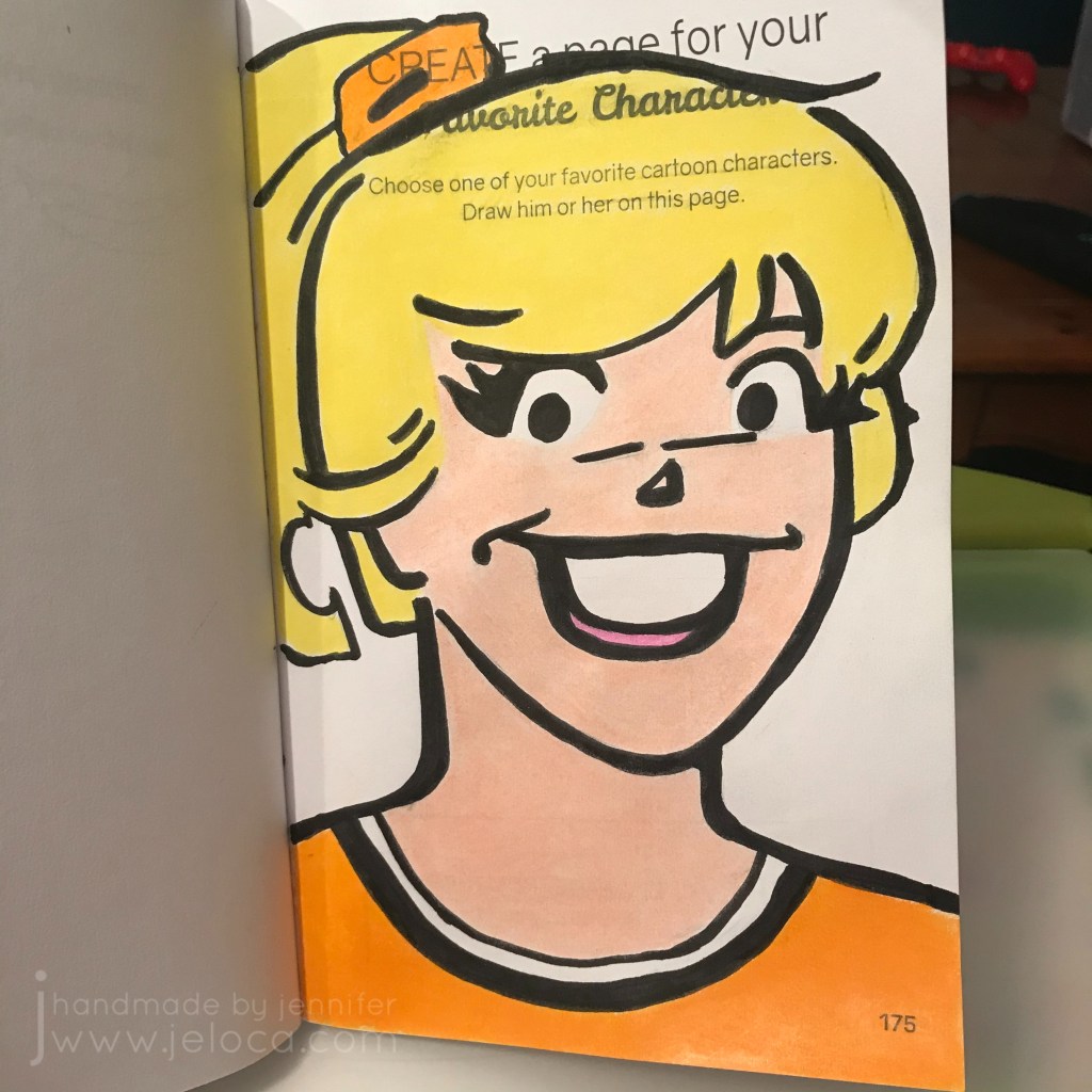
October’s Create This Book challenge page was a fail from the start, because we should have picked a page we could complete with a Halloween theme. Fail #2 was not posting it within the actual month of October. But the page itself isn’t a fail, because I’m really happy with how it came out!
For anyone not following, every month in 2020 my 11yo son Henri and I are choosing a page from Moriah Elizabeth‘s Create This Book (vol 1) and each of us completing the page in our own books. There’s a link to all past pages at the bottom of this post.
For this month Henri picked the “favorite cartoon character” theme on page 175.
Henri’s still on a Henry Stickmin kick and drew a few moments from the game. He traced a glue stick to get perfect circles for Henry, Ellie and Charles’ heads, and then freehanded the rest.
I love how easily he’s able to recreate what he sees freehanded (and often without reference photos), and I especially love the touches he added like the shadow under Ellie.
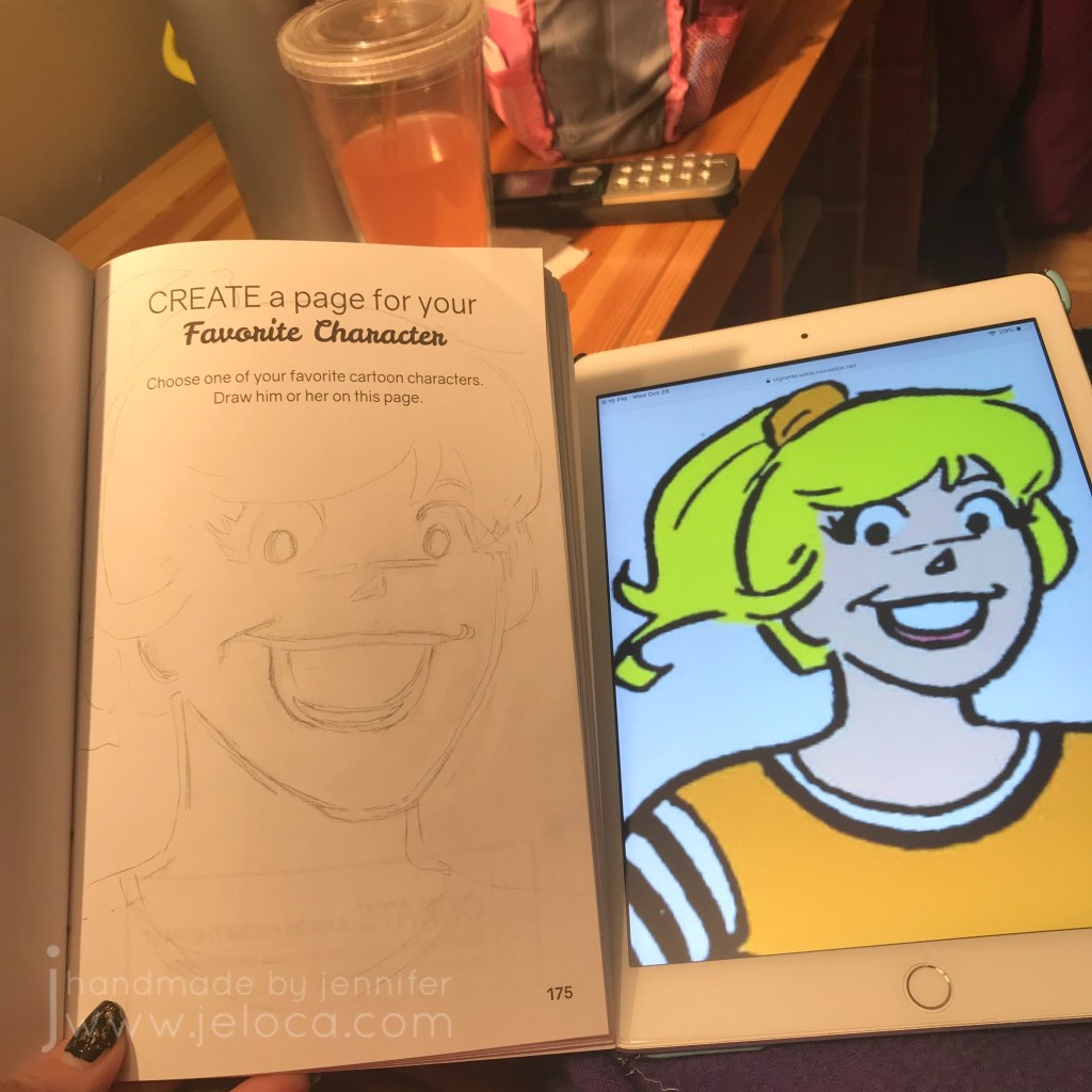
I was going to sketch up Harley Quinn but decided instead to go with my girl, Betty Cooper (from the comics, not the show). I found an image I liked online, and I’ll be honest- I was going to trace it. I was in the mood to color, but not to draw so I planned to take the easy way out.
And then I decided to draw after all, and accept however it turned out.
I started by sketching the outline of the face and then started blocking in the features.
Thickening the lines to match the widths of the comic really did a lot to make it look more accurate, though it did take me a lot of erasing and redoing until I got it to a point I was happy with.
It’s not quite perfect – her face should be longer so she’s a little squished between the nose and chin… but all in all I’m happy with my accuracy.
I filled in the inking lines with the brush end of my Feela markers. (There will be a full review on those coming soon, I’ve been using them a lot and really love them, especially for coloring book fans). Adding the black lines really helped me to see what worked and what didn’t. It still looks pretty good, but I can still see the shortened face.
The paper in this book is thin, and the water-based marker does bleed and ghost. But the page on the back asks one to “attach” something so I don’t think it will be an issue to cover in the future.
The next step was coloring, which I was really down for. I was watching the Big Brother 22 (All Stars 2) finale and it was something relaxing to do while enjoying the drama on screen.
Betty’s pretty simple, in terms of color. No shading, no highlights, just block color fills in the outlined areas.
I could have left the page as-is, but long-time blog readers will know I’m growing addicted to colorless blenders. I have a bad habit of “saving” things I like and not using them, and I’ve been trying to force myself to USE these things and not worry I’m “wasting” them by using them for their intended purpose. (Plus, it’s 2020. If ever there was a time for enjoying the little things, it’s now!)
Here you can see the difference before and after. Betty’s face was colored only with the Polychromos, but her neck has been gone over with the colorless blender. Just colored as you would normally, only instead of adding pigment, it blends the existing pigment together, smoothing it and filling in the white areas left on the paper. (Effectively, this burnishes the coloring, so you only want to do this after you’re done coloring, because it would be very difficult to lay down any more color afterwards).
Here’s Betty after I’ve blended the whole page. It really transforms the look! I find it makes it look more complete, and more professional. I’m always looking to improve my skills so these blenders are one tool I’m thrilled to have discovered.
Finally, I went back over some of the black lines with the brush end of my marker, to touch up areas where I’d gone out of the lines and the colored pencil showed on top of the borders.
Complete list of 2020 Create This Book Challenge pages: