If you’ve ever struggled with storage solutions for your markers or colored pencils then this is the post for you! I’m going to show you how to make your own custom elastic holders to fit all your supplies no matter their diameter.
I love this type of pencil storage case. In fact, I own a number of them where I’ve divided up some supplies by type (ie: water-soluble pencils, kid-friendly sets I’ll let my children use, etc).
What the pre-made cases offer in convenience is offset by the limitations of the number of slots and the spacing they provide. Some supplies (like the mechanical pencil and Prismacolor colorless blender) are too thick for the majority of slots and could only fit in one of the few wider spaces inside the front cover…or you want to have room for other supplies like perhaps a ruler or notepad.
Sometimes your supplies all fit but you want to be able to remove the pages to either take only what you need or to be able to see more of the colors at once. They do offer these elastic pencil holders as 3-ring binder options:
but I found they didn’t come with enough room for my purposes and were prohibitively expensive.
The solution? Make your own!
This DIY can be customized for any size binder. I was trying to store over 160 colored pencils plus all the sketch pencils, fineliners, highlight options and blending supplies all together so I went out searching for the largest binder I could find and wound up with this big boy: The Case-It The Dual 2-in-1 zipper binder.
Having found the perfect case it was time to tackle the main issue – the pencil holders. Elastic was an obvious requirement, and thread to sew it down. It was the backing that stumped me for a bit…it had to be easy enough to sew through without heavy duty equipment but stiff enough to support the supplies it was holding. It also needed to be durable so repeated handling wouldn’t wear it down or tear through the binder holes.
Finally it came to me in the form of one of my favorite supplies: plastic canvas!
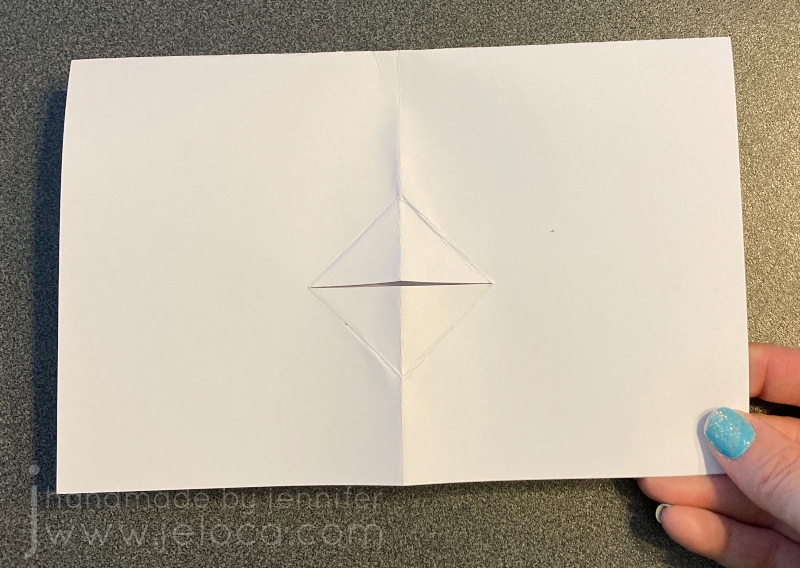
For my proof of concept sample I didn’t cut the elastic as I wasn’t sure how much I’d need to fill the plastic canvas “page” with slots. Knowing I intended these sheets to go into a binder I left a margin at the left edge. After tacking down the elastic at one end, about centered in the remaining space, I set about figuring how much elastic to use for each loop and many holes-worth of space to leave between them.
Leaving one unused hole between folds works perfectly for most colored pencil and thin marker brands. It also works with gel pens though you will want to position them with the caps on alternate ends.
Tip: Carry your thread up the back to each new stitching location and knot it in place before and after completing each loop. This way if you pull too hard on a loop and accidentally tear the stitching the rest of your loops aren’t at risk.
Once you figure out the spacing that works for you mark off the elastic at regular intervals of your custom measurement and then sew the elastic down through the holes in the plastic canvas.
These sheets are going in a binder, of course, so I marked off where the 3 rings would go and removed the plastic inside a grouping of 4 squares to create a hole. I made sure to inset these holes by at least 2 full rows for structure and stability.
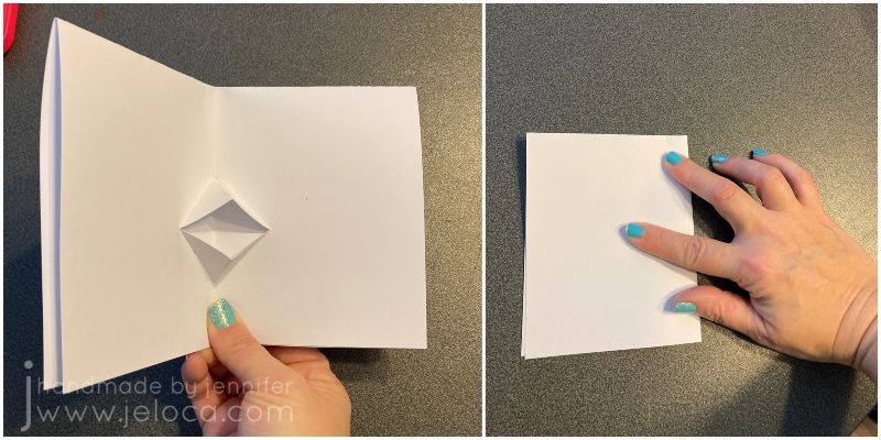
The final step is the tuck under the elastic’s loose end and sew that down, for a neatly finished look as you see in one of the finished sheets above. Because the materials are so inexpensive you can make as many as you’d like and can space out the elastic to fully customize it to your exact needs. This was a super-quick project that took only one evening to make a dozen sheets.
And they’re super secure!
This post may contain affiliate links. This means I might make a small commission on purchases made through the links, at no cost to you.
The last day of February is International Repetitive Strain Injury Awareness Day. Whether you knit, crochet, color, sew, cross stitch, embroider, or enjoy other crafty pastimes like diamond painting or LEGO building, you’ve likely done repetitive motions while in pursuit of your hobbies. I reached out to Alyssa Cape from Alyssa Massage for tips, tricks and helpful hints on ways to keep our mobility and flexibility healthy so we can continue to craft for many years to come.
Me: Hi Alyssa! Crafters (like myself) have a tendency to sit for long periods of time. We can be hunched over our desks during activities like coloring, sewing or diamond painting, or spend many hours cross-legged on the couch while knitting, crocheting or doing embroidery. Do you have any posture tips for long crafting sessions?
Alyssa: I’d put a small step stool or shoe box under the feet so the knees are slightly higher than the hips. This helps the small curve in your back from pinching and then your neck automatically goes forward. This way when your feet are slightly elevated, the pelvis is tilted back a bit so you can rest your back on lumbar support or pillow and your muscles relax.
I wouldn’t suggest sitting cross legged, however if you do, switch positions often. Get up to drink some water and to walk around to give your body a break.
There are multiple videos showing how to be comfortable while doing crafts like knitting or crocheting, like this one:
Me: Crafters can be prone to sore wrists, hands and fingers. Sometimes this pain can shoot up into the arm. Should we be doing exercises to keep our hands, wrists or arms in shape?
Alyssa: Here are 2 links, one shows 3 stretches for carpal tunnel and the other is self hand massaging. I do these myself as well! They can also be used for computer/ desk work.
I would recommend not to over-stretch as you can pull on the nerves. Nerves are like dental floss, they pass through the joints. They don’t stretch like muscle, tendons and ligaments. So if you feel tingling or burning in your fingers, stop!
Me: How hard should we be stretching? How often should we do them?
Alyssa: Do the stretches gently so you feel a slight stretch/ resistance and then stop. You’ll see mobility, flexibility and strength will come! Seeing a physiotherapist is also a good idea as they can provide you with multiple exercises and stretches and suggest the frequency of both as it’s different for each person.
Me: What should we do when in pain? Is that the time to stretch?
Alyssa: I don’t recommend when in pain to stretch and self massage. Rest hands as much as possible. There are thumb/ wrist/ arm braces that can be worn while crafting and at night as well to help stabilize the wrist during sleep.
Me: Do you recommend ice or heat?
Alyssa: You can alternate heat and cold compresses 15 minutes each. Heat allows for more blood flow which speeds up healing and cold reduces blood flow for swelling and inflammation.
Me: Any other tips?
Alyssa: A warm bath with 2 cups of Epsom salts really helps de-stress the muscles and then you can apply cold on the specific location. Drinking lots of water also helps with muscle soreness and tension!
That said- always consult with your doctor before doing any stretches or exercises to make sure there isn’t an underlying issue!!
About Alyssa:
Alyssa has been a registered & certified Massotherapist for over 12 years. She is professional, dynamic and intuitive in her practices and completely dedicated to your overall wellness. You can enjoy the benefits of preventative and ongoing massage therapy for your health and well-being by visiting her here.
Disclaimer: I reached out to Alyssa on my own and asked for her professional advice to share here today. There was no compensation given on either part in exchange.
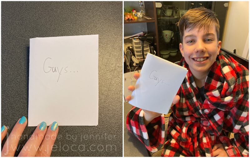
Did you know that February 21st is “Card Reading Day”? According to Checkiday.com this is a day for reading and enjoying cards that you’ve received over the years, that you’ve held on to for sentimental reasons. Here’s a quick and easy card project you can make with your kids to give others something they can hold on to and re-read on future Card Reading days.
To make a talking greeting card you will need:
paper or cardstock
scissors (plain or with a creative edge)
bone folder (optional)
pencil
supplies of choice for decorating (markers, colored pencil, construction paper, glue, etc)
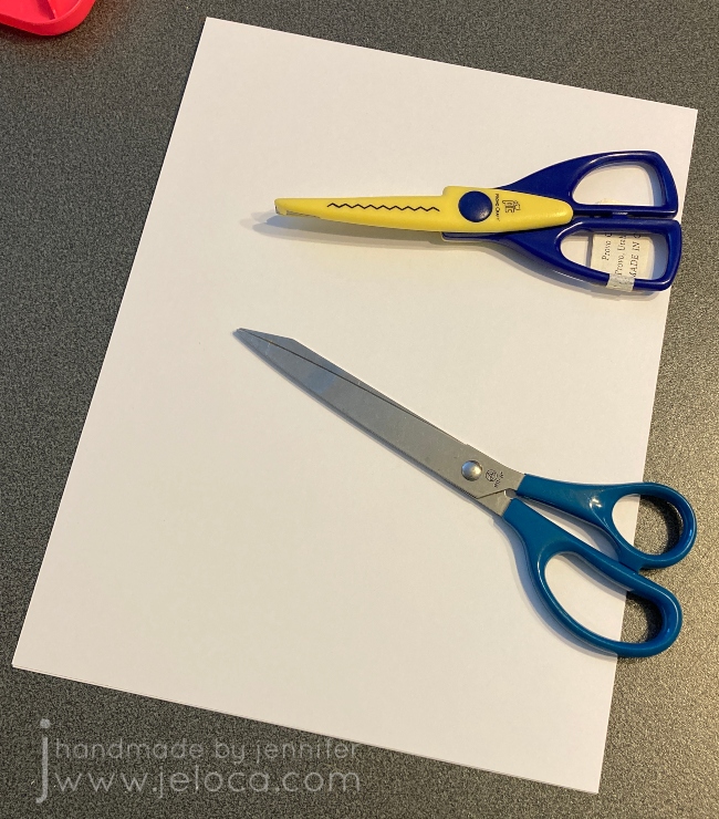
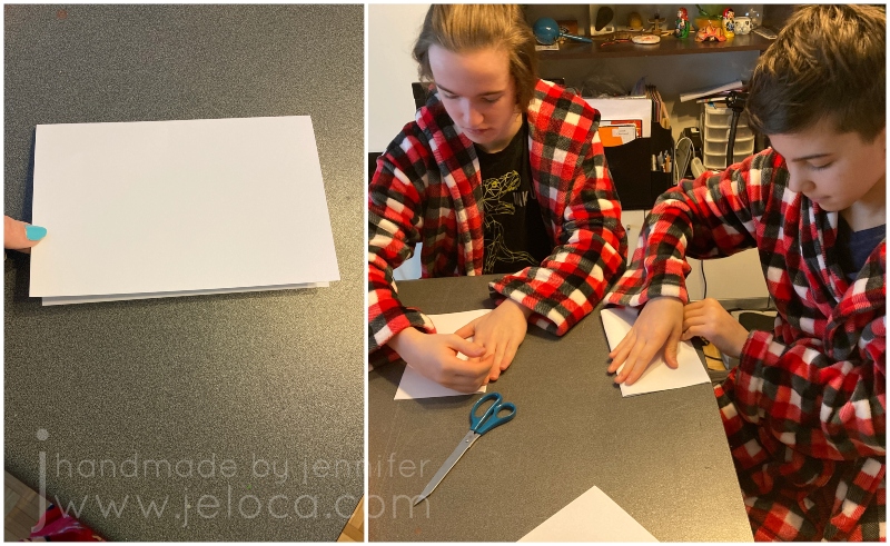
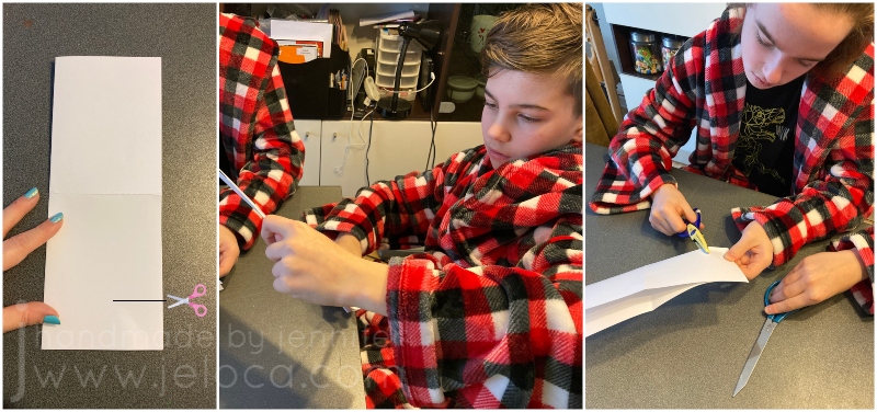
STEP 1- with your paper placed vertically in front of you (taller than wider), fold the top edge down to meet the bottom edge, then press fold flat
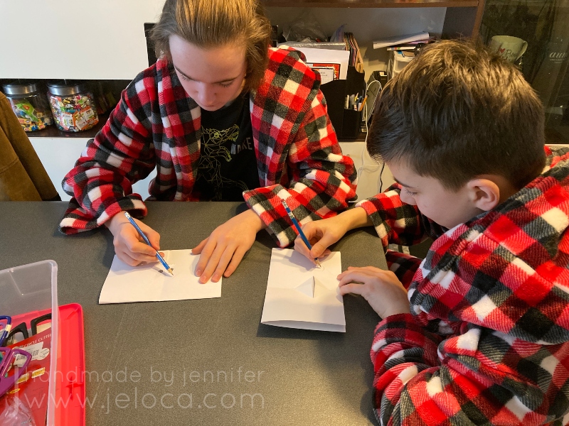
My kids decided to try out this project, so I talked them through it while making my sample and let them have full creative control over their own.
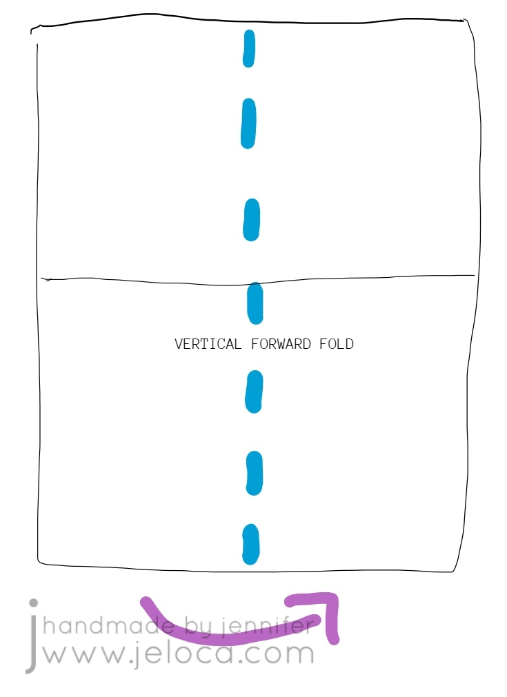
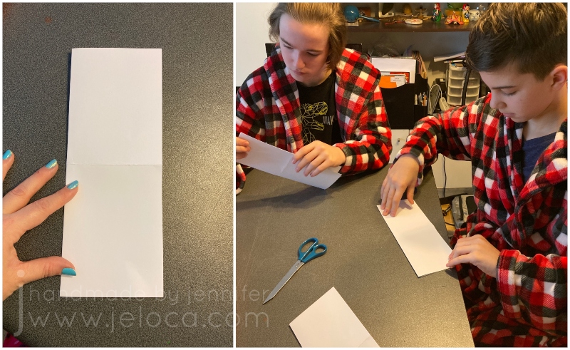
STEP 2- unfold your paper and this time fold it vertically, so the left edge goes behind and under the right edge.
I’d first learned this card at an art class when I was a bit younger than my boys are now, so it was cool to be teaching it to them now, and passing it on.
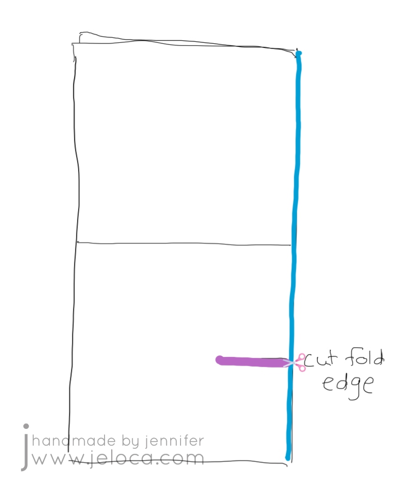
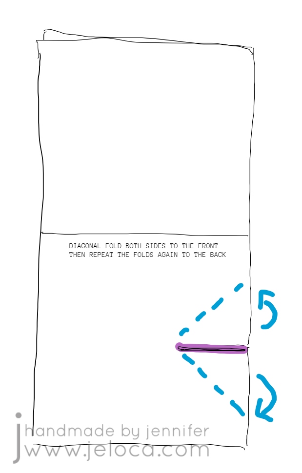
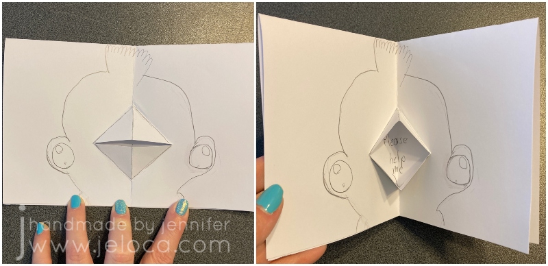
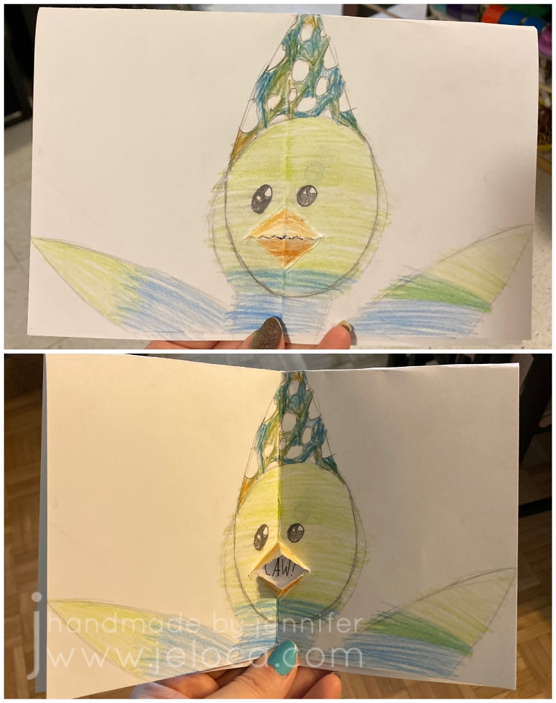
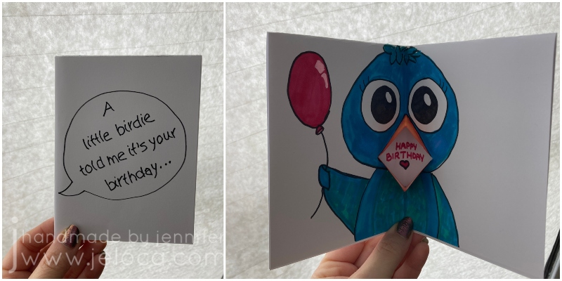
STEP 3- orient the card so the fold is on the right. Figure out where you want the mouth to be and make a straight cut.
Your mouth can be as high or low on the card as you would like, but remember that you will be folding the edges on the diagonal, so if you want to place it closer to the upper or lower edges, you will need to make your cut shorter. (So you don’t surpass the upper or lower edge of the inner card face – this will become clearer after the next step).
Henri and I used regular scissors for a straight cut, and Jakob chose ones with a pinking blade to get a zigzag edge to his mouth.
STEP 4- fold either side of the cut edges up, and press firmly. Repeat the same folds to the other side. If you think of the mouth as a bird’s beak, you are folding at the beak’s outer edges.
Our examples are shown with the folds at roughly 45 degrees but you can get creative with this. With a shorter cut you can fold at 45 degrees for a smaller mouth or you can fold at a narrower angle for a bigger mouth (with a small opening).
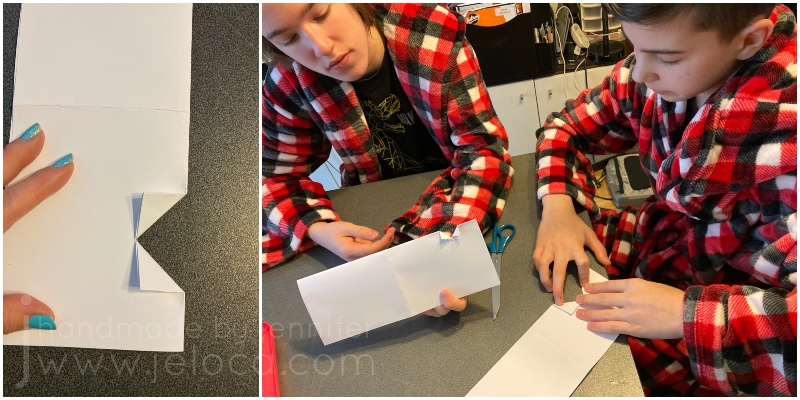
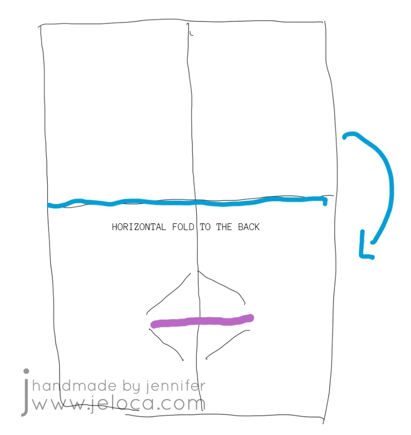
STEP 5- once you have folded the cut edges to both sides of the card, smooth them flat then fold the top half of the card down to the back.
This puts the 2 solid faces on the outside for the front and back of the card and the mouth on the inside.
STEP 6- use your fingers to tuck the mouth/beak folds outwards while keeping the card folding inwards. Then press the card flat and smooth over it a few times, to “set” that fold.
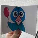
This is the mouth that will open and close as you open and close the card, making it look like your card is “talking”!
STEP 7- the final step is to use a pencil to lightly trace the inside mouth corners to mark off the boundaries of where you can put your “spoken” message.
You want to use a pencil for two reasons: 1) a pen or marker might bleed through your paper to the outside faces of the card, and 2) you can erase the border after creating your message, for a cleaner look.
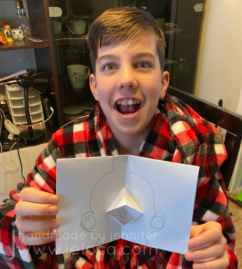
From this point on you can decorate the card however you like!
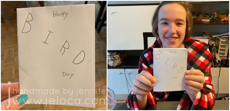
We all ended up taking inspiration from the mouth looking like a beak, and created bird-themed cards.
Jakob and I went for sweet birthday messages…
…while Henri went a bit rogue!
Reinforcing how well he takes after his punny mom, Jakob made a cute BIRD-day card.
I think it’s really TWEET!
He was so proud he just had to CROW about it. (Ok I’ll stop)
I went for a similar theme with mine.
Because the inside of the card isn’t visible (except for where the message is) you can use alcohol markers or other media that might bleed through your paper. You can avoid the message area or glue in a clean bit of white paper after decorating the rest of the card, enabling you to get as creative as you’d like and not be limited to dry media.
I’m so glad I got to pass on this easy card-making method. I hope you (or your kids) make some cute, creative cards that can be someone’s sentimental memory to look at fondly in the future. ❤
Today Lunar New Year 2022! It’s also National Serpent Day! While today starts the Year of the Tiger, my Chinese sign is the Snake, so I think that makes this a perfect day to share this snake-themed DIY from my backlog of never-before-posted projects.
I’ve always loved snakes and Jakob inherited that affinity from me at an early age.
In fact, here’s him at about 3 years old proudly showing off a live snake around his neck!
Back in 2016 I was doing the Christmas gift prep and realized I was short on a stocking stuffer for him. I’d been on a squishy-making kick, having made an assortment of faux food for Henri’s robo-hamster, and decided to try and see if I could figure out how to make a snake for Jakob.
It worked perfectly, and here’s how you can make your own:
You will need:
pool noodle(s)
You can get multiple from one noodle, though can make them as long as you wish. I’m not going to put an Amazon link – you can get them much cheaper at your local dollar store!
Start by cutting the pool noodle to your desired length.
You can use scissors for this but I find it easier to get a flat cut with a knife, and slicing halfway through then rotating and slicing the other half to match.
Draw a diagonal line around your noodle tube. This will mark the divisions where your snake is coiled up.
You can score the line with the tip of your pencil or knife/scissors to make it more visible and easier to follow.
Starting at one end, cut through your tube to the hole in the center and then cut along the line you’ve scored. Try to keep your line straight though it’s ok if it’s a bit messy at this point – it will get cleaned up in the next step.
Remember that one end is the tail and the other is the head, so start your cut on the diagonal as in the image above, to create the point of the snake’s tail. Stop your cut short at the other end and then cut vertically to leave a wider, flat edge which will become the snake’s head.
Once your basic shape is established, you can clean it up. Use your scissors to take small snips on the diagonal of each edge to round out the snake’s body. Shape the head, and you can carve in any other details you’d like, like eyes or scales.
If you want to make sure your snake will stand on its own, make sure one edge is flat.
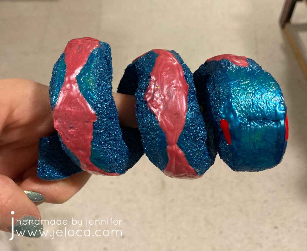
Don’t forget to make sure that there is enough room between the coils to keep them from sticking to each other as you are painting.
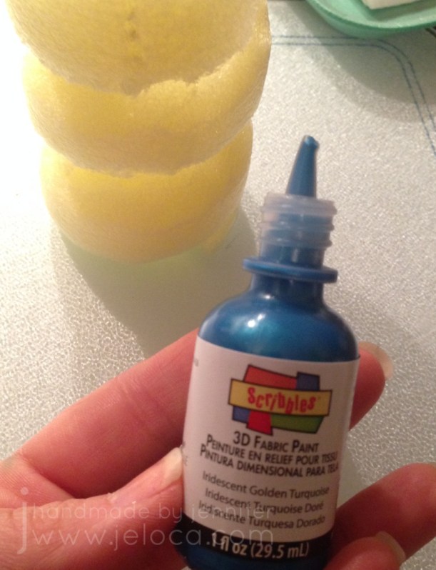
Then you get to paint! You want to use puffy/fabric paint in opaque colors. If you use colors that are too translucent you will need to do many more coats. If that is the case I would suggest a base layer of an opaque white first.
Note: Do not use acrylic/craft paint! If you do, the first time you squish your toy the paint will crack and flake off, which would be a shame after your hard work. With fabric/puffy paint your toy can last for many years.
(Here’s a pic I took as I’m typing this in 2021. Looks brand new!)
Don’t try to use a paintbrush! Squeeze some paint onto your squishy then spread it out with a craft stick. Repeat this process everywhere you want the current color, remembering to leave one side or base unpainted so you have somewhere to set it down while the paint dries.
Continue in this manner, adding more paint in your desired colors. Allow each coat to dry thoroughly between layers. When the body is dry, you can paint the base with the same number of layers.
When the final layer is dry you can add further details like eyes or scale patterns.
Not only are these little guys easy to make, but they make ASMR-like sounds when squished.
(Sound on!)
I hope you enjoy making your own!
This post may contain affiliate links. This means I might make a small commission on purchases made through the links, at no cost to you.
It’s International LEGO Day today, so to celebrate here’s a really easy DIY you can do to turn any dollhouse/playset with flat surfaces into a LEGO playset!
That’s right – with just a few simple household tools we’re going to turn this:
into this:
What you’ll need:
dollhouse/playset with flat surfaces
I used this unfinished ArtMinds Wood Castle Dollhouse from Michael’s, (US / Can)
damp sponge or paper towels (to wipe off sanding dust)
For this project I used this ArtMinds Wood Castle (linked above).
Jakob had received this castle as a Hanukkah gift from my parents and I wanted to surprise him by turning it into a LEGO playset since he never really played with action figures but was completely obsessed with LEGO.
If working with an unfinished product like this castle, you’ll want to sand it before you begin. Some of the edges are unfinished or rough and could cause splinters. The wood is soft, though, so it’s easy work to bring it outside and give the exposed edges and surfaces a quick sanding. This will also help make sure your surfaces are flat.
If using something like a plastic play house, you will want to sand any of the surfaces where you plan to attach LEGO plates to help ensure they stick well.
After sanding, wipe all surfaces with a damp sponge or paper towel. You want to remove the fine sanding dust so it doesn’t interfere with your glue later.
We’ll be using a craft knife to score the LEGO baseplate and LEGO bricks to give us a good edge to cut and snap from.
In my case, every surface in the castle had the same depth, so I wanted to start by cutting my baseplate into strips that were the proper depth. Then later I could cut them into individual pieces for each section.
Set the corner of your baseplate into the corner of one of your sections and use a separate LEGO brick to mark the edge line. We don’t want to cut the studs in half so if necessary err for pieces that are slightly too short instead of ones that would stick out beyond the edge of your playset.
Once you know your depth, use additional LEGO bricks to continue the line all the way from edge to edge. Do not use flat bricks for this as the thickness of the standard bricks will help keep your blade from slipping. Be sure to press the bricks securely as any gaps where they’re not properly seated onto the plate could allow your blade to catch.
NOTE: use a cutting mat or cut on a protective surface. I use my table as a craft table so I cut directly on it. Don’t be like me!
Run the blade of your craft knife down the edge of bricks once or twice, then snap your baseplate away from the cut edge. If you use enough pressure when scoring it should snap cleanly.
If the baseplate doesn’t snap clean off, you can slide your craft knife down the cut edge and the two pieces will separate easily.
Here’s a video for those who find it easier to see the process:
As you can see, with proper pressure the piece will snap cleanly off with a neat, straight edge.
Now that you have strips that are the proper depth, use the same brick-marking method to mark off the width for each section you want to cover. Do each section one-at-a-time.
Here’s the first baseplate flooring cut to size and inserted in place.
NOTE: They are not glued into place. I merely like to place them where they’ll go to help me keep track of what I have left to do, and to make it easy to know where they will go later.
Repeat this process until you have cut baseplates for every surface you’d like to cover. I did all floor surfaces, as well as the stairs. After this image was taken I also cut pieces for the windowsills and doorframes.
When all your pieces are cut, lightly roughen the backs of each with your sandpaper. You want to remove the plastic’s shine and roughen up the surface to help the glue better adhere. At this point you can plug in your glue gun so it can start warming up. I like to keep my glue gun on a silicone mat or scrap tin foil to protect my surface from glue drips.
Apply glue to the back of each piece and hold in place for a moment, pressing firmly. Once all the sections were glued I set it aside overnight so the glue could harden fully.
That’s all it takes! One baseplate was enough to cover all the surfaces shown plus have some extra left over.
The studs on the floors and stairs allow your Minifigs to be posed nearly anywhere, and the ones on the windowsills are really cute to put flowers and plants. Plus you can build off the plates, creating LEGO furniture for your playset.
I couldn’t resist staging a few characters for Jakob to find when he got home from school.
The “renovation” was a big hit, and while it only took a bit of time over one evening to do, it has held up since 2018 and is still going strong. I hope you enjoy this DIY and that it gives you inspiration on how to convert existing toys that might not be getting much love into ones that will be played with for many more years.
Happy International LEGO Day!
This post may contain affiliate links. This means I might make a small commission on purchases made through the links, at no cost to you.
Two weeks ago I shared the cake I made for my sister’s bridal shower. As the saying goes, first comes love, then comes marriage, then comes Mommy with the baby carriage.
Sure enough, about a year later I got to make a baby shower cake for my first niece*!
This post isn’t going to be a full walkthrough, but rather a look at the process for designing and making a baby shower cake. As explained in my “how to bake a cake” post, it’s important to do as much prep as you can in advance. Not only do cakes need time to cool fully before you start to decorate, but some decor pieces need time to dry or set up.
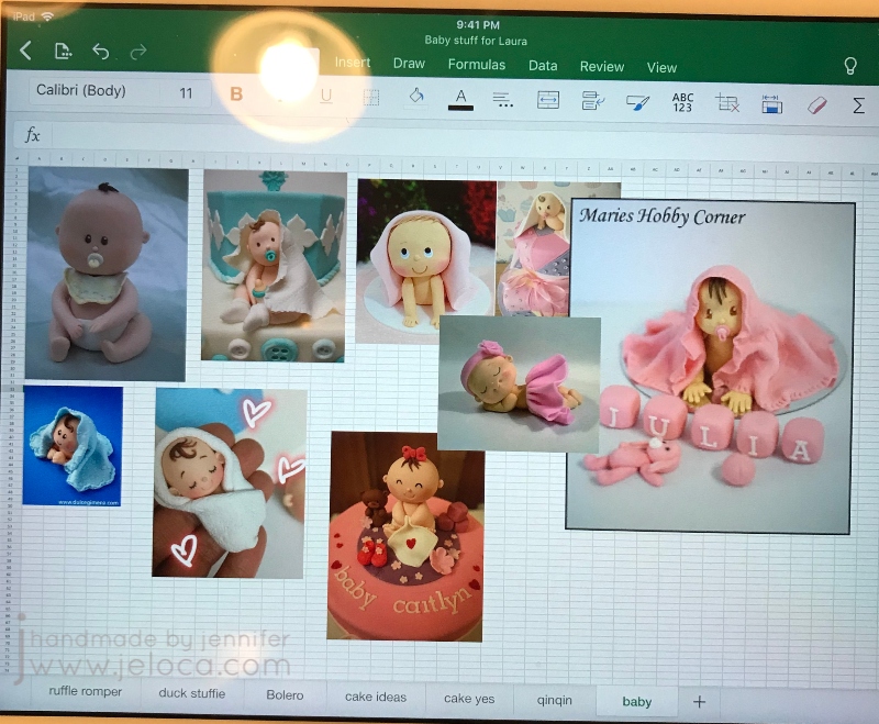
My cakes always start with a sketch and some research. In this case I knew the number of people it would be serving, and that it was for a baby girl, but the rest was up to me. I decided on a layered cake with some kind of topper, and after looking at sample cakes online I vetoed a crib in favor of a baby on top of the cake.
I always make an Excel file with inspiration samples. The goal is not to straight copy anything you find, but to have a sense of what’s possible. At the time I didn’t yet have a baby mold so since I’d be hand-sculpting I collected an assortment of toppers that looked like something I could do.
I’d enjoyed texturing the fondant into ribbons for Laura’s bridal shower cake and so to tie the two cakes together I chose to make a sort of flower shape by flanging out the edges of pre-cut circles. The only thing I had to decide was if I’d color the edges or the centers of the flowers. I also had to make the fondant topper so it would have time to solidify before setting atop the cake.
The baby shower was on a Saturday and I still had residual exhaustion from finishing her last cake at 5am the morning of her party, so I got started early – on Wednesday.
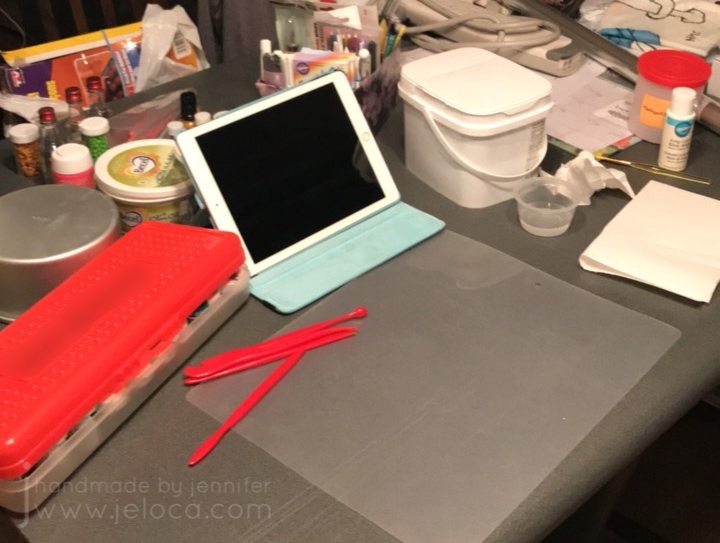
I always like to assemble my supplies before I start. There’s a tub of white fondant, fondant shaping tools, my organized container of tools, paintbrushes and edible markers, my collection of gel colors, water, mini vodka bottles (for fondant painting), paper towels for blotting, and most importantly – the cake tin I’d be using for the top tier (so I could scale my topper appropriately. Plus my iPad for both inspiration and entertainment while working.
To make the flowers I used my fondant roller and silicone mat to roll out some fondant to about 2mm thick. I used a 1.5″ circle cutter to cut out 3 circles for each flower sample and flared out the edges by rolling over them with a ball tool on a foam mat. Using a food-only paintbrush and some pink edible color dust, I brushed the center of 3 of the disks and the edges of the other 3, and then loosely squished each circle with my fingers and pressed them together. I much preferred the pink-center version, so now I was able to make a proper sketch and decide on my topper (as I still wasn’t sure if I wanted a seated figure or the laying-down-with-blanket style.
A sketch really helps to visualize your plans. Once I saw how busy the cake would look with the lower tier covered in flowers I decided the blanket baby would be too much.
Next was to make the baby. In my research I found that the creator of the first baby in my inspo pic had a full YouTube tutorial available. Don’t shy away from tutorials, that’s what they’re there for! I keep up this blog specifically so my tutorials can help others, and to share what I’ve found. Here is the designer’s website with instructions on making the baby boy, and the video I followed for the baby girl:
How could I not recommend it? Look how cute it turned out!
Seriously, I love her!! My only mistake was in laying the head down while I worked on the body. Unfortunately it flattened out and I didn’t want to mess up the face by trying to round it out again. So my figure looks great from the front but her head is clearly a little squished from a side view – oops! I’d recommend perhaps laying the head in a bowl of icing sugar, flour or corn starch to hold it without applying pressure to any of the sides.
On the Thursday night I baked 2 cakes, and prepped them to cool as per my post linked above. Then Friday night was for putting it all together.
First I covered each tier in fondant – white for the flower base and a pink matching the baby diaper for the upper tier.
Knowing how heavy the solid-fondant baby figure was, I inserted a wide straw (ones for slushies are perfect) and cut it to be flush with the top tier. This would provide support and hold the weight of the figure so the cakes wouldn’t compress.
Next was to make more flowers. As for my sample, I rolled out a workable section of fondant, cut a bunch of circles, added some color to the center then squished the sides in. Be careful to not roll out more than you can handle at a time, so they don’t harden before you can flare the edges and squish them into shape. The flowers were applied to the cake with a bit of water on the cake and the adjacent petals. If necessary hold into place for a few seconds until it stays. Cover the entire base.
Remember to look at your cake from different angles. I hadn’t – I remained seated the entire time – and so I didn’t realize until I was looking at it later from above that there was a gap along the edge of the top cake where you could see the unfinished edge. Had I noticed in time I’d have pushed the top edge of petals up higher to fully encircle the top tier.
I had a few extra flowers in the end so I placed them around the baby figure, though that’s completely optional.
And there’s the finished cake! I absolutely love how it turned out. The flowers/petals give a great visual payoff that belies how EASY they are to make. Looks great and easy to customize with your choice of colors – I highly recommend!
And just as for her bridal shower cake, here’s a bonus pic of the mom-to-be with her baby shower cake. ❤
*whose arrival was followed immediately after – as in, less than 24 hours later!! – by my second niece! ❤
This post may contain affiliate links. This means I might make a small commission on purchases made through the links, at no cost to you.
Three-years ago today my baby sister Laura got married. Since I never shared the cake I’d made for her bridal shower, here’s a full step-by-step tutorial on how to make your own Barbie/Fashion Doll wedding dress cake!
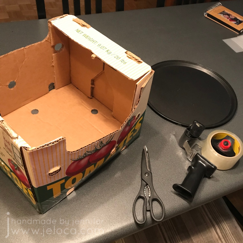
One important step that often gets overlooked is transport. As I’d be driving the cake to the party, before even starting to bake I had to make sure I had a way to bring the cake with me safely. First I selected the platter I wanted to use – in this case a pizza oven tray – and made sure I had a box that fit. This crate saved from a Costco run worked perfectly. I used scissors to cut one of the sides so I could flatten it and slide the cake in, and the packing tape was there to re-tape the box again for the ride.
Once I knew I had a way to get the cake to the party I was able to plan the cake itself. My mom and I had spent an afternoon looking for a brunette Barbie/generic “Fashion Doll” that would resemble my sister. Knowing the doll’s height allowed me to plan how many cakes I’d need to bake. I used a Wilton “Wonder Mold” dress pan to bake a vanilla cake and added height with an additional chocolate cake baked in a pan that matched the width of the dress mold.
Note- as this is a very picture-heavy post I tried to group as many together as possible. You can click on any image to view it larger if desired.
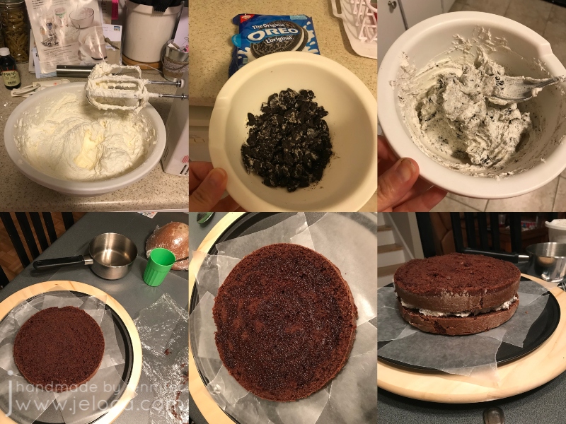
As explained in my “How to bake a cake” post, I always bake a few days in advance. Optional: make a simple syrup by boiling together an equal amount of white sugar and water and set that aside to cool completely. While it’s cooling prepare a few batches of buttercream icing using your favorite recipe. I used Wilton’s. You can flavor them as you like; in my case most of it was left plain but I took out enough to fill the chocolate cake and mixed in crushed Oreo cookies to make an Oreo icing. After the syrup is fully cooled, tort and fill each cake (I like using my favorite cake leveling helper) adding a drizzle of syrup to the layers to keep the cake moist until the party. For mine, the chocolate cake was split into two layers with the Oreo icing in between, and the vanilla cake was split into three with the plain vanilla icing. Don’t forget to “glue” your cake to your platter of choice with a dollop of icing.
You can see the significant height difference achieved by torting & filling the cakes!
Once the cake base was ready I used watercolor pencils to change the doll’s eyes to match my sister (using techniques from Poppen Atelier) and tucked the doll’s hair up to keep it out of the way. I also wrapped her lower body in saran wrap. It’s an optional step but as I wanted my sister to be able to keep the doll it made it easier to keep it clean.
Decide where the doll would be inserted and use a knife to carve out a channel for her legs. Note- I didn’t realize my channel was off-center. This resulted in the dress looking bulkier in the front than the back. Just something to keep in mind when making your own.
Then cover the cake using the remaining icing. Smooth it but don’t stress about making it too even as it won’t be seen later. Once fully covered, roll out white fondant to a diameter matching the height of the cake, doubled. Using a rolling pin with levelers can help keep your work even.
Cover the cake base with the fondant and trim the lower edge. Use a separate piece of fondant to make a dress bodice and moisten the inside with a bit of water to help adhere it to the doll, then insert the doll. To finish prepping the dress, roll out a fondant snake to fill in the gap between the dress and bodice, and smooth to blend evenly.
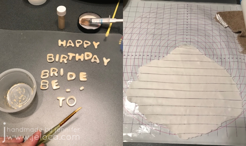
If you are planning to have wording around the base of the cake platter, cut out your fondant letters now so they have a chance to harden. We were having the party right after my sister’s birthday so I cut out the words “HAPPY BIRTHDAY BRIDE-TO-BE” and brushed them with gold “paint” made by mixing pearl dust with vodka. Tip: use a medicine syringe for easy dispensing of small amounts of vodka to avoid over-diluting your dust and needing to add more.
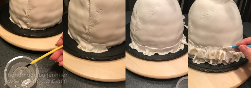
Now you’re ready to work on the dress’ ruffles. Be forewarned – this takes a long time. Cake decorating always does, but looking at timestamps from my images I can see the ruffles portion alone took about 3.5 hours. (It also adds a lot of extra weight to the cake which is partly why I used the pizza tray as my platter – I didn’t want to take a chance on a plastic platter cracking under the weight).
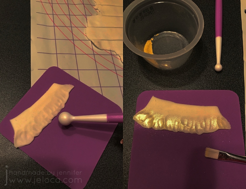
Roll out a piece of fondant and cut it into strips. My Wilton fondant mat was really helpful here for easily cutting at 1-inch intervals. Cut enough strips so that you’re not stopping too often but not so many that they stiffen or harden too much to be usable by the time you get to them.
You will need a ball tool and shaping foam mat in order to make the ruffles. Note: I’ve deliberately darkened the contrast & shadows in this image to show you the ruffle texture. Using the ball tool, roll over one edge of your fondant strip to thin and flare it out. Don’t go so thin that it tears through. As I was making my dress have an ombre effect, I used more pearl dust gold “paint” to add sheen to the ruffled edge. Don’t bother painting the flat edge as it won’t be seen.
Use water and a food-only paintbrush to moisten the back of the ruffle’s flat edge and add it to the cake. You can use a smoothing tool or your fingers to help secure.
For the ombre effect, vary the tone of your colors as you go. In my case I lowered the ratio of gold pearl dust to vodka as I went, so the lower tiers have a darker gold shine and it fades to white as it goes upwards.
Repeat the process until you’ve covered the whole cake. Just like when icing or other decorating, a turntable is REALLY helpful during this process.
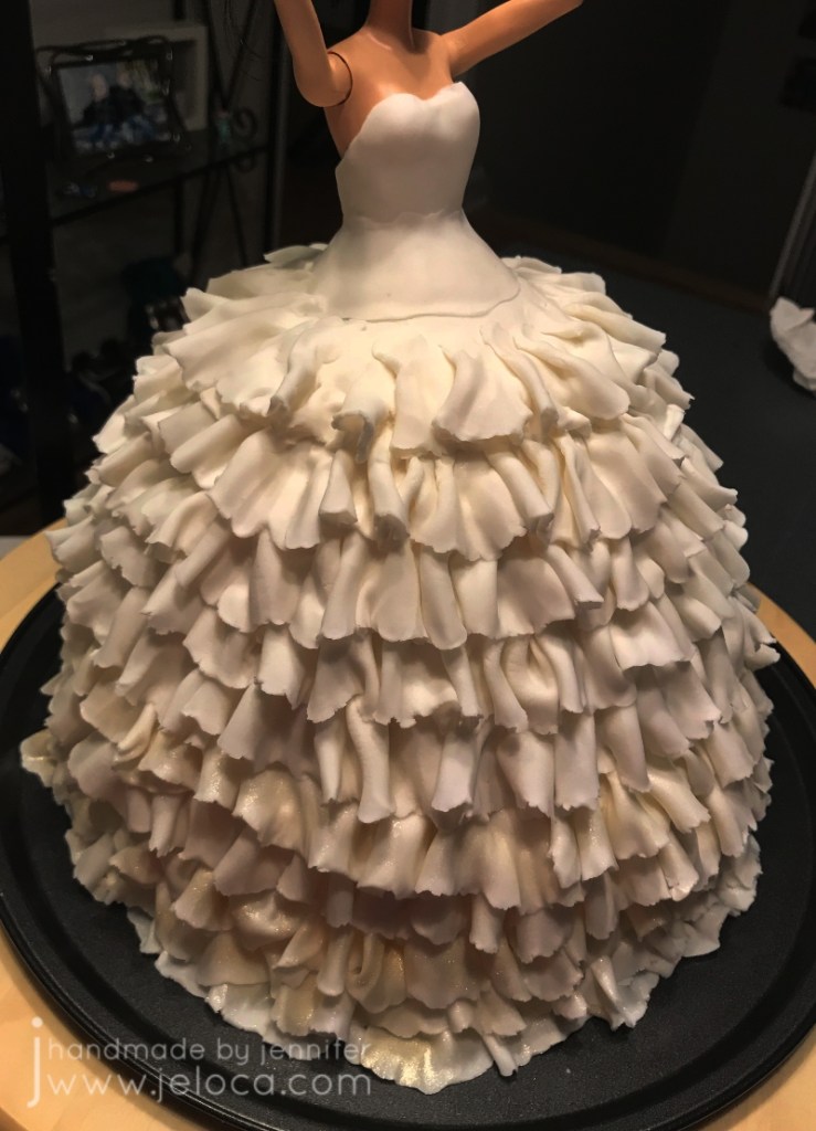
On your final layer, smooth out the ruffle’s flat edge to blend into the bodice.
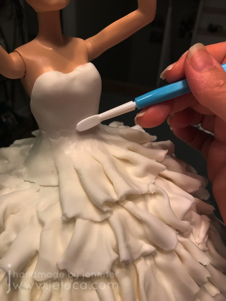
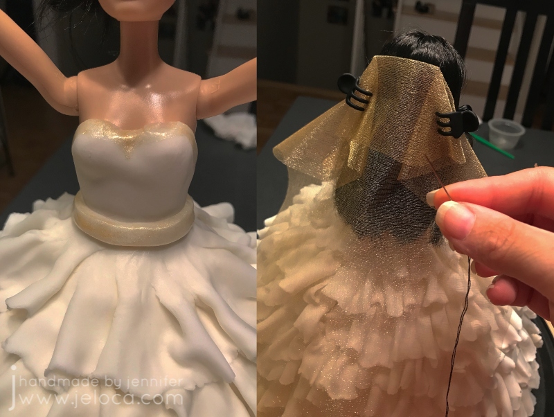
Make sure to smooth it on all sides. You can stop there or add decorative finishing details.
I added a gold paint trim and a fondant “belt”, and then sewed some gold tulle fabric into place as a veil using thread that matched the doll’s hair color. I also added the doll’s original gold bracelet.
Add your lettering (if using) and you’re done!
Here you can see how I’d accidentally offset the doll’s placement. I would prefer to have her centered, or at least have the extra pouf in the back, but I didn’t realize until too late. A good reminder to always view your cake from all angles, not just the front!
Make sure to leave yourself enough time to decorate! I wound up finishing the cake at around 5:00am and had to be at the bridal shower by 11:30 to help set up.
I slid the cake into the box and then taped the front back up into place using packing tape. This made it really easy to carry the box around and the dab of icing under the cakes guaranteed it didn’t slide around on the platter.
The cake slices do wind up very tall, but it did give the option of splitting a piece so one person could have the vanilla half and the other the chocolate.
As a bonus for those who made it this far down, here’s a pic of my sister at her wedding. 🙂
I hope this post helps someone create their own wedding dress cake! The customization options are endless, and you can really have fund with the details.
This post may contain affiliate links. This means I might make a small commission on purchases made through the links, at no cost to you.
Today, September 14th, is National Coloring Day. Of course coloring isn’t limited to coloring books, but over the last few years they’ve definitely become more prevalent! Whether they’re your preferred place to apply color or something you only do with kids, you’ve likely noticed that the paper quality can vary greatly. From thick cardstock to what’s basically printer paper, the type of paper will affect everything from what media you can use in the book to if you can actually color both sides of the same page.
On average, most adult coloring books use a slightly thicker-weight white paper that can handle all dry media as well as water-based markers, with some bleed-through if you press too hard or go over the same spot repeatedly. Crayons and colored pencils will lay down pretty evenly as the paper has little-to-no tooth, but if you’re the kind of artist who prefers to work with a more textured paper, here’s a tip that can help transform the books you already own – sandpaper!
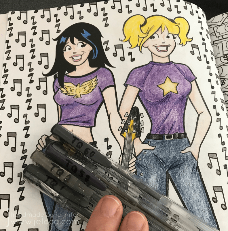
I’ll demonstrate this in my copy Archie’s Coloring Book (and there’s a video demonstration at the end of the post).
This is a great book that is jam-packed with tons of images of Archie and the gang, showcasing everyone from the core trio to side characters (Dilton, Moose, Cheryl, Sabrina, Josie and the Pussycats, Miss Grundy, Mr. Weatherbee), to the ‘Lil Archie gang. Even Jughead’s dog Hotdog appears in all his shaggy glory!
I first thought about this back in 2017 after watching one of SuperRaeDizzle’s videos on dollar store art supplies. If you don’t follow her you really should – she’s a fantastic artist who does a lot of art supply reviews and draws/paints with incredible realism. In the linked video she uses a sanding block to rough up a sheet of inexpensive Bristol board to give it a better drawing surface.
I thought it was really cool but didn’t think it applied to me – until I started wondering if the same technique would work in what I was using a lot of at the time – coloring books. In theory it seemed like it should work but with the paper so much thinner than Bristol board I didn’t know if it would work. Would it tear the paper? Would it destroy the printed outlines? Would the ink bleed?
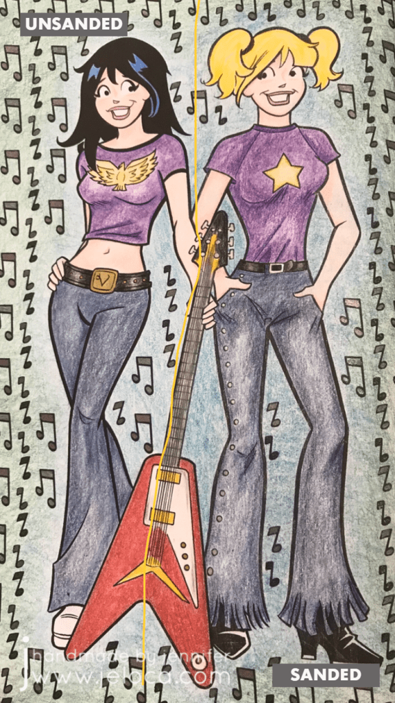
I had to try it for myself. To make the results as clear as possible I chose a page that allowed me to clearly divide the page into two halves.
I left the Veronica side of the page untouched and sandpaper I had on-hand to lightly rough up the Betty side of the page.
Here you can see the before (left) and after (right). There’s no obvious distress to the page though if you look closely at the black line of Betty’s shirt near the guitar you can see faint striae where the ink was removed.
To hold the book open while I worked I used my pants hanger hack. Still highly recommend!
I then set about coloring the page with Faber-Castell Polychromos colored pencils. I was careful to color in both girls the same way, using the same colors and applying the same amount of pressure.
Right away you can see a difference! Coloring on the Veronica side was exactly like coloring with colored pencils on computer printer paper (though I think this paper is slightly thicker). It’s super smooth and flat without any tooth or texture at all, and the colored pencil glided over the page really easily. On the Betty side I could feel the roughened-up surface of the page and it gave the colored pencil something to grab to, making coloring a very different experience.
It’s difficult to put the feeling into words but coloring the Veronica side felt like I had to concentrate more, because my natural tendency was to use more pressure to get more color payoff, whereas on the Betty side the same amount of barely-there pressure gave a richer color payoff.
Coloring on the super-smooth side made me very conscious of trying to not color too hard because it took more work to lay color down. On the flip side, coloring on the textured side of the page made color application a breeze, to the point where I had to concentrate on not applying too much and losing any highlights.
Both sides are colored the exact same way, using different colors for shading. I didn’t want to do anything too fancy because this was only a test; it was more about seeing if the sandpaper would ruin the book or any attempts to color vs me trying to get a professional-looking result.
I’d sanded the guitar evenly down the middle and thought there would be a more obvious difference between the two sides but I’d say it’s pretty subtle. Again- the sanded side has more depth and more color payoff while using the exact same pressure as the unsanded side.
I was also curious if sanding the paper would affect marker application, so decided to fill in the music notes with a mix of sparkle and metallic gel pens, in black and charcoal. I was really happy to see that there didn’t seem to be any effect on how the gel ink applied, and that both sides had the same amount of glitter and shine in the light.
Finally I wanted to see if there would be any issues coloring on larger open areas, so I picked two colors and experimented with blending them to each other. In my first layer of color (2nd image from the left) you can see that both sides are streaky but the funny thing is it’s for different reasons!
Veronica’s side is streaky because I struggle with laying down barely any color…though I probably didn’t have a proper point on my pencil, which didn’t help. Whereas Betty’s side is streaky because that’s the grain from the direction I’d sanded. You can see it better in the image below (though I sort of like the streaky look on her jeans because it makes them look more like real denim LOL)
The last test that I did was to compare the difference that burnishing would make on either side. I went over both sides of the guitar with my beloved Prismacolor Premiere colorless blender and really tried to smooth any grain down and move the color to fill any remaining white areas. I have the page open in front of me as I type this and while my fingertip can tell the difference between the two sides it is SLIGHT, and definitely not as much of a contrast as the rest of the page halves.
(And truthfully I’m not completely convinced that I’d feel a texture difference there at all if I hadn’t sanded too hard in that spot, as you can see by the diagonal lines of indentation on the lower right of the guitar)
Here’s the completed page. If I didn’t know that one side had been sanded I would think that I’d colored harder on the right side, and possibly used a different color for Betty’s jeans and background, as I do feel that there’s a visible difference in this closeup.
I don’t find the difference is as obvious in this image, though I’m not sure if it’s because the black background is causing a distraction.
After trying this once I’m a convert! I have a large collection of coloring books and I think this technique opens up a world of possibilities for getting different effects and results with colored pencils, crayons, and pastels. The opportunities expand even further if you experiment with different grits of sandpaper!
Imagine coloring a fantasy scene and sanding a grassy area with one grade of sandpaper, bricks of a castle with another, and the bark of a tree with a third… you could get a whole range of textural effects within the image all before even laying down any color!
Other notes: in the video below you’ll see a little bit of ink smearing. That was due to pressing too hard with the sandpaper, so it’s avoidable but something to watch out for. I was happy to see that there was no consequence to the back of the sanded page, nor any texture transfer on the facing page.
Here’s a graphic for those of you who like to pin my posts, and as promised above, here below is a video showing this technique in action.
This post may contain affiliate links. This means I might make a small commission on purchases made through the links, at no cost to you.
Most of the cakes I make are a 2-4 day process. The final 2 days are always baking 2 nights before the party (so Friday for a Sunday cake) and then decorating on the day before the party (Saturday for a Sunday cake). I add a few more days prior if I need to make fondant decorations or anything that requires drying time. This Pitfall cake, for as detailed as it looks, took 3 days.
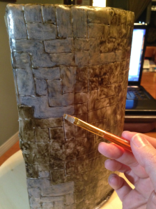
When I got home from work I prepared the base stand to get it to look like a brick wall with a cave by covering it with fondant and scribing a brick pattern to match one from the game.
Day 2: Friday
In the morning before leaving for work I gave the stand a quick wash of color. I needed to fill in the grout lines and give it time to dry before I got home. In a small cup I mixed together 1 drop of black Americolor food gel, 1 drop of brown gel, and 6 ml of water. I used a food-only paintbrush to apply the wash to the fondant, not aiming for any sort of pattern, and allowing the color to drip and run a bit before smoothing it around. I let it set for a minute or two then dabbed at it with a paper towel to remove areas of excess, and then used the same brush with only water to remove even more color. The goal was not to paint or finish the brickwork but to allow the dark color to seep into the etched lines and provide some aging.
At this point it looks like a dark, muddy mess.
When I got home from work I rushed to bake the 2 cakes I’d need. I knew I’d have plenty of time for them to cool before I planned to ice and decorate on Saturday, but I often use the oven for storing fondant bits overnight and didn’t want there to be any residual heat left inside it.
When the cakes were cooled some I wrapped them in saran wrap to set aside for the night.
Then I prepared the table for getting down to some fondant painting. These are the supplies I prepared: in the lid of my color box are a smaller box of Americolor icing colors and a bottle of Wilton White-White, then the contents of the case itself is my collection of Wilton icing gels and some regular, grocery-store-type food coloring. I brought down some cotton balls thinking I might use them for blotting, but testing on a scrap of fondant revealed it stuck terribly to the wet sweet, and I quickly got rid of them. I’ve got a measuring cup of water for rinsing my brushes, a small cup of water and syringe for adding clean water to my colors if I need to thin them any (the syringe gives you way more precision when working with tiny amounts of color than dropping by spoonful or pouring), and a small cup of the leftover dark wash from the morning that I’d kept moist in a tupperware for the day. I’ve got a few sizes of food-safe paintbrushes and some paper towels for blotting, and finally at the bottom is my standard palette, left over from an old pack of hors d’oeuvres.
That’s the palette I use most often, and it works great with larger quantities of color, like when tinting icing sugar/water for the fondant toppers I make. However when using tiny bits and blending a lot of shades I find it’s not as practical, and I eventually switched over to an artist’s style palette with small dabs of the gel colors on it, and a small styrofoam tray for blending. The colors bead up on the tray so I don’t lose any to absorption.
I prepared the stand by putting it on my lazy susan., These things are SO useful with decorating and crafting! I’ve actually got three – one wood, one glass, and one plastic, depending on my project needs. I stuck a tub of icing in there to help weigh it down. The stand is pretty heavy, especially with the fondant, but that was a precaution.
The first thing I did was to mix up a color that approximated the bricks I was trying to copy. In the game they look like this:
Now that I had the general shape scribed in and the darker grout lines, I needed to lighten the bricks to a faded, creamy, beige-ish color. I began to mix up a color, testing on the paper towel until I had something that looked right. You can see at the bottom of this next pic where I’d tried out a color that was too pale, and I had to darken it up a bit. In the end I used some Wilton White-White as a base, then some brown and black Wilton gel colors, a touch of Wilton lemon yellow, and some of the morning’s dark wash water to thin it out.
I painted small dabs of the resulting mix onto each brick individually, blending and smoothing until I got rid of the brush strokes and had something that looked like an old brick wall.
For the first time ever I took a short video of my process. If you find it helpful and want more video tutorials, please let me know in the comments. 🙂
After the back was done I moved on to the front. The small amount of mixed color that you saw in the video was enough to paint the entire back and front.
The next step was to add some greenery. I knew I’d have a lot of grass and vines and leaves in the cake, but wanted to add more depth to the bricks so I used more of the dark wash and deepened it up with Wilton gels (leaf green I think).
I used a messy brush to pounce the color in areas where moss would grow, mostly around the bottom of the back piece and around the top and sides of the front. This is a great reason to keep those brushes that get all messed up, so you don’t ruin good ones!
As I added the moss I made sure to keep the brush from being too wet – the effect was supposed to be subtle – and I also periodically touched my brush in different areas of the mix where I hadn’t fully blended, sometimes picking up straight gel from the edge of the palette. This gave me varying shades of green and a more natural look.
Finally I used some White-White and Americolor black and a touch of brown to get a nice varying gray shade for the rock cave. Again I resisted the urge to overmix the color, so I could get depth to the wall. Sometimes I touched in a bit more white, which lightened the grays, and then I’d go back in with a more liquid black, getting into the cracks.
Here’s the finished support, set aside for the night. The front (above) and the back (below).
This post may contain affiliate links. This means I might make a small commission on purchases made through the links, at no cost to you.
Update: This tutorial is now also available as a downloadable PDF here. More details at bottom of this post.
It’s October! That means it’s okay to start talking about Halloween, right?
It is according to Henri- when I woke him up for school this morning he gazed up at me sleepily and grinned “It’s October 1st.” When I asked why that mattered he smiled even more adorably and said “Because now it’s almost Halloween.”
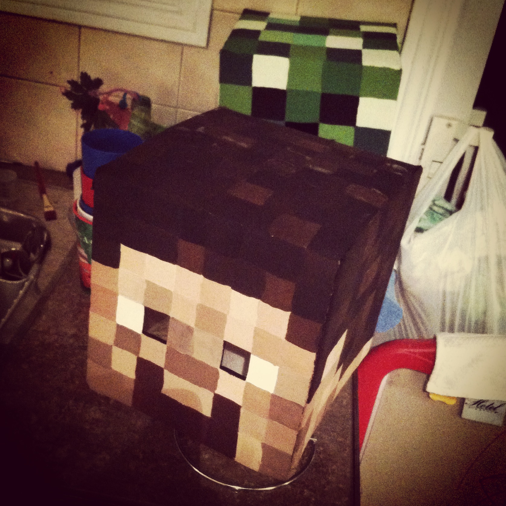
‘Almost’ is relative. (He clearly gets his awareness of time from his father). However his mention of it reminded me that I never showed last year’s costume. So. Now, with plenty of time to get ready for this year’s holiday… here’s how I made the boys Minecraft Steve and creeper heads, and how you can too!
The boys decided for Halloween they wanted to dress up as their favorite Minecraft characters. They do sell ready-made cardboard heads in stores but they are expensive, and there are a ton of tutorials online. I looked at a few, then worked things out with what I had on hand, and what I was able to find at the dollar store.
What you’ll need:
square boxes (large enough to fit over the wearer’s head)
1. Yannick came home with 2 small boxes he’d found somewhere. Grocery stores often have ones you can ask for, or as a last resort you can buy boxes.
2. I used two-sided tape to tape the outer flaps to the inner ones (not shown) so the inner flaps wouldn’t drop down onto the kids’ heads. Then I used masking tape to fully tape over the top seam, both to securely close one end of the box, and to make the seams less visible once they were painted.
3. I cut the lower flaps off the boxes and then used the same masking tape to cover the exposed edges. It would gave a cleaner look, vs the rough look of cut corrugated cardboard, plus was less likely to catch and tear, which could potentially pull off the paint.
4. I divided the 4 sides and top into even grids. I looked at pictures of the characters online and mapped out roughly how many squares per color/face, and then used a ruler to divide the front (face side) into the grid. Once the face was set, I carried the markings around the sides of the boxes, and finally the top. Because the boxes are taller than wide, the top has fewer squares than the sides do. That’s not what the characters SHOULD look like, but I didn’t think the kids would mind.
5. Once the boxes were plotted I used a cutting blade (also from the dollar store) to slice out the eyehole sections. For Steve, only the dark pupil area was cut out. For the creeper it made more sense with where Henri’s face was to cut out the larger nose/mouth section. After removing those areas I covered the exposed edges with masking tape.
6. Finally it was time to start painting. The paints and brushes were from – you guessed it – the dollar store. The advantage with the Minecraft characters is that if you have to custom mix your paints to get the right colors, it doesn’t matter as much as it would in most projects if you have enough to complete your painting or if you need to mix more and risk not matching quite right. The goal is to have an assortment of shades, so blending colors works perfectly.
That said, if you prefer a more accurate version, I have compiled this tutorial into a downloadable PDF (linked at the bottom of the post) which includes full-color screen-accurate charts for both characters, including the hex codes for each color so you can color-match accurately.
Here’s the four sides of the painted creeper head. I set the boxes to dry on a paper towel roll to hold them off my counter until the lower edge was dry. (I held them up the same way while painting too).
Same goes for our buddy Steve here. I’d only had three shades of brown paint on-hand to work with, so I blended them together with some black for the hair, and then lightened with some white and a touch of red for the face. (I’d actually done the face/neck/ears first, so then I could re-use the same paints but darken them for the hair. That avoided any waste and kept the same unifying overall color tone for the head.)
I had them both on the counter while I cleaned up the dining room table of all my painting gear. Couldn’t resist this dramatic shot. Look out! He’s behind you!
7. The next step was to seal the heads with an aerosol can of clear sealant. I didn’t know what the weather would be like on Halloween and didn’t relish the idea of my hard work being ruined by a few drops of rain or thick snow settling on the kids’ heads. I moved the heads into the garage and set them on some newspaper to protect the floor as I sprayed, and did a few coats, allowing each one to dry for about 20 minutes in between. If you have a dry, open area outside or good, even weather you could do this next step outside, but here there was nowhere I could leave them unattended, so I had my garage door open the entire time I sprayed, and then left it about a foot open during the drying time between coats. Once they were properly sealed and dry to the touch I brought them inside and allowed them to dry for a full day before the final steps.
The last bit in getting the masks ready to wear was to block out the open areas. I bought a gauzy sheer black scarf (also at the dollar store!) and cut off squares large enough to fully cover the open areas.
8. Using the same double-sided tape I secured the black fabric down around the cut areas.
9. Finally I covered all the exposed edges of the cloth with masking tape, making it doubly secure and hiding any rough, cut edges so they wouldn’t catch or fray.
With that, the masks were complete! The black gauzy fabric looks opaque from the outside but from the inside it’s so sheer that it’s quite easy to see through it, making it perfect for this project.
From idea to finished product this project took about 4 days. Halloween was on a Friday last year and Yannick brought me home the boxes on Monday night. Tuesday I did everything up to/including painting. On Wednesday night I sprayed the clear coat, and then on Thursday night I stuck the black fabric in.
They were pretty darn excited!
Halloween night they posed for a quick picture inside…
…then it was time to go trick-or-treating.
Can’t you almost hear the tick…tick…tick…BOOM? The heads held up beautifully and the boys felt like mini celebrities as they walked down the street and people from all over, even in passing cars, yelled out “Steve!” and “Creeper!” and gave them high-fives. The heads have now become part of our dress-up box and are still in great condition, and they wore them for ‘Halloween Day’ at their camp this summer.
*Update in 2020: the heads are still going strong! The boys outgrew them of course, but we keep them as nerdy shelf displays and they look exactly the same as they did back when I made them.
I hope this post shows you how easy and fast it can be to make your own Minecraft Steve and Creeper heads!
You can adapt the tutorial to make any Minecraft mob, and I’ve got an assortment compiled for you here.
As mentioned above, if you’d like an easy-to-print-and-save PDF version of this tutorial, I have made it available on Etsy here. The 9-page PDF includes full instructions with additional details, clear photographs, as well as game-accurate full-color numbered charts for all 5 sides of both character’s heads along with their hex codes for perfect color matching.