Leave a comment

The Secret to Blending Crayola Markers

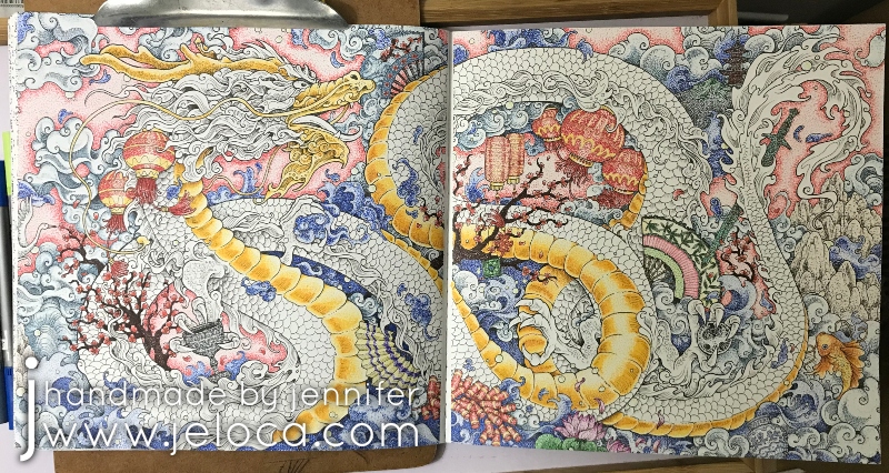
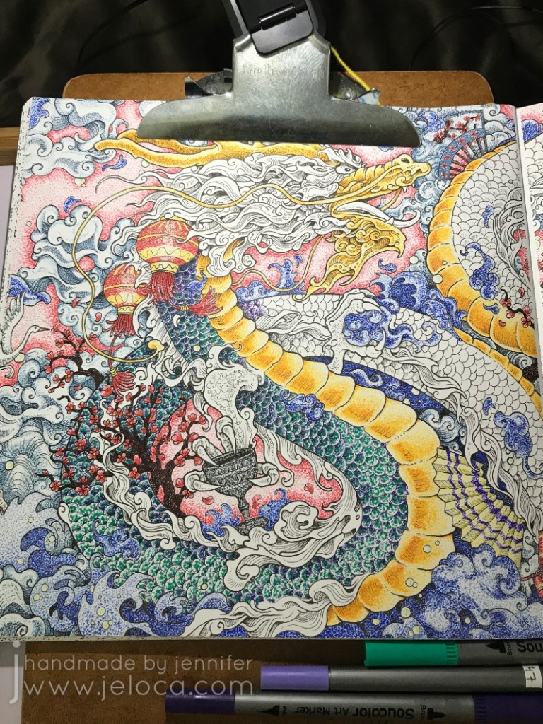
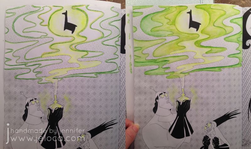
In a recent post celebrating The Princess Bride movie’s 35th anniversary I shared my completion of a double-page spread from the official The Princess Bride adult coloring book and teased a special secret that allowed me to blend Crayola markers as if they were Copics.

We’re not talking some special “Premium” art supply here – these were regular old water-based Crayola Super Tips markers, and as you can see in the finished page not only was I able to blend two shades each of red and green to get a subtle watercolor effect in the roses, but I was also able to get a beautiful gradient using 5 shades through the sunset and again in the hill.

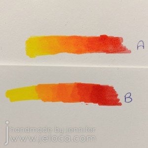
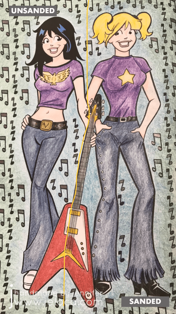
Even preschoolers know that if you try to layer non-alcohol markers on regular paper you end up with streaks or smears and not a blended gradient, just like you see in example B below. While the paper in this book is decently thick it’s still just regular light cardstock – heavy enough to hold up to water applications but definitely not special blending paper.

Same 5 markers, same paper.

So if the trick isn’t the markers, and it isn’t the paper, what is it?

It’s what goes in between!

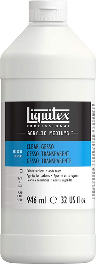
That’s right – this painter’s supply is an excellent addition to a coloring crafter too. Unlike the opaque white variety that is generally used to prime wood or canvas for painting, clear gesso is completely transparent and can be used on regular paper or within coloring books to protect the page from water damage and bleed-through. I don’t claim that using gesso in a coloring book is my unique, original idea. However it is the unexpected benefit of what this will allow you to do that I haven’t seen shared anywhere before.

Any brand will work, with the main distinction being that you use clear and not white. Liquitex is a great brand, I used Mont Marte as it’s what I happened to have, and Amazon has the U.S. Art Supply brand for a good price.

The idea came to mind when I picked the As You Wish/silhouette roses spread as my WIP. Not having used clear gesso before, I felt it would be smart to test it out before tackling my coloring page. I wanted to make sure that not only would I be able to see the printed lines clearly, but that they wouldn’t smear or bleed. I was also curious if the gesso would discolor the paper.

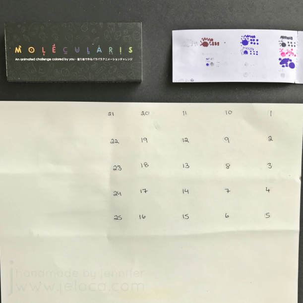
In order to properly test things out I marked off a square in a corner of one of the tester pages at the back of the coloring book and painted it with clear gesso and allowed it to dry fully.

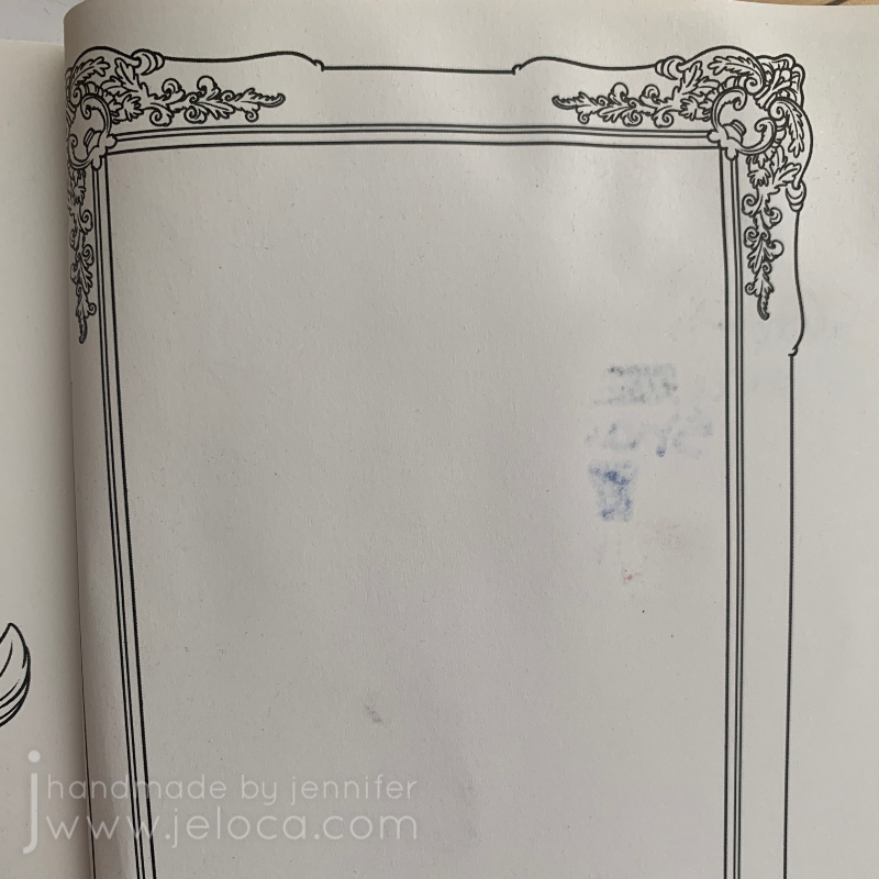
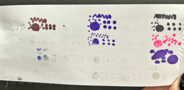
While there is clearly an addition of texture to the page I was very happy to see that there was no discoloration or ink smearing. I then got to work testing an assortment of media to see how they worked with the gessoed page.

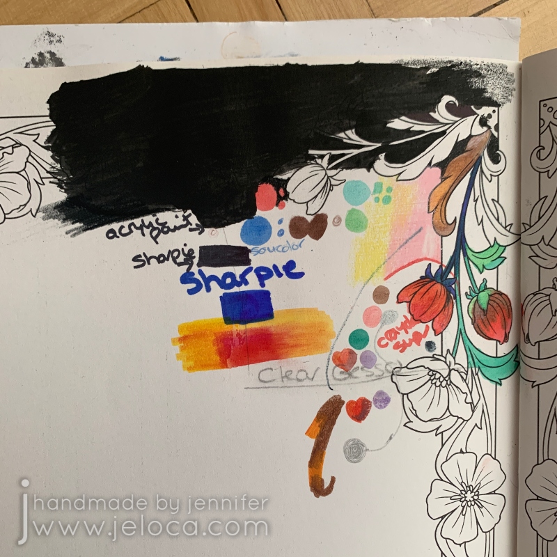
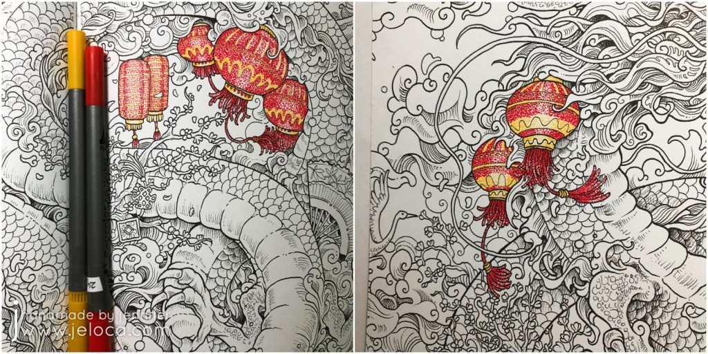
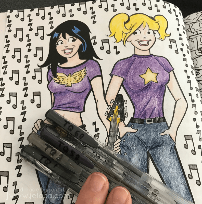
At the time I’d been debating painting the background black, so I tried that at the top of the page, followed below with black and colored Sharpies. I did a little colored pencil (the pink and yellow stripes) and a little with my brush tip/fineliner markers (the ones I used for the Eagle pointilism image), but spent most of my effort playing around with the Crayola Super Tips I intended to use on the actual coloring page. In order to compare the difference between the protected and untreated paper I deliberately overlapped my testing samples across the border of the gessoed section.

A quick look at the back of the page showed it was working! None of the media bled through the treated side of the paper!

This is also where I first realized that the Crayola markers were blending. To be sure I tested across both sides of the paper and, indeed, on the gessoed side the orange and red were forming a gradient whereas on the plain paper side they were overlapping with blocky, chunky edges.

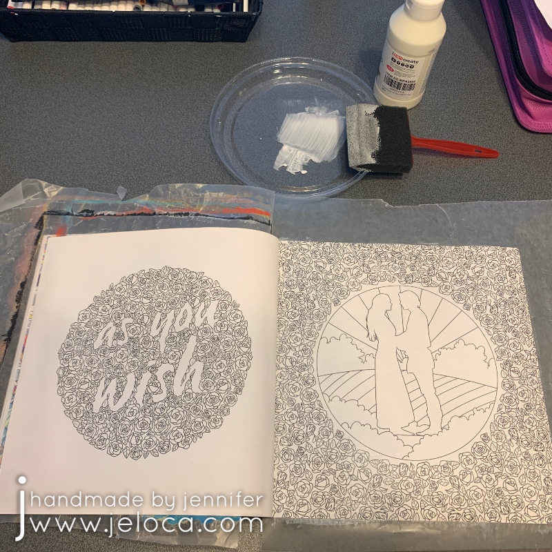
Now that I knew it would work I was able to start on the actual pages. A little goes a long way with gesso and it didn’t take much to evenly coat both pages with a thin layer. I like protecting the underneath pages with a bit of wax paper and the lid from a takeout container makes a great palette.

This is a closeup of the dried, treated page. As you can see there’s no discoloration to speak of and no ink smears. There is a faint bit of grainy texture which would make this an equally excellent tip for use with colored pencils though you’d need to be conscious of your brush strokes and try to keep everything even and not streaky.

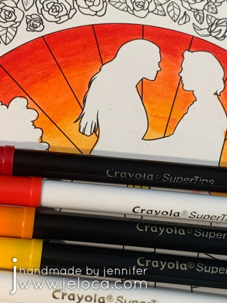
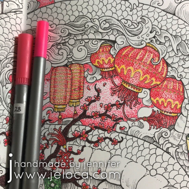
The coloring part itself is no different than were you to be using colored pencils or alcohol markers. You can blend the shades by overlapping them and blending out with the lighter color. In this example I colored horizontal sections of the 5 colors chosen for my sunset and then blended them by using the lightest yellow overlapping onto the yellow/orange, and then that marker overlapping onto the orange, which then overlapped onto the red, and then finally overlapped into the darkest red section.

Much like alcohol markers you have a long working time as applying new color will allow you to mix and move the colors below.

Just keep in mind that since the gesso stops the water-based markers from absorbing immediately into the page they will be transferrable until they dry completely. So be careful to avoid smudging or smearing the wet marker with your fingers or the side of your hand.

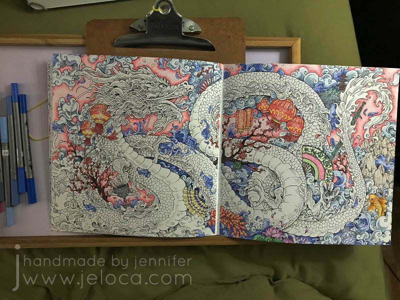
I found this to be a wonderful, fun process and absolutely adore how the final image turned out. I enjoy finding new ways to use existing supplies and love that this one product opens the door to so many coloring possibilities!

This post may contain affiliate links. This means I might make a small commission on purchases made through the links, at no cost to you.


1 Comment

Mythomorphia’s Chinese Dragon in Pointilism

In celebration of today being “Circle Day“, I’m posting the process of coloring the Chinese Dragon page in Kirby Rosanes’ Mythomorphia coloring book.

Can you tell why I’m posting this today? Look closely – every single drop of color in this image is created with a tiny circle. That’s right- over the course of the entire month of November 2018 I painstakingly tapped markers to the page to color in the whole picture with teensy little dots.

(The glare from my mini clip light makes for a bad photo but was a fantastic way to help see all the millions of dots without going cross-eyed!)

Of course a project of this scale requires fineliners and so I pulled out my pack of Soucolor markers. Not only do they come in 100 colors but while one side has a fantastic brush tip, the other has a 0.4mm fineliner tip, making these markers great for coloring books and perfect for this attempt. (Note: I own these same markers by two different brands. The Soucolor ones only seem to be currently available in sets of 34 but they are completely identical to this 100-count set by Feela that I also use regularly.)

The best way to start a project like this is simply to just begin, so I found a small, contained shape in this lantern and began to tap individual dots of red and yellow, I worked tighter groupings of dots anywhere I wanted to create shading, like in the vertical ridges on the lantern above.

I then found the other lanterns in the image and dotted them with the same two colors, creating patterns and stripes for more interest.

Next I used a brown marker to fill in both areas of cherry blossom branches and two shades of pink for the cherry blossom flowers and blowing petals. I completed the jade charm in the center of the above image and then used the original red and yellow to begin the firecrackers at the bottom.

It’s very peaceful to tap out little dots and then step back and have a complete shaded area of color and to then watch the whole image come together in the same way.

After finishing the fireworks I wanted a change of color so hopped over to some lotus flowers, then a koi, and then a decorative fan.

More fans followed. I’d noted what colors I’d used where so it was easy to have the fan’s cherry blossoms match those of the larger image. I then completed the little temple area in the upper right and the sword just below.

The pewter-look goblet was next, followed by the porcelain china.

Sometimes, when pages are as busy as this, it can be difficult to tell what’s what. For example, I found myself needing to decipher if some curls were clouds or waves. To help visually distinguish individual sections I decided to begin filling in the background. I used two shades of pink and darkened the edges around each icon so that it would have a nice contract against the planned colors for the dragon, clouds and waves.

As background areas were completed and it was easier to pick out clouds vs waves I used different shades of blues and grays to fill in each section.

I moved around the page in this manner, working first the pinks, then blues and grays. If I wasn’t sure yet what a random swirl was then I would fill in the areas around it until it became clear.

I kept going, making more itsy bitsy dots, until the entire background was complete leaving only the central, most important image of the page: the dragon.

For the dragon’s belly I selected two colors that give a golden effect when worked together – a coppery-orange for the darker areas and a ocher-y yellow for the lighter. Each segment was worked with the orange first (as you can see in the upper left) and then finished with the yellow.

I took a video of the process for a closer look:

After completing the belly I used the same golden colors for the dragon’s face and whiskers.

Then I moved on to the dragon’s scales.

I wanted to give him an oil-slick look with purple reflecting to green, so used those shades in tighter and looser groupings to indicate shadow and reflection.

Here’s another video showing a close up with more detail on how the scales were done (above).

Eventually all the scales were done and the dragon was SO CLOSE to being complete! All that remained were the frilly bits along his body, tail and face.

To keep things cohesive on such a busy page I used the same yellow, orange, purples and green and filled in the sections more densely to have deeper, richer sections of color.

And with that, the coloring is complete!

This project was SO much fun to do even though it took SO long to complete. There was something incredibly satisfying about working on each small bit at a time, tapping dot after dot, and then backing up to see how the image all came together.

Kirby’s designs are great for a project like this because there are dozens of self-contained little sections and he includes just enough shading detail to give you a guide to follow.

This post may contain affiliate links. This means I might make a small commission on purchases made through the links, at no cost to you.


Leave a comment

The Time Garden – Quilt Page FO

This past Tuesday (Aug 2nd) was National Coloring Book Day. I’d originally planned to celebrate and post by working on a new page from one of my books but I’m working on a major knitting project that is requiring my time and my hands. Therefore instead I’ll be sharing some completed pages that were part of a previous blog post series of mine – my 2019 19 WIP to FO Challenge.

First up is the Quilt Page from Daria Song’s The Time Garden.

What I’d posted at the time:

This page took nearly 3 years (!!) to complete, due to nothing but me putting it off forever. I’d started it on June 11 2016 and finally finished it on March 7 2019 making it one of the 19-for-2019 WIPs actually FO’d during 2019.

The small sections and tiny details of the page made it ideal for fineliners. Except for some metallic accents (using my favorite Gel Xtreme pens that have lasted for literal DECADES) the whole page was worked with Stabilo 88s and Staedler Triplus fineliners.

The quilt flower blocks repeat on a diagonal so I chose a different color palette for each row and worked the same 5 colors for each stripe but rotated clockwise once for each repeat. (IE: the color that was at 12 o’clock in the first repeat was used at 1 o’clock in the 2nd, and 2 o’clock in the 3rd, etc). This kept the coloring more interesting than coloring the same thing many, many times over.

And then I stopped with only one set of repeat left to go. No idea why, but as I’d kept the paper with my swatch notes it was easy to pull out the matching colors and get to work finally finishing it up.

I used the same colors for the matching quilt flowers in the main character’s hair on the facing page. I’d had the idea of coloring her the same through the whole book so left her uncolored until I was ready to tackle her on all the pages.

It’s a busy, chaotic mess but it’s finally done!

This post may contain affiliate links. This means I might make a small commission on purchases made through the links, at no cost to you.


Leave a comment

World Creativity and Innovation Day

It’s World Creativity and Innovation Day so today’s post is a round-up of previous posts that I feel incorporated some outside-of-the-box thinking!

Ever need to transfer live stitches to waste yarn but can’t find your tapestry needle? No problem! Here’s an easy way to “knit” the live stitches over so you can keep working on your project.

If you find standard provisional cast-ons too difficult, here’s a super easy way to get your knitting started. No extra tools required!

Here’s a neat trick for making thin vines/ropes for use in decorating your cakes or cupcakes. They’re flexible, stretchable, and edible!

Here’s a hands-free way to hold your coloring books open!

Not getting the look you want with colored pencils in your adult coloring books? Here’s a great way to add more tooth to the paper.

Are your fondant balls/pearls coming out all different sizes? Here’s a super easy hack to get identical ones, every time!

Here’s a simple way to give a plain toy new life and make it work with your LEGO pieces.

Finally, for when you want to provide homemade, individual snacks, here’s a free & easy way to transport mini cupcakes by repurposing something you’ve probably already got on hand.


Leave a comment

Glow Effects with Gel Pens

Today’s post is a little tip on how to use gel pens to get a special effect in your coloring book pages. In honor of Walt Disney’s birthday this week* I’ve used a page from my Art of Coloring: Disney Villains coloring book.

This is the original page. It’s slightly warped because on the back is a page I colored fully with my Inktense pencils and it was saturated over and over. While I do keep this book clipped shut (as shown in this post with my hanger tip) I’m still impressed at the thickness of the paper in this book. It’s definitely better than most of my coloring books!

As with many of the coloring books based on movies and tv shows, the scenes in this book are often pulled directly from a still from the original source material. In this case you can see the above image is nearly an exact copy of the second image from the movie, below. It looks like the book artist added a background detail and the mist with the llama above in order to make it more interesting as a coloring page.

While I did use the still as a reference for the characters, I took creative liberties with the color of the potion as I wanted to see if I could achieve a glowing affect and thought the contrast with a yellow glow would stand out more than pink.

This is a super easy effect to achieve, and takes materials you’ve probably already got on-hand! All you really need is a gel pen in your desired bright color! I’ve also used a water brush for convenience, but you can swap in a regular paint brush and small cup of water and get the exact results.

You have to work fast so I wasn’t able to pause and take a step by step. Outline the area you want to have the glow, and then immediately while the gel pen ink is still wet, use a water brush or water-dampened paintbrush to blend out the gel ink.

The glow areas in this image are too large to do all at once as the gel would dry before I could get to it. So I worked in small sections, tracing just inside the lines of the swirl and blending the wet ink inwards. For the glasses and potion bottle I only traced on one side so there wouldn’t be too much ink. I then scribbled some of the ink on a piece of scrap cardstock (the shiny kind like used in consumer packaging) and diluted it with water to make a paint for the glow around the bottle.

That’s it! That gives a really cool glow effect that you can achieve super-simply, in almost any coloring project. To see the glow really pop, let’s finish coloring the page!

Switching to my beloved Inktense, I outlined the misty sections with a few shades of green. I didn’t record my colors but there was definitely #1400 (Apple Green) and I believe some #1520 (Hooker’s Green). If you look in the mist closest to the llama, you can also see some #0100 (Sherbet Lemon) to amplify the glow and pull the yellows into the mist.

With Inktense the rule is always “a little goes a long way” so I only needed the barest of color application to get the light wash you see in the image on the right. To blend out you can use a water brush or regular paintbrush with some water and moisten the drawn lines just like those old coloring pages in kids’ activity books.

Next I did the same for the background behind the mist, first filling it in with a super-light application of #2020 (Indian Ink) and then deepened up the borders with #2200 (Ink Black).

The main background first had a layer of the same Indian Ink followed by #750 (Dark Purple) since purple is the complementary color to green (opposite on the color wheel).

The last step was to finish the characters with a bit of #1800 (Baked Earth) and #1740 (Saddle Brown) for Kronk and #760 (Deep Violet) for Yzma, and #1210 (Dark Aquamarine) for the teal bits.

I love how this page came out! I’m continually impressed at the paper quality of this book. Having now done a fully water-saturated coloring on both sides of this same page, I’m amazed that there is no bleed-through or tearing. I love the bright glow of the gel pen against the ink, and especially the reflected glow in the goggle lenses.

I hope this tip helps you use your gel pens in new ways!

This post may contain affiliate links. This means I might make a small commission on purchases made through the links, at no cost to you.

*December 5th


2 Comments

Use sandpaper to improve the tooth of coloring book pages

Today, September 14th, is National Coloring Day. Of course coloring isn’t limited to coloring books, but over the last few years they’ve definitely become more prevalent! Whether they’re your preferred place to apply color or something you only do with kids, you’ve likely noticed that the paper quality can vary greatly. From thick cardstock to what’s basically printer paper, the type of paper will affect everything from what media you can use in the book to if you can actually color both sides of the same page.

On average, most adult coloring books use a slightly thicker-weight white paper that can handle all dry media as well as water-based markers, with some bleed-through if you press too hard or go over the same spot repeatedly. Crayons and colored pencils will lay down pretty evenly as the paper has little-to-no tooth, but if you’re the kind of artist who prefers to work with a more textured paper, here’s a tip that can help transform the books you already own – sandpaper!

I’ll demonstrate this in my copy Archie’s Coloring Book (and there’s a video demonstration at the end of the post).

This is a great book that is jam-packed with tons of images of Archie and the gang, showcasing everyone from the core trio to side characters (Dilton, Moose, Cheryl, Sabrina, Josie and the Pussycats, Miss Grundy, Mr. Weatherbee), to the ‘Lil Archie gang. Even Jughead’s dog Hotdog appears in all his shaggy glory!

I first thought about this back in 2017 after watching one of SuperRaeDizzle’s videos on dollar store art supplies. If you don’t follow her you really should – she’s a fantastic artist who does a lot of art supply reviews and draws/paints with incredible realism. In the linked video she uses a sanding block to rough up a sheet of inexpensive Bristol board to give it a better drawing surface.

I thought it was really cool but didn’t think it applied to me – until I started wondering if the same technique would work in what I was using a lot of at the time – coloring books. In theory it seemed like it should work but with the paper so much thinner than Bristol board I didn’t know if it would work. Would it tear the paper? Would it destroy the printed outlines? Would the ink bleed?

I had to try it for myself. To make the results as clear as possible I chose a page that allowed me to clearly divide the page into two halves.

I left the Veronica side of the page untouched and sandpaper I had on-hand to lightly rough up the Betty side of the page.

Here you can see the before (left) and after (right). There’s no obvious distress to the page though if you look closely at the black line of Betty’s shirt near the guitar you can see faint striae where the ink was removed.

To hold the book open while I worked I used my pants hanger hack. Still highly recommend!

I then set about coloring the page with Faber-Castell Polychromos colored pencils. I was careful to color in both girls the same way, using the same colors and applying the same amount of pressure.

Right away you can see a difference! Coloring on the Veronica side was exactly like coloring with colored pencils on computer printer paper (though I think this paper is slightly thicker). It’s super smooth and flat without any tooth or texture at all, and the colored pencil glided over the page really easily. On the Betty side I could feel the roughened-up surface of the page and it gave the colored pencil something to grab to, making coloring a very different experience.

It’s difficult to put the feeling into words but coloring the Veronica side felt like I had to concentrate more, because my natural tendency was to use more pressure to get more color payoff, whereas on the Betty side the same amount of barely-there pressure gave a richer color payoff.

Coloring on the super-smooth side made me very conscious of trying to not color too hard because it took more work to lay color down. On the flip side, coloring on the textured side of the page made color application a breeze, to the point where I had to concentrate on not applying too much and losing any highlights.

Both sides are colored the exact same way, using different colors for shading. I didn’t want to do anything too fancy because this was only a test; it was more about seeing if the sandpaper would ruin the book or any attempts to color vs me trying to get a professional-looking result.

I’d sanded the guitar evenly down the middle and thought there would be a more obvious difference between the two sides but I’d say it’s pretty subtle. Again- the sanded side has more depth and more color payoff while using the exact same pressure as the unsanded side.

I was also curious if sanding the paper would affect marker application, so decided to fill in the music notes with a mix of sparkle and metallic gel pens, in black and charcoal. I was really happy to see that there didn’t seem to be any effect on how the gel ink applied, and that both sides had the same amount of glitter and shine in the light.

Finally I wanted to see if there would be any issues coloring on larger open areas, so I picked two colors and experimented with blending them to each other. In my first layer of color (2nd image from the left) you can see that both sides are streaky but the funny thing is it’s for different reasons!

Veronica’s side is streaky because I struggle with laying down barely any color…though I probably didn’t have a proper point on my pencil, which didn’t help. Whereas Betty’s side is streaky because that’s the grain from the direction I’d sanded. You can see it better in the image below (though I sort of like the streaky look on her jeans because it makes them look more like real denim LOL)

The last test that I did was to compare the difference that burnishing would make on either side. I went over both sides of the guitar with my beloved Prismacolor Premiere colorless blender and really tried to smooth any grain down and move the color to fill any remaining white areas. I have the page open in front of me as I type this and while my fingertip can tell the difference between the two sides it is SLIGHT, and definitely not as much of a contrast as the rest of the page halves.

(And truthfully I’m not completely convinced that I’d feel a texture difference there at all if I hadn’t sanded too hard in that spot, as you can see by the diagonal lines of indentation on the lower right of the guitar)

Here’s the completed page. If I didn’t know that one side had been sanded I would think that I’d colored harder on the right side, and possibly used a different color for Betty’s jeans and background, as I do feel that there’s a visible difference in this closeup.

I don’t find the difference is as obvious in this image, though I’m not sure if it’s because the black background is causing a distraction.

After trying this once I’m a convert! I have a large collection of coloring books and I think this technique opens up a world of possibilities for getting different effects and results with colored pencils, crayons, and pastels. The opportunities expand even further if you experiment with different grits of sandpaper!

Imagine coloring a fantasy scene and sanding a grassy area with one grade of sandpaper, bricks of a castle with another, and the bark of a tree with a third… you could get a whole range of textural effects within the image all before even laying down any color!

Other notes: in the video below you’ll see a little bit of ink smearing. That was due to pressing too hard with the sandpaper, so it’s avoidable but something to watch out for. I was happy to see that there was no consequence to the back of the sanded page, nor any texture transfer on the facing page.

Here’s a graphic for those of you who like to pin my posts, and as promised above, here below is a video showing this technique in action.

This post may contain affiliate links. This means I might make a small commission on purchases made through the links, at no cost to you.


Leave a comment

Flipboku Molecularis Paper Test (& New Kickstarter Announcement!)

Almost 2 years ago I backed a Kickstarter with an interesting premise: part coloring book, part magic trick, it promised to provide 6 completely different coloring book-style flip books in one tidy little package.

They even had a 2nd book – Blanko – for people who wanted to draw their own. I backed at the level where I got just the one already-illustrated book – Molecularis – and when it arrived I can say with complete sincerity that I was absolutely delighted.

The flip book comes in a snug little box/case to keep it clean and protected, and there’s even a neat little secret hiding inside-

A handy little page separator to put between the pages as you color! It appears to be made of the same sturdy cardboard as the cover, which is great as it will help prevent depressions from going through to subsequent pages and causing ghost images to come through.

The book actually contains 6 individual flip book animation sequences, with a different one visible depending on how you hold/flip the pages. The secret is in how the pages are cut, similarly to those “Now it’s empty! Now it’s illustrated! Now it’s fully colored!” ‘magic’ books magicians use. The illustrations are so fun and playful and I couldn’t wait to pull out my coloring supplies and dive in.

But I hesitated. You see, the book is reversible, in the sense that there is a different illustration on the back of each page, which will be used in a completely different animation. What if I used the wrong media? What if my markers bled through? What if water-soluble products warped the paper? The page protector is a wonderful inclusion, but it will only stop staining from going through to the following pages. It cannot prevent bleed-through onto the back of the page being worked on.

So I did something that’s perhaps a little unorthodox. I contacted Flipboku through their Facebook page and asked if they had any extra paper, of the kind they’d used in Molecularis. A full sheet… scraps off the cutting room floor… anything, in any size, would work as long as it was the same paper quality, which I could then test with a range of coloring supplies.

Perhaps because they’re a little unorthodox themselves, they agreed (thanks Julie!), and a little while later I received a thin, flat package in the mail. I’d expected scraps, perhaps narrow little trimmings from when they cut the pages to size, but instead I was pleasantly surprised to find two good-sized sheets of the Molecularis paper, as well as a couple of pages from the Blanko book as well.

The first thing I did was figure out how many products I was going to test, and then draw a grid on the sample papers to delineate each implement. For the Blanko paper I kept the grid small enough to only use one sheet, because it’s regular paper and I was pretty sure I knew how the different media would react.

On the Molecularis paper I went for a bigger grid, using most of one sheet so I could save the other for future testing if necessary. Since the coloring images in the flip book are mostly all small-ish, ovoid shapes, I drew a little squished circle in a similar size so I could see if coloring a contained shape would cause more bleed (from going over and over the same area to fill it in). I also kept a few sections wider for testing water-activated media like Inktense, watercolor pencils and Neocolor II water-soluble crayons so I could see if the paper would warp after getting wet.

I ended up testing 26 different coloring tools, focusing mainly on wet-based media. I didn’t test crayons because I knew they would be fine, though I did include colored pencils just so I could see if the pressure they required would indent the paper at all.

The supplies tested are:

  1. Sharpies – regular (fine) point
  2. Sharpies – neon [I was curious if the brighter pigment would be “juicier” in a way that would be more likely to cause bleed-through]
  3. Sharpies – chisel-tip [same rationale as for the neons, except due to the amount of ink transferred from the wider nib]
  4. Sharpies – metallic [I wondered if the metallic ink was a different formula from the regular one so would behave differently]
  5. Sargent Metallic Ink Markers
  6. Studio Metallic Ink Markers (from Dollarama)
  7. Micron fineliner – 0.5 size
  8. Copic multiliner – 0.8 size
  9. Bic Mark-It! fine tips
  10. Bic Mark-It! ultra-fine tips
  11. Stabilo 88 0.4mm fineliner markers
  12. Staedtler Triplus 0.3mm fineliner markers
  13. water-based dual-tip markers (Soucolor & Feela) – fine tip end
  14. water-based dual-tip markers (Soucolor & Feela) – brush tip end
  15. Crayola Super Tips
  16. generic highlighter
  17. Faber-Castel Polychromos colored pencil
  18. Spectrum Noir alcohol markers
  19. Gel pens (assorted brands)
  20. Gelly Roll gel pens (assorted colors)
  21. Glitter paint markers
  22. Derwent Inktense water-soluble ink pencils
  23. Koh-I-Noor Mondeluz Aquarelle watercolor pencils
  24. Caran D’Ache Neocolor II water-soluble crayons
  25. Wink of Stella clear glitter brush
  26. Studio Roller Pen

Here’s my testing grid after doodling. I deliberately picked purples & blues as those dark colors tend to bleed through more frequently than yellows and greens, etc.

I have to say that coloring on the Molecularis paper was a WONDERFUL experience! Nearly every product I tested glided smoothly over the paper without effort and left rich, even color with minimal strokes or feathering. Only a few products bled over the shape outlines, but they were all Sharpies which are alcohol-based and often have a bit of overbleed. The paper handled the wet media column on the right like a champ, thick like a cardstock so there was no warping, but with just enough texture to get mileage out of the watercolor media. It’s also lovely with colored pencils, having just enough tooth to take color well, leaving me certain it would also be great with charcoal & graphite.

The Blanko paper handled just like regular paper, because that’s what it is. It is smoother than the Molecularis paper, much thinner, and much more of a bright white.

Ready for the results? I was! I deliberately didn’t peek at the back at all while swatching, and had left the paper overnight in case any seepage would occur as the inks dried. The next day I turned the papers around and-

The results 100% blew my expectations out of the water!

I’ll start with the Blanko paper. As it is regular paper, there were no surprises there. The alcohol-based products bled through as expected, the very wet gel pens bled through as well, as did the water-soluble ink of the Inktense pencils (though that was likely due to the water saturating the paper). As for the other markers, while they didn’t bleed as much as the first ones mentioned, most of them had significant ghosting and shadowing through the thin paper.

What really surprised me, however, was the Molecularis paper. There was almost NO bleed-through! I found myself double-checking to be sure, but really- this is it. I numbered the back to make the areas easier to check, and the only one that had anything close to bleed-through is #20 – “assorted Gelly Roll”. Specifically the ones that bled are their Gold Shadow line, which is a two-tone ink that leaves a colored outline with a gold fill.

The alcohol-based Sharpies and Bics didn’t bleed. The Spectrum Noirs didn’t bleed – which means Copics won’t. The water-soluble medias didn’t bleed nor warp, even with a significant amount of water used (I activated all the wet-media with my Derwent waterbrush).

It’s not completely perfect, of course. If I LOOK for issues while the paper is flat (above), I can see slight ghosting in cells 3 (chisel-tip Sharpie), 9 (Bic Mark-It fine tip) and 17 (black colored pencil, applied with firm pressure to fill in the shape). However I don’t believe these are issues that would affect the intended use of the coloring flip book.

I’m blown away, I really am. If I hold it up at an angle, allowing a bit of light to get underneath, there is the slightest ghosting where I colored in the other blobby shapes, with still only the cells referenced above having the most visibility (the Sharpie and Bic showing not only the coloring-in but also my doodling as well).

I’m really impressed. I’ve used many coloring books where I’ve had to make a conscious choice about what page I wanted to color, knowing the image on the reverse would be ruined. Obviously with a book meant to be reversible the company had to consider this, but it almost sounded too good to be true, which is why I had to test it for myself.

Since their original launch Flipboku has expanded their flip book range, with not only the Molecularis and Blanko books (or a bundle with both!) but also fully-illustrated flip books designed in collaboration with different artists. If you’re into history, sci-fi, or even romance, you’ll find an animated book that leaves you in awe of the magic in the tiny printed movies.

You can visit their website here to shop their really cool products, or click here to access their brand new 2-volume Kickstarter that officially launched yesterday.

The first volume of the new Kickstarter, Dots, is a flip book with 6 different animations (also called sequences) created by internationally renowned animators. Each side of the flip book contains 3 different sequences made up of 36 pages. Once you have connected all the dots in one sequence, all you have to do is flip it to discover what is hidden behind the dots.  After that, you can even grab your favorite coloring pens and color the animations, so in fact you have a dot-to-dot flip book and a coloring flip book, all in one!

For the second volume, Lines, they have selected some of the most puzzling optical illusions and turned them into animation. Most of these sequences are based on the dot-to-dot technique as well. They work in a similar way to the ones featured in Dots, but in addition, once all the dots are connected and the pages are flipped, the animations produce mind-boggling optical illusions. Ranging from astonishing to downright weird these sequences include impossible figures, geometrical illusions and visual paradoxes that will play awesome tricks on your eyes and mind.

Note- The above text and gifs are taken from their Kickstarter. While some of the product links above are affiliate links (Amazon) this post is not sponsored. I ordered and paid for Molecularis on my own and Flipboku hasn’t done anything for me beyond send me the paper samples at my request. I just thought it was a unique variation on a coloring book that my readers would enjoy. Happy coloring!


2 Comments

A New Year = A New Challenge!

Last January I set up a challenge on this blog- to celebrate 2019 I would convert 19 long-languishing WIPs (works in progress) into FOs (finished objects).

This year I’ve set a new challenge for myself, one with a bit of a lighter workload since I’ve got so many other things on my plate.

We’re big Moriah Elizabeth fans in this house (the sprinkle song is our jam!) and while I’ve managed to distract Henri from wanting his very own Pickle plushie, I did cave and buy him Create This Book for Hanukkah.  

I ordered volume 1, and when it arrived I realized I’d accidentally put 2 copies in my cart.  We took a quick household vote and instead of returning it, we decided to keep the second copy for me and Jakob to use.  Thus starts the first monthly segment of our Create This Book v1 adventures.

It’s the 2020 Create This Book Monthly Page Create-a-long!

There’s also a volume 2 but we’ll be starting with the first book and working our way forwards.

Henri picked this page to start with in his book, so to catch up I’ll be making that my January page as well. My goal is to do (at least) one page each month. 12 pages doesn’t seem like a lot, but I’ve got a TON of stuff going on this year and don’t want to over-commit.

I have six days to come up with an idea, draw/color the page and then post it to the blog. The idea hasn’t come yet but the supplies have been decided- I’ll be coloring the page with my adored Faber-Castel Polychromos. I can’t help but hear Mike Myers in my head when I use them because they color so smoothly that it’s just like butter.

By the way – if you’re always in search of new, better pencil/pen cases like me, I can happily recommend the Thornton case pictured above. I own a lot of colored pencil sets with 100+ colors and quickly outgrew the 32, 48, 56 and 72-pc sets I’d invested in years ago. Last winter I did my research and bought a few larger cases in different styles then spent a cozy snowed-in winter weekend reorganizing all my pencils. (Yes, it’s the little things that make me happy LOL). Now I have enough room to store the full 120pc pencil set plus additional tools like a fineliner, stick eraser, my favorite blender pencil, and a white marker*.

Note- in Canada at least, the listing for the empty case itself seems to be sold out. The exact case full of 150 of their own-branded colored pencils, however, is available here.

*Money-saving tip: There are a LOT of white markers out there for adding highlights to your drawings and coloring. Sakura Gelly roll white pens are great, Sharpie paint markers can be fantastic, and many other brands have good ones too. But my favorite white “pen” is 100% the Liquid Paper or Wite-Out corrector pens. They give the most opaque, solid coverage because that’s literally what they’re designed for, and can very often be found in the stationary aisle of your local dollar store. (I get mine at Dollarama).

This post may contain affiliate links. This means I might make a small commission on purchases made through the links, at no cost to you.


4 Comments

Quick Crafty Tip: Using Pants Hangers

I don’t have a ‘Crafty Compilation’ for either of the last two weeks as I’ve spent them working primarily on some sample knitting that I’m not sure if I can talk about yet.  So, instead, here’s a quick tip for those of you who enjoy coloring: pants hangers are your friend.

tip color with clips 02

Yup.  Actual hangers that you use to hang up your pants.  (Or your kids’ pants, in my case).
tip color with clips 05

I’ve been using binder clips with my Art of Coloring: Disney Villains book ever since I got it.  I’ve been using a lot of water media in it and I’ve taken to clipping the book shut whenever I’m not using it to minimize most of the page warping.  Because this book has thick cardboard covers it stays open pretty flat on its own, though I tend to pop the clip onto my working page mostly so I don’t misplace it until I need it again.  With other books I’ve taken to working on a clipboard for both the hard surface as well as the ability to clip the book open to my current page.  For the most part, that worked perfectly.

tip color with clips 04
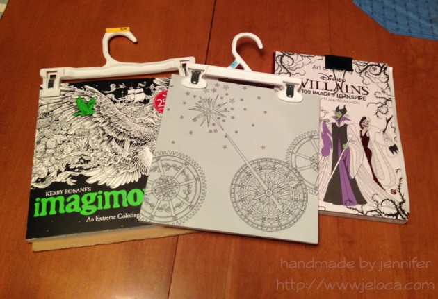
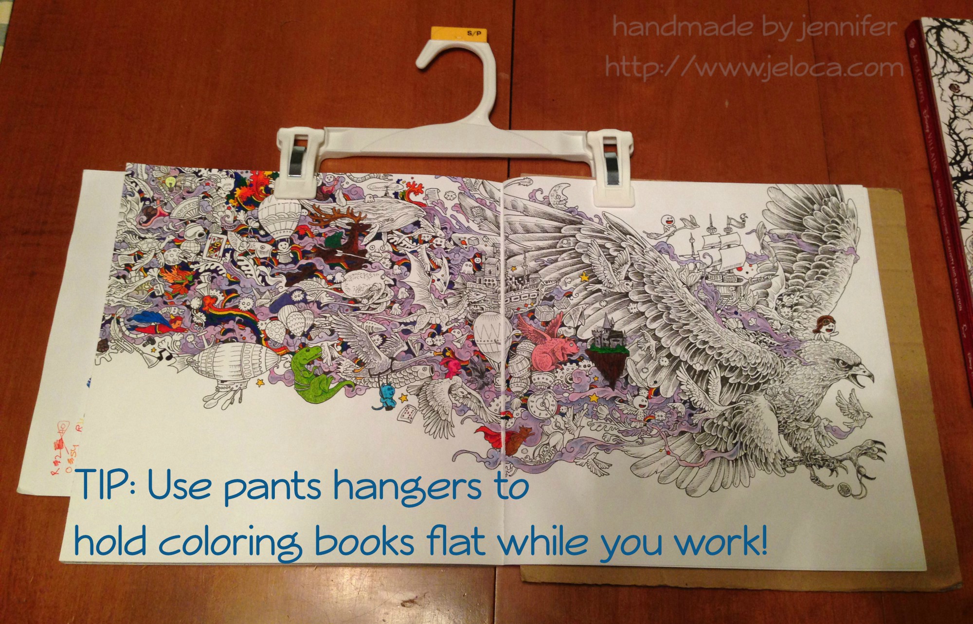
Then one day I was laying on my belly in bed coloring the page above (the Eagle image in Kerby Rosanes’ imagimorphia).  It was held down by my clipboard on the far right of the right page but I kept getting frustrated at the left-side page flipping shut every time I reached over for my coloring supplies (Stabilo 88 and Staedtler Triplus fineliners, as well as Caran D’Ache Neocolor II watercolor crayons for the purple wisps).  I’d been laying on my belly and constantly raising up onto my elbows to brace the page between color changes was starting to hurt more than the coloring itself soothed.

Henri had had a similar problem holding open his Pokemon books so he could sketch from them, and I’d lent him my cookbook stand.  It was a great solution but now that I needed it I didn’t have the heart to steal it back for myself.  That’s when I remembered the image going around Facebook a while ago in a list of kitchen tips: using a pants hanger to hold your recipe up and out of the way, by hanging it from an upper cabinet doorknob.  I had no need to hang my coloring book, but it would be perfect for what I needed too!

tip color with clips 03

And it was!  The two clips hold the pages down on either side, but the stiff bar that connects them keeps them open flat, where the book could otherwise still slip shut.  (The above wip image is also from imagimorphia, and the background wash was done with the Neocolor IIs).  After you’ve finished coloring the page, the hanger can then be used to clip the book shut as it dries to minimize any warping from the wet pages.

If you wanted you could also store your books from the hangers, sideways along a bar similar to needlepoint sets.  (Ooooh now I’m picturing a dry cleaner-style conveyor holding all my coloring and craft books… that would be awesome!!)

tip color with clips 01

And for an easy reminder to pin:

tip color with clips titled

That’s all for now.  Hopefully this tip could be handy for some of you!

This post may contain affiliate links. This means I might make a small commission on purchases made through the links, at no cost to you.


2 Comments

The Princess Bride Coloring Book: the Grandfather and Grandson double-page wip

…aka the Fred Savage/Peter Falk double-page spread.

Sometimes I like mindless projects like stockinette stitch knitting or coloring where the resulting image can look like anything I can imagine.  Other times the challenge of replicating something existing is what thrills me, like Henri’s Pitfall: The Lost Expedition cake that had to look like a scene from the game, or my (full posts still outstanding) Skylanders Sprocket cosplay that had to look like the character from the game.  After a more casual take on the first few pages in the Princess Bride coloring book I was really eager to tackle something detailed and specific, so I was really happy to turn the page and see one of the the Grandfather/Grandson scenes from the movie’s framing device.

princessbride-wip-011

For reference, here’s a still from that scene in the movie:

princessbride wip 015

Just like with the Kaa/Mowglii page in the Art of Coloring: Disney Villains book, the Sherlock coloring book, the Doctor Who one, and others, I think some of the more photo-realistic pages start with photoshopped stills that are then cleaned up and refined by the artist.  In this case the only real differences between the book and the movie are a different jumble of toys and books on the headboard and the altering of Fred’s jersey, both changes likely due to the trademarks involved like the Bears, the Cheetos, and the He-Man figures, etc.

princessbride-wip-012

I don’t have progress pics from before this point because I was so into the coloring that I forgot.  I’d started with the lamp… for no real reason other than I’d wanted to.  After that I started thinking about how the Inktense pencils behaved: while they’re supposed to be permanent, if not fully activated they’d bleed into the surrounding areas.  So, for example, if I laid down a lot of pigment making his hair dark brown, and missed some stray bits near the outline, that dark color would bleed over into the white headboard/shelves if I got too close with my wet brush (which is why I’m leaving that, among other areas, for last).

I spent waaaaay too long on the bedspread.  Even after choosing the colors I spent more time than necessary figuring out if there was a repeatable pattern I could copy.

princessbride wip 016.jpg

(Go figure I didn’t find THIS pic until I was done that part.  Sigh.)

Once the stripes were done I tossed in a bit of shading, then did the pillows.  Next up was the skin (within which the shadows look a little exaggerated at the moment, but I plan to smooth it out with some colored pencil at the end).

princessbride-wip-013

I broke my own ‘dark colors’ rule in doing the jersey next (it’s the exception that proves it, right?) and then the shadows along the wall/shelves/head board.

princessbride-wip-014

And this is the point I’m at now.  I’ve started tossing some color into the books and comics and toys other odds and ends strewn about.

Oh- I wanted to say something excellent about this book: while it’s not made to hold heavy applications of water, and will definitely never stand up to alcohol markers, I’ve put this page so far through a lot.  After working some areas, like the jersey, it was with a lot of trepidation that I turned back to the page before to check for bleed-through.  The page on the other side of this one is the ownership page, so with only the smaller scollwork/flowers in the center of the page, there is a LOT of blank area for ghosting and bleeding to show through.

There’s none.  Nada.  Zilch.  In fact, I took the pics in my previous post after already coloring this far, so you can see for yourself that there aren’t even traces of ghosting to disrupt the background.  🙂


You can find more coloring-related posts sorted by material or book at the Coloring tab in the header above, or click here for more posts about The Princess Bride Coloring Book.

Other pages from this book so far:

This post may contain affiliate links. This means I might make a small commission on purchases made through the links, at no cost to you.