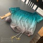
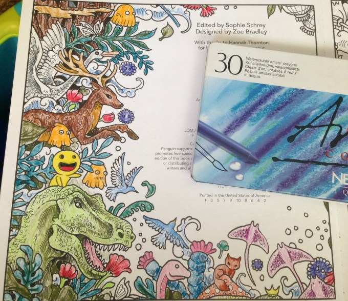
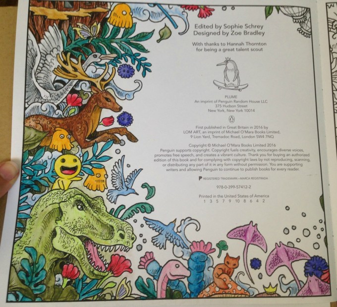
I’ve had a Billowing tee on the needles since August 18 2019. I’d been donated more yarn in exchange for review and after doing a lot of research and seeing this gorgeous version done in the identical yarn I knew it would be the perfect pattern.
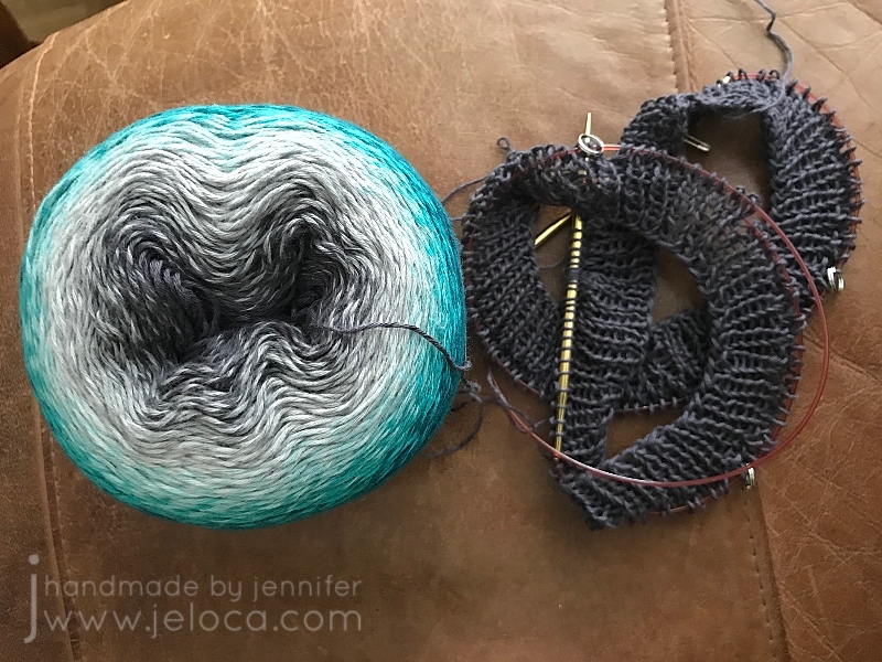
The yarn is Scheepjes Whirl in the Green Tea Tipple colorway. It’s a delicious fingering weight 60/40 cotton/acrylic blend with a whopping 1000m/1093y. It was graciously donated to me by YarnCanada.ca in exchange for review. Whirl blends colors beautifully by evenly changing out the color one of the 2 plies of yarn to create a subtle marled effect, and Green Tea Tipple does this by slowly shifting from from charcoal gray to a deep teal-ish green.
The in-person yarn is identical to the online image, and really lovely to work with. There are a few spots where the end of a blended color sticks out a little bit, and one or two knots, but nothing that creates any sort of inconvenience in the knitting.
As the cake began with gray in the center I went with it and decided my top-down tee would start with gray and blend down to the green.
I’d quickly zipped through a swatch and then cast on. I didn’t want a closed neck on my tee so I calculated how deep I wanted the neckline to fall and cast on a larger amount of stitches, adjusting my rate of increases accordingly.
It’s very addictive to work with yarns that change color like this. You want to keep going to see what the next area will look like.
I worked through the yoke, separated for the armholes (completing their ribbing first so the color would be right) and gotten about an inch or two down the body when I’d stopped. My first two nieces were born not long after and I’d spent my time working on a bunch of baby projects. My tee got put aside and then it languished in my UFO bin until this year.
In March of 2023 I was going to a pub knitting night and needed something with mindless stockinette so I could focus on the live music and not my hands. I remembered this project and pulled it from the depths of the forgotten pile only to realize I was no longer the same size as I’d been in 2019 and it was now too big. I also decided I wanted to start with the green instead of the gray.
I frogged the whole thing and re-wound the cake to be able to start with the green end. With two days to go before knit-nite I cast on for a smaller size and raced through the yoke and mini sleeves so I could get to the body. From that night onwards I kept working on the body, keeping it handy whenever I had the chance for mindless knitting.
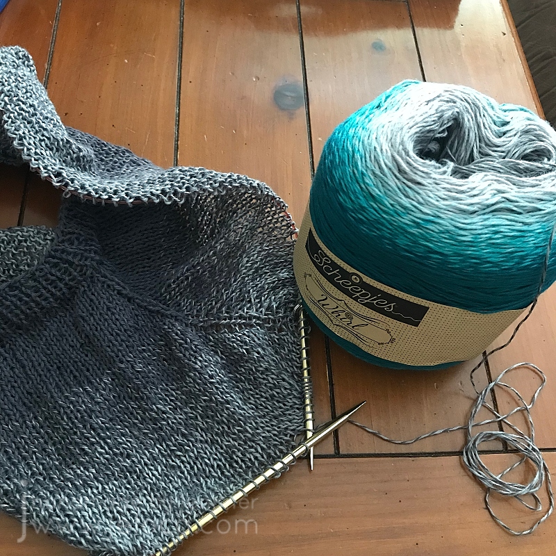
I was hoping to use the full cake and get to the darkest charcoal but I tried it on last week and it was already at the length I wanted. So I measured out how many rows the ribbing would be, ripped back that many, and began to redo the rows as ribbing to finish off the bottom hem.
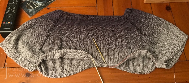
That’s where I was at at the start of UFO Day. My goal was to get through the ribbing and remaining modifications so I could present the finished garment, but I underestimated just how long fingering weight ribbing takes. I suppose it’s fitting that my UFO Day post ends with an unfinished sweater!
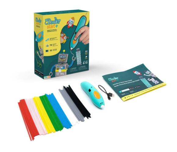
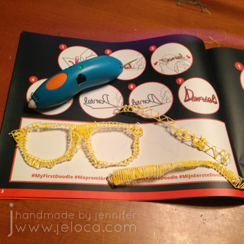
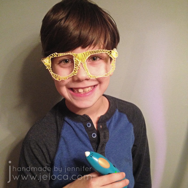
Today is National Technology Day so it’s perfectly fitting to share this product review of the 3Doodler Start 3D pen. This is not a technical review – so if you’re looking for filament info or product specs you’ll have to look elsewhere. This is strictly a child-user review and to spoil the end right at the beginning – we love it.
The 3Doodler Start + Essentials kit includes the rechargeable pen unit, a USB charging cable, as well as an assortment of filament sticks. It also includes an instruction book with a very unique feature – the paper is treated to make the softened plastic NOT stick to it. As such you can follow one of the many tutorials in the book by literally tracing the provided illustrations and your new 3D “print” will lift right off the page.
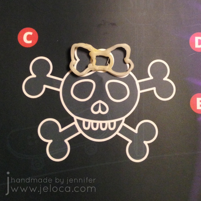
We wanted to start by trying it out on something small so Henri traced this skull’s little bow.
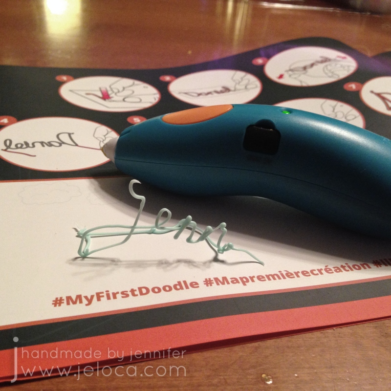
I then followed their clear, graphical instructions to write my name and turn it into a standing decor item.
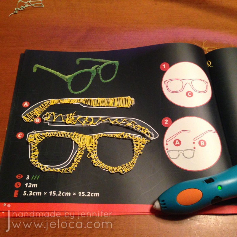
At that point we both felt confident enough to tackle one of the real projects: these 3D glasses.
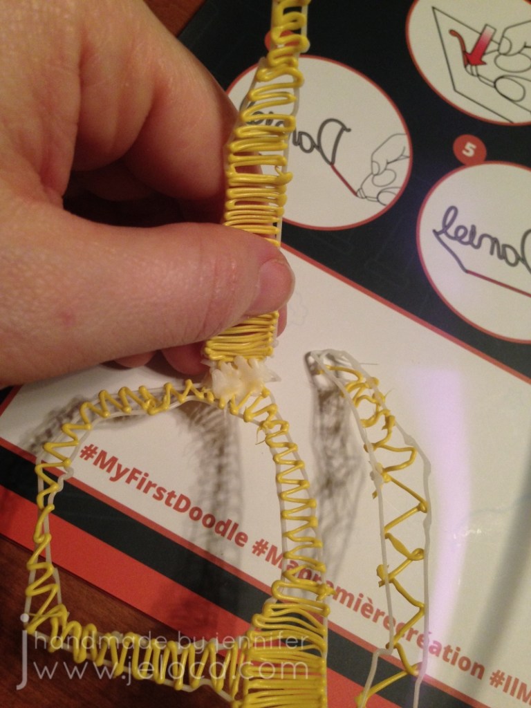
I traced the outlines of each piece with the light aqua filament and then we switched to yellow and began filling it in, taking turns between Henri and myself.
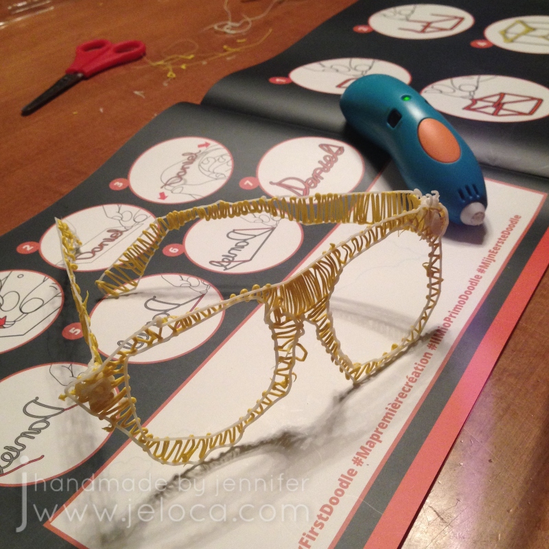
Before long we had all 3 pieces traced and filled, and since they don’t stick and solidify almost instantly they were able to be handled right away.
We used a bit more filament to join the arms to the front of the frame…
…and then we had a complete pair of glasses!
It was such a fast, easy project that really got Henri excited about the possibilities.
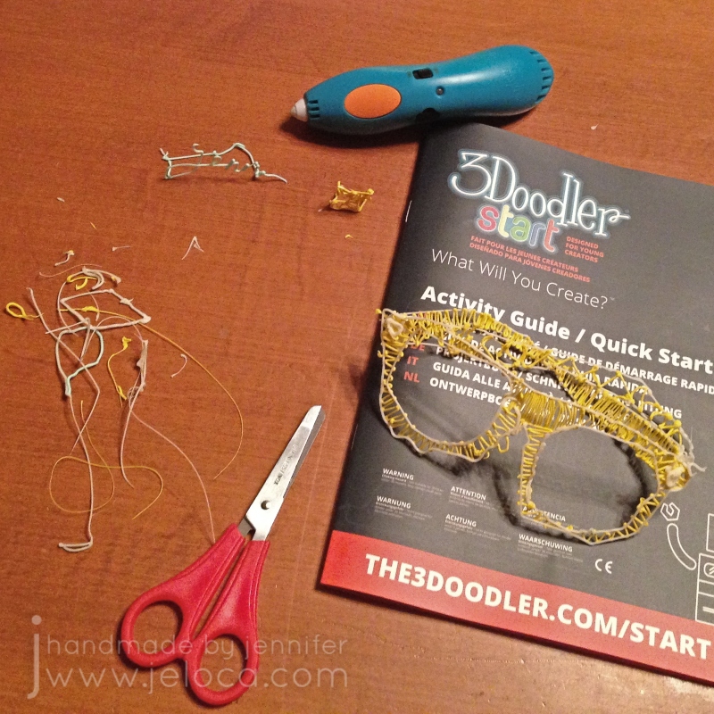
Just like when using a glue gun, the 3D filament can leave trails as you stop or switch colors. These trails are very easy to snip off with a regular pair of scissors and after playing around for a while on the projects we had very little filament waste.
Henri was SUPER proud of his creation and couldn’t wait to make more things.
Long-time readers of this blog might be a little confused now, since Henri looks a little young in this pic. In fact I first shared this pic in this post, back in 2017. It’s true – Henri will be 14 on Sunday and this pic was taken 6 years ago right after he received this gift for his 8th birthday. So why am I posting this review now, alllllllll these years later?
Because he still uses it and it still works JUST as good as on Day 1. It’s true! Most toys, and especially most electronic toys, don’t hold up to long-term wear and tear, but the 3Doodler start is in semi-regular rotation around here and it’s still working great. We have a bunch of 3D “printed” items around the house, from a heart that he made me for Mother’s Day 2-3 years ago to a solid 1″ cube/die to an automated vehicle he’s been working on here and there during school breaks using an add-on motorization kit. A few times now he’s even used it for some minor household repairs!
Not only is the pen still actively being sold and supported but you can also still get filament packs in all kinds of colors, including solids and variety packs. One fun thing we like to do is to use page protectors as “drawing” surfaces so we can put images or text inside to trace or use for inspiration. You can even get cases to hold your pen, charger and filaments to keep them compact and portable!
All in all we both agree that the 3Doodler Start is a great entry-level 3D pen for kids or adult beginners to allow you to experiment with 3D creations without breaking the bank. Plus, it’s durable, allowing us to use the same one without issue or repair for almost 6 years now.
This post may contain affiliate links. This means I might make a small commission on purchases made through the links, at no cost to you.
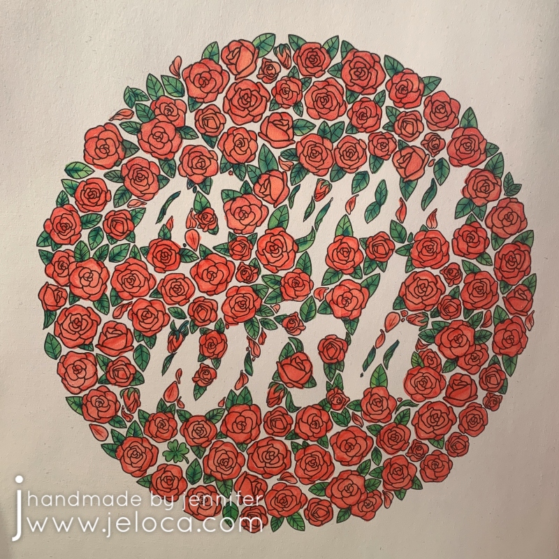
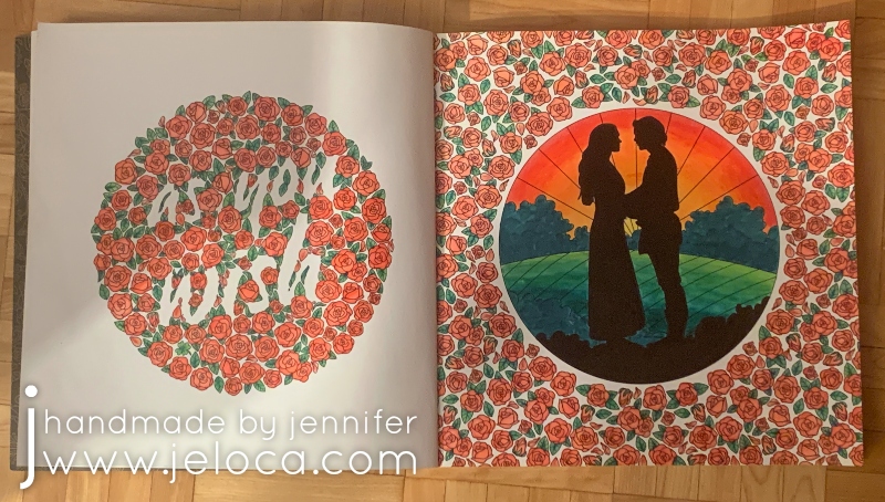
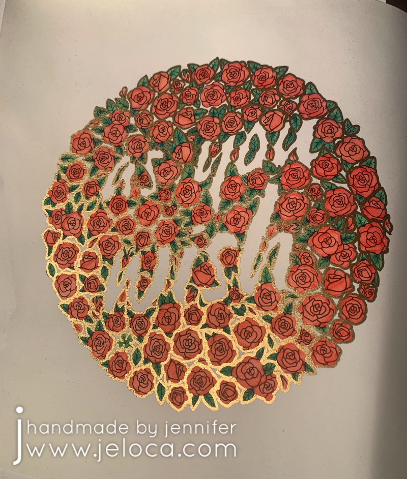
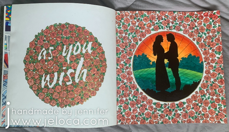
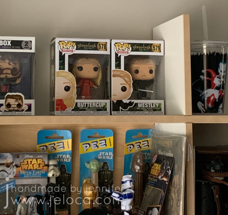
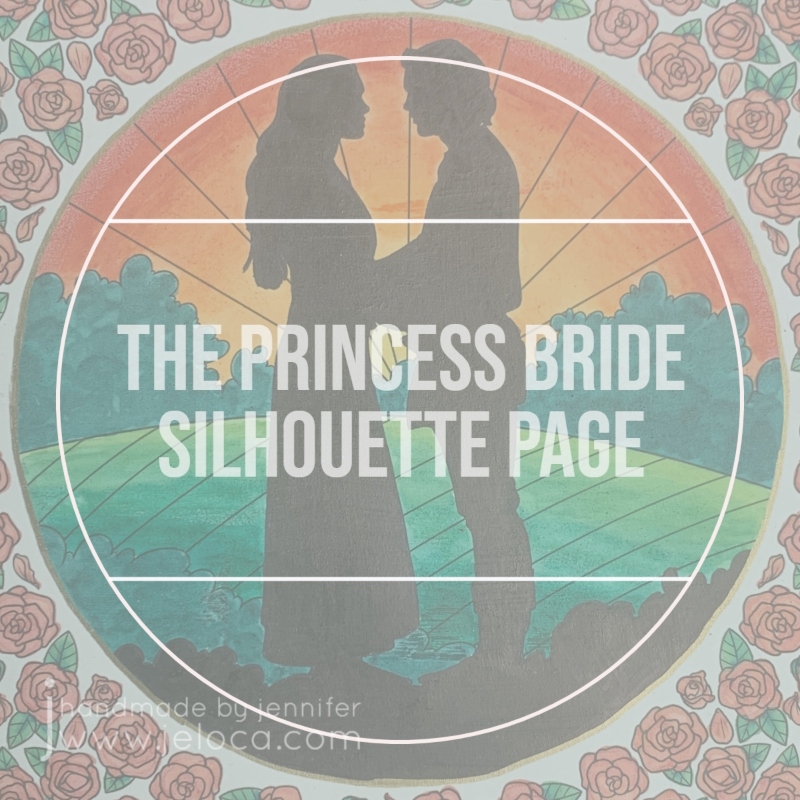
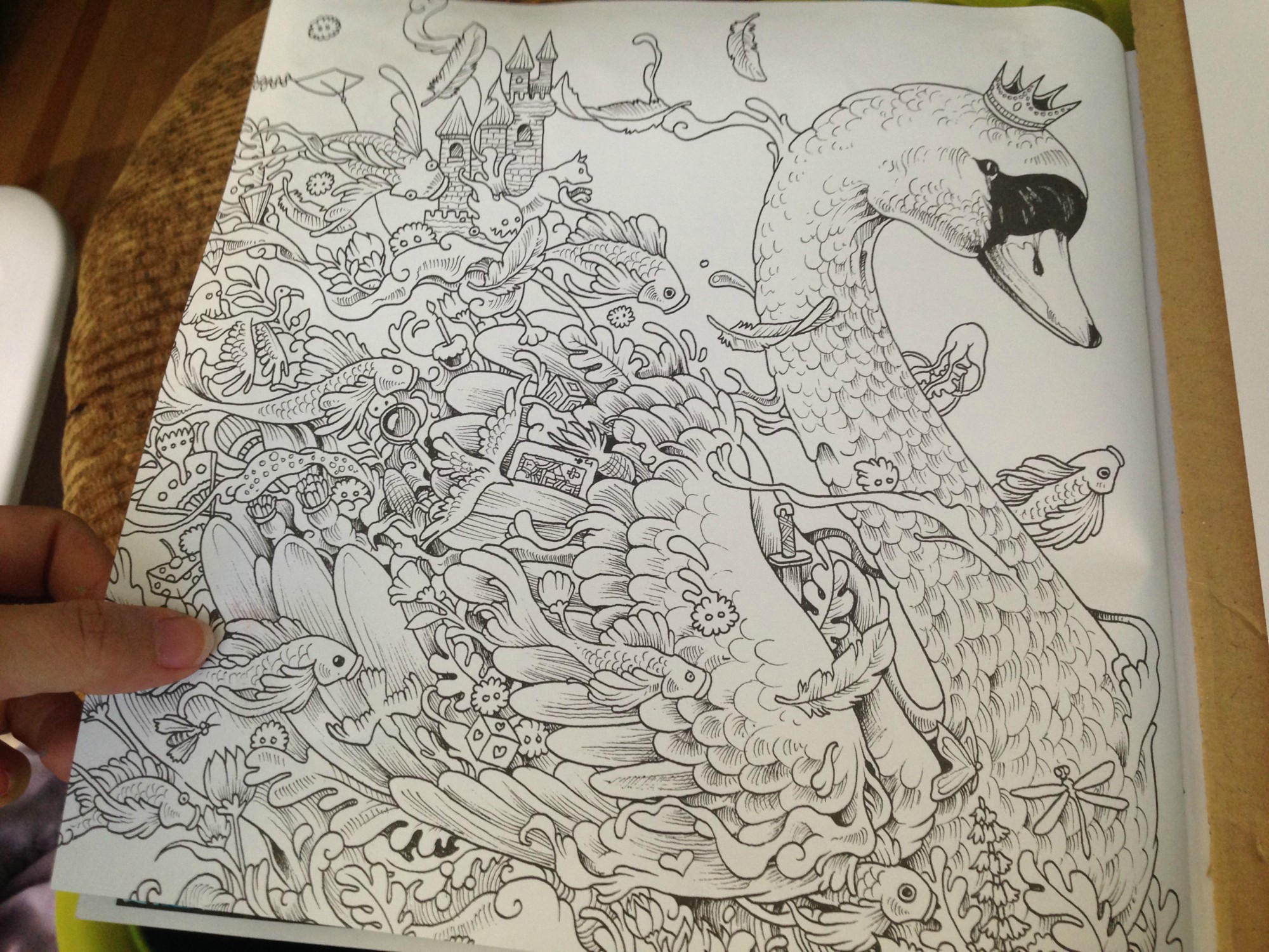
Today marks The Princess Bride movie’s 35th anniversary!* I wanted to do something special for this final post of The Princess Bride Month so I started and completed a brand new set of pages in The Princess Bride coloring book. Nothing is more iconic than Westley’s famous “as you wish” line, so when I turned the page after my current WIP in the book and saw this double-page spread I knew it would be perfect to close out this month’s theme.
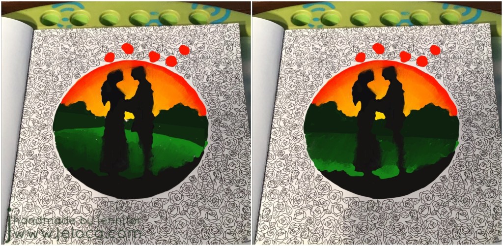
I instantly knew I wanted to put a sunset behind Buttercup and Westley and color their silhouettes in solid black. I wasn’t sure, however, if I wanted to mirror the sunset on the hills and have the lightest shades in the center, or if it would look better with the lightest greens to the front and the darker ones in the back.
I decided to pull a trick from my knitter’s handbook and swatch them! I took a clear image of the page and brought it into the Procreate app on my iPad so I could have a digital version to work with. Using the Apple pencil I roughly blocked in the black silhouettes and a quick sunset. I knew I wanted the bushes on the horizon to be dark as they would be backlit, so scribbled those in too. Then I copied the image so I’d have two to work from, and colored in the hills on each, reversing the color order. I quickly preferred the version on the left, so saved it as my reference sketch.
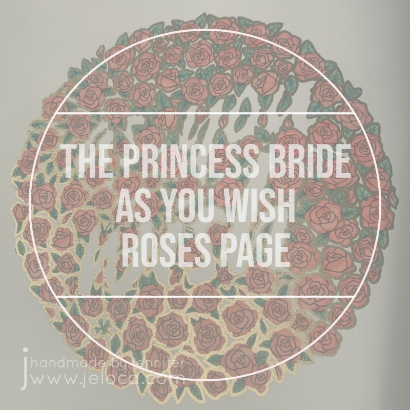
I’d also had the idea of possibly filling in the entire background of the roses page, so decided to test that too. I’m so glad I did as it would have been a TON of work and I really didn’t like the results. I’d also debated outlining the roses in gold and playing with the digital version allowed me to see that I DID like that, all without touching the original coloring page.
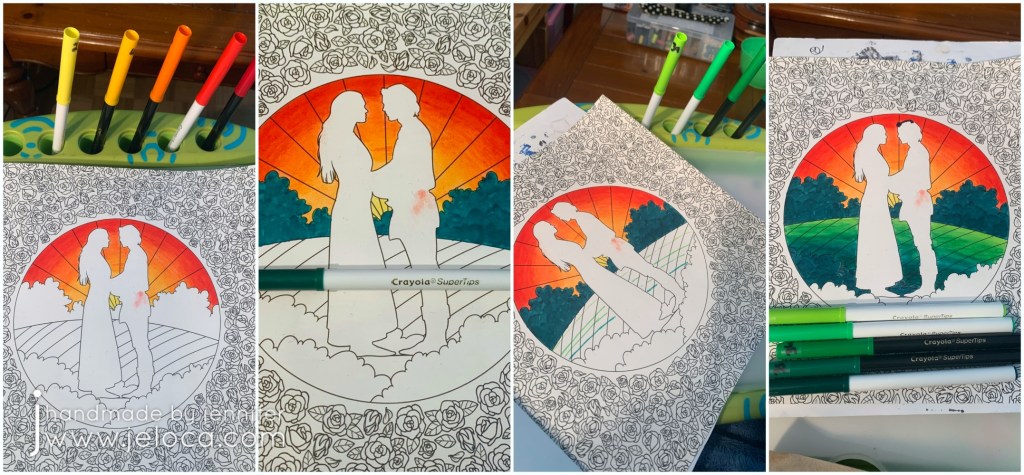
I chose 5 colors that would make a good sunset gradient and filled in the sunset first, blending the colors together.
Yes. I BLENDED the Crayola markers together! There will be a post coming up soon sharing the technique on how I did it, so stay tuned!
Once the sunset was in place I colored the horizon bushes. The same tip that allows the water-based markers to blend also allowed me to work multiple layers of marker to scribble leafy impressions into the bushes. I also used the same color on the foreground bushes just behind the couple.
Then, using 5 greens for the hills, I drafted out where each color would meet and then blended them in the same manner as the sky.
The final step for the page’s focal point was to color in Westley and Buttercup, and the remaining bit of foreground. Adding the black really made the other colors POP and I could not be happier with how the page was turning out.
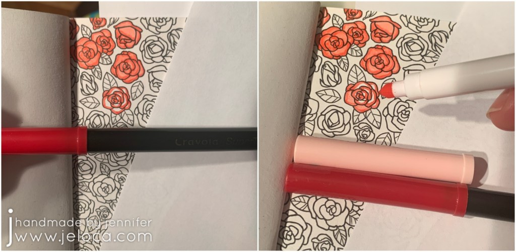
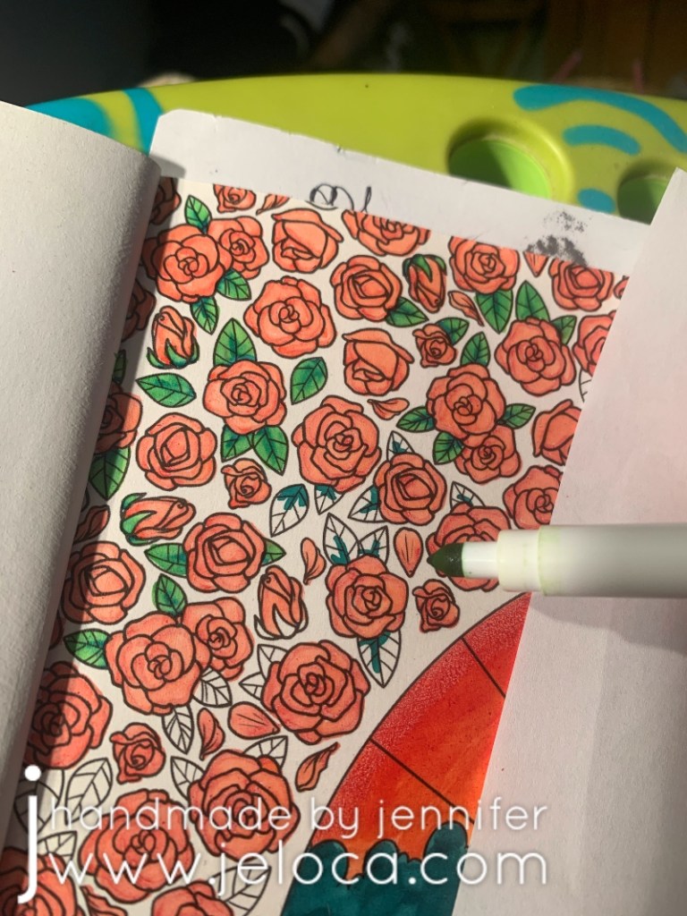
For the roses I started by using the same darkest red as for the sunset, to help tie them together. Every rose was completed in the same manner: first a quick outline over the outer edges of each petal and then filled in the rest with a paler pink marker. The end result, using the aforementioned technique, gives a result similar to that you’d get with alcohol markers, with the red and pink blending together to make a soft gradient.
For the leaves I chose the lightest and darkest of the greens from the hills and worked in a similar way as for the roses- first a quick hit of dark green along the spine and lower edge and then blended it out with a light green to fill in the rest of the leaf.
It was repetitive, but easy, and soon enough all the roses and leaves on both pages were complete.
This was the spread at that point. I quite liked it but it felt a bit unfinished. My initial idea was to color the entire background of the left page in black, but as the lettering is created by the voids between the roses the words would have become black as well and I didn’t really want that.
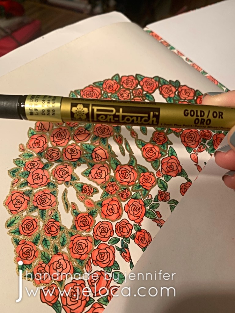
Thanks to my digital sketch I knew I liked the idea of a gold outline around each rose. It wasn’t quite filigree but gave me similar “gold-edged china teacup” vibes. I have a few sizes of Pen-Touch markers and the fine (1.0mm) point was perfect for this step.
The gold outline was the exact finishing touch it needed. When viewed directly (as the upper right of the page) the outline almost looks like a bolder black, throwing the wording into higher contrast. When viewed from an angle (as in the lower left) the metallic gold really shines and gives the romantic, antique feel I was going for.
To further tie the two pages together I added a gold outline to the circle using the same marker, and then both pages were complete.
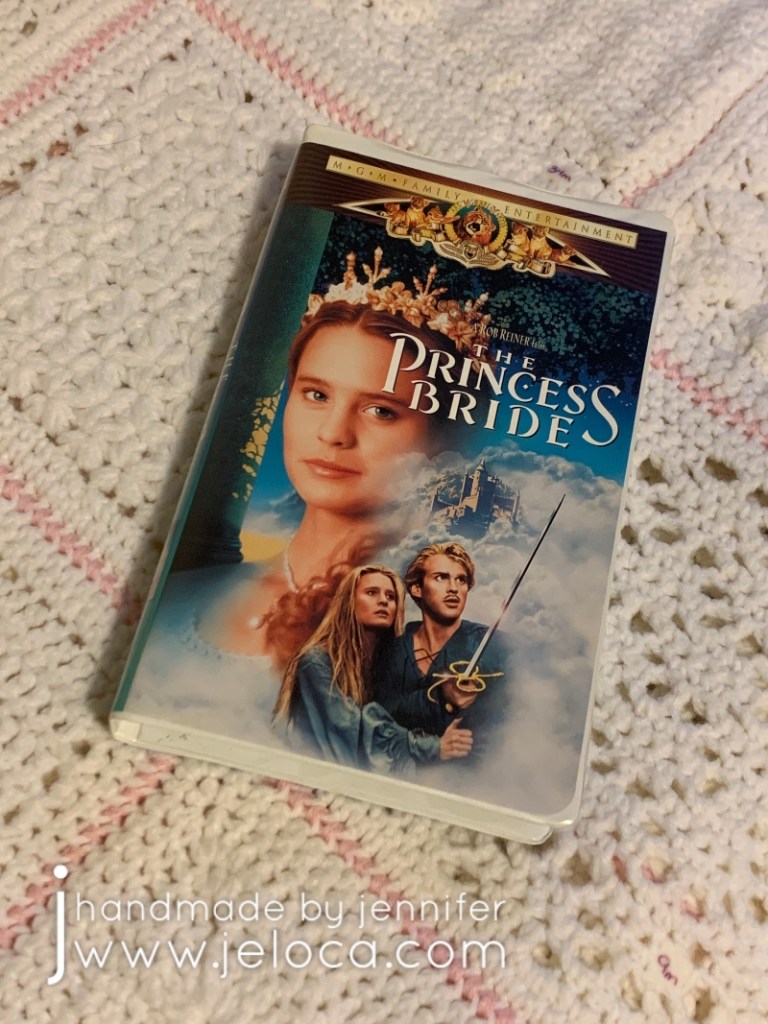
I’ve reviewed the quality of this book before but wanted to add one more time what a joy it’s been to work on. This movie has been a family classic since my childhood, with us spending many nights watching it by the fire, and all of us able to recite it nearly by heart. I’ve loved it enough to own the movie…
Can you count 6 fingers on the Count’s right hand?
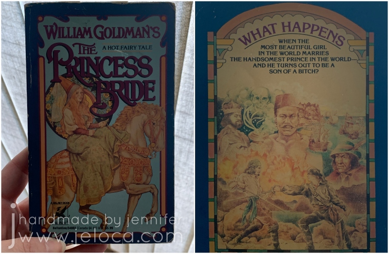
I hadn’t known the coloring book existed so it was a real treat to receive from my brother for Hanukkah a few years ago. Not only does it hit my nostalgic feels but the paper quality is great, the images are a great mix of stills and graphic prints, and it holds up very well to a variety of media and can support mixed media. A very high recommend!
And finally, as the final bonus Princess Bride fact: When the weather was particularly cold, André the Giant would place his giant hand over Robin Wright’s head, covering it entirely and keeping her warm. (Source)
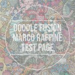
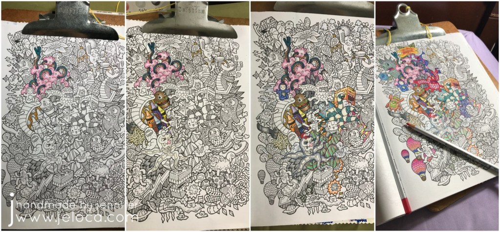
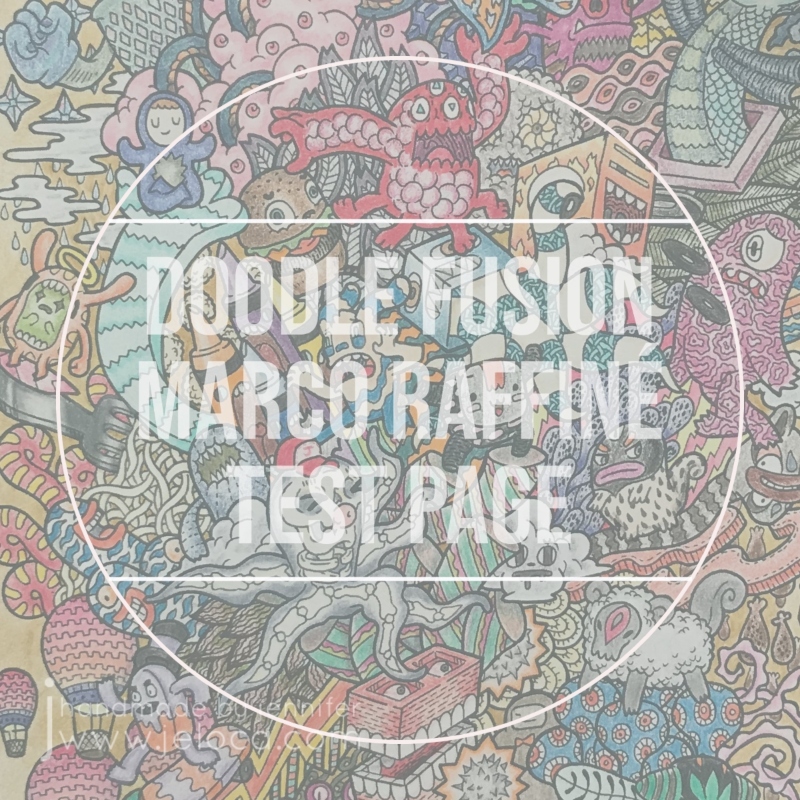
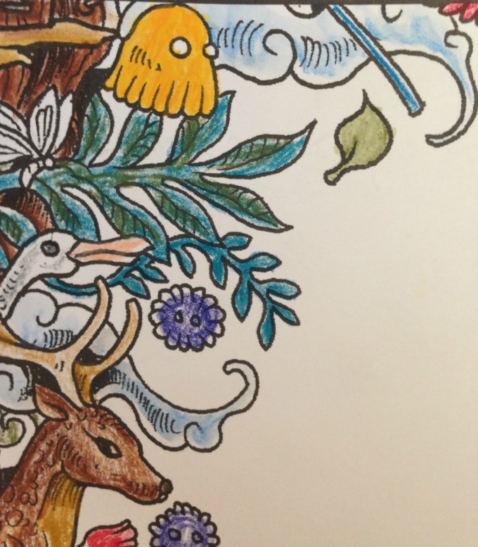
The next 2019 WIP to FO Challenge update (posted a whole 3 years later…sigh) is this page from Doodle Fusion. I love this silly book so much and have completed a bunch of pages from it (unposted), as well as prepped some in my color wash attempts. As they’re all filled with an assortment of wacky monsters it’s hard to come up with a unique name to identify some of the pages so since this one was deliberately done solely with the Marco Raffiné oil-based colored pencils, it’s become known as my test page of such.
I started this Doodle Fusion page on September 8 2019 with the intent of completing an entire page with the Marco Raffinés to really get a feel of how they work and blend.
I really like these pencils! They’re inexpensive (especially compared to the Polychromos or Premiers), and though the different pencils can’t truly be compared as oil-based vs wax-based will give different results and be preferred for different projects by different artists, they have their own unique charm and have been a joy to use. They’re less vibrant than some other brands but are no less pigmented, so while you won’t get neon brights (making them not a good choice for a fun 80s page) they’re great for softer, almost whimsical looks. They’re also slightly water-soluble, as per my tests here.
The first three images below show the lazy progress made over the rest of that month. I’d worked on the page slowly, picking out individual creatures and sections at random depending on my mood at the time.
Posting my WIP-to-FO challenge publicly spurred me to continue working on it, and the fourth picture above was done in January of 2019. I did a bit more work that month and then my attention waned again…
…until October 2020 when I finally picked it back up, determined to finish it once and for all.
I added a fading border to the outer edges in order to test the pencils’ (and my own) shading and fading capabilities. Once that was complete I finished the remaining creatures and doodles.
Overall I think these pencils work wonderfully in this book. It’s a plain-paper coloring book which can make using wet media difficult (although the pictures are one-sided so bleeding won’t be an issue if you protect the subsequent pages with a sheet of cardstock or something. There isn’t a lot of tooth to the page which isn’t the best for colored pencils generally, but these have enough “stick” to really take to the page well. After 2 years the page looks identical to the image above with no bloom (as can happen with wax-based pencils) and no apparent fading.
The only flaw I can see with the Marco Raffinés is the color payout. A number of sections above (ie: the red ball cap, the red 6-legged monster near the middle, the purple creature at the bottom center, the crayon bodies) were colored with maximum pressure to get the darkest, fullest coverage possible. As you can see there are solid, even sections of color but no real “brightness”. To me, all of the colors have a softness to them, even at full strength making them feel almost desaturated. You can see the difference more clearly in my swatches below.
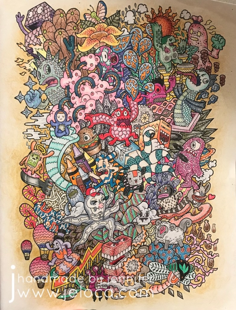
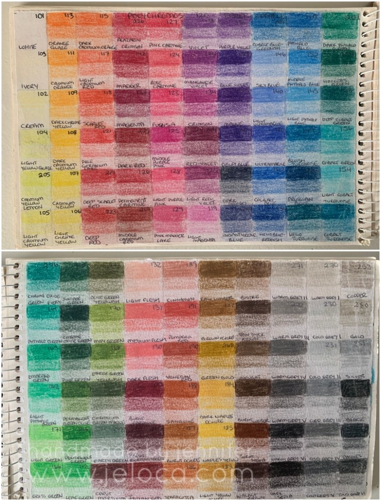
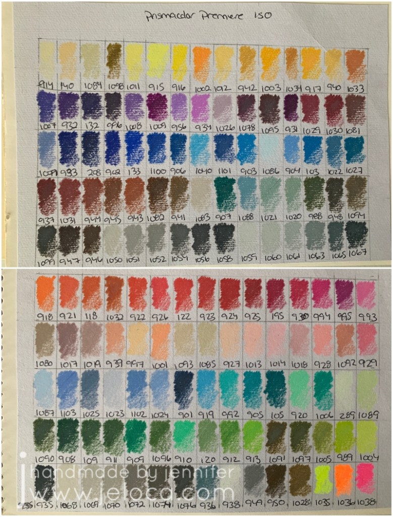
Every time I get new colored pencils I swatch them, labelling the swatches with the color name or number. The oil-based Marco Raffiné pencils (above) are lovely and soft, and very similar in tone to the Faber-Castell Polychromos (below), which are also oil-based.
The Polys have more colors but the feeling of the individual shades is still softer, almost velvety, whereas the wax-based Primsacolor Premier pencils (below) are brighter and more vivid. (Click on any of the swatch images for a better view).
If you’re looking for deep, bright colors then you might be dissatisfied with these…but for anyone else they make a great, inexpensive option to have in your coloring toolkit.
This post may contain affiliate links. This means I might make a small commission on purchases made through the links, at no cost to you.
Over the last few years I have occasionally been reached out to by YarnCanada.ca and offered yarn to review. Unfortunately life got in the way and my projects and posts were delayed. Here, then, is the first of such reviews.
The yarn I was offered this first time was Noro Kureyon. I was familiar with it, having worked with it in the past when knitting my mom’s Booga Bag as well as for my Tasha Tudor shawl. (Remember when those patterns were huge?? I think EVERY knitting blogger was making them. Both are free patterns, and both are enjoyable knits. Here are the links to the patterns: Booga bag by Julie Anderson – Truly Tasha’s shawl by Nancy Bush.)
I’d knit the bag in 2004 and the shawl in 2005 so I was curious if the yarn was still as good as I’d remembered.
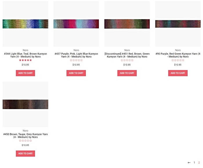
As per YarnCanada’s description, “Noro Kureyon is one of their higher-end, “indie” yarns, known for its artistic colors and hand production process. It’s a hand-dyed, 100% wool that comes in variegated colors that self-stripe as you knit. A wide range of accessories and garments can be knit with this yarn.” I was offered my choice of color, which was a hard decision to make! As you can see below the yarn comes in a TON of beautiful shades, each more gorgeous and interesting than the last.
I wanted to choose a pattern before selecting a yarn, as the colors would be the prominent feature. The yarn colors do sell out fast, and in fact my first choice color at the time had sold out before I was able to decide on a suitable pattern! In the end I chose color 368, and they sent me 3 balls.
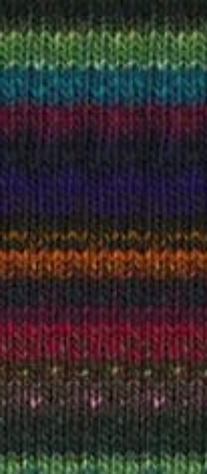
Note: it looks like this color is currently not available on their website. This is what it had looked like at the time:
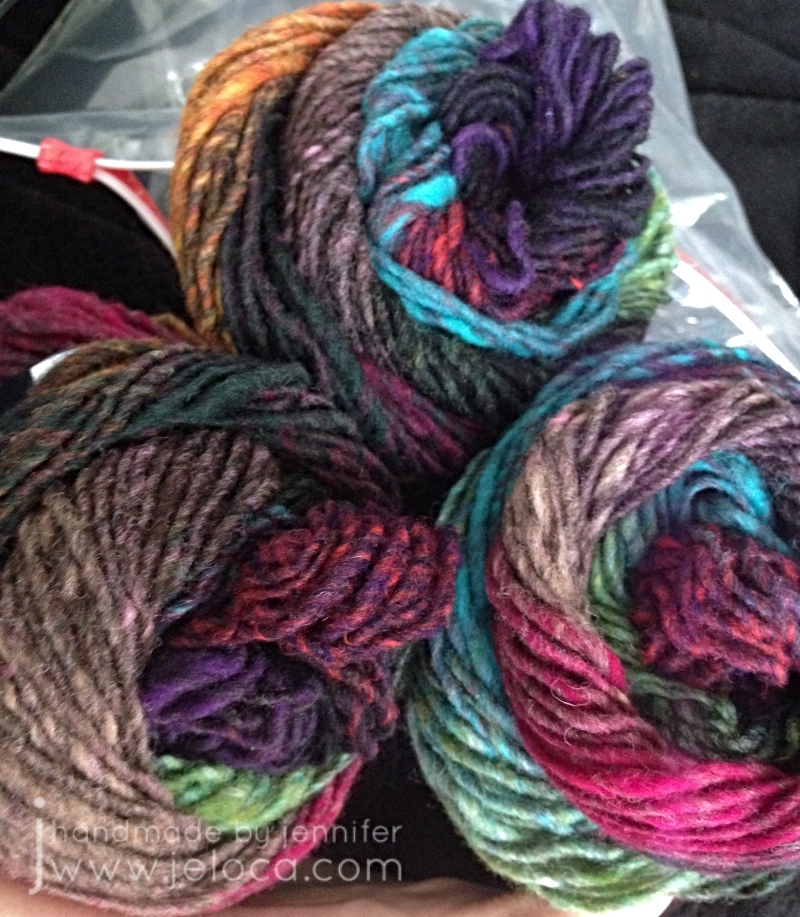
And this is how it looked when it arrived.
Aren’t the colors stunning?? I was swayed by the contrast of the bright blues, greens, pinks and orange against the more muted neutrals.
(Disclaimer – the images in this post from here until the mannequin were taken a few years ago with an old iPhone 4 that had a cracked lens – hence the purple halo in most pics. I cropped out and tweaked what I could, but I can’t go back and account for bad composition or staging, unfortunately).
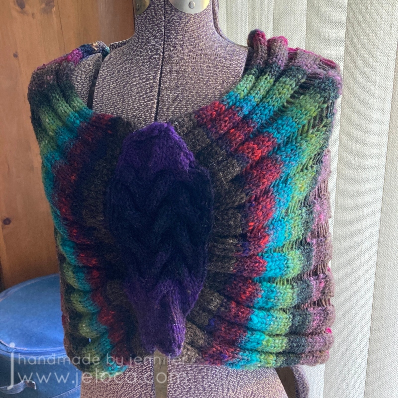
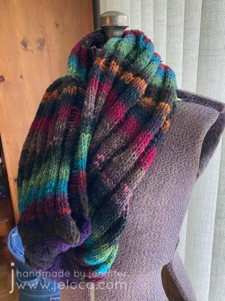
As mentioned, I’d selected a pattern first: the Kansas City Cowl by Kim Guzman. (Free on Ravelry).
I thought it would be really cool to see the colors stripe vertically while the dropped stitches ran horizontally. Being one who gets cold easily, I also liked the idea of having a versatile garment that could be a scarf when on the go but then be pulled down into a shoulder-warming shrug/poncho when necessary.
I hadn’t read the pattern details initially so it wasn’t until I went to get started that I realized I wouldn’t have enough yarn. The pattern calls for 338m and the Noro was labeled as “plus or minus” 50g to 100m. I figured I’d knit the middle size and hope I’d have enough, but then common sense took the better of me and I decided to wind the balls up and run them through my yardage meter at the same time so I’d know for sure. I was hoping there would be an extra yard or two in one of the balls and I’d find myself luckily closer to my desired yardage.
To my surprise each ball was excessively short. Each was supposed to be “around” 100m, but I didn’t get anywhere close. I even wound each ball twice – once to wind into a cake and then a second time into a new cake so there wouldn’t be tension causing any issues. When I saw there was a rather large discrepancy, I also weighed the 3 balls.
These were my results:
Ball 1 – 263 ft or 80 m – 50g
Ball 2 – 257 ft or 78 m – 46g
Ball 3 – 262 ft or 80 m – 40g
I have no idea why the last ball was so much lighter than the first one which had the same yardage. The yarn does slightly vary from thick to thin so it’s possible there were more thin sections. (Note: it’s not a slubby yarn… it’s just occasionally not spun as tightly in spots).
Now knowing I was pretty short on the 340 m yardage my desired pattern required, I riffled through my yarn stash buckets and find something that would match. There was some brown wool left over from a Sylvia Olsen workshop that matched in look and color…except it was leftovers, so there wasn’t much. I measured that to be sure and had 88 ft (26.75m). Armed with that, I formulated a plan.
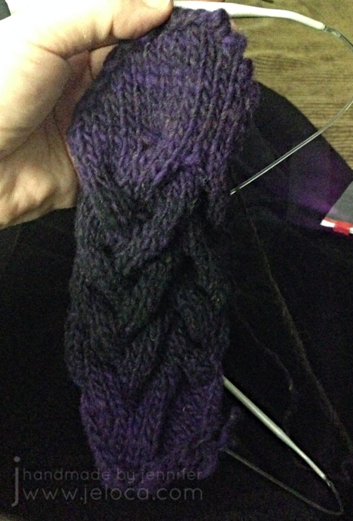
The pattern starts with the cabled center section, and then stitches are picked up from it to work the body. So my loose plan was as follows: pick the ball of yarn that began with the colors I wanted for the cable. Then divide my brown yarn in half, and work as many rows as I could with it, and made a note so at the end I could work the same number of rows with the remaining half so it would create a matching border on either side of the cable. Then, in between, I would work as many rows I could as possible with the Noro.
Happily enough, it worked!
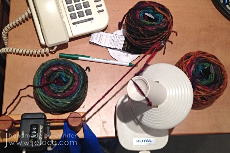
I knit the cable with one skein’s purple-to-black transition and then pulled the same color section from a second ball but reversed it for black-to-purple. As the yarn is 100% wool I split spliced all joins for a seamless knit.
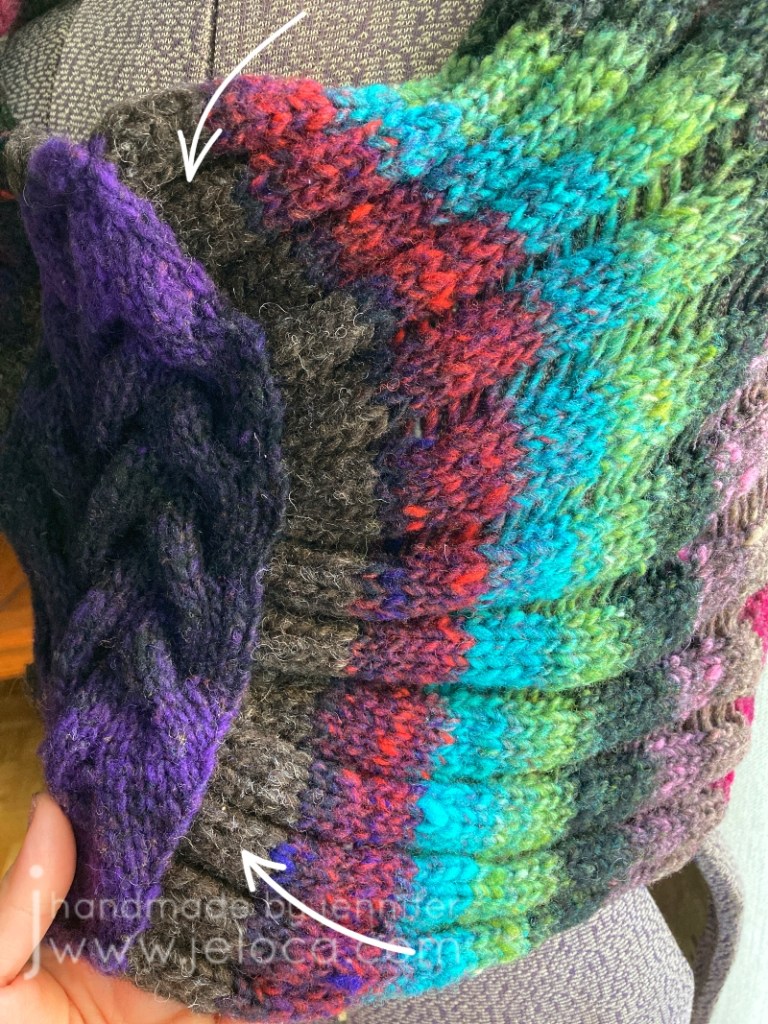
Then I divided my 88ft of brown in half, and used one half to pick up the stitches on one edge of cable, picking up inside the edge stitch for a nice border. I’d marked off the middle of the half of brown, and had originally planned to use a full half on each side but after the pick-up row and 4 more rows it was already pretty wide. I didn’t want 2″ of brown on either side of the cable so chose instead to cut the yarn there, reserving the same amount for the other side, and omitting the rest unless I absolutely needed it.
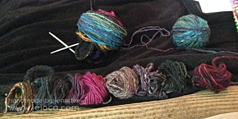
Next I took the two balls I’d cannibalized the purple/black from and matched up their colors, re-winding one in the opposite direction so that the front would be mirrored. The plan for the third ball was to find its center and reverse half so the entire cowl would look like one long repeat that went from the cable to the center back then reversed to the other side of the cable.
It worked great for the first two balls. I wound them off exactly as described. The one with the working yarn I wound around the cable & needles to keep it neat and out of the way. The other end I wound into a ball starting with the added brown that would be the final bit of knitting, and wound in the reverse direction. These two balls happened to be #1 and #3 and had such similar yardage and colors that it was super easy to wind one from front to back and the other from back to front and get a nearly mirrored result.
The middle, shortest one, wasn’t so easy.
I spit-spliced one end of ball 2 to the free end of each of the 2 wound balls and tugged off a few yards from either the outside or inside of the cake and wound it up onto ball 1 or 3. Looking down into the wound cake of the middle ball I could tell it didn’t have the exact colorway of its brothers, but it seemed to have an even repeat – raspberry to teal then green then the dark blends, then back to raspberry to teal then green then the dark blends. I figured it would be easy enough to split it into two equal repeats then reverse one for the center mid point of the back. I wanted the brighter teal coming first because both wound balls already had dark tones near the joins. It worked… until I got near the middle.
This is the only place, not counting reversing direction or adding in brown, where I’ve played with the colorway as dyed, and I’m telling you this so there are no questions as to why my colors don’t match any skein you might buy (though if this color is discontinued by now this won’t matter). Clearly the colors don’t make a repeat that I can just reverse, so I ended up cutting and spit-splicing to make my own sorta-repeat that I was happy with, that would form the middle of the cowl back.
Planning out the colors was by far the hardest part. Once my yarn was turned into one large frankenskein the project practically flew off the needles.
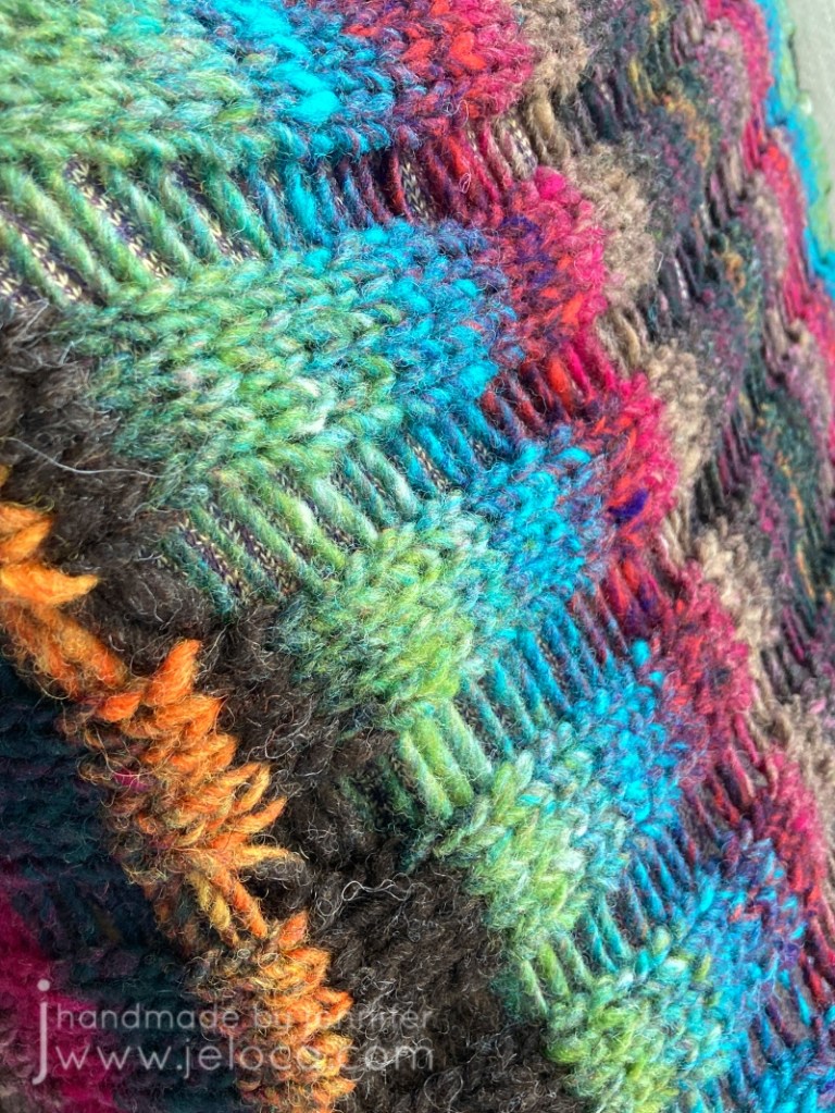
I did stop often to admire the color transitions. Noro yarns truly are gorgeous, and I’m always charmed by the interplay of colors I wouldn’t have thought to pair together.
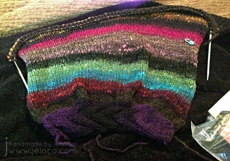
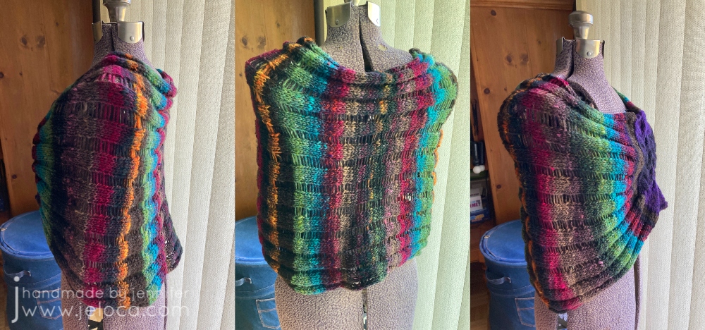
The cowl is knit in stockinette with stitches dropped at the end before you seam the BO row to the opposite side of the cable. Besides the color play, the only modifications I made were to knit my length based on how much yarn I had left, and to not apply the pattern’s suggestion of slipping the first stitch of every row as I found it made the edge way too tight for my liking.
I couldn’t wait to try on the cowl as soon as I’d finished weaving in the ends! You can tell how long ago this pic was taken by the color of my hair at the time 😉
Because of my camera limitations at the time I’ve scrapped my other images and took new ones to do the project and yarn justice.
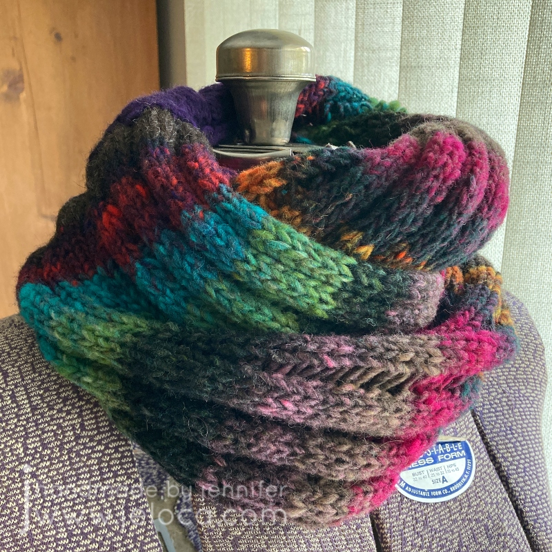
Here is the finished garment. I love the blend of colors so much!
One of the really cool things about Noro Kureyon is that you get these gorgeous color transitions but, because they’re 100% wool, you have the option of changing things up if you want to.
For example, instead of having a mirrored transition like I did here, if color blocking is more your style you could splice the balls together lengthwise, matching up the colors like with like, so as to end up with only one wider section of each color.
I couldn’t resist a detail shot of these vibrant jewel tones. There’s no color editing at play – this is just the yarn in all its glory on a sunny day.
For transparency, as mentioned above this brown section on either side of the cable is the only yarn not part of the Noro Kureyon skeins. It is very similar to a brown that appears within, and is also 100% wool, but is slightly thicker.
I haven’t knit more with Kuryeon over the years. I’m not sure why. Perhaps it was the price factor? At $10.95CAD per ball I simply haven’t had a project that I thought worthy of spending the money on. Not for myself at least, and the gifts that I make typically have had other requirements, like needing 100% cotton for dishcloths or superwash for baby garments that can be thrown into the machine. However knitting it with it again has reminded me just how much I enjoyed it.
Yes it’s 100% wool, but this is not scratchy stuff. It is soft and quite lovely. Sure you can use this for felted bags and slippers as it felts beautifully, but this is one of those few wools that I think is welcomed even against the skin.
I definitely recommend using it for your knitting or crochet projects. The only con would be the short yardage as mentioned above, but as long as you prepare and buy enough for your project, I don’t think it should deter you from trying Noro Kureyon for yourself. Also, this review is based on yarn received in 2017 so it’s possible that this is no longer an issue.
Stay tuned for a huge announcement from YarnCanada.ca coming later this week!
If you would like to pick up some Noro Kureyon for yourself, please visit YarnCanada.ca here. You can also find their full selection of Noro yarn here. All orders ship from Canada to within Canada only(sorry to my US and International followers!), with free shipping on orders over $85.00!
*Note: I received this product for free in exchange for an honest, unbiased review
I haven’t talked about it much but I’m going to be having surgery in about a week. I’ve actually been off work since mid-August, and this unexpected time at home has given me a lot of time to knit and color, and while I’ve been revisiting old supplies I’ve also been lucky enough to get some new ones.
My watercolor research back in August led me to discover Derwent Inktense and I went on a really long review and YouTube binge, learning everything I could about those amazing ink-pigmented colored pencils. When my birthday rolled around in September I basically only asked for art supplies, and my parents were wonderful enough to oblige.
Topping my list was the Inktense set. I really enjoy the metallic watercolor pencils and the Spectrum Noir Sparkle set is just yummy for anyone who likes glitter (um. yes. me! I like glitter!), but in this post I’m focusing on the Inktense which I’ve been using primarily with the waterbrushes I got with them. I really love this waterbrush set because of the sizes, the tiny #1 tip is perfect for the small areas in coloring books while the larger sizes make doing washes of color or wetting larger areas a breeze. They’re super easy to fill and I haven’t had a single leak, and I’ve been using them on a regular basis since September.
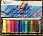
Now then, on to the Inktense! I got the full set of 72 colors but they do come in smaller tins, and the pencils are available open-stock so you can definitely get a smaller set and then add to it as you go.
So what are Inktense pencils? According to their site, “Derwent Inktense pencils are our best watercolour pencil ever! You can use them dry but mix them with water and WOW! the colour turns into vibrant ink. Once it’s dry the colour is fixed and you can work over the top of it, and, because it permanent it’s great for using on fabric such as silk and cotton!” They refer to them as ‘watercolors’ but they’re not, not really. They’re ink pigments in colored pencil format. You can use them as pencils and they’re nice, on the darker end of color ranges, but it’s when you add water that they transform completely. And because they’re ink once they’re dry they’re permanent.
What does this mean for coloring and how does this compare to a watercolor pencil? Let’s say you wanted to color a pink sphere, and you wanted to block in the rounded shading first, then go over it with a wash of pink, leaving a highlight area. With watercolors the paint reactivates any time it gets wet. So even if you let the gray shading dry, once you washed pink over top the gray would bleed out and muddy the pink and if you’re not careful you can make a real mess of your work. Inktense are permanent when dry so you can block in your shadows, wet the pencil strokes and fill your darker areas, and then once that’s dry you can go over it with even the lightest shades and the gray won’t budge. This is a horrible way of explaining that you can go overtop of previous layers without affecting them.
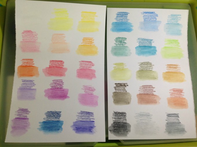
Of course the first thing I did when I got my set was to swatch out the colors so I could see what I’d be working with.
Above are the pencils when dry. The appear quite dark, and there are a lot of greens and browns for those who enjoy coloring books such as Secret Garden and other floral-heavy books. The pencils apply well and it’s very easy to get a lot of color down. Each pencils is marked with it’s color number and name, making it very easy to identify which one I’ve used…which is helpful because the colors on the ends of the barrels aren’t quite identical to the actual color of the pencil itself.
Okay, so they’re really nice when dry. The real magic, however, happens when they are activated.
This image barely shows the bright vibrancy of these colors in real life. The pigments activate instantly with water, and I could have used the lightest of strokes and still had the same color payout as I got here. I was blown away by my swatches and as soon as I’d added them to my swatch book I had to get started on a coloring page.
I’ve been watching a lot of YouTube coloring tutorials featuring Inktense pencils (Peta, Dede, Lindsay and Lisa are four of my favorites) and I know that the pencils are typically used in wet-as-you-go manner, coloring a section and then activating it, and so on. However, making the swatches was so satisfying in a “wait til the end” surprise payoff, that I just had to try coloring an image that way: coloring the whole thing, and then activating the ink at the end to see the before and after.
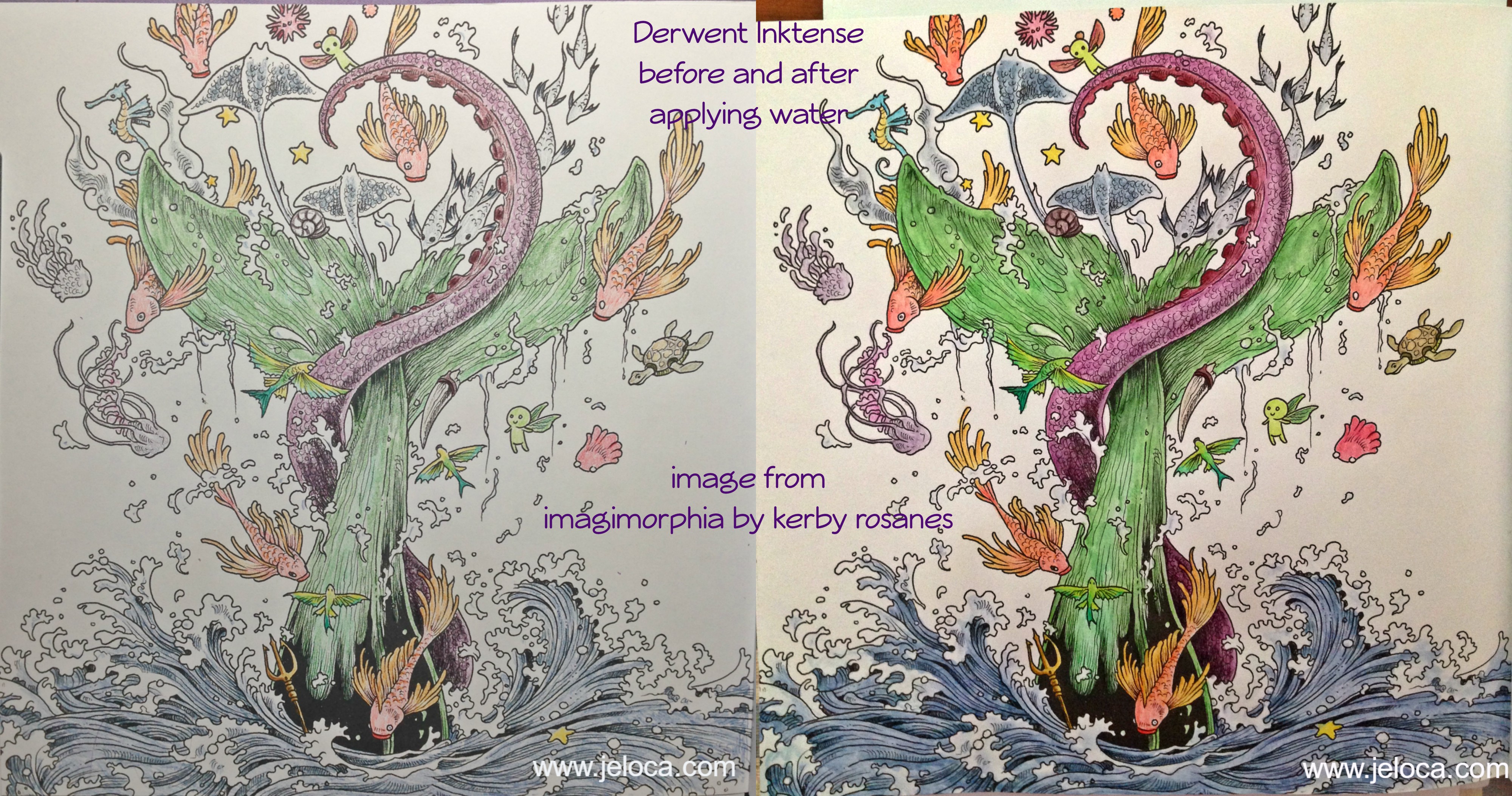
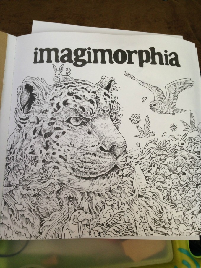
After testing the paper in the back of the book to make sure it would be safe to use (no bleed-through) I chose this image from Kerby Rosanes’ imagimorphia.
I’ve been having a lot of tummy time (lol) and this is how I’d set myself up in bed. A clipboard helped keep the book open as well as gave me a flat, hard surface to work on. I had a sheet of card stock underneath this page to protect the ones beneath, and I had my swatch book open in front of me so I could accurately choose my colors. My laptop was off to the right playing episode after episode of Welcome to Nightvale (soooooo weird and awesome) and the tin of colors was on my left within easy reach. Finally, my flip-top Ott-Light was balanced on the bed casting accurate light over the picture for me, since lighting in my house is crappy at best.
This is my completed painting before activating the Inktense inks. I colored pretty lightly, wanting to see how the pigments did on their own before adding any shading or depth. (PS yes I know that’s supposed to be a whale and whales aren’t green LOL) Coloring with these pencils is like a dream. They apply color beautifully even to paper that doesn’t have a lot of tooth. It is really easy to apply just a hint of color without any pressure on the pencil, which is a good thing because it means you won’t have to waste a lot of the pencil just to get a good color payout. In fact, these colors are so vibrant and juicy when activated that if anything, it’s almost too easy to add TOO MUCH color.
(For example, my son Jakob is addicted to these pencils too and is coloring an image in one of his books. I was showing him how subtle applications of color give pastel-pale results and he tried it out for himself. His three light strokes of Payne’s Gray, applying barely any pressure, provided enough color when activated to light wash a bunny butt around 3″ in diameter.)
I took this image right when I’d started activating the inks. I went slowly, enjoying watching the colors blossom into vibrant paint. (Seriously, it’s addictive). I activated each like section at a time, brushing off any excess pigment onto a paper towel to keep the tip of my water brush clean. In this image you can begin to see the difference between the activated (water-applied) and pencil-only sections. The orange and yellow fish on the right is still pencil, while there has been water applied to the one on the left. The little fairy creatures have been wetted on both sides. What really shows off some of the color payout, however, is the school of fish that crosses the tentacle. You can see how little color I’d applied, versus how much blooms from the watered inks.
And here is the completed painting. I didn’t use very many colors, but even still the brightness and depth these inks have is amazing. This picture is so much brighter and deeper in real life, showing subtle shading and contouring just from the way the ink moved like paint. It dries faster than watercolor so you do have to go in sections and work quickly if you want to activate a larger area without dry lines showing, but there’s still a decent amount of time to move the paint around before it dries, allowing for things like the softer blues in the water froth being ink I’d swiped from the water sections.
I’ve very quickly developed an Inktense addiction, as have my kids, who have been getting to use Mommy’s special art supplies now that they’re a little older. They don’t replace watercolors if that’s the type of medium you want, rather they’re a medium of their own, and are absolutely gorgeous to use.
This post may contain affiliate links. This means I might make a small commission on purchases made through the links, at no cost to you.
I’d been researching watercolor pencils a little while ago, and while reading review sites I came across a few mentions of the Caran D’Ache Neocolor II watercolor crayons. They looked interesting and were lauded for their bright, vibrant colors and creamy texture, so I made a note to look up more reviews. In the meantime, I remembered that at some point during my creative history I’d owned a set of, what my memory told me, were kid’s-quality twist-up watercolor pencils. I could picture the set, and knew there was only one place in my home-office they could be, so one morning I went downstairs and took a look.
I found the twist-up colored pencils right away… and was disappointed to see they were just that- colored pencils. Nothing water-soluble about them. It was frustrating to have been mistaken but I figured I’d just continue my research… and then I peeked through the rest of the drawer just to see what other drawing supplies I’d collected over the years and had forgotten about.
What a discovery! I think I squee’d out loud when I saw the white edge of the tin under an old pencil case of charcoal and blending stumps. Not only had I forgotten I owned these but clearly I’d barely ever used them when I got them, because they were all still full-sized and touching the sponge strip running the top of the case.
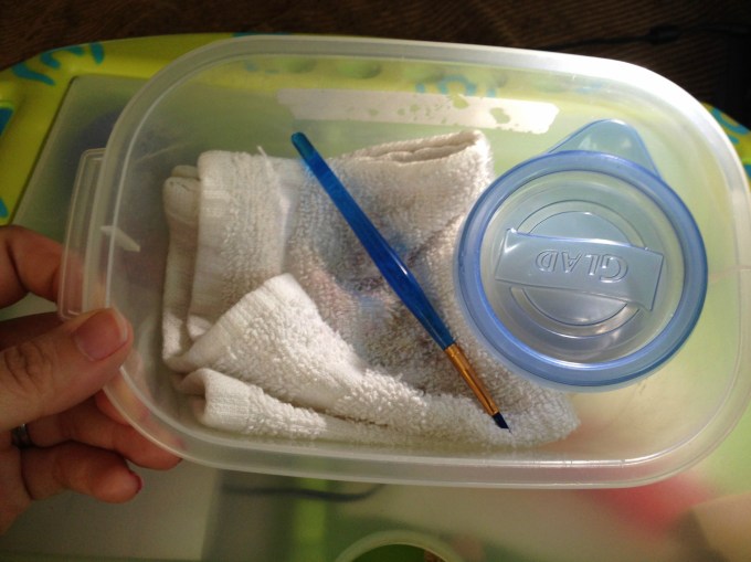
Immediately I brought them upstairs to try out. I’d been stuck in bed, resting my legs due to a really bad bout of sciatica, so I put together a little portable watercolor kit that I could use in bed without making a huge mess: a tiny tupperware of water, a fine-tipped paintbrush, and a folded handtowel for blotting and cleaning my brush, all contained within another small tupperware that I could close up and store with my craft supplies.
I made pages for them to add to my swatch book. I didn’t want to use water in that pad itself because the paper is so thin, so I folded a sheet of cardstock in half and tore it into two papers that each fit on my swatch book’s pages. I scribbled a little bit of each color onto the paper and then activated each with a tiny bit of water. These colors are so rich and the crayons dissolve so easily that a SUPER tiny amount of water is all that is needed.
After the swatches dried I labeled them with the color names from the Caran D’Ache site and then used a glue stick to affix them into the swatch book. Now- onto the coloring!
My first test was the inside cover page of Kerby Rosanes’ imagimorphia, which I have been loving lately. I colored the page pretty quickly, not bothering to fully fill in all areas (like the cut area of the tree, for example) because I knew once wetted, the color would spread. I did some minimal color mixing and shading on the leaves, deer and dino, all using the crayons as crayons to color. Sadly they’re old enough that they became fragile, and two colors broke in half as I worked. They’re still usable, but I was disappointed. More evidence of their age is the (removable) white bloom on some of the darker colors, as well as how the lightest brown dried out to the point of looking like a Flake chocolate bar inside its wrapper. 😦
The crayons applied color wonderfully but, as to be expected of crayons, they didn’t have points sharp enough to work into the fine areas of the image. I was able to use the edges of the points to get into fine spots like the rays’ tails and such, but I didn’t bother trying to color the butterflies, knowing I’d just make a mess. In some areas, like the pom-pom-looking little dudes, I only colored the center, planning to move the color outwards later, once I activated the paint.
The very first spot I activated were the clouds in this image. I set a sheet of cardstock behind the page to protect it from any bleed-through or water damage, but it really took such a tiny amount of water that I doubted there would be any actual problems on the reverse-side pages.
You can see in this enlargement of the lower edge what the clouds looked like before the water was applied, as well as the rough, uneven coloring job I did. I’d cringe, except it was deliberate. After seeing how vibrant the colors were and how much they spread, I didn’t want to waste any of the crayon filling in any more densely.
This is the final result. I can’t get over the difference, and how smooth and rich the colors turned out! I did manage to achieve some subtle shading and depth to the colors, and if I’d wanted to color over-top and re-wet I’m sure I could get even more effects. The largest difference for me is in the tree, the deer and the dino, but I’m charmed by all of it.
I was super-pleased (but not surprised) to see that there was NO bleed-through on the other side of the page. This means I can use these crayons throughout the book without worry, which makes me really happy.
Here’s a side-by-side to really compare the before and after images. Besides blending out the patchy scribbles, the colors (which were pretty vibrant before) didn’t fade out and some became even brighter. They blended beautifully and dried really quickly, but not too fast that I couldn’t move around soft watercolor washes.
For the facing page (above) I decided to try using the crayons in a different fashion, as if they were individual little sticks of paint.
I wetted the brush, blotted most of the water off, and then dabbed it against the tip of the crayon, picking up some color, which I then applied to the image as paint, just as if I’d picked the color up from a palette. You can see some of the peach on the tip of my brush, as well as on the face and hands of the little girl I’d just painted.
This is the finished image after painting. In contrast to the side where I colored first, I think this side has a softer, almost dreamier application. However it is slower to keep re-dabbing the brush to the crayon, and it makes mixing colors more difficult as the paint dries much faster when using this method. I greatly recommend it for areas where you need more control or a finer application than you’d get with the stubby crayon.
This method also made me realize that my broken crayons were not a loss, nor was my flakey, dried-out tan. I can put a small piece of the color in one of my palette wells and activate it to use as paint, meaning that no part of these (expensive!) crayons will ever be wasted. 🙂
Here’s the back, showing again that there was no bleed-through or ghosting.
I’m really glad I found these crayons in my stash, and I can’t wait to play around with them more in this and other books. The colors are incredible and they activate so easily and beautifully, I really recommend them. Mine have broken and dried out, but they are also over 15 years old (!!!) and still work as well as if they were brand new. I would wholeheartedly recommend these.
This post may contain affiliate links. This means I might make a small commission on purchases made through the links, at no cost to you.
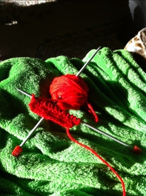
For a while now he’s had “His Knitting” on the living room side table. It’s worsted weight, garter stitch and it’s red of course, and every few weeks he asks if he could knit and I remind him how and he does a stitch or two before getting distracted and then I finish the row so we can put it aside again.
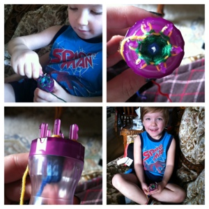
Last night after I picked him up from school we detoured at my LYS before going to get his brother. I had Spidey with me to find yarn to BO and work the spines. At the door I happened to notice a knitting nancy…a modern plastic version of the old spool knitters used for “French knitting”. Jakob saw it too, didn’t know what it was, but wanted it. When I explained it could help him knit but faster than the two needles for while he was learning, he really wanted it. It was the Clover Wonder Knitter.
I think I have an old spool knitter somewhere but have no idea where to look, and this version, while modern and plastic, also has a nice hook, and 3 interchangeable heads with different post numbers, and is designed for working with beads so the central opening is quite large. It’s quite easy to work with because they designed a really smart groove down the side if each post, making it super easy to get the hook down into the stitch to pull up/over.
Today is a ped day for the elementary schools so I sent Henri off to daycare for a rare one-on-one day with Jakob.
After lunch we’re going to the library to get him some audiobooks for bedtime, and then to Tim’s for hot chocolate. But first this morning I taught him to spool knit. And he rocks.
This post may contain affiliate links. This means I might make a small commission on purchases made through the links, at no cost to you.