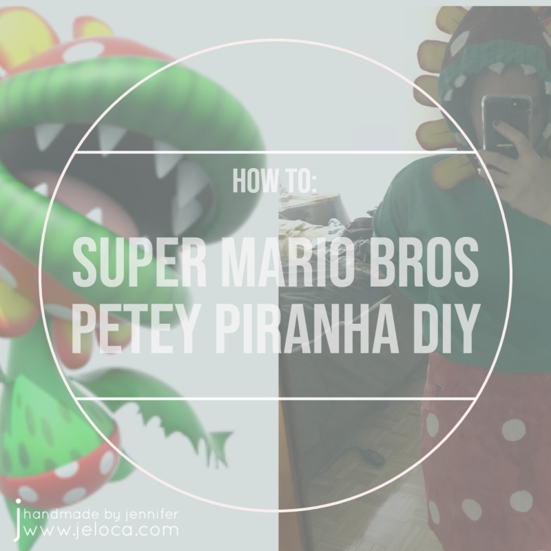
Mario Month 2023’s third DIY is a tutorial for a costume/cosplay for Petey Piranha,

This fabulous fellah is Petey Piranha. He made his debut in Super Mario Sunshine and is confirmed to be the leader of the Piranha Plants. While he’s not as common a Mario villain as Bowser or some of the others, our skit had eight dancers and needed a fourth “bad guy” to oppose our four “good guys”. I’ve already shown how we made the costumes and props for Mario, Luigi, Toad and Peach, as well as Wario and Waluigi. We already had a Bowser, and so Petey here made a great final baddie for our little cast.
I started this costume challenge with a visit to our local thrift shop where I was really lucky and found a solid green hoodie to be the basis of the top, as well as a white skirt as bottoms for our female Petey player.
The first thing I did was to mark off circles on the hood to be Petey’s…uh… face spots…? Mouth dots? I’m going to go with “face”. I used an appropriately-sized candle as a template and traced it out with a white colored pencil. It’s difficult to see in the first image (left side) but I also used a regular pencil to loosely mark off a border around the hood opening.

I used a measuring tape to loosely eyeball how high Petey’s yellow petals should be, based on the proportions of the character. I sketched half of the petal shape on a folded piece of scrap paper and trimmed it out until I had a nice, even petal shape of the right size for my hoodie.

The leftover yellow felt from my Wario costume DIY was perfect for Petey’s petals, and so I used my paper template to trace out 24 halves (to make a total of 12 petals)

I used sewing pins to tack two pieces together so they wouldn’t shift around and then with a regular needle and sewing thread I worked a tiny running stitch all around the sides and rounded top of the petal, leaving the flat bottom unsewn.

You can see in the image (below left) how the petal will look once it is turned inside out. Happy with the results, I continued until all 12 petals were stitched.

I turned them inside out and set them aside.

From there it was time to work on Petey’s face. I didn’t have any fabric paint so used regular acrylic paint for this DIY. I didn’t want the paint to bleed through the hoodie so I prepped it by stuffing it with a plastic bag, which in turn was stuffed with assorted packing materials. This also had the benefit of filling out the hood so I had a flat surface to work on. I also protected as much of the rest of the hoodie as I could by wrapping it in an additional plastic bag.

Using red paint I filled in the entire hood surface EXCEPT for those dots I’d traced earlier, and the lip area I’d marked off. The first image is the result after one coat. The second image was after a second coat of red and also after painting the face spots with white.

A cardboard box worked great as a support to hold the hood in a way that wouldn’t disturb the paint as it dried.
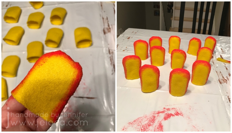
While I had the red paint out I drybrushed a bit around the edges of each petal. To drybrush simply dab off most of the paint onto a paper towel or other scrap surface before working on the felt. This will allow you to get the faded color around the inner edge and give the illusion of a blend.

Continuing to work with the red paint, I set to work on the skirt. After tracing out the spots with the same candle as for the face I painted the rest of the skirt, leaving the spots white. This would have been easier had I found a red skirt – I’d only have had to paint white spots. As it goes with thrift shops, however, you get what you get. (“…and you don’t get upset” as my kids’ daycare used to say!)
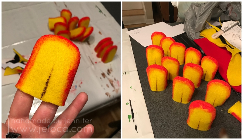
The final touch for the petals was to use a tiny bit of brown paint and a very thin, very dry paintbrush and give the centers their subtle center shading.

Before leaving things to dry I gave the skirt a second coat of red paint. I noticed the paint was bleeding into the white spot areas (as shown in the bottom center spot on the left) and so I went over each spot with white paint for a more crisp edge.

Once the paint had fully dried I was able to do the final touches. Petey has distinctive lip stripes, similar to those on a watermelon. Instead of doing detail shading with paint I went the easy route and drew stripes with an alcohol marker.
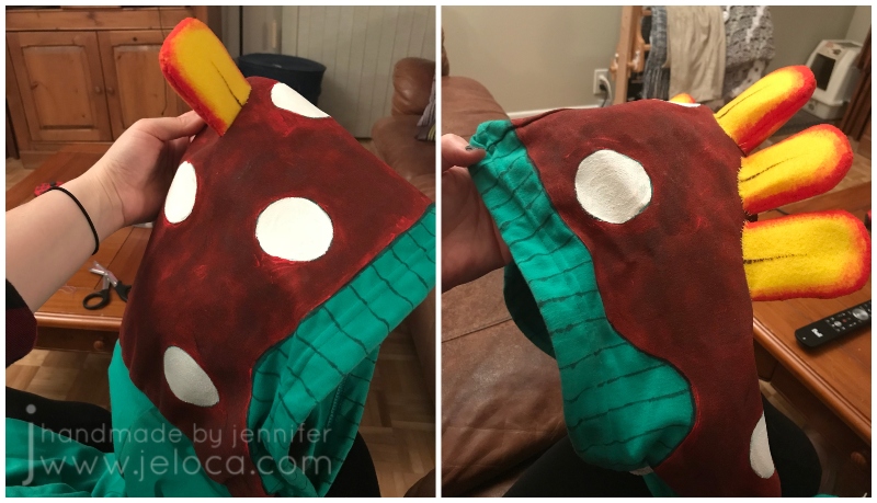
I used more of the yellow sewing thread to sew each petal into place around the hood. Instead of pressing the petals flat and sewing the one edge down I actually whipstitched the full oval of each petal opening down into the hoodie. This kept the petals open ensured they wouldn’t flop around on stage. Remember – just like all the other Mario-themed costumes and props, this outfit had to be durable enough to endure two weeks of quick-change performances, plus dress and tech rehearsals.

The final step to complete Petey’s face was to add his fangs. After figuring out a paper template to give me a rounded cone shape I traced a small paint bottle enough times for each fang and cut the pieces out from white felt scraps. Each circle was then cut into the flat shape that would fold into a cone.
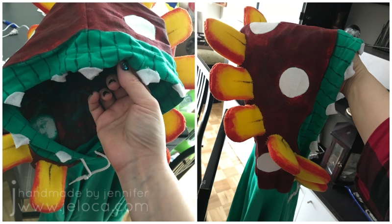
The cones were then sewn into place around the hood opening. Petey’s fangs are actually more inset into his lips but I wanted to be sure the fangs would be visible from the audience so moved them outwards a touch.

Here’s the final costume.

And here it is next to Petey himself. I wasn’t quite sure in the beginning how I’d pull this one off, but in the end he made a great villain in our little dance number and the costume held up throughout without any issues.
Other Mario-themed projects you might like:
- Super Mario Bros Warp Pipe set piece
- Mario, Luigi, Wario & Waluigi Easy DIY felt hats
- Mario, Luigi, Wario & Waluigi Easy DIY costume mustaches
- Wario full costume DIY
- Super Mario Bros bricks stage runner
- Princess Peach Star Wand DIY
- Super Mario Bros Toad Hat/Head DIY