2 Comments

First Attempts at Background Washes in Coloring Books (FAIL)

I follow a number of incredible artists on YouTube and their work has inspired me often over the years. One such time was when I discovered the wonderful art done by Dede Wellingham. I’ve binged many of her livestreams and she’s as sweet and funny as she is talented (which is a lot).

The first video of hers that really got me revved up was “Color Washes in Imagimorphia AdultColor book by Kerby Rosanes Pt 1 of 3“. Adult coloring books were starting to become a big thing in the creative world (back in 2016) and something I’d come to late since I usually focused on fiber- or food-based arts. It hadn’t occurred to me to mix media in the ways Dede demonstrated and I could NOT WAIT to try it out. And I… well to say I missed the mark would be an understatement.

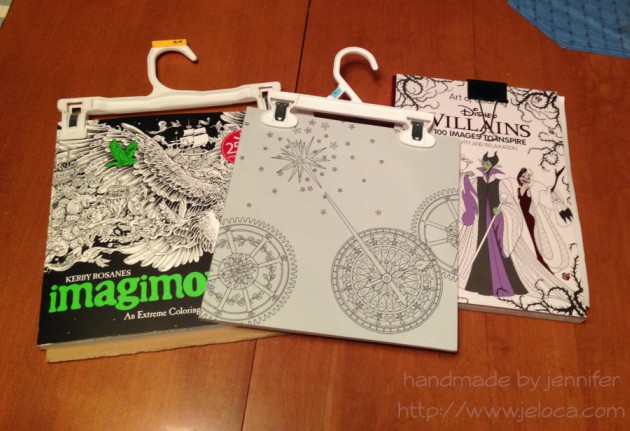
It started out so promising! I collected an assortment of my coloring books, some acrylic paint, my Neocolor II watercolor crayons and my Inktense water-soluble pencils (neither shown in pic).

Problem # 1 – using the wrong materials

Dede uses a number of media in her books, including pan pastels, paint, pencils, markers…but in particular the video that inspired me was based on using acrylic paint to drop in washes of color onto your pages. This has a two-fold effect: 1) it gets color down on the page and fills in the tiny detailed areas, making it easier and less intimidating (and faster) to color in with other media later, and 2) it creates an incredible base for colored pencil as adult coloring books are usually printed on paper that’s relatively smooth but pencils benefit enormously from a paper with more tooth. The acrylic paint gives the paper the missing tooth.

Neither the Neocolor IIs nor the Inktense are acrylic paint. Both of these can be used to add tooth to a page, but I’d diluted them so much that all I’d really managed to do was warp my paper and leave it remaining smooth once dried.

Neocolor II dry in imagimorphia
Neocolor II wet
Neocolor II dry in imagimorphia
Neocolor II wet
Inktense dry in imagimorphia
Inktense wet
Inktense dry in Doodle Fusion
Inktense wet
Neocolor II wet in Doodle Fusion

Looking back, even though I like some of the colors I’d chosen, I’m not happy with the results. I don’t like how all my random scribbles show because I hadn’t put the color down evenly, and I’m disappointed that I completely messed up on the entire “adding tooth” benefit.

Problem # 2 – using the right materials the wrong way

The remaining pages that I’d painted were all done with acrylic paint. That means they must be good, right? No, actually. Not at all. Some of them (the underwater ones in particular) look better in person than in the images below, but none of them are “good”, because I missed the mark again. I was so focused on getting a spread of color onto the page that I didn’t think I had to try and do it nicely. I’m embarrassed to admit it really didn’t occur to me that that it was more than a matter of simply splashing water into paint and wiping it across the page a few times. In most cases below I did a horrible application, and in the one or two that aren’t too bad, I used too much water and so the resulting color doesn’t have the tooth either. (And in the final case, I’d used much too much water and caused the marker on the reverse to completely bleed through).

Acrylic paint in imagimorphia
Acrylic paint in Doodle Fusion
Acrylic paint in The Time Garden
(the next page that bled through to the one above)

Problem # 3 – choosing the wrong pages

I think this was the worst mistake I made out of all of them – I chose the wrong pages. With one exception, I’ve never really wanted to color ANY of the images above. Rather than pick pages that I looked forward to, instead I thought I could “cheat” my way into getting pages “done”, and done “faster” by slapping color down to make the final coloring quicker and easier. Instead I now have pages I still don’t want to do, just now they have some color on them.

So why am I bringing this up now? Well Dede’s videos have come back into my recommendeds and I’ve begun binging again, and once again am completely hooked. On THIS TIME I’ve learned from my mistakes!

This post may contain affiliate links. This means I might make a small commission on purchases made through the links, at no cost to you.


Leave a comment

Glow Effects with Gel Pens

Today’s post is a little tip on how to use gel pens to get a special effect in your coloring book pages. In honor of Walt Disney’s birthday this week* I’ve used a page from my Art of Coloring: Disney Villains coloring book.

This is the original page. It’s slightly warped because on the back is a page I colored fully with my Inktense pencils and it was saturated over and over. While I do keep this book clipped shut (as shown in this post with my hanger tip) I’m still impressed at the thickness of the paper in this book. It’s definitely better than most of my coloring books!

As with many of the coloring books based on movies and tv shows, the scenes in this book are often pulled directly from a still from the original source material. In this case you can see the above image is nearly an exact copy of the second image from the movie, below. It looks like the book artist added a background detail and the mist with the llama above in order to make it more interesting as a coloring page.

While I did use the still as a reference for the characters, I took creative liberties with the color of the potion as I wanted to see if I could achieve a glowing affect and thought the contrast with a yellow glow would stand out more than pink.

This is a super easy effect to achieve, and takes materials you’ve probably already got on-hand! All you really need is a gel pen in your desired bright color! I’ve also used a water brush for convenience, but you can swap in a regular paint brush and small cup of water and get the exact results.

You have to work fast so I wasn’t able to pause and take a step by step. Outline the area you want to have the glow, and then immediately while the gel pen ink is still wet, use a water brush or water-dampened paintbrush to blend out the gel ink.

The glow areas in this image are too large to do all at once as the gel would dry before I could get to it. So I worked in small sections, tracing just inside the lines of the swirl and blending the wet ink inwards. For the glasses and potion bottle I only traced on one side so there wouldn’t be too much ink. I then scribbled some of the ink on a piece of scrap cardstock (the shiny kind like used in consumer packaging) and diluted it with water to make a paint for the glow around the bottle.

That’s it! That gives a really cool glow effect that you can achieve super-simply, in almost any coloring project. To see the glow really pop, let’s finish coloring the page!

Switching to my beloved Inktense, I outlined the misty sections with a few shades of green. I didn’t record my colors but there was definitely #1400 (Apple Green) and I believe some #1520 (Hooker’s Green). If you look in the mist closest to the llama, you can also see some #0100 (Sherbet Lemon) to amplify the glow and pull the yellows into the mist.

With Inktense the rule is always “a little goes a long way” so I only needed the barest of color application to get the light wash you see in the image on the right. To blend out you can use a water brush or regular paintbrush with some water and moisten the drawn lines just like those old coloring pages in kids’ activity books.

Next I did the same for the background behind the mist, first filling it in with a super-light application of #2020 (Indian Ink) and then deepened up the borders with #2200 (Ink Black).

The main background first had a layer of the same Indian Ink followed by #750 (Dark Purple) since purple is the complementary color to green (opposite on the color wheel).

The last step was to finish the characters with a bit of #1800 (Baked Earth) and #1740 (Saddle Brown) for Kronk and #760 (Deep Violet) for Yzma, and #1210 (Dark Aquamarine) for the teal bits.

I love how this page came out! I’m continually impressed at the paper quality of this book. Having now done a fully water-saturated coloring on both sides of this same page, I’m amazed that there is no bleed-through or tearing. I love the bright glow of the gel pen against the ink, and especially the reflected glow in the goggle lenses.

I hope this tip helps you use your gel pens in new ways!

This post may contain affiliate links. This means I might make a small commission on purchases made through the links, at no cost to you.

*December 5th


4 Comments

Quick Crafty Tip: Using Pants Hangers

I don’t have a ‘Crafty Compilation’ for either of the last two weeks as I’ve spent them working primarily on some sample knitting that I’m not sure if I can talk about yet.  So, instead, here’s a quick tip for those of you who enjoy coloring: pants hangers are your friend.

tip color with clips 02

Yup.  Actual hangers that you use to hang up your pants.  (Or your kids’ pants, in my case).
tip color with clips 05

I’ve been using binder clips with my Art of Coloring: Disney Villains book ever since I got it.  I’ve been using a lot of water media in it and I’ve taken to clipping the book shut whenever I’m not using it to minimize most of the page warping.  Because this book has thick cardboard covers it stays open pretty flat on its own, though I tend to pop the clip onto my working page mostly so I don’t misplace it until I need it again.  With other books I’ve taken to working on a clipboard for both the hard surface as well as the ability to clip the book open to my current page.  For the most part, that worked perfectly.

tip color with clips 04
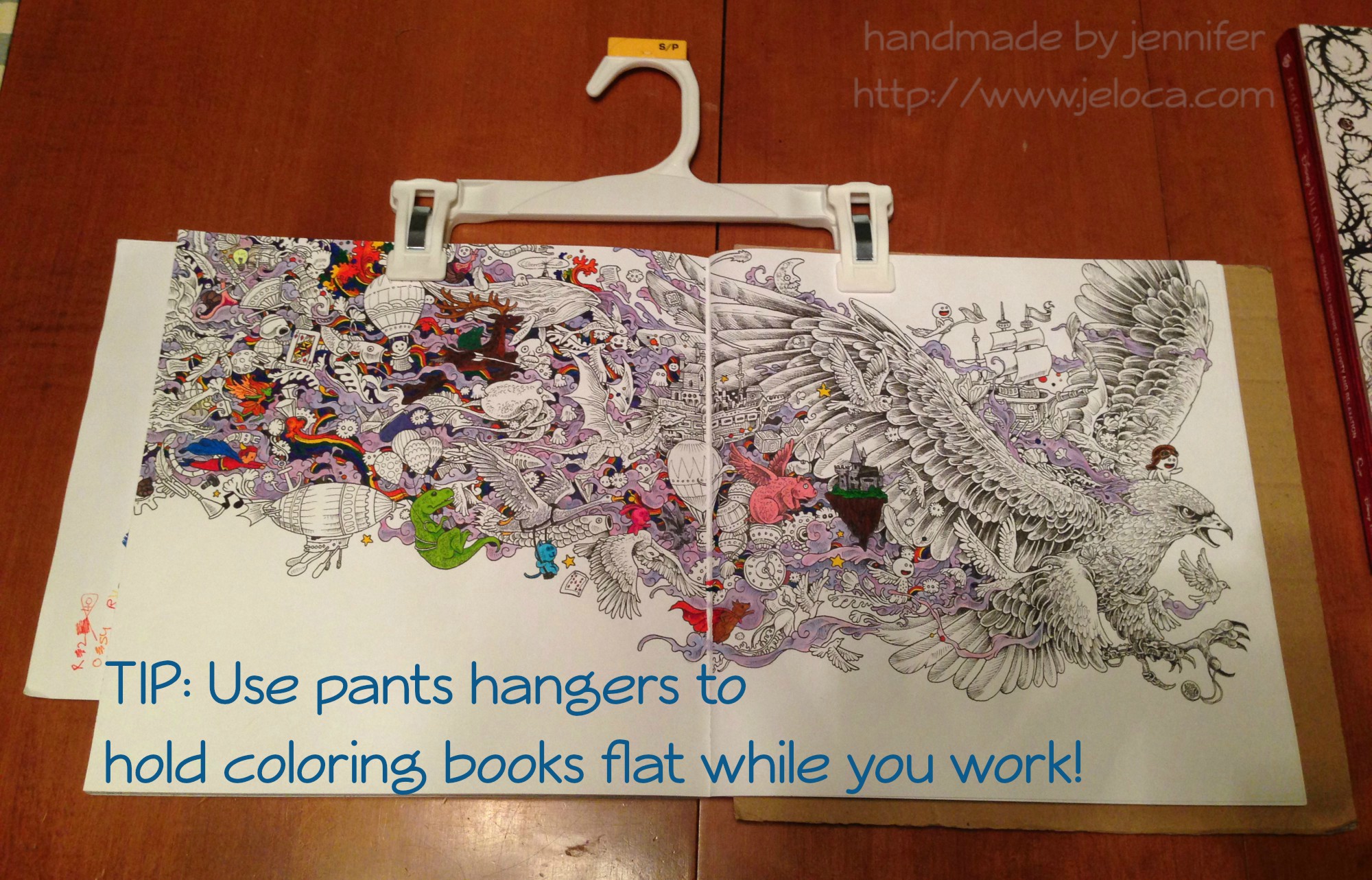
Then one day I was laying on my belly in bed coloring the page above (the Eagle image in Kerby Rosanes’ imagimorphia).  It was held down by my clipboard on the far right of the right page but I kept getting frustrated at the left-side page flipping shut every time I reached over for my coloring supplies (Stabilo 88 and Staedtler Triplus fineliners, as well as Caran D’Ache Neocolor II watercolor crayons for the purple wisps).  I’d been laying on my belly and constantly raising up onto my elbows to brace the page between color changes was starting to hurt more than the coloring itself soothed.

Henri had had a similar problem holding open his Pokemon books so he could sketch from them, and I’d lent him my cookbook stand.  It was a great solution but now that I needed it I didn’t have the heart to steal it back for myself.  That’s when I remembered the image going around Facebook a while ago in a list of kitchen tips: using a pants hanger to hold your recipe up and out of the way, by hanging it from an upper cabinet doorknob.  I had no need to hang my coloring book, but it would be perfect for what I needed too!

tip color with clips 03

And it was!  The two clips hold the pages down on either side, but the stiff bar that connects them keeps them open flat, where the book could otherwise still slip shut.  (The above wip image is also from imagimorphia, and the background wash was done with the Neocolor IIs).  After you’ve finished coloring the page, the hanger can then be used to clip the book shut as it dries to minimize any warping from the wet pages.

If you wanted you could also store your books from the hangers, sideways along a bar similar to needlepoint sets.  (Ooooh now I’m picturing a dry cleaner-style conveyor holding all my coloring and craft books… that would be awesome!!)

tip color with clips 01

And for an easy reminder to pin:

tip color with clips titled

That’s all for now.  Hopefully this tip could be handy for some of you!

This post may contain affiliate links. This means I might make a small commission on purchases made through the links, at no cost to you.


2 Comments

Coloring Mowgli and Kaa in The Art of Coloring: Disney Villains with Derwent Inktense Pencils

For my birthday Yannick got me this excellent coloring book called The Art of Coloring: Disney Villains.  I’ve completed a few pages in it so far, as well as have some in progress.  This is one half of a two-page Kaa spread (from The Jungle Book) that I recently finished.

trust-in-me-wip-collage
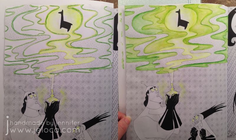
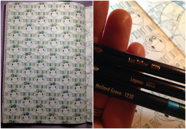
This is the left-side page, that’s still in progress.  I’d begun coloring it in November with my Inktense in Sun Yellow, Lagoon, and Mallard Green to best match the coloration of Kaa’s hynotic eyes.

photo-2016-11-19-12-21-32-am

I did all the writing and then got a little bored LOL and moved on to the facing (right-side) page.  While Googling to find the accurate colors for Kaa and Mowgli I found further proof that a lot of the images in the book are based off of stills from the movies themselves, as it is often quite easy to find reference images in nearly the identical scenarios.  Case in point: Kaa’s face above…photo-2016-11-19-12-04-03-am…combined with Mowgli all wrapped up… become the coloring page in the book.

I decided to try something a little different on this side, rather than do the lettering as I had on the other side.  First I colored in the background writing with a really sharp white colored pencil, then I did a light wash of Inktense pigment over those areas.  The wax from the pencil provides a resist, leaving the lettering white, while the background paper picked up the color.  It was a fun experiment to try, and I’m happy with the results… though I wish I’d used a darker color for the background – maybe a magenta or something – to make the white letters really pop, visually.
collage01

After that the coloring was straightforwards.  I colored Mowgli first, and then for Kaa I went in stages, starting from the lightest colors, to the darkest.  I colored all the sections of his underbelly, followed by his back, and then the spots were last.

kaa-mowgli-preshade

The image above is the page after I was done.  Technically.  But I found that it looked rather flat on the page, so I went at it one more time using a darker color for shading everywhere the snake’s coils overlapped.
kaa-mowgli-postshade
It was a fun page to color, from an excellent coloring book.  The entire page was done with Inktense and painted with my waterbrushes and as you can see, it’s not buckled at all.  I do keep the book closed with a binder clip when I’m not coloring to help keep any wet-media pages flat, but even still, the paper is thick enough to support moderate water use.  In fact, from my trials on blank areas in the back of the book, the only spots where I saw bleed-through were with my alcohol markers (of course) and one area where I’d colored with a red Inktense pencil and applied too much water.  I haven’t used much colored pencil in the book, but I have used the Inktense on a number of pages, as well as gel pens and fineliners, and it took them all beautifully.

This post may contain affiliate links. This means I might make a small commission on purchases made through the links, at no cost to you.