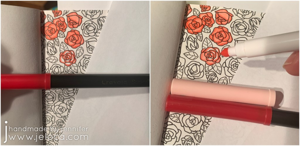
In a recent post celebrating The Princess Bride movie’s 35th anniversary I shared my completion of a double-page spread from the official The Princess Bride adult coloring book and teased a special secret that allowed me to blend Crayola markers as if they were Copics.
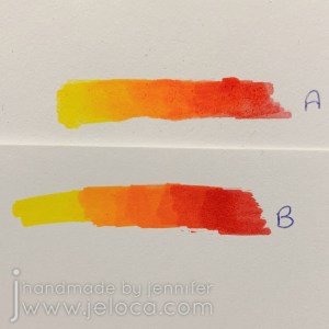
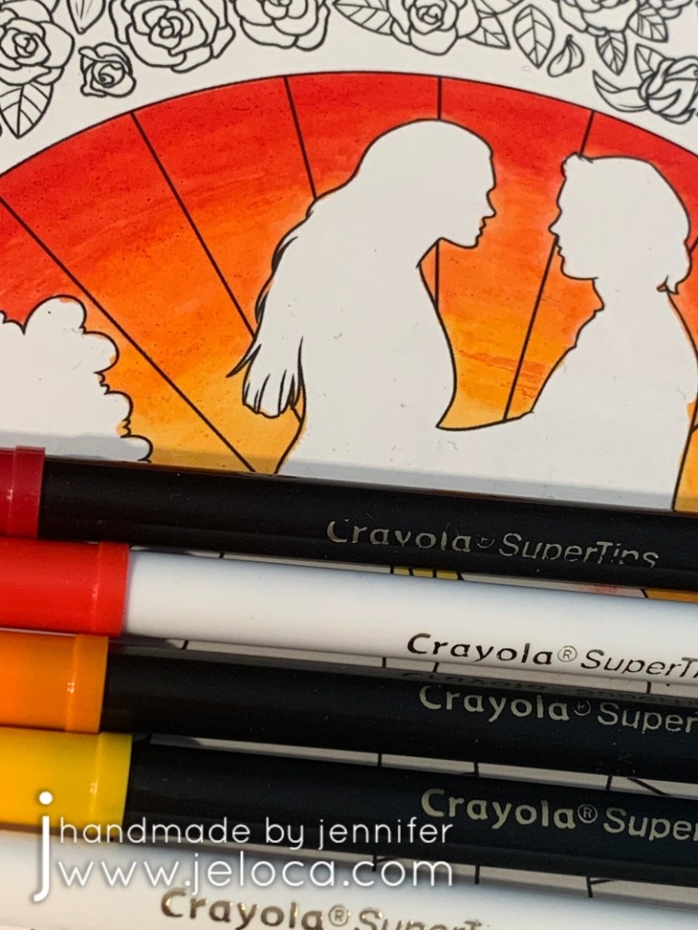
We’re not talking some special “Premium” art supply here – these were regular old water-based Crayola Super Tips markers, and as you can see in the finished page not only was I able to blend two shades each of red and green to get a subtle watercolor effect in the roses, but I was also able to get a beautiful gradient using 5 shades through the sunset and again in the hill.
Even preschoolers know that if you try to layer non-alcohol markers on regular paper you end up with streaks or smears and not a blended gradient, just like you see in example B below. While the paper in this book is decently thick it’s still just regular light cardstock – heavy enough to hold up to water applications but definitely not special blending paper.
Same 5 markers, same paper.
So if the trick isn’t the markers, and it isn’t the paper, what is it?
That’s right – this painter’s supply is an excellent addition to a coloring crafter too. Unlike the opaque white variety that is generally used to prime wood or canvas for painting, clear gesso is completely transparent and can be used on regular paper or within coloring books to protect the page from water damage and bleed-through. I don’t claim that using gesso in a coloring book is my unique, original idea. However it is the unexpected benefit of what this will allow you to do that I haven’t seen shared anywhere before.
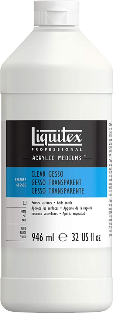
Any brand will work, with the main distinction being that you use clear and not white. Liquitex is a great brand, I used Mont Marte as it’s what I happened to have, and Amazon has the U.S. Art Supply brand for a good price.
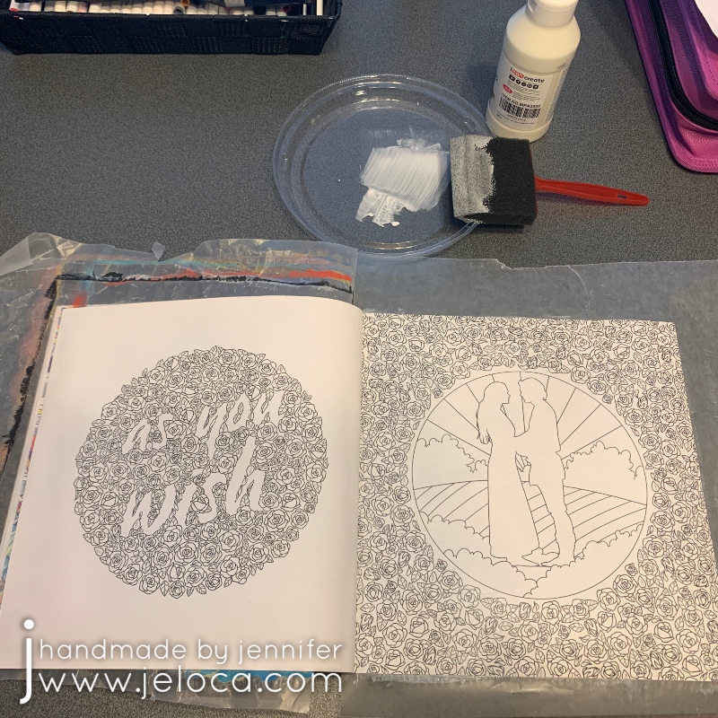
The idea came to mind when I picked the As You Wish/silhouette roses spread as my WIP. Not having used clear gesso before, I felt it would be smart to test it out before tackling my coloring page. I wanted to make sure that not only would I be able to see the printed lines clearly, but that they wouldn’t smear or bleed. I was also curious if the gesso would discolor the paper.
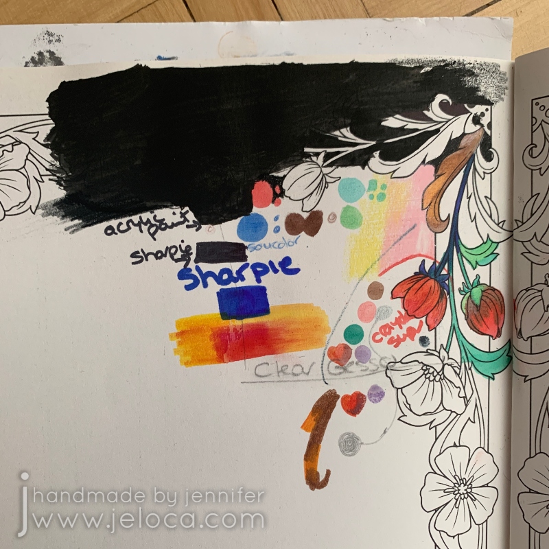
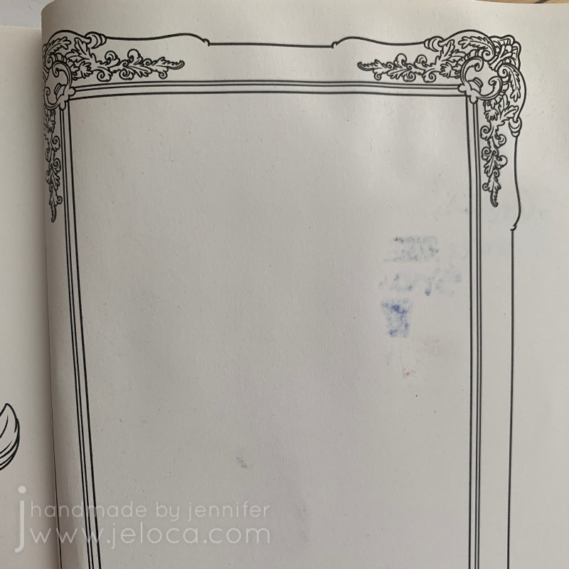
In order to properly test things out I marked off a square in a corner of one of the tester pages at the back of the coloring book and painted it with clear gesso and allowed it to dry fully.
While there is clearly an addition of texture to the page I was very happy to see that there was no discoloration or ink smearing. I then got to work testing an assortment of media to see how they worked with the gessoed page.
At the time I’d been debating painting the background black, so I tried that at the top of the page, followed below with black and colored Sharpies. I did a little colored pencil (the pink and yellow stripes) and a little with my brush tip/fineliner markers (the ones I used for the Eagle pointilism image), but spent most of my effort playing around with the Crayola Super Tips I intended to use on the actual coloring page. In order to compare the difference between the protected and untreated paper I deliberately overlapped my testing samples across the border of the gessoed section.
A quick look at the back of the page showed it was working! None of the media bled through the treated side of the paper!
This is also where I first realized that the Crayola markers were blending. To be sure I tested across both sides of the paper and, indeed, on the gessoed side the orange and red were forming a gradient whereas on the plain paper side they were overlapping with blocky, chunky edges.
Now that I knew it would work I was able to start on the actual pages. A little goes a long way with gesso and it didn’t take much to evenly coat both pages with a thin layer. I like protecting the underneath pages with a bit of wax paper and the lid from a takeout container makes a great palette.
This is a closeup of the dried, treated page. As you can see there’s no discoloration to speak of and no ink smears. There is a faint bit of grainy texture which would make this an equally excellent tip for use with colored pencils though you’d need to be conscious of your brush strokes and try to keep everything even and not streaky.
The coloring part itself is no different than were you to be using colored pencils or alcohol markers. You can blend the shades by overlapping them and blending out with the lighter color. In this example I colored horizontal sections of the 5 colors chosen for my sunset and then blended them by using the lightest yellow overlapping onto the yellow/orange, and then that marker overlapping onto the orange, which then overlapped onto the red, and then finally overlapped into the darkest red section.
Much like alcohol markers you have a long working time as applying new color will allow you to mix and move the colors below.
Just keep in mind that since the gesso stops the water-based markers from absorbing immediately into the page they will be transferrable until they dry completely. So be careful to avoid smudging or smearing the wet marker with your fingers or the side of your hand.
I found this to be a wonderful, fun process and absolutely adore how the final image turned out. I enjoy finding new ways to use existing supplies and love that this one product opens the door to so many coloring possibilities!
This post may contain affiliate links. This means I might make a small commission on purchases made through the links, at no cost to you.
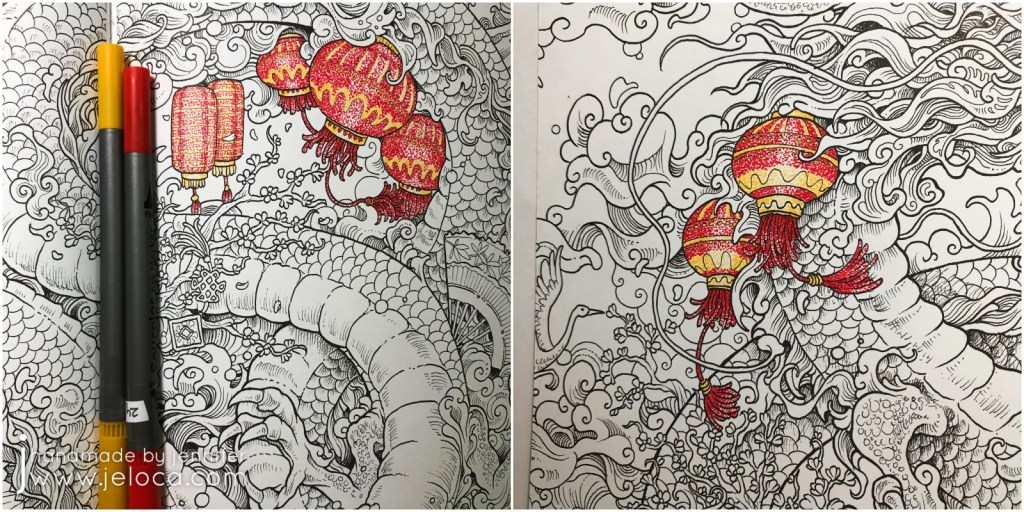
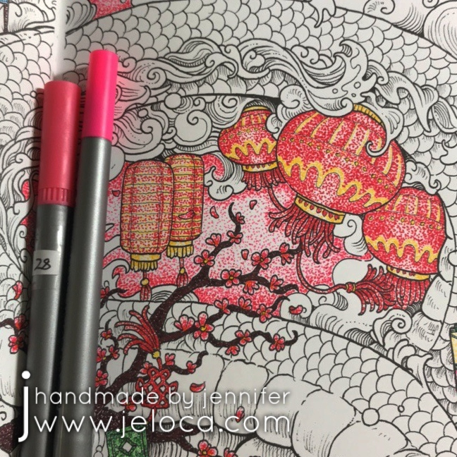
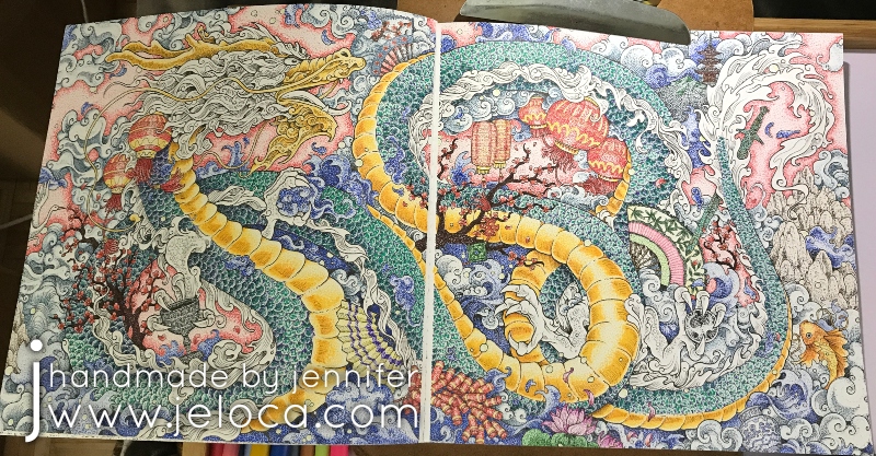
In celebration of today being “Circle Day“, I’m posting the process of coloring the Chinese Dragon page in Kirby Rosanes’ Mythomorphia coloring book.
Can you tell why I’m posting this today? Look closely – every single drop of color in this image is created with a tiny circle. That’s right- over the course of the entire month of November 2018 I painstakingly tapped markers to the page to color in the whole picture with teensy little dots.
(The glare from my mini clip light makes for a bad photo but was a fantastic way to help see all the millions of dots without going cross-eyed!)
Of course a project of this scale requires fineliners and so I pulled out my pack of Soucolor markers. Not only do they come in 100 colors but while one side has a fantastic brush tip, the other has a 0.4mm fineliner tip, making these markers great for coloring books and perfect for this attempt. (Note: I own these same markers by two different brands. The Soucolor ones only seem to be currently available in sets of 34 but they are completely identical to this 100-count set by Feela that I also use regularly.)
The best way to start a project like this is simply to just begin, so I found a small, contained shape in this lantern and began to tap individual dots of red and yellow, I worked tighter groupings of dots anywhere I wanted to create shading, like in the vertical ridges on the lantern above.
I then found the other lanterns in the image and dotted them with the same two colors, creating patterns and stripes for more interest.
Next I used a brown marker to fill in both areas of cherry blossom branches and two shades of pink for the cherry blossom flowers and blowing petals. I completed the jade charm in the center of the above image and then used the original red and yellow to begin the firecrackers at the bottom.
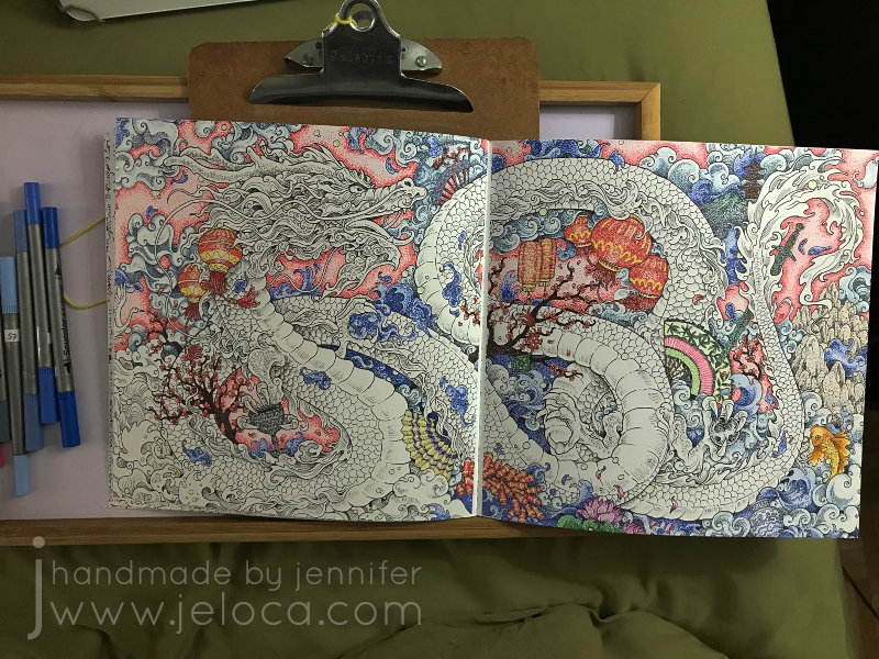
It’s very peaceful to tap out little dots and then step back and have a complete shaded area of color and to then watch the whole image come together in the same way.
After finishing the fireworks I wanted a change of color so hopped over to some lotus flowers, then a koi, and then a decorative fan.
More fans followed. I’d noted what colors I’d used where so it was easy to have the fan’s cherry blossoms match those of the larger image. I then completed the little temple area in the upper right and the sword just below.
The pewter-look goblet was next, followed by the porcelain china.
Sometimes, when pages are as busy as this, it can be difficult to tell what’s what. For example, I found myself needing to decipher if some curls were clouds or waves. To help visually distinguish individual sections I decided to begin filling in the background. I used two shades of pink and darkened the edges around each icon so that it would have a nice contract against the planned colors for the dragon, clouds and waves.
As background areas were completed and it was easier to pick out clouds vs waves I used different shades of blues and grays to fill in each section.
I moved around the page in this manner, working first the pinks, then blues and grays. If I wasn’t sure yet what a random swirl was then I would fill in the areas around it until it became clear.
I kept going, making more itsy bitsy dots, until the entire background was complete leaving only the central, most important image of the page: the dragon.
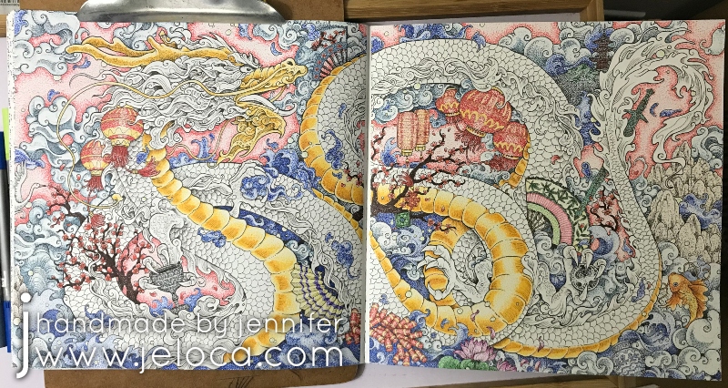
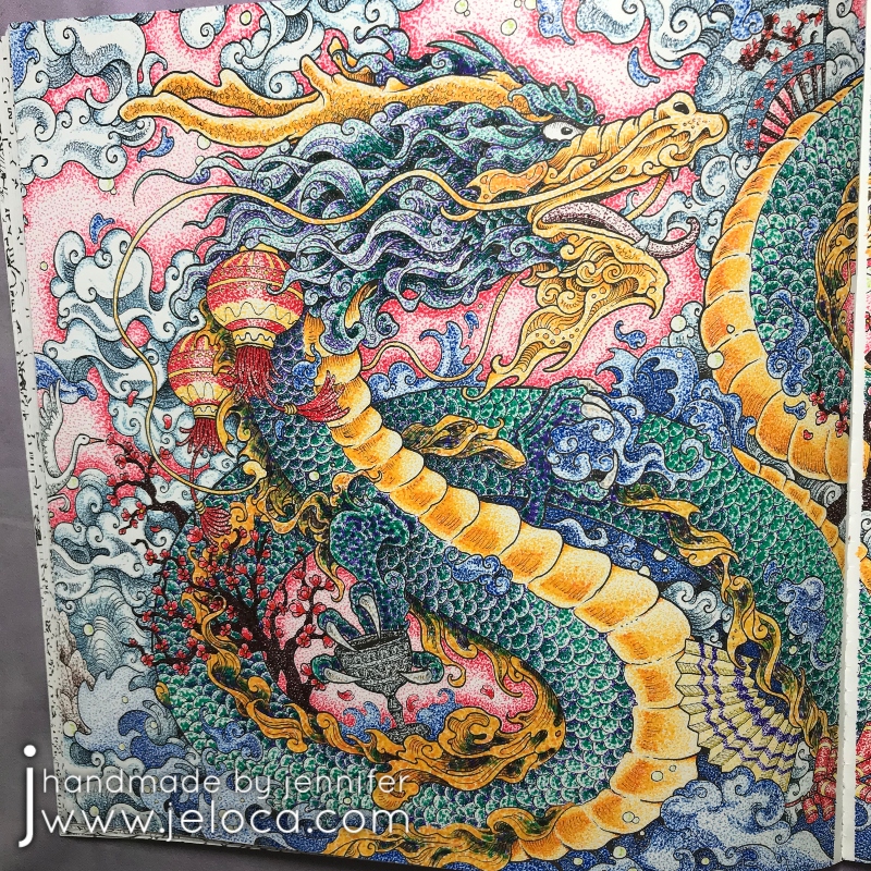
For the dragon’s belly I selected two colors that give a golden effect when worked together – a coppery-orange for the darker areas and a ocher-y yellow for the lighter. Each segment was worked with the orange first (as you can see in the upper left) and then finished with the yellow.
I took a video of the process for a closer look:
After completing the belly I used the same golden colors for the dragon’s face and whiskers.
Then I moved on to the dragon’s scales.
I wanted to give him an oil-slick look with purple reflecting to green, so used those shades in tighter and looser groupings to indicate shadow and reflection.
Here’s another video showing a close up with more detail on how the scales were done (above).
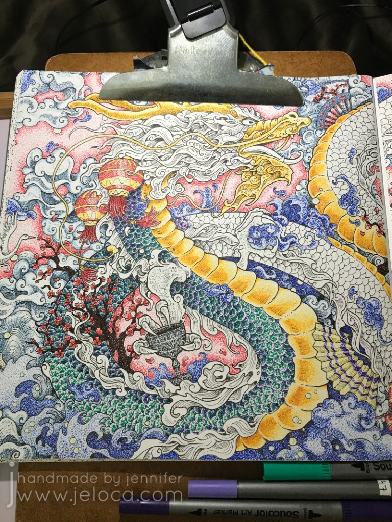
Eventually all the scales were done and the dragon was SO CLOSE to being complete! All that remained were the frilly bits along his body, tail and face.
To keep things cohesive on such a busy page I used the same yellow, orange, purples and green and filled in the sections more densely to have deeper, richer sections of color.
And with that, the coloring is complete!
This project was SO much fun to do even though it took SO long to complete. There was something incredibly satisfying about working on each small bit at a time, tapping dot after dot, and then backing up to see how the image all came together.
Kirby’s designs are great for a project like this because there are dozens of self-contained little sections and he includes just enough shading detail to give you a guide to follow.
This post may contain affiliate links. This means I might make a small commission on purchases made through the links, at no cost to you.
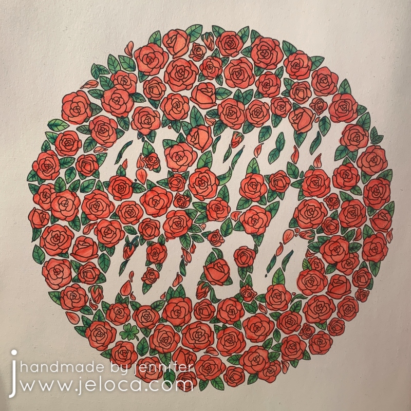
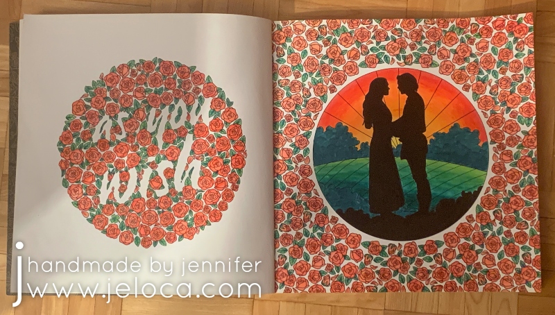
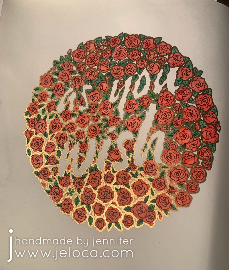
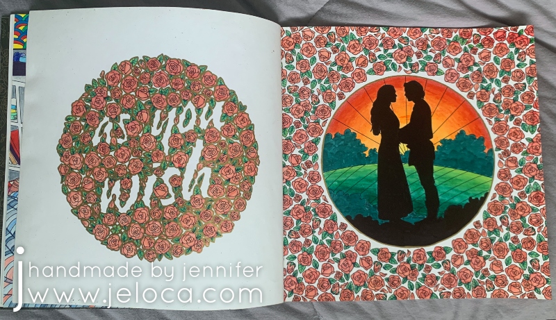
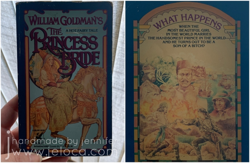
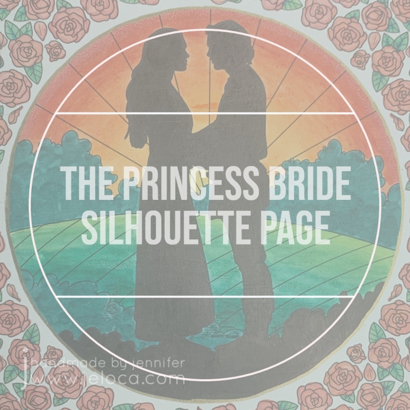
Today marks The Princess Bride movie’s 35th anniversary!* I wanted to do something special for this final post of The Princess Bride Month so I started and completed a brand new set of pages in The Princess Bride coloring book. Nothing is more iconic than Westley’s famous “as you wish” line, so when I turned the page after my current WIP in the book and saw this double-page spread I knew it would be perfect to close out this month’s theme.
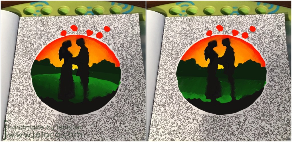
I instantly knew I wanted to put a sunset behind Buttercup and Westley and color their silhouettes in solid black. I wasn’t sure, however, if I wanted to mirror the sunset on the hills and have the lightest shades in the center, or if it would look better with the lightest greens to the front and the darker ones in the back.
I decided to pull a trick from my knitter’s handbook and swatch them! I took a clear image of the page and brought it into the Procreate app on my iPad so I could have a digital version to work with. Using the Apple pencil I roughly blocked in the black silhouettes and a quick sunset. I knew I wanted the bushes on the horizon to be dark as they would be backlit, so scribbled those in too. Then I copied the image so I’d have two to work from, and colored in the hills on each, reversing the color order. I quickly preferred the version on the left, so saved it as my reference sketch.
I’d also had the idea of possibly filling in the entire background of the roses page, so decided to test that too. I’m so glad I did as it would have been a TON of work and I really didn’t like the results. I’d also debated outlining the roses in gold and playing with the digital version allowed me to see that I DID like that, all without touching the original coloring page.
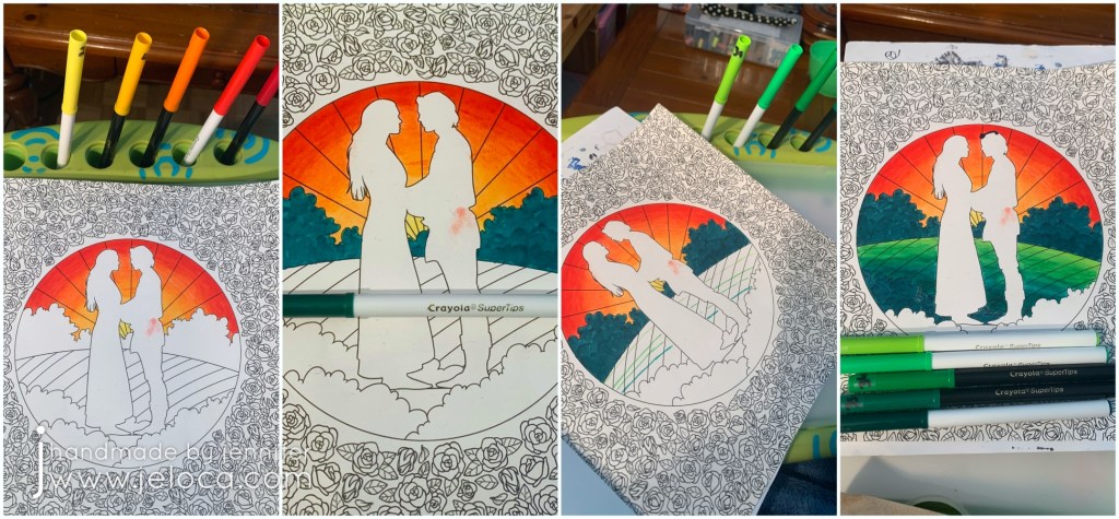
I chose 5 colors that would make a good sunset gradient and filled in the sunset first, blending the colors together.
Yes. I BLENDED the Crayola markers together! There will be a post coming up soon sharing the technique on how I did it, so stay tuned!
Once the sunset was in place I colored the horizon bushes. The same tip that allows the water-based markers to blend also allowed me to work multiple layers of marker to scribble leafy impressions into the bushes. I also used the same color on the foreground bushes just behind the couple.
Then, using 5 greens for the hills, I drafted out where each color would meet and then blended them in the same manner as the sky.
The final step for the page’s focal point was to color in Westley and Buttercup, and the remaining bit of foreground. Adding the black really made the other colors POP and I could not be happier with how the page was turning out.
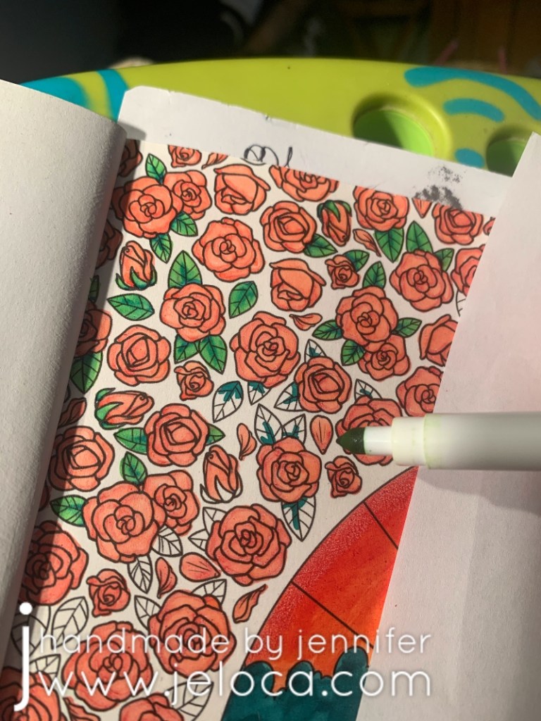
For the roses I started by using the same darkest red as for the sunset, to help tie them together. Every rose was completed in the same manner: first a quick outline over the outer edges of each petal and then filled in the rest with a paler pink marker. The end result, using the aforementioned technique, gives a result similar to that you’d get with alcohol markers, with the red and pink blending together to make a soft gradient.
For the leaves I chose the lightest and darkest of the greens from the hills and worked in a similar way as for the roses- first a quick hit of dark green along the spine and lower edge and then blended it out with a light green to fill in the rest of the leaf.
It was repetitive, but easy, and soon enough all the roses and leaves on both pages were complete.
This was the spread at that point. I quite liked it but it felt a bit unfinished. My initial idea was to color the entire background of the left page in black, but as the lettering is created by the voids between the roses the words would have become black as well and I didn’t really want that.
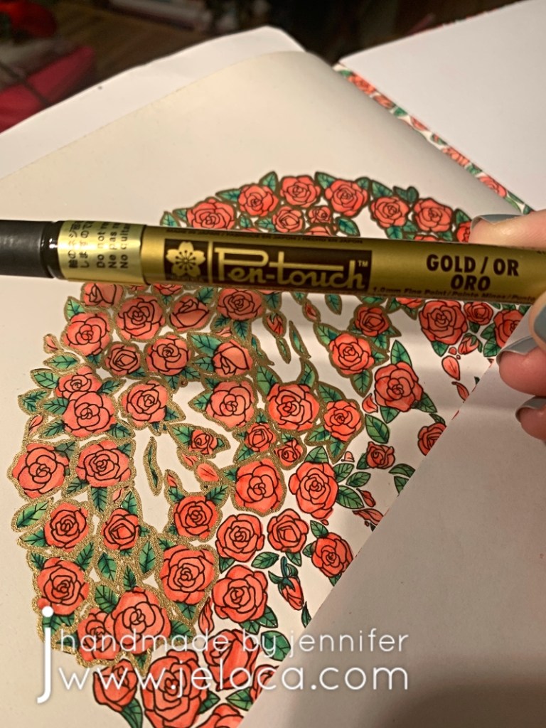
Thanks to my digital sketch I knew I liked the idea of a gold outline around each rose. It wasn’t quite filigree but gave me similar “gold-edged china teacup” vibes. I have a few sizes of Pen-Touch markers and the fine (1.0mm) point was perfect for this step.
The gold outline was the exact finishing touch it needed. When viewed directly (as the upper right of the page) the outline almost looks like a bolder black, throwing the wording into higher contrast. When viewed from an angle (as in the lower left) the metallic gold really shines and gives the romantic, antique feel I was going for.
To further tie the two pages together I added a gold outline to the circle using the same marker, and then both pages were complete.
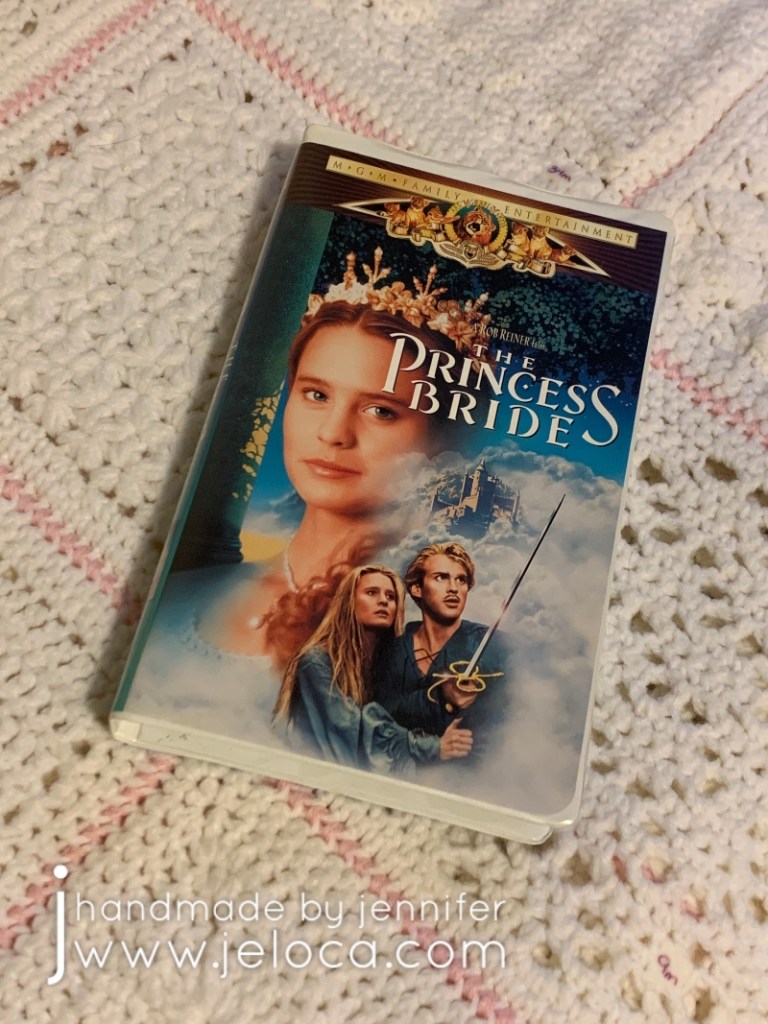
I’ve reviewed the quality of this book before but wanted to add one more time what a joy it’s been to work on. This movie has been a family classic since my childhood, with us spending many nights watching it by the fire, and all of us able to recite it nearly by heart. I’ve loved it enough to own the movie…
Can you count 6 fingers on the Count’s right hand?
I hadn’t known the coloring book existed so it was a real treat to receive from my brother for Hanukkah a few years ago. Not only does it hit my nostalgic feels but the paper quality is great, the images are a great mix of stills and graphic prints, and it holds up very well to a variety of media and can support mixed media. A very high recommend!
And finally, as the final bonus Princess Bride fact: When the weather was particularly cold, André the Giant would place his giant hand over Robin Wright’s head, covering it entirely and keeping her warm. (Source)
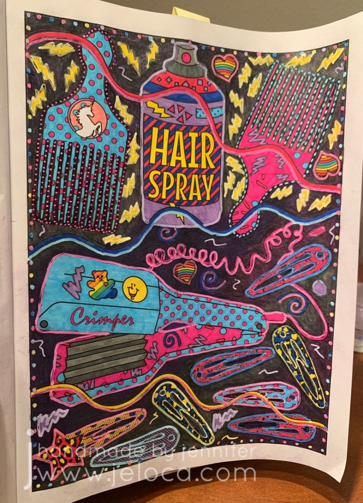
This past Tuesday (Aug 2nd) was National Coloring Book Day. I’d originally planned to celebrate and post by working on a new page from one of my books but I’m working on a major knitting project that is requiring my time and my hands. Therefore instead I’ll be sharing some completed pages that were part of a previous blog post series of mine – my 2019 19 WIP to FO Challenge.
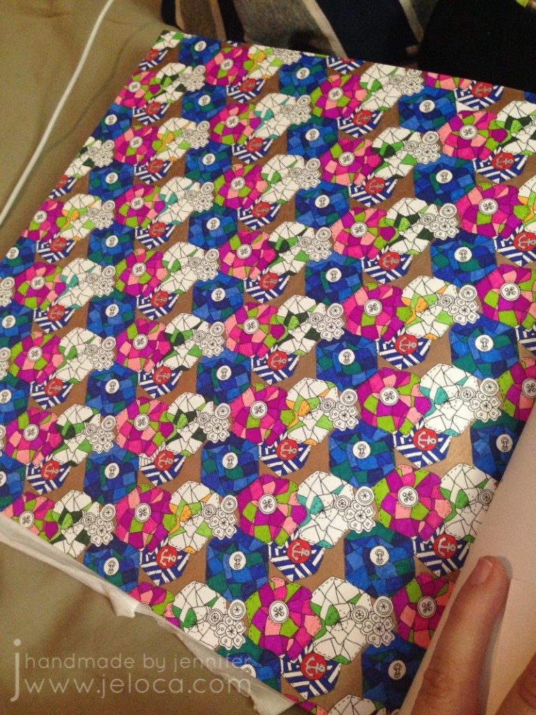
This page took nearly 3 years (!!) to complete, due to nothing but me putting it off forever. I’d started it on June 11 2016 and finally finished it on March 7 2019 making it one of the 19-for-2019 WIPs actually FO’d during 2019.
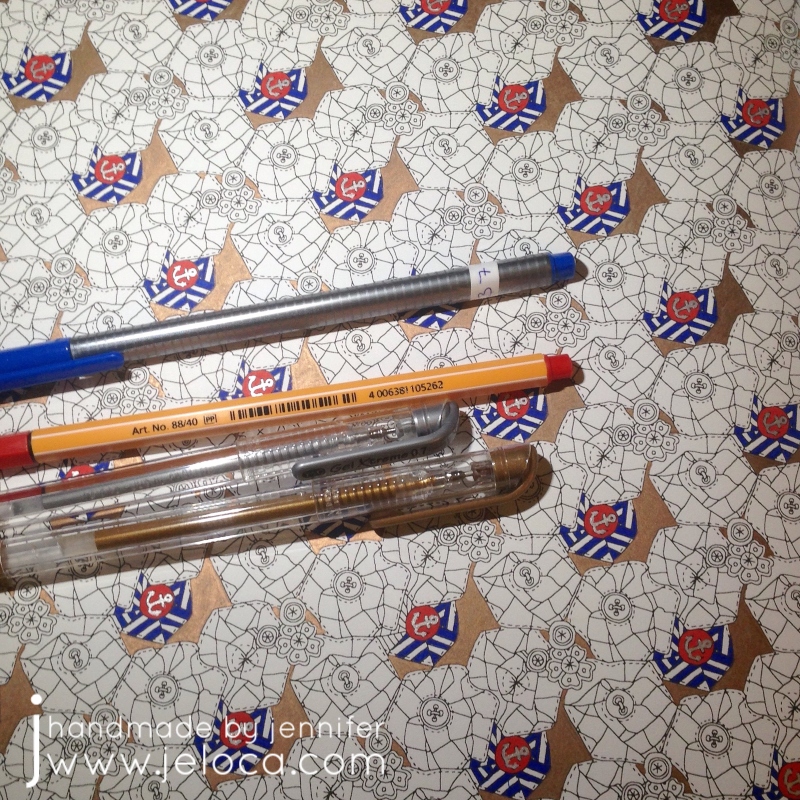
The small sections and tiny details of the page made it ideal for fineliners. Except for some metallic accents (using my favorite Gel Xtreme pens that have lasted for literal DECADES) the whole page was worked with Stabilo 88s and Staedler Triplus fineliners.
The quilt flower blocks repeat on a diagonal so I chose a different color palette for each row and worked the same 5 colors for each stripe but rotated clockwise once for each repeat. (IE: the color that was at 12 o’clock in the first repeat was used at 1 o’clock in the 2nd, and 2 o’clock in the 3rd, etc). This kept the coloring more interesting than coloring the same thing many, many times over.
And then I stopped with only one set of repeat left to go. No idea why, but as I’d kept the paper with my swatch notes it was easy to pull out the matching colors and get to work finally finishing it up.
I used the same colors for the matching quilt flowers in the main character’s hair on the facing page. I’d had the idea of coloring her the same through the whole book so left her uncolored until I was ready to tackle her on all the pages.
It’s a busy, chaotic mess but it’s finally done!
This post may contain affiliate links. This means I might make a small commission on purchases made through the links, at no cost to you.
It’s World Creativity and Innovation Day so today’s post is a round-up of previous posts that I feel incorporated some outside-of-the-box thinking!
Ever need to transfer live stitches to waste yarn but can’t find your tapestry needle? No problem! Here’s an easy way to “knit” the live stitches over so you can keep working on your project.
If you find standard provisional cast-ons too difficult, here’s a super easy way to get your knitting started. No extra tools required!
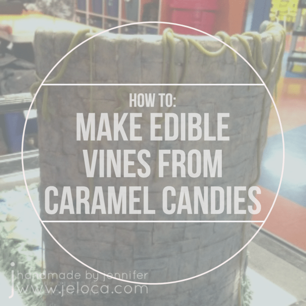
Here’s a neat trick for making thin vines/ropes for use in decorating your cakes or cupcakes. They’re flexible, stretchable, and edible!
Here’s a hands-free way to hold your coloring books open!
Not getting the look you want with colored pencils in your adult coloring books? Here’s a great way to add more tooth to the paper.
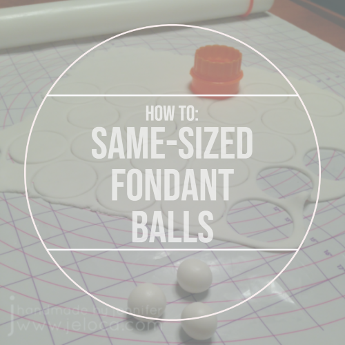
Are your fondant balls/pearls coming out all different sizes? Here’s a super easy hack to get identical ones, every time!
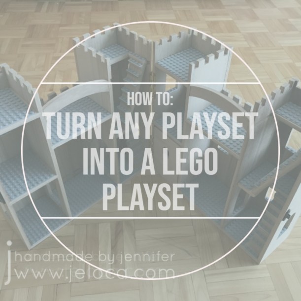
Here’s a simple way to give a plain toy new life and make it work with your LEGO pieces.
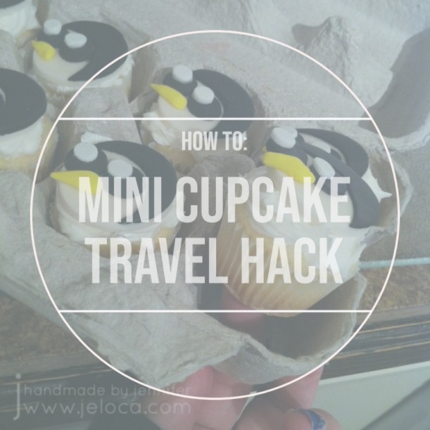
Finally, for when you want to provide homemade, individual snacks, here’s a free & easy way to transport mini cupcakes by repurposing something you’ve probably already got on hand.
Did you know that today, April 7, is National No Housework Day? As a crafter, I’m ALWAYS looking for reasons to get more time in with my hobbies, so avoiding housework to spend that time doing things I love sounds like a FANTASTIC idea.
I can’t pretend this is the only day I’ve ever put off housework in favor of a project or seven though… Most recently I took advantage of a lazy weekend afternoon to do some coloring and try out a new background technique in a coloring book page. If you’d like to celebrate the holiday today by doing the same, read on for more info!
I wanted the quick satisfaction of using markers and this page had just the right mix of small details and elements. This book is single-sided which is great as you don’t have to worry about ruining an image on the back of the page.
To make things even more mindless, I gave myself a limited color palette. I found an 80s-inspired palette of these 6 colors:
It was mindless, for sure, but I forgot that coloring is rarely quick! So I had no choice but to spend even more evenings avoiding housework.
Once all the small sections were complete all that remained was the background. It was too much to fill in with the markers so I reached for my Prismas instead.
First I filled in the entire background with a light gray (not shown). Then, using 3 colors that matched 3 of the marker colors, I went over the background again, doing large, irregular sections of color.
Next I went over the whole thing with a layer of black. My goal was to have the different shades give the black some dimension while subtly tying in the bright 80s tones.
The final step was to go over the entire background one last time, this time with my Derwent Burnisher. You can see the massive difference this makes in the image above – the background below the blue squiggle has been burnished, while the area above has not. There was no additional color applied; I merely flattened the layers of color using the burnishing pencil.
I really like how it turned out! It’s a silly, chaotic coloring book page but it was fun and I really enjoy the subtle depth the black background has by having the other colors underneath.
Looking back now I prefer the original background but at the time I’d felt it wasn’t bright enough to really SCREAM “80s”. I decided to outline everything (and also add random dots around the edge of the page for some reason…?) with a white Posca paint marker. These markers are great with colored pencils as they go over it beautifully without skipping, and once dry you can tint the paint with your markers or pencils.
To beat back the white glare I did just that. Using the same 6 Super Tips I went over the white paint to give every item an outline “glow”.
In the end I’m not mad at the final page (above), but I do prefer it pre-paint. That said, it was a lovely excuse to get out of housework for a bit and do something (relatively) mindless.
I hope you get to use today as an excuse to put down the vacuum or laundry and do something fun that makes you happy!
This post may contain affiliate links. This means I might make a small commission on purchases made through the links, at no cost to you.
A few weeks ago I shared some very old attempts of trying background washes in adult coloring books. Since that point I’ve been watching more Dede videos and reevaluating my supplies and my goals with these coloring pages. To that end, I went through some of my coloring books and chose new pages to try, this time with deliberate intent. Instead of using the washes to help me muster the urge to work on a particular page, now I was choosing pages I wanted to work on, and colors that would help me be happier with the eventual results.
Oh – and I learned from my mistakes – I was for sure going to be using acrylic paint this time.
The best paint to use for this is cheap acrylic paint. It’s matte, opaque but also thins well.
Acrylic paint is a plastic, which means it dries solid and won’t re-wet. This means you can use the same palette over and over, by either pulling off the dried paint or simply working right on top of your (thoroughly) dried paint.
I’ve been using old yogurt and margarine lids but recently started keeping takeout lids for the same purpose. If you have a paint caddy like mine, you can also use the lid as a palette.
I started with my Colours of Comfort coloring book, from my local Dollarama. My kids bought it for me as my Christmas present/stocking stuffer by sneaking it into my cart then making me turn around so they could hand it to the cashier. They then held the bag in the car and carried it into the house so they could get it into my stocking without seeing what they’d picked. (They paid me back later lol)
First up was this mandala-esque page. I picture it completed with golds and jewel tones, so gave the whole page a deep yellow wash.
Next I chose this tea party scene. I was taken with the idea of trying to make the cups look like porcelain, and gave the cups a gray wash so I could layer white pencil on top.
I forgot to take a before pic of this next one. I’m not usually one for landscape drawings, but this one caught my eye.
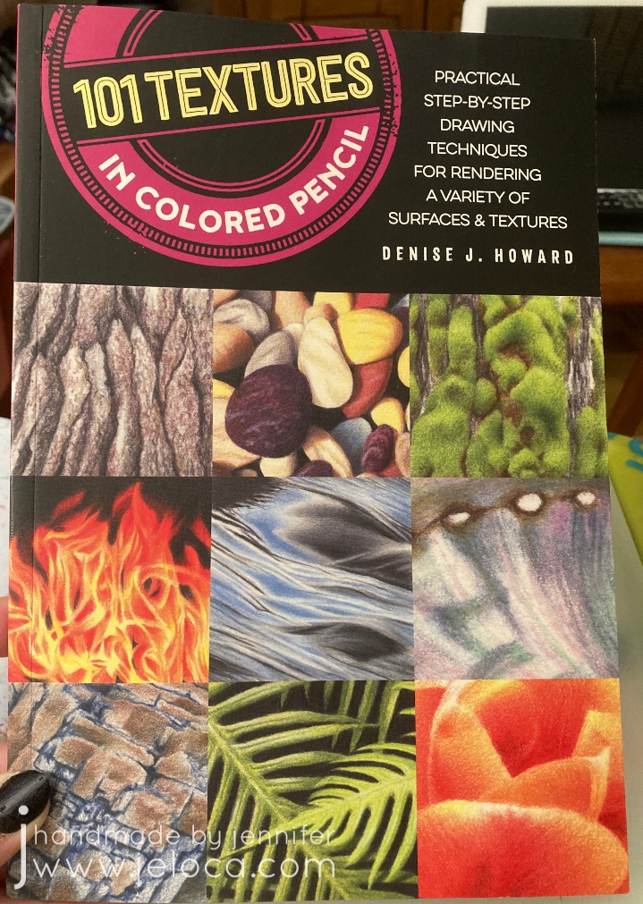
I like the idea of using my textures tutorial book and practicing some natural textures like the stones.
I’ve had this next coloring book for years, and barely touched it. The Mason-Dixon Knitting’s A Coloring Book for Knitters came out back in 2016 and is filled with fun, crafty images to color. While it’s a cute idea, it suffers from the same paper quality issue as most novelty coloring books, so as my media of preference changed, it limited what I was able to use.
It’s not bad…but it’s not strong enough for alcohol markers and not enough tooth for a good job with colored pencils.
I was really drawn to this winder & swift page. I painted the background with silver paint, hoping to get a vintage “mirrored” wallpaper look in the end, and plan to copy my own swift and winder’s color schemes.
From there I grabbed two of my favorite books to flip through.
Just like landscapes, flowers and plants are not usually my go-to either. Using paint makes me eager to work on these images now, though, and I chose the letters that represent the children in our family.
J and H are for my boys, and L, J and C are for my siblings’ children. Inspired by them all I chose colors that represent the respective children’s hair colors. C has dirty blonde hair and loves blue, so I added the sky (which I later regretted, and did not add in any of the others).
I couldn’t NOT go for a Link-looking character for Henri’s H, since my son is obsessed with The Legend of Zelda.
Jakob’s Jonquil Fairy will be blond just like him…
…and just like my niece L’s blonde curls.
None of these are complete, and none have yet gone past the painting stage, but even at this point I’m so much happier with them than I was with the last batch.
This post may contain affiliate links. This means I might make a small commission on purchases made through the links, at no cost to you.
I follow a number of incredible artists on YouTube and their work has inspired me often over the years. One such time was when I discovered the wonderful art done by Dede Wellingham. I’ve binged many of her livestreams and she’s as sweet and funny as she is talented (which is a lot).
The first video of hers that really got me revved up was “Color Washes in Imagimorphia AdultColor book by Kerby Rosanes Pt 1 of 3“. Adult coloring books were starting to become a big thing in the creative world (back in 2016) and something I’d come to late since I usually focused on fiber- or food-based arts. It hadn’t occurred to me to mix media in the ways Dede demonstrated and I could NOT WAIT to try it out. And I… well to say I missed the mark would be an understatement.
It started out so promising! I collected an assortment of my coloring books, some acrylic paint, my Neocolor II watercolor crayons and my Inktense water-soluble pencils (neither shown in pic).
Problem # 1 – using the wrong materials
Dede uses a number of media in her books, including pan pastels, paint, pencils, markers…but in particular the video that inspired me was based on using acrylic paint to drop in washes of color onto your pages. This has a two-fold effect: 1) it gets color down on the page and fills in the tiny detailed areas, making it easier and less intimidating (and faster) to color in with other media later, and 2) it creates an incredible base for colored pencil as adult coloring books are usually printed on paper that’s relatively smooth but pencils benefit enormously from a paper with more tooth. The acrylic paint gives the paper the missing tooth.
Neither the Neocolor IIs nor the Inktense are acrylic paint. Both of these can be used to add tooth to a page, but I’d diluted them so much that all I’d really managed to do was warp my paper and leave it remaining smooth once dried.
Looking back, even though I like some of the colors I’d chosen, I’m not happy with the results. I don’t like how all my random scribbles show because I hadn’t put the color down evenly, and I’m disappointed that I completely messed up on the entire “adding tooth” benefit.
Problem # 2 – using the right materialsthe wrong way
The remaining pages that I’d painted were all done with acrylic paint. That means they must be good, right? No, actually. Not at all. Some of them (the underwater ones in particular) look better in person than in the images below, but none of them are “good”, because I missed the mark again. I was so focused on getting a spread of color onto the page that I didn’t think I had to try and do it nicely. I’m embarrassed to admit it really didn’t occur to me that that it was more than a matter of simply splashing water into paint and wiping it across the page a few times. In most cases below I did a horrible application, and in the one or two that aren’t too bad, I used too much water and so the resulting color doesn’t have the tooth either. (And in the final case, I’d used much too much water and caused the marker on the reverse to completely bleed through).
(the next page that bled through to the one above)
Problem # 3 – choosing the wrong pages
I think this was the worst mistake I made out of all of them – I chose the wrong pages. With one exception, I’ve never really wanted to color ANY of the images above. Rather than pick pages that I looked forward to, instead I thought I could “cheat” my way into getting pages “done”, and done “faster” by slapping color down to make the final coloring quicker and easier. Instead I now have pages I still don’t want to do, just now they have some color on them.
So why am I bringing this up now? Well Dede’s videos have come back into my recommendeds and I’ve begun binging again, and once again am completely hooked. On THIS TIME I’ve learned from my mistakes!
This post may contain affiliate links. This means I might make a small commission on purchases made through the links, at no cost to you.
I’m not a big fan of New Year’s Resolutions. I personally don’t believe in waiting for a special day to start the changes we want to make, and numerous times I’ve made a public declaration of “this year I’ll ____” only to have my interest, enthusiasm or time dwindle until said thing is forgotten completely. My track record the last few years is spotty…I’ve completed a full year of the Create This Book challenge with Henri in 2020, but failed miserably at both my “19 for 19 WIP-to-FO” challenge in 2019 and my daily doodle self-promise in 2021.
So this year I’m not setting a resolution, but rather I’m choosing to make time for the things I want to achieve. In particular this year I want to focus on improving my drawing & coloring skills, so instead of forcing myself to do a set routine daily (which can become a chore) I’m going to simply allow myself to enjoy the process by doing what excites me.
Just before the holidays I’d discovered the YouTuber Sarah Renae Clark, thanks to a collab she did on Jazza’s art channel. I enjoyed their joint challenge so popped over to her channel to take a look and wound up binging a ton of tutorials, one of which prompted today’s post.
For those who don’t know, I do have a background and education/experience in drawing, painting, sculpture and the like as one of my degrees is in Creative Arts. Because I have a “professional” education I often get stuck in practice… feeling like I can’t just color something (for example) without “doing it right” and making sure it’s an accurate representation of my skill. It can be rewarding when the result matches my intent, but it sure puts a lot of pressure on when all I really want to do is chill on the couch with a cup of coffee and an adult coloring book! I’ve shown some pages I’ve colored here on the blog before but even those often feel inadequate for what I know I’m capable of, so improving my techniques in a way that makes them feel more natural has been a long-time desire.
I decided to follow the 5 steps myself, not as an abstract concept but in actual practice. I would select 5 coloring pages, designating one for each of the tips, and hopefully come out of the process feeling like I’d levelled up… even if only a little bit.
I rewatched the video and took notes on each step, and reviewed the extra info in her related blog post, then set about choosing pages that would be ideal for this purpose.
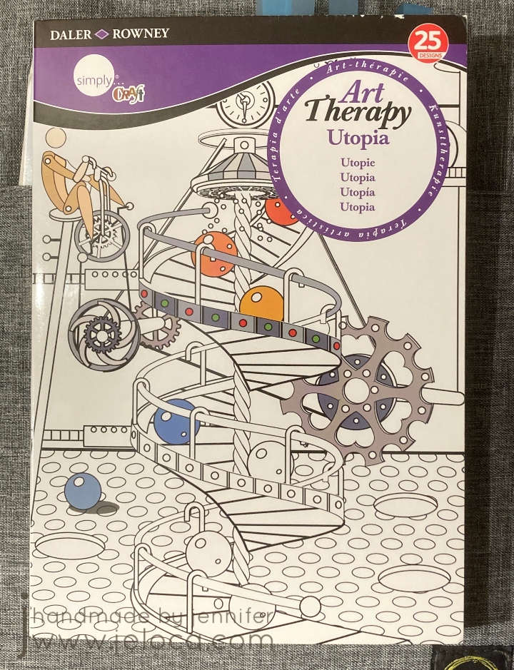
I went with 5 pages in my Daler*Rowney Art Therapy: Utopia book. I have 4 of these little books and they’re quite cute. I’ve worked in this book quite a bit already and while the subject is a bit quirky, I like that the book is small enough to not make each page take forever. (It’s only 5.75″ wide by 8.25″ high). Also, the pages are 1-sided, so I could use media that might bleed through. Bonus- this book series has a built-in page protector (the back cover folds out to go under the page you’re working on) which came in incredibly handy during this process.
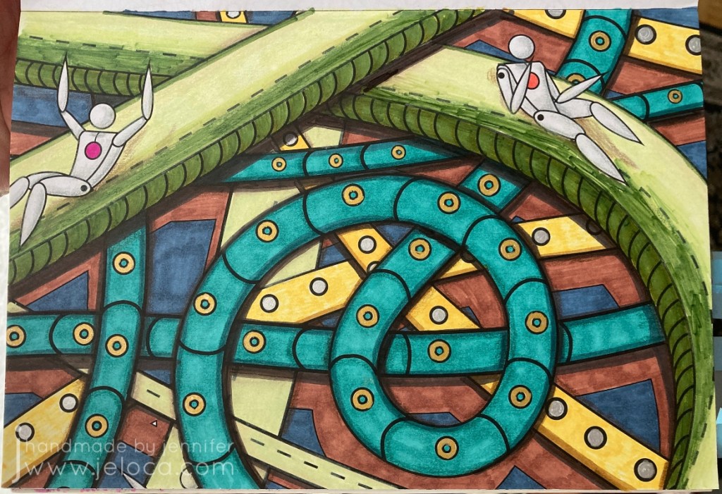
The first of the 5 steps Sarah lists is to incorporate shading and blending. I focused in particular on using shading to create depth, and so chose this “slide” page as I thought it would be easy to darken the lower layers and give a sense of perspective.
My plan was to give each page an underpainting with Spectrum Noir alcohol markers and then go back over it with Prismacolor Premiers for the shading and details.
With that in mind I colored the page. I started with bright colors for the slides to help bring them forwards visually and tried to pick darker ones so the background would recede. I also tend to default to using the same colors so I tried to pick ones I rarely reached for (which is why it’s so chaotic!).
In my head the lower levels would be full of shadows from the upper tubes and I was hoping it would get super dark, to where it almost looked like a really long drop. Unfortunately this was a case where I was unable to execute my vision.
This was after my first pass with the colored pencils. I quite like the shadows I added under each figure…but that’s about it. I don’t feel that any of the other shadows really work. I was able to make the teal tubes look round but I don’t get a sense of depth with any of the others, and I don’t find that the slides look concave at all.
Rather than continue to fuss with it in frustration, I took a break and moved on to coloring the under layer of the next image – the orange scene below. I was still intending on finishing all of the pages in pencil, but by the time I’d started coloring what was meant to be an underpaint on the 3rd image I realized the paper was handling the alcohol markers REALLY well, and that I was enjoying using them. I don’t reach for the Spectrum Noir’s too often because they bleed through most books (and most aren’t one-sided) so having an opportunity to put them to work was really enjoyable. There’s also a really big instant gratification difference in seeing large areas of color completed in minutes vs hours.
At this point I decided to come back and give the page one more go with my markers. This is the final result. Am I happy with it? No. Am I happier with it? Yes.
Mostly I’m happy that I tried. None of the 5 tips are particularly hard – in fact they’re called “easy” right in the title. And for the most part none were ones that I didn’t already know. The point of this exercise, to me, was to actually put them into practice. I did many art theory classes, I know light theory and shadow values and the difference between form shadows and cast shadows etc. But since I rarely apply those principles I don’t have the muscle memory to use them in the way I’d like (unlike something like knitting where my hands just know how to do things without much thought). Tip #1 showed me that this is something I need to work on, which is great because it gives me somewhere to focus and one day see improvement. 🙂
Tip #2 (actually tip 3 in the video & post but I worked out of order) is about incorporating black into your coloring pages. This can be large areas like backgrounds or by using a fineliner and adding details or extras to the page that weren’t there to begin with, like dots or designs in the background.
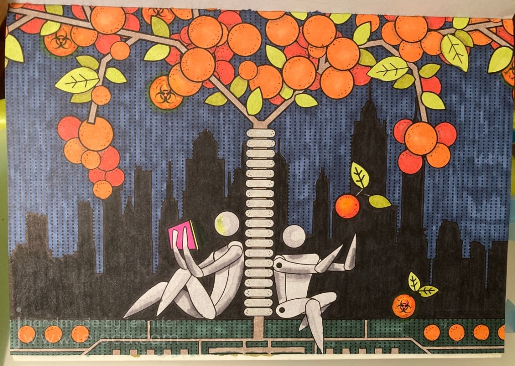
I admit I cheated a bit with this one! I forgot to take a pic before I started coloring, but except for the oranges, this is what the image looked like before I started coloring. The Matrix-esque dots in the sky were already there, and the city silhouette was just asking to be a solid black, so it didn’t take much work or thought on how to incorporate black into this image. Still, I liked it, and chose it for this particular challenge.
The circles felt like oranges to me so that’s what I went with for coloring. I used the same gray on the robots (androids?) as for the previous pic, and a Sharpie for the city. My markers are old so there was a bit of dry-down causing patches of lighter areas (especially visible in the green and blue areas) but it didn’t bother me enough to do a second layer.
Finally, I added a bit of shading (pulling in Tip #1) in the areas the oranges and branches overlapped, as well as some (failed) shading on the robots. I’m not happy with some of the placement nor how blocky it looks. I added a neon glow off the tablet and around the radioactive oranges, and boosted the black background with some colored pencil. The final touch to include a bit more black was to add fine Micron dots to represent the pitting in orange peels, and some faux screw-heads in the tree’s bumpers.
Overall I’m happier with this one than the previous, though I don’t think it has anything to do with the tip or my follow-through. I really do love the idea of not being afraid to make changes to your books, though, and hope to get comfortable enough to add characters and designs of my own to some of the pages with lesser detail.
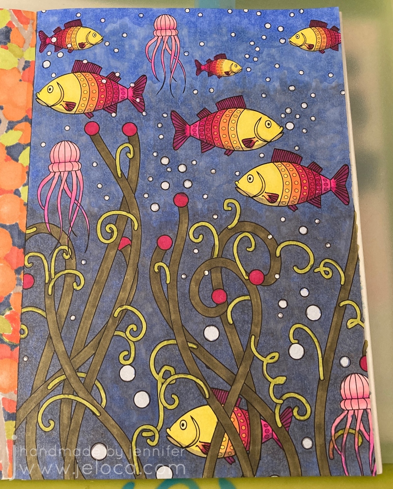
Tip #3 (really tip 2 in the video/post) is to add white for highlights. I’ve used this technique a bit but always been afraid to push it too far. So I chose this fish page deliberately so the bubbles in the water would give me plenty of reflective services to which I could add a shine.
Once again I forgot to take a pic before starting to color, oops. The jellyfish were quickly colored in shades of pink and for the fish I copied a color scheme I’d used on another occurrence of the same fish in the book. Trying to keep working the shading tip, I did add a slightly darker green on any of the intersections between layers of seaweed, but I’m not sure it’s visible in the finished image.
I wanted to give the background a gradient from lighter, closer-to-the-surface water up top down to murkier depths below. To achieve this I colored the background with 2 shades of gray; the first, darker one was applied to about 1/2 the page, and the second, lighter one filled in about 2/3 of what remained. I left the top 1/3 of the water area uncolored. I then went over the entire background with blue, coloring in small overlapping circles.
I outlined each bubble with a colorless blender. It didn’t remove the color completely but just enough to give each bubble a slight halo.
Finally I added highlights to the bubbles, jellyfish and fish with a Sigma Uniball UM-153 white gel pen. I don’t think the fish normally would have highlights but in my head they’re robotic just like all the people in the book. I also added some extra little white dots for oxygen bubbles coming up from each fish’s mouth as well as in the tangle of jellyfish legs.
Am I happy with it? Yes. I could have done better on blending the background and I wish my markers weren’t so old that the alcohol evaporated in patches causing the streaky look, but overall I’m quite happy with it, especially the shine on the fish. I could still use some practice though, and I think getting better at where to put the highlights will come hand-in-hand with getting better at where/how to place shadows.
Tip #4 (but actually #5 in the video/post) is to use a color palette when deciding what colors to pick. This is actually something I’ve struggled with sometimes, as I gravitate to the same colors that I like, and when I stray I can land in some weird territory (see: the slide pic above). You can find basic versions of color palettes available but Sarah offers her own and on a whim I decided to spring for it. I do so many different types of crafts, cakes, coloring, etc that having help for what colors look good together will only be an asset.
Once again I forgot to take a “before” pic until after I’d already started.
What a fantastic resource!
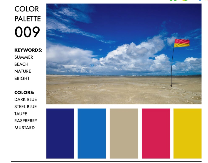
Her palettes are really well organized into clickable PDFs that you can search by keywords, themes or specific colors you want to use. I’d chosen this beach-looking scene as a test page, so I searched by “beach” keyword and decided to use palette #9 since it gave me options for the sand and water along with pops of color I could use for the umbrella and beach chair.
Something really fantastic about the Color Catalog is that she not only gives you the hex, RGB and CMYK color codes for each color in the palette, but there are also companion charts available that will tell you exactly which color she’s mapped to each from many of the most popular brands of pencils and markers. I was able to use the Spectrum Noir companion chart to find the exact SN color numbers and pull my markers without having to manually compare swatches to the samples. It’s really great!
This page probably took me the least amount of time to work on, but felt like the longest when coloring in each individual cell in the umbrella. Overall I’m pretty happy with this page. I didn’t add any white highlights and I’m not sure my laptop glow is in the right shape, but I am happy with the umbrella’s shadow on the ground and cutting across the stand (though looking back now I probably should have had the circle continue on the other side of the chair as well). Still further proof that my shading needs work. This seems to be a running theme!
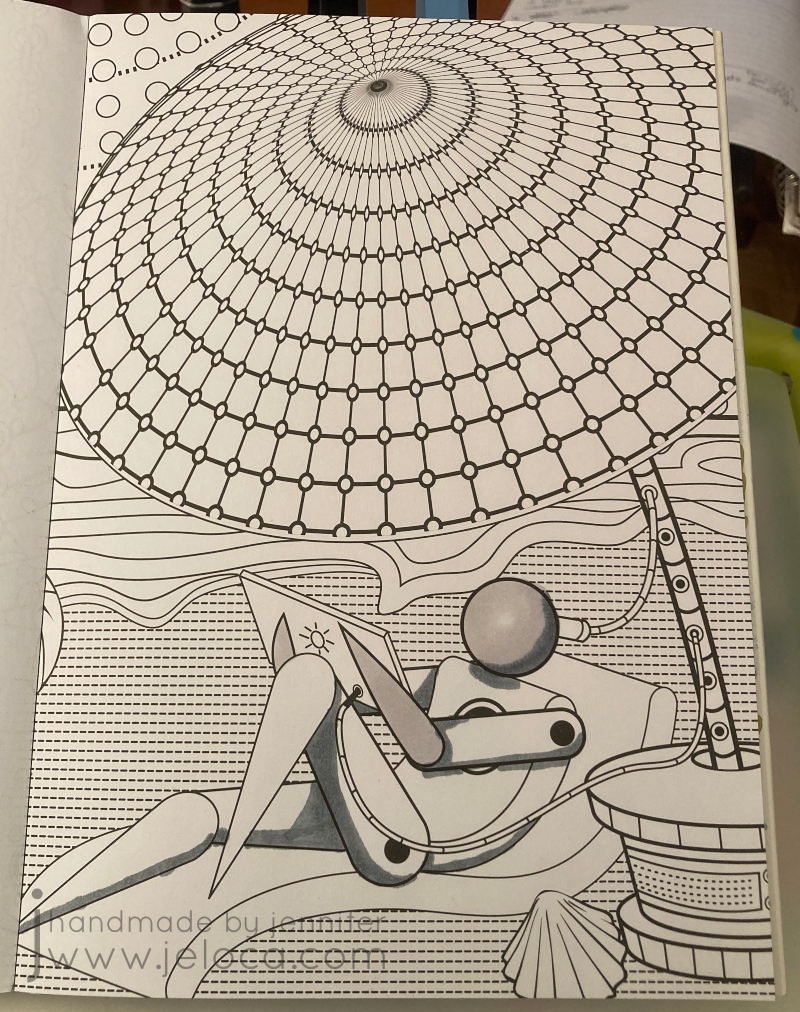
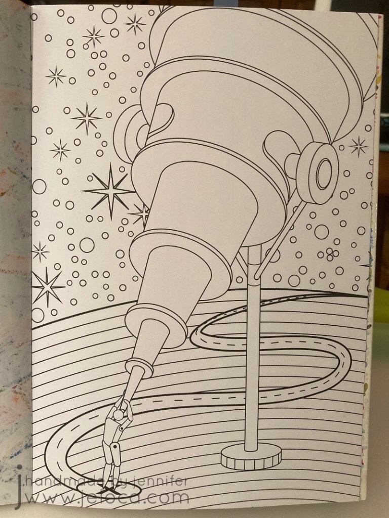
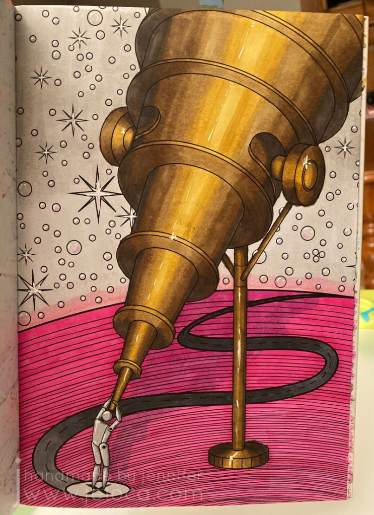
Finally, step 5 (the 4th step in the video/post) is to add textures to your page. I chose to use this telescope page for a very specific reason: it would give me a chance to practice with this texture book I bought SPECIFICALLY to help me color more realistically.
The book is fantastic, showing you how to replicate each texture in short, step-by-step blocks. The only problem was it didn’t include brass, which is the look I’d wanted for my telescope. D’oh! (It has hammered brass, but that’s not quite the same thing). I could have used the references for silver or pewter and simply changed the colors, but instead I decided to find a reference image.
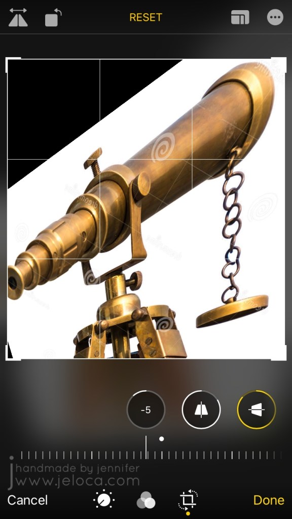
I could not find any telescope images in an upwards angle like the coloring page so I made one myself! I found a sample image of the exact antique brass look I wanted to go for, and saved it to my phone.
I then used my phone’s built-in photo editing tools to flip it and skew the angle until it was as close as possible to what I needed. It’s not perfect, but it’s definitely close and was a really big help as a reference.
I was really nervous about this one because I had such a specific idea in mind and I’ll admit I was worried I wouldn’t be able to execute it. I almost gave up and was going to pick a page to try out one of the other texture ideas (eye shadow) instead but I’m really, REALLY glad I didn’t. I LOVE how it turned out!
In fact, I was so happy with it that I decided to pull all 5 tips together into this one final image.
I went back to the Color Catalog to find a color palette that would work with the copper/bronze/brass colors I already had, and this one with the bright pop of pink really charmed me.
I really tried to make sure I used all 5 tips in this one. Texture? Check. Adding white? Yup- I added highlights throughout including some shine in the brightest areas of the telescope. Adding black? Oh yes – I added extra lines in diminishing circles in the planet to try and give it a sense of depth, with the lines being more concentrated closer to the viewer and moving further apart the further away they got. Color palette? Sure thing – I used only the colors listed. And finally for shadows I got creative and added the shadow from the telescope, although I wasn’t paying proper attention to the actual shape of the telescope and didn’t do the best job.
This was the finished result…and I just did not like it. I actually put it aside for a few days to think, because I was so happy with some parts but couldn’t help thinking it looked so incomplete. I debated adding some darker grays to the sky so they’d still be in the same family as the palette, but wasn’t sure I wanted that look. I was stumped. I’d followed the rules, and yet I wasn’t happy with the result. So what did that mean?
It meant that sometimes, it’s ok to break the rules. There are no coloring police! Plus Sarah’s tips are just that – tips and suggestions on how to improve your coloring results, that you are free to incorporate (or not) but they’re not hard and fast rules. She’s not saying “this is the ONLY way”, she’s saying “if you’re stuck, why not try this? It couldn’t hurt, and it might help!” And they did.
And not being limited meant I could come back to it later and add completely new colors into the background, to give it a sort of galaxy look that I didn’t even know I wanted until I’d achieved it and it was just perfect.
I went over the original gray with two shades of purple, blending them together where (I imagined) the planet’s light met the night sky. I also blended the main purple into the pink halo off the edge of the planet. I then traced over every start and (bubble? pearl?) with the white gel pen to remove their black outlines, and deepened the telescope’s shadow and refined it as best I could.
I am SO happy with the finished result! I’m really proud of this one, and really, really glad I embarked on this challenge.
I’m really glad I took the time to go back and rework something I wasn’t happy with. This makes me feel excited and hopeful about doing more coloring and testing and learning. And having gone through this exercise I can now pinpoint which areas need more refinement, and seek help for those things specifically (like improving my shading!!).
I think this was a great project to start off my year. If it’s something you might like to try for yourself, here are the links again to Sarah’s video and blog post. She’s got a TON of other videos and posts, and whether you’re a beginner, average or expert colorist, if you’re interested in adult coloring I definitely recommend checking her out.
This post may contain affiliate links. This means I might make a small commission on purchases made through the links, at no cost to you.
Today’s post is a little tip on how to use gel pens to get a special effect in your coloring book pages. In honor of Walt Disney’s birthday this week* I’ve used a page from my Art of Coloring: Disney Villains coloring book.
This is the original page. It’s slightly warped because on the back is a page I colored fully with my Inktense pencils and it was saturated over and over. While I do keep this book clipped shut (as shown in this post with my hanger tip) I’m still impressed at the thickness of the paper in this book. It’s definitely better than most of my coloring books!
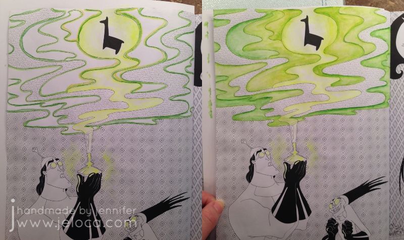
As with many of the coloring books based on movies and tv shows, the scenes in this book are often pulled directly from a still from the original source material. In this case you can see the above image is nearly an exact copy of the second image from the movie, below. It looks like the book artist added a background detail and the mist with the llama above in order to make it more interesting as a coloring page.
While I did use the still as a reference for the characters, I took creative liberties with the color of the potion as I wanted to see if I could achieve a glowing affect and thought the contrast with a yellow glow would stand out more than pink.
This is a super easy effect to achieve, and takes materials you’ve probably already got on-hand! All you really need is a gel pen in your desired bright color! I’ve also used a water brush for convenience, but you can swap in a regular paint brush and small cup of water and get the exact results.
You have to work fast so I wasn’t able to pause and take a step by step. Outline the area you want to have the glow, and then immediately while the gel pen ink is still wet, use a water brush or water-dampened paintbrush to blend out the gel ink.
The glow areas in this image are too large to do all at once as the gel would dry before I could get to it. So I worked in small sections, tracing just inside the lines of the swirl and blending the wet ink inwards. For the glasses and potion bottle I only traced on one side so there wouldn’t be too much ink. I then scribbled some of the ink on a piece of scrap cardstock (the shiny kind like used in consumer packaging) and diluted it with water to make a paint for the glow around the bottle.
That’s it! That gives a really cool glow effect that you can achieve super-simply, in almost any coloring project. To see the glow really pop, let’s finish coloring the page!
Switching to my beloved Inktense, I outlined the misty sections with a few shades of green. I didn’t record my colors but there was definitely #1400 (Apple Green) and I believe some #1520 (Hooker’s Green). If you look in the mist closest to the llama, you can also see some #0100 (Sherbet Lemon) to amplify the glow and pull the yellows into the mist.
With Inktense the rule is always “a little goes a long way” so I only needed the barest of color application to get the light wash you see in the image on the right. To blend out you can use a water brush or regular paintbrush with some water and moisten the drawn lines just like those old coloring pages in kids’ activity books.
Next I did the same for the background behind the mist, first filling it in with a super-light application of #2020 (Indian Ink) and then deepened up the borders with #2200 (Ink Black).
The main background first had a layer of the same Indian Ink followed by #750 (Dark Purple) since purple is the complementary color to green (opposite on the color wheel).
The last step was to finish the characters with a bit of #1800 (Baked Earth) and #1740 (Saddle Brown) for Kronk and #760 (Deep Violet) for Yzma, and #1210 (Dark Aquamarine) for the teal bits.
I love how this page came out! I’m continually impressed at the paper quality of this book. Having now done a fully water-saturated coloring on both sides of this same page, I’m amazed that there is no bleed-through or tearing. I love the bright glow of the gel pen against the ink, and especially the reflected glow in the goggle lenses.
I hope this tip helps you use your gel pens in new ways!
This post may contain affiliate links. This means I might make a small commission on purchases made through the links, at no cost to you.