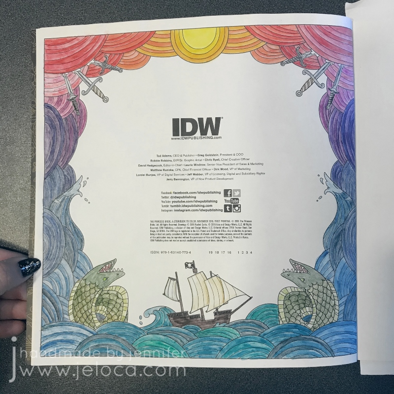
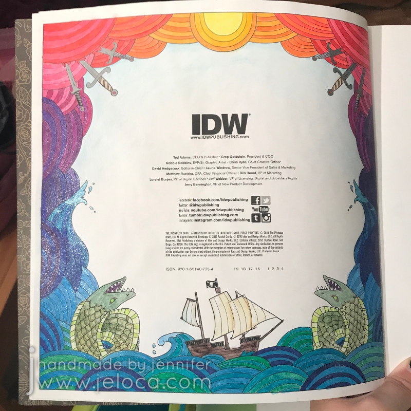
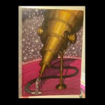
Another The Princess Bride Coloring Book longstanding work in progress has been completed! Originally blogged about here, this third Princess Bride Month post is actually the second coloring page in the book itself – the Copyright Info page.
As mentioned in the original post, my plan for the page was start at the sun in the center and work downwards. I used a few shades of yellow for the sun then started with the oranges, using the darkest color from each section as the palest in the next. So if the first section used colors A and B as ABABAB then the next section was BCBCBC, then CDCDCD, and so on. I’d planned the gradation deliberately timed so the blues would hit by the waves, then the teals/greens in the water.
This was all worked using the Derwent Inktense water-soluble ink pencils. You can activate the pencils as you complete each section but I love seeing the contrast between the dry and wetted inks so I’d waited until the entire page was colored before beginning to activate them. I use the Derwent water brushes for the larger areas and keep a blender marker in my water kit specifically for small areas that are easier with a marker point. You can use any alcohol marker brand’s colorless blender though I prefer to keep one in my kit solely for use with water-soluble pencils (and not also use it with markers). The one in my kit is Prismacolor colorless blender and I really like that it has both a bullet nib for fine details as well as a chisel tip in case I should need it.
Here is the full image after all the Inktense was activated.
It’s…okay but I wasn’t wowed by it. Rather than leave it be, I decided to put my gel pens to work. I have so many gel pens and they can start to dry out over time, so it was a fun challenge to put them to good use and match all the Inktense colors to my gel pen swatches.
I used the glitter gel pens from the Gelly Roll 6-pc Stardust collection, the larger (13) Stardust set from the Gelly Roll large pack, and the glitter selection from the Shuttle Art assorted gel pen set. Having a large variety helped me to find matching colors for all the Inktense, which was really great.
You can see the sparkly difference in the sun (above) and the waves (below).
Here’s the whole page complete. I only added accent glitter to the shrieking eels, and I didn’t put any on the ship.
Otherwise the entire page is COVERED in glitter and my inner magpie absolutely adores it!
Bonus: Every post this month will have a fun fact about the movie. This month’s little-know detail: Did you know there was almost a very different Fezzik? When the movie was originally planned to be made in the 1970s, a then-unknown Arnold Schwarzenegger was interested in playing the role. However by the time the movie was actually made he was too expensive to hire!(Source)
This post may contain affiliate links. This means I might make a small commission on purchases made through the links, at no cost to you.
This past Tuesday (Aug 2nd) was National Coloring Book Day. I’d originally planned to celebrate and post by working on a new page from one of my books but I’m working on a major knitting project that is requiring my time and my hands. Therefore instead I’ll be sharing some completed pages that were part of a previous blog post series of mine – my 2019 19 WIP to FO Challenge.
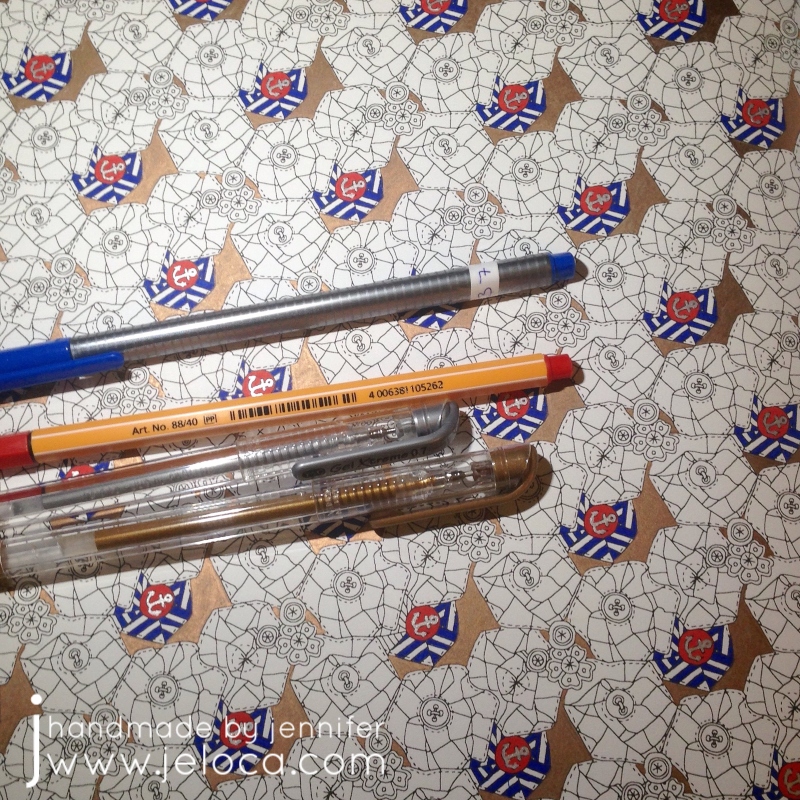
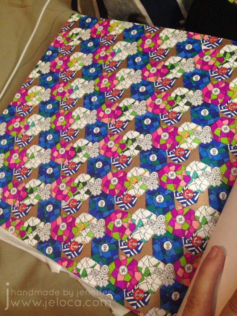
This page took nearly 3 years (!!) to complete, due to nothing but me putting it off forever. I’d started it on June 11 2016 and finally finished it on March 7 2019 making it one of the 19-for-2019 WIPs actually FO’d during 2019.
The small sections and tiny details of the page made it ideal for fineliners. Except for some metallic accents (using my favorite Gel Xtreme pens that have lasted for literal DECADES) the whole page was worked with Stabilo 88s and Staedler Triplus fineliners.
The quilt flower blocks repeat on a diagonal so I chose a different color palette for each row and worked the same 5 colors for each stripe but rotated clockwise once for each repeat. (IE: the color that was at 12 o’clock in the first repeat was used at 1 o’clock in the 2nd, and 2 o’clock in the 3rd, etc). This kept the coloring more interesting than coloring the same thing many, many times over.
And then I stopped with only one set of repeat left to go. No idea why, but as I’d kept the paper with my swatch notes it was easy to pull out the matching colors and get to work finally finishing it up.
I used the same colors for the matching quilt flowers in the main character’s hair on the facing page. I’d had the idea of coloring her the same through the whole book so left her uncolored until I was ready to tackle her on all the pages.
It’s a busy, chaotic mess but it’s finally done!
This post may contain affiliate links. This means I might make a small commission on purchases made through the links, at no cost to you.
I’m not a big fan of New Year’s Resolutions. I personally don’t believe in waiting for a special day to start the changes we want to make, and numerous times I’ve made a public declaration of “this year I’ll ____” only to have my interest, enthusiasm or time dwindle until said thing is forgotten completely. My track record the last few years is spotty…I’ve completed a full year of the Create This Book challenge with Henri in 2020, but failed miserably at both my “19 for 19 WIP-to-FO” challenge in 2019 and my daily doodle self-promise in 2021.
So this year I’m not setting a resolution, but rather I’m choosing to make time for the things I want to achieve. In particular this year I want to focus on improving my drawing & coloring skills, so instead of forcing myself to do a set routine daily (which can become a chore) I’m going to simply allow myself to enjoy the process by doing what excites me.
Just before the holidays I’d discovered the YouTuber Sarah Renae Clark, thanks to a collab she did on Jazza’s art channel. I enjoyed their joint challenge so popped over to her channel to take a look and wound up binging a ton of tutorials, one of which prompted today’s post.
For those who don’t know, I do have a background and education/experience in drawing, painting, sculpture and the like as one of my degrees is in Creative Arts. Because I have a “professional” education I often get stuck in practice… feeling like I can’t just color something (for example) without “doing it right” and making sure it’s an accurate representation of my skill. It can be rewarding when the result matches my intent, but it sure puts a lot of pressure on when all I really want to do is chill on the couch with a cup of coffee and an adult coloring book! I’ve shown some pages I’ve colored here on the blog before but even those often feel inadequate for what I know I’m capable of, so improving my techniques in a way that makes them feel more natural has been a long-time desire.
I decided to follow the 5 steps myself, not as an abstract concept but in actual practice. I would select 5 coloring pages, designating one for each of the tips, and hopefully come out of the process feeling like I’d levelled up… even if only a little bit.
I rewatched the video and took notes on each step, and reviewed the extra info in her related blog post, then set about choosing pages that would be ideal for this purpose.
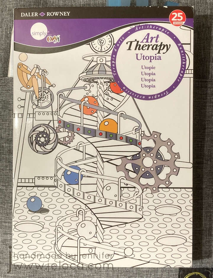
I went with 5 pages in my Daler*Rowney Art Therapy: Utopia book. I have 4 of these little books and they’re quite cute. I’ve worked in this book quite a bit already and while the subject is a bit quirky, I like that the book is small enough to not make each page take forever. (It’s only 5.75″ wide by 8.25″ high). Also, the pages are 1-sided, so I could use media that might bleed through. Bonus- this book series has a built-in page protector (the back cover folds out to go under the page you’re working on) which came in incredibly handy during this process.
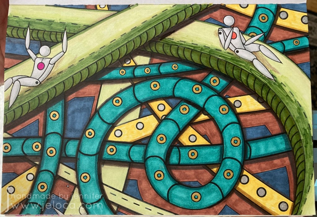
The first of the 5 steps Sarah lists is to incorporate shading and blending. I focused in particular on using shading to create depth, and so chose this “slide” page as I thought it would be easy to darken the lower layers and give a sense of perspective.
My plan was to give each page an underpainting with Spectrum Noir alcohol markers and then go back over it with Prismacolor Premiers for the shading and details.
With that in mind I colored the page. I started with bright colors for the slides to help bring them forwards visually and tried to pick darker ones so the background would recede. I also tend to default to using the same colors so I tried to pick ones I rarely reached for (which is why it’s so chaotic!).
In my head the lower levels would be full of shadows from the upper tubes and I was hoping it would get super dark, to where it almost looked like a really long drop. Unfortunately this was a case where I was unable to execute my vision.
This was after my first pass with the colored pencils. I quite like the shadows I added under each figure…but that’s about it. I don’t feel that any of the other shadows really work. I was able to make the teal tubes look round but I don’t get a sense of depth with any of the others, and I don’t find that the slides look concave at all.
Rather than continue to fuss with it in frustration, I took a break and moved on to coloring the under layer of the next image – the orange scene below. I was still intending on finishing all of the pages in pencil, but by the time I’d started coloring what was meant to be an underpaint on the 3rd image I realized the paper was handling the alcohol markers REALLY well, and that I was enjoying using them. I don’t reach for the Spectrum Noir’s too often because they bleed through most books (and most aren’t one-sided) so having an opportunity to put them to work was really enjoyable. There’s also a really big instant gratification difference in seeing large areas of color completed in minutes vs hours.
At this point I decided to come back and give the page one more go with my markers. This is the final result. Am I happy with it? No. Am I happier with it? Yes.
Mostly I’m happy that I tried. None of the 5 tips are particularly hard – in fact they’re called “easy” right in the title. And for the most part none were ones that I didn’t already know. The point of this exercise, to me, was to actually put them into practice. I did many art theory classes, I know light theory and shadow values and the difference between form shadows and cast shadows etc. But since I rarely apply those principles I don’t have the muscle memory to use them in the way I’d like (unlike something like knitting where my hands just know how to do things without much thought). Tip #1 showed me that this is something I need to work on, which is great because it gives me somewhere to focus and one day see improvement. 🙂
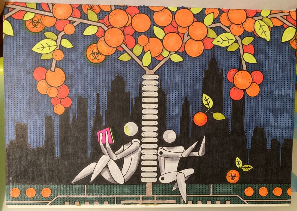
Tip #2 (actually tip 3 in the video & post but I worked out of order) is about incorporating black into your coloring pages. This can be large areas like backgrounds or by using a fineliner and adding details or extras to the page that weren’t there to begin with, like dots or designs in the background.
I admit I cheated a bit with this one! I forgot to take a pic before I started coloring, but except for the oranges, this is what the image looked like before I started coloring. The Matrix-esque dots in the sky were already there, and the city silhouette was just asking to be a solid black, so it didn’t take much work or thought on how to incorporate black into this image. Still, I liked it, and chose it for this particular challenge.
The circles felt like oranges to me so that’s what I went with for coloring. I used the same gray on the robots (androids?) as for the previous pic, and a Sharpie for the city. My markers are old so there was a bit of dry-down causing patches of lighter areas (especially visible in the green and blue areas) but it didn’t bother me enough to do a second layer.
Finally, I added a bit of shading (pulling in Tip #1) in the areas the oranges and branches overlapped, as well as some (failed) shading on the robots. I’m not happy with some of the placement nor how blocky it looks. I added a neon glow off the tablet and around the radioactive oranges, and boosted the black background with some colored pencil. The final touch to include a bit more black was to add fine Micron dots to represent the pitting in orange peels, and some faux screw-heads in the tree’s bumpers.
Overall I’m happier with this one than the previous, though I don’t think it has anything to do with the tip or my follow-through. I really do love the idea of not being afraid to make changes to your books, though, and hope to get comfortable enough to add characters and designs of my own to some of the pages with lesser detail.
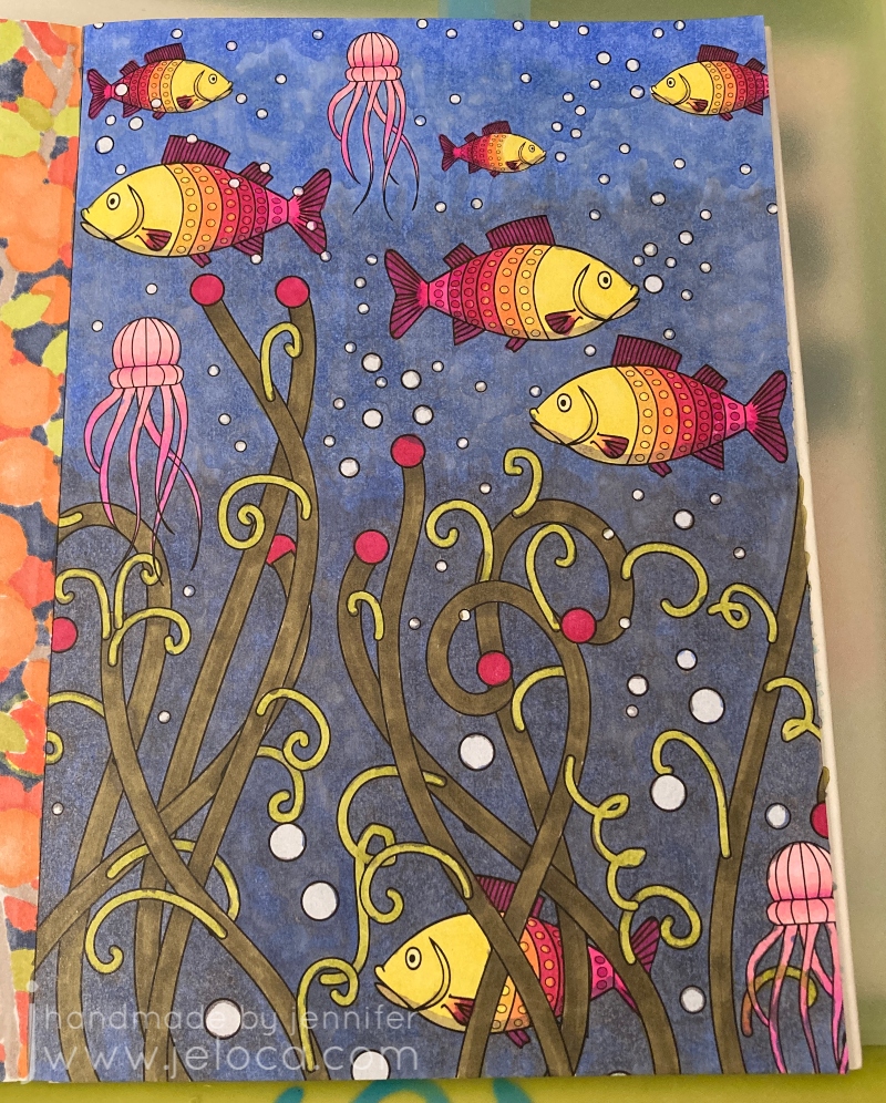
Tip #3 (really tip 2 in the video/post) is to add white for highlights. I’ve used this technique a bit but always been afraid to push it too far. So I chose this fish page deliberately so the bubbles in the water would give me plenty of reflective services to which I could add a shine.
Once again I forgot to take a pic before starting to color, oops. The jellyfish were quickly colored in shades of pink and for the fish I copied a color scheme I’d used on another occurrence of the same fish in the book. Trying to keep working the shading tip, I did add a slightly darker green on any of the intersections between layers of seaweed, but I’m not sure it’s visible in the finished image.
I wanted to give the background a gradient from lighter, closer-to-the-surface water up top down to murkier depths below. To achieve this I colored the background with 2 shades of gray; the first, darker one was applied to about 1/2 the page, and the second, lighter one filled in about 2/3 of what remained. I left the top 1/3 of the water area uncolored. I then went over the entire background with blue, coloring in small overlapping circles.
I outlined each bubble with a colorless blender. It didn’t remove the color completely but just enough to give each bubble a slight halo.
Finally I added highlights to the bubbles, jellyfish and fish with a Sigma Uniball UM-153 white gel pen. I don’t think the fish normally would have highlights but in my head they’re robotic just like all the people in the book. I also added some extra little white dots for oxygen bubbles coming up from each fish’s mouth as well as in the tangle of jellyfish legs.
Am I happy with it? Yes. I could have done better on blending the background and I wish my markers weren’t so old that the alcohol evaporated in patches causing the streaky look, but overall I’m quite happy with it, especially the shine on the fish. I could still use some practice though, and I think getting better at where to put the highlights will come hand-in-hand with getting better at where/how to place shadows.
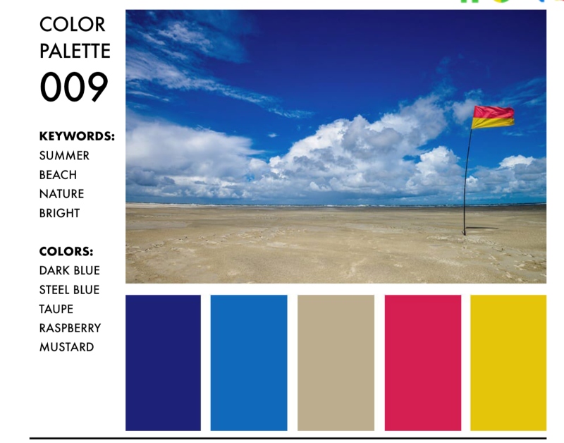
Tip #4 (but actually #5 in the video/post) is to use a color palette when deciding what colors to pick. This is actually something I’ve struggled with sometimes, as I gravitate to the same colors that I like, and when I stray I can land in some weird territory (see: the slide pic above). You can find basic versions of color palettes available but Sarah offers her own and on a whim I decided to spring for it. I do so many different types of crafts, cakes, coloring, etc that having help for what colors look good together will only be an asset.
Once again I forgot to take a “before” pic until after I’d already started.
What a fantastic resource!
Her palettes are really well organized into clickable PDFs that you can search by keywords, themes or specific colors you want to use. I’d chosen this beach-looking scene as a test page, so I searched by “beach” keyword and decided to use palette #9 since it gave me options for the sand and water along with pops of color I could use for the umbrella and beach chair.
Something really fantastic about the Color Catalog is that she not only gives you the hex, RGB and CMYK color codes for each color in the palette, but there are also companion charts available that will tell you exactly which color she’s mapped to each from many of the most popular brands of pencils and markers. I was able to use the Spectrum Noir companion chart to find the exact SN color numbers and pull my markers without having to manually compare swatches to the samples. It’s really great!
This page probably took me the least amount of time to work on, but felt like the longest when coloring in each individual cell in the umbrella. Overall I’m pretty happy with this page. I didn’t add any white highlights and I’m not sure my laptop glow is in the right shape, but I am happy with the umbrella’s shadow on the ground and cutting across the stand (though looking back now I probably should have had the circle continue on the other side of the chair as well). Still further proof that my shading needs work. This seems to be a running theme!
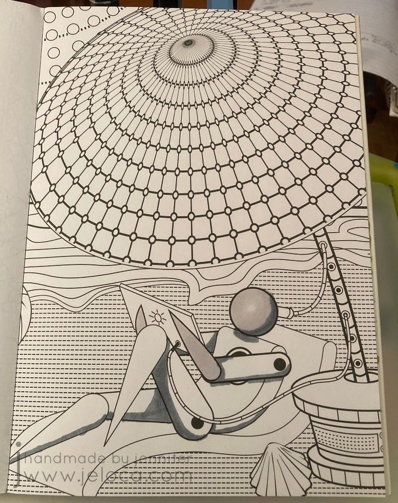
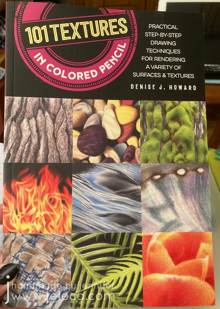
Finally, step 5 (the 4th step in the video/post) is to add textures to your page. I chose to use this telescope page for a very specific reason: it would give me a chance to practice with this texture book I bought SPECIFICALLY to help me color more realistically.
The book is fantastic, showing you how to replicate each texture in short, step-by-step blocks. The only problem was it didn’t include brass, which is the look I’d wanted for my telescope. D’oh! (It has hammered brass, but that’s not quite the same thing). I could have used the references for silver or pewter and simply changed the colors, but instead I decided to find a reference image.
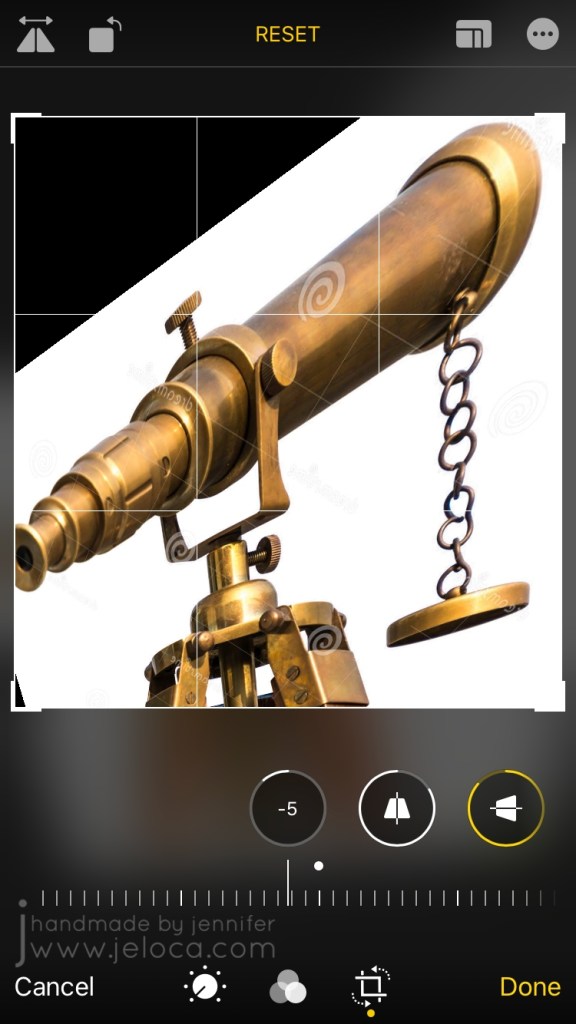
I could not find any telescope images in an upwards angle like the coloring page so I made one myself! I found a sample image of the exact antique brass look I wanted to go for, and saved it to my phone.
I then used my phone’s built-in photo editing tools to flip it and skew the angle until it was as close as possible to what I needed. It’s not perfect, but it’s definitely close and was a really big help as a reference.
I was really nervous about this one because I had such a specific idea in mind and I’ll admit I was worried I wouldn’t be able to execute it. I almost gave up and was going to pick a page to try out one of the other texture ideas (eye shadow) instead but I’m really, REALLY glad I didn’t. I LOVE how it turned out!
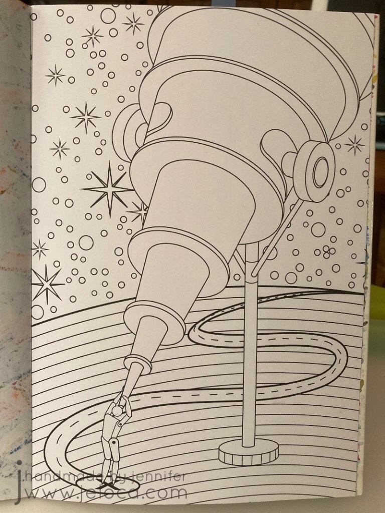
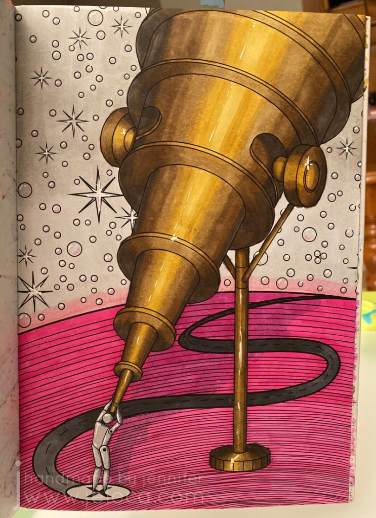
In fact, I was so happy with it that I decided to pull all 5 tips together into this one final image.
I went back to the Color Catalog to find a color palette that would work with the copper/bronze/brass colors I already had, and this one with the bright pop of pink really charmed me.
I really tried to make sure I used all 5 tips in this one. Texture? Check. Adding white? Yup- I added highlights throughout including some shine in the brightest areas of the telescope. Adding black? Oh yes – I added extra lines in diminishing circles in the planet to try and give it a sense of depth, with the lines being more concentrated closer to the viewer and moving further apart the further away they got. Color palette? Sure thing – I used only the colors listed. And finally for shadows I got creative and added the shadow from the telescope, although I wasn’t paying proper attention to the actual shape of the telescope and didn’t do the best job.
This was the finished result…and I just did not like it. I actually put it aside for a few days to think, because I was so happy with some parts but couldn’t help thinking it looked so incomplete. I debated adding some darker grays to the sky so they’d still be in the same family as the palette, but wasn’t sure I wanted that look. I was stumped. I’d followed the rules, and yet I wasn’t happy with the result. So what did that mean?
It meant that sometimes, it’s ok to break the rules. There are no coloring police! Plus Sarah’s tips are just that – tips and suggestions on how to improve your coloring results, that you are free to incorporate (or not) but they’re not hard and fast rules. She’s not saying “this is the ONLY way”, she’s saying “if you’re stuck, why not try this? It couldn’t hurt, and it might help!” And they did.
And not being limited meant I could come back to it later and add completely new colors into the background, to give it a sort of galaxy look that I didn’t even know I wanted until I’d achieved it and it was just perfect.
I went over the original gray with two shades of purple, blending them together where (I imagined) the planet’s light met the night sky. I also blended the main purple into the pink halo off the edge of the planet. I then traced over every start and (bubble? pearl?) with the white gel pen to remove their black outlines, and deepened the telescope’s shadow and refined it as best I could.
I am SO happy with the finished result! I’m really proud of this one, and really, really glad I embarked on this challenge.
I’m really glad I took the time to go back and rework something I wasn’t happy with. This makes me feel excited and hopeful about doing more coloring and testing and learning. And having gone through this exercise I can now pinpoint which areas need more refinement, and seek help for those things specifically (like improving my shading!!).
I think this was a great project to start off my year. If it’s something you might like to try for yourself, here are the links again to Sarah’s video and blog post. She’s got a TON of other videos and posts, and whether you’re a beginner, average or expert colorist, if you’re interested in adult coloring I definitely recommend checking her out.
This post may contain affiliate links. This means I might make a small commission on purchases made through the links, at no cost to you.
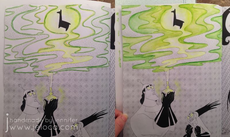
Today’s post is a little tip on how to use gel pens to get a special effect in your coloring book pages. In honor of Walt Disney’s birthday this week* I’ve used a page from my Art of Coloring: Disney Villains coloring book.
This is the original page. It’s slightly warped because on the back is a page I colored fully with my Inktense pencils and it was saturated over and over. While I do keep this book clipped shut (as shown in this post with my hanger tip) I’m still impressed at the thickness of the paper in this book. It’s definitely better than most of my coloring books!
As with many of the coloring books based on movies and tv shows, the scenes in this book are often pulled directly from a still from the original source material. In this case you can see the above image is nearly an exact copy of the second image from the movie, below. It looks like the book artist added a background detail and the mist with the llama above in order to make it more interesting as a coloring page.
While I did use the still as a reference for the characters, I took creative liberties with the color of the potion as I wanted to see if I could achieve a glowing affect and thought the contrast with a yellow glow would stand out more than pink.
This is a super easy effect to achieve, and takes materials you’ve probably already got on-hand! All you really need is a gel pen in your desired bright color! I’ve also used a water brush for convenience, but you can swap in a regular paint brush and small cup of water and get the exact results.
You have to work fast so I wasn’t able to pause and take a step by step. Outline the area you want to have the glow, and then immediately while the gel pen ink is still wet, use a water brush or water-dampened paintbrush to blend out the gel ink.
The glow areas in this image are too large to do all at once as the gel would dry before I could get to it. So I worked in small sections, tracing just inside the lines of the swirl and blending the wet ink inwards. For the glasses and potion bottle I only traced on one side so there wouldn’t be too much ink. I then scribbled some of the ink on a piece of scrap cardstock (the shiny kind like used in consumer packaging) and diluted it with water to make a paint for the glow around the bottle.
That’s it! That gives a really cool glow effect that you can achieve super-simply, in almost any coloring project. To see the glow really pop, let’s finish coloring the page!
Switching to my beloved Inktense, I outlined the misty sections with a few shades of green. I didn’t record my colors but there was definitely #1400 (Apple Green) and I believe some #1520 (Hooker’s Green). If you look in the mist closest to the llama, you can also see some #0100 (Sherbet Lemon) to amplify the glow and pull the yellows into the mist.
With Inktense the rule is always “a little goes a long way” so I only needed the barest of color application to get the light wash you see in the image on the right. To blend out you can use a water brush or regular paintbrush with some water and moisten the drawn lines just like those old coloring pages in kids’ activity books.
Next I did the same for the background behind the mist, first filling it in with a super-light application of #2020 (Indian Ink) and then deepened up the borders with #2200 (Ink Black).
The main background first had a layer of the same Indian Ink followed by #750 (Dark Purple) since purple is the complementary color to green (opposite on the color wheel).
The last step was to finish the characters with a bit of #1800 (Baked Earth) and #1740 (Saddle Brown) for Kronk and #760 (Deep Violet) for Yzma, and #1210 (Dark Aquamarine) for the teal bits.
I love how this page came out! I’m continually impressed at the paper quality of this book. Having now done a fully water-saturated coloring on both sides of this same page, I’m amazed that there is no bleed-through or tearing. I love the bright glow of the gel pen against the ink, and especially the reflected glow in the goggle lenses.
I hope this tip helps you use your gel pens in new ways!
This post may contain affiliate links. This means I might make a small commission on purchases made through the links, at no cost to you.
Today, September 14th, is National Coloring Day. Of course coloring isn’t limited to coloring books, but over the last few years they’ve definitely become more prevalent! Whether they’re your preferred place to apply color or something you only do with kids, you’ve likely noticed that the paper quality can vary greatly. From thick cardstock to what’s basically printer paper, the type of paper will affect everything from what media you can use in the book to if you can actually color both sides of the same page.
On average, most adult coloring books use a slightly thicker-weight white paper that can handle all dry media as well as water-based markers, with some bleed-through if you press too hard or go over the same spot repeatedly. Crayons and colored pencils will lay down pretty evenly as the paper has little-to-no tooth, but if you’re the kind of artist who prefers to work with a more textured paper, here’s a tip that can help transform the books you already own – sandpaper!
I’ll demonstrate this in my copy Archie’s Coloring Book (and there’s a video demonstration at the end of the post).
This is a great book that is jam-packed with tons of images of Archie and the gang, showcasing everyone from the core trio to side characters (Dilton, Moose, Cheryl, Sabrina, Josie and the Pussycats, Miss Grundy, Mr. Weatherbee), to the ‘Lil Archie gang. Even Jughead’s dog Hotdog appears in all his shaggy glory!
I first thought about this back in 2017 after watching one of SuperRaeDizzle’s videos on dollar store art supplies. If you don’t follow her you really should – she’s a fantastic artist who does a lot of art supply reviews and draws/paints with incredible realism. In the linked video she uses a sanding block to rough up a sheet of inexpensive Bristol board to give it a better drawing surface.
I thought it was really cool but didn’t think it applied to me – until I started wondering if the same technique would work in what I was using a lot of at the time – coloring books. In theory it seemed like it should work but with the paper so much thinner than Bristol board I didn’t know if it would work. Would it tear the paper? Would it destroy the printed outlines? Would the ink bleed?
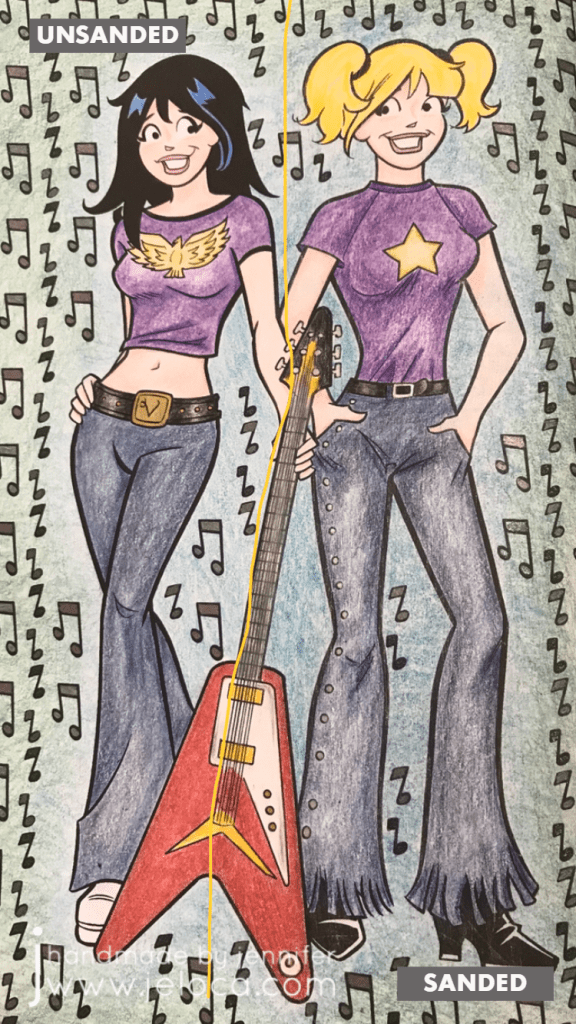
I had to try it for myself. To make the results as clear as possible I chose a page that allowed me to clearly divide the page into two halves.
I left the Veronica side of the page untouched and sandpaper I had on-hand to lightly rough up the Betty side of the page.
Here you can see the before (left) and after (right). There’s no obvious distress to the page though if you look closely at the black line of Betty’s shirt near the guitar you can see faint striae where the ink was removed.
To hold the book open while I worked I used my pants hanger hack. Still highly recommend!
I then set about coloring the page with Faber-Castell Polychromos colored pencils. I was careful to color in both girls the same way, using the same colors and applying the same amount of pressure.
Right away you can see a difference! Coloring on the Veronica side was exactly like coloring with colored pencils on computer printer paper (though I think this paper is slightly thicker). It’s super smooth and flat without any tooth or texture at all, and the colored pencil glided over the page really easily. On the Betty side I could feel the roughened-up surface of the page and it gave the colored pencil something to grab to, making coloring a very different experience.
It’s difficult to put the feeling into words but coloring the Veronica side felt like I had to concentrate more, because my natural tendency was to use more pressure to get more color payoff, whereas on the Betty side the same amount of barely-there pressure gave a richer color payoff.
Coloring on the super-smooth side made me very conscious of trying to not color too hard because it took more work to lay color down. On the flip side, coloring on the textured side of the page made color application a breeze, to the point where I had to concentrate on not applying too much and losing any highlights.
Both sides are colored the exact same way, using different colors for shading. I didn’t want to do anything too fancy because this was only a test; it was more about seeing if the sandpaper would ruin the book or any attempts to color vs me trying to get a professional-looking result.
I’d sanded the guitar evenly down the middle and thought there would be a more obvious difference between the two sides but I’d say it’s pretty subtle. Again- the sanded side has more depth and more color payoff while using the exact same pressure as the unsanded side.
I was also curious if sanding the paper would affect marker application, so decided to fill in the music notes with a mix of sparkle and metallic gel pens, in black and charcoal. I was really happy to see that there didn’t seem to be any effect on how the gel ink applied, and that both sides had the same amount of glitter and shine in the light.
Finally I wanted to see if there would be any issues coloring on larger open areas, so I picked two colors and experimented with blending them to each other. In my first layer of color (2nd image from the left) you can see that both sides are streaky but the funny thing is it’s for different reasons!
Veronica’s side is streaky because I struggle with laying down barely any color…though I probably didn’t have a proper point on my pencil, which didn’t help. Whereas Betty’s side is streaky because that’s the grain from the direction I’d sanded. You can see it better in the image below (though I sort of like the streaky look on her jeans because it makes them look more like real denim LOL)
The last test that I did was to compare the difference that burnishing would make on either side. I went over both sides of the guitar with my beloved Prismacolor Premiere colorless blender and really tried to smooth any grain down and move the color to fill any remaining white areas. I have the page open in front of me as I type this and while my fingertip can tell the difference between the two sides it is SLIGHT, and definitely not as much of a contrast as the rest of the page halves.
(And truthfully I’m not completely convinced that I’d feel a texture difference there at all if I hadn’t sanded too hard in that spot, as you can see by the diagonal lines of indentation on the lower right of the guitar)
Here’s the completed page. If I didn’t know that one side had been sanded I would think that I’d colored harder on the right side, and possibly used a different color for Betty’s jeans and background, as I do feel that there’s a visible difference in this closeup.
I don’t find the difference is as obvious in this image, though I’m not sure if it’s because the black background is causing a distraction.
After trying this once I’m a convert! I have a large collection of coloring books and I think this technique opens up a world of possibilities for getting different effects and results with colored pencils, crayons, and pastels. The opportunities expand even further if you experiment with different grits of sandpaper!
Imagine coloring a fantasy scene and sanding a grassy area with one grade of sandpaper, bricks of a castle with another, and the bark of a tree with a third… you could get a whole range of textural effects within the image all before even laying down any color!
Other notes: in the video below you’ll see a little bit of ink smearing. That was due to pressing too hard with the sandpaper, so it’s avoidable but something to watch out for. I was happy to see that there was no consequence to the back of the sanded page, nor any texture transfer on the facing page.
Here’s a graphic for those of you who like to pin my posts, and as promised above, here below is a video showing this technique in action.
This post may contain affiliate links. This means I might make a small commission on purchases made through the links, at no cost to you.
After finishing the Sierra Socks last week I immediately cast on for a new pair. It wasn’t so much that I needed new knitting as I needed new knitting to be ready ‘on hold’ in my purse in case I ever needed it in the future. Except for very few exceptions, I knit all my socks toe-up, with a short-row heel and toe, from a pattern I’ve long-since memorized. I’ll refer to past project notes to know how many stitches to work up to depending on if it’s a sock for Yannick or for myself, but otherwise the rest of it is pretty much pick-up-and-go. I knit without looking so the only parts of the sock that require my attention are the toe and heel. For that reason, I like to knit the toe before I stash it away in my project bag, so it’s ready at the ‘just knit’ part.
(I’m still loving the personalized travel knitting bag Maaike made for me!)
This sock is going to be an experiment. I’m using Regia Softy Color yarn that I got at a guild stash exchange a year or so ago, and I’m going to be knitting a heel-less sock. I get cold at night so I sleep with socks on, usually fuzzy ones from the dollar store. But then I get hot so I kick them off… and then my toes get cold again so I put them back on. A happy middle ground has been to push my socks off down to the pads of my feet, so my heels are exposed to the cool sheets but my toes are still kept warm. Therefore I’m going to see if a heel-less sock gives me the same effect. If it does, it’ll be a fun way to work through my fun-fur stash.
Coloring
Creative Coloring Throughout the Year page-a-day calendar
Some mornings after getting the kids off for school I got a chance to do some coloring. I don’t have any need to get the calendar pages ‘right’ in any way, so it was fun to pull out a bunch of coloring supplies and just apply color to the pages. I’m usually a lot more strict on myself when it comes to color placement… or adding highlights or shadow… whereas with these pages I’m not giving myself any restrictions to match any preconceived notions of what the resulting pages ‘should’ look like.
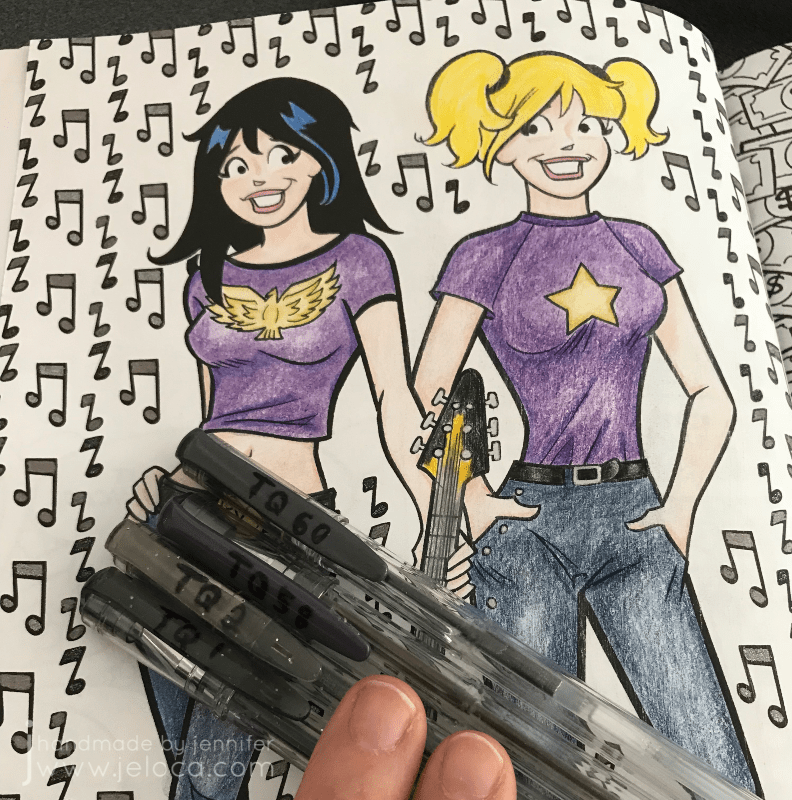
While I was at it I finished swatching my latest batch of gel pens – a 60-count set by Top Quality that I got on Amazon. There were a few duplicate colors to ones I already had, but also a lot of new shades. For the price I’m quite happy with the set.
I did want to differentiate between these colors and my Lolliz and other ones, so I used a Sharpie to mark an “L” on the caps of the Lolliz ones and “TQ” on the Top Quality ones (the other brands showed their brand names on the caps or pens). Then I followed that up with a layer of a clear nail polish topcoat to help prevent the writing from rubbing off too quickly as I used the pens.
I grew up playing Rummikub (we called it ‘Rummy-Q’), and I have fond memories of being my kids’ ages and playing with my Bubbie, so on Saturday afternoon after the kids had finished homework and had lunch I taught them how to play. We did one open game where I gave them a few pointers but then played two full games with our tiles hidden, and they’d picked it up perfectly! In fact- Jakob won the open round as well as one of the closed ones! It was awesome to see them playing the game that had given me so many good memories with my grandparents, and to spend technology-free time with my kids.
This post may contain affiliate links. This means I might make a small commission on purchases made through the links, at no cost to you.
2017. Wow. I can’t believe I started this blog roughly 13 years ago, nor that some of you have been around since the very beginning. Whether you’re one of my original few hundred subscribers or one of the couple thousand who discovered my site when looking for my most popular Halloween DIY, hi there, happy holidays, and happy New Year! I’ve got a lot planned for this little blog over the upcoming year, so if you’re an old friend- thanks for sticking around… and if you’re new- I hope you’ll pull up a chair and stay a while.
Some of you may note that I’ve slowly made changes to the type of content that I post. I’ve never been a mono-crafty person, and the blog will always adapt to whatever creative pursuits I’m into at the time, whether they’re knitting or crochet, cosplay or cakes. Coloring books are going to have more of a showing on the blog, as will as a variety of crafts beyond the yarn-based ones. For the last two years I’ve taken step-by-step photos of all the projects that I’ve made with the intent to focus more on sharing helpful DIYs, tutorials and tips going forwards, instead of merely showing off whatever I’ve made. I’m going to have more reviews coming up, both sponsored and non, and while there might be affiliate links popping up at the end of some posts, I can promise you that my reviews will always be strictly my honest, unbiased thoughts.
Another feature I’m going to add is a weekly roundup, to both keep track of and hold accountable to the projects I’ve got ongoing. Not everything needs to wait for a finished reveal, and sometimes quick projects or small pastimes get lost in the shuffle of the day-to-day. To that end – this is my first Crafty Compilation. I plan to post these on Sundays and to cover the previous week’s goings-on, but this first one is being posted on Thursday because life LOL. Amazing how, even when one is off work in post-op recovery, when it comes to crafting, there still isn’t enough time! This first CC will cover some stuff worked on over the holidays, as well as last week.
Knitting
Gift knitting
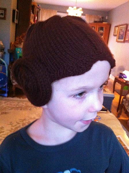
Over the holidays I knit a special baby hat. One of Yannick’s closest friends had a baby girl just before the holidays, and when he showed me the gifts he planned to bring for the friend and his other young daughter, I told him I knew just the thing to make for the new arrival. The little girl’s dad has similar geeky tastes as we do, and I thought this pattern would be perfect.
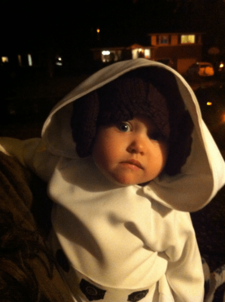
I’ve knit it once before, back in 2013, as part of a Hallowe’en costume for a baby girl aptly named Leia. This was a pic of Jakob trying it on for me at the time:
and this is a pic of the little sweetheart in her full costume. Cutest Leia I’ve ever seen!
The pattern is very well written and it’s a pretty quick knit, even with all the icord. The hat and the ear puffs each took a night’s worth of knitting to work up, then the assembly took barely an episode of Elementary.
Forgive the bad pics, it’s hard to take hat pics without an appropriately-sized head! 🙂 I’m really pleased with how the hat came out, even though I’d knit it before and expected it to look the same. One thing I love about this pattern vs others out there is how it incorporates ‘bangs’ and the center part (not clearly visible in these photos but seen better in the one of Leia wearing it above).
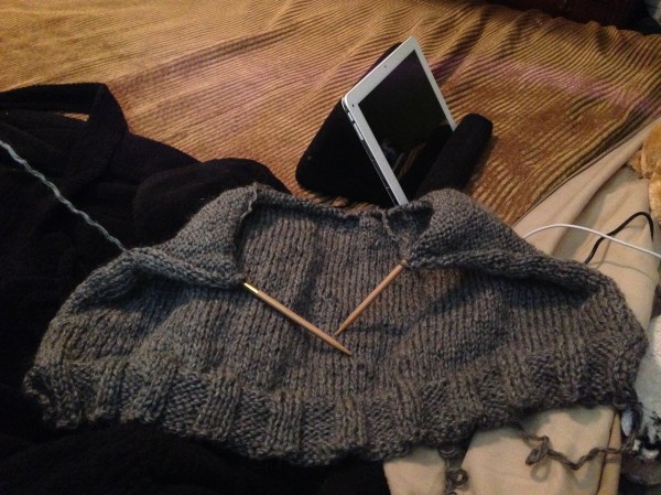
Drops v-neck sweater
I also completely frogged a sweater I’d been working on. Back in September I’d started a garter-stitch oversized sweater with a lovely gray yarn from my stash. I’d thought it would be perfect ‘no-look’ movie or tv knitting but after measuring a sweater I own that had the fit I wanted, I realized that what I was making wouldn’t have the proper shape. Plus I’d been having a nagging feeling that the garter stitch was eating up too much of my limited yarn. So I frogged it one evening last week and began this pattern instead. I’m pretty sure I’ll have enough yarn, and if not I’ll work the neckband and/or cuffs in something contrasting.
So far I’m at about 32cm of the 34cm I need to be at before splitting for the low v-neck.
Coloring
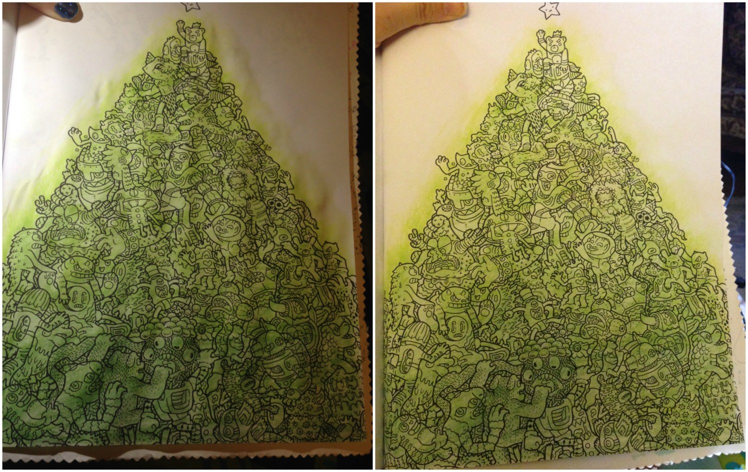
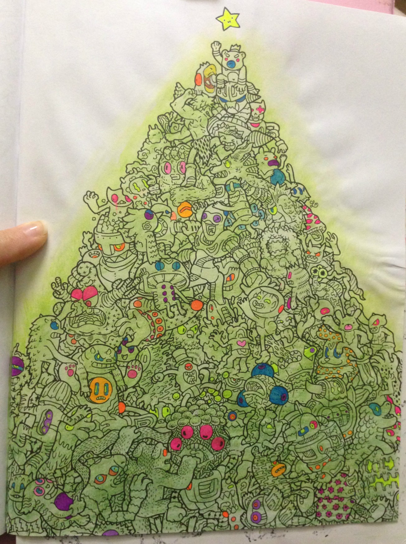
Doodle Fusion ‘Christmas Tree’
A few weeks ago I’d taken a page from Dede Willingham and done color washes across a bunch of my coloring book pages. From what I’ve seen she primarily uses acrylic paints, but I mixed it up a bit, using not only paint, but also my Neocolors(seen previously here, in imagimorphia) and my Inktense(last seen here, also in imagimorphia). This particular page, from Zifflin’s Doodle Fusion, seems to deliberately invoke a Christmas tree, so that’s how I decided to approach it. I colored over the whole image with the Inktense in shades of green. The first pic is immediately after wetting the pencils, and the second is the next day, after the page had dried.
My plan is to color the characters in colored pencil over the Inktense, keeping them muted and dark, but to color all the eyes and anything round-ish in bright gel pens, so they’d (hopefully) look like bright ornaments on the tree. If you squinted at it. Maybe.
This was after my first pass with the gel pens. I think I got all the areas I’d wanted, but I’m sure as I work on the figures I’ll find more. I’m looking forwards to coloring the characters now in dark tones to really make the gel pen pop.
PS- this book is crazy, and I love it. I’ll be showing a lot more of it in future posts.
I finally finished a page I started coloring back in November in the Disney Villains coloring book Yannick had bought for me, but as this post is getting long I’ll save them for another. That’s another excellent coloring book that I’ve been working in quite a bit.
While the boys were off school for Christmas break I tried to keep them occupied with more than just Minecraft, Little Big Planet, or their new Skylanders Imaginators. Every few days we had ‘technology-free’ time during which we’d color, or do pencil puzzle books, and during one of those afternoons I taught them how to make their own stuffies. However I took a TON of photos and so I’ll share the step-by-steps of their work in another post
Alright, that’s it for this round-up!
This post may contain affiliate links. This means I might make a small commission on purchases made through the links, at no cost to you.
And once again, what seems to happen cyclically around here has happened again. Every time I get into a rush on secret projects that I cannot blog about, the blog itself falls into a standstill. I get so focused on the major things… a sculptural piece I’m mailing out soon, baby gifts, the props for my upcoming show… and I forget that I can also share the small things that are just as important and fulfilling, if not as fun or tutorial-able.
Here, then, are some of those moments, from the last 6 weeks.
Over March break the boys went to spend the week with my inlaws. They learned how to play UNO and have been so hooked that even after being away from consoles for a week, this ^ was their first night back home. Ignoring the systems, ignoring the tv, spending a quiet night after dinner rushing to get ‘just one more game in!’. 🙂
I’ve been doing some coloring, mentioned a bit here and there on Instagram. I’ve got big posts semi-worked up talking about markers and pencils and storage, but while all that’s been getting ready, I’ve been enjoying some quiet time of my own while the kids play or while watching tv and tackling some pages from one of my new favorite coloring books: The Time Garden by Daria Song. The wallpaper background on these two (and the subsequent 2 pages set in the same room) took about a week to complete, tucking into it here and there when my attention wasn’t needed elsewhere. I used my Staedler Triplus Fineliners in Mauve and Gray in alternating rows, and the dots in between the flowers were colored in Silver Gray. The dots within the flowers were colored with a metallic silver pen from the dollar store, and then I filled in the background itself with an old blue Bristol colored pencil I’ve probably had since I was 10.
We went out for a nice family dinner for my father-in-law’s birthday, and it proved to be a long, late night for the boys. We were driving home from the restaurant at about 9:30 at night when I peeked into the back seat and saw them, sound asleep, and cuddling.
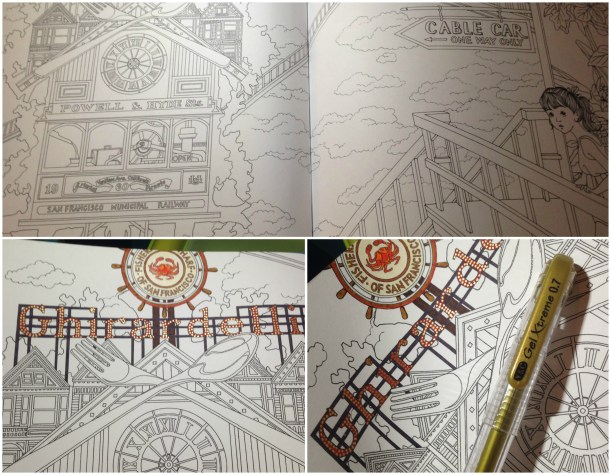
Back to more coloring. After the long spread of wallpaper I decided to tackle something equally as detailed, but with smaller sections that could feel completed as I worked on them. I jumped ahead to the Ghiradelli/Pier 39 spreads in the book. Wherever I’ve found repeating elements I’m working on them at the same time vs having to make notes on what colors I’ve used where, so I did the large sign on the above spread and then jumped immediately into the matching cable-car page that followed. The crab sign is colored to match the real one, using various Triplus or Stabilo 88 fineliners and then a light shading of colored pencil, and then after coloring the sign and its supports I suggested the myriad lights with a metallic gold gel pen.
The Yarn Harlot‘s Strung Along retreat happened this past weekend and I donated some patterns for their goodie bags. Hopefully they liked them!
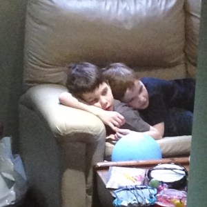
Saturday had another cute moment for the kids, when I passed by the open door to the den and noticed them watching tv like this. Go figure… they’re so close that even with a whole floor and mini futon and couch and easy chair, they still prefer to snuggle together no matter what they’re doing. I can’t imagine they’ll be this close when they’re teenagers, but it sure makes me smile for now.
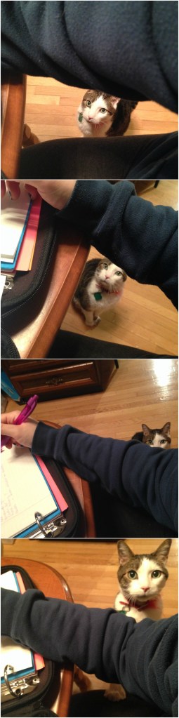
Sunday night I was working on the props for my show, making lists of everything I still needed to take care of, and a plan of action, and casually nibbling on a piece of kernatzel (pepperoni stick). Turns out my cat is addicted to them. ADDICTED. What looks like a cute little moment above WAS TAKEN OVER 2 HOURS. Each one of those photos is 30 minutes apart AND HE NEVER LEFT MY SIDE THE ENTIRE TIME. Sitting. Staring. Drooling.
Finally, a bit more coloring, this time from the cable car page. I don’t have the materials yet for one set of props, and the others were glued and clamped and drying in the garage, so I made a fresh cup of coffee and put on a YouTube channel I like and settled down to color the ice cream adorning the cable car.
I got this far when Yannick came home, and I showed him my progress, especially proud of the shading on the center cones (all done with the two sets of aforementioned fineliners and colored pencils). “The cones look great,” he said. “The pop too. But what’s the turd on the end?”
Hmph.Who says you can’t polish a turd? (Actually, you can, and not just by recoloring an ice cream pop). The markers and pencils play really nicely together and I was able to adjust the highlights so it looks more like a slightly melty Magnum bar. I also finished up the chocolate and strawberry swirls in the center, as well as the neon sign.
Any more coloring will have to be put on hold, as tonight I buy the final items needed to finish the props, and then my next few nights will be spent making same. I can’t complain, though- it’s for a really great cause.
If you want to see some incredible dancers, some amazing singers, a hugely talented band… yummy food… oh- and me… then get your tickets now and come enjoy the show!
This post may contain affiliate links. This means I might make a small commission on purchases made through the links, at no cost to you.


 Who says you can’t polish a turd? (Actually,

