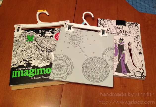
I don’t have a ‘Crafty Compilation’ for either of the last two weeks as I’ve spent them working primarily on some sample knitting that I’m not sure if I can talk about yet. So, instead, here’s a quick tip for those of you who enjoy coloring: pants hangers are your friend.
Yup. Actual hangers that you use to hang up your pants. (Or your kids’ pants, in my case).
I’ve been using binder clips with my Art of Coloring: Disney Villains book ever since I got it. I’ve been using a lot of water media in it and I’ve taken to clipping the book shut whenever I’m not using it to minimize most of the page warping. Because this book has thick cardboard covers it stays open pretty flat on its own, though I tend to pop the clip onto my working page mostly so I don’t misplace it until I need it again. With other books I’ve taken to working on a clipboard for both the hard surface as well as the ability to clip the book open to my current page. For the most part, that worked perfectly.
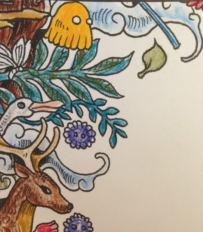
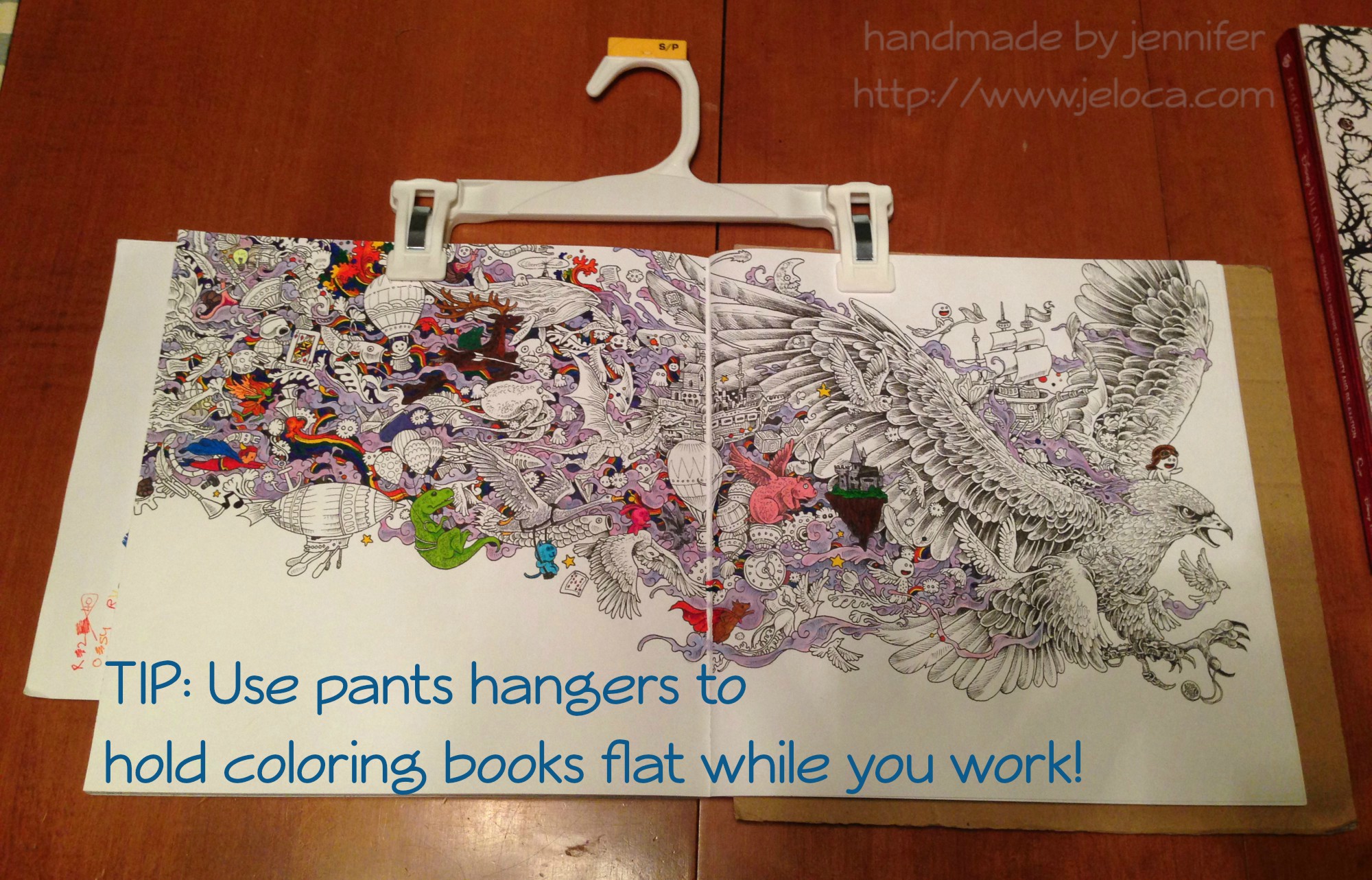
Then one day I was laying on my belly in bed coloring the page above (the Eagle image in Kerby Rosanes’ imagimorphia). It was held down by my clipboard on the far right of the right page but I kept getting frustrated at the left-side page flipping shut every time I reached over for my coloring supplies (Stabilo 88 and Staedtler Triplus fineliners, as well as Caran D’Ache Neocolor II watercolor crayons for the purple wisps). I’d been laying on my belly and constantly raising up onto my elbows to brace the page between color changes was starting to hurt more than the coloring itself soothed.
Henri had had a similar problem holding open his Pokemon books so he could sketch from them, and I’d lent him my cookbook stand. It was a great solution but now that I needed it I didn’t have the heart to steal it back for myself. That’s when I remembered the image going around Facebook a while ago in a list of kitchen tips: using a pants hanger to hold your recipe up and out of the way, by hanging it from an upper cabinet doorknob. I had no need to hang my coloring book, but it would be perfect for what I needed too!
And it was! The two clips hold the pages down on either side, but the stiff bar that connects them keeps them open flat, where the book could otherwise still slip shut. (The above wip image is also from imagimorphia, and the background wash was done with the Neocolor IIs). After you’ve finished coloring the page, the hanger can then be used to clip the book shut as it dries to minimize any warping from the wet pages.
If you wanted you could also store your books from the hangers, sideways along a bar similar to needlepoint sets. (Ooooh now I’m picturing a dry cleaner-style conveyor holding all my coloring and craft books… that would be awesome!!)
And for an easy reminder to pin:
That’s all for now. Hopefully this tip could be handy for some of you!
This post may contain affiliate links. This means I might make a small commission on purchases made through the links, at no cost to you.
I know, I know- three posts in a row! I told you- I’m addicted to this book, and if I don’t start posting stuff from where I’m at I’ll keep winding up too far ahead. Unlike tutorials or cakes where once they’re done, they’re done and I can post the finished thing anytime, ideally with coloring projects I could be somewhat up to date so I can post pics here or on my Instagram as I work on them. Since this book is my current obsession, I’m making sure to get these posts out before I move ahead too far.
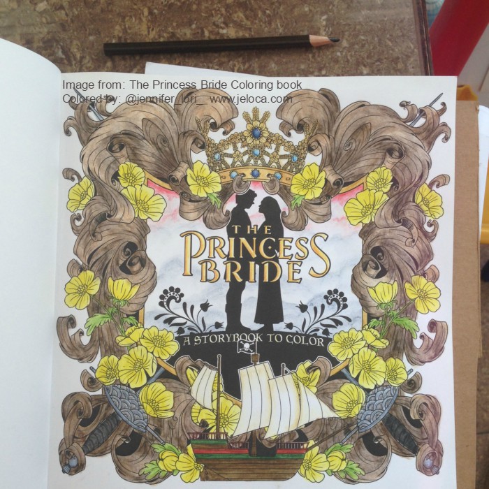
So. This is the ownership page in progress. (If anyone isn’t following along this is the The Princess Bride Coloring Book, colored with Derwent Inktense pencils). For the most part it’s a repeat of the title page, since it has the same buttercups and carved wood. I did learn from my mistakes on the last page, however, and went lighter for my initial passes at the wood color. I haven’t done any colored pencil shading on this one yet, and so far it reminds me of the strips of Birch kids would get in trouble for tearing off the trees at my old camp.
Before giving the book pages a slight antique stain I’d lightly sketched out my name, trying as best I could to match the font on the opposing page. In pencil it looked great… only I’d been hasty in wanting to finish that part and I’d used the first ink pen I’d had handy not even thinking that the nib was thicker than the printed ink. I traced the “J” and instantly regretted it, wishing I’d used one of my smaller sizes Micron pen instead. However, now that I’d started it was too late to do anything about it. Hmph.
I’d even tried to erase the ink over the J, wondering if it would fade it enough to not stand out with as much contrast as it was having. Again I was being hasty and nearly smeared the black ink. Sigh. In the end I managed to salvage the pic, I think. Since I couldn’t undo the thicker outline on the right, I chose to use the same pen to outline the existing words on the left, so both pages matched.
The Inktense on this page is complete, and all I want to do now is darken the depths of the shadows of the wood and the flower centers with some colored pencil, and then this page will be done.
You can find more coloring-related posts sorted by material or book at the Coloring tab in the header above, or click here for more posts about The Princess Bride Coloring Book.
This post may contain affiliate links. This means I might make a small commission on purchases made through the links, at no cost to you.
(As an aside, you can clearly see the lack of bleed-through on this page, even after all the layers of color I’d put down).
Still working with the Inktense, I started at the sun in the center and worked downwards. I used a few shades of yellow for the sun then started with the oranges, using the darkest color from each section as the palest in the next. So if the first section used colors A and B as ABABAB then the next section was BCBCBC, then CDCDCD, and so on. I planned the gradation deliberately timed so the blues would hit by the waves, then the teals/greens in the water.
The lines are so narrow that I can’t really look up to watch tv or something while I activate it, so I’ve been working on it here and there while catching up on past episodes of the podcast Lore. I’m in no rush, though, as I love watching the muted pigment (the left side) spring to life once wetted (the right side, up to midway).
This post may contain affiliate links. This means I might make a small commission on purchases made through the links, at no cost to you.
As I mentioned in my last post, I’ve been completely addicted to the Princess Bride Coloring Book lately. I’ve been using it as my reward for getting chores and stuff done, and currently have 5 pages in progress.
The title page is the first one I started with. I confess I felt really dumb when, after staring at the page for a while trying to figure out what color I wanted to make the flowers, I had a flash of insight and did a quick Google search. Sure enough – sigh – they had to be yellow. They’re buttercups! 😀
My plan for the book is to work primarily with my Derwent Inktense and then finish up with colored pencils when/if necessary for some finer detail work.
I don’t have full step-by-steps of the order I’d worked but for this page I’d tackled it like this:
-First I colored the buttercups with two shades of yellow (it’s hard to see but there’s a darker yellow in the center) and then done the greenery
-Next I used Payne’s Gray to shadow in some clouds behind Buttercup and Westley
-Then I colored the crown, using an image of Buttercup’s coronation crown for reference
-Then I worked on the ship. I spent way too much time trying to find decent pics of either of the two main ships in the movie (The Dread Pirate Roberts’ ship or Vizzini’s ship) but the one drawn doesn’t perfectly match either. If anything it’s closest to Vizzini’s but it has a skull and crossbones flag so…? Finally I did my best approximation copying, of all things, a LEGO ship build.
-Next I threw some gray and black into the two rapiers, and some pinks into the background, plus darkened the grays to give the illusion of mountains or far-off lands.
-The last thing I did at this step was to color the carved wood. I did a HORRIBLE job with my shading, and, while this paper is pretty thick and didn’t bleed through at all, it does start to pebble after too many water applications, so I eventually maxed-out on how deep I could get the shadows. That’s when I decided to jump right into some colored pencil.
In this image (above) I’ve worked colored pencil shading on the left side of the wood carvings only (so far), and I’ve used an eraser to lift out some highlights in both the wood as well as the sword handles.
This post may contain affiliate links. This means I might make a small commission on purchases made through the links, at no cost to you.
Ugghhhhh. Is February really almost over? Is that a thing?
Sigh. When there’s nearly 4 weeks of everyone in your household getting back-to-back gastro, time can really get away from you, y’know?
I’m obviously behind on these little compilation posts of mine, so rather than upload a bunch of weeks’ worth of recaps in quick succession here’s an overview of the non-own-post-worthy stuff that happened during these last few weeks:
Knitting
Comfy Socks
My travel knitting socks have become my sit-on-couch-watching-Supernatural socks because I’ve only been back to work part time as yet and there hasn’t been much need for a travel project. No pics, but the first one is about mid-foot.
V-neck sweater progress
The sweater was moving along at a great pace, as stockinette projects tend to do, until I was nearly finished the front. You split the front at the v-neck, working each side individually. I’d finished one half and held it up against me to see how it was gonna look…and noted that the v-neck began roughly in the middle of my rib cage. I’m not one to shy away from a low-cut top but that’s a bit much to wear without an under layer, even for me.
I calculated the height I wanted it to start at and ripped back, making notes so I could add that many rows before the split. I have ripped this yarn back so many times I’m surprised it hasn’t fallen apart by now!
Crochet
Kitchen soap cozies
As part of my massive cleaning kick (see ‘other stuff’ below) I threw together these liquid soap bottle cozies for my kitchen.
The counter used to be a giant mess (pic censored to spare your eyes) and the cleaning supplies weren’t hideous but the kids (and I) had a hard time remembering which pump bottle I’d refilled with dish washing liquid and which one was hand soap. The ‘dish’ one used to say ‘DISH’ in scrawled black Sharpie but it kept wearing off the bottle.
I didn’t use a pattern. It took longer to keep casting on, starting then ripping to get the correct number of stitches than it did to actually work the two pieces. In the end they took 30 sts, and I worked 4 rows of single crochet for stability, followed by 3 of double crochet (so it wouldn’t take as long to make), then 3 more rows of sc to have a more closed-in area to embroider on, another 2 rows of dc and then finished with a row of sc to stabilize the top. I embroidered the words and then sewed the cozies together in place on the bottles. They do stretch enough to be removed and since they’re dishcloth cotton when they get dirty or covered in soap drips I can wring them out a few times and they’ll be good as new.
I’m not going to keep showing the coloring for each day… I tend to do them in batches as the images can start getting repetitive and I’m not always in the mood to work on them. I’ve got them mostly completed through til February 12th or so, but I haven’t taken pics of them all yet so here are the last few I did photograph:
The Princess Bride coloring book
I have been ADDICTED to the new coloring book my brother got me for Hanukkah.
This book is gorgeous. It’s the entire movie in coloring book format! No matter what your favorite scene from the movie might be, there’s a page ready for you to get to color it!
I always use the pages in the back of the book to swatch the supplies I plan to use. I knew the pages were thick enough to allow water applications for my Inktense, but the little swatch sample I keep with the pencils is on beige paper. I want to try to go for screen-accurate colors when possible, so I decided to swatch out ALL the Inktense colors.
I gridded it out with a ruler then scribbled a tiny bit of color on one side of each cell. Once it was dry I added the color numbers next to each but didn’t photograph that.
I’ve since begun working on some of the pages. I’m going in order and have 4 pages in various states of completion. It’s become my reward each night after I get the kids settled and tidy up and do laundry or whatever. Chores done = coloring time LOL
Other Stuff
Cleaning!
Oh. So. Much. Cleaning. (…she says, pretending it wasn’t her own craft supplies making the mess in the first place!) The house is long overdue for a big, thorough clean, and the first thing I’d tackled was the hutch in our dining room. As you can see in the ‘before’ pic below, it was a massive jumble of an ill-organized mess, so crammed full of unnecessary things that there was no room for the things we DID need to store there. During the brief lull between the kids’ gastro sessions I revamped the storage to better handle the things we needed. My cake decorating supplies are still there, with the closed containers now spanning the top sections, and the open boxes and packages hidden inside the center. Now the unit has become more of a central home art hub, with my drawing and coloring supplies on the left, and all of the home’s coloring and instructional drawing books on the right. I’d grown up leafing through drawing books from a very young age and I didn’t want the boys to miss out just because mine were hidden away in my office. The center square thing has become a homework depot (rather than homework remaining piled on the table or chairs during the week) with space for their binders and duotangs, as well as now being pre-stocked with construction paper, looseleaf, bond paper and cardstock, and the horizontal storage unit is all set up for them with glue sticks, scissors, erasers, sharpeners, etc. All of their colored pencils and markers and such are in the top drawer right under the coloring books, so whether they’re up to some crafting or sitting down to homework, everything they need is right there.
I also did a similar complete overhaul to the den (I think that was between mine and Yannick’s bouts… ughhhh…), and am currently on a break with the kitchen about 85% complete to work on my office. No pics of the rest cus there’s only so much of my mess I want to make public LOL
My hair 🙂
In the middle of all the illnesses I returned to work for the first time since roughly August. Finally getting to be around people again was reason enough to treat myself to a little salon time, and I redid my crazy colors once more.
This post may contain affiliate links. This means I might make a small commission on purchases made through the links, at no cost to you.
For my birthday Yannick got me this excellent coloring book called The Art of Coloring: Disney Villains. I’ve completed a few pages in it so far, as well as have some in progress. This is one half of a two-page Kaa spread (from The Jungle Book) that I recently finished.
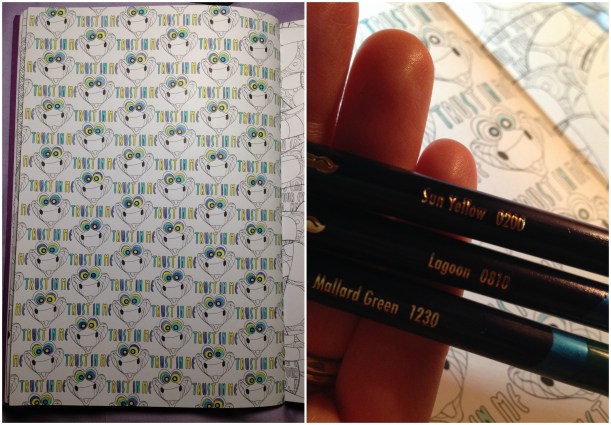
This is the left-side page, that’s still in progress. I’d begun coloring it in November with my Inktense in Sun Yellow, Lagoon, and Mallard Green to best match the coloration of Kaa’s hynotic eyes.
I did all the writing and then got a little bored LOL and moved on to the facing (right-side) page. While Googling to find the accurate colors for Kaa and Mowgli I found further proof that a lot of the images in the book are based off of stills from the movies themselves, as it is often quite easy to find reference images in nearly the identical scenarios. Case in point: Kaa’s face above……combined with Mowgli all wrapped up… become the coloring page in the book.
I decided to try something a little different on this side, rather than do the lettering as I had on the other side. First I colored in the background writing with a really sharp white colored pencil, then I did a light wash of Inktense pigment over those areas. The wax from the pencil provides a resist, leaving the lettering white, while the background paper picked up the color. It was a fun experiment to try, and I’m happy with the results… though I wish I’d used a darker color for the background – maybe a magenta or something – to make the white letters really pop, visually.
After that the coloring was straightforwards. I colored Mowgli first, and then for Kaa I went in stages, starting from the lightest colors, to the darkest. I colored all the sections of his underbelly, followed by his back, and then the spots were last.
The image above is the page after I was done. Technically. But I found that it looked rather flat on the page, so I went at it one more time using a darker color for shading everywhere the snake’s coils overlapped. It was a fun page to color, from an excellent coloring book. The entire page was done with Inktense and painted with my waterbrushes and as you can see, it’s not buckled at all. I do keep the book closed with a binder clip when I’m not coloring to help keep any wet-media pages flat, but even still, the paper is thick enough to support moderate water use. In fact, from my trials on blank areas in the back of the book, the only spots where I saw bleed-through were with my alcohol markers (of course) and one area where I’d colored with a red Inktense pencil and applied too much water. I haven’t used much colored pencil in the book, but I have used the Inktense on a number of pages, as well as gel pens and fineliners, and it took them all beautifully.
This post may contain affiliate links. This means I might make a small commission on purchases made through the links, at no cost to you.
2017. Wow. I can’t believe I started this blog roughly 13 years ago, nor that some of you have been around since the very beginning. Whether you’re one of my original few hundred subscribers or one of the couple thousand who discovered my site when looking for my most popular Halloween DIY, hi there, happy holidays, and happy New Year! I’ve got a lot planned for this little blog over the upcoming year, so if you’re an old friend- thanks for sticking around… and if you’re new- I hope you’ll pull up a chair and stay a while.
Some of you may note that I’ve slowly made changes to the type of content that I post. I’ve never been a mono-crafty person, and the blog will always adapt to whatever creative pursuits I’m into at the time, whether they’re knitting or crochet, cosplay or cakes. Coloring books are going to have more of a showing on the blog, as will as a variety of crafts beyond the yarn-based ones. For the last two years I’ve taken step-by-step photos of all the projects that I’ve made with the intent to focus more on sharing helpful DIYs, tutorials and tips going forwards, instead of merely showing off whatever I’ve made. I’m going to have more reviews coming up, both sponsored and non, and while there might be affiliate links popping up at the end of some posts, I can promise you that my reviews will always be strictly my honest, unbiased thoughts.
Another feature I’m going to add is a weekly roundup, to both keep track of and hold accountable to the projects I’ve got ongoing. Not everything needs to wait for a finished reveal, and sometimes quick projects or small pastimes get lost in the shuffle of the day-to-day. To that end – this is my first Crafty Compilation. I plan to post these on Sundays and to cover the previous week’s goings-on, but this first one is being posted on Thursday because life LOL. Amazing how, even when one is off work in post-op recovery, when it comes to crafting, there still isn’t enough time! This first CC will cover some stuff worked on over the holidays, as well as last week.
Knitting
Gift knitting
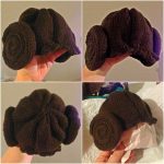
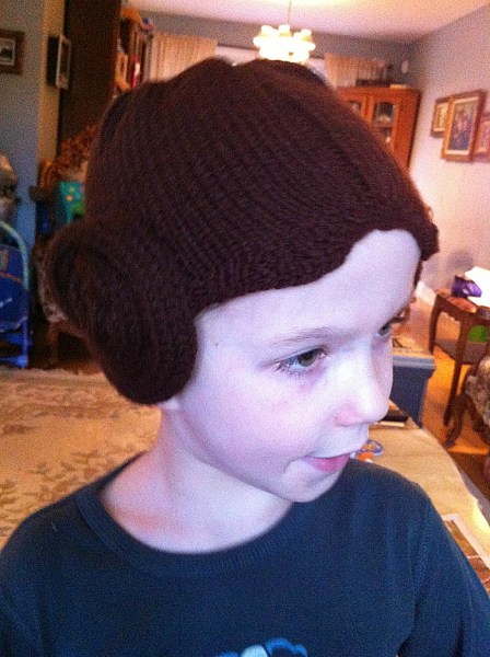
Over the holidays I knit a special baby hat. One of Yannick’s closest friends had a baby girl just before the holidays, and when he showed me the gifts he planned to bring for the friend and his other young daughter, I told him I knew just the thing to make for the new arrival. The little girl’s dad has similar geeky tastes as we do, and I thought this pattern would be perfect.
I’ve knit it once before, back in 2013, as part of a Hallowe’en costume for a baby girl aptly named Leia. This was a pic of Jakob trying it on for me at the time:
and this is a pic of the little sweetheart in her full costume. Cutest Leia I’ve ever seen!
The pattern is very well written and it’s a pretty quick knit, even with all the icord. The hat and the ear puffs each took a night’s worth of knitting to work up, then the assembly took barely an episode of Elementary.
Forgive the bad pics, it’s hard to take hat pics without an appropriately-sized head! 🙂 I’m really pleased with how the hat came out, even though I’d knit it before and expected it to look the same. One thing I love about this pattern vs others out there is how it incorporates ‘bangs’ and the center part (not clearly visible in these photos but seen better in the one of Leia wearing it above).
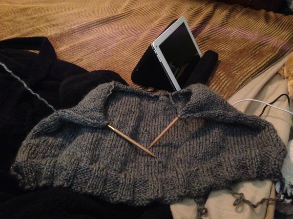
Drops v-neck sweater
I also completely frogged a sweater I’d been working on. Back in September I’d started a garter-stitch oversized sweater with a lovely gray yarn from my stash. I’d thought it would be perfect ‘no-look’ movie or tv knitting but after measuring a sweater I own that had the fit I wanted, I realized that what I was making wouldn’t have the proper shape. Plus I’d been having a nagging feeling that the garter stitch was eating up too much of my limited yarn. So I frogged it one evening last week and began this pattern instead. I’m pretty sure I’ll have enough yarn, and if not I’ll work the neckband and/or cuffs in something contrasting.
So far I’m at about 32cm of the 34cm I need to be at before splitting for the low v-neck.
Coloring
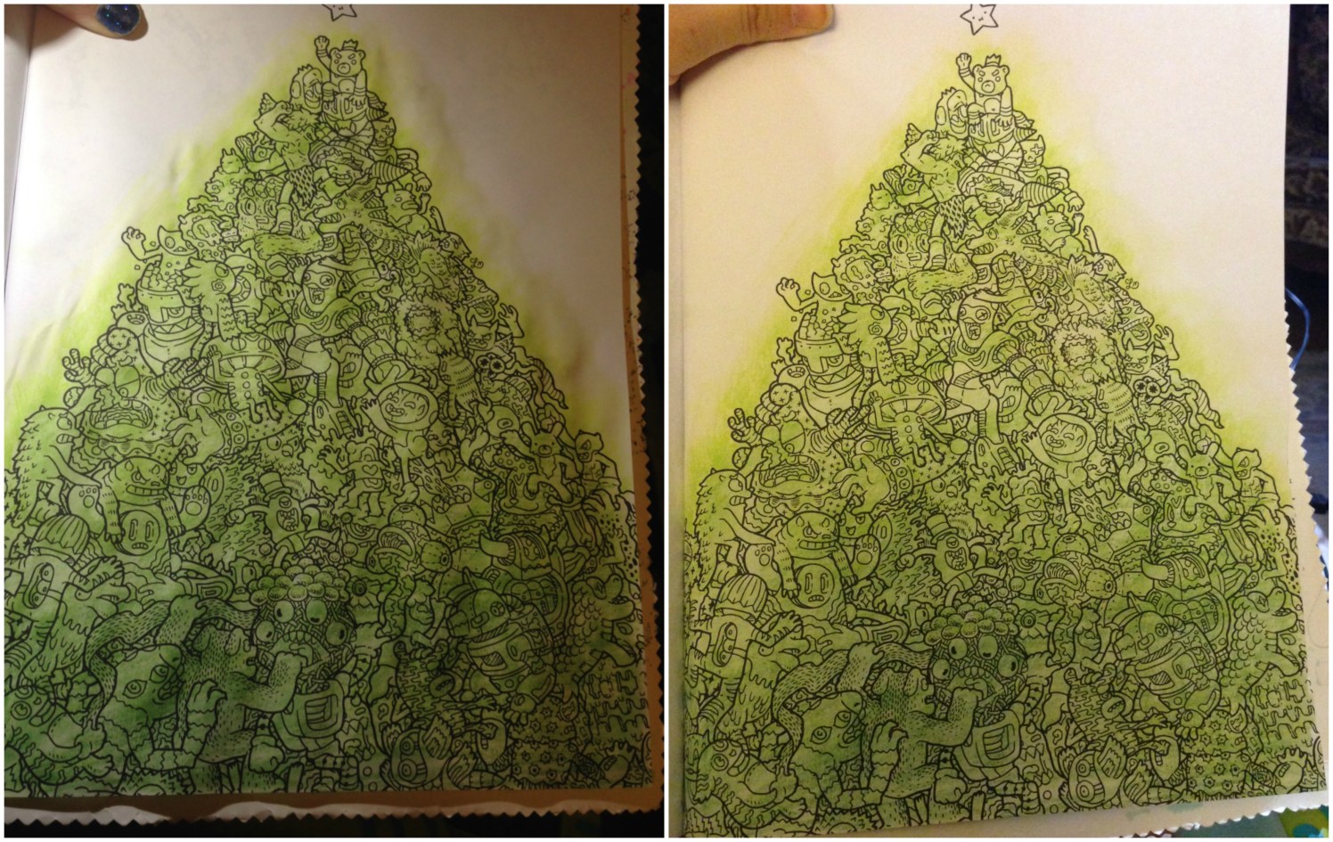
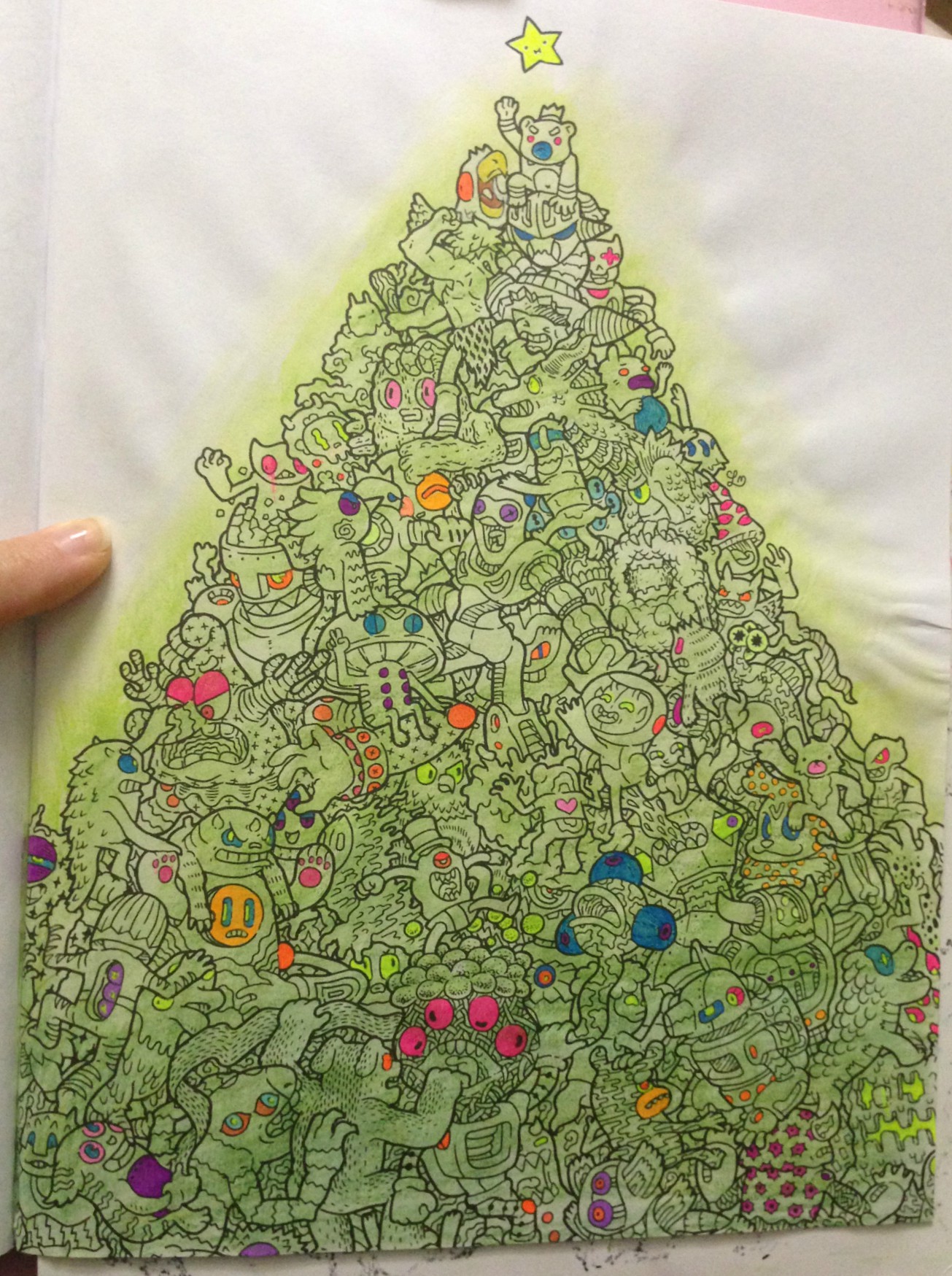
Doodle Fusion ‘Christmas Tree’
A few weeks ago I’d taken a page from Dede Willingham and done color washes across a bunch of my coloring book pages. From what I’ve seen she primarily uses acrylic paints, but I mixed it up a bit, using not only paint, but also my Neocolors(seen previously here, in imagimorphia) and my Inktense(last seen here, also in imagimorphia). This particular page, from Zifflin’s Doodle Fusion, seems to deliberately invoke a Christmas tree, so that’s how I decided to approach it. I colored over the whole image with the Inktense in shades of green. The first pic is immediately after wetting the pencils, and the second is the next day, after the page had dried.
My plan is to color the characters in colored pencil over the Inktense, keeping them muted and dark, but to color all the eyes and anything round-ish in bright gel pens, so they’d (hopefully) look like bright ornaments on the tree. If you squinted at it. Maybe.
This was after my first pass with the gel pens. I think I got all the areas I’d wanted, but I’m sure as I work on the figures I’ll find more. I’m looking forwards to coloring the characters now in dark tones to really make the gel pen pop.
PS- this book is crazy, and I love it. I’ll be showing a lot more of it in future posts.
I finally finished a page I started coloring back in November in the Disney Villains coloring book Yannick had bought for me, but as this post is getting long I’ll save them for another. That’s another excellent coloring book that I’ve been working in quite a bit.
While the boys were off school for Christmas break I tried to keep them occupied with more than just Minecraft, Little Big Planet, or their new Skylanders Imaginators. Every few days we had ‘technology-free’ time during which we’d color, or do pencil puzzle books, and during one of those afternoons I taught them how to make their own stuffies. However I took a TON of photos and so I’ll share the step-by-steps of their work in another post
Alright, that’s it for this round-up!
This post may contain affiliate links. This means I might make a small commission on purchases made through the links, at no cost to you.
I haven’t talked about it much but I’m going to be having surgery in about a week. I’ve actually been off work since mid-August, and this unexpected time at home has given me a lot of time to knit and color, and while I’ve been revisiting old supplies I’ve also been lucky enough to get some new ones.
My watercolor research back in August led me to discover Derwent Inktense and I went on a really long review and YouTube binge, learning everything I could about those amazing ink-pigmented colored pencils. When my birthday rolled around in September I basically only asked for art supplies, and my parents were wonderful enough to oblige.
Topping my list was the Inktense set. I really enjoy the metallic watercolor pencils and the Spectrum Noir Sparkle set is just yummy for anyone who likes glitter (um. yes. me! I like glitter!), but in this post I’m focusing on the Inktense which I’ve been using primarily with the waterbrushes I got with them. I really love this waterbrush set because of the sizes, the tiny #1 tip is perfect for the small areas in coloring books while the larger sizes make doing washes of color or wetting larger areas a breeze. They’re super easy to fill and I haven’t had a single leak, and I’ve been using them on a regular basis since September.
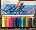
Now then, on to the Inktense! I got the full set of 72 colors but they do come in smaller tins, and the pencils are available open-stock so you can definitely get a smaller set and then add to it as you go.
So what are Inktense pencils? According to their site, “Derwent Inktense pencils are our best watercolour pencil ever! You can use them dry but mix them with water and WOW! the colour turns into vibrant ink. Once it’s dry the colour is fixed and you can work over the top of it, and, because it permanent it’s great for using on fabric such as silk and cotton!” They refer to them as ‘watercolors’ but they’re not, not really. They’re ink pigments in colored pencil format. You can use them as pencils and they’re nice, on the darker end of color ranges, but it’s when you add water that they transform completely. And because they’re ink once they’re dry they’re permanent.
What does this mean for coloring and how does this compare to a watercolor pencil? Let’s say you wanted to color a pink sphere, and you wanted to block in the rounded shading first, then go over it with a wash of pink, leaving a highlight area. With watercolors the paint reactivates any time it gets wet. So even if you let the gray shading dry, once you washed pink over top the gray would bleed out and muddy the pink and if you’re not careful you can make a real mess of your work. Inktense are permanent when dry so you can block in your shadows, wet the pencil strokes and fill your darker areas, and then once that’s dry you can go over it with even the lightest shades and the gray won’t budge. This is a horrible way of explaining that you can go overtop of previous layers without affecting them.
Of course the first thing I did when I got my set was to swatch out the colors so I could see what I’d be working with.
Above are the pencils when dry. The appear quite dark, and there are a lot of greens and browns for those who enjoy coloring books such as Secret Garden and other floral-heavy books. The pencils apply well and it’s very easy to get a lot of color down. Each pencils is marked with it’s color number and name, making it very easy to identify which one I’ve used…which is helpful because the colors on the ends of the barrels aren’t quite identical to the actual color of the pencil itself.
Okay, so they’re really nice when dry. The real magic, however, happens when they are activated.
This image barely shows the bright vibrancy of these colors in real life. The pigments activate instantly with water, and I could have used the lightest of strokes and still had the same color payout as I got here. I was blown away by my swatches and as soon as I’d added them to my swatch book I had to get started on a coloring page.
I’ve been watching a lot of YouTube coloring tutorials featuring Inktense pencils (Peta, Dede, Lindsay and Lisa are four of my favorites) and I know that the pencils are typically used in wet-as-you-go manner, coloring a section and then activating it, and so on. However, making the swatches was so satisfying in a “wait til the end” surprise payoff, that I just had to try coloring an image that way: coloring the whole thing, and then activating the ink at the end to see the before and after.
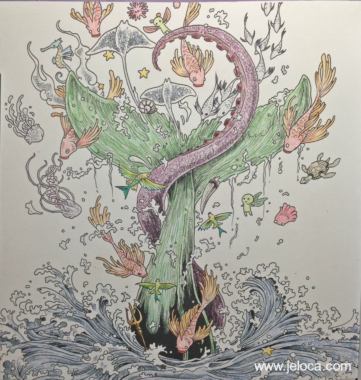
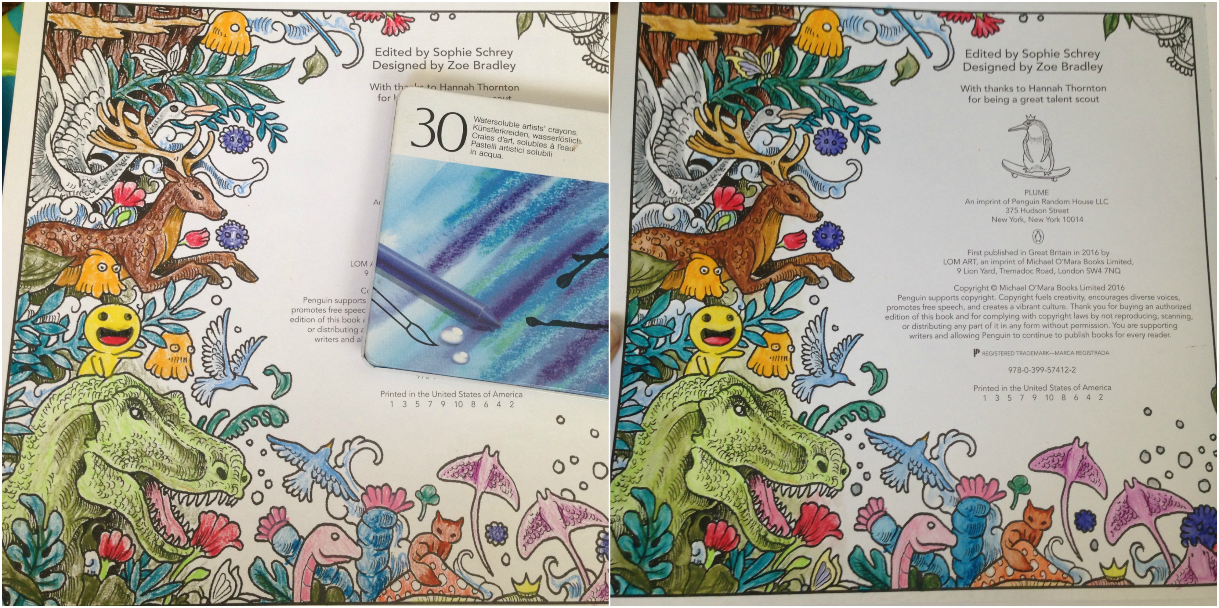
After testing the paper in the back of the book to make sure it would be safe to use (no bleed-through) I chose this image from Kerby Rosanes’ imagimorphia.
I’ve been having a lot of tummy time (lol) and this is how I’d set myself up in bed. A clipboard helped keep the book open as well as gave me a flat, hard surface to work on. I had a sheet of card stock underneath this page to protect the ones beneath, and I had my swatch book open in front of me so I could accurately choose my colors. My laptop was off to the right playing episode after episode of Welcome to Nightvale (soooooo weird and awesome) and the tin of colors was on my left within easy reach. Finally, my flip-top Ott-Light was balanced on the bed casting accurate light over the picture for me, since lighting in my house is crappy at best.
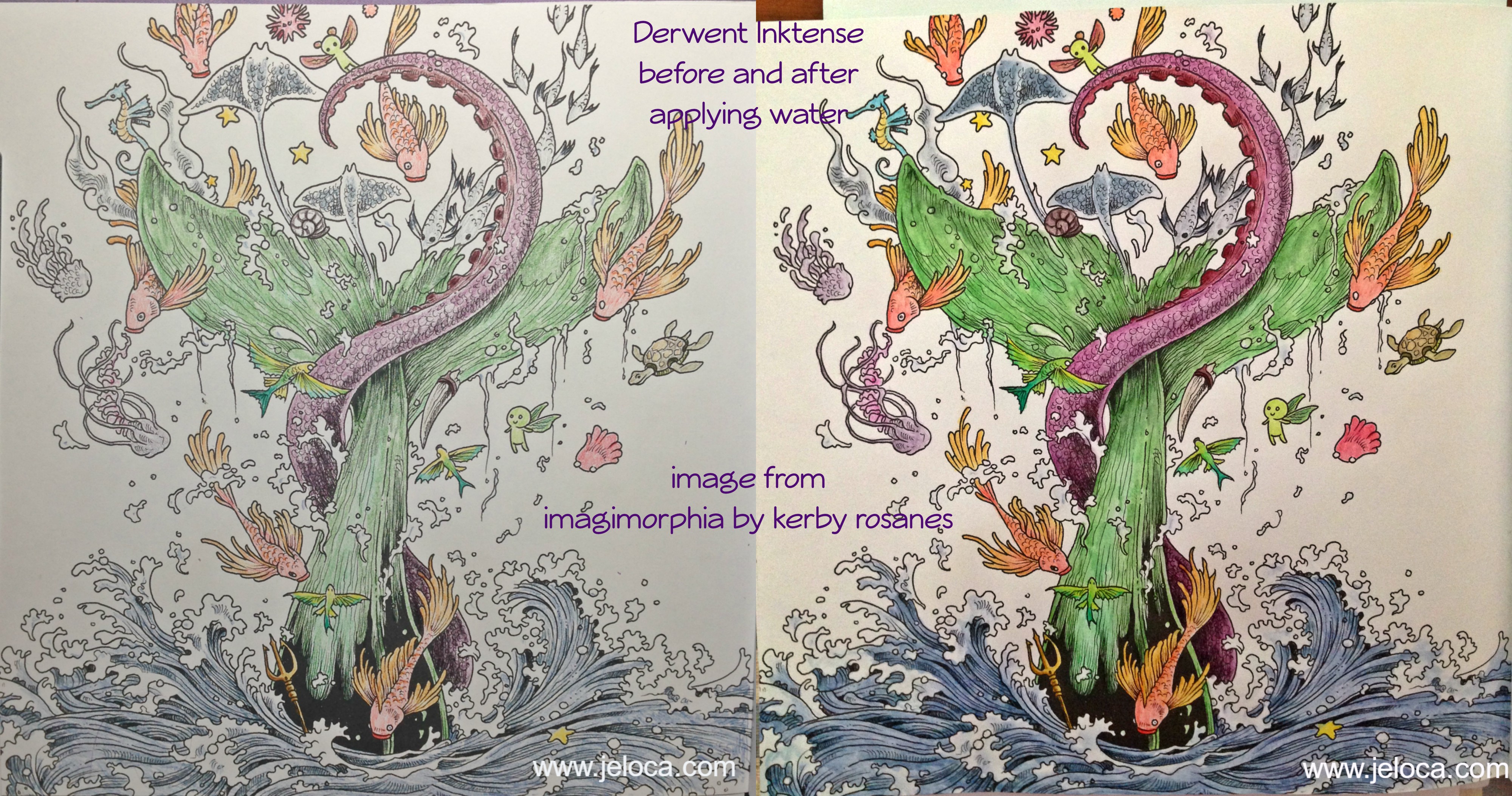
This is my completed painting before activating the Inktense inks. I colored pretty lightly, wanting to see how the pigments did on their own before adding any shading or depth. (PS yes I know that’s supposed to be a whale and whales aren’t green LOL) Coloring with these pencils is like a dream. They apply color beautifully even to paper that doesn’t have a lot of tooth. It is really easy to apply just a hint of color without any pressure on the pencil, which is a good thing because it means you won’t have to waste a lot of the pencil just to get a good color payout. In fact, these colors are so vibrant and juicy when activated that if anything, it’s almost too easy to add TOO MUCH color.
(For example, my son Jakob is addicted to these pencils too and is coloring an image in one of his books. I was showing him how subtle applications of color give pastel-pale results and he tried it out for himself. His three light strokes of Payne’s Gray, applying barely any pressure, provided enough color when activated to light wash a bunny butt around 3″ in diameter.)
I took this image right when I’d started activating the inks. I went slowly, enjoying watching the colors blossom into vibrant paint. (Seriously, it’s addictive). I activated each like section at a time, brushing off any excess pigment onto a paper towel to keep the tip of my water brush clean. In this image you can begin to see the difference between the activated (water-applied) and pencil-only sections. The orange and yellow fish on the right is still pencil, while there has been water applied to the one on the left. The little fairy creatures have been wetted on both sides. What really shows off some of the color payout, however, is the school of fish that crosses the tentacle. You can see how little color I’d applied, versus how much blooms from the watered inks.
And here is the completed painting. I didn’t use very many colors, but even still the brightness and depth these inks have is amazing. This picture is so much brighter and deeper in real life, showing subtle shading and contouring just from the way the ink moved like paint. It dries faster than watercolor so you do have to go in sections and work quickly if you want to activate a larger area without dry lines showing, but there’s still a decent amount of time to move the paint around before it dries, allowing for things like the softer blues in the water froth being ink I’d swiped from the water sections.
I’ve very quickly developed an Inktense addiction, as have my kids, who have been getting to use Mommy’s special art supplies now that they’re a little older. They don’t replace watercolors if that’s the type of medium you want, rather they’re a medium of their own, and are absolutely gorgeous to use.
This post may contain affiliate links. This means I might make a small commission on purchases made through the links, at no cost to you.
When I was playing around with my Caran D’Ache Neocolor II watercolor crayons I had my Raffinés next to me, as I’d just been working on the Egypt picture in the same imagimorphia coloring book. I’d done a lot of research on them before purchasing, and one thing that had come up in people’s comments were how some of them had been able to use them as watercolors, though not everyone had that luck. The Raffinés are oil-based colored pencils, not wax-based like Crayola and Prismacolor and most others, so they do color and shade and grip the tooth of the paper in a different way, but were they really so different that they could dissolve in water enough to be used as paint?
Let’s find out.
This is the page in the back of the book right before the hidden objects are pointed out. I colored a bit of it with the pencils then used the same small brush and water pot as I used for the Neocolor IIs.
Here’s a before-and-after closeup of the lower section of the page.
The top image is the dry coloring, and the lower image is after I’d applied water. At first I was happily startled to see that it did appear to work! I had to double check the ‘before’ pic on my phone to be sure, but seeing them side by side it’s hard to deny that there’s a clear difference between the two. The light pencil strokes in the worm (?) have blended outwards, as well as in the pink flower on the left and the green leaf in the background. The orange puff ball looks exactly like a watercolor had painted it, and even the browns in the fox (?) and mushroom are more evened and fluid.
I immediately checked the back of the page even though I wasn’t really concerned with bleed-through, but sure-enough there was none.
So if I think it sort of worked, why am I hesitant to say that outright? Because while the colors did wetten and spread, once dried the strokes were still visible and retained the soft look of the oil-based pencils. It’s hard to explain but it sort of looks like I’d done a light wash of watercolors over or under the pencils, as they’re both visible.
Since it was hard to compare the ‘after’ with the small image on my phone, I decided to do a definitive comparison test in the book itself.
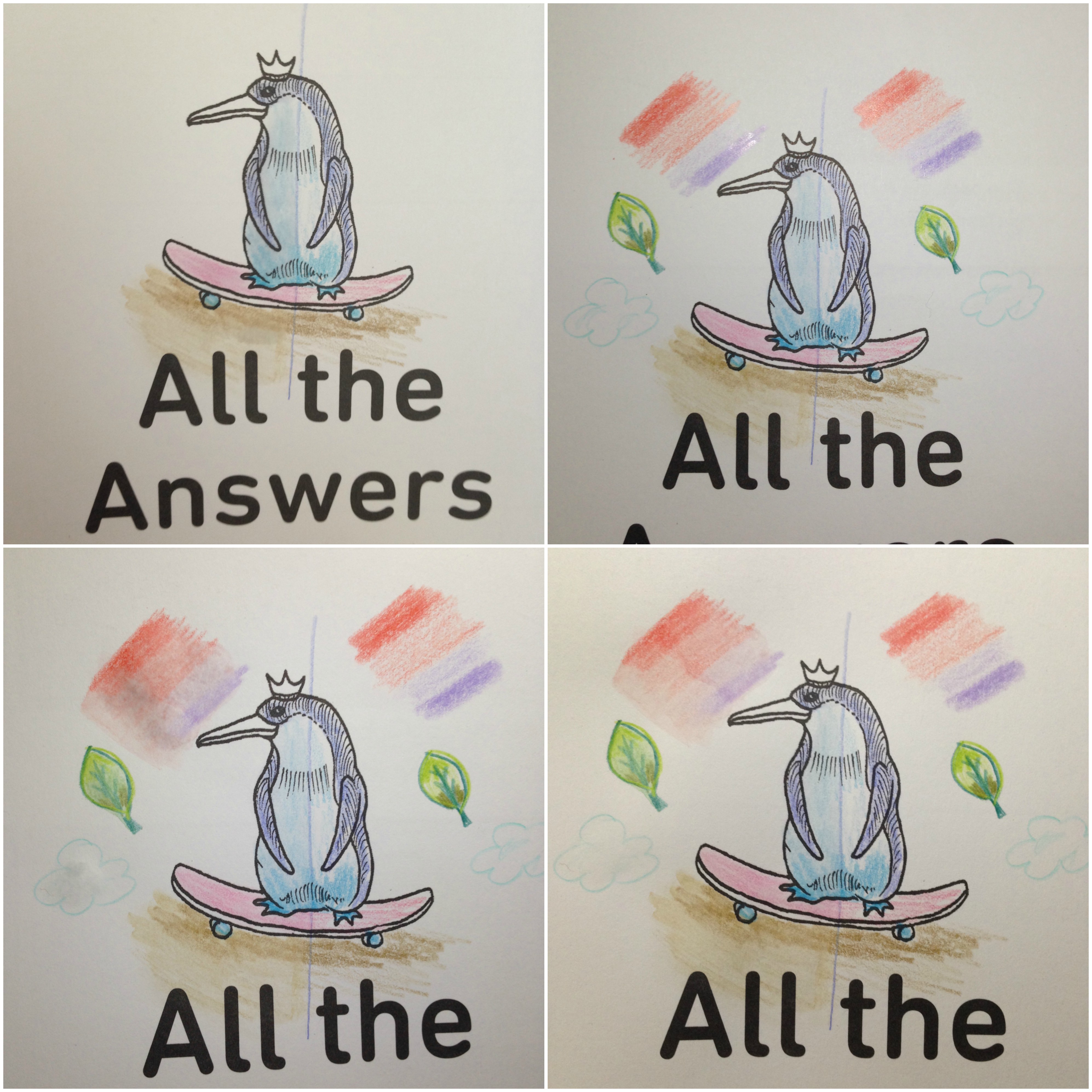
The first image below (top left) is my initial coloring of the royal penguin on a skateboard. I drew a line down the center to keep the division clear and then colored both sides with the Raffinés. Then I wetted the left side only. Did the pigment become a wash of color? Yes… there is a visible difference in the two sides, with the left side looking more even and ‘full’. But I still wanted to see a bit more.
In the top right image I added a few more test things to try out. On both sides I put a light shading of red and blue to see if it would be possible to blend them once wet, and I also drew a quick leaf and colored it with some light and dark shades to see if I could get blending on that. Basically I was trying to mimic effects one would be trying to achieve in a coloring book or drawing.
The bottom right image is right after I wetted the left side. I did my best to blend the red and blue together, as well as the colors in the leaf. Those items are still wet, but the penguin is already begun to dry and look a little different from when wet – a touch less blended and spread, and a bit more colored-pencil-y (if that makes any sense at all).
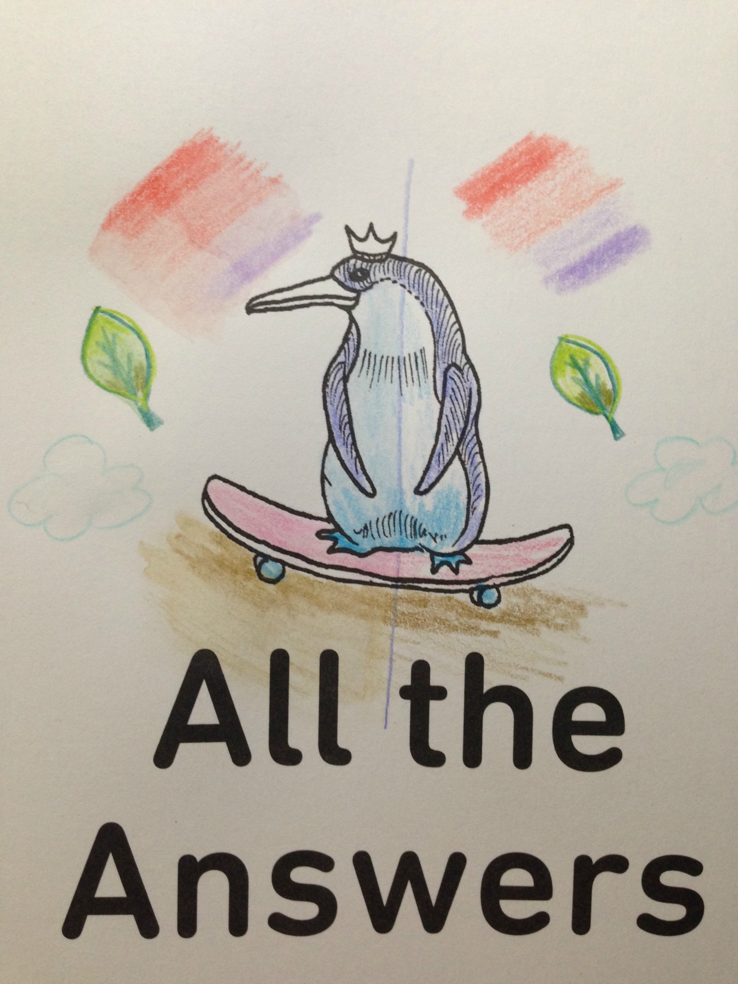
Finally the bottom right image is after everything had dried, for a full comparison. I’ve included a solo pic of that image here, so it can be viewed larger:
So. Do we really have “All the Answers”? Did the blue and red blend? Not really. There was a bit of pigment bleed spreading the colors to one another, but no real blending of the two to become purple. What they did do, was soften alongside each other. In fact, that seems to be what all the colors did. The pigments spread slightly, giving a bit more color to the background of the pencil strokes and softening the overall look of the colored image. In real life the coloring looks very dry, almost pastel-y, and the pencil strokes are visible over the softened backgrounds.
I think the final answer is that they DO spread somewhat with water, but not completely nor efficiently to claim they would be an inexpensive comparable to true watercolor pencils. What they DO do, is soften the pencil look. I think they would be great used with stamps for cardmaking, where one can lightly shade the image then soften the pencil colors. In knitting there’s a term called ‘fulling‘, where the yarn is plumped up and thickened while still retaining some stitch integrity (unlike complete felting), and that’s how I feel about adding water to these pencils; when wettened the color plumps and fills its space while still retaining the original lines and strokes.
TLDR: Do they watercolor? No. Does applying water slightly bleed and soften the colored pencils for a unique, almost delicate look? Yes.
This post may contain affiliate links. This means I might make a small commission on purchases made through the links, at no cost to you.
I’d been researching watercolor pencils a little while ago, and while reading review sites I came across a few mentions of the Caran D’Ache Neocolor II watercolor crayons. They looked interesting and were lauded for their bright, vibrant colors and creamy texture, so I made a note to look up more reviews. In the meantime, I remembered that at some point during my creative history I’d owned a set of, what my memory told me, were kid’s-quality twist-up watercolor pencils. I could picture the set, and knew there was only one place in my home-office they could be, so one morning I went downstairs and took a look.
I found the twist-up colored pencils right away… and was disappointed to see they were just that- colored pencils. Nothing water-soluble about them. It was frustrating to have been mistaken but I figured I’d just continue my research… and then I peeked through the rest of the drawer just to see what other drawing supplies I’d collected over the years and had forgotten about.
What a discovery! I think I squee’d out loud when I saw the white edge of the tin under an old pencil case of charcoal and blending stumps. Not only had I forgotten I owned these but clearly I’d barely ever used them when I got them, because they were all still full-sized and touching the sponge strip running the top of the case.
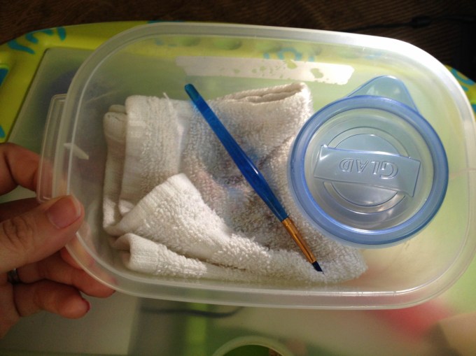
Immediately I brought them upstairs to try out. I’d been stuck in bed, resting my legs due to a really bad bout of sciatica, so I put together a little portable watercolor kit that I could use in bed without making a huge mess: a tiny tupperware of water, a fine-tipped paintbrush, and a folded handtowel for blotting and cleaning my brush, all contained within another small tupperware that I could close up and store with my craft supplies.
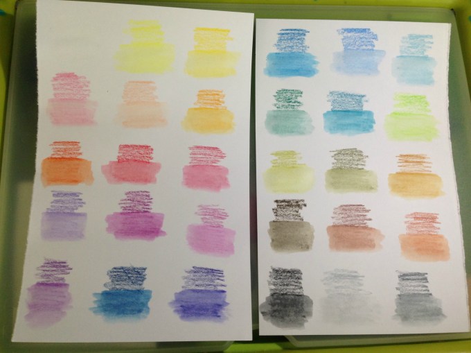
I made pages for them to add to my swatch book. I didn’t want to use water in that pad itself because the paper is so thin, so I folded a sheet of cardstock in half and tore it into two papers that each fit on my swatch book’s pages. I scribbled a little bit of each color onto the paper and then activated each with a tiny bit of water. These colors are so rich and the crayons dissolve so easily that a SUPER tiny amount of water is all that is needed.
After the swatches dried I labeled them with the color names from the Caran D’Ache site and then used a glue stick to affix them into the swatch book. Now- onto the coloring!
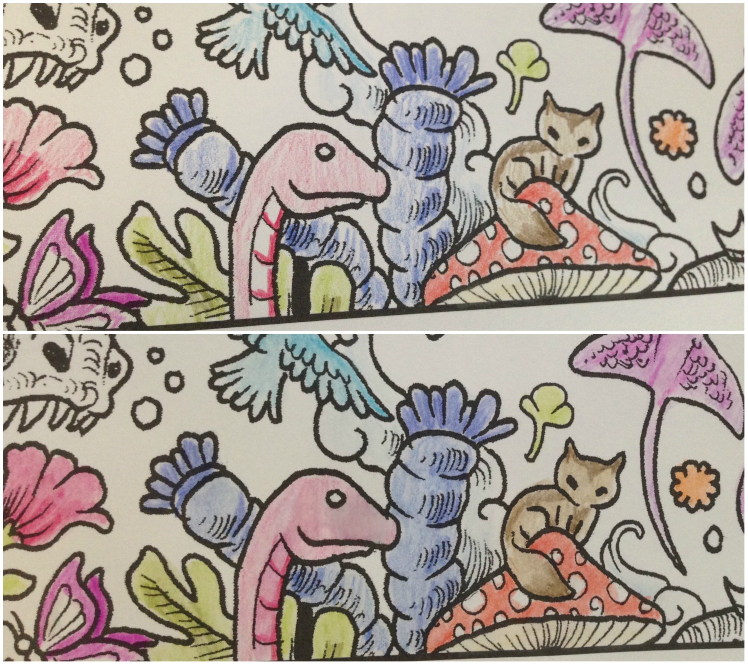
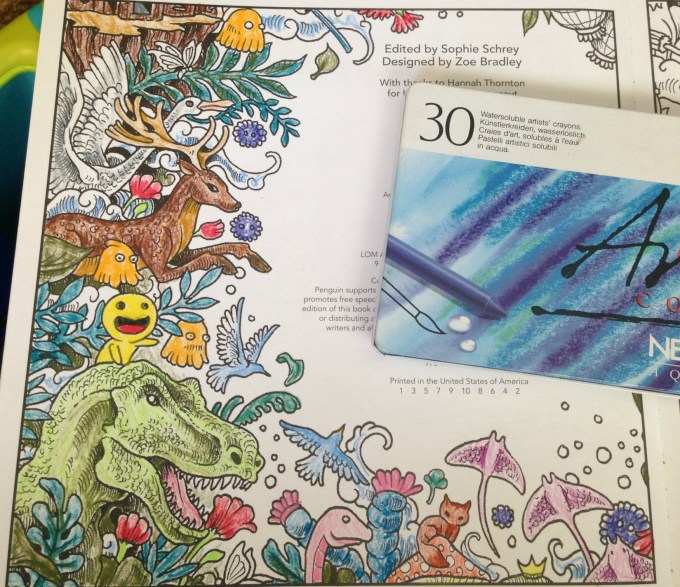
My first test was the inside cover page of Kerby Rosanes’ imagimorphia, which I have been loving lately. I colored the page pretty quickly, not bothering to fully fill in all areas (like the cut area of the tree, for example) because I knew once wetted, the color would spread. I did some minimal color mixing and shading on the leaves, deer and dino, all using the crayons as crayons to color. Sadly they’re old enough that they became fragile, and two colors broke in half as I worked. They’re still usable, but I was disappointed. More evidence of their age is the (removable) white bloom on some of the darker colors, as well as how the lightest brown dried out to the point of looking like a Flake chocolate bar inside its wrapper. 😦
The crayons applied color wonderfully but, as to be expected of crayons, they didn’t have points sharp enough to work into the fine areas of the image. I was able to use the edges of the points to get into fine spots like the rays’ tails and such, but I didn’t bother trying to color the butterflies, knowing I’d just make a mess. In some areas, like the pom-pom-looking little dudes, I only colored the center, planning to move the color outwards later, once I activated the paint.
The very first spot I activated were the clouds in this image. I set a sheet of cardstock behind the page to protect it from any bleed-through or water damage, but it really took such a tiny amount of water that I doubted there would be any actual problems on the reverse-side pages.
You can see in this enlargement of the lower edge what the clouds looked like before the water was applied, as well as the rough, uneven coloring job I did. I’d cringe, except it was deliberate. After seeing how vibrant the colors were and how much they spread, I didn’t want to waste any of the crayon filling in any more densely.
This is the final result. I can’t get over the difference, and how smooth and rich the colors turned out! I did manage to achieve some subtle shading and depth to the colors, and if I’d wanted to color over-top and re-wet I’m sure I could get even more effects. The largest difference for me is in the tree, the deer and the dino, but I’m charmed by all of it.
I was super-pleased (but not surprised) to see that there was NO bleed-through on the other side of the page. This means I can use these crayons throughout the book without worry, which makes me really happy.
Here’s a side-by-side to really compare the before and after images. Besides blending out the patchy scribbles, the colors (which were pretty vibrant before) didn’t fade out and some became even brighter. They blended beautifully and dried really quickly, but not too fast that I couldn’t move around soft watercolor washes.
For the facing page (above) I decided to try using the crayons in a different fashion, as if they were individual little sticks of paint.
I wetted the brush, blotted most of the water off, and then dabbed it against the tip of the crayon, picking up some color, which I then applied to the image as paint, just as if I’d picked the color up from a palette. You can see some of the peach on the tip of my brush, as well as on the face and hands of the little girl I’d just painted.
This is the finished image after painting. In contrast to the side where I colored first, I think this side has a softer, almost dreamier application. However it is slower to keep re-dabbing the brush to the crayon, and it makes mixing colors more difficult as the paint dries much faster when using this method. I greatly recommend it for areas where you need more control or a finer application than you’d get with the stubby crayon.
This method also made me realize that my broken crayons were not a loss, nor was my flakey, dried-out tan. I can put a small piece of the color in one of my palette wells and activate it to use as paint, meaning that no part of these (expensive!) crayons will ever be wasted. 🙂
Here’s the back, showing again that there was no bleed-through or ghosting.
I’m really glad I found these crayons in my stash, and I can’t wait to play around with them more in this and other books. The colors are incredible and they activate so easily and beautifully, I really recommend them. Mine have broken and dried out, but they are also over 15 years old (!!!) and still work as well as if they were brand new. I would wholeheartedly recommend these.
This post may contain affiliate links. This means I might make a small commission on purchases made through the links, at no cost to you.


 Then one day I was laying on my belly in bed coloring the page above (the Eagle image in Kerby Rosanes’ imagimorphia). It was held down by my clipboard on the far right of the right page but I kept getting frustrated at the left-side page flipping shut every time I reached over for my coloring supplies (Stabilo 88 and Staedtler Triplus fineliners, as well as Caran D’Ache Neocolor II watercolor crayons for the purple wisps). I’d been laying on my belly and constantly raising up onto my elbows to brace the page between color changes was starting to hurt more than the coloring itself soothed.


 Before giving the book pages a slight antique stain I’d lightly sketched out my name, trying as best I could to match the font on the opposing page. In pencil it looked great… only I’d been hasty in wanting to finish that part and I’d used the first ink pen I’d had handy not even thinking that the nib was thicker than the printed ink. I traced the “J” and instantly regretted it, wishing I’d used one of my smaller sizes Micron pen instead. However, now that I’d started it was too late to do anything about it. Hmph.


 This is the left-side page, that’s still in progress. I’d begun coloring it in November with my
 …combined with Mowgli all wrapped up… become the coloring page in the book.