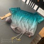
I’ve had a Billowing tee on the needles since August 18 2019. I’d been donated more yarn in exchange for review and after doing a lot of research and seeing this gorgeous version done in the identical yarn I knew it would be the perfect pattern.
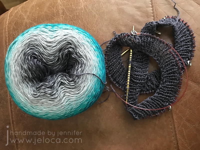
The yarn is Scheepjes Whirl in the Green Tea Tipple colorway. It’s a delicious fingering weight 60/40 cotton/acrylic blend with a whopping 1000m/1093y. It was graciously donated to me by YarnCanada.ca in exchange for review. Whirl blends colors beautifully by evenly changing out the color one of the 2 plies of yarn to create a subtle marled effect, and Green Tea Tipple does this by slowly shifting from from charcoal gray to a deep teal-ish green.
The in-person yarn is identical to the online image, and really lovely to work with. There are a few spots where the end of a blended color sticks out a little bit, and one or two knots, but nothing that creates any sort of inconvenience in the knitting.
As the cake began with gray in the center I went with it and decided my top-down tee would start with gray and blend down to the green.
I’d quickly zipped through a swatch and then cast on. I didn’t want a closed neck on my tee so I calculated how deep I wanted the neckline to fall and cast on a larger amount of stitches, adjusting my rate of increases accordingly.
It’s very addictive to work with yarns that change color like this. You want to keep going to see what the next area will look like.
I worked through the yoke, separated for the armholes (completing their ribbing first so the color would be right) and gotten about an inch or two down the body when I’d stopped. My first two nieces were born not long after and I’d spent my time working on a bunch of baby projects. My tee got put aside and then it languished in my UFO bin until this year.
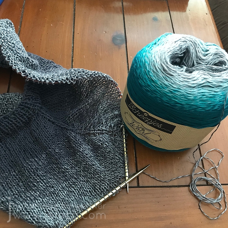
In March of 2023 I was going to a pub knitting night and needed something with mindless stockinette so I could focus on the live music and not my hands. I remembered this project and pulled it from the depths of the forgotten pile only to realize I was no longer the same size as I’d been in 2019 and it was now too big. I also decided I wanted to start with the green instead of the gray.
I frogged the whole thing and re-wound the cake to be able to start with the green end. With two days to go before knit-nite I cast on for a smaller size and raced through the yoke and mini sleeves so I could get to the body. From that night onwards I kept working on the body, keeping it handy whenever I had the chance for mindless knitting.
I was hoping to use the full cake and get to the darkest charcoal but I tried it on last week and it was already at the length I wanted. So I measured out how many rows the ribbing would be, ripped back that many, and began to redo the rows as ribbing to finish off the bottom hem.
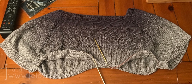
That’s where I was at at the start of UFO Day. My goal was to get through the ribbing and remaining modifications so I could present the finished garment, but I underestimated just how long fingering weight ribbing takes. I suppose it’s fitting that my UFO Day post ends with an unfinished sweater!
Today is World Wide Knit in Public Day! I’ve usually got knitting out in the wild with me, but it felt especially required on today of all days.
I brought my current “purse project” with me to sound check before the Becket Players’ performance at the West Island Relay for Life event tonight. Didn’t get much knitting done but we did have a successful set up. We’ll be playing some great music for a great cause so if you’ll be around the Rive Boisée area come on by and check it out!
A few weeks ago I shared some very old attempts of trying background washes in adult coloring books. Since that point I’ve been watching more Dede videos and reevaluating my supplies and my goals with these coloring pages. To that end, I went through some of my coloring books and chose new pages to try, this time with deliberate intent. Instead of using the washes to help me muster the urge to work on a particular page, now I was choosing pages I wanted to work on, and colors that would help me be happier with the eventual results.
Oh – and I learned from my mistakes – I was for sure going to be using acrylic paint this time.
The best paint to use for this is cheap acrylic paint. It’s matte, opaque but also thins well.
Acrylic paint is a plastic, which means it dries solid and won’t re-wet. This means you can use the same palette over and over, by either pulling off the dried paint or simply working right on top of your (thoroughly) dried paint.
I’ve been using old yogurt and margarine lids but recently started keeping takeout lids for the same purpose. If you have a paint caddy like mine, you can also use the lid as a palette.
I started with my Colours of Comfort coloring book, from my local Dollarama. My kids bought it for me as my Christmas present/stocking stuffer by sneaking it into my cart then making me turn around so they could hand it to the cashier. They then held the bag in the car and carried it into the house so they could get it into my stocking without seeing what they’d picked. (They paid me back later lol)
First up was this mandala-esque page. I picture it completed with golds and jewel tones, so gave the whole page a deep yellow wash.
Next I chose this tea party scene. I was taken with the idea of trying to make the cups look like porcelain, and gave the cups a gray wash so I could layer white pencil on top.
I forgot to take a before pic of this next one. I’m not usually one for landscape drawings, but this one caught my eye.
I like the idea of using my textures tutorial book and practicing some natural textures like the stones.
I’ve had this next coloring book for years, and barely touched it. The Mason-Dixon Knitting’s A Coloring Book for Knitters came out back in 2016 and is filled with fun, crafty images to color. While it’s a cute idea, it suffers from the same paper quality issue as most novelty coloring books, so as my media of preference changed, it limited what I was able to use.
It’s not bad…but it’s not strong enough for alcohol markers and not enough tooth for a good job with colored pencils.
I was really drawn to this winder & swift page. I painted the background with silver paint, hoping to get a vintage “mirrored” wallpaper look in the end, and plan to copy my own swift and winder’s color schemes.
From there I grabbed two of my favorite books to flip through.
Just like landscapes, flowers and plants are not usually my go-to either. Using paint makes me eager to work on these images now, though, and I chose the letters that represent the children in our family.
J and H are for my boys, and L, J and C are for my siblings’ children. Inspired by them all I chose colors that represent the respective children’s hair colors. C has dirty blonde hair and loves blue, so I added the sky (which I later regretted, and did not add in any of the others).
I couldn’t NOT go for a Link-looking character for Henri’s H, since my son is obsessed with The Legend of Zelda.
Jakob’s Jonquil Fairy will be blond just like him…
…and just like my niece L’s blonde curls.
None of these are complete, and none have yet gone past the painting stage, but even at this point I’m so much happier with them than I was with the last batch.
This post may contain affiliate links. This means I might make a small commission on purchases made through the links, at no cost to you.
I follow a number of incredible artists on YouTube and their work has inspired me often over the years. One such time was when I discovered the wonderful art done by Dede Wellingham. I’ve binged many of her livestreams and she’s as sweet and funny as she is talented (which is a lot).
The first video of hers that really got me revved up was “Color Washes in Imagimorphia AdultColor book by Kerby Rosanes Pt 1 of 3“. Adult coloring books were starting to become a big thing in the creative world (back in 2016) and something I’d come to late since I usually focused on fiber- or food-based arts. It hadn’t occurred to me to mix media in the ways Dede demonstrated and I could NOT WAIT to try it out. And I… well to say I missed the mark would be an understatement.
It started out so promising! I collected an assortment of my coloring books, some acrylic paint, my Neocolor II watercolor crayons and my Inktense water-soluble pencils (neither shown in pic).
Problem # 1 – using the wrong materials
Dede uses a number of media in her books, including pan pastels, paint, pencils, markers…but in particular the video that inspired me was based on using acrylic paint to drop in washes of color onto your pages. This has a two-fold effect: 1) it gets color down on the page and fills in the tiny detailed areas, making it easier and less intimidating (and faster) to color in with other media later, and 2) it creates an incredible base for colored pencil as adult coloring books are usually printed on paper that’s relatively smooth but pencils benefit enormously from a paper with more tooth. The acrylic paint gives the paper the missing tooth.
Neither the Neocolor IIs nor the Inktense are acrylic paint. Both of these can be used to add tooth to a page, but I’d diluted them so much that all I’d really managed to do was warp my paper and leave it remaining smooth once dried.
Looking back, even though I like some of the colors I’d chosen, I’m not happy with the results. I don’t like how all my random scribbles show because I hadn’t put the color down evenly, and I’m disappointed that I completely messed up on the entire “adding tooth” benefit.
Problem # 2 – using the right materialsthe wrong way
The remaining pages that I’d painted were all done with acrylic paint. That means they must be good, right? No, actually. Not at all. Some of them (the underwater ones in particular) look better in person than in the images below, but none of them are “good”, because I missed the mark again. I was so focused on getting a spread of color onto the page that I didn’t think I had to try and do it nicely. I’m embarrassed to admit it really didn’t occur to me that that it was more than a matter of simply splashing water into paint and wiping it across the page a few times. In most cases below I did a horrible application, and in the one or two that aren’t too bad, I used too much water and so the resulting color doesn’t have the tooth either. (And in the final case, I’d used much too much water and caused the marker on the reverse to completely bleed through).
(the next page that bled through to the one above)
Problem # 3 – choosing the wrong pages
I think this was the worst mistake I made out of all of them – I chose the wrong pages. With one exception, I’ve never really wanted to color ANY of the images above. Rather than pick pages that I looked forward to, instead I thought I could “cheat” my way into getting pages “done”, and done “faster” by slapping color down to make the final coloring quicker and easier. Instead I now have pages I still don’t want to do, just now they have some color on them.
So why am I bringing this up now? Well Dede’s videos have come back into my recommendeds and I’ve begun binging again, and once again am completely hooked. On THIS TIME I’ve learned from my mistakes!
This post may contain affiliate links. This means I might make a small commission on purchases made through the links, at no cost to you.
Back in January 2019 (!) I posted 19 projects I was determined to complete in 2019. Spoiler alert – I failed – but I have made significant progress on about half of the projects on the list. Inspired by the recent Masters of the Universe and Suicide Squad remakes, here’s the current progress on my trio of 80s cartoon girls.
What I said: I’ve never shown these before, except for the odd glimpse in the background of Instagram pics. I started this trio of plastic canvas portraits when I moved in August 2017. While I love how they look in black and white (and blue), I designed them to be in full color and I’d love to see them complete.
What I did: Quite a bit of progress!
I’d never shown them on the blog prior to that post, so here’s a look back at how they got to where they are now.
I’d moved in 2017 and was really excited to be able to fill my space with all the crafty, nerdy little things that make me who I am.
Every shelf and table has some item that references my varied interests, and I’ve even used some previous projects as home décor – see the Minecraft heads from my tutorials peeping from above the kids’ desk, along with an as-yet-unshown secret project hidden among the books – so I was really excited to fill a blank wall space in my dining room with a handmade project.
First I purchased three of the largest plastic canvas sheets I could find. When looking for inspiration for what to stitch on them I really didn’t need to look very far. There are Archie comics in nearly every room in my house, thanks to my kids enjoying them as much as I do. In addition to the coloring book from my last post, I’ve drawn Betty on the blog here before, and Henri had drawn Archie a few years back. (He was even an Archie comics character for Hallowe’en last year, and I’ll be sharing that project here in October.) So clearly, Betty Cooper would be one of my cartoon trio.
Initially I drafted up Betty, Archie and Veronica, and planned out a triptych of the three of them, but the more I thought about it the more I realized it was Betty specifically that I like, and that I didn’t care if I saw Archie and Veronica daily, so I scrapped them and looked around for more inspo. As soon as I had the freedom to look beyond Riverdale I knew Harley Quinn HAD to be one of them. I’ve adored her for decades, and she’s featured in assorted places around my house, including in two different spots on this one shelving unit:
Finally, it wasn’t hard to decide on Teela as my third girl. I grew up watching He-Man and playing with the toy sets along with my younger brothers. I don’t know if it’s that she’s a strong, independant woman or if it was because she often wore a cobra headpiece and had a snake staff, and I’ve always adored snakes… but either way she had to be the one to complete my cartoon trio. I’ve shared Teela and a portion of my 80s toy collection on the blog before, and they’ve now found a home in a cabinet along with other childhood relics:
The hard part done, the next step was to create charts for each character. Instead of doing it the easy way and importing reference images into a stitch software, I decided to go the hard route and chart them myself in Excel. I found reference images for each character, adjusted the Excel cells to be square and marked off an area with the same stitch count as my total canvas size. From there it was just a matter of redrawing each girl, pixel-art style, and tweaking the design until they looked right. I’d originally planned to use continental stitch to save time, but quickly realized the angles would be skewed and that cross-stitch would be best, using one stitch for every pixel/cell in my chart.
I ordered a bunch of yarn from Knit Pics, then got started.
Here you can see the initial stages. I didn’t want to have to refer to the charts throughout the entire stitching process so decided to start with the black outlines first, so I could then later fill them in, coloring-book-style. Plus I didn’t know how long they would take to complete into full color and wanted to be able to hang them on the wall in the meantime. Considering I started these in 2017 and I’m typing this post in 2021, I’m glad I had that foresight!!
After finishing most of Betty I moved on to chart HQ next. I bet you’re wondering why I left Betty mostly done instead of finishing the rest of her border? Took me a moment to remember too lol but it’s because I left myself things to work on that didn’t require concentration, so when I had more time I would work on HQ and follow my charts, and when I had the kids with me or was watching something that required more focus I could work on Betty’s border that didn’t require much thought or any chart reference. Basically it was the cross-stitch equivalent of having knitting or crochet projects of varying difficulty levels.
Once the outlining was all done I worked on each of their eyes, as I thought it would look better on the wall, and truthfully HQ was a bit creepy without them. Then, while I still had the blue out, I added Betty’s shirt. Her top was red in my reference image but blue is my favorite color so I swapped it out, plus I liked having a color that was in each of the 3 images, to help tie them together. The middle pic above is the one posted on the blog back in 2019, and where they sat for basically most of the last 3 years. At some point I filled in their mouths and got started on Betty’s skin, and that’s where I’d stopped and moved on to other projects.
Eventually I started working on them again. I’d always had it in mind to work on equal parts of each, so as they hung on the wall they’d look similar in completion. First Betty had the slow progress on her face and neck…
…and then this past summer Teela got the same treatment, using stash yarn so she wouldn’t have the exact same skin tone as Betty’s.
Technically I should have done Harley’s face next, for them to all match, but these sheets are large and get folded up against my body or resting under my arm as I work. Since Harley’s face is white, and clearly a focal point of the image, I decided to hold it off for last so it wouldn’t get dirty or faded, and work on her costume instead.
At that point I was on a roll! The new Netflix Masters of the Universe had just come out, and it was kinda cool to start working on Teela’s tiara while watching the premiere. In fact, I got so into it that I kept watching until I found I’d binged the whole first season!
Spoiler-free take: ignore the men complaining about the show. It’s awesome to see the old gang again, even Stinkor! (Man I can still remember the smell of that toy!) I love the focus on Teela and magic vs tech. Made me think about Skylanders and my girl Sprocket – guess I’m always drawn to my tech girls! Also, as a big Buffy fan, with Sarah Michelle Gellar as the voice of Teela, it’s fantastic to hear Buffy kicking butt again. ♥
This is where the girls are now. I’ll be working on HQ’s white bib and pompom next, to complete her outfit, and that will put me into the home stretch with only 2 sections left on each girl. At the end I’ll have to do one run of border around each one, as the edges are currently unfinished, and then finally attach rings for hanging them properly, as I’m currently holding them to the wall with thumbtacks.
I know it’s not conventional wall art for an adult woman, but I love them.
It’s January, so that means out with the old, and in with the new… challenge. While I didn’t get as far as posting my backlog of projects and tutorials, the monthly posting (self-imposed) commitment did keep me going, and I’m going to take it a step further in 2021.
But first- let’s close out the current challenge. For the 12th and final time: each month in 2020 my 11yo son Henri and I chose a page from Moriah Elizabeth‘s Create This Book (vol 1) and each of us completed the page in our own books. Now the year has gone by, Henri will be 12 next week, and there’s a link to all past pages at the bottom of this post.
For December Henri chose the “Create Art with Wax” spread on pages 52-53.
Instead of coloring with the crayons, he wanted to try a heat-and-drip method. He used regular Crayola and Cra-Z-Art wax crayons, and I decided to get “fancy” and go with the Crayola Twistables I’d used back in May.
Note- don’t do this. First of all, if you don’t twist the crayon out enough, you can start melting the plastic. Secondly, the glitter ones kept making strands (like when you use a glue gun). Thirdly, they don’t melt that great before starting to scorch, and finally – they burn. As in, like a candle. As in they hold a flame and now you’re just holding fire. I was able to time how long to heat them for, but I wouldn’t allow my kids to try to heat these. Stick to using them on paper.
We used the candle as our heat source and started playing around. Looking back at this pic I remember how well I thought it was starting. It wasn’t great by any means – they didn’t melt well and they dried super fast so I only got one dab onto the paper before having to re-heat… but it seemed like it would be ok…
<cough> …and then this mess happened. I have no words. Like, it’s just… ugly. I tried to embrace the “no rules, just go with it” but then also tried to do… something? The combination doesn’t work. These crayons for melting doesn’t work. Nothing you see here works LOL
In fact I like the blotting paper I kept on the side better than the actual “artwork”.
I even like the dusting page where we swept up all the wax bits better than the actual art!
So it’s no surprise that once again Henri kicked my ass!
Seriously. The kid made a freaking sunset over water.
How cool is that??? I love it. I’m tempted to give him a canvas and a lighter and ask him to make me one for my wall. (Kidding).
(Mostly).
And that’s a wrap on the year!
Complete list of 2020 Create This Book Challenge pages:
December – pages 52-53 “Create with Wax” – this post
Final thoughts: this was a really fun experience to do all year. I loved having an art challenge with my child, and getting to see his creativity and the ways it can be similar or different from my own. I loved watching him hunched over the book or getting excited over an idea, and I love that I have the book as a memento of his talents at this point in time (and future ones as we keep filling in the pages).
Favorite page(s) of Henri’s: I love his February because it’s got so many weird and random elements (pooping apple?!?) that reflect his sense of humor. Speaking of which, I LOVE his September page! Not only the idea but the execution. Oh, and his July! He made it look like a full magazine spread!
Favorite page(s) of mine: I think March was my most “professional” page, so the part of me that feels like the art I present to the world needs to be reflective of skill, I’m proud of that one. April takes me back to my childhood, as a card fold I learned in an early art class when I was about 8 or 9 is one I still use today for fun “talking” cards, and this page will always remind me of 2020 and social distancing and quarantining and cuddling with my boys and giggling over cool TikTok videos. I also really like my October. I haven’t freehand drawn anything publicly (outside of Becket stuff) and it felt good to flex those muscles again.
Finally I think I like November for both of us. I created my first OC in years, and he wow’d me with the details and thought he puts into his drawings. He doesn’t miss a thing.
So now that 2020 is done, it’s time to reveal my 2021 challenge. It’s actually one I was looking into about a year or so ago, but then forgot about. When it came to mind on Jan 1 I knew it was a sign, because one of my current goals is to teach myself Procreate, and this challenge can be either physical or digital. I sprung for the digital version, and on January 1st 2021 I sat down and did my first square in the One Year Doodle Challenge by Jennifer (SeaLemon on YouTube).
My short explanation is that it’s a year (undated, so you can start anytime, any year) of doodle prompts, but you can watch her full explanation video:
I’m going to do my best to do one doodle per day and then post the full month somewhere in the first week of the following month.
As a little preview, here’s my January 1 square “balloon”. I was going to draw a regular balloon but went for a balloon animal instead. If I’d been sketching by hand on paper, I’d have put in the actual 3D perspective with the other legs and ear behind the ones shown. But I’m still learning layers and shading and didn’t want to have the extra elements to get me frustrated. As it was I should have used the function that smooths the lines, because my balloon would look way better without wonky edges, and the smudge function annoys me because it doesn’t smudge like I feel it should… Nonetheless I’m quite pleased with my little doodle and looking forward to seeing how far I come by Dec 31.
Happy New Year!
This post may contain affiliate links. This means I might make a small commission on purchases made through the links, at no cost to you.
It seems like everywhere you look online these days, people are taking stock of 2018 and setting goals for moving forward. The first few days of the new year tend to be all about making resolutions, and to that end- here’s one of mine:
I resolve to turn the following 19 wips (works in progress) into FOs (finished objects) before the end of 2019.
I’ll write at length about each project when I finish (and post) about them, but for now here’s a short blurb for each:
1. FO Project Jars
I need to rip out all the individual lengths of yarn (1-10 yards long, each), match them up with what project they were from, and put the separated yarn into jars designated for each year.
2. Harvest Moon Pullover – crochet
I started this sweater on November 25 2016 as a way to use my adored Noro Silk Garden limited stash on something for myself. Limited yarn + crocheted pattern with big holes = a sweater that might fit… right?
3. Granny Rectangle Blanket – crochet
I started this blanket on August 9 2015 as a way to use up random sock yarns I figured I’d never get around to using for, y’know, socks. Figured out how to make granny squares as rectangles and then alternated with white for… some reason.
4. & 5. Ralph and Black Sheep’s Sweaters – sewing & cross stitch
I started these sweaters for the boys’ favorite stuffed animals a few nights before Christmas 2016. They were intended to be little surprises for them but instead they’ve sat in a bag ever since. Sadly Jakob is no longer as into iHasCupQuake as he used to be, so I’ll need to rip out the stitching on the front of Ralph’s sweater and hope it doesn’t leave gaping holes in the fleece. Then I’ll have to figure out new designs to personalize the fronts, find where I put the sleeve pieces, and sew the little sweaters together.
6. Drops V-Neck Pullover – knitting
I started this deep-v sweater somewhere in 2015 or 2016. It’s slouchy and soft and I want to wear it already.
7. Fluffy Shawl – knitting
I started this shawl on April 6 2015. It’s been sitting untouched in a bag since roughly that Fall. I love how the colors blend together (black Sandes Garn Sisu and purple/green Noro Kureyon Sock) and would like it to be done and hugging my shoulders.
8. Comfy Socks – knitting
According to myself, I started these socks 2 FULL YEARS AGO. They’re supposed to be my ‘take along’ knitting but because I haven’t finished designing the pattern, I never take them with me to work on. I need them done so I can reclaim the needles and portable hanging knitting bag and start being more productive again.
9. Fun Fur Vest – knitting
I started this Bergere de France vest in 2012(!!). My Ravelry projects page has it listed as completed on Feb 10 2015 but clearly it isn’t. No ends are woven in, it might need armhole cuffs, and I think I was debating overdying the entire thing black.
10. Doodle Fusion Marco Raffiné Page – coloring
This page from Doodle Fusion was started last summer (I think) using only my set of Marco Raffiné oil-based colored pencils.
11. Grimm Fairy Tales Alice Page – coloring
This page from Grimm’s Fairy Tales was a test to see if I could get good results using dollar store colored pencils. I’ve since moved the pencils somewhere else and want to finish the image so I don’t need to dig them out any more.
12. Grimm Fairy Tales Little Red Page – coloring
Those of you who follow me on Instagram would have seen this page from Grimm’s Fairy Tales back when I started it in June. I love how it’s turning out and want to see how well I can complete it.
13. Imagimorphia Eagle 2-Page – coloring
This double-page spread from Imagimorphia was started in the Fall of 2016. I loved coloring the tiny rainbows and then lost steam.
I honestly don’t remember when I started this page. Luckily I’d blogged about it!
15. The Time Garden Quilt Page – coloring
I don’t recall when I started working on this page in Daria Song’s The Time Garden either but judging from other posts about it I’d made in April 2016, I’m going to guess it was about that time. I have NO idea, however, why I stopped it so close to being done.
16. The Princess Bride Fred Savage 2-Page – coloring
This page was blogged when I first started it, way back in March 2017. I don’t want to move on to another page in the book until this one is done, though, so I need to make the time to finally get it finished up.
I’ve never shown these before, except for the odd glimpse in the background of Instagram pics. I started this trio of plastic canvas portraits when I moved in August 2017. While I love how they look in black and white (and blue), I designed them to be in full color and I’d love to see them complete.
Think I can do it? Want to play along? Use the tag #19WIPtoFO2019 so I can see how many you get through!
ps: As I’m about to post this I just realized that 19 projects means committing to completing more than one per month. Months that are already pretty busy with Becket, work, kids, commissions and all the new projects I want to work on and might come up over the year… Wish me luck- I’m gonna need it!!
This post may contain affiliate links. This means I might make a small commission on purchases made through the links, at no cost to you.
…aka the Fred Savage/Peter Falk double-page spread.
Sometimes I like mindless projects like stockinette stitch knitting or coloring where the resulting image can look like anything I can imagine. Other times the challenge of replicating something existing is what thrills me, like Henri’s Pitfall: The Lost Expedition cake that had to look like a scene from the game, or my (full posts still outstanding) Skylanders Sprocket cosplay that had to look like the character from the game. After a more casual take on the first few pages in the Princess Bride coloring book I was really eager to tackle something detailed and specific, so I was really happy to turn the page and see one of the the Grandfather/Grandson scenes from the movie’s framing device.
For reference, here’s a still from that scene in the movie:
Just like with the Kaa/Mowglii page in the Art of Coloring: Disney Villains book, the Sherlock coloring book, the Doctor Who one, and others, I think some of the more photo-realistic pages start with photoshopped stills that are then cleaned up and refined by the artist. In this case the only real differences between the book and the movie are a different jumble of toys and books on the headboard and the altering of Fred’s jersey, both changes likely due to the trademarks involved like the Bears, the Cheetos, and the He-Man figures, etc.
I don’t have progress pics from before this point because I was so into the coloring that I forgot. I’d started with the lamp… for no real reason other than I’d wanted to. After that I started thinking about how the Inktense pencils behaved: while they’re supposed to be permanent, if not fully activated they’d bleed into the surrounding areas. So, for example, if I laid down a lot of pigment making his hair dark brown, and missed some stray bits near the outline, that dark color would bleed over into the white headboard/shelves if I got too close with my wet brush (which is why I’m leaving that, among other areas, for last).
I spent waaaaay too long on the bedspread. Even after choosing the colors I spent more time than necessary figuring out if there was a repeatable pattern I could copy.
(Go figure I didn’t find THIS pic until I was done that part. Sigh.)
Once the stripes were done I tossed in a bit of shading, then did the pillows. Next up was the skin (within which the shadows look a little exaggerated at the moment, but I plan to smooth it out with some colored pencil at the end).
I broke my own ‘dark colors’ rule in doing the jersey next (it’s the exception that proves it, right?) and then the shadows along the wall/shelves/head board.
And this is the point I’m at now. I’ve started tossing some color into the books and comics and toys other odds and ends strewn about.
Oh- I wanted to say something excellent about this book: while it’s not made to hold heavy applications of water, and will definitely never stand up to alcohol markers, I’ve put this page so far through a lot. After working some areas, like the jersey, it was with a lot of trepidation that I turned back to the page before to check for bleed-through. The page on the other side of this one is the ownership page, so with only the smaller scollwork/flowers in the center of the page, there is a LOT of blank area for ghosting and bleeding to show through.
There’s none. Nada. Zilch. In fact, I took the pics in my previous post after already coloring this far, so you can see for yourself that there aren’t even traces of ghosting to disrupt the background. 🙂
You can find more coloring-related posts sorted by material or book at the Coloring tab in the header above, or click here for more posts about The Princess Bride Coloring Book.
I know, I know- three posts in a row! I told you- I’m addicted to this book, and if I don’t start posting stuff from where I’m at I’ll keep winding up too far ahead. Unlike tutorials or cakes where once they’re done, they’re done and I can post the finished thing anytime, ideally with coloring projects I could be somewhat up to date so I can post pics here or on my Instagram as I work on them. Since this book is my current obsession, I’m making sure to get these posts out before I move ahead too far.
So. This is the ownership page in progress. (If anyone isn’t following along this is the The Princess Bride Coloring Book, colored with Derwent Inktense pencils). For the most part it’s a repeat of the title page, since it has the same buttercups and carved wood. I did learn from my mistakes on the last page, however, and went lighter for my initial passes at the wood color. I haven’t done any colored pencil shading on this one yet, and so far it reminds me of the strips of Birch kids would get in trouble for tearing off the trees at my old camp.
Before giving the book pages a slight antique stain I’d lightly sketched out my name, trying as best I could to match the font on the opposing page. In pencil it looked great… only I’d been hasty in wanting to finish that part and I’d used the first ink pen I’d had handy not even thinking that the nib was thicker than the printed ink. I traced the “J” and instantly regretted it, wishing I’d used one of my smaller sizes Micron pen instead. However, now that I’d started it was too late to do anything about it. Hmph.
I’d even tried to erase the ink over the J, wondering if it would fade it enough to not stand out with as much contrast as it was having. Again I was being hasty and nearly smeared the black ink. Sigh. In the end I managed to salvage the pic, I think. Since I couldn’t undo the thicker outline on the right, I chose to use the same pen to outline the existing words on the left, so both pages matched.
The Inktense on this page is complete, and all I want to do now is darken the depths of the shadows of the wood and the flower centers with some colored pencil, and then this page will be done.
You can find more coloring-related posts sorted by material or book at the Coloring tab in the header above, or click here for more posts about The Princess Bride Coloring Book.
This post may contain affiliate links. This means I might make a small commission on purchases made through the links, at no cost to you.
(As an aside, you can clearly see the lack of bleed-through on this page, even after all the layers of color I’d put down).
Still working with the Inktense, I started at the sun in the center and worked downwards. I used a few shades of yellow for the sun then started with the oranges, using the darkest color from each section as the palest in the next. So if the first section used colors A and B as ABABAB then the next section was BCBCBC, then CDCDCD, and so on. I planned the gradation deliberately timed so the blues would hit by the waves, then the teals/greens in the water.
The lines are so narrow that I can’t really look up to watch tv or something while I activate it, so I’ve been working on it here and there while catching up on past episodes of the podcast Lore. I’m in no rush, though, as I love watching the muted pigment (the left side) spring to life once wetted (the right side, up to midway).
This post may contain affiliate links. This means I might make a small commission on purchases made through the links, at no cost to you.


 Before giving the book pages a slight antique stain I’d lightly sketched out my name, trying as best I could to match the font on the opposing page. In pencil it looked great… only I’d been hasty in wanting to finish that part and I’d used the first ink pen I’d had handy not even thinking that the nib was thicker than the printed ink. I traced the “J” and instantly regretted it, wishing I’d used one of my smaller sizes Micron pen instead. However, now that I’d started it was too late to do anything about it. Hmph.


