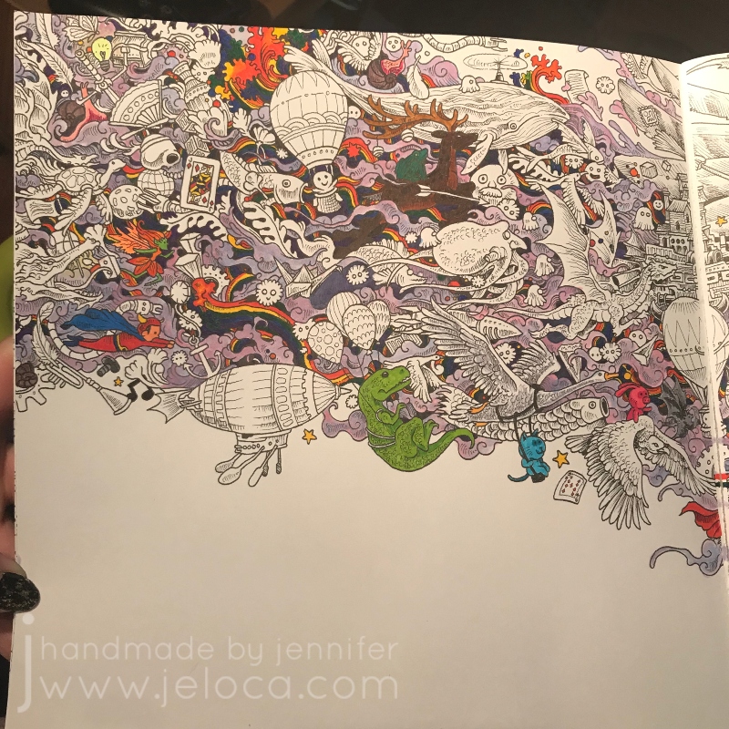
I still don’t know why I lost interest. Likely it was because so many fun coloring books had come out around the same time and my attention span was fickle 😉
When I resumed working on it I filled in the remaining areas with the same fineliners as well as my set of Feela double-ended markers that have a brush tip on one end and a fineliner on the other.
I added Inktense water-soluble ink pencils at the end for the background, but clearly had not yet figured out how to apply them without leaving streaks, sigh.
I can’t say I’m super thrilled with the final image, though I am quite happy it’s done.
If I were to start it all over again I’d pick a cohesive color palette with the Color Catalog first. Ignoring the larger picture and working everything as individual motifs gives a rather chaotic look in the end that I don’t think I pulled off well.
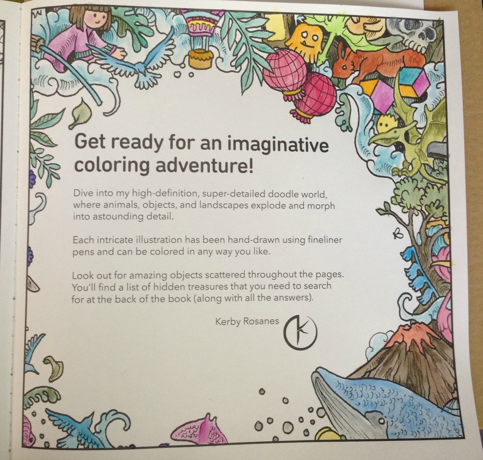
This post may contain affiliate links. This means I might make a small commission on purchases made through the links, at no cost to you.
I follow a number of incredible artists on YouTube and their work has inspired me often over the years. One such time was when I discovered the wonderful art done by Dede Wellingham. I’ve binged many of her livestreams and she’s as sweet and funny as she is talented (which is a lot).
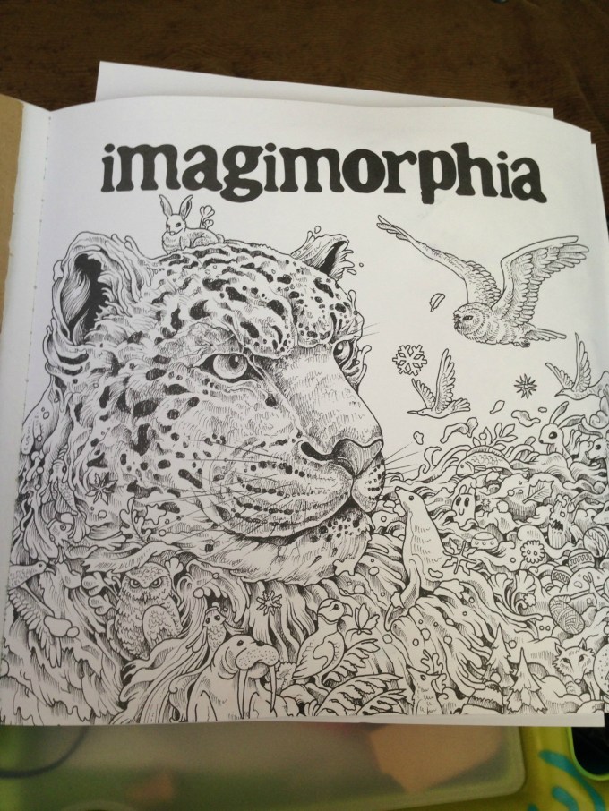
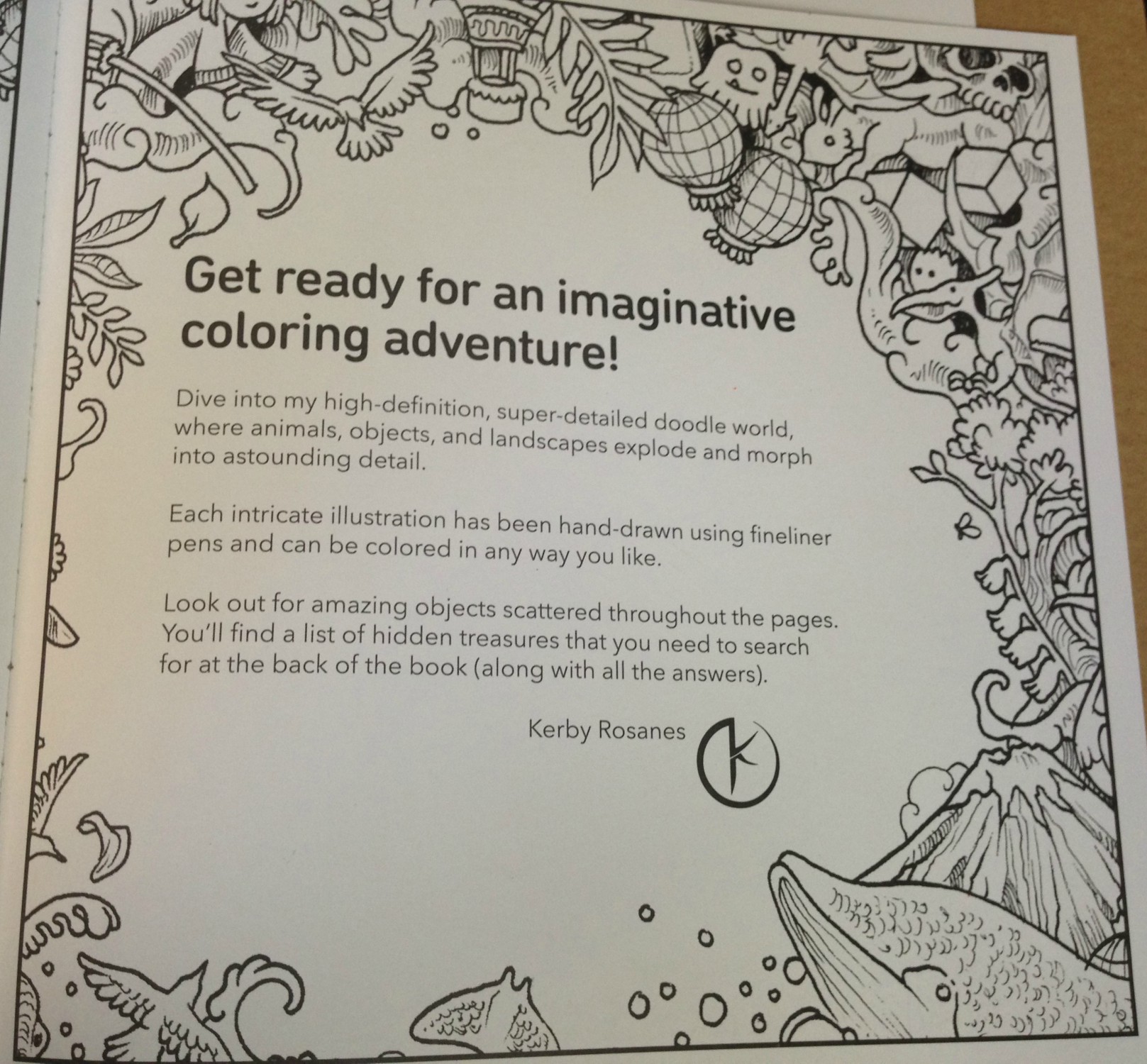
The first video of hers that really got me revved up was “Color Washes in Imagimorphia AdultColor book by Kerby Rosanes Pt 1 of 3“. Adult coloring books were starting to become a big thing in the creative world (back in 2016) and something I’d come to late since I usually focused on fiber- or food-based arts. It hadn’t occurred to me to mix media in the ways Dede demonstrated and I could NOT WAIT to try it out. And I… well to say I missed the mark would be an understatement.
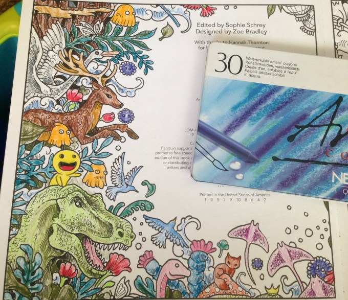
It started out so promising! I collected an assortment of my coloring books, some acrylic paint, my Neocolor II watercolor crayons and my Inktense water-soluble pencils (neither shown in pic).
Problem # 1 – using the wrong materials
Dede uses a number of media in her books, including pan pastels, paint, pencils, markers…but in particular the video that inspired me was based on using acrylic paint to drop in washes of color onto your pages. This has a two-fold effect: 1) it gets color down on the page and fills in the tiny detailed areas, making it easier and less intimidating (and faster) to color in with other media later, and 2) it creates an incredible base for colored pencil as adult coloring books are usually printed on paper that’s relatively smooth but pencils benefit enormously from a paper with more tooth. The acrylic paint gives the paper the missing tooth.
Neither the Neocolor IIs nor the Inktense are acrylic paint. Both of these can be used to add tooth to a page, but I’d diluted them so much that all I’d really managed to do was warp my paper and leave it remaining smooth once dried.
Looking back, even though I like some of the colors I’d chosen, I’m not happy with the results. I don’t like how all my random scribbles show because I hadn’t put the color down evenly, and I’m disappointed that I completely messed up on the entire “adding tooth” benefit.
Problem # 2 – using the right materialsthe wrong way
The remaining pages that I’d painted were all done with acrylic paint. That means they must be good, right? No, actually. Not at all. Some of them (the underwater ones in particular) look better in person than in the images below, but none of them are “good”, because I missed the mark again. I was so focused on getting a spread of color onto the page that I didn’t think I had to try and do it nicely. I’m embarrassed to admit it really didn’t occur to me that that it was more than a matter of simply splashing water into paint and wiping it across the page a few times. In most cases below I did a horrible application, and in the one or two that aren’t too bad, I used too much water and so the resulting color doesn’t have the tooth either. (And in the final case, I’d used much too much water and caused the marker on the reverse to completely bleed through).
(the next page that bled through to the one above)
Problem # 3 – choosing the wrong pages
I think this was the worst mistake I made out of all of them – I chose the wrong pages. With one exception, I’ve never really wanted to color ANY of the images above. Rather than pick pages that I looked forward to, instead I thought I could “cheat” my way into getting pages “done”, and done “faster” by slapping color down to make the final coloring quicker and easier. Instead I now have pages I still don’t want to do, just now they have some color on them.
So why am I bringing this up now? Well Dede’s videos have come back into my recommendeds and I’ve begun binging again, and once again am completely hooked. On THIS TIME I’ve learned from my mistakes!
This post may contain affiliate links. This means I might make a small commission on purchases made through the links, at no cost to you.
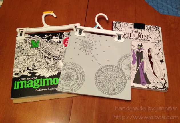
I don’t have a ‘Crafty Compilation’ for either of the last two weeks as I’ve spent them working primarily on some sample knitting that I’m not sure if I can talk about yet. So, instead, here’s a quick tip for those of you who enjoy coloring: pants hangers are your friend.
Yup. Actual hangers that you use to hang up your pants. (Or your kids’ pants, in my case).
I’ve been using binder clips with my Art of Coloring: Disney Villains book ever since I got it. I’ve been using a lot of water media in it and I’ve taken to clipping the book shut whenever I’m not using it to minimize most of the page warping. Because this book has thick cardboard covers it stays open pretty flat on its own, though I tend to pop the clip onto my working page mostly so I don’t misplace it until I need it again. With other books I’ve taken to working on a clipboard for both the hard surface as well as the ability to clip the book open to my current page. For the most part, that worked perfectly.
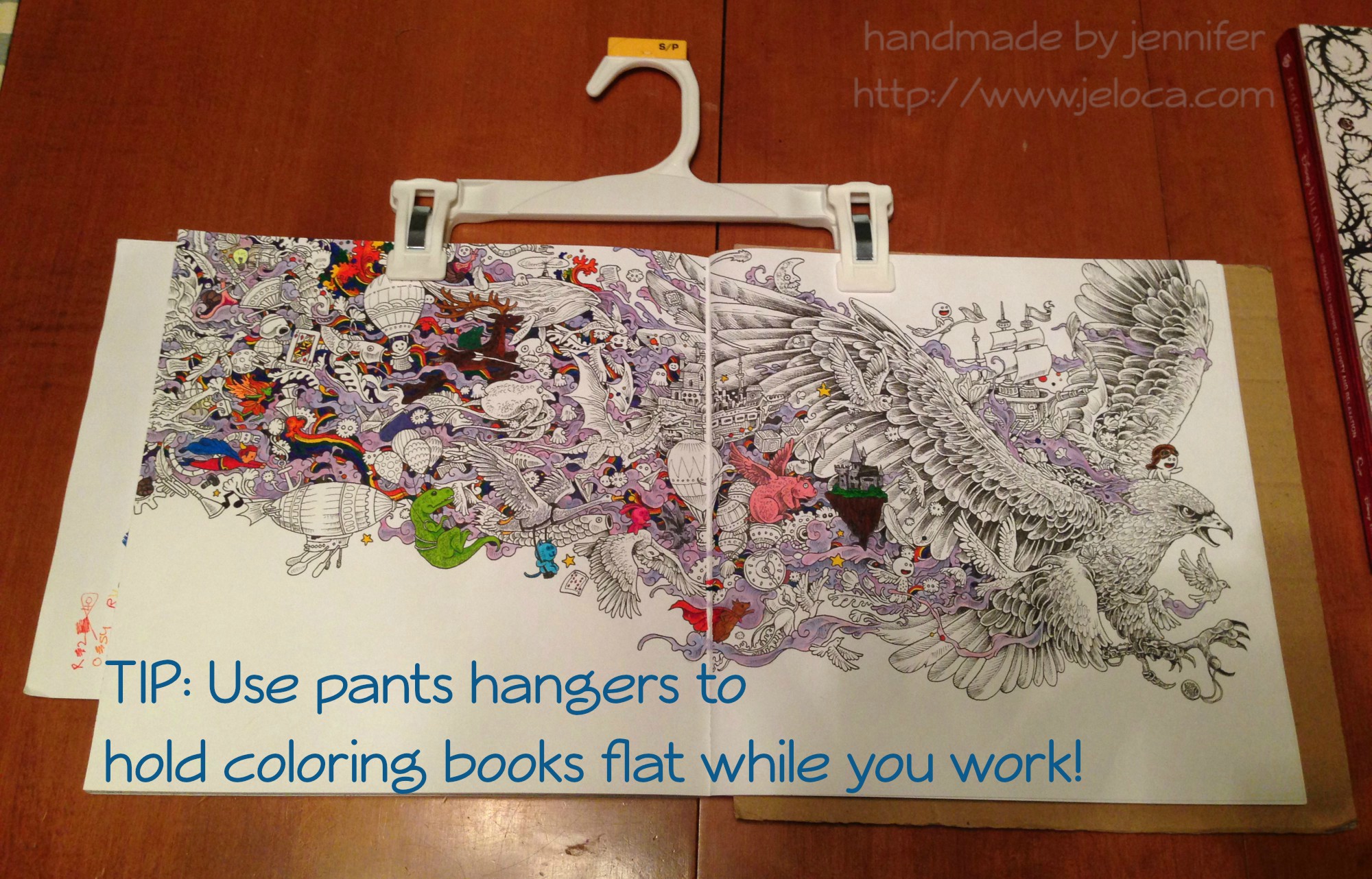
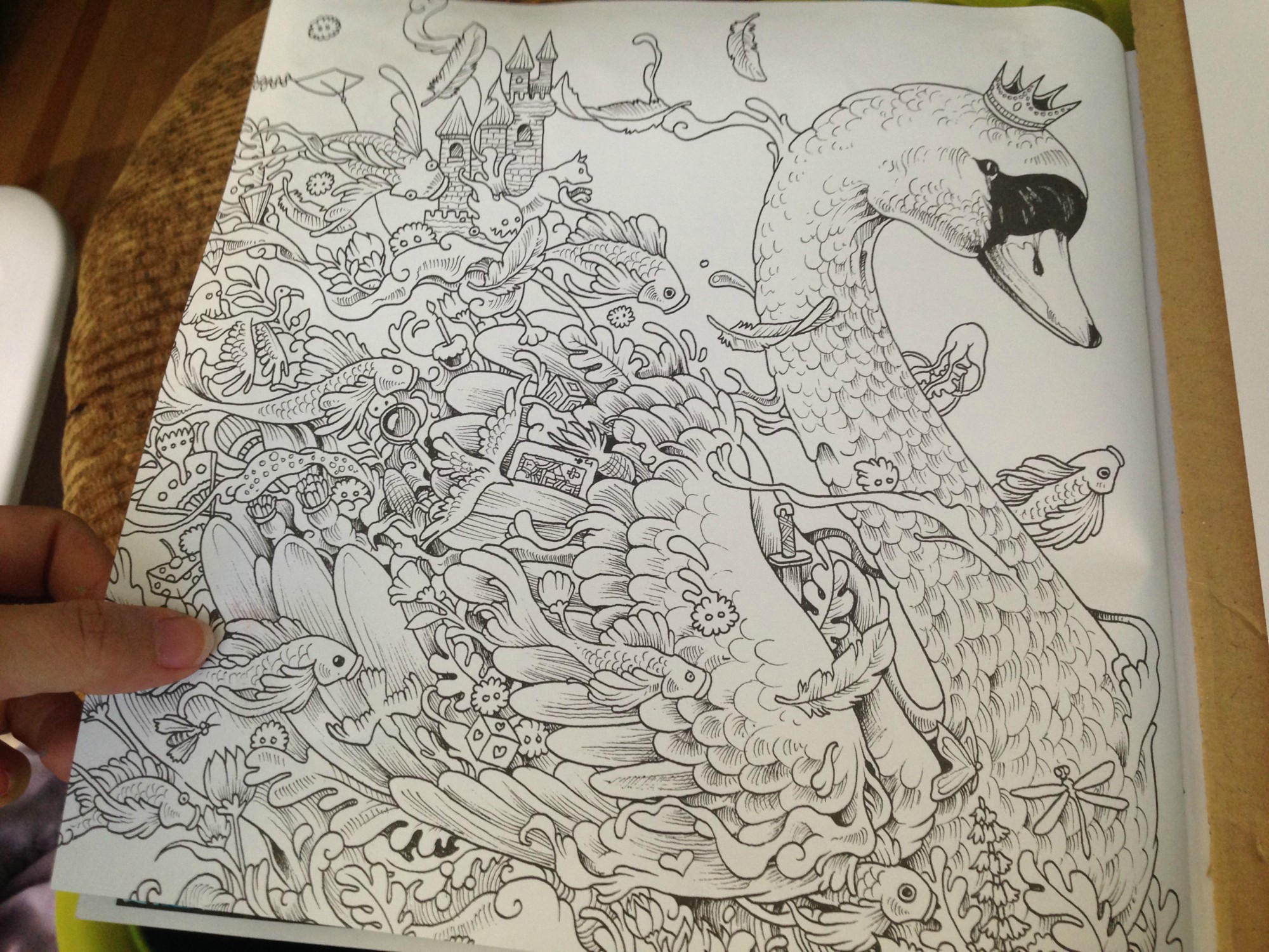
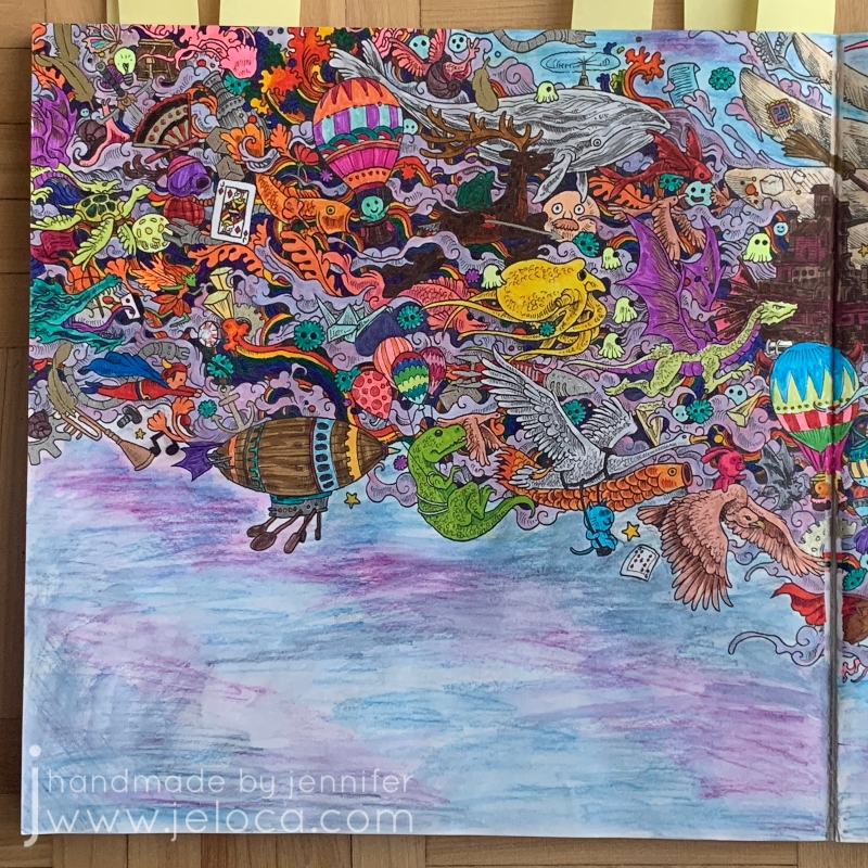
Then one day I was laying on my belly in bed coloring the page above (the Eagle image in Kerby Rosanes’ imagimorphia). It was held down by my clipboard on the far right of the right page but I kept getting frustrated at the left-side page flipping shut every time I reached over for my coloring supplies (Stabilo 88 and Staedtler Triplus fineliners, as well as Caran D’Ache Neocolor II watercolor crayons for the purple wisps). I’d been laying on my belly and constantly raising up onto my elbows to brace the page between color changes was starting to hurt more than the coloring itself soothed.
Henri had had a similar problem holding open his Pokemon books so he could sketch from them, and I’d lent him my cookbook stand. It was a great solution but now that I needed it I didn’t have the heart to steal it back for myself. That’s when I remembered the image going around Facebook a while ago in a list of kitchen tips: using a pants hanger to hold your recipe up and out of the way, by hanging it from an upper cabinet doorknob. I had no need to hang my coloring book, but it would be perfect for what I needed too!
And it was! The two clips hold the pages down on either side, but the stiff bar that connects them keeps them open flat, where the book could otherwise still slip shut. (The above wip image is also from imagimorphia, and the background wash was done with the Neocolor IIs). After you’ve finished coloring the page, the hanger can then be used to clip the book shut as it dries to minimize any warping from the wet pages.
If you wanted you could also store your books from the hangers, sideways along a bar similar to needlepoint sets. (Ooooh now I’m picturing a dry cleaner-style conveyor holding all my coloring and craft books… that would be awesome!!)
And for an easy reminder to pin:
That’s all for now. Hopefully this tip could be handy for some of you!
This post may contain affiliate links. This means I might make a small commission on purchases made through the links, at no cost to you.
I’d been researching watercolor pencils a little while ago, and while reading review sites I came across a few mentions of the Caran D’Ache Neocolor II watercolor crayons. They looked interesting and were lauded for their bright, vibrant colors and creamy texture, so I made a note to look up more reviews. In the meantime, I remembered that at some point during my creative history I’d owned a set of, what my memory told me, were kid’s-quality twist-up watercolor pencils. I could picture the set, and knew there was only one place in my home-office they could be, so one morning I went downstairs and took a look.
I found the twist-up colored pencils right away… and was disappointed to see they were just that- colored pencils. Nothing water-soluble about them. It was frustrating to have been mistaken but I figured I’d just continue my research… and then I peeked through the rest of the drawer just to see what other drawing supplies I’d collected over the years and had forgotten about.
What a discovery! I think I squee’d out loud when I saw the white edge of the tin under an old pencil case of charcoal and blending stumps. Not only had I forgotten I owned these but clearly I’d barely ever used them when I got them, because they were all still full-sized and touching the sponge strip running the top of the case.
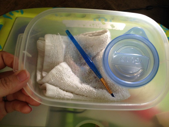
Immediately I brought them upstairs to try out. I’d been stuck in bed, resting my legs due to a really bad bout of sciatica, so I put together a little portable watercolor kit that I could use in bed without making a huge mess: a tiny tupperware of water, a fine-tipped paintbrush, and a folded handtowel for blotting and cleaning my brush, all contained within another small tupperware that I could close up and store with my craft supplies.
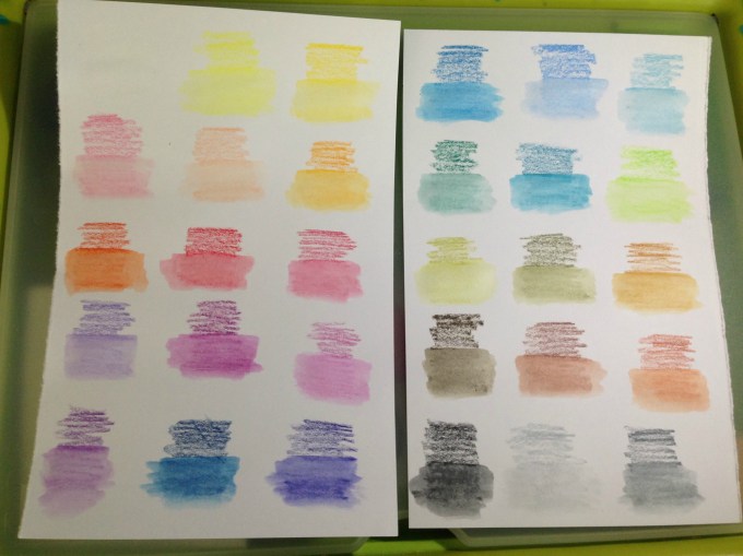
I made pages for them to add to my swatch book. I didn’t want to use water in that pad itself because the paper is so thin, so I folded a sheet of cardstock in half and tore it into two papers that each fit on my swatch book’s pages. I scribbled a little bit of each color onto the paper and then activated each with a tiny bit of water. These colors are so rich and the crayons dissolve so easily that a SUPER tiny amount of water is all that is needed.
After the swatches dried I labeled them with the color names from the Caran D’Ache site and then used a glue stick to affix them into the swatch book. Now- onto the coloring!
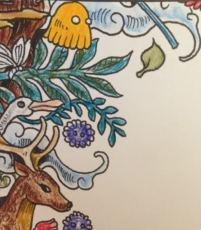
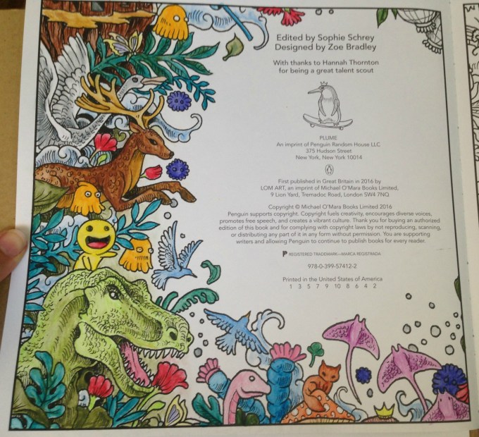
My first test was the inside cover page of Kerby Rosanes’ imagimorphia, which I have been loving lately. I colored the page pretty quickly, not bothering to fully fill in all areas (like the cut area of the tree, for example) because I knew once wetted, the color would spread. I did some minimal color mixing and shading on the leaves, deer and dino, all using the crayons as crayons to color. Sadly they’re old enough that they became fragile, and two colors broke in half as I worked. They’re still usable, but I was disappointed. More evidence of their age is the (removable) white bloom on some of the darker colors, as well as how the lightest brown dried out to the point of looking like a Flake chocolate bar inside its wrapper. 😦
The crayons applied color wonderfully but, as to be expected of crayons, they didn’t have points sharp enough to work into the fine areas of the image. I was able to use the edges of the points to get into fine spots like the rays’ tails and such, but I didn’t bother trying to color the butterflies, knowing I’d just make a mess. In some areas, like the pom-pom-looking little dudes, I only colored the center, planning to move the color outwards later, once I activated the paint.
The very first spot I activated were the clouds in this image. I set a sheet of cardstock behind the page to protect it from any bleed-through or water damage, but it really took such a tiny amount of water that I doubted there would be any actual problems on the reverse-side pages.
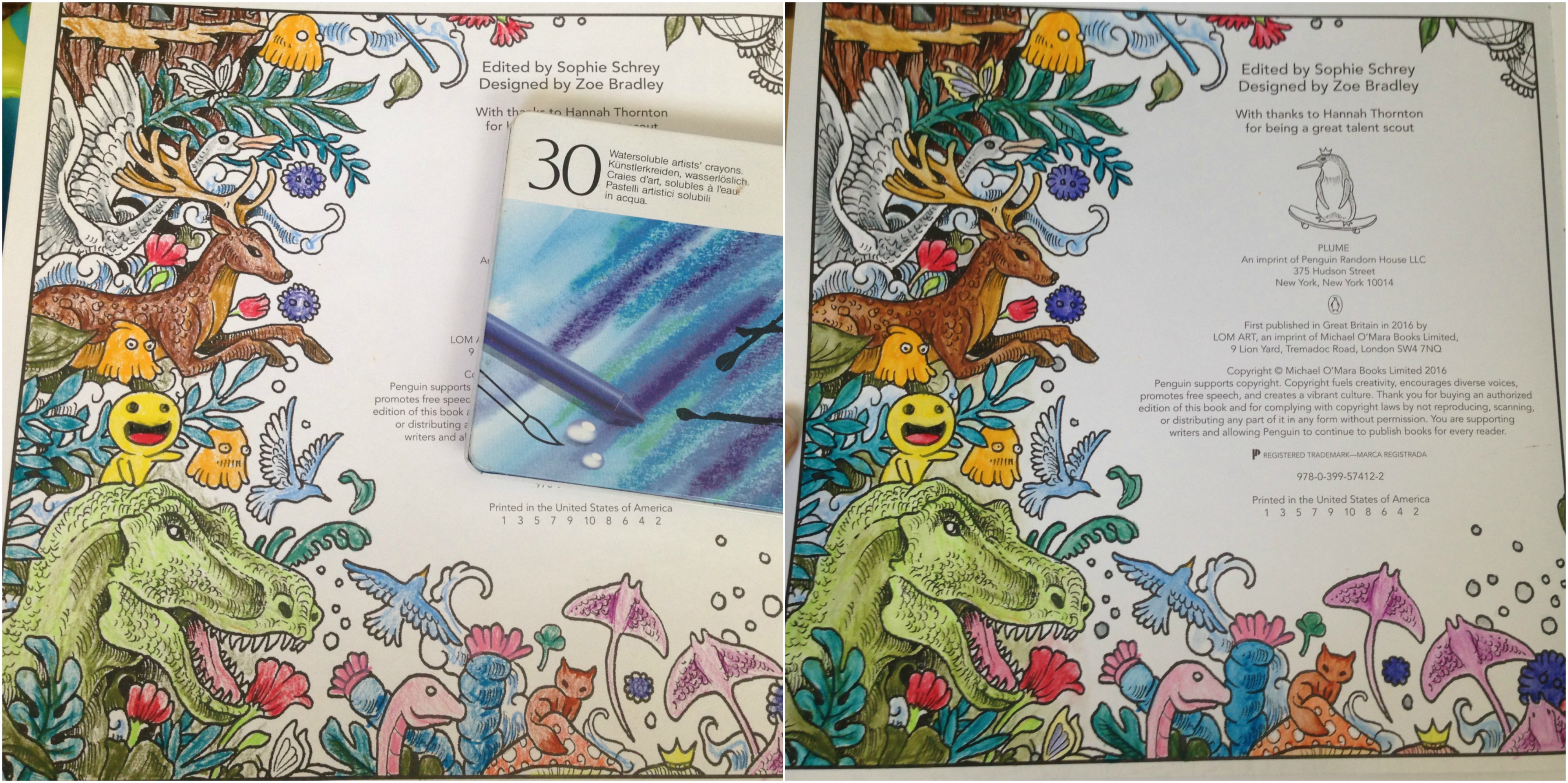
You can see in this enlargement of the lower edge what the clouds looked like before the water was applied, as well as the rough, uneven coloring job I did. I’d cringe, except it was deliberate. After seeing how vibrant the colors were and how much they spread, I didn’t want to waste any of the crayon filling in any more densely.
This is the final result. I can’t get over the difference, and how smooth and rich the colors turned out! I did manage to achieve some subtle shading and depth to the colors, and if I’d wanted to color over-top and re-wet I’m sure I could get even more effects. The largest difference for me is in the tree, the deer and the dino, but I’m charmed by all of it.
I was super-pleased (but not surprised) to see that there was NO bleed-through on the other side of the page. This means I can use these crayons throughout the book without worry, which makes me really happy.
Here’s a side-by-side to really compare the before and after images. Besides blending out the patchy scribbles, the colors (which were pretty vibrant before) didn’t fade out and some became even brighter. They blended beautifully and dried really quickly, but not too fast that I couldn’t move around soft watercolor washes.
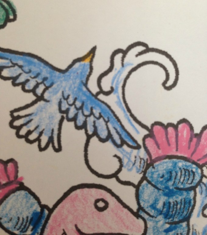
For the facing page (above) I decided to try using the crayons in a different fashion, as if they were individual little sticks of paint.
I wetted the brush, blotted most of the water off, and then dabbed it against the tip of the crayon, picking up some color, which I then applied to the image as paint, just as if I’d picked the color up from a palette. You can see some of the peach on the tip of my brush, as well as on the face and hands of the little girl I’d just painted.
This is the finished image after painting. In contrast to the side where I colored first, I think this side has a softer, almost dreamier application. However it is slower to keep re-dabbing the brush to the crayon, and it makes mixing colors more difficult as the paint dries much faster when using this method. I greatly recommend it for areas where you need more control or a finer application than you’d get with the stubby crayon.
This method also made me realize that my broken crayons were not a loss, nor was my flakey, dried-out tan. I can put a small piece of the color in one of my palette wells and activate it to use as paint, meaning that no part of these (expensive!) crayons will ever be wasted. 🙂
Here’s the back, showing again that there was no bleed-through or ghosting.
I’m really glad I found these crayons in my stash, and I can’t wait to play around with them more in this and other books. The colors are incredible and they activate so easily and beautifully, I really recommend them. Mine have broken and dried out, but they are also over 15 years old (!!!) and still work as well as if they were brand new. I would wholeheartedly recommend these.
This post may contain affiliate links. This means I might make a small commission on purchases made through the links, at no cost to you.


 Then one day I was laying on my belly in bed coloring the page above (the Eagle image in