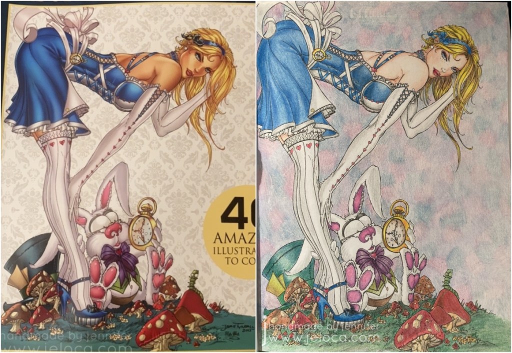
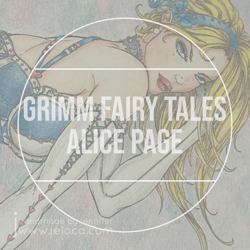
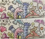
I’d started this page back in 2017(!!) using the cover of the coloring book itself as a reference.
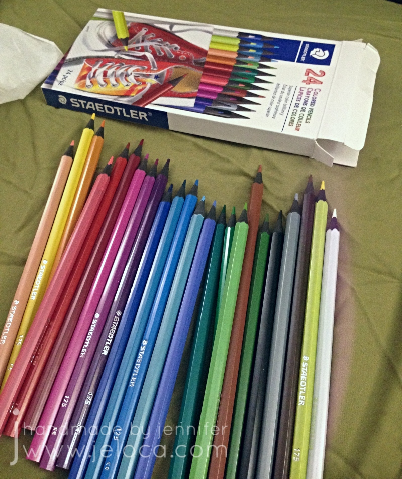
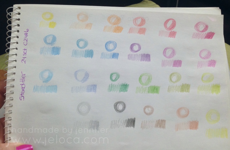
I’d found this 24-pack of Staedtler Colored Pencils at my local dollar store and was curious about how they would compare to more expensive pencils. Would I be able to get good results without paying very much?
As always I swatched the colors first for my swatch book. They’re very soft and muted, and the swatches remind me a lot of the Marco Raffiné colored pencils I reviewed here.
The pencils have hard cores that hold a point well but the color payoff is not very vivid. Even with a lot of pressure they remain desaturated and soft-looking.
Using light layers I was able to build up some color depth but it wasn’t easy.
What I’d said in my previous challenge post about this page:
As the caption states, I wanted to finish this page primarily so I wouldn’t have to use the pencils any longer.
Once the image was complete I found it lacking without a background but didn’t have any inspiration for what to put. In the end I did soft swirls with pink, purple and blue to fill in the white space.
Start date: November 2 2017
Completion date: January 6 2022
Summary: can you get good results with cheap pencils? IMHO, sure. I enjoy using my other pencils more, but if you’re looking for soft colors, hard leads that will hold a point and have a decent assortment of colors, you could do a lot worse than these inexpensive pencils. I wouldn’t recommend them for professional artists but they’d be fine for kids, school or coloring books with small sections that need good points.
This post may contain affiliate links. This means I might make a small commission on purchases made through the links, at no cost to you.
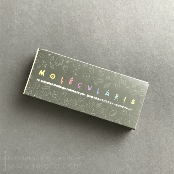
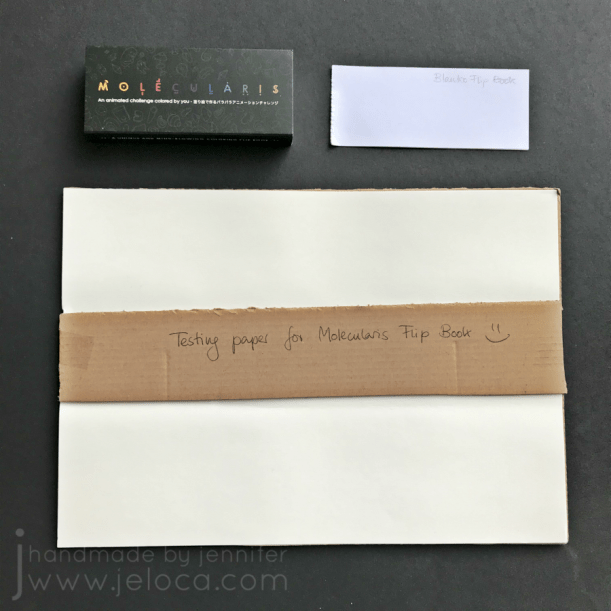
Almost 2 years ago I backed a Kickstarter with an interesting premise: part coloring book, part magic trick, it promised to provide 6 completely different coloring book-style flip books in one tidy little package.
They even had a 2nd book – Blanko – for people who wanted to draw their own. I backed at the level where I got just the one already-illustrated book – Molecularis – and when it arrived I can say with complete sincerity that I was absolutely delighted.
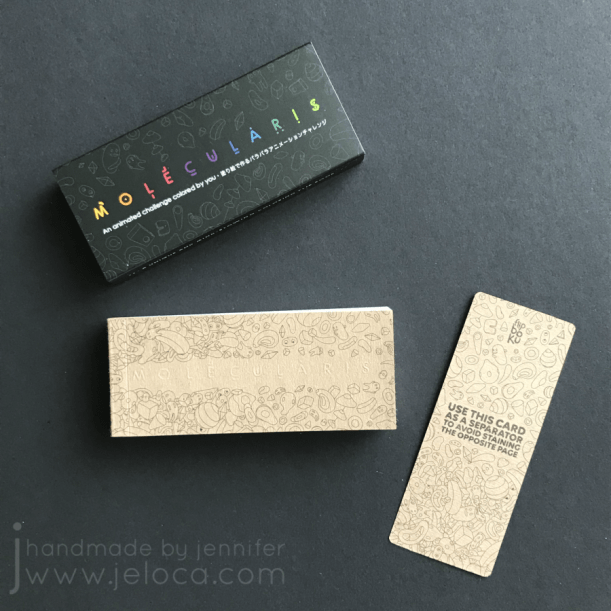
The flip book comes in a snug little box/case to keep it clean and protected, and there’s even a neat little secret hiding inside-
A handy little page separator to put between the pages as you color! It appears to be made of the same sturdy cardboard as the cover, which is great as it will help prevent depressions from going through to subsequent pages and causing ghost images to come through.
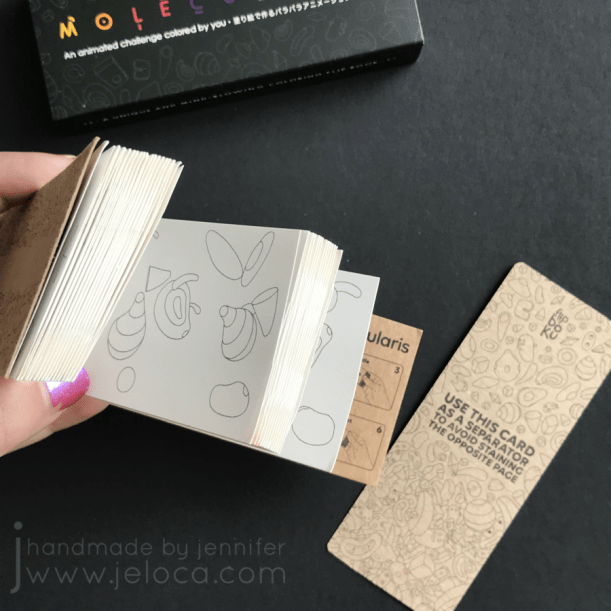
The book actually contains 6 individual flip book animation sequences, with a different one visible depending on how you hold/flip the pages. The secret is in how the pages are cut, similarly to those “Now it’s empty! Now it’s illustrated! Now it’s fully colored!” ‘magic’ books magicians use. The illustrations are so fun and playful and I couldn’t wait to pull out my coloring supplies and dive in.
But I hesitated. You see, the book is reversible, in the sense that there is a different illustration on the back of each page, which will be used in a completely different animation. What if I used the wrong media? What if my markers bled through? What if water-soluble products warped the paper? The page protector is a wonderful inclusion, but it will only stop staining from going through to the following pages. It cannot prevent bleed-through onto the back of the page being worked on.
So I did something that’s perhaps a little unorthodox. I contacted Flipboku through their Facebook page and asked if they had any extra paper, of the kind they’d used in Molecularis. A full sheet… scraps off the cutting room floor… anything, in any size, would work as long as it was the same paper quality, which I could then test with a range of coloring supplies.
Perhaps because they’re a little unorthodox themselves, they agreed (thanks Julie!), and a little while later I received a thin, flat package in the mail. I’d expected scraps, perhaps narrow little trimmings from when they cut the pages to size, but instead I was pleasantly surprised to find two good-sized sheets of the Molecularis paper, as well as a couple of pages from the Blanko book as well.
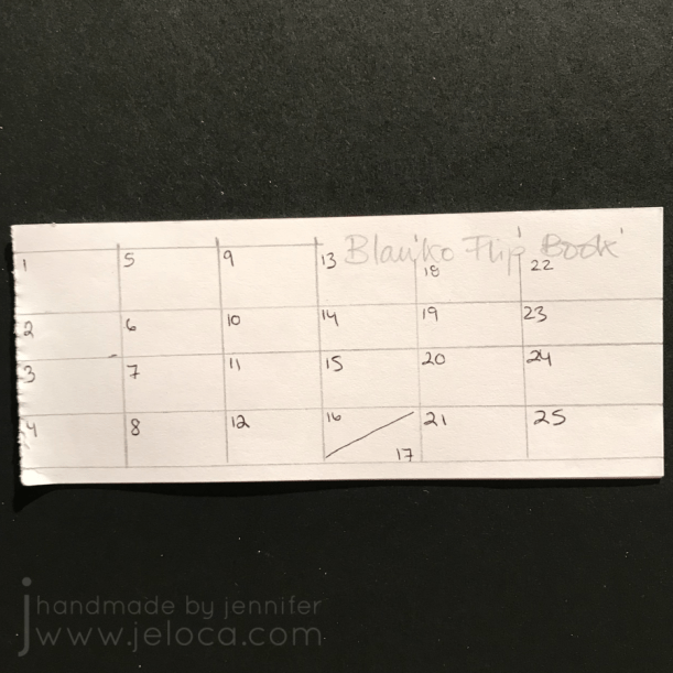
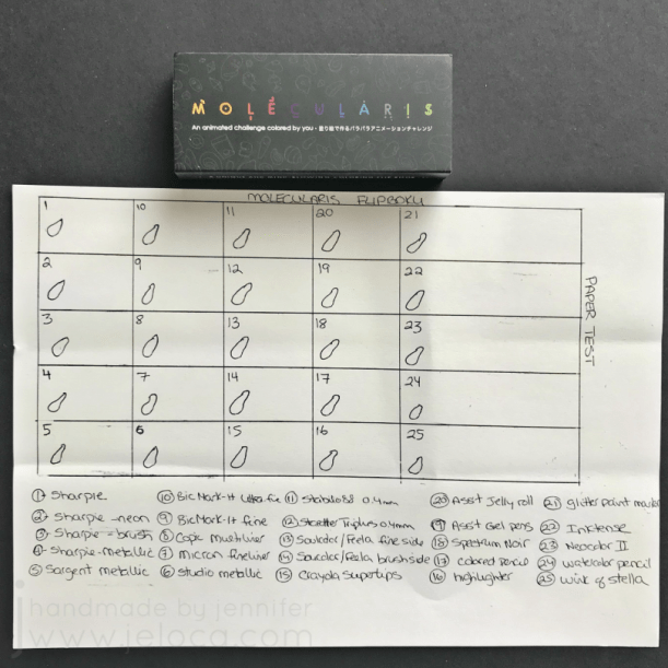
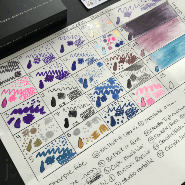
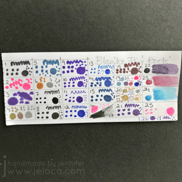
The first thing I did was figure out how many products I was going to test, and then draw a grid on the sample papers to delineate each implement. For the Blanko paper I kept the grid small enough to only use one sheet, because it’s regular paper and I was pretty sure I knew how the different media would react.
On the Molecularis paper I went for a bigger grid, using most of one sheet so I could save the other for future testing if necessary. Since the coloring images in the flip book are mostly all small-ish, ovoid shapes, I drew a little squished circle in a similar size so I could see if coloring a contained shape would cause more bleed (from going over and over the same area to fill it in). I also kept a few sections wider for testing water-activated media like Inktense, watercolor pencils and Neocolor II water-soluble crayons so I could see if the paper would warp after getting wet.
I ended up testing 26 different coloring tools, focusing mainly on wet-based media. I didn’t test crayons because I knew they would be fine, though I did include colored pencils just so I could see if the pressure they required would indent the paper at all.
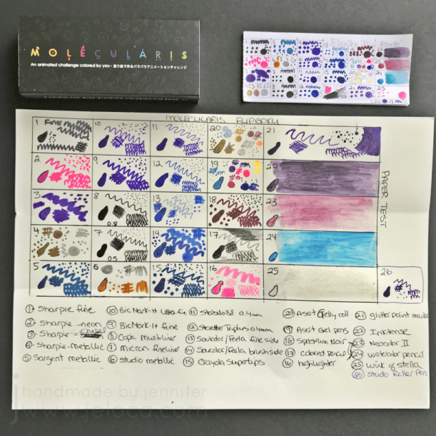
Here’s my testing grid after doodling. I deliberately picked purples & blues as those dark colors tend to bleed through more frequently than yellows and greens, etc.
I have to say that coloring on the Molecularis paper was a WONDERFUL experience! Nearly every product I tested glided smoothly over the paper without effort and left rich, even color with minimal strokes or feathering. Only a few products bled over the shape outlines, but they were all Sharpies which are alcohol-based and often have a bit of overbleed. The paper handled the wet media column on the right like a champ, thick like a cardstock so there was no warping, but with just enough texture to get mileage out of the watercolor media. It’s also lovely with colored pencils, having just enough tooth to take color well, leaving me certain it would also be great with charcoal & graphite.
The Blanko paper handled just like regular paper, because that’s what it is. It is smoother than the Molecularis paper, much thinner, and much more of a bright white.
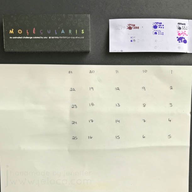
Ready for the results? I was! I deliberately didn’t peek at the back at all while swatching, and had left the paper overnight in case any seepage would occur as the inks dried. The next day I turned the papers around and-
The results 100% blew my expectations out of the water!
I’ll start with the Blanko paper. As it is regular paper, there were no surprises there. The alcohol-based products bled through as expected, the very wet gel pens bled through as well, as did the water-soluble ink of the Inktense pencils (though that was likely due to the water saturating the paper). As for the other markers, while they didn’t bleed as much as the first ones mentioned, most of them had significant ghosting and shadowing through the thin paper.
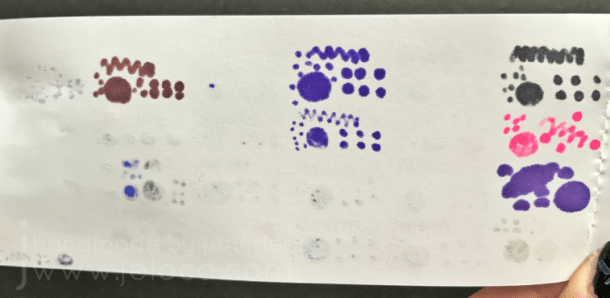
What really surprised me, however, was the Molecularis paper. There was almost NO bleed-through! I found myself double-checking to be sure, but really- this is it. I numbered the back to make the areas easier to check, and the only one that had anything close to bleed-through is #20 – “assorted Gelly Roll”. Specifically the ones that bled are their Gold Shadow line, which is a two-tone ink that leaves a colored outline with a gold fill.
The alcohol-based Sharpies and Bics didn’t bleed. The Spectrum Noirs didn’t bleed – which means Copics won’t. The water-soluble medias didn’t bleed nor warp, even with a significant amount of water used (I activated all the wet-media with my Derwent waterbrush).
It’s not completely perfect, of course. If I LOOK for issues while the paper is flat (above), I can see slight ghosting in cells 3 (chisel-tip Sharpie), 9 (Bic Mark-It fine tip) and 17 (black colored pencil, applied with firm pressure to fill in the shape). However I don’t believe these are issues that would affect the intended use of the coloring flip book.
I’m blown away, I really am. If I hold it up at an angle, allowing a bit of light to get underneath, there is the slightest ghosting where I colored in the other blobby shapes, with still only the cells referenced above having the most visibility (the Sharpie and Bic showing not only the coloring-in but also my doodling as well).
I’m really impressed. I’ve used many coloring books where I’ve had to make a conscious choice about what page I wanted to color, knowing the image on the reverse would be ruined. Obviously with a book meant to be reversible the company had to consider this, but it almost sounded too good to be true, which is why I had to test it for myself.
Since their original launch Flipboku has expanded their flip book range, with not only the Molecularis and Blanko books (or a bundle with both!) but also fully-illustrated flip books designed in collaboration with different artists. If you’re into history, sci-fi, or even romance, you’ll find an animated book that leaves you in awe of the magic in the tiny printed movies.
You can visit their website here to shop their really cool products, or click here to access their brand new 2-volume Kickstarter that officially launched yesterday.
The first volume of the new Kickstarter, Dots, is a flip book with 6 different animations (also called sequences) created by internationally renowned animators. Each side of the flip book contains 3 different sequences made up of 36 pages. Once you have connected all the dots in one sequence, all you have to do is flip it to discover what is hidden behind the dots. After that, you can even grab your favorite coloring pens and color the animations, so in fact you have a dot-to-dot flip book and a coloring flip book, all in one!
For the second volume, Lines, they have selected some of the most puzzling optical illusions and turned them into animation. Most of these sequences are based on the dot-to-dot technique as well. They work in a similar way to the ones featured in Dots, but in addition, once all the dots are connected and the pages are flipped, the animations produce mind-boggling optical illusions. Ranging from astonishing to downright weird these sequences include impossible figures, geometrical illusions and visual paradoxes that will play awesome tricks on your eyes and mind.
Note- The above text and gifs are taken from their Kickstarter. While some of the product links above are affiliate links (Amazon) this post is not sponsored. I ordered and paid for Molecularis on my own and Flipboku hasn’t done anything for me beyond send me the paper samples at my request. I just thought it was a unique variation on a coloring book that my readers would enjoy. Happy coloring!
I haven’t talked about it much but I’m going to be having surgery in about a week. I’ve actually been off work since mid-August, and this unexpected time at home has given me a lot of time to knit and color, and while I’ve been revisiting old supplies I’ve also been lucky enough to get some new ones.
My watercolor research back in August led me to discover Derwent Inktense and I went on a really long review and YouTube binge, learning everything I could about those amazing ink-pigmented colored pencils. When my birthday rolled around in September I basically only asked for art supplies, and my parents were wonderful enough to oblige.
Topping my list was the Inktense set. I really enjoy the metallic watercolor pencils and the Spectrum Noir Sparkle set is just yummy for anyone who likes glitter (um. yes. me! I like glitter!), but in this post I’m focusing on the Inktense which I’ve been using primarily with the waterbrushes I got with them. I really love this waterbrush set because of the sizes, the tiny #1 tip is perfect for the small areas in coloring books while the larger sizes make doing washes of color or wetting larger areas a breeze. They’re super easy to fill and I haven’t had a single leak, and I’ve been using them on a regular basis since September.
Now then, on to the Inktense! I got the full set of 72 colors but they do come in smaller tins, and the pencils are available open-stock so you can definitely get a smaller set and then add to it as you go.
So what are Inktense pencils? According to their site, “Derwent Inktense pencils are our best watercolour pencil ever! You can use them dry but mix them with water and WOW! the colour turns into vibrant ink. Once it’s dry the colour is fixed and you can work over the top of it, and, because it permanent it’s great for using on fabric such as silk and cotton!” They refer to them as ‘watercolors’ but they’re not, not really. They’re ink pigments in colored pencil format. You can use them as pencils and they’re nice, on the darker end of color ranges, but it’s when you add water that they transform completely. And because they’re ink once they’re dry they’re permanent.
What does this mean for coloring and how does this compare to a watercolor pencil? Let’s say you wanted to color a pink sphere, and you wanted to block in the rounded shading first, then go over it with a wash of pink, leaving a highlight area. With watercolors the paint reactivates any time it gets wet. So even if you let the gray shading dry, once you washed pink over top the gray would bleed out and muddy the pink and if you’re not careful you can make a real mess of your work. Inktense are permanent when dry so you can block in your shadows, wet the pencil strokes and fill your darker areas, and then once that’s dry you can go over it with even the lightest shades and the gray won’t budge. This is a horrible way of explaining that you can go overtop of previous layers without affecting them.
Of course the first thing I did when I got my set was to swatch out the colors so I could see what I’d be working with.
Above are the pencils when dry. The appear quite dark, and there are a lot of greens and browns for those who enjoy coloring books such as Secret Garden and other floral-heavy books. The pencils apply well and it’s very easy to get a lot of color down. Each pencils is marked with it’s color number and name, making it very easy to identify which one I’ve used…which is helpful because the colors on the ends of the barrels aren’t quite identical to the actual color of the pencil itself.
Okay, so they’re really nice when dry. The real magic, however, happens when they are activated.
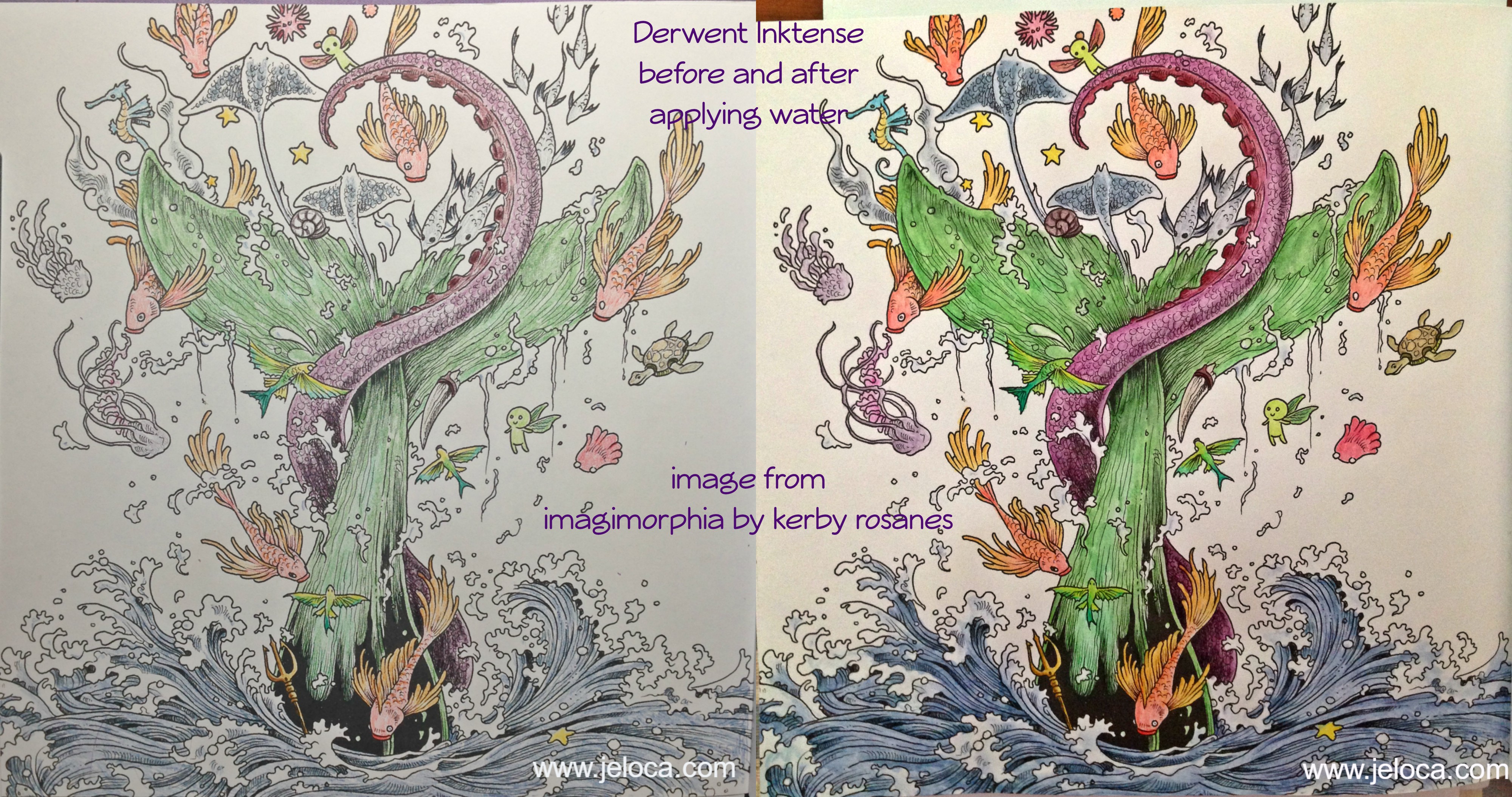
This image barely shows the bright vibrancy of these colors in real life. The pigments activate instantly with water, and I could have used the lightest of strokes and still had the same color payout as I got here. I was blown away by my swatches and as soon as I’d added them to my swatch book I had to get started on a coloring page.
I’ve been watching a lot of YouTube coloring tutorials featuring Inktense pencils (Peta, Dede, Lindsay and Lisa are four of my favorites) and I know that the pencils are typically used in wet-as-you-go manner, coloring a section and then activating it, and so on. However, making the swatches was so satisfying in a “wait til the end” surprise payoff, that I just had to try coloring an image that way: coloring the whole thing, and then activating the ink at the end to see the before and after.
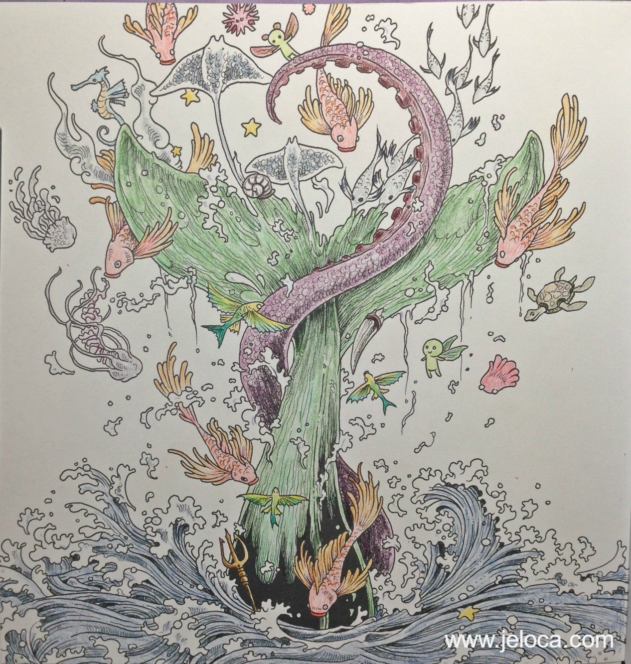
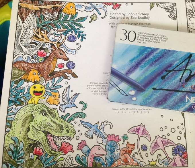
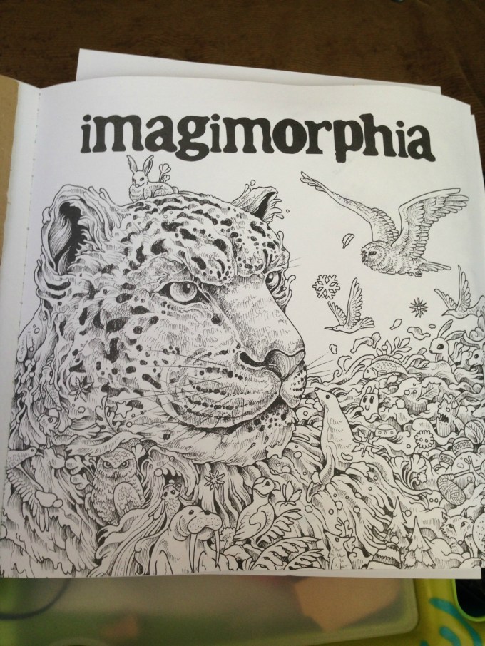
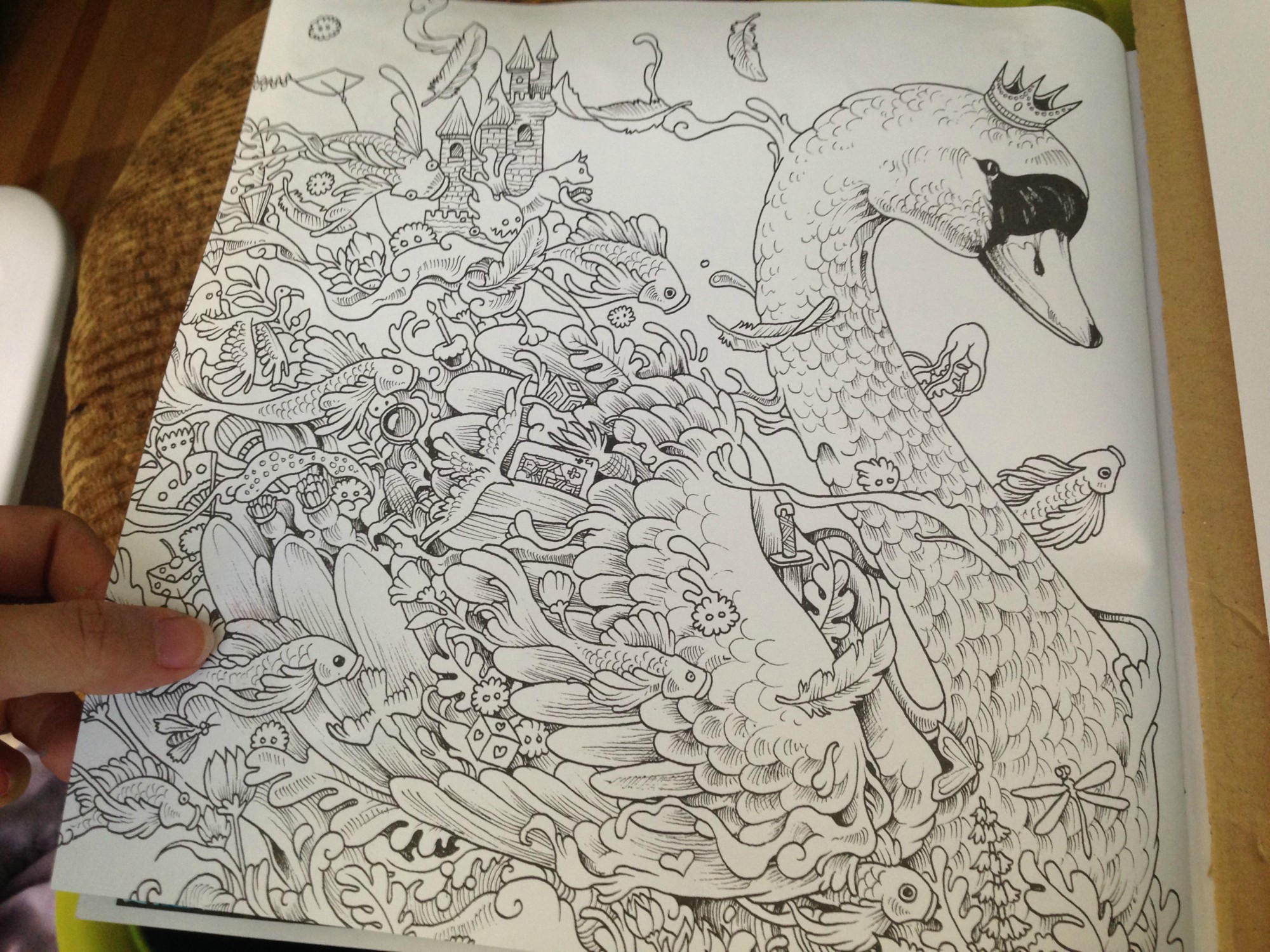
After testing the paper in the back of the book to make sure it would be safe to use (no bleed-through) I chose this image from Kerby Rosanes’ imagimorphia.
I’ve been having a lot of tummy time (lol) and this is how I’d set myself up in bed. A clipboard helped keep the book open as well as gave me a flat, hard surface to work on. I had a sheet of card stock underneath this page to protect the ones beneath, and I had my swatch book open in front of me so I could accurately choose my colors. My laptop was off to the right playing episode after episode of Welcome to Nightvale (soooooo weird and awesome) and the tin of colors was on my left within easy reach. Finally, my flip-top Ott-Light was balanced on the bed casting accurate light over the picture for me, since lighting in my house is crappy at best.
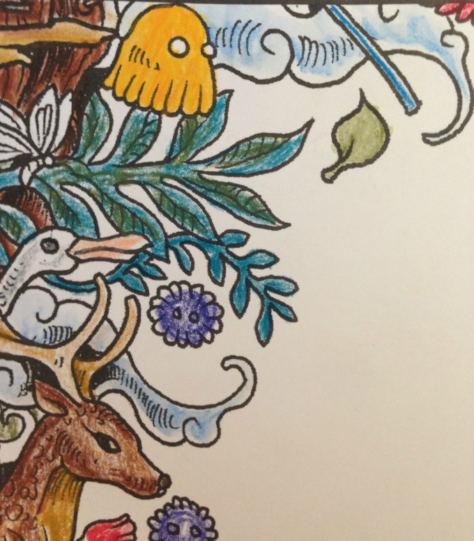
This is my completed painting before activating the Inktense inks. I colored pretty lightly, wanting to see how the pigments did on their own before adding any shading or depth. (PS yes I know that’s supposed to be a whale and whales aren’t green LOL) Coloring with these pencils is like a dream. They apply color beautifully even to paper that doesn’t have a lot of tooth. It is really easy to apply just a hint of color without any pressure on the pencil, which is a good thing because it means you won’t have to waste a lot of the pencil just to get a good color payout. In fact, these colors are so vibrant and juicy when activated that if anything, it’s almost too easy to add TOO MUCH color.
(For example, my son Jakob is addicted to these pencils too and is coloring an image in one of his books. I was showing him how subtle applications of color give pastel-pale results and he tried it out for himself. His three light strokes of Payne’s Gray, applying barely any pressure, provided enough color when activated to light wash a bunny butt around 3″ in diameter.)
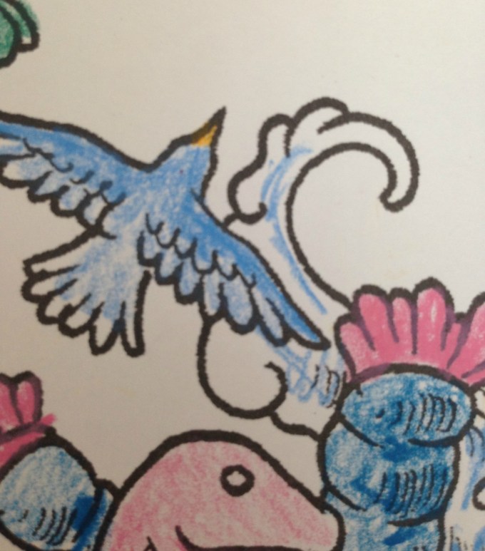
I took this image right when I’d started activating the inks. I went slowly, enjoying watching the colors blossom into vibrant paint. (Seriously, it’s addictive). I activated each like section at a time, brushing off any excess pigment onto a paper towel to keep the tip of my water brush clean. In this image you can begin to see the difference between the activated (water-applied) and pencil-only sections. The orange and yellow fish on the right is still pencil, while there has been water applied to the one on the left. The little fairy creatures have been wetted on both sides. What really shows off some of the color payout, however, is the school of fish that crosses the tentacle. You can see how little color I’d applied, versus how much blooms from the watered inks.
And here is the completed painting. I didn’t use very many colors, but even still the brightness and depth these inks have is amazing. This picture is so much brighter and deeper in real life, showing subtle shading and contouring just from the way the ink moved like paint. It dries faster than watercolor so you do have to go in sections and work quickly if you want to activate a larger area without dry lines showing, but there’s still a decent amount of time to move the paint around before it dries, allowing for things like the softer blues in the water froth being ink I’d swiped from the water sections.
I’ve very quickly developed an Inktense addiction, as have my kids, who have been getting to use Mommy’s special art supplies now that they’re a little older. They don’t replace watercolors if that’s the type of medium you want, rather they’re a medium of their own, and are absolutely gorgeous to use.
This post may contain affiliate links. This means I might make a small commission on purchases made through the links, at no cost to you.
When I was playing around with my Caran D’Ache Neocolor II watercolor crayons I had my Raffinés next to me, as I’d just been working on the Egypt picture in the same imagimorphia coloring book. I’d done a lot of research on them before purchasing, and one thing that had come up in people’s comments were how some of them had been able to use them as watercolors, though not everyone had that luck. The Raffinés are oil-based colored pencils, not wax-based like Crayola and Prismacolor and most others, so they do color and shade and grip the tooth of the paper in a different way, but were they really so different that they could dissolve in water enough to be used as paint?
Let’s find out.
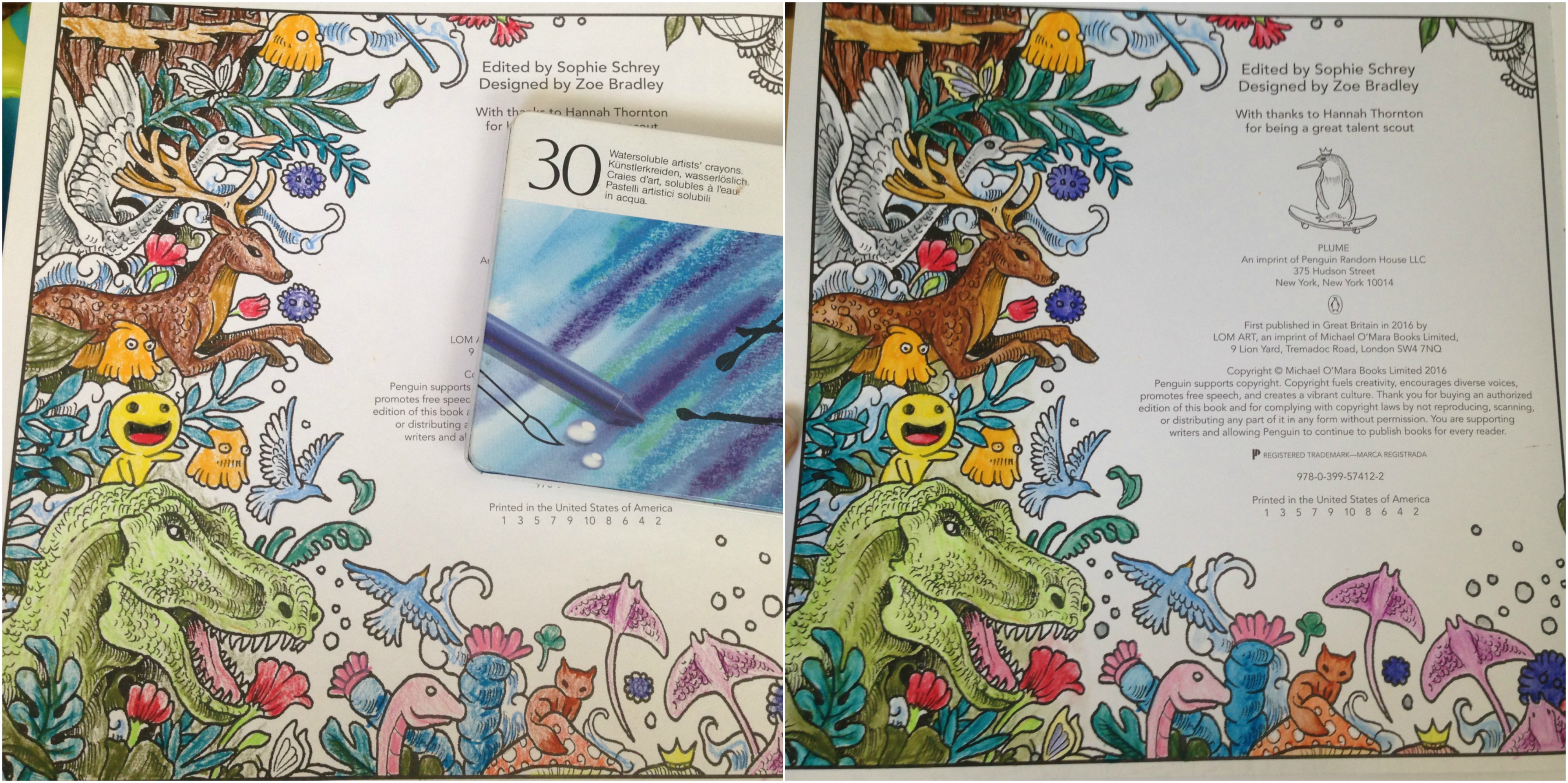
This is the page in the back of the book right before the hidden objects are pointed out. I colored a bit of it with the pencils then used the same small brush and water pot as I used for the Neocolor IIs.
Here’s a before-and-after closeup of the lower section of the page.
The top image is the dry coloring, and the lower image is after I’d applied water. At first I was happily startled to see that it did appear to work! I had to double check the ‘before’ pic on my phone to be sure, but seeing them side by side it’s hard to deny that there’s a clear difference between the two. The light pencil strokes in the worm (?) have blended outwards, as well as in the pink flower on the left and the green leaf in the background. The orange puff ball looks exactly like a watercolor had painted it, and even the browns in the fox (?) and mushroom are more evened and fluid.
I immediately checked the back of the page even though I wasn’t really concerned with bleed-through, but sure-enough there was none.
So if I think it sort of worked, why am I hesitant to say that outright? Because while the colors did wetten and spread, once dried the strokes were still visible and retained the soft look of the oil-based pencils. It’s hard to explain but it sort of looks like I’d done a light wash of watercolors over or under the pencils, as they’re both visible.
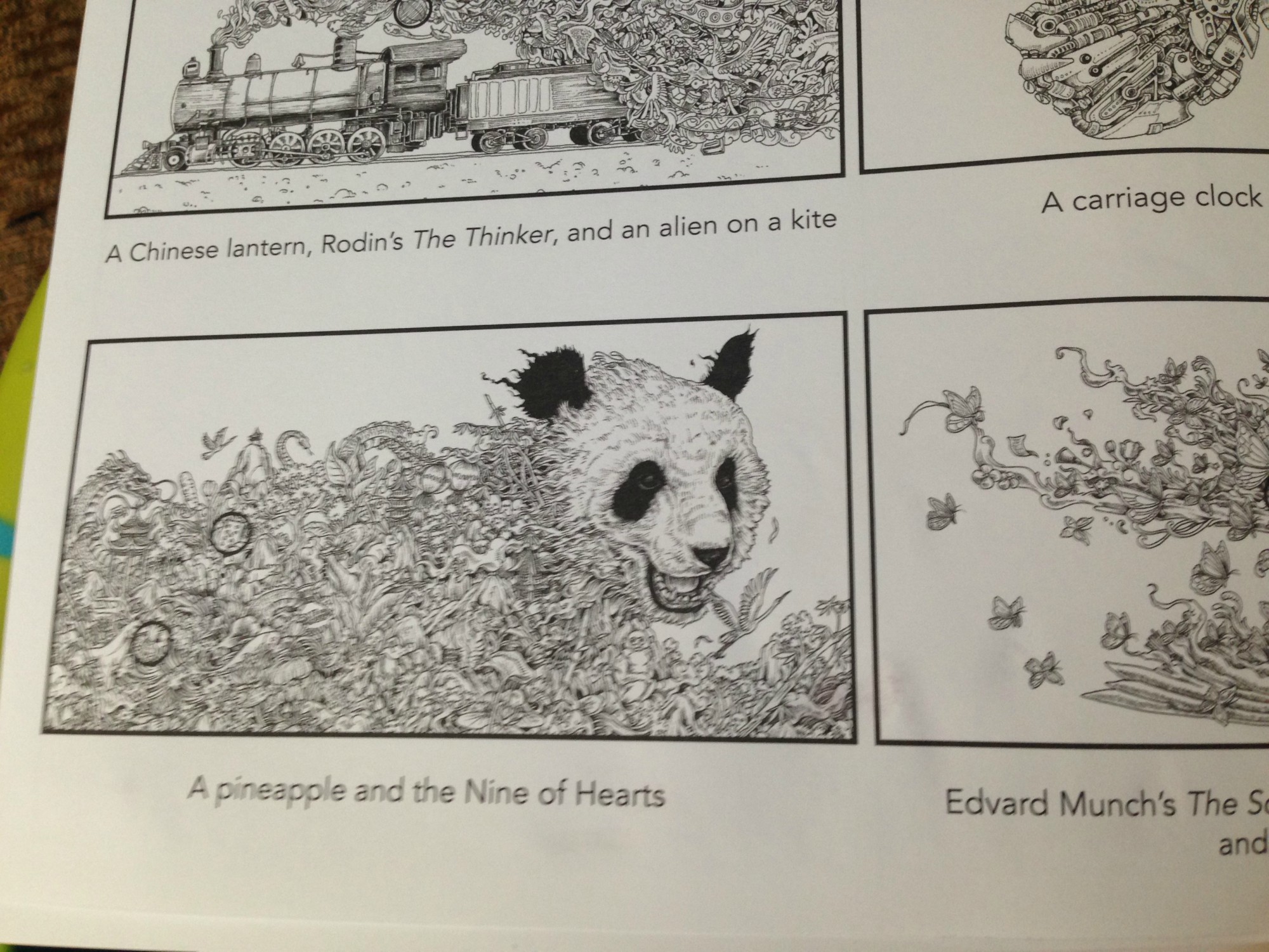
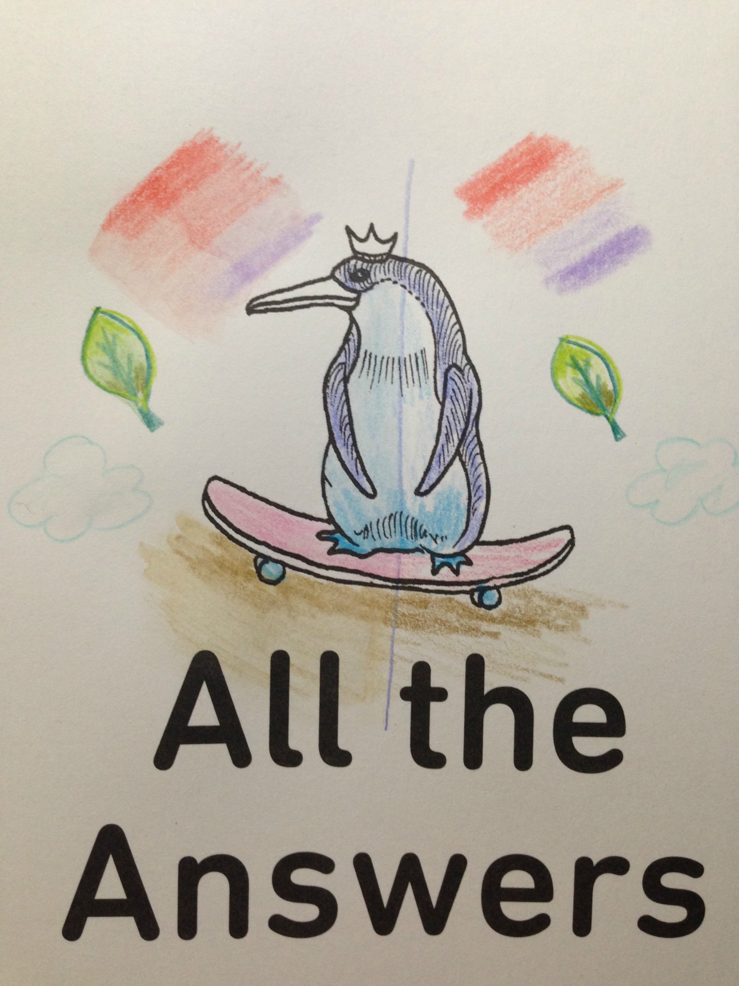
Since it was hard to compare the ‘after’ with the small image on my phone, I decided to do a definitive comparison test in the book itself.
The first image below (top left) is my initial coloring of the royal penguin on a skateboard. I drew a line down the center to keep the division clear and then colored both sides with the Raffinés. Then I wetted the left side only. Did the pigment become a wash of color? Yes… there is a visible difference in the two sides, with the left side looking more even and ‘full’. But I still wanted to see a bit more.
In the top right image I added a few more test things to try out. On both sides I put a light shading of red and blue to see if it would be possible to blend them once wet, and I also drew a quick leaf and colored it with some light and dark shades to see if I could get blending on that. Basically I was trying to mimic effects one would be trying to achieve in a coloring book or drawing.
The bottom right image is right after I wetted the left side. I did my best to blend the red and blue together, as well as the colors in the leaf. Those items are still wet, but the penguin is already begun to dry and look a little different from when wet – a touch less blended and spread, and a bit more colored-pencil-y (if that makes any sense at all).
Finally the bottom right image is after everything had dried, for a full comparison. I’ve included a solo pic of that image here, so it can be viewed larger:
So. Do we really have “All the Answers”? Did the blue and red blend? Not really. There was a bit of pigment bleed spreading the colors to one another, but no real blending of the two to become purple. What they did do, was soften alongside each other. In fact, that seems to be what all the colors did. The pigments spread slightly, giving a bit more color to the background of the pencil strokes and softening the overall look of the colored image. In real life the coloring looks very dry, almost pastel-y, and the pencil strokes are visible over the softened backgrounds.
I think the final answer is that they DO spread somewhat with water, but not completely nor efficiently to claim they would be an inexpensive comparable to true watercolor pencils. What they DO do, is soften the pencil look. I think they would be great used with stamps for cardmaking, where one can lightly shade the image then soften the pencil colors. In knitting there’s a term called ‘fulling‘, where the yarn is plumped up and thickened while still retaining some stitch integrity (unlike complete felting), and that’s how I feel about adding water to these pencils; when wettened the color plumps and fills its space while still retaining the original lines and strokes.
TLDR: Do they watercolor? No. Does applying water slightly bleed and soften the colored pencils for a unique, almost delicate look? Yes.
This post may contain affiliate links. This means I might make a small commission on purchases made through the links, at no cost to you.
I’d been researching watercolor pencils a little while ago, and while reading review sites I came across a few mentions of the Caran D’Ache Neocolor II watercolor crayons. They looked interesting and were lauded for their bright, vibrant colors and creamy texture, so I made a note to look up more reviews. In the meantime, I remembered that at some point during my creative history I’d owned a set of, what my memory told me, were kid’s-quality twist-up watercolor pencils. I could picture the set, and knew there was only one place in my home-office they could be, so one morning I went downstairs and took a look.
I found the twist-up colored pencils right away… and was disappointed to see they were just that- colored pencils. Nothing water-soluble about them. It was frustrating to have been mistaken but I figured I’d just continue my research… and then I peeked through the rest of the drawer just to see what other drawing supplies I’d collected over the years and had forgotten about.
What a discovery! I think I squee’d out loud when I saw the white edge of the tin under an old pencil case of charcoal and blending stumps. Not only had I forgotten I owned these but clearly I’d barely ever used them when I got them, because they were all still full-sized and touching the sponge strip running the top of the case.
Immediately I brought them upstairs to try out. I’d been stuck in bed, resting my legs due to a really bad bout of sciatica, so I put together a little portable watercolor kit that I could use in bed without making a huge mess: a tiny tupperware of water, a fine-tipped paintbrush, and a folded handtowel for blotting and cleaning my brush, all contained within another small tupperware that I could close up and store with my craft supplies.
I made pages for them to add to my swatch book. I didn’t want to use water in that pad itself because the paper is so thin, so I folded a sheet of cardstock in half and tore it into two papers that each fit on my swatch book’s pages. I scribbled a little bit of each color onto the paper and then activated each with a tiny bit of water. These colors are so rich and the crayons dissolve so easily that a SUPER tiny amount of water is all that is needed.
After the swatches dried I labeled them with the color names from the Caran D’Ache site and then used a glue stick to affix them into the swatch book. Now- onto the coloring!
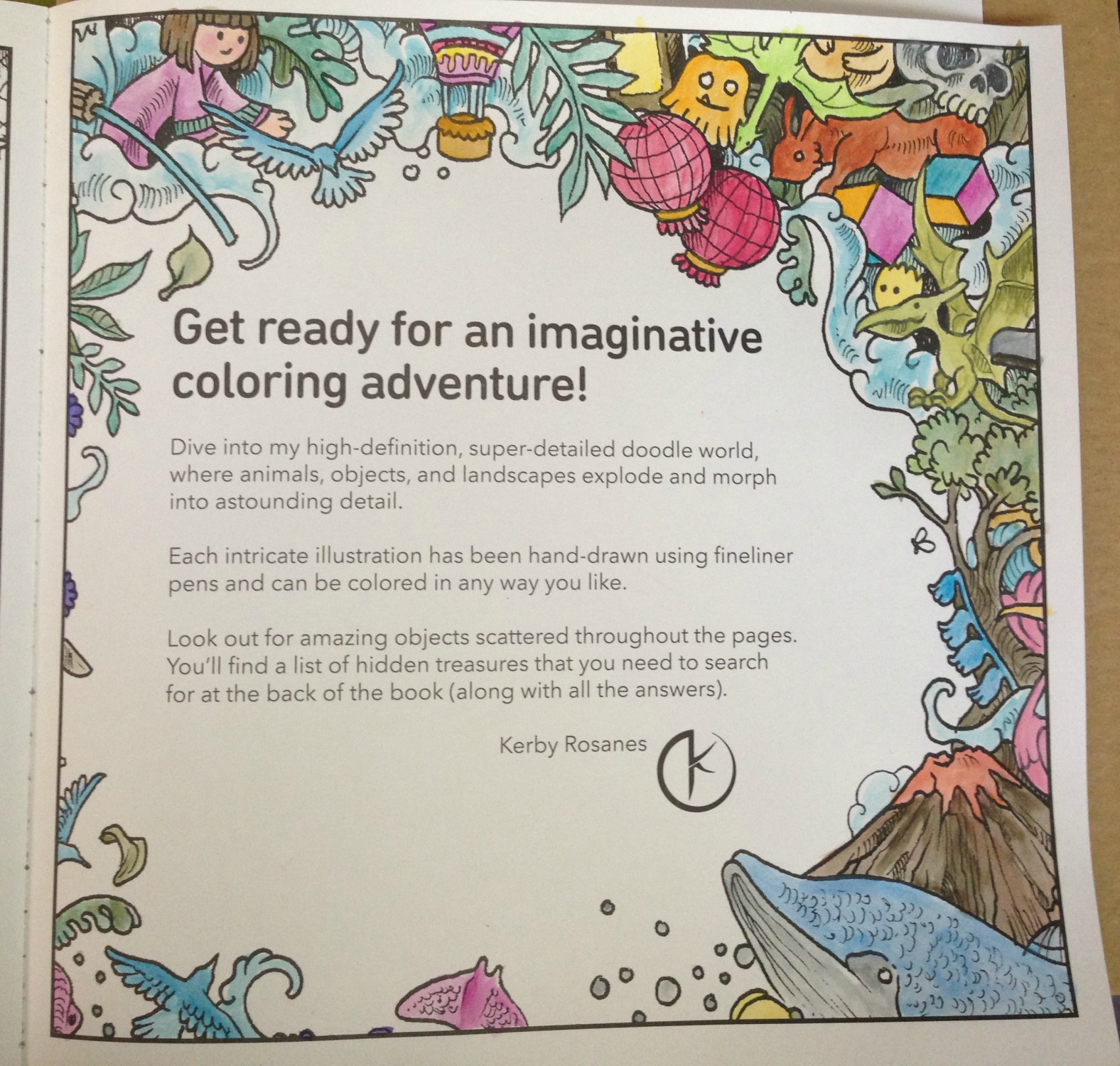
My first test was the inside cover page of Kerby Rosanes’ imagimorphia, which I have been loving lately. I colored the page pretty quickly, not bothering to fully fill in all areas (like the cut area of the tree, for example) because I knew once wetted, the color would spread. I did some minimal color mixing and shading on the leaves, deer and dino, all using the crayons as crayons to color. Sadly they’re old enough that they became fragile, and two colors broke in half as I worked. They’re still usable, but I was disappointed. More evidence of their age is the (removable) white bloom on some of the darker colors, as well as how the lightest brown dried out to the point of looking like a Flake chocolate bar inside its wrapper. 😦
The crayons applied color wonderfully but, as to be expected of crayons, they didn’t have points sharp enough to work into the fine areas of the image. I was able to use the edges of the points to get into fine spots like the rays’ tails and such, but I didn’t bother trying to color the butterflies, knowing I’d just make a mess. In some areas, like the pom-pom-looking little dudes, I only colored the center, planning to move the color outwards later, once I activated the paint.
The very first spot I activated were the clouds in this image. I set a sheet of cardstock behind the page to protect it from any bleed-through or water damage, but it really took such a tiny amount of water that I doubted there would be any actual problems on the reverse-side pages.
You can see in this enlargement of the lower edge what the clouds looked like before the water was applied, as well as the rough, uneven coloring job I did. I’d cringe, except it was deliberate. After seeing how vibrant the colors were and how much they spread, I didn’t want to waste any of the crayon filling in any more densely.
This is the final result. I can’t get over the difference, and how smooth and rich the colors turned out! I did manage to achieve some subtle shading and depth to the colors, and if I’d wanted to color over-top and re-wet I’m sure I could get even more effects. The largest difference for me is in the tree, the deer and the dino, but I’m charmed by all of it.
I was super-pleased (but not surprised) to see that there was NO bleed-through on the other side of the page. This means I can use these crayons throughout the book without worry, which makes me really happy.
Here’s a side-by-side to really compare the before and after images. Besides blending out the patchy scribbles, the colors (which were pretty vibrant before) didn’t fade out and some became even brighter. They blended beautifully and dried really quickly, but not too fast that I couldn’t move around soft watercolor washes.
For the facing page (above) I decided to try using the crayons in a different fashion, as if they were individual little sticks of paint.
I wetted the brush, blotted most of the water off, and then dabbed it against the tip of the crayon, picking up some color, which I then applied to the image as paint, just as if I’d picked the color up from a palette. You can see some of the peach on the tip of my brush, as well as on the face and hands of the little girl I’d just painted.
This is the finished image after painting. In contrast to the side where I colored first, I think this side has a softer, almost dreamier application. However it is slower to keep re-dabbing the brush to the crayon, and it makes mixing colors more difficult as the paint dries much faster when using this method. I greatly recommend it for areas where you need more control or a finer application than you’d get with the stubby crayon.
This method also made me realize that my broken crayons were not a loss, nor was my flakey, dried-out tan. I can put a small piece of the color in one of my palette wells and activate it to use as paint, meaning that no part of these (expensive!) crayons will ever be wasted. 🙂
Here’s the back, showing again that there was no bleed-through or ghosting.
I’m really glad I found these crayons in my stash, and I can’t wait to play around with them more in this and other books. The colors are incredible and they activate so easily and beautifully, I really recommend them. Mine have broken and dried out, but they are also over 15 years old (!!!) and still work as well as if they were brand new. I would wholeheartedly recommend these.
This post may contain affiliate links. This means I might make a small commission on purchases made through the links, at no cost to you.
A few weeks ago I was privileged to spend the weekend at the Travelodge Hotel with a bunch of knitters and one very famous knitting designer. In honor of her having led the very first Montreal Knitting Guild workshop 10 years ago, (and also because she’s just a wonderful teacher), the MKG brought back Sally Melville to run a weekend-long series of workshops.
Sally Melville. Maybe you’ve heard of her? Author of Styles, The Knit Stitch, The Purl Stitch and Color, not to mention designer of countless patterns in magazines from Interweave to Vogue to…
Yeah. Her.
If you ever get a chance to take a class with Sally, do it! She is the cutest little thing, and tells wonderful stories. She is also a great teacher. Here are my swatches from that weekend:
On Saturday I took 2 workshops- “Rescue Tips and Emergency Techniques” and “Learning to Love Intarsia”.
This poor swatch got really put through the wringer! First we had to cut a stitch and unravel back to show how you could cut your knitting to make changes (shorten, lengthen, etc). I wasn’t afraid to cut, remember the Superman costume legs? I’d already cut them and lengthened them by an inch, before grafting the feet back on. We also learned how to fix a mistake by duplicate stitching then cutting out the original yarn. In this swatch, the blue stitches in the Fair Isle row were originally black. We duplicated-stitched over them, then cut out the black stitches. This was our intarsia sampler. She gave us some great techniques for avoiding holes without too much twisting of the yarn.
After the classes Saturday night a bunch of us went out for dinner with Sally. We had a great time and had some yummy (but overpriced) Italian food in Dorval.
On Sunday it was one workshop all day long; I forget the name but it was something about tips and techniques “…for the Self-Taught Knitter”. This was a little stockinette stitch swatch I made to show Angie that knitting wouldn’t unravel sideways. She was positive that if you cut your knitting, it will all come undone- this was to show her that even in a plain-old acrylic yarn, the stitches aren’t going anywhere. The 1-stitch width you see unravelled above took a LOT of tugging and pulling to get it to “pop out” on its own. This hideous piece was our increase, decrease and bobble sampler. It also prompted a witty observation- we spend money to go to a workshop, spend all day joyfully knitting away, then come home to our significant others waving this deformed mess at them, proudly exclaiming “look what I did today!!!”. No wonder non-knitters don’t get it! This last swatch was for practicing seaming and buttonholes. I think one of the best “a-ha!” moments of the class was her tips on picking up stitches for a neckband. One simple modification to eliminate any gaps- it’s genious.
All in all, it was a great weekend spent with some great people. I am thrilled that I was able to meet a knitting legend like Sally, and wish her much success with future books and projects.
…the swatches! I am so happy with how the yarn turned out! I think I’ve been over using the word “love” lately (I love the yarn, in love with certain patterns, love the way things come out) so I don’t want to sit here and say there’s yet another thing I love. I might have overstated my affection for some other projects. There might be projects that I merely like, projects I wouldn’t mind seeing again, and projects I think I might have a future with. But this yarn? This yarn I really do love!
I did the swatches with a 2.5mm needle (my usual for socks) and on 64 sts, which, depending on the pattern, is roughly my size. Here’s the Black Cherry. This photo shows a pretty good variation of color, but is lacking the deep tones of wine that permeate every strand, even the deep blacks. This will be stunning with either an open lace or a cable pattern. Yannick would like to claim it for himself but it is mine! This is one side of my Oxford swatch. I took a photo of each side to show you how the yarn will behave on a larger swatch (or a sock). You see how the black-striped section starts at the lower left and moves up on a diagonal to the top right? And how the colored section with no black seems to do the same? Here’s the other side of the same swatch. # 1 had one dark section in the middle. # 2 has 2 dark sections, one on top and one below, with a lighter middle. What I’m trying to show here is that the two areas of color will spiral around each other, and around the sock. Look at this! It worked! I can’t believe it worked! I made a self-striping yarn! There is so much I enjoy about this one, especially the palest row of green right above the darkest one. Something about the way one looks near the other really tickles me. If I was to do this again I would only change the concentration of dye to water to try and get another shade in there, as I feel 2 of the rows look the same. It might be related to where I cast on from and how the yarn is wrapping around itself, though.
I have been knitting Bunnies for the last week. The pattern is great, but I’m knitting in Fun Fur which is such a pain! I knit the first one only in the Fun Fur stuff, but seaming it was NOT fun, so I knit the second with the FF held along with a strand of white dk weight acrylic. It made the FF somewhat more bearable.
I’m knitting the Bunnies as a gift for a friend’s 2.5 year old daughter, who brought a gift for Jakob when we introduced them, and I unfortunately showed up empty handed. I found out her favorite colours are pink, purple and blue (is there any 2.5 year old girl who doesn’t have those as her favorite colours?) so I’m knitting a pink mommy bunny, a blue daddy bunny, and a purple baby bunny. As of tonight only the pink is left to knit. Photos tomorrow after the Guild meeting.