Picking colors that go well together can be a challenge when coloring. Sometimes you have no idea where to start, spending too long staring at the blank page afraid to make a mistake that will ruin the whole thing. You might find yourself gravitating to your favorite colors, only to have all your FOs start to feel the same.
Artists of any kind can have the same struggles, whether it’s choosing the right combinations of yarns for colorwork knitting or crochet, selecting floss shades when going rogue in an embroidery pattern, or blending the right fondant color to go with your iced cake base. This problem isn’t only for artists either! Think of matching accessories to an outfit or selecting the accent color for pillows to give your living room the spark it needs.
Colors can be hard. I’ve mentioned Sarah Renae Clark‘s Color Catalog here before as a solution I’ve turned to when coloring and I’ve found myself referencing it often for various projects.
The digital catalog is easy to search and scroll on my ipad and I like to take a screenshot of my chosen reference image to keep with my project notes and refer to as I work. For digital art it even provides RGB, CMYK & Hex codes for every color palette included in Vol 1 or Vol 2.
I’d also treated myself to her Color Catalog Companion to make swatching the right colors easier – it provides the color names/numbers to match the swatches for a number of popular marker and colored pencil brands.
The only problem with the catalogs is that they’re fully digital which could be an issue if my devices were low on battery or I was working outside and couldn’t see my screens well. I love swatching and always had a scrap of paper with my color scribbles on it but more so than the colors themselves I really benefit from the reference images in the respective palettes. They really help me to see how the colors work together and the various shades and tones of shadow and light.
Turns out having a hardcopy version has been a popular request and now it officially exists! This week Sarah introduced the Color Cube!
It’s available for pre-order now and *cough* I may or may not have treated myself to the bundle of both Vol 1 and Vol 2. I love the idea that I will be able to keep my chosen palette in my project bag or tucked into my coloring book for easy, convenient reference.
I also really, really love that not only does the back of the card have the same color codes as the digital version, but that the colors run right to the edge of the card – making color matching super easy.
The Color Cube is available through Sarah’s site right here. You can get Vol 1 or 2 (or both) or get them in a bigger bundle with the catalogs and companion too. I’m really excited about adding this resource to my crafter’s toolkit!
This post may contain affiliate links. This means I might make a small commission on purchases made through the links, at no cost to you.
Ugghhhhh. Is February really almost over? Is that a thing?
Sigh. When there’s nearly 4 weeks of everyone in your household getting back-to-back gastro, time can really get away from you, y’know?
I’m obviously behind on these little compilation posts of mine, so rather than upload a bunch of weeks’ worth of recaps in quick succession here’s an overview of the non-own-post-worthy stuff that happened during these last few weeks:
Knitting
Comfy Socks
My travel knitting socks have become my sit-on-couch-watching-Supernatural socks because I’ve only been back to work part time as yet and there hasn’t been much need for a travel project. No pics, but the first one is about mid-foot.
V-neck sweater progress
The sweater was moving along at a great pace, as stockinette projects tend to do, until I was nearly finished the front. You split the front at the v-neck, working each side individually. I’d finished one half and held it up against me to see how it was gonna look…and noted that the v-neck began roughly in the middle of my rib cage. I’m not one to shy away from a low-cut top but that’s a bit much to wear without an under layer, even for me.
I calculated the height I wanted it to start at and ripped back, making notes so I could add that many rows before the split. I have ripped this yarn back so many times I’m surprised it hasn’t fallen apart by now!
Crochet
Kitchen soap cozies
As part of my massive cleaning kick (see ‘other stuff’ below) I threw together these liquid soap bottle cozies for my kitchen.
The counter used to be a giant mess (pic censored to spare your eyes) and the cleaning supplies weren’t hideous but the kids (and I) had a hard time remembering which pump bottle I’d refilled with dish washing liquid and which one was hand soap. The ‘dish’ one used to say ‘DISH’ in scrawled black Sharpie but it kept wearing off the bottle.
I didn’t use a pattern. It took longer to keep casting on, starting then ripping to get the correct number of stitches than it did to actually work the two pieces. In the end they took 30 sts, and I worked 4 rows of single crochet for stability, followed by 3 of double crochet (so it wouldn’t take as long to make), then 3 more rows of sc to have a more closed-in area to embroider on, another 2 rows of dc and then finished with a row of sc to stabilize the top. I embroidered the words and then sewed the cozies together in place on the bottles. They do stretch enough to be removed and since they’re dishcloth cotton when they get dirty or covered in soap drips I can wring them out a few times and they’ll be good as new.
I’m not going to keep showing the coloring for each day… I tend to do them in batches as the images can start getting repetitive and I’m not always in the mood to work on them. I’ve got them mostly completed through til February 12th or so, but I haven’t taken pics of them all yet so here are the last few I did photograph:
The Princess Bride coloring book
I have been ADDICTED to the new coloring book my brother got me for Hanukkah.
This book is gorgeous. It’s the entire movie in coloring book format! No matter what your favorite scene from the movie might be, there’s a page ready for you to get to color it!
I always use the pages in the back of the book to swatch the supplies I plan to use. I knew the pages were thick enough to allow water applications for my Inktense, but the little swatch sample I keep with the pencils is on beige paper. I want to try to go for screen-accurate colors when possible, so I decided to swatch out ALL the Inktense colors.
I gridded it out with a ruler then scribbled a tiny bit of color on one side of each cell. Once it was dry I added the color numbers next to each but didn’t photograph that.
I’ve since begun working on some of the pages. I’m going in order and have 4 pages in various states of completion. It’s become my reward each night after I get the kids settled and tidy up and do laundry or whatever. Chores done = coloring time LOL
Other Stuff
Cleaning!
Oh. So. Much. Cleaning. (…she says, pretending it wasn’t her own craft supplies making the mess in the first place!) The house is long overdue for a big, thorough clean, and the first thing I’d tackled was the hutch in our dining room. As you can see in the ‘before’ pic below, it was a massive jumble of an ill-organized mess, so crammed full of unnecessary things that there was no room for the things we DID need to store there. During the brief lull between the kids’ gastro sessions I revamped the storage to better handle the things we needed. My cake decorating supplies are still there, with the closed containers now spanning the top sections, and the open boxes and packages hidden inside the center. Now the unit has become more of a central home art hub, with my drawing and coloring supplies on the left, and all of the home’s coloring and instructional drawing books on the right. I’d grown up leafing through drawing books from a very young age and I didn’t want the boys to miss out just because mine were hidden away in my office. The center square thing has become a homework depot (rather than homework remaining piled on the table or chairs during the week) with space for their binders and duotangs, as well as now being pre-stocked with construction paper, looseleaf, bond paper and cardstock, and the horizontal storage unit is all set up for them with glue sticks, scissors, erasers, sharpeners, etc. All of their colored pencils and markers and such are in the top drawer right under the coloring books, so whether they’re up to some crafting or sitting down to homework, everything they need is right there.
I also did a similar complete overhaul to the den (I think that was between mine and Yannick’s bouts… ughhhh…), and am currently on a break with the kitchen about 85% complete to work on my office. No pics of the rest cus there’s only so much of my mess I want to make public LOL
My hair 🙂
In the middle of all the illnesses I returned to work for the first time since roughly August. Finally getting to be around people again was reason enough to treat myself to a little salon time, and I redid my crazy colors once more.
This post may contain affiliate links. This means I might make a small commission on purchases made through the links, at no cost to you.
After finishing the Sierra Socks last week I immediately cast on for a new pair. It wasn’t so much that I needed new knitting as I needed new knitting to be ready ‘on hold’ in my purse in case I ever needed it in the future. Except for very few exceptions, I knit all my socks toe-up, with a short-row heel and toe, from a pattern I’ve long-since memorized. I’ll refer to past project notes to know how many stitches to work up to depending on if it’s a sock for Yannick or for myself, but otherwise the rest of it is pretty much pick-up-and-go. I knit without looking so the only parts of the sock that require my attention are the toe and heel. For that reason, I like to knit the toe before I stash it away in my project bag, so it’s ready at the ‘just knit’ part.
(I’m still loving the personalized travel knitting bag Maaike made for me!)
This sock is going to be an experiment. I’m using Regia Softy Color yarn that I got at a guild stash exchange a year or so ago, and I’m going to be knitting a heel-less sock. I get cold at night so I sleep with socks on, usually fuzzy ones from the dollar store. But then I get hot so I kick them off… and then my toes get cold again so I put them back on. A happy middle ground has been to push my socks off down to the pads of my feet, so my heels are exposed to the cool sheets but my toes are still kept warm. Therefore I’m going to see if a heel-less sock gives me the same effect. If it does, it’ll be a fun way to work through my fun-fur stash.
Coloring
Creative Coloring Throughout the Year page-a-day calendar
Some mornings after getting the kids off for school I got a chance to do some coloring. I don’t have any need to get the calendar pages ‘right’ in any way, so it was fun to pull out a bunch of coloring supplies and just apply color to the pages. I’m usually a lot more strict on myself when it comes to color placement… or adding highlights or shadow… whereas with these pages I’m not giving myself any restrictions to match any preconceived notions of what the resulting pages ‘should’ look like.
While I was at it I finished swatching my latest batch of gel pens – a 60-count set by Top Quality that I got on Amazon. There were a few duplicate colors to ones I already had, but also a lot of new shades. For the price I’m quite happy with the set.
I did want to differentiate between these colors and my Lolliz and other ones, so I used a Sharpie to mark an “L” on the caps of the Lolliz ones and “TQ” on the Top Quality ones (the other brands showed their brand names on the caps or pens). Then I followed that up with a layer of a clear nail polish topcoat to help prevent the writing from rubbing off too quickly as I used the pens.
I grew up playing Rummikub (we called it ‘Rummy-Q’), and I have fond memories of being my kids’ ages and playing with my Bubbie, so on Saturday afternoon after the kids had finished homework and had lunch I taught them how to play. We did one open game where I gave them a few pointers but then played two full games with our tiles hidden, and they’d picked it up perfectly! In fact- Jakob won the open round as well as one of the closed ones! It was awesome to see them playing the game that had given me so many good memories with my grandparents, and to spend technology-free time with my kids.
This post may contain affiliate links. This means I might make a small commission on purchases made through the links, at no cost to you.
I haven’t talked about it much but I’m going to be having surgery in about a week. I’ve actually been off work since mid-August, and this unexpected time at home has given me a lot of time to knit and color, and while I’ve been revisiting old supplies I’ve also been lucky enough to get some new ones.
My watercolor research back in August led me to discover Derwent Inktense and I went on a really long review and YouTube binge, learning everything I could about those amazing ink-pigmented colored pencils. When my birthday rolled around in September I basically only asked for art supplies, and my parents were wonderful enough to oblige.
Topping my list was the Inktense set. I really enjoy the metallic watercolor pencils and the Spectrum Noir Sparkle set is just yummy for anyone who likes glitter (um. yes. me! I like glitter!), but in this post I’m focusing on the Inktense which I’ve been using primarily with the waterbrushes I got with them. I really love this waterbrush set because of the sizes, the tiny #1 tip is perfect for the small areas in coloring books while the larger sizes make doing washes of color or wetting larger areas a breeze. They’re super easy to fill and I haven’t had a single leak, and I’ve been using them on a regular basis since September.
Now then, on to the Inktense! I got the full set of 72 colors but they do come in smaller tins, and the pencils are available open-stock so you can definitely get a smaller set and then add to it as you go.
So what are Inktense pencils? According to their site, “Derwent Inktense pencils are our best watercolour pencil ever! You can use them dry but mix them with water and WOW! the colour turns into vibrant ink. Once it’s dry the colour is fixed and you can work over the top of it, and, because it permanent it’s great for using on fabric such as silk and cotton!” They refer to them as ‘watercolors’ but they’re not, not really. They’re ink pigments in colored pencil format. You can use them as pencils and they’re nice, on the darker end of color ranges, but it’s when you add water that they transform completely. And because they’re ink once they’re dry they’re permanent.
What does this mean for coloring and how does this compare to a watercolor pencil? Let’s say you wanted to color a pink sphere, and you wanted to block in the rounded shading first, then go over it with a wash of pink, leaving a highlight area. With watercolors the paint reactivates any time it gets wet. So even if you let the gray shading dry, once you washed pink over top the gray would bleed out and muddy the pink and if you’re not careful you can make a real mess of your work. Inktense are permanent when dry so you can block in your shadows, wet the pencil strokes and fill your darker areas, and then once that’s dry you can go over it with even the lightest shades and the gray won’t budge. This is a horrible way of explaining that you can go overtop of previous layers without affecting them.
Of course the first thing I did when I got my set was to swatch out the colors so I could see what I’d be working with.
Above are the pencils when dry. The appear quite dark, and there are a lot of greens and browns for those who enjoy coloring books such as Secret Garden and other floral-heavy books. The pencils apply well and it’s very easy to get a lot of color down. Each pencils is marked with it’s color number and name, making it very easy to identify which one I’ve used…which is helpful because the colors on the ends of the barrels aren’t quite identical to the actual color of the pencil itself.
Okay, so they’re really nice when dry. The real magic, however, happens when they are activated.
This image barely shows the bright vibrancy of these colors in real life. The pigments activate instantly with water, and I could have used the lightest of strokes and still had the same color payout as I got here. I was blown away by my swatches and as soon as I’d added them to my swatch book I had to get started on a coloring page.
I’ve been watching a lot of YouTube coloring tutorials featuring Inktense pencils (Peta, Dede, Lindsay and Lisa are four of my favorites) and I know that the pencils are typically used in wet-as-you-go manner, coloring a section and then activating it, and so on. However, making the swatches was so satisfying in a “wait til the end” surprise payoff, that I just had to try coloring an image that way: coloring the whole thing, and then activating the ink at the end to see the before and after.
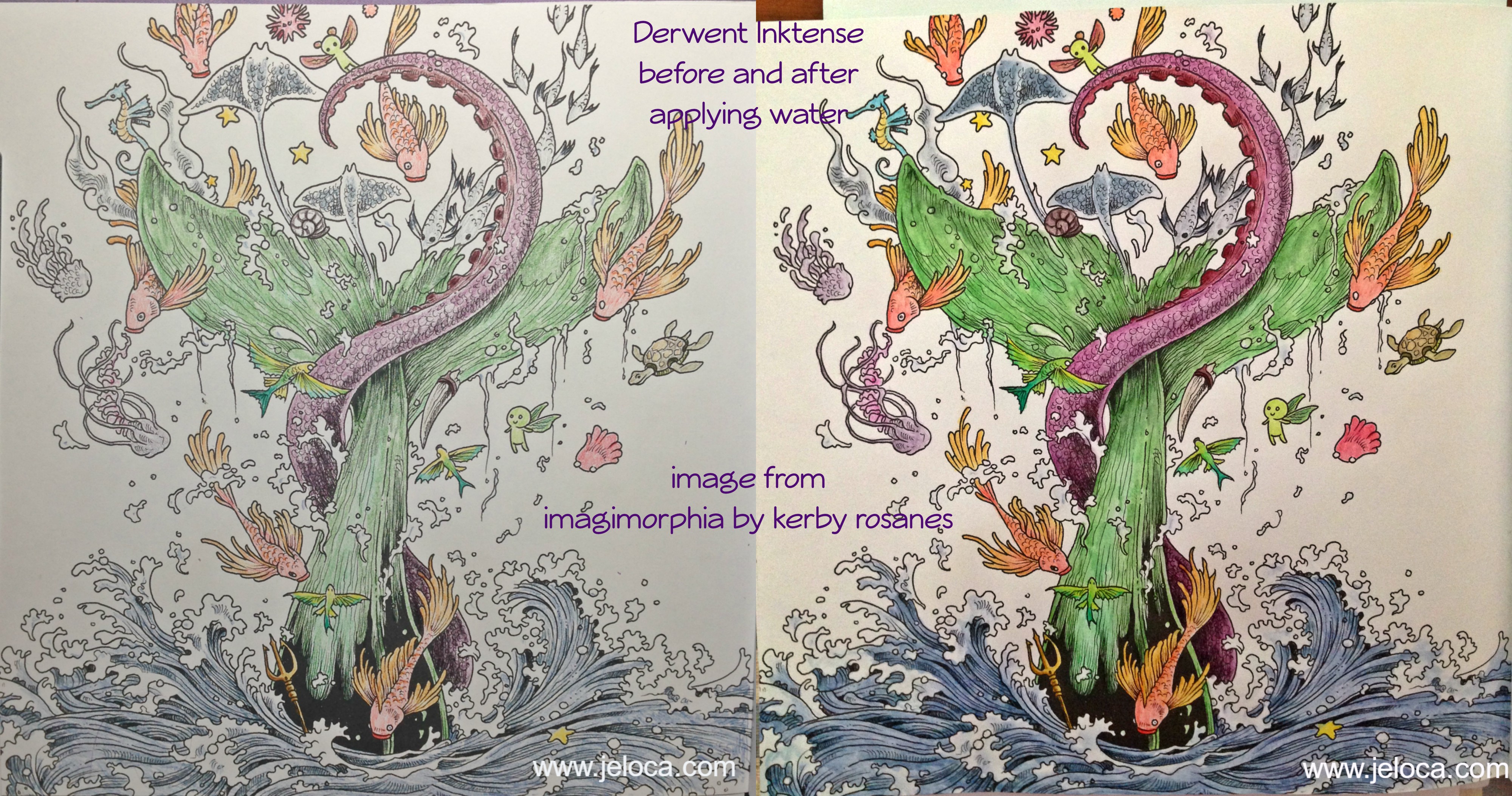
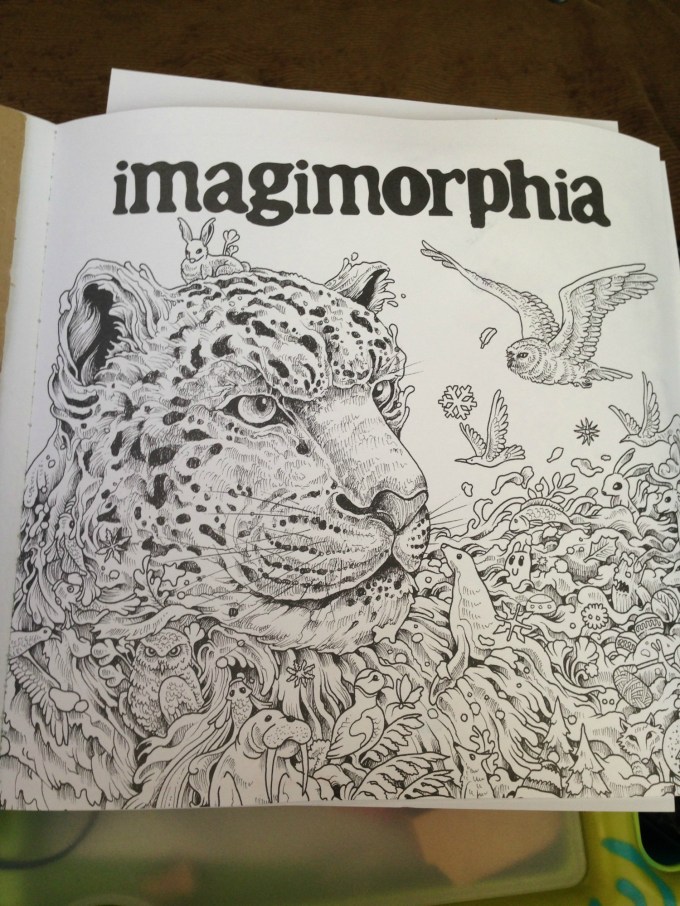
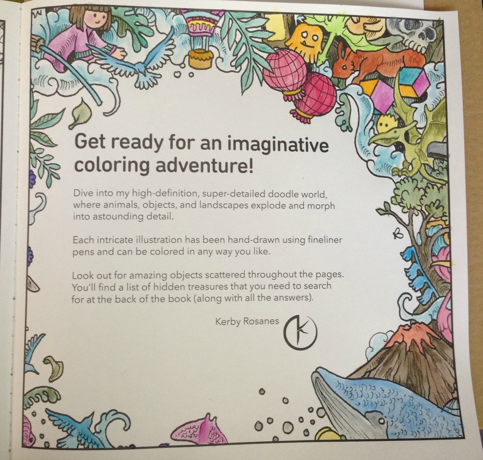
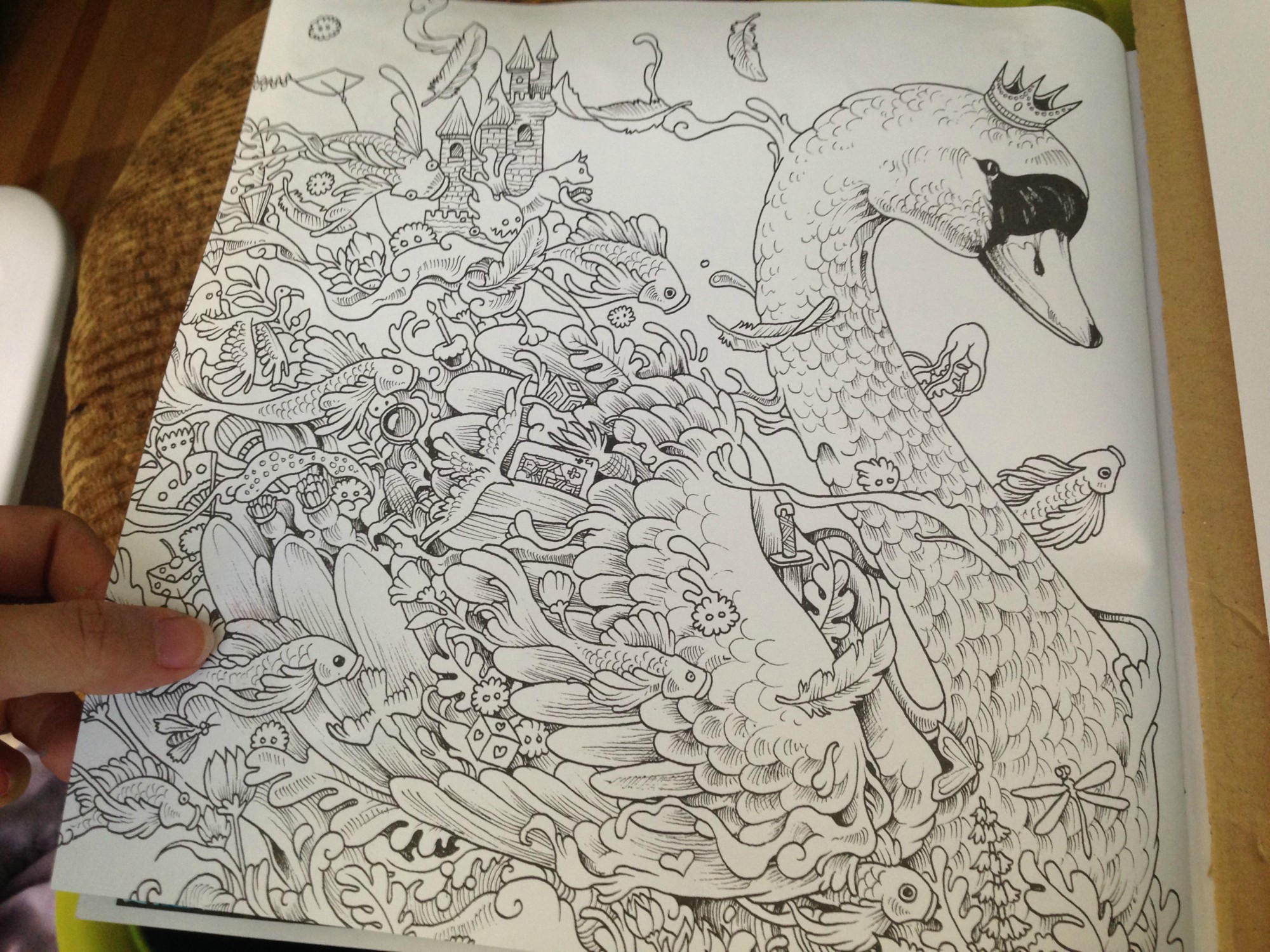
After testing the paper in the back of the book to make sure it would be safe to use (no bleed-through) I chose this image from Kerby Rosanes’ imagimorphia.
I’ve been having a lot of tummy time (lol) and this is how I’d set myself up in bed. A clipboard helped keep the book open as well as gave me a flat, hard surface to work on. I had a sheet of card stock underneath this page to protect the ones beneath, and I had my swatch book open in front of me so I could accurately choose my colors. My laptop was off to the right playing episode after episode of Welcome to Nightvale (soooooo weird and awesome) and the tin of colors was on my left within easy reach. Finally, my flip-top Ott-Light was balanced on the bed casting accurate light over the picture for me, since lighting in my house is crappy at best.
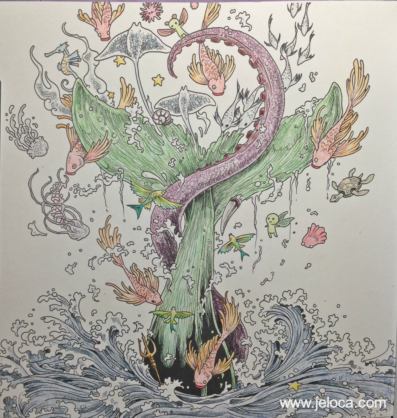
This is my completed painting before activating the Inktense inks. I colored pretty lightly, wanting to see how the pigments did on their own before adding any shading or depth. (PS yes I know that’s supposed to be a whale and whales aren’t green LOL) Coloring with these pencils is like a dream. They apply color beautifully even to paper that doesn’t have a lot of tooth. It is really easy to apply just a hint of color without any pressure on the pencil, which is a good thing because it means you won’t have to waste a lot of the pencil just to get a good color payout. In fact, these colors are so vibrant and juicy when activated that if anything, it’s almost too easy to add TOO MUCH color.
(For example, my son Jakob is addicted to these pencils too and is coloring an image in one of his books. I was showing him how subtle applications of color give pastel-pale results and he tried it out for himself. His three light strokes of Payne’s Gray, applying barely any pressure, provided enough color when activated to light wash a bunny butt around 3″ in diameter.)
I took this image right when I’d started activating the inks. I went slowly, enjoying watching the colors blossom into vibrant paint. (Seriously, it’s addictive). I activated each like section at a time, brushing off any excess pigment onto a paper towel to keep the tip of my water brush clean. In this image you can begin to see the difference between the activated (water-applied) and pencil-only sections. The orange and yellow fish on the right is still pencil, while there has been water applied to the one on the left. The little fairy creatures have been wetted on both sides. What really shows off some of the color payout, however, is the school of fish that crosses the tentacle. You can see how little color I’d applied, versus how much blooms from the watered inks.
And here is the completed painting. I didn’t use very many colors, but even still the brightness and depth these inks have is amazing. This picture is so much brighter and deeper in real life, showing subtle shading and contouring just from the way the ink moved like paint. It dries faster than watercolor so you do have to go in sections and work quickly if you want to activate a larger area without dry lines showing, but there’s still a decent amount of time to move the paint around before it dries, allowing for things like the softer blues in the water froth being ink I’d swiped from the water sections.
I’ve very quickly developed an Inktense addiction, as have my kids, who have been getting to use Mommy’s special art supplies now that they’re a little older. They don’t replace watercolors if that’s the type of medium you want, rather they’re a medium of their own, and are absolutely gorgeous to use.
This post may contain affiliate links. This means I might make a small commission on purchases made through the links, at no cost to you.
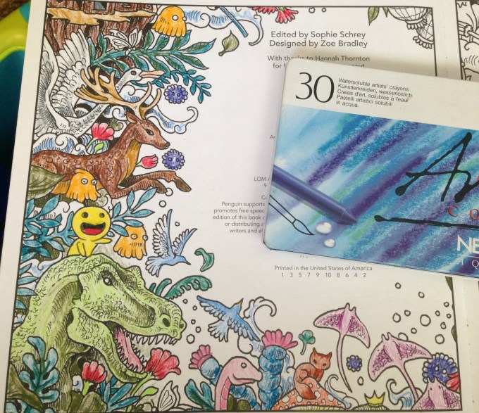
I’d been researching watercolor pencils a little while ago, and while reading review sites I came across a few mentions of the Caran D’Ache Neocolor II watercolor crayons. They looked interesting and were lauded for their bright, vibrant colors and creamy texture, so I made a note to look up more reviews. In the meantime, I remembered that at some point during my creative history I’d owned a set of, what my memory told me, were kid’s-quality twist-up watercolor pencils. I could picture the set, and knew there was only one place in my home-office they could be, so one morning I went downstairs and took a look.
I found the twist-up colored pencils right away… and was disappointed to see they were just that- colored pencils. Nothing water-soluble about them. It was frustrating to have been mistaken but I figured I’d just continue my research… and then I peeked through the rest of the drawer just to see what other drawing supplies I’d collected over the years and had forgotten about.
What a discovery! I think I squee’d out loud when I saw the white edge of the tin under an old pencil case of charcoal and blending stumps. Not only had I forgotten I owned these but clearly I’d barely ever used them when I got them, because they were all still full-sized and touching the sponge strip running the top of the case.
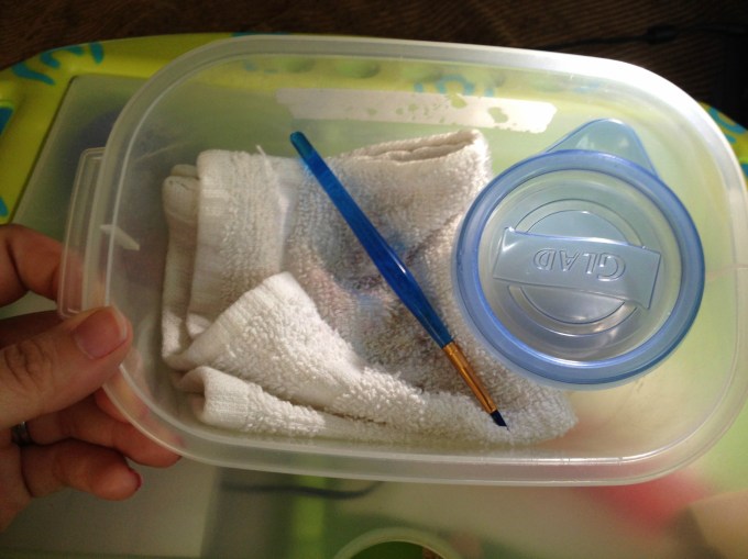
Immediately I brought them upstairs to try out. I’d been stuck in bed, resting my legs due to a really bad bout of sciatica, so I put together a little portable watercolor kit that I could use in bed without making a huge mess: a tiny tupperware of water, a fine-tipped paintbrush, and a folded handtowel for blotting and cleaning my brush, all contained within another small tupperware that I could close up and store with my craft supplies.
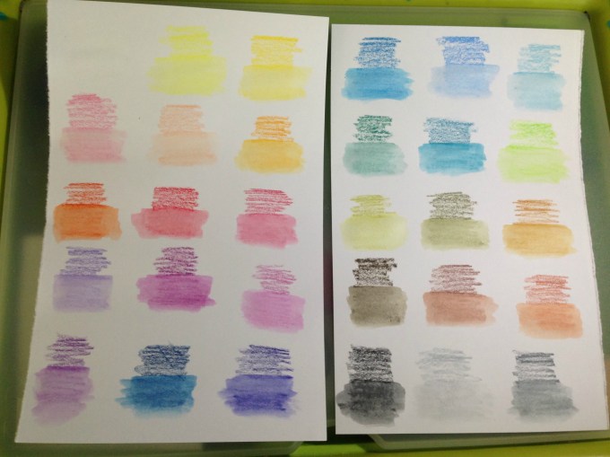
I made pages for them to add to my swatch book. I didn’t want to use water in that pad itself because the paper is so thin, so I folded a sheet of cardstock in half and tore it into two papers that each fit on my swatch book’s pages. I scribbled a little bit of each color onto the paper and then activated each with a tiny bit of water. These colors are so rich and the crayons dissolve so easily that a SUPER tiny amount of water is all that is needed.
After the swatches dried I labeled them with the color names from the Caran D’Ache site and then used a glue stick to affix them into the swatch book. Now- onto the coloring!
My first test was the inside cover page of Kerby Rosanes’ imagimorphia, which I have been loving lately. I colored the page pretty quickly, not bothering to fully fill in all areas (like the cut area of the tree, for example) because I knew once wetted, the color would spread. I did some minimal color mixing and shading on the leaves, deer and dino, all using the crayons as crayons to color. Sadly they’re old enough that they became fragile, and two colors broke in half as I worked. They’re still usable, but I was disappointed. More evidence of their age is the (removable) white bloom on some of the darker colors, as well as how the lightest brown dried out to the point of looking like a Flake chocolate bar inside its wrapper. 😦
The crayons applied color wonderfully but, as to be expected of crayons, they didn’t have points sharp enough to work into the fine areas of the image. I was able to use the edges of the points to get into fine spots like the rays’ tails and such, but I didn’t bother trying to color the butterflies, knowing I’d just make a mess. In some areas, like the pom-pom-looking little dudes, I only colored the center, planning to move the color outwards later, once I activated the paint.
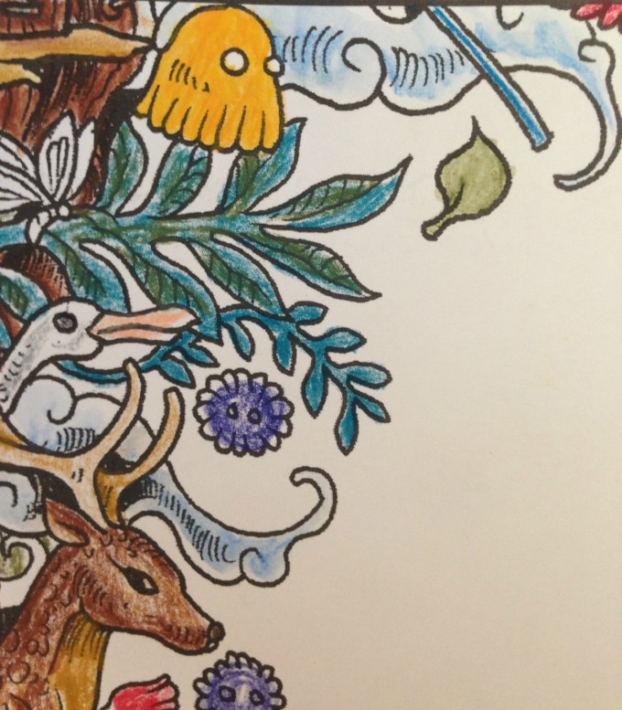
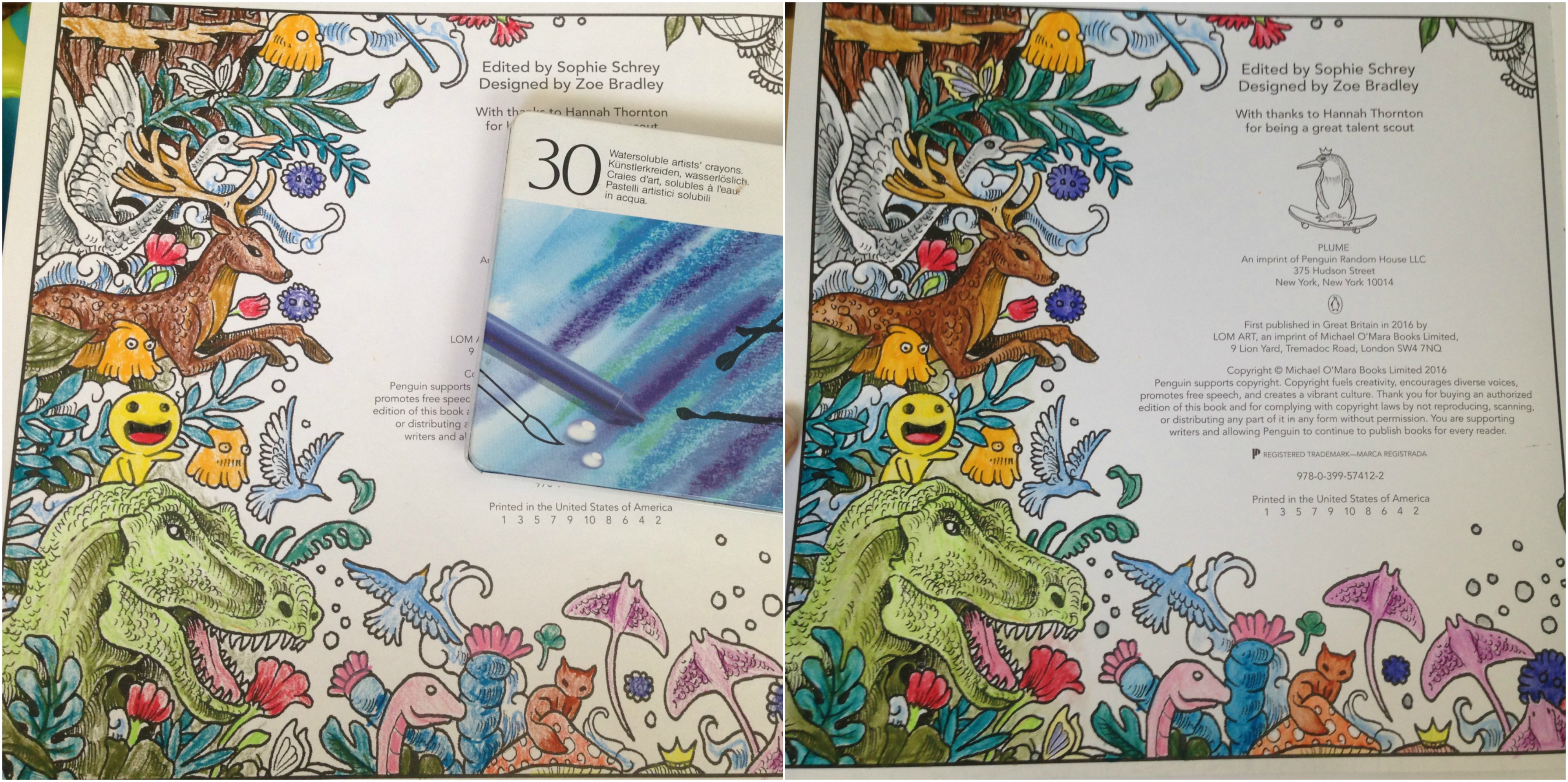
The very first spot I activated were the clouds in this image. I set a sheet of cardstock behind the page to protect it from any bleed-through or water damage, but it really took such a tiny amount of water that I doubted there would be any actual problems on the reverse-side pages.
You can see in this enlargement of the lower edge what the clouds looked like before the water was applied, as well as the rough, uneven coloring job I did. I’d cringe, except it was deliberate. After seeing how vibrant the colors were and how much they spread, I didn’t want to waste any of the crayon filling in any more densely.
This is the final result. I can’t get over the difference, and how smooth and rich the colors turned out! I did manage to achieve some subtle shading and depth to the colors, and if I’d wanted to color over-top and re-wet I’m sure I could get even more effects. The largest difference for me is in the tree, the deer and the dino, but I’m charmed by all of it.
I was super-pleased (but not surprised) to see that there was NO bleed-through on the other side of the page. This means I can use these crayons throughout the book without worry, which makes me really happy.
Here’s a side-by-side to really compare the before and after images. Besides blending out the patchy scribbles, the colors (which were pretty vibrant before) didn’t fade out and some became even brighter. They blended beautifully and dried really quickly, but not too fast that I couldn’t move around soft watercolor washes.
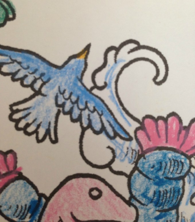
For the facing page (above) I decided to try using the crayons in a different fashion, as if they were individual little sticks of paint.
I wetted the brush, blotted most of the water off, and then dabbed it against the tip of the crayon, picking up some color, which I then applied to the image as paint, just as if I’d picked the color up from a palette. You can see some of the peach on the tip of my brush, as well as on the face and hands of the little girl I’d just painted.
This is the finished image after painting. In contrast to the side where I colored first, I think this side has a softer, almost dreamier application. However it is slower to keep re-dabbing the brush to the crayon, and it makes mixing colors more difficult as the paint dries much faster when using this method. I greatly recommend it for areas where you need more control or a finer application than you’d get with the stubby crayon.
This method also made me realize that my broken crayons were not a loss, nor was my flakey, dried-out tan. I can put a small piece of the color in one of my palette wells and activate it to use as paint, meaning that no part of these (expensive!) crayons will ever be wasted. 🙂
Here’s the back, showing again that there was no bleed-through or ghosting.
I’m really glad I found these crayons in my stash, and I can’t wait to play around with them more in this and other books. The colors are incredible and they activate so easily and beautifully, I really recommend them. Mine have broken and dried out, but they are also over 15 years old (!!!) and still work as well as if they were brand new. I would wholeheartedly recommend these.
This post may contain affiliate links. This means I might make a small commission on purchases made through the links, at no cost to you.