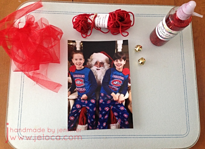
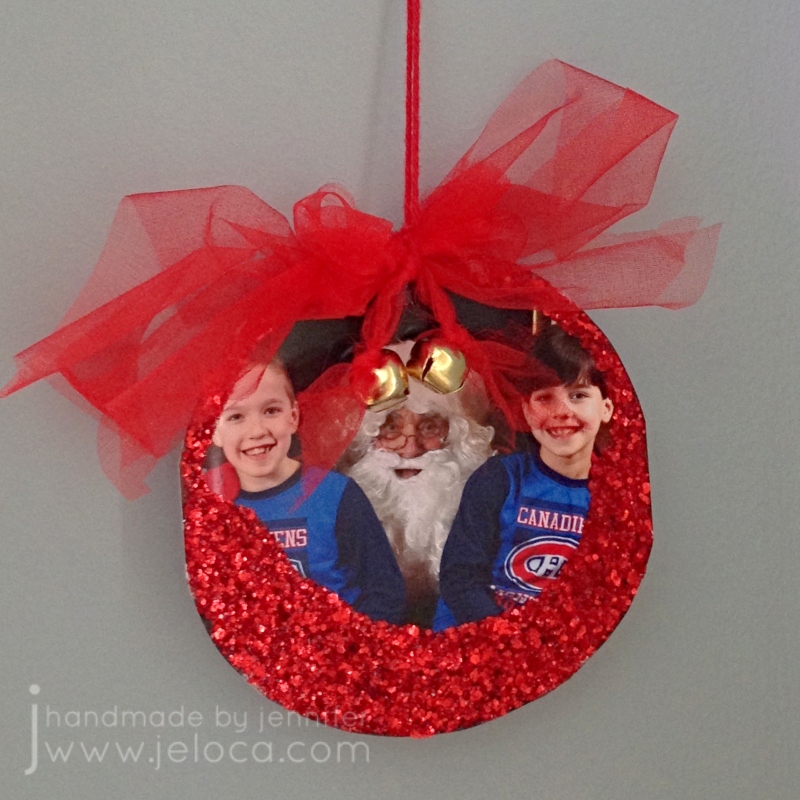
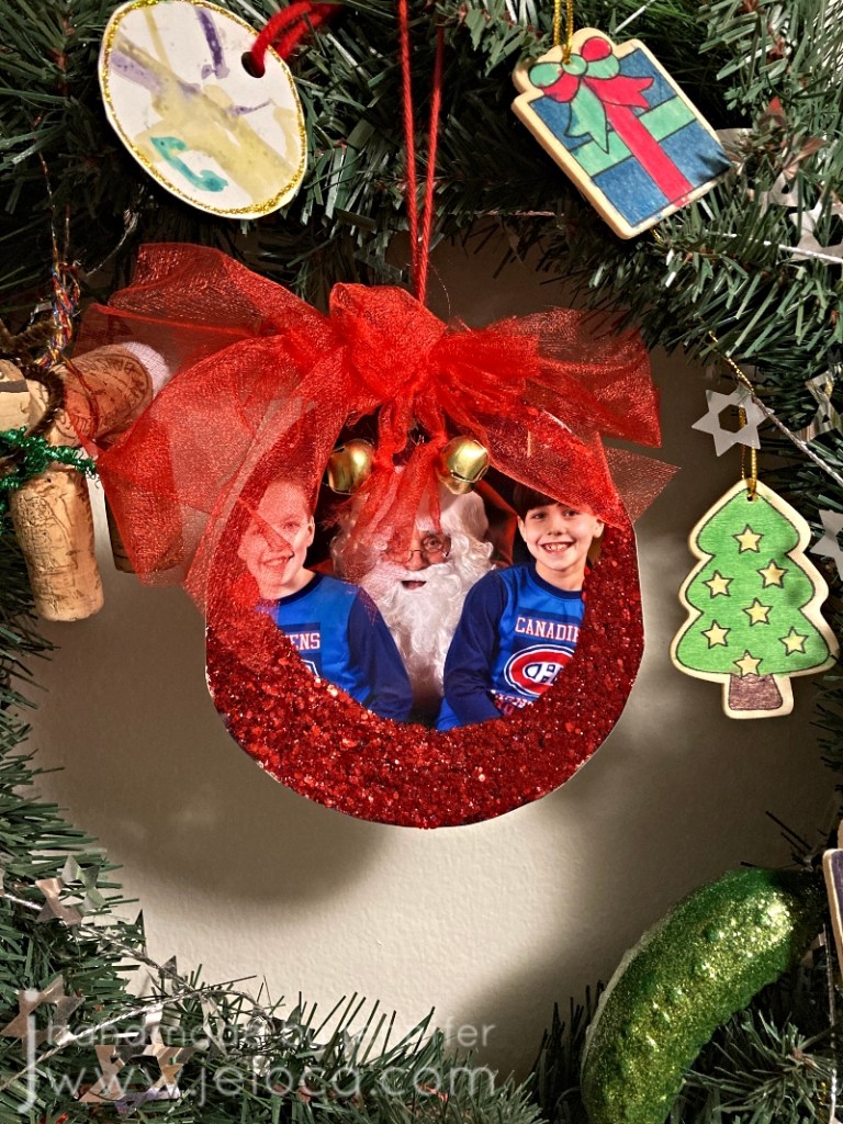
It’s December 1st, and although stores have been in Christmas mode since even before (American) Thanksgiving, we’re now “officially” close to the holidays. Here’s a quick holiday project that’s easy enough for kids to make (with minor supervision). These easy photo ornaments are a great way to share cute images and make great gifts for grandparents. They can even be used as gift tags!
I used extras of my kids’ Santa’s lap pictures, but you can use school photos, family portraits, even pet pics!
All materials as shown were found at my local Dollarama, though I’ve linked Amazon’s versions for delivery convenience.
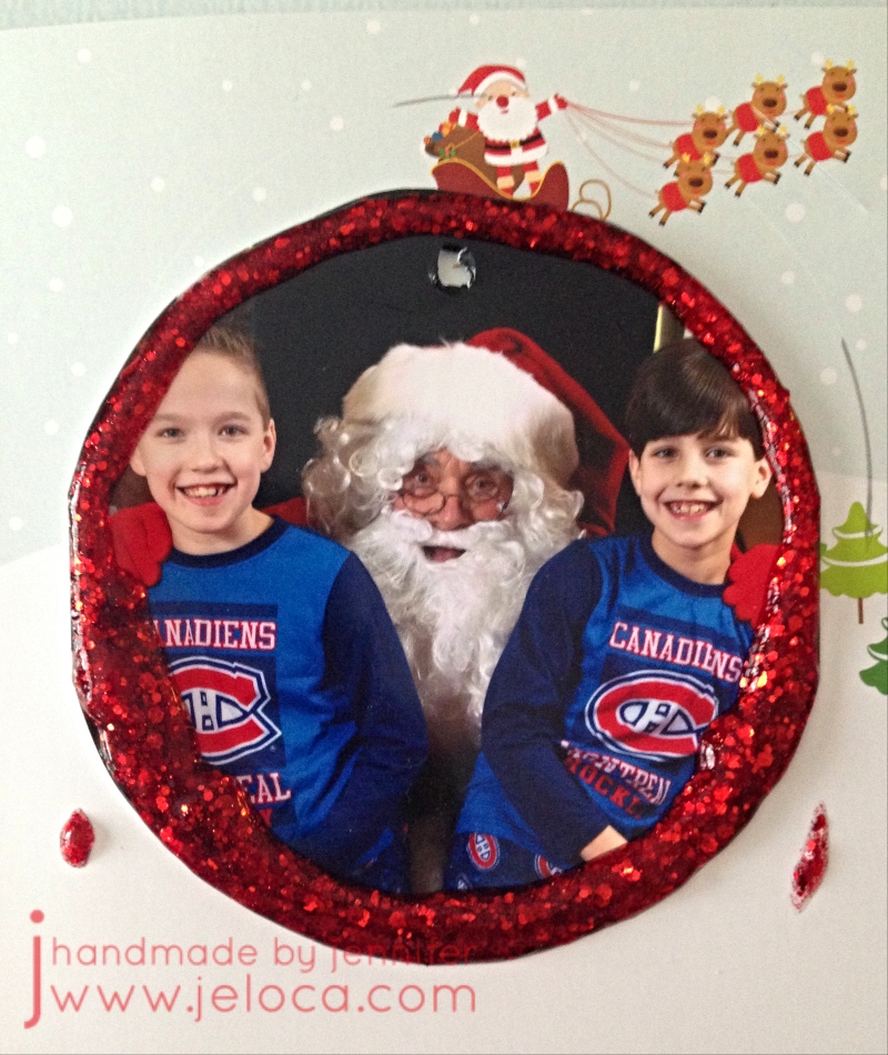
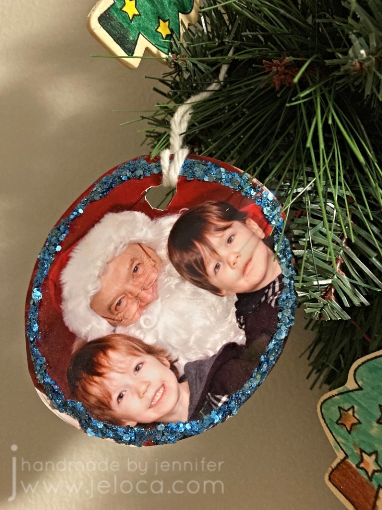
For an ornament style, have draw or trace a circle around the desired part of your image. You aren’t limited to circles, of course, and can draw any shape you like. Cut out your shape and outline it with your choice of glitter glue. You can add other embellishments if desired, can trace only the outline as above or a later pic below, or fill in a part of the image as seen in the following images. Set aside to dry fully – at least a few hours, or overnight.
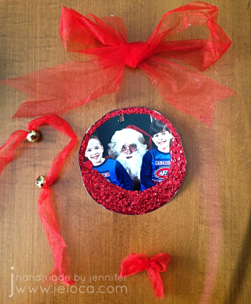
Prepare your tulle or ribbon as follows: make one large bow, one small one, and then tie two bells onto a 10″ length of tulle/ribbon, leaving about 3.5″ between them. You can trim the tail ends later. If unable to thread the tulle/ribbon through the bell’s loop, a yarn needle can help. You can also use the yarn needle (or the scissors or a hole punch) to make a small hole in the top center of the image.
Stack the small bow on top of the large bow and use the tulle/ribbon with the bells to tie them together, allowing the bells to dangle below. Cut all tails to desired length.
To assemble: Cut a 10″-12″ length of yarn. Loop through the hole in the ornament. You can use the yarn needle to thread the yarn ends through the knot of the large bow, or tie the yarn directly around the center of the bow bundle, between the two bells. Knot the two ends of the yarn together to create a hanging loop.
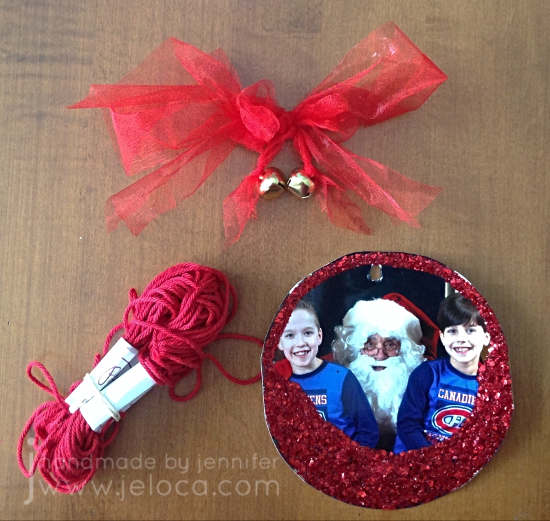
These hold up pretty well! While the step-by-step images were taken in 2017, the photos from here onward were taken in November 2021. This is an early, more simple version I’d made in about 2015.
The example ornament has the center spot in our wreath and it’s lasted quite well. I’ve written the date and kids’ ages on the back, and they create a nice memory during the holiday season.
Happy holidays!
This post may contain affiliate links. This means I might make a small commission on purchases made through the links, at no cost to you.
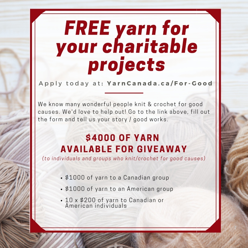
Have you ever done any charity knitting or crochet? There are so many ways to give back to your local community or to help others around the world. I’ve done a lot in the past…through the Montreal Knitting Guild, my local hospital or volunteer Facebook groups, my friends and I have made everything from Teddies for Tragedies to chemo caps to birds’ nests for Australia. Most recently the Warm Hands Knitting club from my local Federation CJA spent last winter making hats, scarves, and slippers to keep our elderly community warm.
It feels great to give back and YarnCanada.ca is giving you the chance to get the yarn for your projects donated to you, free of charge.
Yes that’s right – they’re giving away yarn for FREE!
They’ve just started their 4th annual event of giving yarn to individuals and groups who knit or crochet for good causes!
In partnership with Bernat and Patons Yarn, they’re giving away $4000 (!!) worth of yarn to 12 different charitable individuals/groups. The hope is that the yarn goes to wherever it can do the most good.
And even better – this opportunity is open to both Canadians and Americans! Yes that’s right – they will ship the free yarn to the US!
To apply all you need to do is click the image above (or click here), fill in the form and tell them your story. Let them know what you will use the yarn for, what impact this or previous projects have had, or anything else important to your story. You can even attach photos to show them past charity projects you’ve done.
You have until January 13th 2022 to apply. Good luck!
Over the last few years I have occasionally been reached out to by YarnCanada.ca and offered yarn to review. Unfortunately life got in the way and my projects and posts were delayed. Here, then, is the first of such reviews.
The yarn I was offered this first time was Noro Kureyon. I was familiar with it, having worked with it in the past when knitting my mom’s Booga Bag as well as for my Tasha Tudor shawl. (Remember when those patterns were huge?? I think EVERY knitting blogger was making them. Both are free patterns, and both are enjoyable knits. Here are the links to the patterns: Booga bag by Julie Anderson – Truly Tasha’s shawl by Nancy Bush.)
I’d knit the bag in 2004 and the shawl in 2005 so I was curious if the yarn was still as good as I’d remembered.
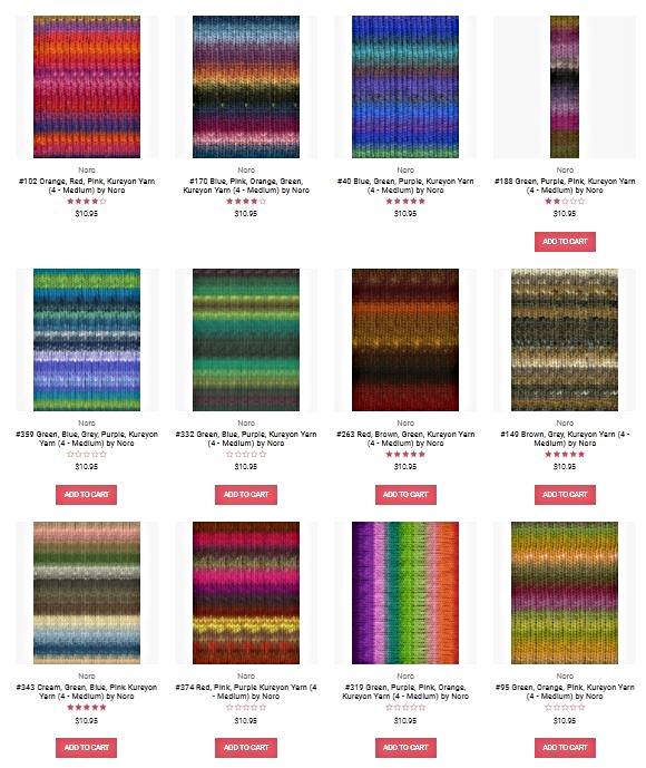
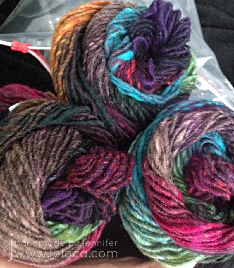
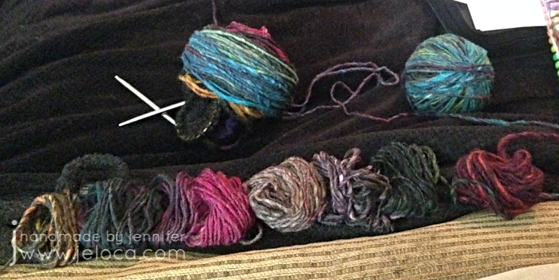
As per YarnCanada’s description, “Noro Kureyon is one of their higher-end, “indie” yarns, known for its artistic colors and hand production process. It’s a hand-dyed, 100% wool that comes in variegated colors that self-stripe as you knit. A wide range of accessories and garments can be knit with this yarn.” I was offered my choice of color, which was a hard decision to make! As you can see below the yarn comes in a TON of beautiful shades, each more gorgeous and interesting than the last.
I wanted to choose a pattern before selecting a yarn, as the colors would be the prominent feature. The yarn colors do sell out fast, and in fact my first choice color at the time had sold out before I was able to decide on a suitable pattern! In the end I chose color 368, and they sent me 3 balls.
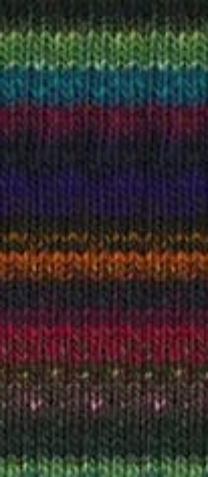
Note: it looks like this color is currently not available on their website. This is what it had looked like at the time:
And this is how it looked when it arrived.
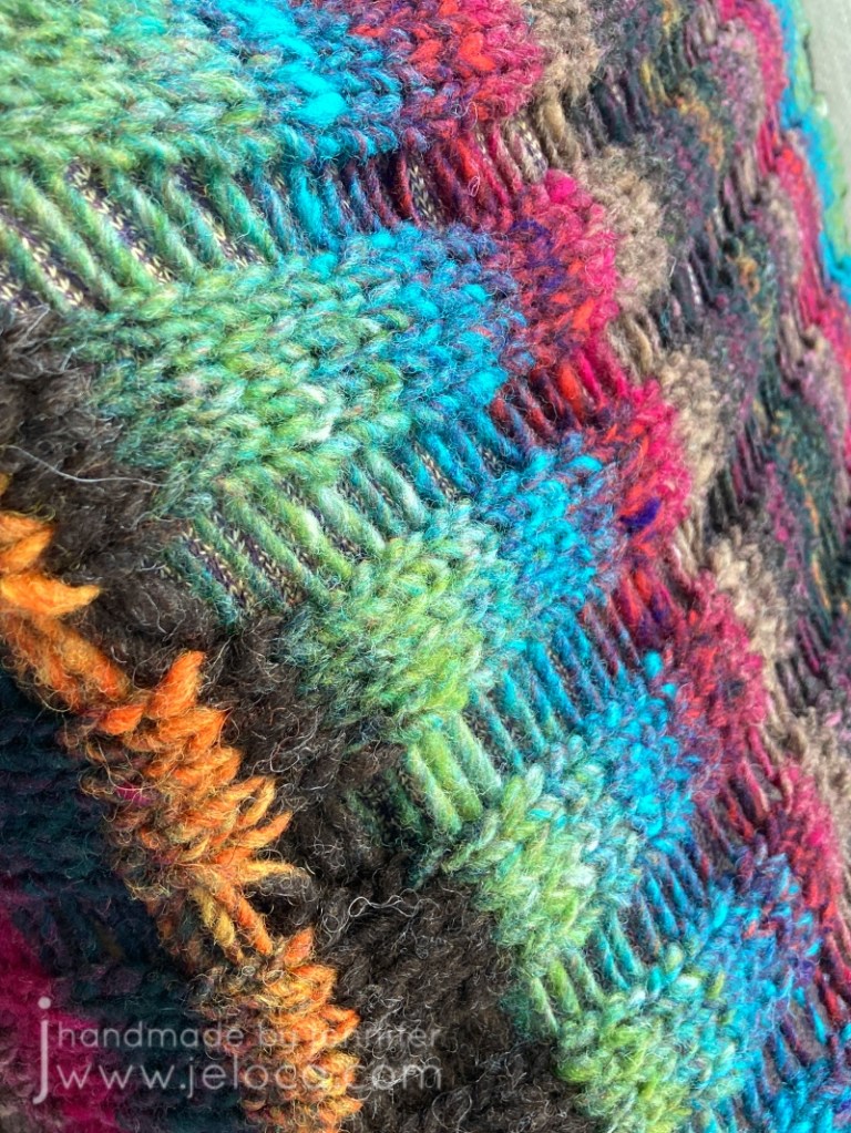
Aren’t the colors stunning?? I was swayed by the contrast of the bright blues, greens, pinks and orange against the more muted neutrals.
(Disclaimer – the images in this post from here until the mannequin were taken a few years ago with an old iPhone 4 that had a cracked lens – hence the purple halo in most pics. I cropped out and tweaked what I could, but I can’t go back and account for bad composition or staging, unfortunately).
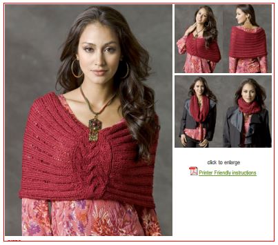
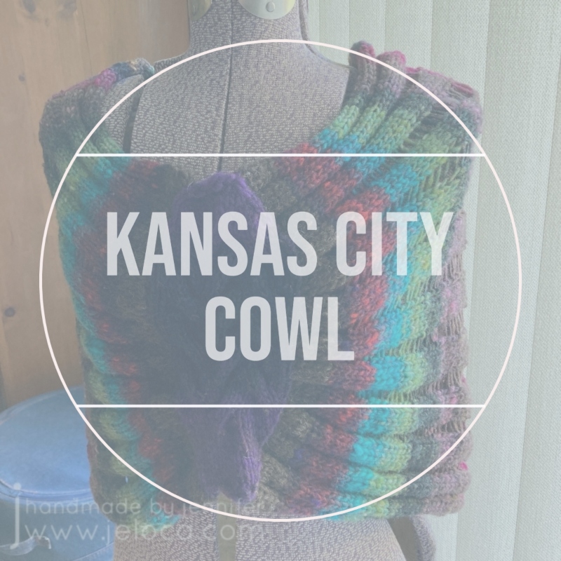
As mentioned, I’d selected a pattern first: the Kansas City Cowl by Kim Guzman. (Free on Ravelry).
I thought it would be really cool to see the colors stripe vertically while the dropped stitches ran horizontally. Being one who gets cold easily, I also liked the idea of having a versatile garment that could be a scarf when on the go but then be pulled down into a shoulder-warming shrug/poncho when necessary.
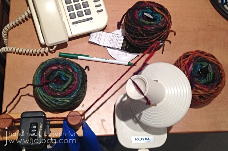
I hadn’t read the pattern details initially so it wasn’t until I went to get started that I realized I wouldn’t have enough yarn. The pattern calls for 338m and the Noro was labeled as “plus or minus” 50g to 100m. I figured I’d knit the middle size and hope I’d have enough, but then common sense took the better of me and I decided to wind the balls up and run them through my yardage meter at the same time so I’d know for sure. I was hoping there would be an extra yard or two in one of the balls and I’d find myself luckily closer to my desired yardage.
To my surprise each ball was excessively short. Each was supposed to be “around” 100m, but I didn’t get anywhere close. I even wound each ball twice – once to wind into a cake and then a second time into a new cake so there wouldn’t be tension causing any issues. When I saw there was a rather large discrepancy, I also weighed the 3 balls.
These were my results:
Ball 1 – 263 ft or 80 m – 50g
Ball 2 – 257 ft or 78 m – 46g
Ball 3 – 262 ft or 80 m – 40g
I have no idea why the last ball was so much lighter than the first one which had the same yardage. The yarn does slightly vary from thick to thin so it’s possible there were more thin sections. (Note: it’s not a slubby yarn… it’s just occasionally not spun as tightly in spots).
Now knowing I was pretty short on the 340 m yardage my desired pattern required, I riffled through my yarn stash buckets and find something that would match. There was some brown wool left over from a Sylvia Olsen workshop that matched in look and color…except it was leftovers, so there wasn’t much. I measured that to be sure and had 88 ft (26.75m). Armed with that, I formulated a plan.
The pattern starts with the cabled center section, and then stitches are picked up from it to work the body. So my loose plan was as follows: pick the ball of yarn that began with the colors I wanted for the cable. Then divide my brown yarn in half, and work as many rows as I could with it, and made a note so at the end I could work the same number of rows with the remaining half so it would create a matching border on either side of the cable. Then, in between, I would work as many rows I could as possible with the Noro.
Happily enough, it worked!
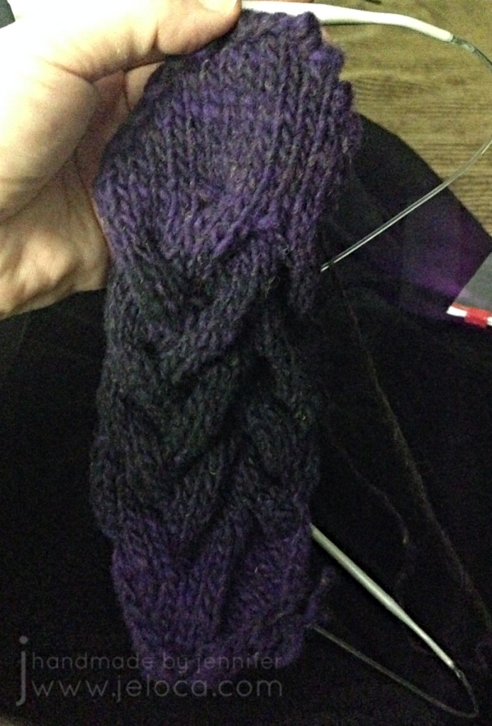
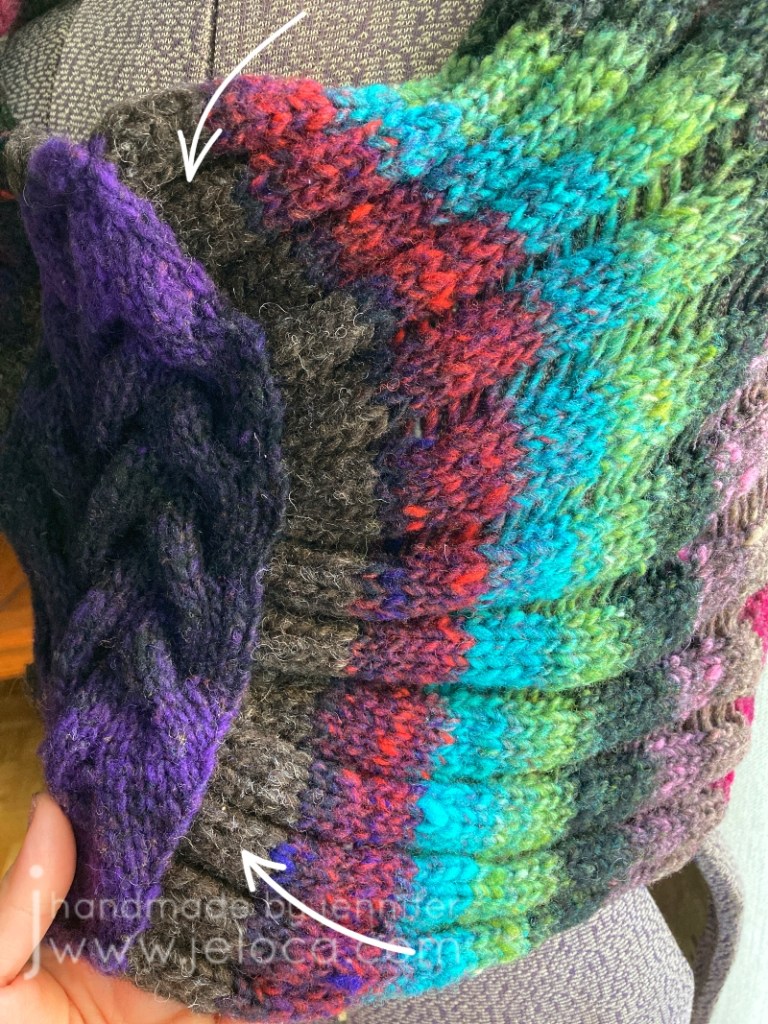
I knit the cable with one skein’s purple-to-black transition and then pulled the same color section from a second ball but reversed it for black-to-purple. As the yarn is 100% wool I split spliced all joins for a seamless knit.
Then I divided my 88ft of brown in half, and used one half to pick up the stitches on one edge of cable, picking up inside the edge stitch for a nice border. I’d marked off the middle of the half of brown, and had originally planned to use a full half on each side but after the pick-up row and 4 more rows it was already pretty wide. I didn’t want 2″ of brown on either side of the cable so chose instead to cut the yarn there, reserving the same amount for the other side, and omitting the rest unless I absolutely needed it.
Next I took the two balls I’d cannibalized the purple/black from and matched up their colors, re-winding one in the opposite direction so that the front would be mirrored. The plan for the third ball was to find its center and reverse half so the entire cowl would look like one long repeat that went from the cable to the center back then reversed to the other side of the cable.
It worked great for the first two balls. I wound them off exactly as described. The one with the working yarn I wound around the cable & needles to keep it neat and out of the way. The other end I wound into a ball starting with the added brown that would be the final bit of knitting, and wound in the reverse direction. These two balls happened to be #1 and #3 and had such similar yardage and colors that it was super easy to wind one from front to back and the other from back to front and get a nearly mirrored result.
The middle, shortest one, wasn’t so easy.
I spit-spliced one end of ball 2 to the free end of each of the 2 wound balls and tugged off a few yards from either the outside or inside of the cake and wound it up onto ball 1 or 3. Looking down into the wound cake of the middle ball I could tell it didn’t have the exact colorway of its brothers, but it seemed to have an even repeat – raspberry to teal then green then the dark blends, then back to raspberry to teal then green then the dark blends. I figured it would be easy enough to split it into two equal repeats then reverse one for the center mid point of the back. I wanted the brighter teal coming first because both wound balls already had dark tones near the joins. It worked… until I got near the middle.
This is the only place, not counting reversing direction or adding in brown, where I’ve played with the colorway as dyed, and I’m telling you this so there are no questions as to why my colors don’t match any skein you might buy (though if this color is discontinued by now this won’t matter). Clearly the colors don’t make a repeat that I can just reverse, so I ended up cutting and spit-splicing to make my own sorta-repeat that I was happy with, that would form the middle of the cowl back.
Planning out the colors was by far the hardest part. Once my yarn was turned into one large frankenskein the project practically flew off the needles.
I did stop often to admire the color transitions. Noro yarns truly are gorgeous, and I’m always charmed by the interplay of colors I wouldn’t have thought to pair together.
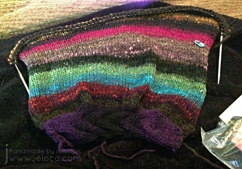
The cowl is knit in stockinette with stitches dropped at the end before you seam the BO row to the opposite side of the cable. Besides the color play, the only modifications I made were to knit my length based on how much yarn I had left, and to not apply the pattern’s suggestion of slipping the first stitch of every row as I found it made the edge way too tight for my liking.
I couldn’t wait to try on the cowl as soon as I’d finished weaving in the ends! You can tell how long ago this pic was taken by the color of my hair at the time 😉
Because of my camera limitations at the time I’ve scrapped my other images and took new ones to do the project and yarn justice.
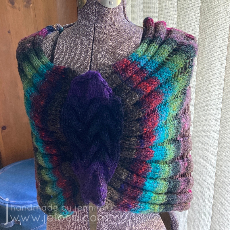
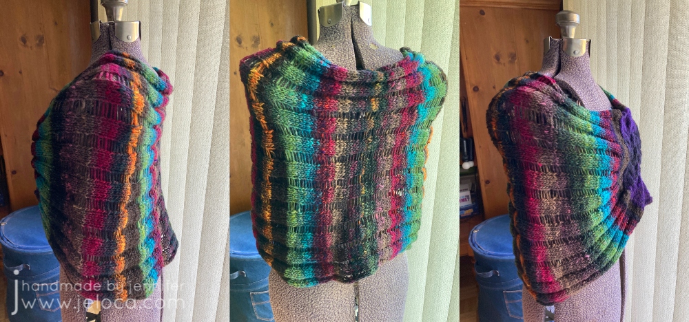
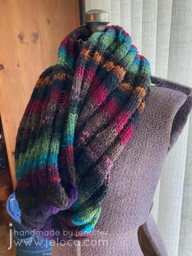
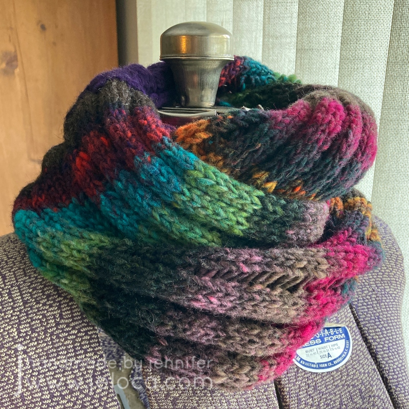
Here is the finished garment. I love the blend of colors so much!
One of the really cool things about Noro Kureyon is that you get these gorgeous color transitions but, because they’re 100% wool, you have the option of changing things up if you want to.
For example, instead of having a mirrored transition like I did here, if color blocking is more your style you could splice the balls together lengthwise, matching up the colors like with like, so as to end up with only one wider section of each color.
I couldn’t resist a detail shot of these vibrant jewel tones. There’s no color editing at play – this is just the yarn in all its glory on a sunny day.
For transparency, as mentioned above this brown section on either side of the cable is the only yarn not part of the Noro Kureyon skeins. It is very similar to a brown that appears within, and is also 100% wool, but is slightly thicker.
I haven’t knit more with Kuryeon over the years. I’m not sure why. Perhaps it was the price factor? At $10.95CAD per ball I simply haven’t had a project that I thought worthy of spending the money on. Not for myself at least, and the gifts that I make typically have had other requirements, like needing 100% cotton for dishcloths or superwash for baby garments that can be thrown into the machine. However knitting it with it again has reminded me just how much I enjoyed it.
Yes it’s 100% wool, but this is not scratchy stuff. It is soft and quite lovely. Sure you can use this for felted bags and slippers as it felts beautifully, but this is one of those few wools that I think is welcomed even against the skin.
I definitely recommend using it for your knitting or crochet projects. The only con would be the short yardage as mentioned above, but as long as you prepare and buy enough for your project, I don’t think it should deter you from trying Noro Kureyon for yourself. Also, this review is based on yarn received in 2017 so it’s possible that this is no longer an issue.
Stay tuned for a huge announcement from YarnCanada.ca coming later this week!
If you would like to pick up some Noro Kureyon for yourself, please visit YarnCanada.ca here. You can also find their full selection of Noro yarn here. All orders ship from Canada to within Canada only(sorry to my US and International followers!), with free shipping on orders over $85.00!
*Note: I received this product for free in exchange for an honest, unbiased review
It’s been almost 2 years since my Order of the Phoenix blanket was published in the Knitting Magic book.
There it is on the cover!
The Black family’s ancestral home played a huge role in the source book (Harry Potter and the Order of the Phoneix) so in honor of today being Sirius Black’s birthday I’m going to answer the number one question I get asked about my pattern: how to enlarge the charts.
In case you missed my previous post about it, The Order of the Phoenix blanket is a circular throw that features motifs representing Harry’s scar as well as phoenix feathers and flames to represent the phoenix’ rebirth. A primary feature of the blanket is the text “The Order of the Phoenix” that goes around the center.
As the book is under copyright I’m not allowed to share a digital version of the charts when people request it, nor use that as my example here in this post. Instead I’m going to use my Lullaby baby blanket pattern for reference as they are both similar in having a charted band of words going around the center.
Lullaby was originally published in the Spring/Summer 2010 issue of the now-defunct St-Denis magazine, that supported Veronik Avery’s yarn line of the same name. It has a deep border of garter feather-and-fan lace and features the words HUSH * BABY * SLEEP * BABY * around the center.
Using my hand for scale you can see that the charts are of relatively similar size between the two pattern books:
Obviously I had to blur out the charts themselves but you can still see the suggestion of where the words are and so the instructions I give for Lullaby will work just as well on Phoenix or any other chart by any designer.
There are a few different ways you can enlarge your patterns, depending on if you start with a physical or digital pattern, and on the result you want (physical or digital enlargement).
How to enlarge a PHYSICAL pattern (book, magazine or printout)
There are 2 options for enlarging a physical pattern.
Option 1: home scanner/copier/printer
Most home printers these days have a built-in copy/scan feature. If you scroll through the copy settings you can find an “enlarge” option that will allow you to increase the size of the chart in the printout.
You can also use the printer’s scan function to get a digital copy of your pattern that you can enlarge with any of the following digital methods.
Option 2: public photocopy center/machine
You can find both self-service and with-service public photocopiers at commercial copy centers like Staples. You can also often find public photocopiers at your local pharmacy or library.
This is a direct photocopy from my pattern. My hand is provided for scale.
This is an enlargement of the same page, made using the photocopier’s built-in enlargement option. Most photocopiers can handle legal and oversized papers. In this case, I used the 129% option to print on the largest size paper available (11″x17″).
You can see the difference between the two sizes.
The HUSH chart, for example, is 1.75″ high by 6″ wide in the original (and copy), and 2.25″ high by 8″ wide in the enlargement. These differences might make printing as-is enough of an enlargement for you, or you can take the enlargement and use it as your starting image to photocopy again even larger…repeating the process as-needed until the resulting chart is of a size for you to work with comfortably.
How to enlarge a DIGITAL pattern
There are many options for enlarging a physical pattern. I will be demoing these methods using my computer and/or an iPad. It is possible to do them all on a smart phone as well but since the point is to enlarge a chart to make it more convenient to work from, I’m going to assume you’re going to be working from your tablet or computer/laptop and not the smaller screen of a phone.
Option 1: from a physical file
Take a picture of your chart with a smart device and then email it to yourself so you have a digital file to work with.
Alternately you can upload it directly to an accessible storage media like Dropbox or Google Drive, or upload the image directly into a data-processing app like Microsoft Word, Excel or OneNote, Google Docs or Sheets, or your favorite annotation app/software. From there you can proceed to the enlargement instructions below.
Option 1b: from a digital file
You would use this option if you already have your pattern in a digital format. In this case I’ll be using the sale pattern version of Lullabye.
Use your favorite screenshot app to take a picture of the chart on your screen. I like Microsoft’s built-in “Snipping Tool” but you can use Snagit or any others including the “print screen” button yon your keyboard. As the “print screen” key method has a few extra steps, both ways are shown below. TIP: enlarge the chart on-screen before taking the screenshot so you are already starting with a larger version.
A) Using Snipping Tool (or other screen-grab software)
Open your pattern document (ie: Word doc, Excel file or PDF) on screen. Make sure the chart (or section of the chart you wish to capture) is in full view, then open your screen-grab software.
Click “new” to start a new screenshot. The software will freeze the entire screen as it currently looks.
As it says on the prompt – drag the cursor around the area you want to capture. Use your mouse to drag a square or rectangle from one corner to the opposite diagonal, making sure your desired image is fully inside your boundaries.
You can see the red boundaries on the image above. I started my capture at the upper left corner and dragged down to the lower right (where the cross is). Everything inside the red rectangle will be part of my screen-grab. I made sure to include my chart’s legend as well as the instructions on the bottom.
After you release the mouse after dragging, your cropped result will appear within the software’s window. If you don’t like the results, or are missing part of your chart, simply click “new” to start over and drag again.
Once you have the results you want, click “file” then “save as” and save the image to your computer. I keep a folder for every project I work on so I would save it in there for easy reference but you can save it to your downloads or anywhere that you would like.
B) Using your keyboard’s “print screen” key
Open your pattern document (ie: Word doc, Excel file or PDF) on screen. Make sure the chart (or section of the chart you wish to capture) is in full view, then tap the “print screen” button on your keyboard. This will take a screenshot of your full screen – everything showing on your monitor.
Open any software that will allow you to paste and then crop an image. I’ve used Word, Excel and Paint regularly with great results, and many other programs will work as well. My example is using Word.
Place your cursor anywhere on the page and use ctrl-v or click file→paste to paste your screenshot into the document.
You can see the image of my screen is now pasted into the Word document – background, taskbar, clock and all.
Click on the image within the document itself.
This will bring up a “Picture Format” tab at the top of your Word window. Click on it.
If you look over to the far right of the ribbon bar at the top, you will see a “crop” option. Click on it and you will see black crop bars appear on the border of your image. We will use those to remove all the excess parts of the image, leaving only the chart you want to work with.
Drag the dark black crop marks to surround only the part of the image that has your chart. As you drag you will see the edges of your image get shaded. Those are the parts that will be cropped out of the final image.
Keep moving the borders from the top, sides or corners until your chart is isolated. Then click anywhere outside of the image.
The shaded areas will disappear and you will be left with your desired chart.
Right-click anywhere within the image and choose “Save as Picture”. Now you can save your cropped chart image anywhere on your computer for use in the following enlargement step. In this example I kept all 3 words and the legend as one image, but if you want to enlarge each word even bigger you can repeat this process 3 times to crop out each individual word and save it as its own chart image.
Enlargement Instructions:
Once you have your chart in digital format enlarging it is really easy!
Option 1: Paint, Befunky or other photo-editing software
Insert or open your saved chart image into your favorite photo editing software and resize it to enlarge. You can save the image in its larger size and print it at home or email it to your local copy center for printing. You might also find that having it large on-screen is enough for your purposes.
Option 2: Word, Excel, Docs or Sheets-type data processing software
Open your favorite processing software and use the “insert” feature to add your digital chart image. Once inserted you can drag on the corners to resize the chart. You can also right-click for more editing options. Once you have the image large enough for your purposes you can use it on-screen or print it for a large paper copy.
Option 3: PDF Annotation Software
There are a number of computer and iPad/Android programs that will allow you to annotate a PDF. To use your favorite one, insert your chart image into Word or Sheets as per Option 2 and then save your file as a PDF. Open the PDF in your annotation software and you can zoom in as well as make notes or highlight directly onto the chart.
My favorite annotation software is OneNote, and I use it daily for making notes, highlights and annotations on PDFs as well as images for all my crafting needs. It is free but since it might not be widely-used I’m putting it as a standalone option below:
Option 4: OneNote
I use OneNote extensively and find it an invaluable tool for any crafter/hobbyist. I love that I can import an image of a chart, blow it up as big as I’d like, and then in draw mode can use my Apple Pencil or finger and the highlight pen to highlight chart rows as I go just as I would on paper. The ability to undo mistakes is a big improvement over paper charts and I can also annotate as I go.
I like to insert my digital chart image into a new page created for my current project.
Tapping on the image will allow you to move it on the page as well as to drag the corners for an initial resize. You also have the option to rotate the image if desired, though as the chart in this case is rectangular I prefer to use the width of my iPad.
You can resize the image even larger if needed. Use two fingers to pinch and zoom out to enlarge the chart to its maximum size.
My favorite thing about OneNote is how I can work on my charts completely digitally. Here I’ve left part of the chart un-blurred so you can see how I use it. It’s possible to make notes about dropped sts, missing yarn-overs or any other reminders for yourself, as well as to switch to a highlighter pen in your favorite color and nib width and mark off your rows as you go. Better than on real paper- if you make a mistake you can easily erase the highlighting so you’ll always be able to keep track of exactly where you are.
I do use the Apple pencil as pictured above but you can do the same with your finger tip or a stylus, including change the pen nib size so everything is clear and legible.
I’ve used this method for everything from complicated cable knits to incredibly detailed 18ct cross stitch and it works perfectly every time. It also syncs to my OneNote account so I can access my chart on the computer or on my phone or even log in from any internet device so I can bring my work with me where ever I go.
I regret that I cannot share the charts for my Order of the Phoenix blanket pattern, but no matter what project you’re working on hopefully the above tips and techniques will help you enlarge your charts into something you can work with comfortably. If there are any other tips or techniques you’d like to learn about, feel free to message me or leave a comment below!
There are 4 more sleeps until Halloween, and that’s plenty of time to make most of the costume and prop tutorials I’ve been sharing over the last few weeks. Today’s post is so quick and easy that you can make it in under an hour and probably have all the materials you need already!
Back in 2019 Henri couldn’t wear his actual Halloween costume to school because the Neighbor outfit (from Hello Neighbor) had a mask. It didn’t take any time to come up with a school-safe alternate idea for my little brunette food-machine – Jughead! Henri’s a voracious Archie comics reader and we joke that his favorite food is “food” so combining the two was a no-brainer.
The costume is really simple because you can wear any school-appropriate outfit that a teenager would wear. The main key to get the look is Juggie’s trademark hat, and then as a bonus you can include a burger to really sell it.
We went with the comics version, not the Cole Sprouse version from Riverdale, mostly because I didn’t feel like knitting the whoopie cap.
Step 1: A burger. If we’d had a toy or squishy burger I’d have used that, but since we didn’t I went with an easy thought bubble because Mr Jones is always daydreaming of his favorite food.
You can find free clipart online and prepare the image in any software that will allow you to manipulate images. My preference is Excel but you can also use Word, BeFunky, Photoshop, etc. You can also draw the image digitally in something like Procreate or draw it outright on cardstock and color it in with any art supplies you have already. You want to scale your final image to fit as large as possible on a single sheet of paper (if printing it) or can go as large as you like if drawing it on something larger like a Bristol board.
I’ve included the image I used here as a free download. For best results print directly onto cardstock or print onto computer paper and then glue it onto cardstock or cardboard. A panel from an old cereal box or shipping box from the recycling bin is perfect.
To finish the prop and protect it, laminate it with packing tape! I like to cut the image out first so when I laminate I can have a thin edge of tape just past the paper, so no moisture can get in. Cut out your image and lay strips of packing tape evenly across the front of the image, smoothing down any bubbles as you go. Next, flip the image over and repeat the process. Use your fingers to make sure the seal around the edges of the image is tight, and then trim away the excess tape. Finally, tape a stick of some kind to the back. I used a wooden chopstick from takeout sushi that I covered with white electrical tape.
Step 2: The whoopie cap. If there’s ANY key piece for a Jughead cosplay, it’s his unique hat. Cut a strip of cardboard the height of the cap, and long enough to go around the wearer’s head with about an inch of overlap. If you want to paint it gray do that now, though we didn’t bother. Cut the top into points and then try it on the wearer again to make sure it fits and that the points line up where the seam will be.
Draw or paint on the iconic buttons Juggie always has. I used permanent markers and White-Out. Finally, staple or tape the edges together.
That’s all there is to it! So quick and easy it can be ready for school the next day without keeping you up into the late hours of the night.
As we count down towards Halloween I’m going to share a few more quick and easy projects that can improve an existing costume or be a brand new one. Today’s post is the former.
A few years ago the boys got Ninja Halloween costumes from Walmart. They weren’t fans of the faux weapons that came with the outfits so we went to Spirit Halloween and picked up a sword for each of them.
They both chose this one with a skeleton hilt. It probably belongs to a pirate, but they loved it, though they weren’t fans of the mixed color scheme. Henri wanted an all gold sword to match his Gold Ninja, and Jakob wanted an all silver look. I was quick to agree because differentiating between whose was whose would make my life as a parent easier.
Besides… how could I say “no” to these faces?*
The instructions are so easy I didn’t even take action photos! Using your gold and silver craft paint of choice, dab on paint over the raised areas. Leaving the grooves black will keep the depth and shadows. You can use a paintbrush, Q-Tip, even your finger, to dab on the paint. Wipe off any excess with a paper towel.
In this image I’ve repainted the bronzed skeleton silver to match the blade. I used DecoArt Crafter’s Acrylic from my local dollar store in Spun Gold and Silver Morning, but you can use any metallics that match your props. This gold and this silver are good options by the same brand.
You can see what a big difference it makes when comparing it to the original hilt! Luckily my silver matched the blade exactly but if it didn’t you could easily mix in some white or black to adjust the shade.
The second step was to do the same for Henri’s sword. Instead of a darker bronze like the hilt he wanted gold to match his costume. I brushed it on with a paint brush then quickly pounced on a crumpled paper towel to remove some of the paint and make sure the texture still showed through.
The last step for each was to fill in the skeletons’ eyes so they looked like gemstones. I used glitter nail polish for this but you can use anything sparkly you have on hand- glitter glue, nail polish, craft glue and loose glitter… even a tightly-packed glitter eyeshadow would work! Once dry, seal the eyes with clear nail polish or a protectant like Mod Podge. You can seal the rest of the sword if you like, with the same Mod Podge or a spray sealer, if you’re worried about the elements or long-term wear.
And that’s it! A few paint dabs to transform store-bought plastic swords into custom swords for my little Ninjas. So easy to do, and easy to adapt for any prop to add the color or wear you like. A touch of orange and green can add rust stains and oxidation, while dabbing on a few spots of red can imply the sword has seen more than the inside of a sheath.
You can find this year’s Halloween costume/prop/tip roundup here.
*Aside- it astounds me how much they’ve changed since 2017 when that pic was taken! This is the same duo in August 2021
This post may contain affiliate links. This means I might make a small commission on purchases made through the links, at no cost to you.
Another year means another roundup of costume-related projects and tutorials! With almost 3 weeks left until Halloween you’ll still have plenty of time to make any of the projects below.
Back in January 2019 (!) I posted 19 projects I was determined to complete in 2019. Spoiler alert – I failed – but I have made significant progress on about half of the projects on the list. Inspired by the recent Masters of the Universe and Suicide Squad remakes, here’s the current progress on my trio of 80s cartoon girls.
What I said: I’ve never shown these before, except for the odd glimpse in the background of Instagram pics. I started this trio of plastic canvas portraits when I moved in August 2017. While I love how they look in black and white (and blue), I designed them to be in full color and I’d love to see them complete.
What I did: Quite a bit of progress!
I’d never shown them on the blog prior to that post, so here’s a look back at how they got to where they are now.
I’d moved in 2017 and was really excited to be able to fill my space with all the crafty, nerdy little things that make me who I am.
Every shelf and table has some item that references my varied interests, and I’ve even used some previous projects as home décor – see the Minecraft heads from my tutorials peeping from above the kids’ desk, along with an as-yet-unshown secret project hidden among the books – so I was really excited to fill a blank wall space in my dining room with a handmade project.
First I purchased three of the largest plastic canvas sheets I could find. When looking for inspiration for what to stitch on them I really didn’t need to look very far. There are Archie comics in nearly every room in my house, thanks to my kids enjoying them as much as I do. In addition to the coloring book from my last post, I’ve drawn Betty on the blog here before, and Henri had drawn Archie a few years back. (He was even an Archie comics character for Hallowe’en last year, and I’ll be sharing that project here in October.) So clearly, Betty Cooper would be one of my cartoon trio.
Initially I drafted up Betty, Archie and Veronica, and planned out a triptych of the three of them, but the more I thought about it the more I realized it was Betty specifically that I like, and that I didn’t care if I saw Archie and Veronica daily, so I scrapped them and looked around for more inspo. As soon as I had the freedom to look beyond Riverdale I knew Harley Quinn HAD to be one of them. I’ve adored her for decades, and she’s featured in assorted places around my house, including in two different spots on this one shelving unit:
Finally, it wasn’t hard to decide on Teela as my third girl. I grew up watching He-Man and playing with the toy sets along with my younger brothers. I don’t know if it’s that she’s a strong, independant woman or if it was because she often wore a cobra headpiece and had a snake staff, and I’ve always adored snakes… but either way she had to be the one to complete my cartoon trio. I’ve shared Teela and a portion of my 80s toy collection on the blog before, and they’ve now found a home in a cabinet along with other childhood relics:
The hard part done, the next step was to create charts for each character. Instead of doing it the easy way and importing reference images into a stitch software, I decided to go the hard route and chart them myself in Excel. I found reference images for each character, adjusted the Excel cells to be square and marked off an area with the same stitch count as my total canvas size. From there it was just a matter of redrawing each girl, pixel-art style, and tweaking the design until they looked right. I’d originally planned to use continental stitch to save time, but quickly realized the angles would be skewed and that cross-stitch would be best, using one stitch for every pixel/cell in my chart.
I ordered a bunch of yarn from Knit Pics, then got started.
Here you can see the initial stages. I didn’t want to have to refer to the charts throughout the entire stitching process so decided to start with the black outlines first, so I could then later fill them in, coloring-book-style. Plus I didn’t know how long they would take to complete into full color and wanted to be able to hang them on the wall in the meantime. Considering I started these in 2017 and I’m typing this post in 2021, I’m glad I had that foresight!!
After finishing most of Betty I moved on to chart HQ next. I bet you’re wondering why I left Betty mostly done instead of finishing the rest of her border? Took me a moment to remember too lol but it’s because I left myself things to work on that didn’t require concentration, so when I had more time I would work on HQ and follow my charts, and when I had the kids with me or was watching something that required more focus I could work on Betty’s border that didn’t require much thought or any chart reference. Basically it was the cross-stitch equivalent of having knitting or crochet projects of varying difficulty levels.
Once the outlining was all done I worked on each of their eyes, as I thought it would look better on the wall, and truthfully HQ was a bit creepy without them. Then, while I still had the blue out, I added Betty’s shirt. Her top was red in my reference image but blue is my favorite color so I swapped it out, plus I liked having a color that was in each of the 3 images, to help tie them together. The middle pic above is the one posted on the blog back in 2019, and where they sat for basically most of the last 3 years. At some point I filled in their mouths and got started on Betty’s skin, and that’s where I’d stopped and moved on to other projects.
Eventually I started working on them again. I’d always had it in mind to work on equal parts of each, so as they hung on the wall they’d look similar in completion. First Betty had the slow progress on her face and neck…
…and then this past summer Teela got the same treatment, using stash yarn so she wouldn’t have the exact same skin tone as Betty’s.
Technically I should have done Harley’s face next, for them to all match, but these sheets are large and get folded up against my body or resting under my arm as I work. Since Harley’s face is white, and clearly a focal point of the image, I decided to hold it off for last so it wouldn’t get dirty or faded, and work on her costume instead.
At that point I was on a roll! The new Netflix Masters of the Universe had just come out, and it was kinda cool to start working on Teela’s tiara while watching the premiere. In fact, I got so into it that I kept watching until I found I’d binged the whole first season!
Spoiler-free take: ignore the men complaining about the show. It’s awesome to see the old gang again, even Stinkor! (Man I can still remember the smell of that toy!) I love the focus on Teela and magic vs tech. Made me think about Skylanders and my girl Sprocket – guess I’m always drawn to my tech girls! Also, as a big Buffy fan, with Sarah Michelle Gellar as the voice of Teela, it’s fantastic to hear Buffy kicking butt again. ♥
This is where the girls are now. I’ll be working on HQ’s white bib and pompom next, to complete her outfit, and that will put me into the home stretch with only 2 sections left on each girl. At the end I’ll have to do one run of border around each one, as the edges are currently unfinished, and then finally attach rings for hanging them properly, as I’m currently holding them to the wall with thumbtacks.
I know it’s not conventional wall art for an adult woman, but I love them.
Today, September 14th, is National Coloring Day. Of course coloring isn’t limited to coloring books, but over the last few years they’ve definitely become more prevalent! Whether they’re your preferred place to apply color or something you only do with kids, you’ve likely noticed that the paper quality can vary greatly. From thick cardstock to what’s basically printer paper, the type of paper will affect everything from what media you can use in the book to if you can actually color both sides of the same page.
On average, most adult coloring books use a slightly thicker-weight white paper that can handle all dry media as well as water-based markers, with some bleed-through if you press too hard or go over the same spot repeatedly. Crayons and colored pencils will lay down pretty evenly as the paper has little-to-no tooth, but if you’re the kind of artist who prefers to work with a more textured paper, here’s a tip that can help transform the books you already own – sandpaper!
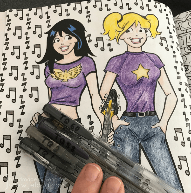
I’ll demonstrate this in my copy Archie’s Coloring Book (and there’s a video demonstration at the end of the post).
This is a great book that is jam-packed with tons of images of Archie and the gang, showcasing everyone from the core trio to side characters (Dilton, Moose, Cheryl, Sabrina, Josie and the Pussycats, Miss Grundy, Mr. Weatherbee), to the ‘Lil Archie gang. Even Jughead’s dog Hotdog appears in all his shaggy glory!
I first thought about this back in 2017 after watching one of SuperRaeDizzle’s videos on dollar store art supplies. If you don’t follow her you really should – she’s a fantastic artist who does a lot of art supply reviews and draws/paints with incredible realism. In the linked video she uses a sanding block to rough up a sheet of inexpensive Bristol board to give it a better drawing surface.
I thought it was really cool but didn’t think it applied to me – until I started wondering if the same technique would work in what I was using a lot of at the time – coloring books. In theory it seemed like it should work but with the paper so much thinner than Bristol board I didn’t know if it would work. Would it tear the paper? Would it destroy the printed outlines? Would the ink bleed?
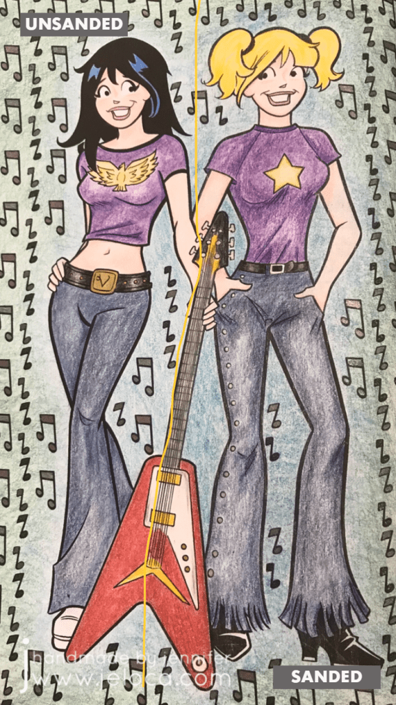
I had to try it for myself. To make the results as clear as possible I chose a page that allowed me to clearly divide the page into two halves.
I left the Veronica side of the page untouched and sandpaper I had on-hand to lightly rough up the Betty side of the page.
Here you can see the before (left) and after (right). There’s no obvious distress to the page though if you look closely at the black line of Betty’s shirt near the guitar you can see faint striae where the ink was removed.
To hold the book open while I worked I used my pants hanger hack. Still highly recommend!
I then set about coloring the page with Faber-Castell Polychromos colored pencils. I was careful to color in both girls the same way, using the same colors and applying the same amount of pressure.
Right away you can see a difference! Coloring on the Veronica side was exactly like coloring with colored pencils on computer printer paper (though I think this paper is slightly thicker). It’s super smooth and flat without any tooth or texture at all, and the colored pencil glided over the page really easily. On the Betty side I could feel the roughened-up surface of the page and it gave the colored pencil something to grab to, making coloring a very different experience.
It’s difficult to put the feeling into words but coloring the Veronica side felt like I had to concentrate more, because my natural tendency was to use more pressure to get more color payoff, whereas on the Betty side the same amount of barely-there pressure gave a richer color payoff.
Coloring on the super-smooth side made me very conscious of trying to not color too hard because it took more work to lay color down. On the flip side, coloring on the textured side of the page made color application a breeze, to the point where I had to concentrate on not applying too much and losing any highlights.
Both sides are colored the exact same way, using different colors for shading. I didn’t want to do anything too fancy because this was only a test; it was more about seeing if the sandpaper would ruin the book or any attempts to color vs me trying to get a professional-looking result.
I’d sanded the guitar evenly down the middle and thought there would be a more obvious difference between the two sides but I’d say it’s pretty subtle. Again- the sanded side has more depth and more color payoff while using the exact same pressure as the unsanded side.
I was also curious if sanding the paper would affect marker application, so decided to fill in the music notes with a mix of sparkle and metallic gel pens, in black and charcoal. I was really happy to see that there didn’t seem to be any effect on how the gel ink applied, and that both sides had the same amount of glitter and shine in the light.
Finally I wanted to see if there would be any issues coloring on larger open areas, so I picked two colors and experimented with blending them to each other. In my first layer of color (2nd image from the left) you can see that both sides are streaky but the funny thing is it’s for different reasons!
Veronica’s side is streaky because I struggle with laying down barely any color…though I probably didn’t have a proper point on my pencil, which didn’t help. Whereas Betty’s side is streaky because that’s the grain from the direction I’d sanded. You can see it better in the image below (though I sort of like the streaky look on her jeans because it makes them look more like real denim LOL)
The last test that I did was to compare the difference that burnishing would make on either side. I went over both sides of the guitar with my beloved Prismacolor Premiere colorless blender and really tried to smooth any grain down and move the color to fill any remaining white areas. I have the page open in front of me as I type this and while my fingertip can tell the difference between the two sides it is SLIGHT, and definitely not as much of a contrast as the rest of the page halves.
(And truthfully I’m not completely convinced that I’d feel a texture difference there at all if I hadn’t sanded too hard in that spot, as you can see by the diagonal lines of indentation on the lower right of the guitar)
Here’s the completed page. If I didn’t know that one side had been sanded I would think that I’d colored harder on the right side, and possibly used a different color for Betty’s jeans and background, as I do feel that there’s a visible difference in this closeup.
I don’t find the difference is as obvious in this image, though I’m not sure if it’s because the black background is causing a distraction.
After trying this once I’m a convert! I have a large collection of coloring books and I think this technique opens up a world of possibilities for getting different effects and results with colored pencils, crayons, and pastels. The opportunities expand even further if you experiment with different grits of sandpaper!
Imagine coloring a fantasy scene and sanding a grassy area with one grade of sandpaper, bricks of a castle with another, and the bark of a tree with a third… you could get a whole range of textural effects within the image all before even laying down any color!
Other notes: in the video below you’ll see a little bit of ink smearing. That was due to pressing too hard with the sandpaper, so it’s avoidable but something to watch out for. I was happy to see that there was no consequence to the back of the sanded page, nor any texture transfer on the facing page.
Here’s a graphic for those of you who like to pin my posts, and as promised above, here below is a video showing this technique in action.
This post may contain affiliate links. This means I might make a small commission on purchases made through the links, at no cost to you.
Seventeen years ago, on September 7 2004, I started this blog. Yes, this creative passion project of mine is officially old enough to be in college and donate blood. It began on Blogger in the boom of knitting/craft blogs that fed blogrolls and Yahoo swaps and RAOK groups. We’ve seen the onset of Ravelry and Worldwide Knit In Public Day, and welcomed pattern sources like Knitty, Craftsy, Twist Collective, St Denis Yarns and others before having to say goodbye to some of them.
With YouTube, Instagram and TikTok flooding the internet with video-based creative content, running a blog feels almost antiquated. I’ve been asked by friends and family why I don’t switch to another format but the truth is… I don’t want to. I love video tutorials. I follow a TON of craft-content YouTubers, and have saved a huge amount of “try one day” crafty TikToks to my favorites list too, so it’s not a critique of the other formats. They absolutely have their place, especially for some techniques or tutorials that can really only best be shown in video. That said, I still think there’s a place for blogs and photo-based project/pattern support.
My “blogaversary” this year falls on the first day of Rosh Hashana, which is the Jewish New Year. I think that makes it perfect timing for a long-overdue blog restart. (I know, I know, I’ve said this before. Shhhh!) Coincidentally I was born on was erev (eve) Rosh Hashanna (we won’t say how long ago!) so Happy birthday to the blog, happy sort of birthday to me, and happy Jewish New Year!
To celebrate 17 years in the public craft domain I’ve scoured the site, my notes, folders, and metadata and picked 17 fun, interesting or long-forgotten items from my blogging history.
1-7
Numbers 1-7 are from the archives. These are posts even I forgot about! Some are helpful tips, some are free patterns/tutorials, and all are added to the How To section above.
Even when I don’t post regularly I get a steady stream of visitors (thanks!) and I’m always curious to see what search terms bring people my way. So number 8 is my top referrer keywords from back in my Blogger days. Funny enough it’s a tie between two completely random things that have almost nothing to do with my site: “cute japanese cartoons” & “hangman”. I’m guessing the former is related to the time I knit a Japanese boy band, but the latter? NO idea.
9
Number 9 is the results of my top search terms after migrating the blog to WordPress. Unfortunately/fortunately Google has been encrypting the vast majority of search terms since 2013 so 9771 of my results are “unknown”. Of the list that remains the top three terms are: “Toothless”, “pocketbook slippers”, and “pocket book slippers”, likely linking back to these two projects (Toothless, slippers). Wanna know the lowest search result that brought someone my way? “Long hair cut feet”. I wonder how disappointed the searcher was to find my post was literally about a long hair transformation??
10
Number 10 is a really cool fact- I’ve had visitors from 170 different countries! The majority are, unsurprisingly, from Canada and the United States, but rounding out the top 20 are the UK, Australia, Germany, Brazil, the Netherlands, Mexico, France, Iceland, Spain, Italy, the Philippines, Israel, New Zealand, Poland, South Africa, Argentina, Hungary and Denmark.
11-14
Numbers 11-14 are my the top 4 posts since switching to WordPress. I had a hunch what these were because they keep Pinterest flashing up on my phone. What I didn’t expect was that the top post would outrank second place by more than double!
I’ve spent the last few months poring over my unshared projects and planning out a blog schedule for the year. For number 15 I thought it would be fun to look through my folders and see just how old my oldest unshared project truly is. There was a lot to wade through but I found it! Coming in at over a decade old a crafty hack that you’ll see on the block next year dates all the way back to February 2010!
16
Looking through all those projects was a fun trip down a creative memory lane. As number 16 here’s a little teaser of a post I can’t wait to share in full…
Any guesses?
17
And finally, for making down this far: number 17 is a picture of me at the same age as this blog.
Whether you’ve been here since day 1 or day 6204, thanks for being a part of my creative adventures. I run this blog for me, but I love sharing it with you. ♥
*All search terms and other totals above were accurate as of the date of preparing this post.