Leave a comment

Coloring with Kids: Cookie Cutter Coloring Game

If you’re home during the holidays and are looking for a kid-friendly and fun craft activity for your family, this boredom-breaker I came up with a few years ago could be just the thing. It’s quick and easy to set up and can be done with nearly any supplies you have on-hand.

What you’ll need:

  • paper
    • Any writing surface will work: computer paper, cardstock, construction paper, even the back of all that wrapping paper from holiday gifts. We used cardstock.
  • something to trace
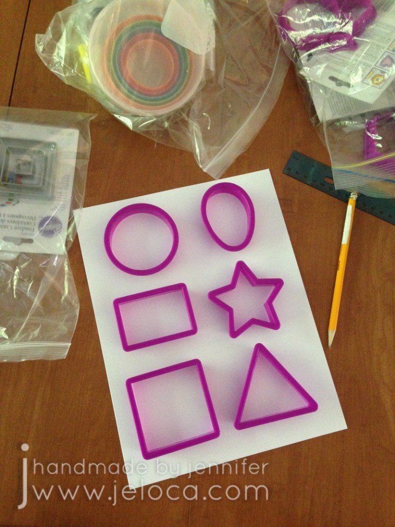
    • This is perfect for using the cookie cutters you pulled out to bake holiday cookies. Use simple shapes like we did or have fun and find unusual ones! If you don’t have cookie cutters you can get creative and trace tissue boxes, tape rolls, erasers, little toys, etc… We used the shapes from a large assorted set like this one.
  • something to trace with
    • Anything you have on hand! We used a pencil.
  • something to draw/color with
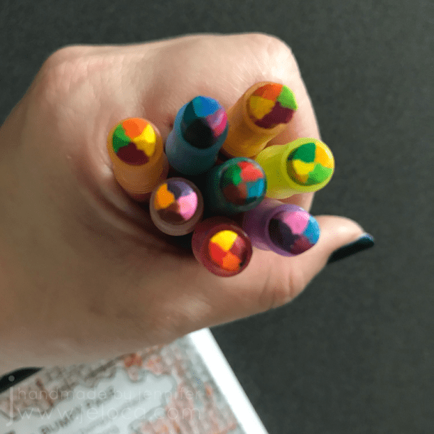
    • Once again anything you have handy will work. Crayons, markers, colored pencils…even ballpoint pens will work just fine. We used Crayola Super Tips.

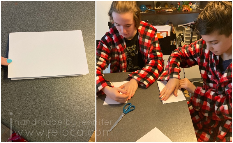
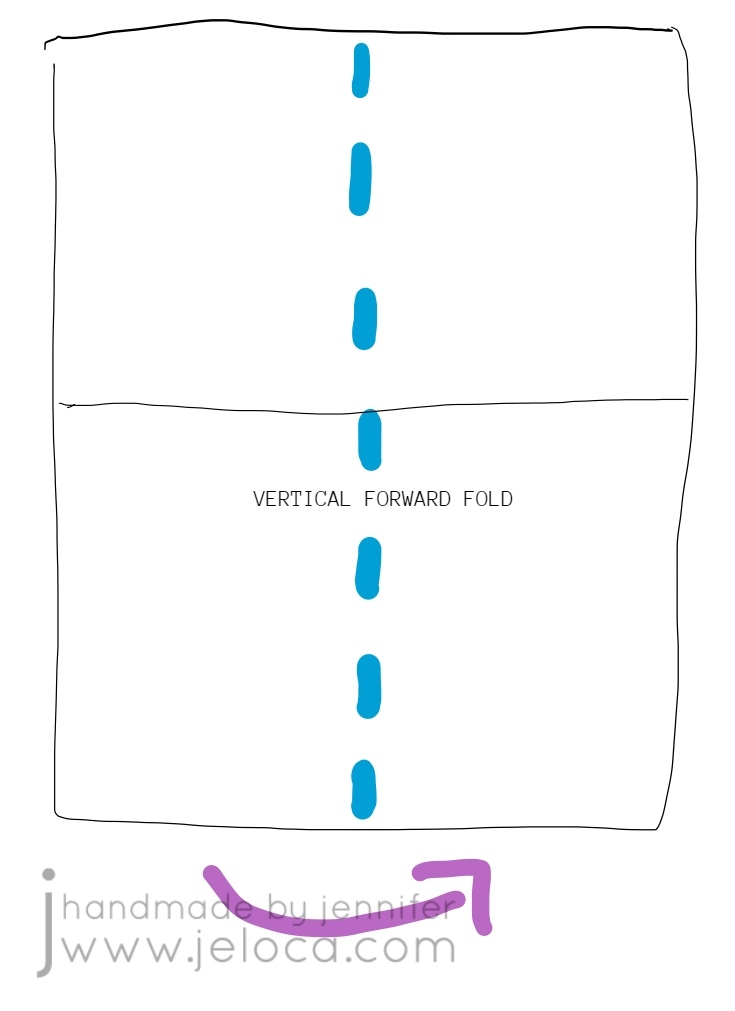
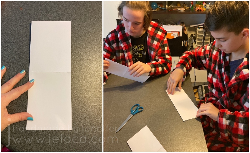
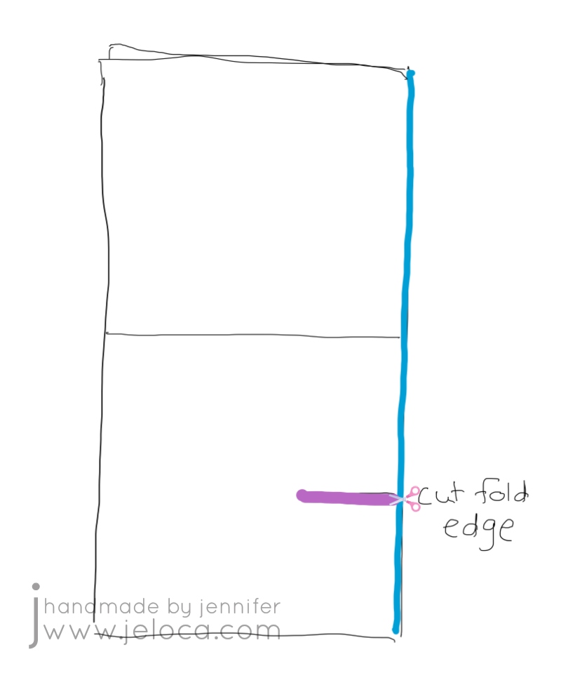
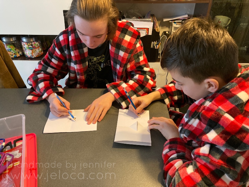
Start by assembling your materials. I used a ruler to divide our pages into even sections but that’s unnecessary.

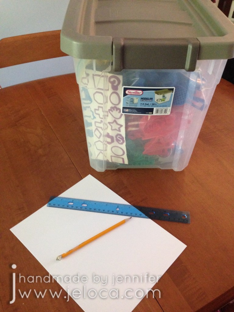
Figure out which cutters (or household objects) you want to trace and lay them out in a pleasing manner on your paper of choice.

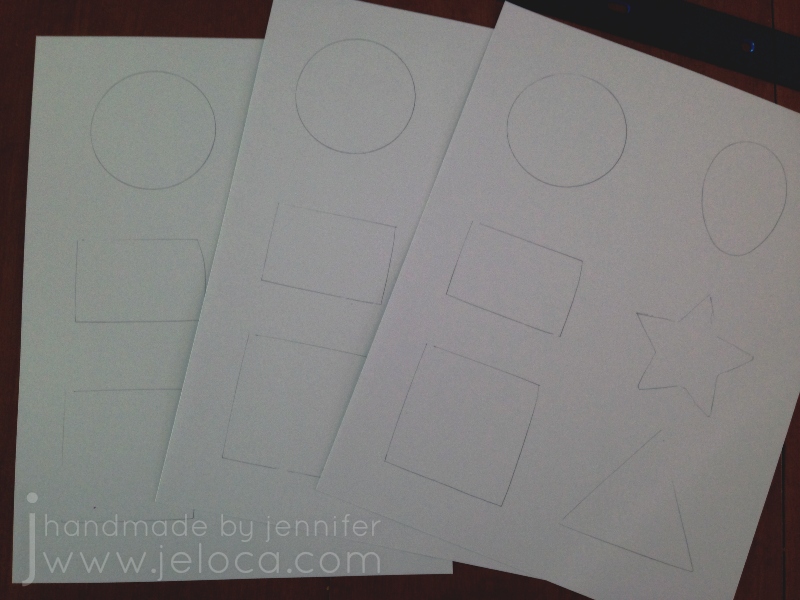
Trace the objects and repeat so you have one set of tracings for every child or adult participating.

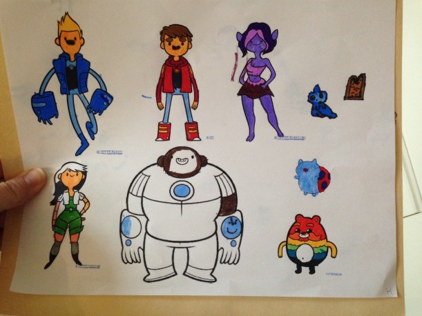
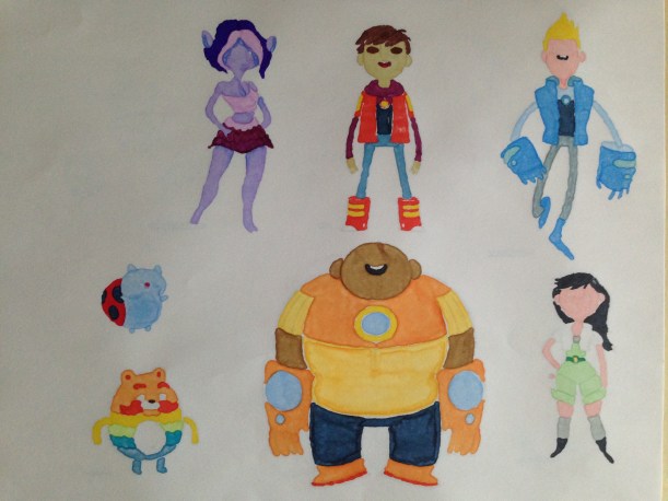
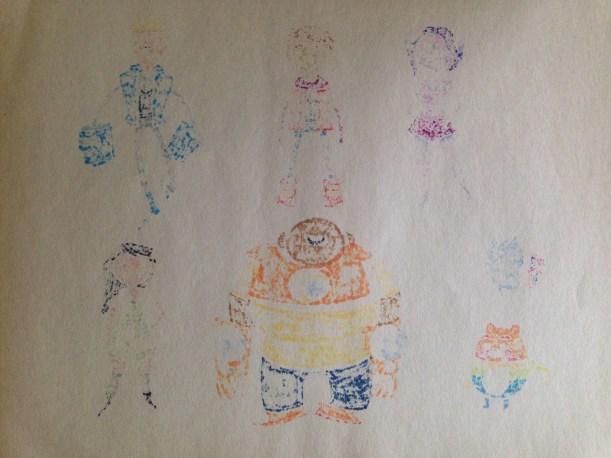
That’s it! That’s all the prep work you need! The goal of the game: be creative and turn each traces shape into something new.

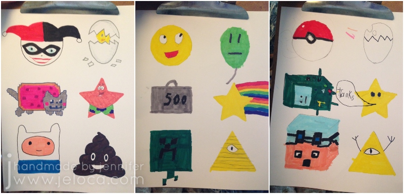
It was fun to do and kept the kids occupied for ages while they tried to “out-think” the rest of us and come up with the most unique, original ideas. (Though as you can see from our sheets they managed to think themselves right into some similar outcomes!)

There’s no desired outcome so you can have fun and see where your kids’ (and your own!) imaginations run. In our case we ended up with:

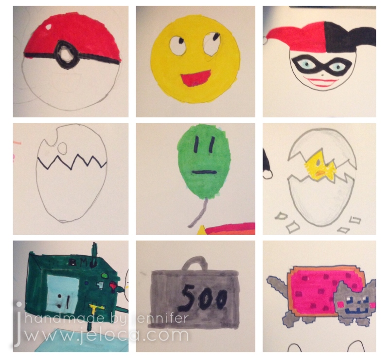
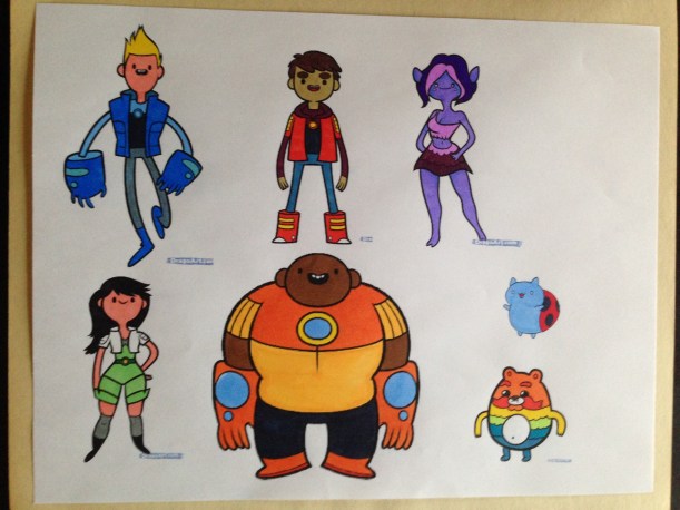
Circle – a Pokeball, an emoji, Harley Quinn
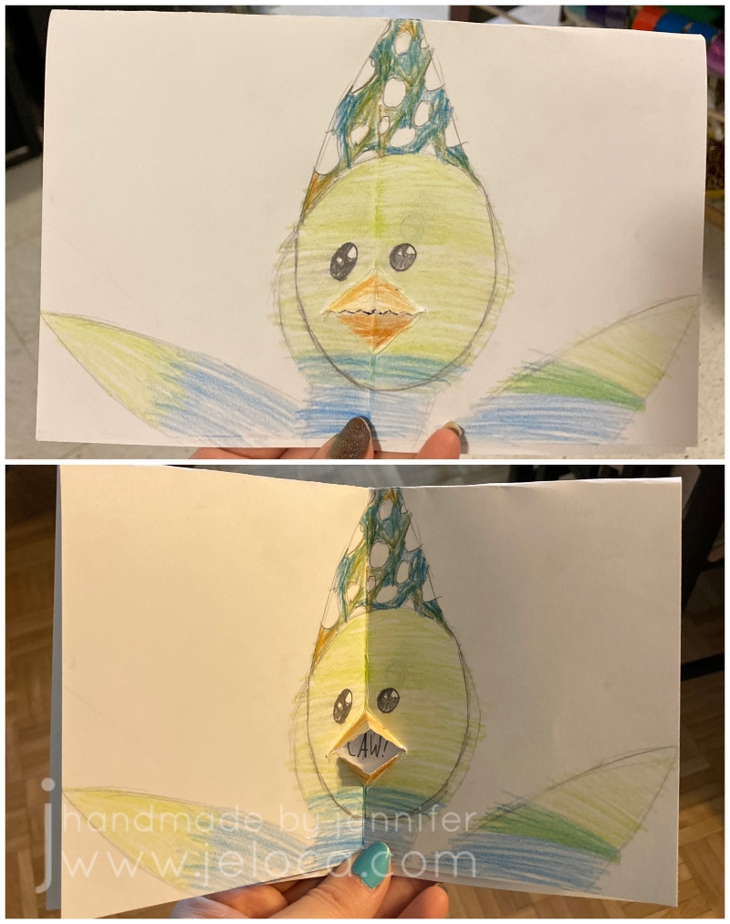
Oval – an egg, an unimpressed balloon, a chick hatching
Rectangle – Adventure Time’s B-MO, a 500lb weight, Nyan Cat

Star – a Mario Bros star, a rainbow shooting star, Spongebob Squarepants’ Patrick Star
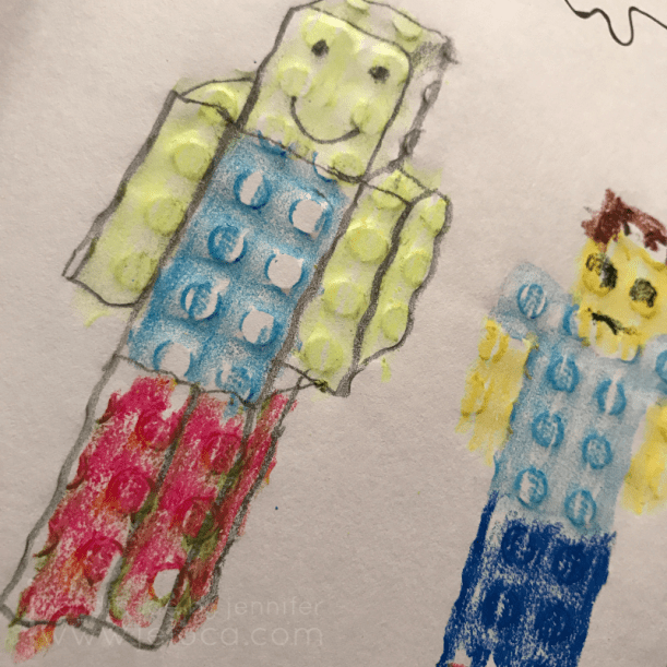
Square – DanTDM’s Minecraft avatar, a Minecraft Creeper, Adventure Time’s Finn the Human
Triangle – Gravity Falls’ Bill Cipher, another Bill Cipher (or general Illuminati reference lol), a poop emoji

Hopefully this easy coloring “game” can inspire imagination in your family like it has in ours.

Happy holidays!

This post may contain affiliate links. This means I might make a small commission on purchases made through the links, at no cost to you.


Leave a comment

Crafts with Kids: How to Make a Talking Card

Did you know that February 21st is “Card Reading Day”? According to Checkiday.com this is a day for reading and enjoying cards that you’ve received over the years, that you’ve held on to for sentimental reasons. Here’s a quick and easy card project you can make with your kids to give others something they can hold on to and re-read on future Card Reading days.

To make a talking greeting card you will need:

  • paper or cardstock
  • scissors (plain or with a creative edge)
  • bone folder (optional)
  • pencil
  • supplies of choice for decorating (markers, colored pencil, construction paper, glue, etc)

STEP 1- with your paper placed vertically in front of you (taller than wider), fold the top edge down to meet the bottom edge, then press fold flat

My kids decided to try out this project, so I talked them through it while making my sample and let them have full creative control over their own.

STEP 2- unfold your paper and this time fold it vertically, so the left edge goes behind and under the right edge.

I’d first learned this card at an art class when I was a bit younger than my boys are now, so it was cool to be teaching it to them now, and passing it on.

STEP 3- orient the card so the fold is on the right. Figure out where you want the mouth to be and make a straight cut.

Your mouth can be as high or low on the card as you would like, but remember that you will be folding the edges on the diagonal, so if you want to place it closer to the upper or lower edges, you will need to make your cut shorter. (So you don’t surpass the upper or lower edge of the inner card face – this will become clearer after the next step).

Henri and I used regular scissors for a straight cut, and Jakob chose ones with a pinking blade to get a zigzag edge to his mouth.

STEP 4- fold either side of the cut edges up, and press firmly. Repeat the same folds to the other side. If you think of the mouth as a bird’s beak, you are folding at the beak’s outer edges.

Our examples are shown with the folds at roughly 45 degrees but you can get creative with this. With a shorter cut you can fold at 45 degrees for a smaller mouth or you can fold at a narrower angle for a bigger mouth (with a small opening).

STEP 5- once you have folded the cut edges to both sides of the card, smooth them flat then fold the top half of the card down to the back.

This puts the 2 solid faces on the outside for the front and back of the card and the mouth on the inside.

STEP 6- use your fingers to tuck the mouth/beak folds outwards while keeping the card folding inwards. Then press the card flat and smooth over it a few times, to “set” that fold.

This is the mouth that will open and close as you open and close the card, making it look like your card is “talking”!

STEP 7- the final step is to use a pencil to lightly trace the inside mouth corners to mark off the boundaries of where you can put your “spoken” message.

You want to use a pencil for two reasons: 1) a pen or marker might bleed through your paper to the outside faces of the card, and 2) you can erase the border after creating your message, for a cleaner look.

From this point on you can decorate the card however you like!

We all ended up taking inspiration from the mouth looking like a beak, and created bird-themed cards.

Jakob and I went for sweet birthday messages…

…while Henri went a bit rogue!

Reinforcing how well he takes after his punny mom, Jakob made a cute BIRD-day card.

I think it’s really TWEET!

He was so proud he just had to CROW about it. (Ok I’ll stop)

I went for a similar theme with mine.

Because the inside of the card isn’t visible (except for where the message is) you can use alcohol markers or other media that might bleed through your paper. You can avoid the message area or glue in a clean bit of white paper after decorating the rest of the card, enabling you to get as creative as you’d like and not be limited to dry media.

I’m so glad I got to pass on this easy card-making method. I hope you (or your kids) make some cute, creative cards that can be someone’s sentimental memory to look at fondly in the future. ❤


8 Comments

Create This Book May Challenge

There’s been a lot going on behind the scenes, but all I have to currently show for it is this month’s Create This Book Challenge, yet again coming in just under the wire.

Every month in 2020 my 11-year-old son Henri and I will be completing a challenge from Moriah Elizabeth‘s Create This Book (vol 1). For January he choose the “create an empty setting” on page 163, for February it was the “food” page on page 208, March was the “something different” challenge on page 207, April was the “folds” page on page 23, (links to all previous posts in this series below), and for May he picked the “bumpy” page on page 47 (of which I completely forgot to take a “before” blank picture).

We both wound up completing the page with similar themes of fun and playfulness. In Henri’s case it meant mixing his two current obsessions – LEGO and Minecraft. He used a LEGO plate for the texture and then drew two LEGO minifigs, one regular and one in a Minecraft-style.

This close-up really shows the texture in the page. I thought using a LEGO plate was a great idea!

I’ve been planning a bunch of plastic canvas projects and decided to use some scrap strips as my texture base. While the page does say to “try to write or draw something” I’ve been working on detailed items lately and was really craving the opportunity to color and not really think. I decided to relax and have fun with this page and simply rub the texture of my own current obsession.

Once that idea took hold, there was no alternative but to grab some crayons and really let my inner kid come out to scribble-scrabble. I dove into the crayon bag and came out with these Crayola Fun Effects Mini Twistables – multicolor twist-up no-sharpen crayons .

This wasn’t a page that took long, nor does it look like anything special beyond a riot of irregular color… but it was FUN. For the first time in a few months I didn’t have to think about what I was doing or plan the next few steps. I just sat and scribbled and watched the bright colors mix and blend and honestly? It felt really good.

A few days later I watching one of Moriah’s current videos within which she responds to a question about saving art supplies to combat the feeling of wasting them by using them up, and was reminded of these glitter pens I own. The white one is gold glitter in a clear base by Wink of Stella, and the black one is silver glitter in a clear base by Spectrum Noir, and while I love them (and ADORE glitter) I just… never use them. I never consider a project “worthy” or “appropriate”.

So I glitter-bombed my bumpy page.

I always forget how pressure-sensitive these glitter brushes can be, so accidentally saturated that middle block with the silver. That whole square was covered with silver glitter, the one to its lower right was covered with gold, and then I randomly did a few stripes and individual squares of each color around the page.

I was trying to limit how moisture-warped the page got so rather than let it dry naturally I broke out my heat tool and quickly dried the page. (Amazon seems out of the identical model but this one looks the same and is inexpensive).

Unfortunately because this is regular paper it did stay warped even once tried, but it didn’t tear through so I’m not mad about it. (Possibly the wax from the crayons protected the paper from actually ripping, though, so be cautious using very watery media in this book.)

Here’s the final page. Nothing polished, nothing professional or fancy. I didn’t even follow the instructions.

It’s chaotic and crazy and loud and sparkly, but it makes me smile. 🙂

It’s a sparkly rainbow, how could it not? 😀

Complete list of 2020 Create This Book Challenge pages:

This post may contain affiliate links. This means I might make a small commission on purchases made through the links, at no cost to you.


8 Comments

Create This Book April Challenge

Another month, another Create This Book Challenge! All month I’ve had the time to work on it but found myself working on other projects instead, and now once again I find myself composing this post on the last day of the month. But- it’s still April, and so this is still on time!

Every month in 2020 my 11-year-old son Henri and I will be completing a challenge from Moriah Elizabeth‘s Create This Book (vol 1). For January he choose the “create an empty setting” on page 163, for February it was the “food” page on page 208, March was the “something different” challenge on page 207, (links to all previous posts in this series below), and for April he decided to pick the “folds” page on page 23.

We’d been watching art videos on Tiktok and Henri was inspired to try this one by owelboi:

What’s up TikTok? New drawing trend!

(Note: all bolded/italicized text is transcribed from the audio of the original video)

First take your paper and fold it any way you want. The crazier the folding, the better. Mine looks something like this:

Now take your pen and draw a face… or animal… or whatever you want, all over top of your folds. I’m gonna do a face.

I blocked in my face with pencil first. Wasn’t really liking the sketch but I needed features that were wide and low enough to overlap the folds as much as possible, seeing as we were limited in folding possibilities by the paper being bound in the book on one edge.

This is Henri’s version. He’d been doing the challenge from memory and didn’t remember that he had to make the folds have the inside on the outside, so that when he opened the page all the drawing was on the original page. So instead he just recreated the same image on the original page and stopped there. (So when you unfold his page 24, it’s the same full drawing on page 23).

Here’s my version. After penciling I went over the image with a Copic Multiliner and a bit of Sharpie for the inside of the mouth. I wasn’t concerned about bleed-through on the reverse of the pages as they were already a write-off because of the folding.

After you have your face drawn you’re going to do something really crazy – take your paper and unfold it like this:

It looks really weird but stick with me! This is where it gets WACKY. Connect the lines where there is space.

Before I show the grand reveal I need to show a revised folded version, because I didn’t pay close enough attention to my folds and wound up with some extra drawing showing through under the left eye. This resulted in me adding the lines under the eyes to try and camouflage… which was still messed up by the extra eyelashes. Oh well 😛

Aaaand here’s the results. I couldn’t say it any better than owelboi himself:

Then you get some wacky, crazy drawing you can have nightmares of for years to come!

#Truth

Complete list of 2020 Create This Book Challenge pages:

This post may contain affiliate links. This means I might make a small commission on purchases made through the links, at no cost to you.


8 Comments

Create This Book March Challenge

I haven’t posted since my February Create This Book Challenge post, and I spent a lot of time in the last few weeks debating posting this, or other planned projects. With so much going on in the world, it hardly seems important to share silly doodles.

Or so I thought, until I watched my kids spend an entire afternoon at the table, elbows-deep in my art supplies. Creating is important. It feels good. It can bring peace and calm amid chaos, and it gives a sense of accomplishment that can be difficult to find when schedules and routine are in upheaval.

So I asked Henri to pick the page for this month, and we both set to work.

For those who haven’t been following along, every month in 2020 my 11-year-old son Henri and I will be completing a challenge from Moriah Elizabeth‘s Create This Book (vol 1). For January we choose the “create an empty setting” on page 163, for February it was the “food” page on page 208, and for March he decided to go with the “something different” challenge on page 207.

Henri has 2 current obsessions – LEGO and The Legend of Zelda – and since he draws/makes/sculpts Link and the Master Sword incessantly, he decided to draw a LEGO minifig on his page, as he’d never drawn one before.

I love how the minifig looks resolute. Like “meh”. LOL

It took me a little while to come up with an idea for my page. I’ve been drawing/etc since I was very young, so it’s hard to come up with an idea that was truly new and not break the spirit of the challenge. In the end I decided to follow a YouTube drawing tutorial. I’ve watched many craft tutorials on everything from bookbinding to watercolors, but I’ve never actually followed a drawing/sketching one.

A quick search brought me to Shayda Campbell’s “Twelve Easy Flower Doodles You Need To Know” video. Shayda has a TON of help for new artists and tips and tricks on her channel, which I highly recommend. I almost never draw flowers so this seemed like a great fit. (At least until I was finished and turned to see if my ink had bled and saw the page on the back is “draw a nature scene”… oops!).

I settled down with a mechanical pencil from the dollar store, an 05 Micron fineliner, and an eraser pencil from Faber-Castell (the Perfection 7056).

I followed along with the steps in the video while listening to Jonathan Kellerman’s The Museum of Desire (an Alex Delaware novel) on loan from my local library. I admit I really wasn’t feeling my sketches until I was dne and looked at the page as a whole. Seeing them all together makes me happy, they look better than I’d thought! While nose deep in the book they really didn’t look as good 😛

This morning I realized it was the last day of the month, thus my last day to post this on time. I’d planned to merely take pics in sunlight and post them, but last-minute I decided to add a bit of color to the pages, so I pulled out my Polychromos and quickly finished off each flower.

Here’s the final results! I don’t think I’ll remember how to draw any of these by heart, but I’m really happy with how they turned out.

In particular I’m fond of the lilac…

…the hibiscus and the rosehips.

You can see some shadowing on page 207… that’s the fineliner doodles of “food” that I did for Februrary’s page. I was pretty confident that it wouldn’t interfere with completing this page, and I’m glad to see that it didn’t get in the way at all. It’s more apparent in the pictures than it is in real life – I didn’t even notice it while sketching.

Keep creating, stay indoors, stay healthy, and stay safe. ❤

Complete list of 2020 Create This Book Challenge pages:

This post may contain affiliate links. This means I might make a small commission on purchases made through the links, at no cost to you.


8 Comments

Create This Book February Challenge

Good thing it’s a leap year, because that means I can get mine and Henri’s February Create This Book pages posted on time!

As I mentioned in my intro post, every month in 2020 my 11-year-old son Henri and I will be completing a challenge from Moriah Elizabeth‘s Create This Book (vol 1). For January we choose the “create an empty setting” on page 163, and for February Henri decided he wanted to do the “food” page seen here on page 208:

This is no surprise to anyone who knows Henri. It’s a running joke that my almost-13-year-old son Jakob’s favorite food is “bananas”, while Henri’s favorite food is “food”.*

Henri completed his page first, working on it over a few evenings while watching The Masked Singer.

He started with the little taco near the top and worked his way down the page, but I’m showing his close-ups in reverse order. For reasons.

Even though he’s just turned 11 Henri has been drawing for years, and I’m always impressed with the thought he puts into his art. The cheese, popsicle and donut are clearly meant to look 3D, and he even drew the complete bite with teeth marks in the popsicle instead of merely a chunk missing. The donut is especially well done, where he didn’t capture merely the glaze dripping down the top, but his rounded bite went through the donut to expose the hole in the middle- something I probably wouldn’t have thought of, tbh.

The top of the page is where he really went wild with the imagination. As I’d mentioned, he’d started with the taco, and before it got page-smudged it was really, really well done. Next came the hamburger, then the pineapple got a few minutes of detail work. Then- the apple. Oh boy that apple LOL

I’m not putting a more detailed close up because I’m already smh’ing that I’ve included it twice in this post…but what happened is this: Henri drew the apple. Then he decided that the bottom of the apple looked like a butt. So he made it pooping. Then, for dramatic effect, he added a pair of undies to the apple, with a torn flap of fabric hanging off the back because the apple’s poop was so explosive that it ripped right through the undies. His words. (Which is good, because I have none.)

When it came time for my own run at the page, I was stumped. I wasn’t in the mood to attempt something photo-realistic but nothing cutesy or cartoon-y was coming to mind. And then I looked at Henri’s page again and noticed his cheeky “FOOD” lettering at the bottom. He’d pointed that out to me joking “it says decorate with ‘food’, so I did!”. And so did I.

While Henri had used a regular pencil for his art, I switched over to Micron fineliners for mine. I swatched both a 01 and 05 tip on a blank page at the back of the book and while they both worked well on the paper, I think if I’d tried to color in any areas the 05 would have bled through to the page on the other side. So I stuck with the 01 and doodled my way randomly around the page, filling it in with the word “food” over and over.

It was really relaxing to tackle the page with no ideas in mind and allow myself to doodle the word however I wanted.

I listened to an audiobook (The Never Game by Jeffrey Deaver **) and kept a sheet of cardstock under the page while I worked. As previously mentioned, I do this not only to prevent ink bleed-through but also to keep the pages beneath from getting pressure impressions.

I usually didn’t have any idea what I wanted to do until I started drawing the letter “f”, though every now and then I’d turn the page a different way and try to remember to keep some areas light for some white contrast.

The only exception to this was the empty FOOD at the top of the page, in the dotted area. I had to consciously work the dots around the letters without an outline (I didn’t use pencil at all) and then fill in enough background dots to keep the word legible.

It was fun filling the page with swirls and loops and lines!

Periodically I checked the back of the page for bleed-through and was happy there was none. There was clearly shading of the dark areas to the back side, but I don’t believe this will interfere with future coloring of that page, especially if I work that one in color.

And that’s February done! On to March!

Complete list of 2020 Create This Book Challenge pages:

*Jakob is almost 13. He’s in high school. This… does not compute.

**I’m a big Jeffrey Deaver fan, and have been watching the new show Lincoln Rhyme: The Search for the Bone Collector. Fun show, but I can’t believe I’m about 6 episodes in to a LINCOLN RHYME project and haven’t heard the words “walk the grid” A SINGLE TIME.

This post may contain affiliate links. This means I might make a small commission on purchases made through the links, at no cost to you.


7 Comments

Create This Book January Challenge

We did it! Coming in just under the wire, here are mine and Henri’s completed Create This Book pages for January.

As I mentioned in my intro post, every month in 2020 my 11-year-old son Henri and I will be completing a challenge from Moriah Elizabeth‘s Create This Book (vol 1). For January we choose the “create an empty setting” page seen here:

Henri used colored pencils for his page, creating a beach scene. He made it a double-page spread, with a multi-colored sunset over the water.

I love the little details I can pick up of how he went about planning his page, like how he clearly sketched out his ideas in pencil before outlining in fineliner…

…or how he blended the sun’s reflection into the water.

For my page, I went with a bit of a more literally definition of a setting – an actual stage set LOL.

First I sketched it out in pencil. Whenever I’m working in a coloring book with regular paper I always use a sheet of cardstock underneath the page. This prevents any impressions from affecting the following pages and ghosting through when I try to color them. This time I used a remnant of bristol board that has seen many, many coloring pages… though most obviously the one where I colored an entire background with black Sharpie.

After that I put on a podcast (HDTGM FTW), pulled out my Polychromos and colored until I was happy(ish) with the image. I did a few base layers of brown and green into the black back wall to prep before going over it with a black pencil, and roughed in the colors for the wooden stage, then later did the same for the red curtains and seats.

I say “happy-ish” because I’m not 100% thrilled with how the lights came out. I’d planned to color the background solid black and then erase the light paths but when I tried it looked just… I don’t know. Meh. I wound up coloring over most of it and leaving only the spotlight on the stage floor.

And there’s my final image. I decided against making it a two-page spread like Henri because I didn’t feel like coloring nearly two solid pages of red. In the end I’m mostly happy with it, though I see a lot of flaws that make me cringe. That said- my goal with this monthly challenge was NOT to create perfect, ideal art. It was simply to CREATE.

Complete list of 2020 Create This Book Challenge pages:

This post may contain affiliate links. This means I might make a small commission on purchases made through the links, at no cost to you.


2 Comments

A New Year = A New Challenge!

Last January I set up a challenge on this blog- to celebrate 2019 I would convert 19 long-languishing WIPs (works in progress) into FOs (finished objects).

This year I’ve set a new challenge for myself, one with a bit of a lighter workload since I’ve got so many other things on my plate.

We’re big Moriah Elizabeth fans in this house (the sprinkle song is our jam!) and while I’ve managed to distract Henri from wanting his very own Pickle plushie, I did cave and buy him Create This Book for Hanukkah.  

I ordered volume 1, and when it arrived I realized I’d accidentally put 2 copies in my cart.  We took a quick household vote and instead of returning it, we decided to keep the second copy for me and Jakob to use.  Thus starts the first monthly segment of our Create This Book v1 adventures.

It’s the 2020 Create This Book Monthly Page Create-a-long!

There’s also a volume 2 but we’ll be starting with the first book and working our way forwards.

Henri picked this page to start with in his book, so to catch up I’ll be making that my January page as well. My goal is to do (at least) one page each month. 12 pages doesn’t seem like a lot, but I’ve got a TON of stuff going on this year and don’t want to over-commit.

I have six days to come up with an idea, draw/color the page and then post it to the blog. The idea hasn’t come yet but the supplies have been decided- I’ll be coloring the page with my adored Faber-Castel Polychromos. I can’t help but hear Mike Myers in my head when I use them because they color so smoothly that it’s just like butter.

By the way – if you’re always in search of new, better pencil/pen cases like me, I can happily recommend the Thornton case pictured above. I own a lot of colored pencil sets with 100+ colors and quickly outgrew the 32, 48, 56 and 72-pc sets I’d invested in years ago. Last winter I did my research and bought a few larger cases in different styles then spent a cozy snowed-in winter weekend reorganizing all my pencils. (Yes, it’s the little things that make me happy LOL). Now I have enough room to store the full 120pc pencil set plus additional tools like a fineliner, stick eraser, my favorite blender pencil, and a white marker*.

Note- in Canada at least, the listing for the empty case itself seems to be sold out. The exact case full of 150 of their own-branded colored pencils, however, is available here.

*Money-saving tip: There are a LOT of white markers out there for adding highlights to your drawings and coloring. Sakura Gelly roll white pens are great, Sharpie paint markers can be fantastic, and many other brands have good ones too. But my favorite white “pen” is 100% the Liquid Paper or Wite-Out corrector pens. They give the most opaque, solid coverage because that’s literally what they’re designed for, and can very often be found in the stationary aisle of your local dollar store. (I get mine at Dollarama).

This post may contain affiliate links. This means I might make a small commission on purchases made through the links, at no cost to you.


Leave a comment

Coloring with BIC Mark-It Markers

The more coloring I did, the more I wanted to do.  I began looking for better supplies and looking up better techniques.  It is impossible to be interested in ‘coloring’ and not somehow, somewhere come across Copic markers.  For the uninitiated, Copics are alcohol markers, one of, if not THE premium brand, and are vastly loved by artists everywhere.

They’re also expensive as hell.

When I’d first heard of them, a few years ago, I immediately discounted them.  I had no use for new art supplies that weren’t integral to my passions at the time, and that kind of investment just didn’t seem worth it.  Lately, though… something was drawing me to them.  Maybe I’d outgrown Crayolas, finally, or maybe it was the appeal of being able to blend and achieve digital-art-style results with something I could control by hand.  I started finding reasons to justify them- I’d do more drawing, and finally open an Etsy shop… and they’re refillable, so over time the cost works itself out… and I’m an adult, and could treat myself to professional, adult supplies…

I was in.  Hanukkah was coming up and the ONLY thing I put on my wish list was a gift certificate to Curry’s Art in Ontario, the place I’d found with the best prices for Canadians.  The markers I wanted, Copic Sketch markers, are available locally at $8 CAD each.  The cheapest US price I could find online is $5.35 but any free shipping deals were US only, and there would still be a cost conversion, and the exchange rate these days is insane, so I ruled that out.  Curry’s has them for $6.50 each, and free shipping within Canada if you spend $75.  Perfect!  (Note: I found out about Curry’s by watching Baylee Jae’s videos on YouTube, thanks Baylee!)

Knowing I had some time to wait until we had our family gift exchange and I (hopefully) got what I’d asked for, I looked further, exploring more tips and techniques.  Along the way I found a number of videos and blog posts mentioning BIC Mark-Its as inexpensive alcohol marker alternatives, stating they could also be blended, had better colors than Sharpies, and worked with Copic or other brands’ blending markers.

All my Sharpies were old and dried anyways, so I ordered myself 2 sets of BICs, the 36-pack fine and the 36-pack of ultra fine.

When they arrived I sat down with the boys one Saturday morning and we did some coloring together.  They’d been watching me color lately and a few times I’d given them a ‘treat’ and let them use ‘Mommy’s good markers’.  They love my colored fineliners and both were in awe of the stained glass coloring pages, so I let them pick their favorite pages to color for themselves.  When I was ready to test the BICs I printed off some characters from one of our new favorite shows, Bravest Warriors, and we all colored together, with me allowing the kids to use the BICs as long as they were responsible with them.

Photo 2015-12-19, 12 28 08 PM

Jakob went for speed, coloring the characters carefully, but quickly, and getting distracted here and there by the tv that was on in the background.

Photo 2015-12-19, 12 51 40 PM

Henri did the opposite.  He took his time, trying to color-match as carefully as he could to the original characters.  He was SO thorough, in fact, that he drew in his favorite missing character – JellyKid (complete with toast!) and even added Pixel to Wallow’s glove!
Photo 2015-12-19, 12 29 33 PM

I didn’t have anything in mind when I colored mine except to enjoy the markers, the lovely colors, and the flow of the ink.  I didn’t attempt any blending or ‘Copic-like’ techniques, just colored and chatted with my boys.

Okay well maybe I did a teensy bit of shading… if you look carefully at Plum there’s some blue shading under her hairline and skirt.  But that’s it.

I loved the BICs and I am thrilled that they’re part of my stash- uh I mean my perfectly adult and mature collection of art supplies.  But my FAVORITE part of coloring with them was discovered after I was done.

The BICs, just like Copics and other alcohol markers, bleed through most papers.  Alcohol markers are designed to saturate the paper to get even blending and streak-less coloring.  With water-based markers like Crayolas, coloring hard over one section will leave blotchy, uneven patches of bled color.  With these, however…
Photo 2015-12-19, 12 29 47 PM

The bleed-through is so lovely!  It looks like a watercolor illustration!  I’m fascinated by how pretty the backside of this coloring looks and can think of so many ideas for deliberate reverse drawings, coloring one side while intending the back to be the later ‘front’.Photo 2015-12-19, 12 29 58 PM

Not that, but I was completely charmed by my discovery on the paper I was using to absorb the bleed-through.  It looks like pointilism!  Probably not really good for anything, technique-wise, but I like how it looks regardless.  🙂

This post may contain affiliate links. This means I might make a small commission on purchases made through the links, at no cost to you.