The last day of February is International Repetitive Strain Injury Awareness Day. Whether you knit, crochet, color, sew, cross stitch, embroider, or enjoy other crafty pastimes like diamond painting or LEGO building, you’ve likely done repetitive motions while in pursuit of your hobbies. I reached out to Alyssa Cape from Alyssa Massage for tips, tricks and helpful hints on ways to keep our mobility and flexibility healthy so we can continue to craft for many years to come.
Me: Hi Alyssa! Crafters (like myself) have a tendency to sit for long periods of time. We can be hunched over our desks during activities like coloring, sewing or diamond painting, or spend many hours cross-legged on the couch while knitting, crocheting or doing embroidery. Do you have any posture tips for long crafting sessions?
Alyssa: I’d put a small step stool or shoe box under the feet so the knees are slightly higher than the hips. This helps the small curve in your back from pinching and then your neck automatically goes forward. This way when your feet are slightly elevated, the pelvis is tilted back a bit so you can rest your back on lumbar support or pillow and your muscles relax.
I wouldn’t suggest sitting cross legged, however if you do, switch positions often. Get up to drink some water and to walk around to give your body a break.
There are multiple videos showing how to be comfortable while doing crafts like knitting or crocheting, like this one:
Me: Crafters can be prone to sore wrists, hands and fingers. Sometimes this pain can shoot up into the arm. Should we be doing exercises to keep our hands, wrists or arms in shape?
Alyssa: Here are 2 links, one shows 3 stretches for carpal tunnel and the other is self hand massaging. I do these myself as well! They can also be used for computer/ desk work.
I would recommend not to over-stretch as you can pull on the nerves. Nerves are like dental floss, they pass through the joints. They don’t stretch like muscle, tendons and ligaments. So if you feel tingling or burning in your fingers, stop!
Me: How hard should we be stretching? How often should we do them?
Alyssa: Do the stretches gently so you feel a slight stretch/ resistance and then stop. You’ll see mobility, flexibility and strength will come! Seeing a physiotherapist is also a good idea as they can provide you with multiple exercises and stretches and suggest the frequency of both as it’s different for each person.
Me: What should we do when in pain? Is that the time to stretch?
Alyssa: I don’t recommend when in pain to stretch and self massage. Rest hands as much as possible. There are thumb/ wrist/ arm braces that can be worn while crafting and at night as well to help stabilize the wrist during sleep.
Me: Do you recommend ice or heat?
Alyssa: You can alternate heat and cold compresses 15 minutes each. Heat allows for more blood flow which speeds up healing and cold reduces blood flow for swelling and inflammation.
Me: Any other tips?
Alyssa: A warm bath with 2 cups of Epsom salts really helps de-stress the muscles and then you can apply cold on the specific location. Drinking lots of water also helps with muscle soreness and tension!
That said- always consult with your doctor before doing any stretches or exercises to make sure there isn’t an underlying issue!!
About Alyssa:
Alyssa has been a registered & certified Massotherapist for over 12 years. She is professional, dynamic and intuitive in her practices and completely dedicated to your overall wellness. You can enjoy the benefits of preventative and ongoing massage therapy for your health and well-being by visiting her here.
Disclaimer: I reached out to Alyssa on my own and asked for her professional advice to share here today. There was no compensation given on either part in exchange.
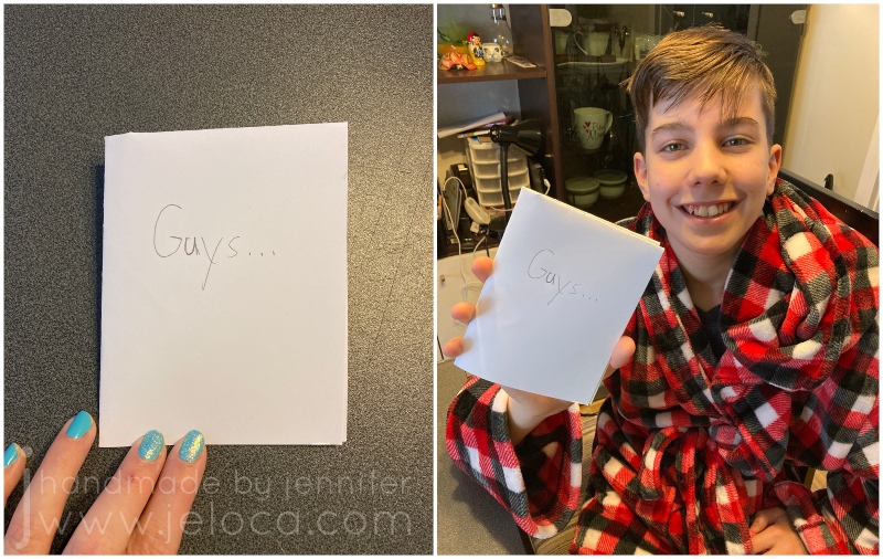
Did you know that February 21st is “Card Reading Day”? According to Checkiday.com this is a day for reading and enjoying cards that you’ve received over the years, that you’ve held on to for sentimental reasons. Here’s a quick and easy card project you can make with your kids to give others something they can hold on to and re-read on future Card Reading days.
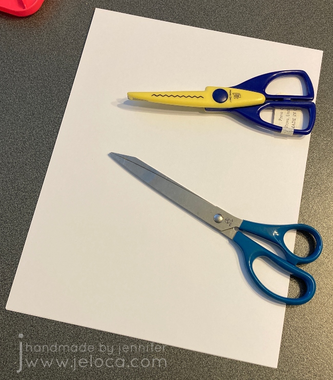
To make a talking greeting card you will need:
paper or cardstock
scissors (plain or with a creative edge)
bone folder (optional)
pencil
supplies of choice for decorating (markers, colored pencil, construction paper, glue, etc)
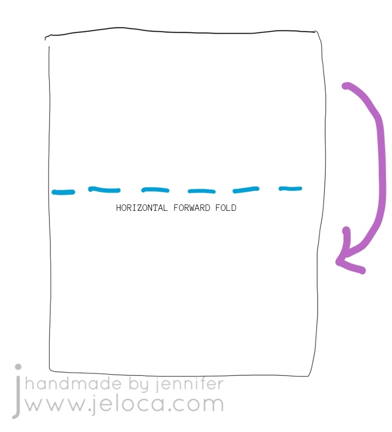
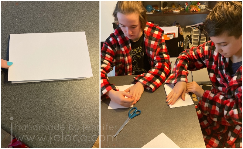
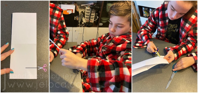
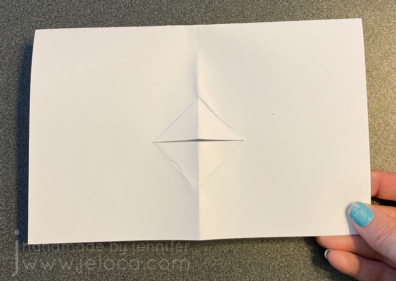
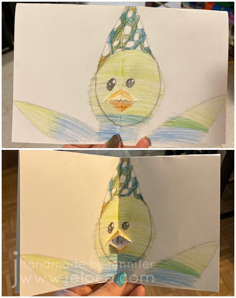
STEP 1- with your paper placed vertically in front of you (taller than wider), fold the top edge down to meet the bottom edge, then press fold flat
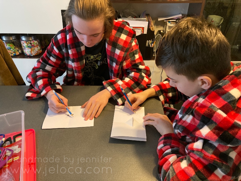
My kids decided to try out this project, so I talked them through it while making my sample and let them have full creative control over their own.
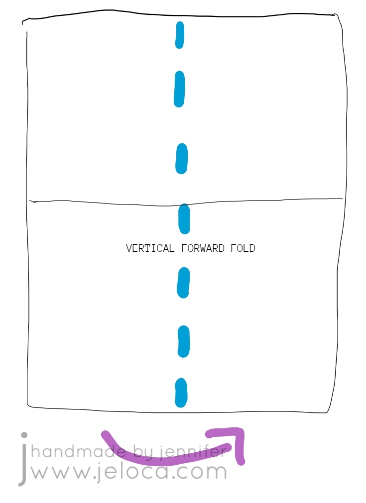
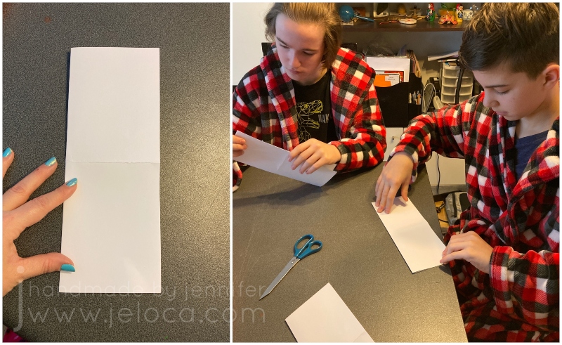
STEP 2- unfold your paper and this time fold it vertically, so the left edge goes behind and under the right edge.
I’d first learned this card at an art class when I was a bit younger than my boys are now, so it was cool to be teaching it to them now, and passing it on.
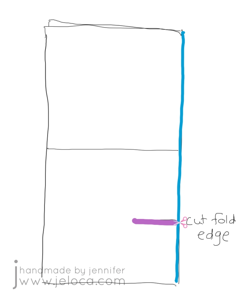
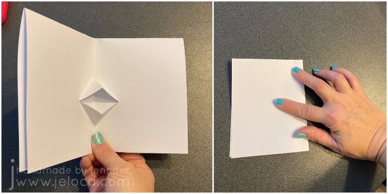
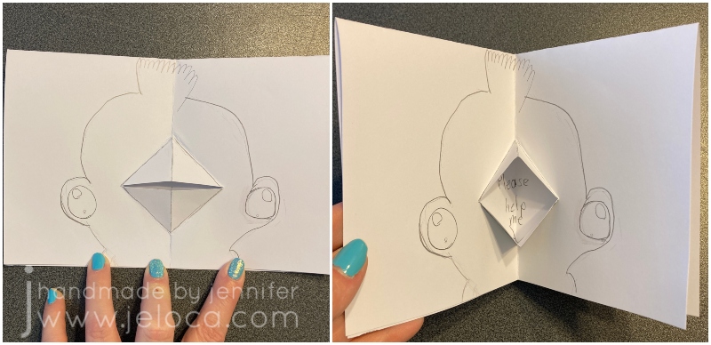
STEP 3- orient the card so the fold is on the right. Figure out where you want the mouth to be and make a straight cut.
Your mouth can be as high or low on the card as you would like, but remember that you will be folding the edges on the diagonal, so if you want to place it closer to the upper or lower edges, you will need to make your cut shorter. (So you don’t surpass the upper or lower edge of the inner card face – this will become clearer after the next step).
Henri and I used regular scissors for a straight cut, and Jakob chose ones with a pinking blade to get a zigzag edge to his mouth.
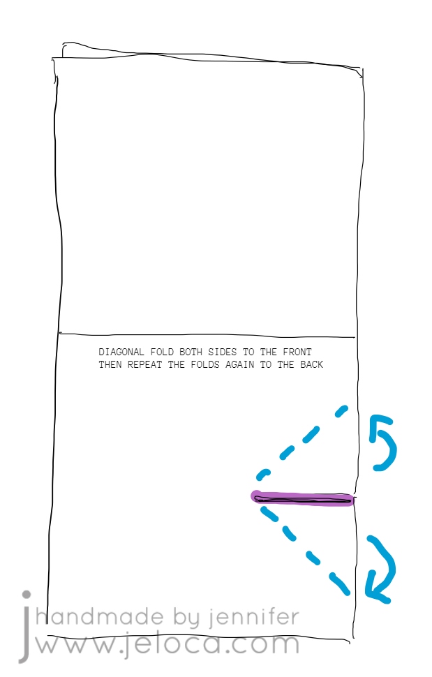
STEP 4- fold either side of the cut edges up, and press firmly. Repeat the same folds to the other side. If you think of the mouth as a bird’s beak, you are folding at the beak’s outer edges.
Our examples are shown with the folds at roughly 45 degrees but you can get creative with this. With a shorter cut you can fold at 45 degrees for a smaller mouth or you can fold at a narrower angle for a bigger mouth (with a small opening).
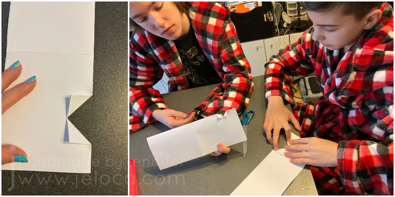
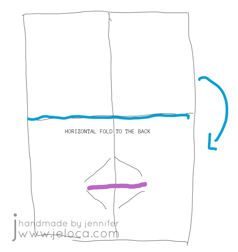
STEP 5- once you have folded the cut edges to both sides of the card, smooth them flat then fold the top half of the card down to the back.
This puts the 2 solid faces on the outside for the front and back of the card and the mouth on the inside.
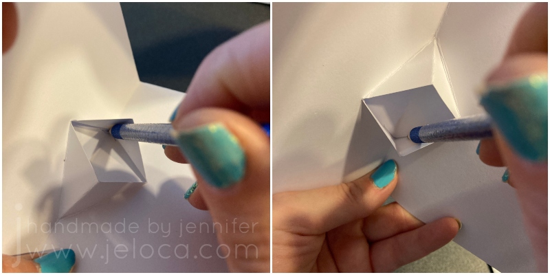
STEP 6- use your fingers to tuck the mouth/beak folds outwards while keeping the card folding inwards. Then press the card flat and smooth over it a few times, to “set” that fold.
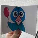
This is the mouth that will open and close as you open and close the card, making it look like your card is “talking”!
STEP 7- the final step is to use a pencil to lightly trace the inside mouth corners to mark off the boundaries of where you can put your “spoken” message.
You want to use a pencil for two reasons: 1) a pen or marker might bleed through your paper to the outside faces of the card, and 2) you can erase the border after creating your message, for a cleaner look.
From this point on you can decorate the card however you like!
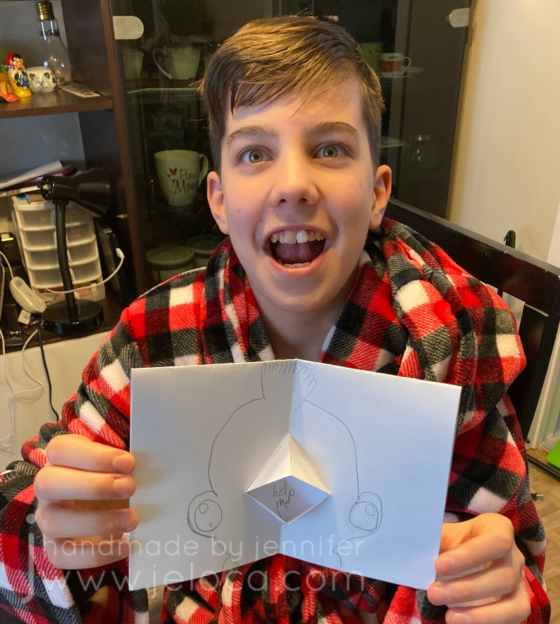
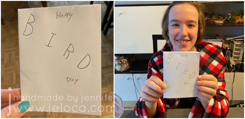
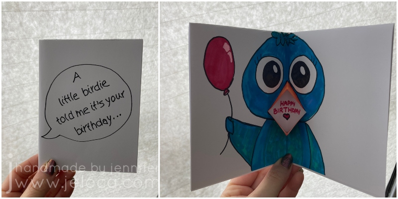
We all ended up taking inspiration from the mouth looking like a beak, and created bird-themed cards.
Jakob and I went for sweet birthday messages…
…while Henri went a bit rogue!
Reinforcing how well he takes after his punny mom, Jakob made a cute BIRD-day card.
I think it’s really TWEET!
He was so proud he just had to CROW about it. (Ok I’ll stop)
I went for a similar theme with mine.
Because the inside of the card isn’t visible (except for where the message is) you can use alcohol markers or other media that might bleed through your paper. You can avoid the message area or glue in a clean bit of white paper after decorating the rest of the card, enabling you to get as creative as you’d like and not be limited to dry media.
I’m so glad I got to pass on this easy card-making method. I hope you (or your kids) make some cute, creative cards that can be someone’s sentimental memory to look at fondly in the future. ❤
A few weeks ago I shared some very old attempts of trying background washes in adult coloring books. Since that point I’ve been watching more Dede videos and reevaluating my supplies and my goals with these coloring pages. To that end, I went through some of my coloring books and chose new pages to try, this time with deliberate intent. Instead of using the washes to help me muster the urge to work on a particular page, now I was choosing pages I wanted to work on, and colors that would help me be happier with the eventual results.
Oh – and I learned from my mistakes – I was for sure going to be using acrylic paint this time.
The best paint to use for this is cheap acrylic paint. It’s matte, opaque but also thins well.
Acrylic paint is a plastic, which means it dries solid and won’t re-wet. This means you can use the same palette over and over, by either pulling off the dried paint or simply working right on top of your (thoroughly) dried paint.
I’ve been using old yogurt and margarine lids but recently started keeping takeout lids for the same purpose. If you have a paint caddy like mine, you can also use the lid as a palette.
I started with my Colours of Comfort coloring book, from my local Dollarama. My kids bought it for me as my Christmas present/stocking stuffer by sneaking it into my cart then making me turn around so they could hand it to the cashier. They then held the bag in the car and carried it into the house so they could get it into my stocking without seeing what they’d picked. (They paid me back later lol)
First up was this mandala-esque page. I picture it completed with golds and jewel tones, so gave the whole page a deep yellow wash.
Next I chose this tea party scene. I was taken with the idea of trying to make the cups look like porcelain, and gave the cups a gray wash so I could layer white pencil on top.
I forgot to take a before pic of this next one. I’m not usually one for landscape drawings, but this one caught my eye.
I like the idea of using my textures tutorial book and practicing some natural textures like the stones.
I’ve had this next coloring book for years, and barely touched it. The Mason-Dixon Knitting’s A Coloring Book for Knitters came out back in 2016 and is filled with fun, crafty images to color. While it’s a cute idea, it suffers from the same paper quality issue as most novelty coloring books, so as my media of preference changed, it limited what I was able to use.
It’s not bad…but it’s not strong enough for alcohol markers and not enough tooth for a good job with colored pencils.
I was really drawn to this winder & swift page. I painted the background with silver paint, hoping to get a vintage “mirrored” wallpaper look in the end, and plan to copy my own swift and winder’s color schemes.
From there I grabbed two of my favorite books to flip through.
Just like landscapes, flowers and plants are not usually my go-to either. Using paint makes me eager to work on these images now, though, and I chose the letters that represent the children in our family.
J and H are for my boys, and L, J and C are for my siblings’ children. Inspired by them all I chose colors that represent the respective children’s hair colors. C has dirty blonde hair and loves blue, so I added the sky (which I later regretted, and did not add in any of the others).
I couldn’t NOT go for a Link-looking character for Henri’s H, since my son is obsessed with The Legend of Zelda.
Jakob’s Jonquil Fairy will be blond just like him…
…and just like my niece L’s blonde curls.
None of these are complete, and none have yet gone past the painting stage, but even at this point I’m so much happier with them than I was with the last batch.
This post may contain affiliate links. This means I might make a small commission on purchases made through the links, at no cost to you.
It’s Super Bowl Sunday, and everyone knows the best parts of any Super Bowl are the snacks and the commercials, right? (No? Just me?)
It’s been 24 years (!!!) since Ali Landry famously tossed 3D Doritos into a laundromat dryer in an ad during Super Bowl XXXII, and 1 year since she showed she’s still got the same moves for snacking. I had to recreate this vintage snack a few years ago as a prop for a skit that took place in the 90s, and today I’m going to show you how you can make your own. Whether it’s for a play, a costume accessory, or simply nostalgic feels, it’s a quick and easy DIY that doesn’t require many supplies to make.
Note: 3D Doritos were relaunched in 2021 and got Matthew McConaughey’s “FlatMatthew” ad during Super Bowl LV, but they redesigned the bag so we’re going to focus on the original.
Besides access to a printer, you’ll need a few other supplies:
paper
I used full-page sticker paper, but you can use regular printer paper as well. If using sticker paper make sure it’s white and matte.
Start with your bag of Doritos. Empty the bag (into a bowl… or your mouth… no judgements here) and then carefully wash the inside and outside with soapy water. You want to make sure there is no food left inside that could mold over time, as well as remove any greasy or oily fingerprints from the outside that could interfere with your glue/tape.
3D Doritos have a red background so I used a bag of regular nacho flavor Doritos as my base so the back of the bag would match the altered front. Allow your bag to dry thoroughly before attaching your image.
Find a source image online and print it to scale with your bag. There are a number of great image resources out there, so you can use your favorite. Just be sure to choose a the highest image quality you can find, for the best results when printing.
If your printer quality is lackluster, like mine, you can retouch your printout with markers or colored pencils. I needed my prop to be highly visible from stage to an audience of 200-300 people, so I chose to deepen some of the sections for higher contrast.
In the image on the left, you can see the difference in the retouched red (to the left of my marker) vs unretouched (the right side, which I’d already outlined with the marker). In the middle image you can see the yellow marker inside the D, and in the last image you can see the contrast between the first half of each word vs the paler second half.
Once you’re happy with your retouching, cover the entire image with clear packing tape.
Try to be as smooth as possible but if you get a few wrinkles (like I did) it isn’t the end of the world as we will be crumpling the bag later. The wrinkles won’t show from the audience so don’t stress over them.
Here you can see the vivid difference between the retouched, taped good copy and my first print that was slightly too small.
The final image is bolder and more vibrant, with higher contrast. It also more closely resembles the shiny foil of an actual bag of chips vs a printed piece of paper.
Trim your image to the size of your bag. If using sticker paper, peel off your backing and apply your sticker. If using regular paper, cover the back with stick glue then set it in place.
Use more packing tape to seal all 4 edges so your new chip bag front is fully secure.
Continue around the back, and fully cover the back, bottom seam, and open edges with packing tape as well. Foil bags tear easily and the packing tape will keep your prop from falling apart when handled.
We needed an open bag that an actor could pretend to eat from, but you could just as easily stuff the bag lightly with crumped paper and tape the bag shut, to recreate a brand-new, unopened bag of chips.
The final step after taping is to crumple the bag like crazy. For real! Squish it, scrunch it, really work creases into that tape! Real bags will fold and crease easily and stiff, straight surfaces will spoil the illusion so don’t be afraid to crumple it up into a little ball and squeeze well.
Dig in!
This post may contain affiliate links. This means I might make a small commission on purchases made through the links, at no cost to you.
Today Lunar New Year 2022! It’s also National Serpent Day! While today starts the Year of the Tiger, my Chinese sign is the Snake, so I think that makes this a perfect day to share this snake-themed DIY from my backlog of never-before-posted projects.
I’ve always loved snakes and Jakob inherited that affinity from me at an early age.
In fact, here’s him at about 3 years old proudly showing off a live snake around his neck!
Back in 2016 I was doing the Christmas gift prep and realized I was short on a stocking stuffer for him. I’d been on a squishy-making kick, having made an assortment of faux food for Henri’s robo-hamster, and decided to try and see if I could figure out how to make a snake for Jakob.
It worked perfectly, and here’s how you can make your own:
You will need:
pool noodle(s)
You can get multiple from one noodle, though can make them as long as you wish. I’m not going to put an Amazon link – you can get them much cheaper at your local dollar store!
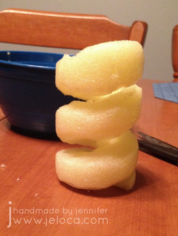
Start by cutting the pool noodle to your desired length.
You can use scissors for this but I find it easier to get a flat cut with a knife, and slicing halfway through then rotating and slicing the other half to match.
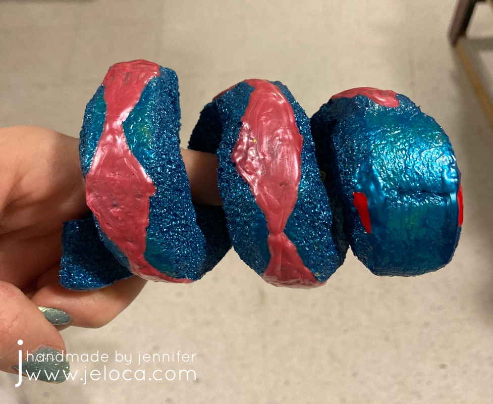
Draw a diagonal line around your noodle tube. This will mark the divisions where your snake is coiled up.
You can score the line with the tip of your pencil or knife/scissors to make it more visible and easier to follow.
Starting at one end, cut through your tube to the hole in the center and then cut along the line you’ve scored. Try to keep your line straight though it’s ok if it’s a bit messy at this point – it will get cleaned up in the next step.
Remember that one end is the tail and the other is the head, so start your cut on the diagonal as in the image above, to create the point of the snake’s tail. Stop your cut short at the other end and then cut vertically to leave a wider, flat edge which will become the snake’s head.
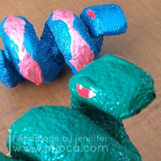
Once your basic shape is established, you can clean it up. Use your scissors to take small snips on the diagonal of each edge to round out the snake’s body. Shape the head, and you can carve in any other details you’d like, like eyes or scales.
If you want to make sure your snake will stand on its own, make sure one edge is flat.
Don’t forget to make sure that there is enough room between the coils to keep them from sticking to each other as you are painting.
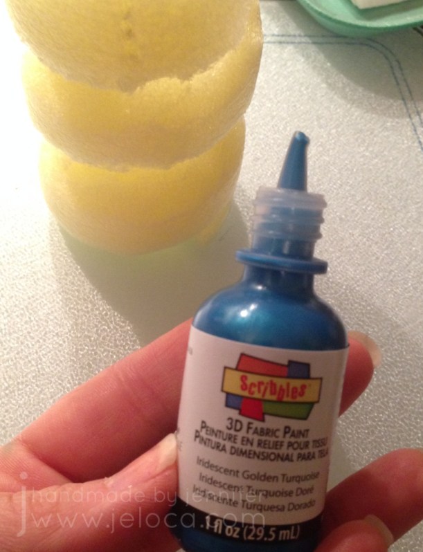
Then you get to paint! You want to use puffy/fabric paint in opaque colors. If you use colors that are too translucent you will need to do many more coats. If that is the case I would suggest a base layer of an opaque white first.
Note: Do not use acrylic/craft paint! If you do, the first time you squish your toy the paint will crack and flake off, which would be a shame after your hard work. With fabric/puffy paint your toy can last for many years.
(Here’s a pic I took as I’m typing this in 2021. Looks brand new!)
Don’t try to use a paintbrush! Squeeze some paint onto your squishy then spread it out with a craft stick. Repeat this process everywhere you want the current color, remembering to leave one side or base unpainted so you have somewhere to set it down while the paint dries.
Continue in this manner, adding more paint in your desired colors. Allow each coat to dry thoroughly between layers. When the body is dry, you can paint the base with the same number of layers.
When the final layer is dry you can add further details like eyes or scale patterns.
Not only are these little guys easy to make, but they make ASMR-like sounds when squished.
(Sound on!)
I hope you enjoy making your own!
This post may contain affiliate links. This means I might make a small commission on purchases made through the links, at no cost to you.
It’s International LEGO Day today, so to celebrate here’s a really easy DIY you can do to turn any dollhouse/playset with flat surfaces into a LEGO playset!
That’s right – with just a few simple household tools we’re going to turn this:
into this:
What you’ll need:
dollhouse/playset with flat surfaces
I used this unfinished ArtMinds Wood Castle Dollhouse from Michael’s, (US / Can)
damp sponge or paper towels (to wipe off sanding dust)
For this project I used this ArtMinds Wood Castle (linked above).
Jakob had received this castle as a Hanukkah gift from my parents and I wanted to surprise him by turning it into a LEGO playset since he never really played with action figures but was completely obsessed with LEGO.
If working with an unfinished product like this castle, you’ll want to sand it before you begin. Some of the edges are unfinished or rough and could cause splinters. The wood is soft, though, so it’s easy work to bring it outside and give the exposed edges and surfaces a quick sanding. This will also help make sure your surfaces are flat.
If using something like a plastic play house, you will want to sand any of the surfaces where you plan to attach LEGO plates to help ensure they stick well.
After sanding, wipe all surfaces with a damp sponge or paper towel. You want to remove the fine sanding dust so it doesn’t interfere with your glue later.
We’ll be using a craft knife to score the LEGO baseplate and LEGO bricks to give us a good edge to cut and snap from.
In my case, every surface in the castle had the same depth, so I wanted to start by cutting my baseplate into strips that were the proper depth. Then later I could cut them into individual pieces for each section.
Set the corner of your baseplate into the corner of one of your sections and use a separate LEGO brick to mark the edge line. We don’t want to cut the studs in half so if necessary err for pieces that are slightly too short instead of ones that would stick out beyond the edge of your playset.
Once you know your depth, use additional LEGO bricks to continue the line all the way from edge to edge. Do not use flat bricks for this as the thickness of the standard bricks will help keep your blade from slipping. Be sure to press the bricks securely as any gaps where they’re not properly seated onto the plate could allow your blade to catch.
NOTE: use a cutting mat or cut on a protective surface. I use my table as a craft table so I cut directly on it. Don’t be like me!
Run the blade of your craft knife down the edge of bricks once or twice, then snap your baseplate away from the cut edge. If you use enough pressure when scoring it should snap cleanly.
If the baseplate doesn’t snap clean off, you can slide your craft knife down the cut edge and the two pieces will separate easily.
Here’s a video for those who find it easier to see the process:
As you can see, with proper pressure the piece will snap cleanly off with a neat, straight edge.
Now that you have strips that are the proper depth, use the same brick-marking method to mark off the width for each section you want to cover. Do each section one-at-a-time.
Here’s the first baseplate flooring cut to size and inserted in place.
NOTE: They are not glued into place. I merely like to place them where they’ll go to help me keep track of what I have left to do, and to make it easy to know where they will go later.
Repeat this process until you have cut baseplates for every surface you’d like to cover. I did all floor surfaces, as well as the stairs. After this image was taken I also cut pieces for the windowsills and doorframes.
When all your pieces are cut, lightly roughen the backs of each with your sandpaper. You want to remove the plastic’s shine and roughen up the surface to help the glue better adhere. At this point you can plug in your glue gun so it can start warming up. I like to keep my glue gun on a silicone mat or scrap tin foil to protect my surface from glue drips.
Apply glue to the back of each piece and hold in place for a moment, pressing firmly. Once all the sections were glued I set it aside overnight so the glue could harden fully.
That’s all it takes! One baseplate was enough to cover all the surfaces shown plus have some extra left over.
The studs on the floors and stairs allow your Minifigs to be posed nearly anywhere, and the ones on the windowsills are really cute to put flowers and plants. Plus you can build off the plates, creating LEGO furniture for your playset.
I couldn’t resist staging a few characters for Jakob to find when he got home from school.
The “renovation” was a big hit, and while it only took a bit of time over one evening to do, it has held up since 2018 and is still going strong. I hope you enjoy this DIY and that it gives you inspiration on how to convert existing toys that might not be getting much love into ones that will be played with for many more years.
Happy International LEGO Day!
This post may contain affiliate links. This means I might make a small commission on purchases made through the links, at no cost to you.
I follow a number of incredible artists on YouTube and their work has inspired me often over the years. One such time was when I discovered the wonderful art done by Dede Wellingham. I’ve binged many of her livestreams and she’s as sweet and funny as she is talented (which is a lot).
The first video of hers that really got me revved up was “Color Washes in Imagimorphia AdultColor book by Kerby Rosanes Pt 1 of 3“. Adult coloring books were starting to become a big thing in the creative world (back in 2016) and something I’d come to late since I usually focused on fiber- or food-based arts. It hadn’t occurred to me to mix media in the ways Dede demonstrated and I could NOT WAIT to try it out. And I… well to say I missed the mark would be an understatement.
It started out so promising! I collected an assortment of my coloring books, some acrylic paint, my Neocolor II watercolor crayons and my Inktense water-soluble pencils (neither shown in pic).
Problem # 1 – using the wrong materials
Dede uses a number of media in her books, including pan pastels, paint, pencils, markers…but in particular the video that inspired me was based on using acrylic paint to drop in washes of color onto your pages. This has a two-fold effect: 1) it gets color down on the page and fills in the tiny detailed areas, making it easier and less intimidating (and faster) to color in with other media later, and 2) it creates an incredible base for colored pencil as adult coloring books are usually printed on paper that’s relatively smooth but pencils benefit enormously from a paper with more tooth. The acrylic paint gives the paper the missing tooth.
Neither the Neocolor IIs nor the Inktense are acrylic paint. Both of these can be used to add tooth to a page, but I’d diluted them so much that all I’d really managed to do was warp my paper and leave it remaining smooth once dried.
Looking back, even though I like some of the colors I’d chosen, I’m not happy with the results. I don’t like how all my random scribbles show because I hadn’t put the color down evenly, and I’m disappointed that I completely messed up on the entire “adding tooth” benefit.
Problem # 2 – using the right materialsthe wrong way
The remaining pages that I’d painted were all done with acrylic paint. That means they must be good, right? No, actually. Not at all. Some of them (the underwater ones in particular) look better in person than in the images below, but none of them are “good”, because I missed the mark again. I was so focused on getting a spread of color onto the page that I didn’t think I had to try and do it nicely. I’m embarrassed to admit it really didn’t occur to me that that it was more than a matter of simply splashing water into paint and wiping it across the page a few times. In most cases below I did a horrible application, and in the one or two that aren’t too bad, I used too much water and so the resulting color doesn’t have the tooth either. (And in the final case, I’d used much too much water and caused the marker on the reverse to completely bleed through).
(the next page that bled through to the one above)
Problem # 3 – choosing the wrong pages
I think this was the worst mistake I made out of all of them – I chose the wrong pages. With one exception, I’ve never really wanted to color ANY of the images above. Rather than pick pages that I looked forward to, instead I thought I could “cheat” my way into getting pages “done”, and done “faster” by slapping color down to make the final coloring quicker and easier. Instead I now have pages I still don’t want to do, just now they have some color on them.
So why am I bringing this up now? Well Dede’s videos have come back into my recommendeds and I’ve begun binging again, and once again am completely hooked. On THIS TIME I’ve learned from my mistakes!
This post may contain affiliate links. This means I might make a small commission on purchases made through the links, at no cost to you.
I’m not a big fan of New Year’s Resolutions. I personally don’t believe in waiting for a special day to start the changes we want to make, and numerous times I’ve made a public declaration of “this year I’ll ____” only to have my interest, enthusiasm or time dwindle until said thing is forgotten completely. My track record the last few years is spotty…I’ve completed a full year of the Create This Book challenge with Henri in 2020, but failed miserably at both my “19 for 19 WIP-to-FO” challenge in 2019 and my daily doodle self-promise in 2021.
So this year I’m not setting a resolution, but rather I’m choosing to make time for the things I want to achieve. In particular this year I want to focus on improving my drawing & coloring skills, so instead of forcing myself to do a set routine daily (which can become a chore) I’m going to simply allow myself to enjoy the process by doing what excites me.
Just before the holidays I’d discovered the YouTuber Sarah Renae Clark, thanks to a collab she did on Jazza’s art channel. I enjoyed their joint challenge so popped over to her channel to take a look and wound up binging a ton of tutorials, one of which prompted today’s post.
For those who don’t know, I do have a background and education/experience in drawing, painting, sculpture and the like as one of my degrees is in Creative Arts. Because I have a “professional” education I often get stuck in practice… feeling like I can’t just color something (for example) without “doing it right” and making sure it’s an accurate representation of my skill. It can be rewarding when the result matches my intent, but it sure puts a lot of pressure on when all I really want to do is chill on the couch with a cup of coffee and an adult coloring book! I’ve shown some pages I’ve colored here on the blog before but even those often feel inadequate for what I know I’m capable of, so improving my techniques in a way that makes them feel more natural has been a long-time desire.
I decided to follow the 5 steps myself, not as an abstract concept but in actual practice. I would select 5 coloring pages, designating one for each of the tips, and hopefully come out of the process feeling like I’d levelled up… even if only a little bit.
I rewatched the video and took notes on each step, and reviewed the extra info in her related blog post, then set about choosing pages that would be ideal for this purpose.
I went with 5 pages in my Daler*Rowney Art Therapy: Utopia book. I have 4 of these little books and they’re quite cute. I’ve worked in this book quite a bit already and while the subject is a bit quirky, I like that the book is small enough to not make each page take forever. (It’s only 5.75″ wide by 8.25″ high). Also, the pages are 1-sided, so I could use media that might bleed through. Bonus- this book series has a built-in page protector (the back cover folds out to go under the page you’re working on) which came in incredibly handy during this process.
The first of the 5 steps Sarah lists is to incorporate shading and blending. I focused in particular on using shading to create depth, and so chose this “slide” page as I thought it would be easy to darken the lower layers and give a sense of perspective.
My plan was to give each page an underpainting with Spectrum Noir alcohol markers and then go back over it with Prismacolor Premiers for the shading and details.
With that in mind I colored the page. I started with bright colors for the slides to help bring them forwards visually and tried to pick darker ones so the background would recede. I also tend to default to using the same colors so I tried to pick ones I rarely reached for (which is why it’s so chaotic!).
In my head the lower levels would be full of shadows from the upper tubes and I was hoping it would get super dark, to where it almost looked like a really long drop. Unfortunately this was a case where I was unable to execute my vision.
This was after my first pass with the colored pencils. I quite like the shadows I added under each figure…but that’s about it. I don’t feel that any of the other shadows really work. I was able to make the teal tubes look round but I don’t get a sense of depth with any of the others, and I don’t find that the slides look concave at all.
Rather than continue to fuss with it in frustration, I took a break and moved on to coloring the under layer of the next image – the orange scene below. I was still intending on finishing all of the pages in pencil, but by the time I’d started coloring what was meant to be an underpaint on the 3rd image I realized the paper was handling the alcohol markers REALLY well, and that I was enjoying using them. I don’t reach for the Spectrum Noir’s too often because they bleed through most books (and most aren’t one-sided) so having an opportunity to put them to work was really enjoyable. There’s also a really big instant gratification difference in seeing large areas of color completed in minutes vs hours.
At this point I decided to come back and give the page one more go with my markers. This is the final result. Am I happy with it? No. Am I happier with it? Yes.
Mostly I’m happy that I tried. None of the 5 tips are particularly hard – in fact they’re called “easy” right in the title. And for the most part none were ones that I didn’t already know. The point of this exercise, to me, was to actually put them into practice. I did many art theory classes, I know light theory and shadow values and the difference between form shadows and cast shadows etc. But since I rarely apply those principles I don’t have the muscle memory to use them in the way I’d like (unlike something like knitting where my hands just know how to do things without much thought). Tip #1 showed me that this is something I need to work on, which is great because it gives me somewhere to focus and one day see improvement. 🙂
Tip #2 (actually tip 3 in the video & post but I worked out of order) is about incorporating black into your coloring pages. This can be large areas like backgrounds or by using a fineliner and adding details or extras to the page that weren’t there to begin with, like dots or designs in the background.
I admit I cheated a bit with this one! I forgot to take a pic before I started coloring, but except for the oranges, this is what the image looked like before I started coloring. The Matrix-esque dots in the sky were already there, and the city silhouette was just asking to be a solid black, so it didn’t take much work or thought on how to incorporate black into this image. Still, I liked it, and chose it for this particular challenge.
The circles felt like oranges to me so that’s what I went with for coloring. I used the same gray on the robots (androids?) as for the previous pic, and a Sharpie for the city. My markers are old so there was a bit of dry-down causing patches of lighter areas (especially visible in the green and blue areas) but it didn’t bother me enough to do a second layer.
Finally, I added a bit of shading (pulling in Tip #1) in the areas the oranges and branches overlapped, as well as some (failed) shading on the robots. I’m not happy with some of the placement nor how blocky it looks. I added a neon glow off the tablet and around the radioactive oranges, and boosted the black background with some colored pencil. The final touch to include a bit more black was to add fine Micron dots to represent the pitting in orange peels, and some faux screw-heads in the tree’s bumpers.
Overall I’m happier with this one than the previous, though I don’t think it has anything to do with the tip or my follow-through. I really do love the idea of not being afraid to make changes to your books, though, and hope to get comfortable enough to add characters and designs of my own to some of the pages with lesser detail.
Tip #3 (really tip 2 in the video/post) is to add white for highlights. I’ve used this technique a bit but always been afraid to push it too far. So I chose this fish page deliberately so the bubbles in the water would give me plenty of reflective services to which I could add a shine.
Once again I forgot to take a pic before starting to color, oops. The jellyfish were quickly colored in shades of pink and for the fish I copied a color scheme I’d used on another occurrence of the same fish in the book. Trying to keep working the shading tip, I did add a slightly darker green on any of the intersections between layers of seaweed, but I’m not sure it’s visible in the finished image.
I wanted to give the background a gradient from lighter, closer-to-the-surface water up top down to murkier depths below. To achieve this I colored the background with 2 shades of gray; the first, darker one was applied to about 1/2 the page, and the second, lighter one filled in about 2/3 of what remained. I left the top 1/3 of the water area uncolored. I then went over the entire background with blue, coloring in small overlapping circles.
I outlined each bubble with a colorless blender. It didn’t remove the color completely but just enough to give each bubble a slight halo.
Finally I added highlights to the bubbles, jellyfish and fish with a Sigma Uniball UM-153 white gel pen. I don’t think the fish normally would have highlights but in my head they’re robotic just like all the people in the book. I also added some extra little white dots for oxygen bubbles coming up from each fish’s mouth as well as in the tangle of jellyfish legs.
Am I happy with it? Yes. I could have done better on blending the background and I wish my markers weren’t so old that the alcohol evaporated in patches causing the streaky look, but overall I’m quite happy with it, especially the shine on the fish. I could still use some practice though, and I think getting better at where to put the highlights will come hand-in-hand with getting better at where/how to place shadows.
Tip #4 (but actually #5 in the video/post) is to use a color palette when deciding what colors to pick. This is actually something I’ve struggled with sometimes, as I gravitate to the same colors that I like, and when I stray I can land in some weird territory (see: the slide pic above). You can find basic versions of color palettes available but Sarah offers her own and on a whim I decided to spring for it. I do so many different types of crafts, cakes, coloring, etc that having help for what colors look good together will only be an asset.
Once again I forgot to take a “before” pic until after I’d already started.
What a fantastic resource!
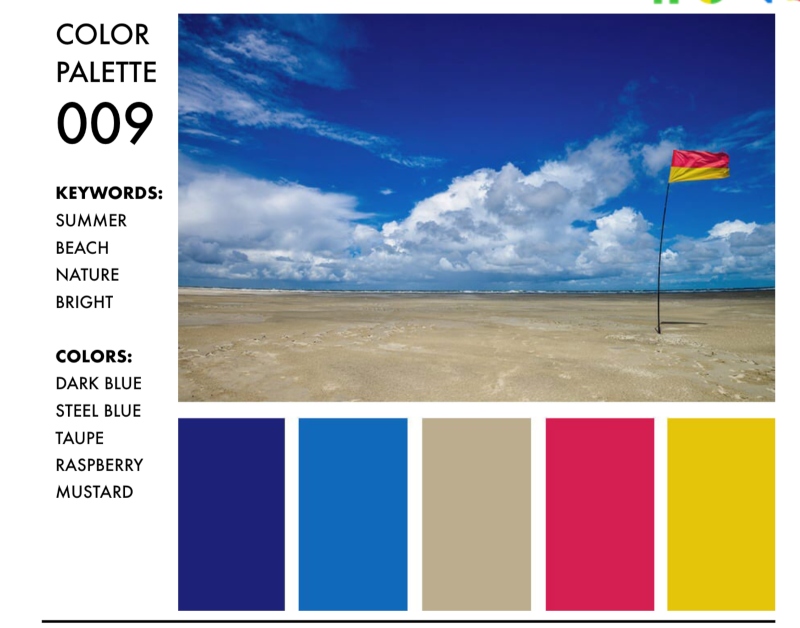
Her palettes are really well organized into clickable PDFs that you can search by keywords, themes or specific colors you want to use. I’d chosen this beach-looking scene as a test page, so I searched by “beach” keyword and decided to use palette #9 since it gave me options for the sand and water along with pops of color I could use for the umbrella and beach chair.
Something really fantastic about the Color Catalog is that she not only gives you the hex, RGB and CMYK color codes for each color in the palette, but there are also companion charts available that will tell you exactly which color she’s mapped to each from many of the most popular brands of pencils and markers. I was able to use the Spectrum Noir companion chart to find the exact SN color numbers and pull my markers without having to manually compare swatches to the samples. It’s really great!
This page probably took me the least amount of time to work on, but felt like the longest when coloring in each individual cell in the umbrella. Overall I’m pretty happy with this page. I didn’t add any white highlights and I’m not sure my laptop glow is in the right shape, but I am happy with the umbrella’s shadow on the ground and cutting across the stand (though looking back now I probably should have had the circle continue on the other side of the chair as well). Still further proof that my shading needs work. This seems to be a running theme!
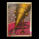
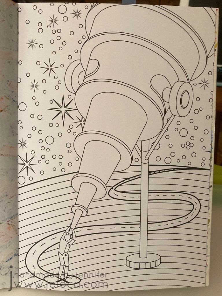
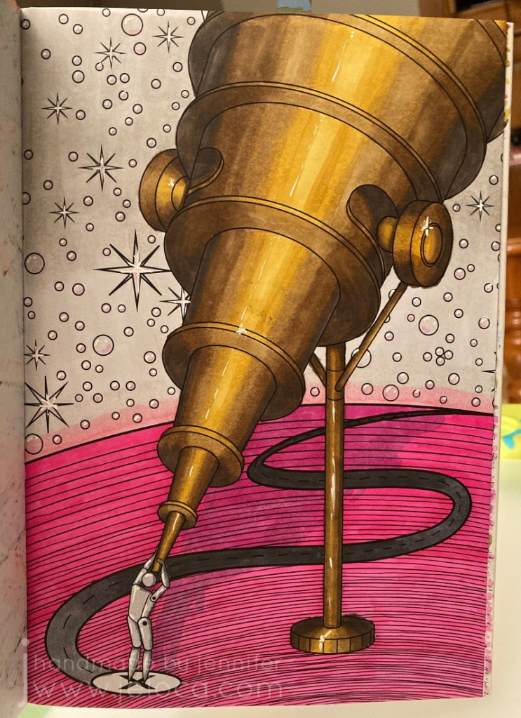
Finally, step 5 (the 4th step in the video/post) is to add textures to your page. I chose to use this telescope page for a very specific reason: it would give me a chance to practice with this texture book I bought SPECIFICALLY to help me color more realistically.
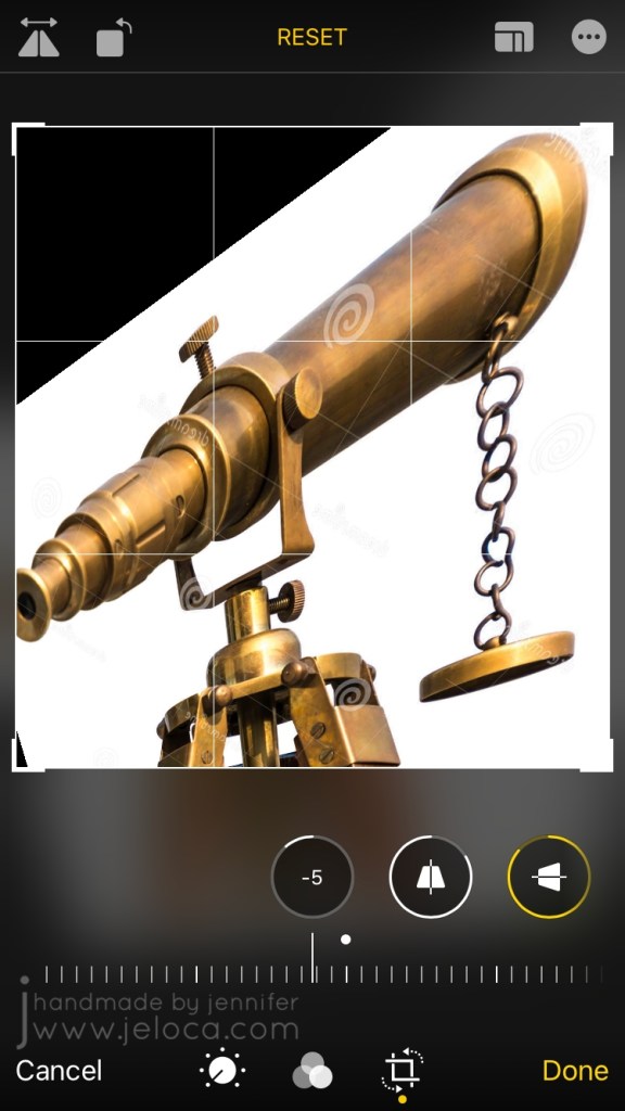
The book is fantastic, showing you how to replicate each texture in short, step-by-step blocks. The only problem was it didn’t include brass, which is the look I’d wanted for my telescope. D’oh! (It has hammered brass, but that’s not quite the same thing). I could have used the references for silver or pewter and simply changed the colors, but instead I decided to find a reference image.
I could not find any telescope images in an upwards angle like the coloring page so I made one myself! I found a sample image of the exact antique brass look I wanted to go for, and saved it to my phone.
I then used my phone’s built-in photo editing tools to flip it and skew the angle until it was as close as possible to what I needed. It’s not perfect, but it’s definitely close and was a really big help as a reference.
I was really nervous about this one because I had such a specific idea in mind and I’ll admit I was worried I wouldn’t be able to execute it. I almost gave up and was going to pick a page to try out one of the other texture ideas (eye shadow) instead but I’m really, REALLY glad I didn’t. I LOVE how it turned out!
In fact, I was so happy with it that I decided to pull all 5 tips together into this one final image.
I went back to the Color Catalog to find a color palette that would work with the copper/bronze/brass colors I already had, and this one with the bright pop of pink really charmed me.
I really tried to make sure I used all 5 tips in this one. Texture? Check. Adding white? Yup- I added highlights throughout including some shine in the brightest areas of the telescope. Adding black? Oh yes – I added extra lines in diminishing circles in the planet to try and give it a sense of depth, with the lines being more concentrated closer to the viewer and moving further apart the further away they got. Color palette? Sure thing – I used only the colors listed. And finally for shadows I got creative and added the shadow from the telescope, although I wasn’t paying proper attention to the actual shape of the telescope and didn’t do the best job.
This was the finished result…and I just did not like it. I actually put it aside for a few days to think, because I was so happy with some parts but couldn’t help thinking it looked so incomplete. I debated adding some darker grays to the sky so they’d still be in the same family as the palette, but wasn’t sure I wanted that look. I was stumped. I’d followed the rules, and yet I wasn’t happy with the result. So what did that mean?
It meant that sometimes, it’s ok to break the rules. There are no coloring police! Plus Sarah’s tips are just that – tips and suggestions on how to improve your coloring results, that you are free to incorporate (or not) but they’re not hard and fast rules. She’s not saying “this is the ONLY way”, she’s saying “if you’re stuck, why not try this? It couldn’t hurt, and it might help!” And they did.
And not being limited meant I could come back to it later and add completely new colors into the background, to give it a sort of galaxy look that I didn’t even know I wanted until I’d achieved it and it was just perfect.
I went over the original gray with two shades of purple, blending them together where (I imagined) the planet’s light met the night sky. I also blended the main purple into the pink halo off the edge of the planet. I then traced over every start and (bubble? pearl?) with the white gel pen to remove their black outlines, and deepened the telescope’s shadow and refined it as best I could.
I am SO happy with the finished result! I’m really proud of this one, and really, really glad I embarked on this challenge.
I’m really glad I took the time to go back and rework something I wasn’t happy with. This makes me feel excited and hopeful about doing more coloring and testing and learning. And having gone through this exercise I can now pinpoint which areas need more refinement, and seek help for those things specifically (like improving my shading!!).
I think this was a great project to start off my year. If it’s something you might like to try for yourself, here are the links again to Sarah’s video and blog post. She’s got a TON of other videos and posts, and whether you’re a beginner, average or expert colorist, if you’re interested in adult coloring I definitely recommend checking her out.
This post may contain affiliate links. This means I might make a small commission on purchases made through the links, at no cost to you.
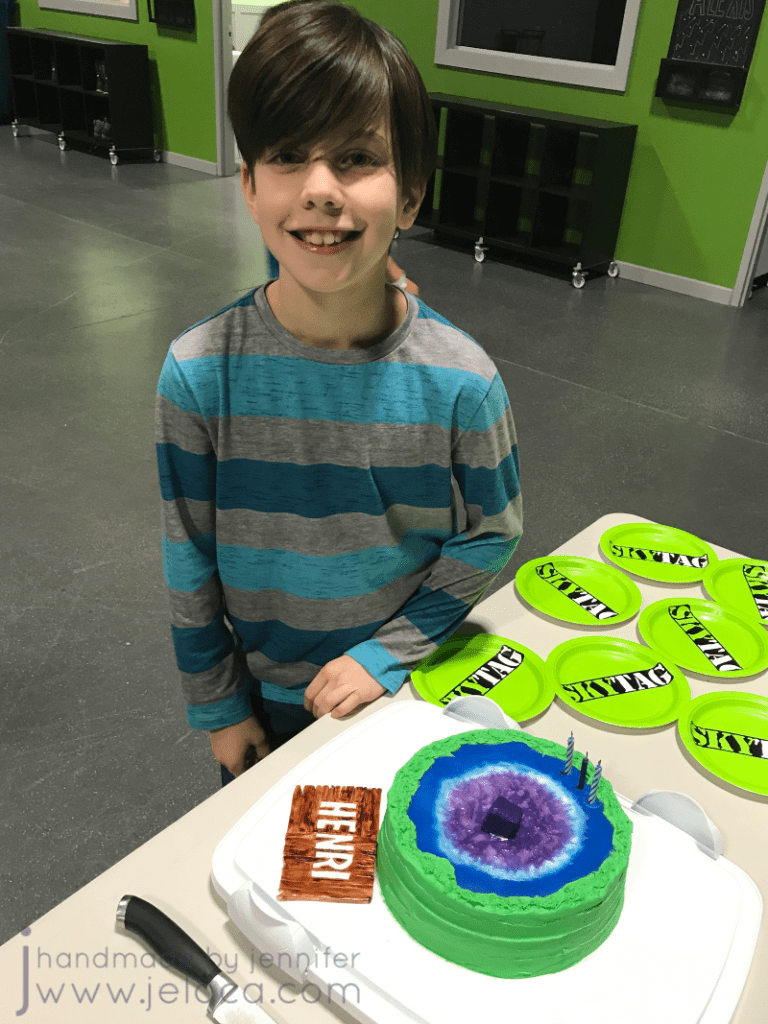
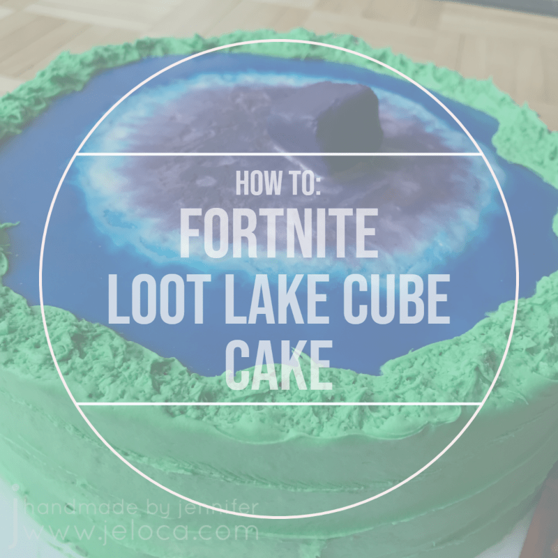
Today’s Henri’s 13th birthday and we’ve made it to his big, first “double-digits” birthday cake. Not only was Fortnite massive at the end of 2018/early 2019, but the Loot Lake cube event had just taken place and when asked what theme he wanted for his cake that year, there was zero hesitation. Easy for him to decide, but I’ll admit it took me a moment to figure out how to put it into action!
In the end I went with a cake that represented Loot Lake with the cube starting to submerge, and one of the wooden panels with Henri’s name on it. If curious about the cubes, you can read up on them here. You can actually watch the cube hit and go under here.
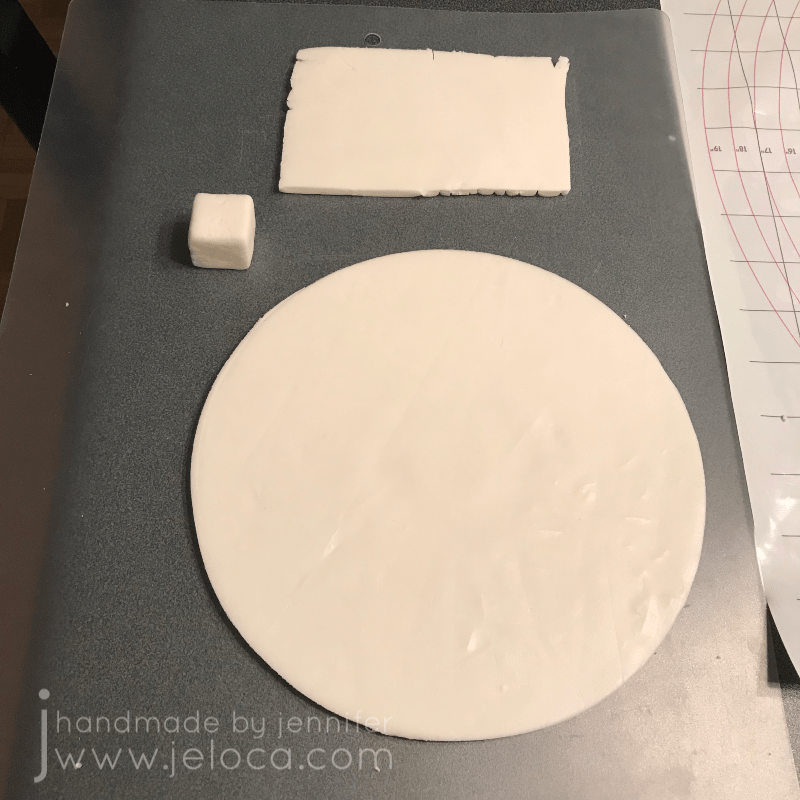
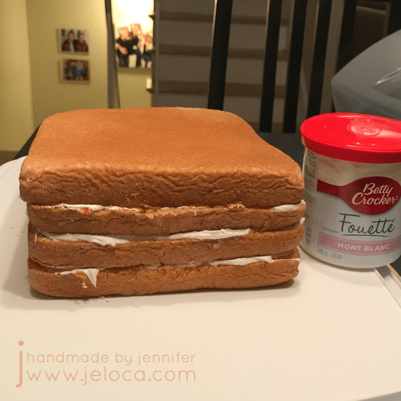
At this point this should be really familiar reading, but once again a few days before his party I baked cakes and prepared them as per my usual method. I also prepared my fondant pieces so they would have time to harden.
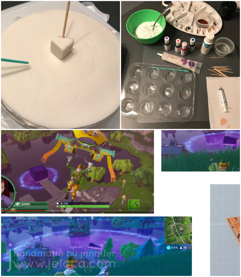
For the wooden panel I printed out his name in the Fortnite font and cut a rectangle around it with my dull blade cutter, freehanding the perpendicular planks.
I also cut out 6 1-inch squares to use for the cube. The grid on my measuring mat was perfect for this!
…except that it was too annoying to assemble the panels into a cube so instead I squished them all back together with some extra fondant and cut a 1″ cube out of the larger chunk.
I used my adjustable circle cutter to cut out a disk of fondant the same diameter as the top of my cake. I’d link it but can’t find it for sale any longer. I wonder if that’s because it isn’t that great – and tends to leave unsightly divots in the center of your fondant (like in the above image). You can either freehand cut a circle using a mat with markings like mine, or trace around your cake pan or same-sized bowl and cut that out instead.
At this point I set aside all the fondant pieces to air-dry, turning a few times daily so all sides could dry well.
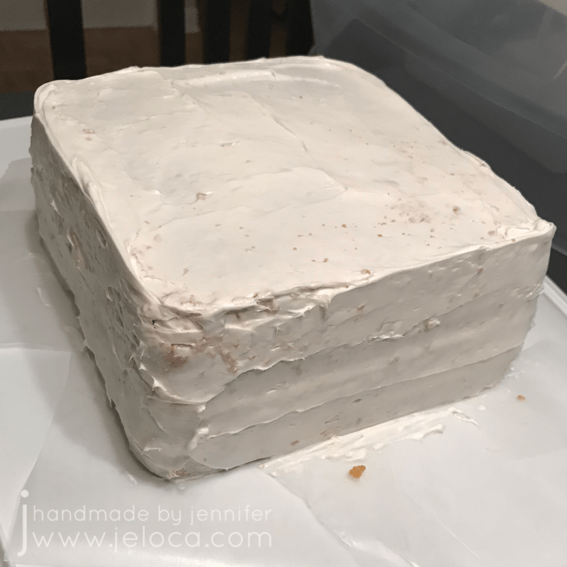
The night before the party I levelled, torted and crumb-coated the cake as per my tutorial linked above.
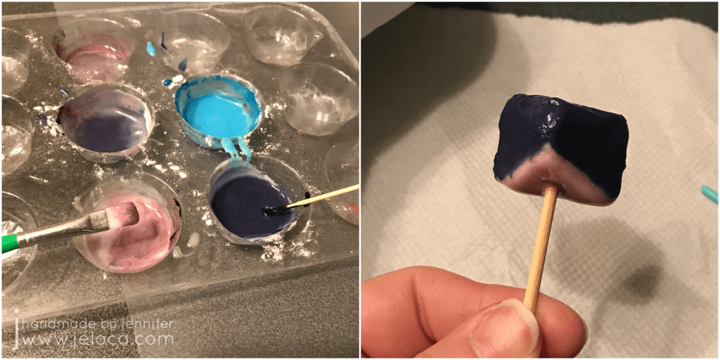
While the cake was chilling in the fridge I painted the nameplate with gel colors diluted in vodka, using a quick version of my painting fondant to look like wood tutorial (another version of the wood also found here). I also cut an angled slice off of the cube so it could sit flush against the top of the cake and still look submerged, and inserted a bamboo skewer to help it anchor to the cake later.
The cake got a clean layer of white icing and then the fondant disk was placed on top so it would adhere well.
I used the back of a food-only paintbrush to lightly score demarcation lines for where the cube’s magical effect would spread to, using the game screenshots as color and placement references. (Oh yeah- the cube is magical. It turned the lake bouncy). I also gathered my supplies for food painting: more gel colors in my required colors, white icing tint, sparkle gel, water with a syringe, my gel paint palette, toothpicks, food-only paintbrushes and icing sugar to be the base of my “paint”.
To create the lake I added blue gel colors to some icing sugar and used a syringe to add water until I got a consistency similar to paint. The syringe helps avoid adding too much water at a time, but if it does get too watery you can thicken it back up with more icing sugar. Once it looked right I painted the lake blue, stopping at the demarcation line and feathering slightly over the edge so it wouldn’t be sharp or precise.
I mixed up more of the same color but runnier (similar to flood consistency, if you decorate cakes) and applied it all over the same sections, allowing it to self-level. Then I left the cake to set for 15 minutes.
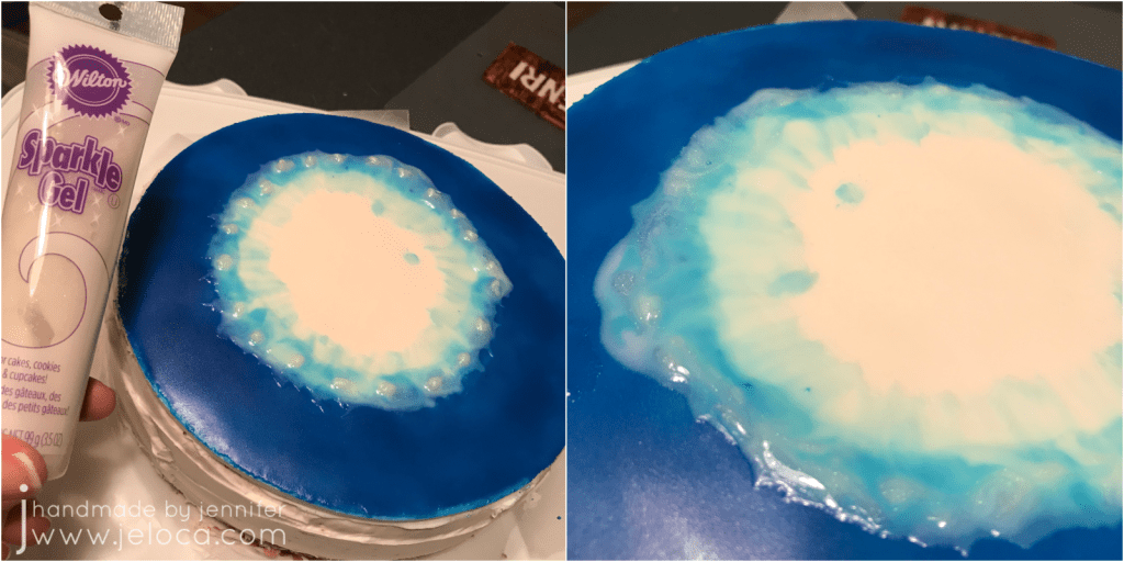
Next I mixed up more icing paint in white and light blue and put dabs of each in an alternating pattern around the inner circle’s edge before using a toothpick to swirl them together. It’s ok if the darker blue bleeds into them a bit, as this was meant to be the edge where the lake water meets the rubberized water and has the magic glow effect.
To add more magical “oomph” I added sparkle gel around the edge, overlapping into the darker blue. Then I set it aside for another 15 minutes.
For the center where the lake has already transformed, first I mixed up a medium purple shade with a lot of the sparkle gel mixed in, as well as a lighter purple and white with sparkle. I filled the center circle with the medium purple and while it was still wet I dripped in the two lighter colors and swirled them gently. Once I was happy with how it looked I set it aside for another 15 minutes.
I tinted some vanilla icing green for the grassy land around the lake and covered the sides of the cake, slightly overlapping the disk on top to hide the fondant edges. I then textured the top bit to look more like grass. You can pipe around the base of the cake if desired (I’d run out of icing, oops).
I mixed up a darker purple for the cube and a brighter pink to be the glowing light where the cube touched the water, and painted the cube itself. Allow to dry for 15 minutes by either holding it (and enjoying a little break!) or you can push the skewer into a scrap chunk of fondant or styrofoam.
Tip: Save a bit of the dark purple in case you need to touch up the cube after you stick it on the cake.
Even though my fondant was white to start, I decided to paint over Henri’s name with the Wilton White-White. It doesn’t show much in the pic, but in person it made it much brighter.
The last step is to push the skewer into the cake and then the Fortnite Loot Lake cube cake is done!
I’d used a bit too much water in one of my purples, so the next day you can see that it cratered a bit when it dried down. But I’m still super pleased with how it turned out! I love the glowy swirl where the lake meets the “magic” and it really does look like the cube is sinking into the water.
Plus Henri was really happy with it, which was the most important part! ❤
I’ve had questions before about whether fondant topper painting adds extra thickness to the top of a cake, and as you can see from the cross-section, it really doesn’t.
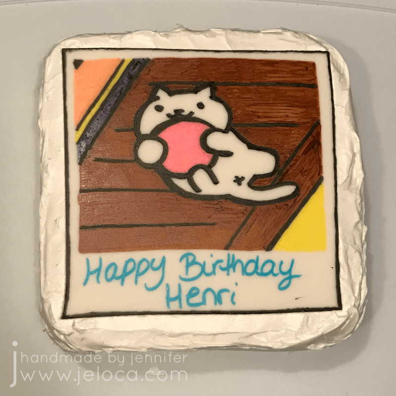
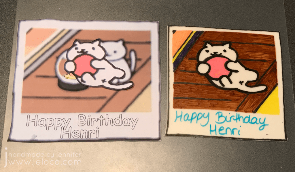
A few years ago one of the games the kids were obsessed with was Neko Atsume. They loved collecting all the little cats and their toys and taking in-game Polaroids of the kitties doing cute things. Snowball was Henri’s favorite, and on his 9th birthday he asked for a Snowball pic cake.
First thing I did, as always, was to bake the cakes a few days before his party.
He couldn’t decide between cherry chip or vanilla cakes so I made one of each then set them aside to stay moist until time to decorate.
Next I made the fondant topper. Just as for the Tem Shop cake I like to make my fondant toppers in advance as well so they have time to harden and set before placing on the cake.
I’m a big proponent of using references, so once again I found a reference image and scaled it to my desired size. I couldn’t find one with the specific pose Henri wanted (Snowball holding the red ball) so I found separate references and combined them myself into one.
On the same day I baked the cakes I also rolled out some white fondant and cut it to the size of my Polaroid. I let it air dry until the night before the party, when I sat down to finish the cake.
I used a pin tool to lightly sketch the cat outline in place by tracing the Snowball cut out onto my fondant. Then I used edible ink markers to color in the image, finishing with black for the cartoon-look outline.
Using a reference image is a really great way to help get a result that you’re happy with!
I set the topper aside so the ink could dry and then it was time to focus on the cake! First step was to levelled and tort each cake, then stack them into place.
The trimmed bits of cake freeze really well for future snacking, or you can crumble them up and mix with your leftover icing to make cake pops (which also freeze well for future snacking!).
First the cake gets a crumb coat (above) and then later a second, clean layer of icing.
I applied the topper to the still-moist icing and then the cake was done!
The fondant topper doesn’t add too much extra thickness to the top of the cake and does not need to be removed for slicing. It’s also easily removable from the slice for anyone who doesn’t like the taste.