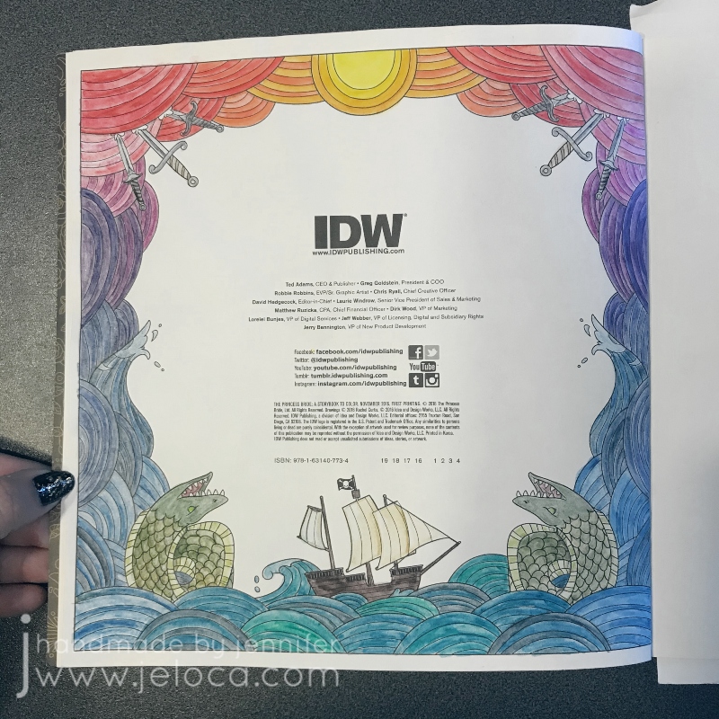
Another The Princess Bride Coloring Book longstanding work in progress has been completed! Originally blogged about here, this third Princess Bride Month post is actually the second coloring page in the book itself – the Copyright Info page.
As mentioned in the original post, my plan for the page was start at the sun in the center and work downwards. I used a few shades of yellow for the sun then started with the oranges, using the darkest color from each section as the palest in the next. So if the first section used colors A and B as ABABAB then the next section was BCBCBC, then CDCDCD, and so on. I’d planned the gradation deliberately timed so the blues would hit by the waves, then the teals/greens in the water.
This was all worked using the Derwent Inktense water-soluble ink pencils. You can activate the pencils as you complete each section but I love seeing the contrast between the dry and wetted inks so I’d waited until the entire page was colored before beginning to activate them. I use the Derwent water brushes for the larger areas and keep a blender marker in my water kit specifically for small areas that are easier with a marker point. You can use any alcohol marker brand’s colorless blender though I prefer to keep one in my kit solely for use with water-soluble pencils (and not also use it with markers). The one in my kit is Prismacolor colorless blender and I really like that it has both a bullet nib for fine details as well as a chisel tip in case I should need it.
Here is the full image after all the Inktense was activated.
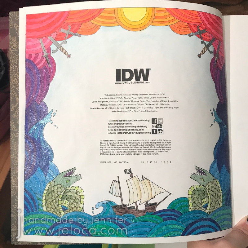
It’s…okay but I wasn’t wowed by it. Rather than leave it be, I decided to put my gel pens to work. I have so many gel pens and they can start to dry out over time, so it was a fun challenge to put them to good use and match all the Inktense colors to my gel pen swatches.
I used the glitter gel pens from the Gelly Roll 6-pc Stardust collection, the larger (13) Stardust set from the Gelly Roll large pack, and the glitter selection from the Shuttle Art assorted gel pen set. Having a large variety helped me to find matching colors for all the Inktense, which was really great.
You can see the sparkly difference in the sun (above) and the waves (below).
Here’s the whole page complete. I only added accent glitter to the shrieking eels, and I didn’t put any on the ship.
Otherwise the entire page is COVERED in glitter and my inner magpie absolutely adores it!
Bonus: Every post this month will have a fun fact about the movie. This month’s little-know detail: Did you know there was almost a very different Fezzik? When the movie was originally planned to be made in the 1970s, a then-unknown Arnold Schwarzenegger was interested in playing the role. However by the time the movie was actually made he was too expensive to hire!(Source)
This post may contain affiliate links. This means I might make a small commission on purchases made through the links, at no cost to you.
All last month I posted completed coloring pages from my 2019-19-WIP-to-FO Challenge. When I looked through the assortment of pages I’d originally posted to see what was finished, I noticed the cover of The Princess Bride coloring book.
Specifically it was the gold banner in the top corner that caught my eye. 30th anniversary hmmm? I was pretty sure I’d received the book about 4-5 years prior so did a little digging and, sure enough it was 5 years ago, meaning that THIS year will be the 35th anniversary since The Princess Bride movie was released!
The official release date seems to vary, with the majority of sites listing it as September 25th 1987, a few listing October 9th 1987, and one saying October 1st. I’m going to go with the majority on this one and officially designate this September as The Princess Bride month! I’ve got a few long-term WIPs that have finally been finished and will be shared over the month, along with a brand new double-page spread that I completed last month specifically for the 35th anniversary and will have a tutorial to go along with it.
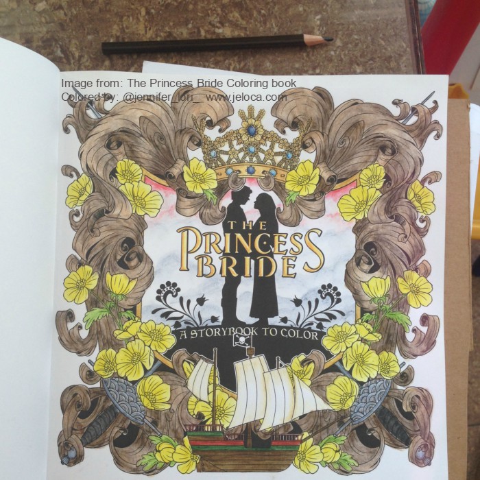
The first of these pages (literally, as it is the first in the book!) is the copy of the title page itself.
I was pretty happy with where I’d left off but decided the page needed a background to properly look complete. I selected 4 shades of green and lightly filled in the page with small sections of each color, being sure to overlap them slightly. I then went in with the Prismacolor Colorless Blender (one of my FAVORITE tools) and blended it out. In the image on the right you can see the left half has been blended but the upper right bit has not.
The background came out exactly as I’d hoped – soft, muted and almost velvety! I’m really pleased with it, and find it gave the page the finished look I was after.
With that, at long last, my very first page from The Princess Bride coloring book was complete. All posts referencing this book can be found via the Coloring page up top, or directly here.
Bonus: Every post this month will have a fun fact about the movie. This month’s little-know detail: The R.O.U.S.s were played by grown men in rat suits! One of them got into a fight with his wife and burned down their kennel, so the film crew bailed him out of jail so he could film the Fire Swamp scene. (Source)
This post may contain affiliate links. This means I might make a small commission on purchases made through the links, at no cost to you.
I still don’t know why I lost interest. Likely it was because so many fun coloring books had come out around the same time and my attention span was fickle 😉
When I resumed working on it I filled in the remaining areas with the same fineliners as well as my set of Feela double-ended markers that have a brush tip on one end and a fineliner on the other.
I added Inktense water-soluble ink pencils at the end for the background, but clearly had not yet figured out how to apply them without leaving streaks, sigh.
I can’t say I’m super thrilled with the final image, though I am quite happy it’s done.
If I were to start it all over again I’d pick a cohesive color palette with the Color Catalog first. Ignoring the larger picture and working everything as individual motifs gives a rather chaotic look in the end that I don’t think I pulled off well.
This post may contain affiliate links. This means I might make a small commission on purchases made through the links, at no cost to you.
I follow a number of incredible artists on YouTube and their work has inspired me often over the years. One such time was when I discovered the wonderful art done by Dede Wellingham. I’ve binged many of her livestreams and she’s as sweet and funny as she is talented (which is a lot).
The first video of hers that really got me revved up was “Color Washes in Imagimorphia AdultColor book by Kerby Rosanes Pt 1 of 3“. Adult coloring books were starting to become a big thing in the creative world (back in 2016) and something I’d come to late since I usually focused on fiber- or food-based arts. It hadn’t occurred to me to mix media in the ways Dede demonstrated and I could NOT WAIT to try it out. And I… well to say I missed the mark would be an understatement.
It started out so promising! I collected an assortment of my coloring books, some acrylic paint, my Neocolor II watercolor crayons and my Inktense water-soluble pencils (neither shown in pic).
Problem # 1 – using the wrong materials
Dede uses a number of media in her books, including pan pastels, paint, pencils, markers…but in particular the video that inspired me was based on using acrylic paint to drop in washes of color onto your pages. This has a two-fold effect: 1) it gets color down on the page and fills in the tiny detailed areas, making it easier and less intimidating (and faster) to color in with other media later, and 2) it creates an incredible base for colored pencil as adult coloring books are usually printed on paper that’s relatively smooth but pencils benefit enormously from a paper with more tooth. The acrylic paint gives the paper the missing tooth.
Neither the Neocolor IIs nor the Inktense are acrylic paint. Both of these can be used to add tooth to a page, but I’d diluted them so much that all I’d really managed to do was warp my paper and leave it remaining smooth once dried.
Looking back, even though I like some of the colors I’d chosen, I’m not happy with the results. I don’t like how all my random scribbles show because I hadn’t put the color down evenly, and I’m disappointed that I completely messed up on the entire “adding tooth” benefit.
Problem # 2 – using the right materialsthe wrong way
The remaining pages that I’d painted were all done with acrylic paint. That means they must be good, right? No, actually. Not at all. Some of them (the underwater ones in particular) look better in person than in the images below, but none of them are “good”, because I missed the mark again. I was so focused on getting a spread of color onto the page that I didn’t think I had to try and do it nicely. I’m embarrassed to admit it really didn’t occur to me that that it was more than a matter of simply splashing water into paint and wiping it across the page a few times. In most cases below I did a horrible application, and in the one or two that aren’t too bad, I used too much water and so the resulting color doesn’t have the tooth either. (And in the final case, I’d used much too much water and caused the marker on the reverse to completely bleed through).
(the next page that bled through to the one above)
Problem # 3 – choosing the wrong pages
I think this was the worst mistake I made out of all of them – I chose the wrong pages. With one exception, I’ve never really wanted to color ANY of the images above. Rather than pick pages that I looked forward to, instead I thought I could “cheat” my way into getting pages “done”, and done “faster” by slapping color down to make the final coloring quicker and easier. Instead I now have pages I still don’t want to do, just now they have some color on them.
So why am I bringing this up now? Well Dede’s videos have come back into my recommendeds and I’ve begun binging again, and once again am completely hooked. On THIS TIME I’ve learned from my mistakes!
This post may contain affiliate links. This means I might make a small commission on purchases made through the links, at no cost to you.
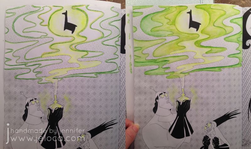
Today’s post is a little tip on how to use gel pens to get a special effect in your coloring book pages. In honor of Walt Disney’s birthday this week* I’ve used a page from my Art of Coloring: Disney Villains coloring book.
This is the original page. It’s slightly warped because on the back is a page I colored fully with my Inktense pencils and it was saturated over and over. While I do keep this book clipped shut (as shown in this post with my hanger tip) I’m still impressed at the thickness of the paper in this book. It’s definitely better than most of my coloring books!
As with many of the coloring books based on movies and tv shows, the scenes in this book are often pulled directly from a still from the original source material. In this case you can see the above image is nearly an exact copy of the second image from the movie, below. It looks like the book artist added a background detail and the mist with the llama above in order to make it more interesting as a coloring page.
While I did use the still as a reference for the characters, I took creative liberties with the color of the potion as I wanted to see if I could achieve a glowing affect and thought the contrast with a yellow glow would stand out more than pink.
This is a super easy effect to achieve, and takes materials you’ve probably already got on-hand! All you really need is a gel pen in your desired bright color! I’ve also used a water brush for convenience, but you can swap in a regular paint brush and small cup of water and get the exact results.
You have to work fast so I wasn’t able to pause and take a step by step. Outline the area you want to have the glow, and then immediately while the gel pen ink is still wet, use a water brush or water-dampened paintbrush to blend out the gel ink.
The glow areas in this image are too large to do all at once as the gel would dry before I could get to it. So I worked in small sections, tracing just inside the lines of the swirl and blending the wet ink inwards. For the glasses and potion bottle I only traced on one side so there wouldn’t be too much ink. I then scribbled some of the ink on a piece of scrap cardstock (the shiny kind like used in consumer packaging) and diluted it with water to make a paint for the glow around the bottle.
That’s it! That gives a really cool glow effect that you can achieve super-simply, in almost any coloring project. To see the glow really pop, let’s finish coloring the page!
Switching to my beloved Inktense, I outlined the misty sections with a few shades of green. I didn’t record my colors but there was definitely #1400 (Apple Green) and I believe some #1520 (Hooker’s Green). If you look in the mist closest to the llama, you can also see some #0100 (Sherbet Lemon) to amplify the glow and pull the yellows into the mist.
With Inktense the rule is always “a little goes a long way” so I only needed the barest of color application to get the light wash you see in the image on the right. To blend out you can use a water brush or regular paintbrush with some water and moisten the drawn lines just like those old coloring pages in kids’ activity books.
Next I did the same for the background behind the mist, first filling it in with a super-light application of #2020 (Indian Ink) and then deepened up the borders with #2200 (Ink Black).
The main background first had a layer of the same Indian Ink followed by #750 (Dark Purple) since purple is the complementary color to green (opposite on the color wheel).
The last step was to finish the characters with a bit of #1800 (Baked Earth) and #1740 (Saddle Brown) for Kronk and #760 (Deep Violet) for Yzma, and #1210 (Dark Aquamarine) for the teal bits.
I love how this page came out! I’m continually impressed at the paper quality of this book. Having now done a fully water-saturated coloring on both sides of this same page, I’m amazed that there is no bleed-through or tearing. I love the bright glow of the gel pen against the ink, and especially the reflected glow in the goggle lenses.
I hope this tip helps you use your gel pens in new ways!
This post may contain affiliate links. This means I might make a small commission on purchases made through the links, at no cost to you.
It seems like everywhere you look online these days, people are taking stock of 2018 and setting goals for moving forward. The first few days of the new year tend to be all about making resolutions, and to that end- here’s one of mine:
I resolve to turn the following 19 wips (works in progress) into FOs (finished objects) before the end of 2019.
I’ll write at length about each project when I finish (and post) about them, but for now here’s a short blurb for each:
1. FO Project Jars
I need to rip out all the individual lengths of yarn (1-10 yards long, each), match them up with what project they were from, and put the separated yarn into jars designated for each year.
2. Harvest Moon Pullover – crochet
I started this sweater on November 25 2016 as a way to use my adored Noro Silk Garden limited stash on something for myself. Limited yarn + crocheted pattern with big holes = a sweater that might fit… right?
3. Granny Rectangle Blanket – crochet
I started this blanket on August 9 2015 as a way to use up random sock yarns I figured I’d never get around to using for, y’know, socks. Figured out how to make granny squares as rectangles and then alternated with white for… some reason.
4. & 5. Ralph and Black Sheep’s Sweaters – sewing & cross stitch
I started these sweaters for the boys’ favorite stuffed animals a few nights before Christmas 2016. They were intended to be little surprises for them but instead they’ve sat in a bag ever since. Sadly Jakob is no longer as into iHasCupQuake as he used to be, so I’ll need to rip out the stitching on the front of Ralph’s sweater and hope it doesn’t leave gaping holes in the fleece. Then I’ll have to figure out new designs to personalize the fronts, find where I put the sleeve pieces, and sew the little sweaters together.
6. Drops V-Neck Pullover – knitting
I started this deep-v sweater somewhere in 2015 or 2016. It’s slouchy and soft and I want to wear it already.
7. Fluffy Shawl – knitting
I started this shawl on April 6 2015. It’s been sitting untouched in a bag since roughly that Fall. I love how the colors blend together (black Sandes Garn Sisu and purple/green Noro Kureyon Sock) and would like it to be done and hugging my shoulders.
8. Comfy Socks – knitting
According to myself, I started these socks 2 FULL YEARS AGO. They’re supposed to be my ‘take along’ knitting but because I haven’t finished designing the pattern, I never take them with me to work on. I need them done so I can reclaim the needles and portable hanging knitting bag and start being more productive again.
9. Fun Fur Vest – knitting
I started this Bergere de France vest in 2012(!!). My Ravelry projects page has it listed as completed on Feb 10 2015 but clearly it isn’t. No ends are woven in, it might need armhole cuffs, and I think I was debating overdying the entire thing black.
10. Doodle Fusion Marco Raffiné Page – coloring
This page from Doodle Fusion was started last summer (I think) using only my set of Marco Raffiné oil-based colored pencils.
11. Grimm Fairy Tales Alice Page – coloring
This page from Grimm’s Fairy Tales was a test to see if I could get good results using dollar store colored pencils. I’ve since moved the pencils somewhere else and want to finish the image so I don’t need to dig them out any more.
12. Grimm Fairy Tales Little Red Page – coloring
Those of you who follow me on Instagram would have seen this page from Grimm’s Fairy Tales back when I started it in June. I love how it’s turning out and want to see how well I can complete it.
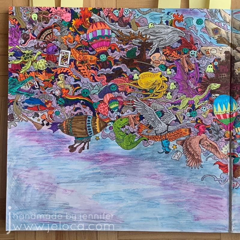
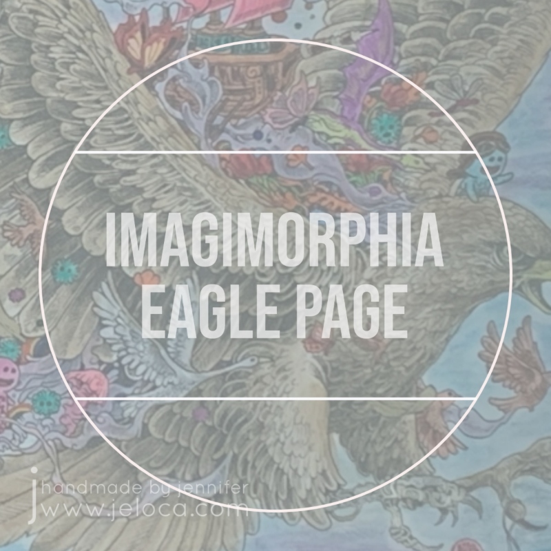
13. Imagimorphia Eagle 2-Page – coloring
This double-page spread from Imagimorphia was started in the Fall of 2016. I loved coloring the tiny rainbows and then lost steam.
I honestly don’t remember when I started this page. Luckily I’d blogged about it!
15. The Time Garden Quilt Page – coloring
I don’t recall when I started working on this page in Daria Song’s The Time Garden either but judging from other posts about it I’d made in April 2016, I’m going to guess it was about that time. I have NO idea, however, why I stopped it so close to being done.
16. The Princess Bride Fred Savage 2-Page – coloring
This page was blogged when I first started it, way back in March 2017. I don’t want to move on to another page in the book until this one is done, though, so I need to make the time to finally get it finished up.
I’ve never shown these before, except for the odd glimpse in the background of Instagram pics. I started this trio of plastic canvas portraits when I moved in August 2017. While I love how they look in black and white (and blue), I designed them to be in full color and I’d love to see them complete.
Think I can do it? Want to play along? Use the tag #19WIPtoFO2019 so I can see how many you get through!
ps: As I’m about to post this I just realized that 19 projects means committing to completing more than one per month. Months that are already pretty busy with Becket, work, kids, commissions and all the new projects I want to work on and might come up over the year… Wish me luck- I’m gonna need it!!
This post may contain affiliate links. This means I might make a small commission on purchases made through the links, at no cost to you.
…aka the Fred Savage/Peter Falk double-page spread.
Sometimes I like mindless projects like stockinette stitch knitting or coloring where the resulting image can look like anything I can imagine. Other times the challenge of replicating something existing is what thrills me, like Henri’s Pitfall: The Lost Expedition cake that had to look like a scene from the game, or my (full posts still outstanding) Skylanders Sprocket cosplay that had to look like the character from the game. After a more casual take on the first few pages in the Princess Bride coloring book I was really eager to tackle something detailed and specific, so I was really happy to turn the page and see one of the the Grandfather/Grandson scenes from the movie’s framing device.
For reference, here’s a still from that scene in the movie:
Just like with the Kaa/Mowglii page in the Art of Coloring: Disney Villains book, the Sherlock coloring book, the Doctor Who one, and others, I think some of the more photo-realistic pages start with photoshopped stills that are then cleaned up and refined by the artist. In this case the only real differences between the book and the movie are a different jumble of toys and books on the headboard and the altering of Fred’s jersey, both changes likely due to the trademarks involved like the Bears, the Cheetos, and the He-Man figures, etc.
I don’t have progress pics from before this point because I was so into the coloring that I forgot. I’d started with the lamp… for no real reason other than I’d wanted to. After that I started thinking about how the Inktense pencils behaved: while they’re supposed to be permanent, if not fully activated they’d bleed into the surrounding areas. So, for example, if I laid down a lot of pigment making his hair dark brown, and missed some stray bits near the outline, that dark color would bleed over into the white headboard/shelves if I got too close with my wet brush (which is why I’m leaving that, among other areas, for last).
I spent waaaaay too long on the bedspread. Even after choosing the colors I spent more time than necessary figuring out if there was a repeatable pattern I could copy.
(Go figure I didn’t find THIS pic until I was done that part. Sigh.)
Once the stripes were done I tossed in a bit of shading, then did the pillows. Next up was the skin (within which the shadows look a little exaggerated at the moment, but I plan to smooth it out with some colored pencil at the end).
I broke my own ‘dark colors’ rule in doing the jersey next (it’s the exception that proves it, right?) and then the shadows along the wall/shelves/head board.
And this is the point I’m at now. I’ve started tossing some color into the books and comics and toys other odds and ends strewn about.
Oh- I wanted to say something excellent about this book: while it’s not made to hold heavy applications of water, and will definitely never stand up to alcohol markers, I’ve put this page so far through a lot. After working some areas, like the jersey, it was with a lot of trepidation that I turned back to the page before to check for bleed-through. The page on the other side of this one is the ownership page, so with only the smaller scollwork/flowers in the center of the page, there is a LOT of blank area for ghosting and bleeding to show through.
There’s none. Nada. Zilch. In fact, I took the pics in my previous post after already coloring this far, so you can see for yourself that there aren’t even traces of ghosting to disrupt the background. 🙂
You can find more coloring-related posts sorted by material or book at the Coloring tab in the header above, or click here for more posts about The Princess Bride Coloring Book.
I know, I know- three posts in a row! I told you- I’m addicted to this book, and if I don’t start posting stuff from where I’m at I’ll keep winding up too far ahead. Unlike tutorials or cakes where once they’re done, they’re done and I can post the finished thing anytime, ideally with coloring projects I could be somewhat up to date so I can post pics here or on my Instagram as I work on them. Since this book is my current obsession, I’m making sure to get these posts out before I move ahead too far.
So. This is the ownership page in progress. (If anyone isn’t following along this is the The Princess Bride Coloring Book, colored with Derwent Inktense pencils). For the most part it’s a repeat of the title page, since it has the same buttercups and carved wood. I did learn from my mistakes on the last page, however, and went lighter for my initial passes at the wood color. I haven’t done any colored pencil shading on this one yet, and so far it reminds me of the strips of Birch kids would get in trouble for tearing off the trees at my old camp.
Before giving the book pages a slight antique stain I’d lightly sketched out my name, trying as best I could to match the font on the opposing page. In pencil it looked great… only I’d been hasty in wanting to finish that part and I’d used the first ink pen I’d had handy not even thinking that the nib was thicker than the printed ink. I traced the “J” and instantly regretted it, wishing I’d used one of my smaller sizes Micron pen instead. However, now that I’d started it was too late to do anything about it. Hmph.
I’d even tried to erase the ink over the J, wondering if it would fade it enough to not stand out with as much contrast as it was having. Again I was being hasty and nearly smeared the black ink. Sigh. In the end I managed to salvage the pic, I think. Since I couldn’t undo the thicker outline on the right, I chose to use the same pen to outline the existing words on the left, so both pages matched.
The Inktense on this page is complete, and all I want to do now is darken the depths of the shadows of the wood and the flower centers with some colored pencil, and then this page will be done.
You can find more coloring-related posts sorted by material or book at the Coloring tab in the header above, or click here for more posts about The Princess Bride Coloring Book.
This post may contain affiliate links. This means I might make a small commission on purchases made through the links, at no cost to you.
(As an aside, you can clearly see the lack of bleed-through on this page, even after all the layers of color I’d put down).
Still working with the Inktense, I started at the sun in the center and worked downwards. I used a few shades of yellow for the sun then started with the oranges, using the darkest color from each section as the palest in the next. So if the first section used colors A and B as ABABAB then the next section was BCBCBC, then CDCDCD, and so on. I planned the gradation deliberately timed so the blues would hit by the waves, then the teals/greens in the water.
The lines are so narrow that I can’t really look up to watch tv or something while I activate it, so I’ve been working on it here and there while catching up on past episodes of the podcast Lore. I’m in no rush, though, as I love watching the muted pigment (the left side) spring to life once wetted (the right side, up to midway).
This post may contain affiliate links. This means I might make a small commission on purchases made through the links, at no cost to you.
As I mentioned in my last post, I’ve been completely addicted to the Princess Bride Coloring Book lately. I’ve been using it as my reward for getting chores and stuff done, and currently have 5 pages in progress.
The title page is the first one I started with. I confess I felt really dumb when, after staring at the page for a while trying to figure out what color I wanted to make the flowers, I had a flash of insight and did a quick Google search. Sure enough – sigh – they had to be yellow. They’re buttercups! 😀
My plan for the book is to work primarily with my Derwent Inktense and then finish up with colored pencils when/if necessary for some finer detail work.
I don’t have full step-by-steps of the order I’d worked but for this page I’d tackled it like this:
-First I colored the buttercups with two shades of yellow (it’s hard to see but there’s a darker yellow in the center) and then done the greenery
-Next I used Payne’s Gray to shadow in some clouds behind Buttercup and Westley
-Then I colored the crown, using an image of Buttercup’s coronation crown for reference
-Then I worked on the ship. I spent way too much time trying to find decent pics of either of the two main ships in the movie (The Dread Pirate Roberts’ ship or Vizzini’s ship) but the one drawn doesn’t perfectly match either. If anything it’s closest to Vizzini’s but it has a skull and crossbones flag so…? Finally I did my best approximation copying, of all things, a LEGO ship build.
-Next I threw some gray and black into the two rapiers, and some pinks into the background, plus darkened the grays to give the illusion of mountains or far-off lands.
-The last thing I did at this step was to color the carved wood. I did a HORRIBLE job with my shading, and, while this paper is pretty thick and didn’t bleed through at all, it does start to pebble after too many water applications, so I eventually maxed-out on how deep I could get the shadows. That’s when I decided to jump right into some colored pencil.
In this image (above) I’ve worked colored pencil shading on the left side of the wood carvings only (so far), and I’ve used an eraser to lift out some highlights in both the wood as well as the sword handles.
This post may contain affiliate links. This means I might make a small commission on purchases made through the links, at no cost to you.


 Before giving the book pages a slight antique stain I’d lightly sketched out my name, trying as best I could to match the font on the opposing page. In pencil it looked great… only I’d been hasty in wanting to finish that part and I’d used the first ink pen I’d had handy not even thinking that the nib was thicker than the printed ink. I traced the “J” and instantly regretted it, wishing I’d used one of my smaller sizes Micron pen instead. However, now that I’d started it was too late to do anything about it. Hmph.