Leave a comment

Avoiding Chores with Coloring!

Did you know that today, April 7, is National No Housework Day? As a crafter, I’m ALWAYS looking for reasons to get more time in with my hobbies, so avoiding housework to spend that time doing things I love sounds like a FANTASTIC idea.

I can’t pretend this is the only day I’ve ever put off housework in favor of a project or seven though… Most recently I took advantage of a lazy weekend afternoon to do some coloring and try out a new background technique in a coloring book page. If you’d like to celebrate the holiday today by doing the same, read on for more info!

After going through my coloring book stash to see what fit my mood, I went with the super rad Like, Totally 80’s coloring book and picked a new page instead of working on one of the pages I’ve already prepped.

I wanted the quick satisfaction of using markers and this page had just the right mix of small details and elements. This book is single-sided which is great as you don’t have to worry about ruining an image on the back of the page.

To make things even more mindless, I gave myself a limited color palette. I found an 80s-inspired palette of these 6 colors:

…which I then matched in my Crayola Super Tips.

It was mindless, for sure, but I forgot that coloring is rarely quick! So I had no choice but to spend even more evenings avoiding housework.

Once all the small sections were complete all that remained was the background. It was too much to fill in with the markers so I reached for my Prismas instead.

First I filled in the entire background with a light gray (not shown). Then, using 3 colors that matched 3 of the marker colors, I went over the background again, doing large, irregular sections of color.

Next I went over the whole thing with a layer of black. My goal was to have the different shades give the black some dimension while subtly tying in the bright 80s tones.

The final step was to go over the entire background one last time, this time with my Derwent Burnisher. You can see the massive difference this makes in the image above – the background below the blue squiggle has been burnished, while the area above has not. There was no additional color applied; I merely flattened the layers of color using the burnishing pencil.

I really like how it turned out! It’s a silly, chaotic coloring book page but it was fun and I really enjoy the subtle depth the black background has by having the other colors underneath.

Looking back now I prefer the original background but at the time I’d felt it wasn’t bright enough to really SCREAM “80s”. I decided to outline everything (and also add random dots around the edge of the page for some reason…?) with a white Posca paint marker. These markers are great with colored pencils as they go over it beautifully without skipping, and once dry you can tint the paint with your markers or pencils.

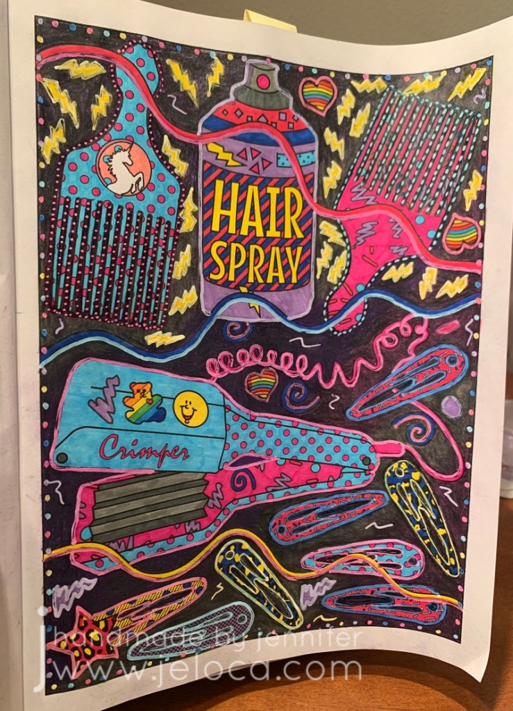
To beat back the white glare I did just that. Using the same 6 Super Tips I went over the white paint to give every item an outline “glow”.

In the end I’m not mad at the final page (above), but I do prefer it pre-paint. That said, it was a lovely excuse to get out of housework for a bit and do something (relatively) mindless.

I hope you get to use today as an excuse to put down the vacuum or laundry and do something fun that makes you happy!

This post may contain affiliate links. This means I might make a small commission on purchases made through the links, at no cost to you.


1 Comment

Second Attempts at Background Washes in Coloring Books

A few weeks ago I shared some very old attempts of trying background washes in adult coloring books. Since that point I’ve been watching more Dede videos and reevaluating my supplies and my goals with these coloring pages. To that end, I went through some of my coloring books and chose new pages to try, this time with deliberate intent. Instead of using the washes to help me muster the urge to work on a particular page, now I was choosing pages I wanted to work on, and colors that would help me be happier with the eventual results.

Oh – and I learned from my mistakes – I was for sure going to be using acrylic paint this time.

The best paint to use for this is cheap acrylic paint. It’s matte, opaque but also thins well.

Acrylic paint is a plastic, which means it dries solid and won’t re-wet. This means you can use the same palette over and over, by either pulling off the dried paint or simply working right on top of your (thoroughly) dried paint.

I’ve been using old yogurt and margarine lids but recently started keeping takeout lids for the same purpose. If you have a paint caddy like mine, you can also use the lid as a palette.

I started with my Colours of Comfort coloring book, from my local Dollarama. My kids bought it for me as my Christmas present/stocking stuffer by sneaking it into my cart then making me turn around so they could hand it to the cashier. They then held the bag in the car and carried it into the house so they could get it into my stocking without seeing what they’d picked. (They paid me back later lol)

First up was this mandala-esque page. I picture it completed with golds and jewel tones, so gave the whole page a deep yellow wash.

Next I chose this tea party scene. I was taken with the idea of trying to make the cups look like porcelain, and gave the cups a gray wash so I could layer white pencil on top.

I forgot to take a before pic of this next one. I’m not usually one for landscape drawings, but this one caught my eye.

I like the idea of using my textures tutorial book and practicing some natural textures like the stones.

I’ve had this next coloring book for years, and barely touched it. The Mason-Dixon Knitting’s A Coloring Book for Knitters came out back in 2016 and is filled with fun, crafty images to color. While it’s a cute idea, it suffers from the same paper quality issue as most novelty coloring books, so as my media of preference changed, it limited what I was able to use.

It’s not bad…but it’s not strong enough for alcohol markers and not enough tooth for a good job with colored pencils.

I was really drawn to this winder & swift page. I painted the background with silver paint, hoping to get a vintage “mirrored” wallpaper look in the end, and plan to copy my own swift and winder’s color schemes.

From there I grabbed two of my favorite books to flip through.

This Like, Totally 80’s coloring book gave me a chance to break out my neon paints.

I picked two pages that I thought would be fun to complete.

From there it I moved to Color the 90’s. It’s a really fun blast from the past by the same author as “Sit the F*ck Down and Color”.

This Easy Bake Oven page caught my eye!

I found a good reference image for the oven and think it’ll be a really cute page to color.

Finally, I turned to this Garden Fairy Alphabet coloring book that I’ve had for a really long time.

Just like landscapes, flowers and plants are not usually my go-to either. Using paint makes me eager to work on these images now, though, and I chose the letters that represent the children in our family.

J and H are for my boys, and L, J and C are for my siblings’ children. Inspired by them all I chose colors that represent the respective children’s hair colors. C has dirty blonde hair and loves blue, so I added the sky (which I later regretted, and did not add in any of the others).

I couldn’t NOT go for a Link-looking character for Henri’s H, since my son is obsessed with The Legend of Zelda.

Jakob’s Jonquil Fairy will be blond just like him…

…and just like my niece L’s blonde curls.

None of these are complete, and none have yet gone past the painting stage, but even at this point I’m so much happier with them than I was with the last batch.

This post may contain affiliate links. This means I might make a small commission on purchases made through the links, at no cost to you.