
I’m not a big fan of New Year’s Resolutions. I personally don’t believe in waiting for a special day to start the changes we want to make, and numerous times I’ve made a public declaration of “this year I’ll ____” only to have my interest, enthusiasm or time dwindle until said thing is forgotten completely. My track record the last few years is spotty…I’ve completed a full year of the Create This Book challenge with Henri in 2020, but failed miserably at both my “19 for 19 WIP-to-FO” challenge in 2019 and my daily doodle self-promise in 2021.
So this year I’m not setting a resolution, but rather I’m choosing to make time for the things I want to achieve. In particular this year I want to focus on improving my drawing & coloring skills, so instead of forcing myself to do a set routine daily (which can become a chore) I’m going to simply allow myself to enjoy the process by doing what excites me.
Just before the holidays I’d discovered the YouTuber Sarah Renae Clark, thanks to a collab she did on Jazza’s art channel. I enjoyed their joint challenge so popped over to her channel to take a look and wound up binging a ton of tutorials, one of which prompted today’s post.
For those who don’t know, I do have a background and education/experience in drawing, painting, sculpture and the like as one of my degrees is in Creative Arts. Because I have a “professional” education I often get stuck in practice… feeling like I can’t just color something (for example) without “doing it right” and making sure it’s an accurate representation of my skill. It can be rewarding when the result matches my intent, but it sure puts a lot of pressure on when all I really want to do is chill on the couch with a cup of coffee and an adult coloring book! I’ve shown some pages I’ve colored here on the blog before but even those often feel inadequate for what I know I’m capable of, so improving my techniques in a way that makes them feel more natural has been a long-time desire.
And then I watched Sarah’s “5 Easy Tips to Instantly Improve Your Coloring Pages” video and an idea quickly formulated.
I decided to follow the 5 steps myself, not as an abstract concept but in actual practice. I would select 5 coloring pages, designating one for each of the tips, and hopefully come out of the process feeling like I’d levelled up… even if only a little bit.
I rewatched the video and took notes on each step, and reviewed the extra info in her related blog post, then set about choosing pages that would be ideal for this purpose.
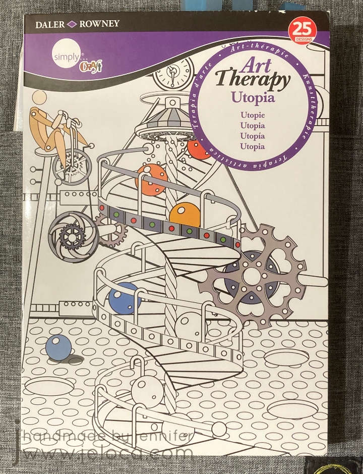
I went with 5 pages in my Daler*Rowney Art Therapy: Utopia book. I have 4 of these little books and they’re quite cute. I’ve worked in this book quite a bit already and while the subject is a bit quirky, I like that the book is small enough to not make each page take forever. (It’s only 5.75″ wide by 8.25″ high). Also, the pages are 1-sided, so I could use media that might bleed through. Bonus- this book series has a built-in page protector (the back cover folds out to go under the page you’re working on) which came in incredibly handy during this process.
The first of the 5 steps Sarah lists is to incorporate shading and blending. I focused in particular on using shading to create depth, and so chose this “slide” page as I thought it would be easy to darken the lower layers and give a sense of perspective.

My plan was to give each page an underpainting with Spectrum Noir alcohol markers and then go back over it with Prismacolor Premiers for the shading and details.

With that in mind I colored the page. I started with bright colors for the slides to help bring them forwards visually and tried to pick darker ones so the background would recede. I also tend to default to using the same colors so I tried to pick ones I rarely reached for (which is why it’s so chaotic!).
In my head the lower levels would be full of shadows from the upper tubes and I was hoping it would get super dark, to where it almost looked like a really long drop. Unfortunately this was a case where I was unable to execute my vision.

This was after my first pass with the colored pencils. I quite like the shadows I added under each figure…but that’s about it. I don’t feel that any of the other shadows really work. I was able to make the teal tubes look round but I don’t get a sense of depth with any of the others, and I don’t find that the slides look concave at all.
Rather than continue to fuss with it in frustration, I took a break and moved on to coloring the under layer of the next image – the orange scene below. I was still intending on finishing all of the pages in pencil, but by the time I’d started coloring what was meant to be an underpaint on the 3rd image I realized the paper was handling the alcohol markers REALLY well, and that I was enjoying using them. I don’t reach for the Spectrum Noir’s too often because they bleed through most books (and most aren’t one-sided) so having an opportunity to put them to work was really enjoyable. There’s also a really big instant gratification difference in seeing large areas of color completed in minutes vs hours.
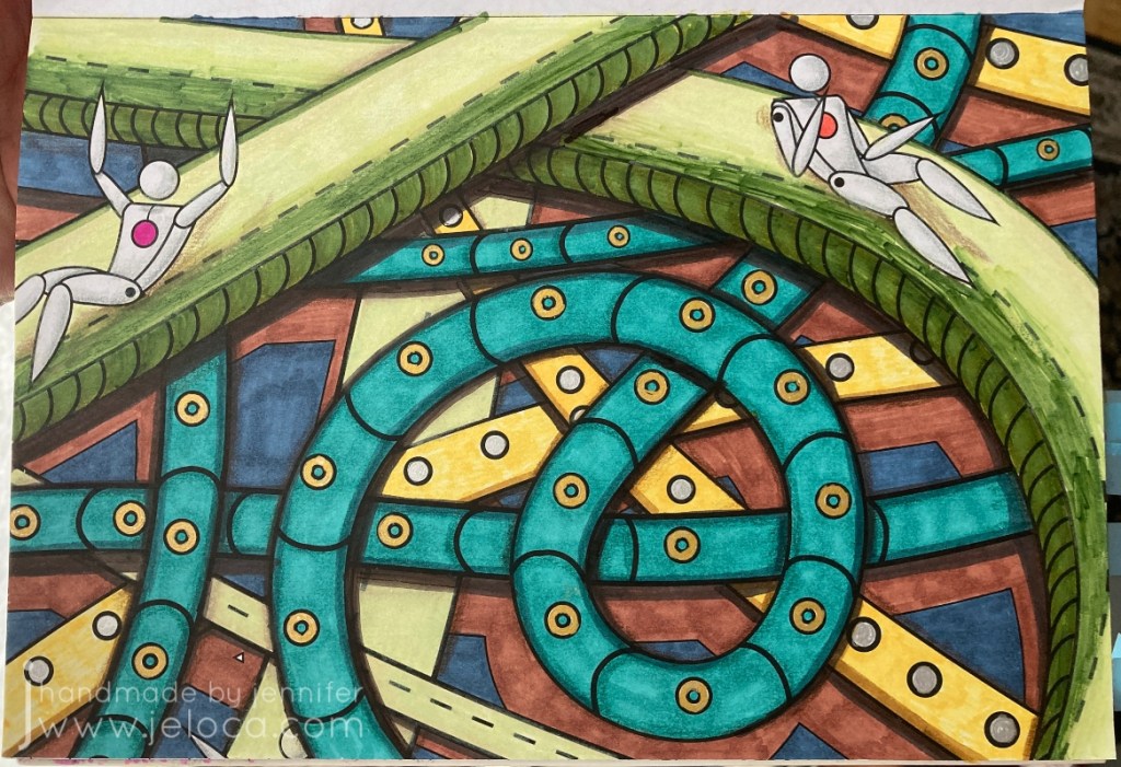
At this point I decided to come back and give the page one more go with my markers. This is the final result. Am I happy with it? No. Am I happier with it? Yes.
Mostly I’m happy that I tried. None of the 5 tips are particularly hard – in fact they’re called “easy” right in the title. And for the most part none were ones that I didn’t already know. The point of this exercise, to me, was to actually put them into practice. I did many art theory classes, I know light theory and shadow values and the difference between form shadows and cast shadows etc. But since I rarely apply those principles I don’t have the muscle memory to use them in the way I’d like (unlike something like knitting where my hands just know how to do things without much thought). Tip #1 showed me that this is something I need to work on, which is great because it gives me somewhere to focus and one day see improvement. 🙂
Tip #2 (actually tip 3 in the video & post but I worked out of order) is about incorporating black into your coloring pages. This can be large areas like backgrounds or by using a fineliner and adding details or extras to the page that weren’t there to begin with, like dots or designs in the background.

I admit I cheated a bit with this one! I forgot to take a pic before I started coloring, but except for the oranges, this is what the image looked like before I started coloring. The Matrix-esque dots in the sky were already there, and the city silhouette was just asking to be a solid black, so it didn’t take much work or thought on how to incorporate black into this image. Still, I liked it, and chose it for this particular challenge.

The circles felt like oranges to me so that’s what I went with for coloring. I used the same gray on the robots (androids?) as for the previous pic, and a Sharpie for the city. My markers are old so there was a bit of dry-down causing patches of lighter areas (especially visible in the green and blue areas) but it didn’t bother me enough to do a second layer.
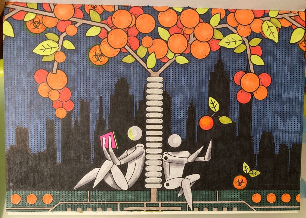
Finally, I added a bit of shading (pulling in Tip #1) in the areas the oranges and branches overlapped, as well as some (failed) shading on the robots. I’m not happy with some of the placement nor how blocky it looks. I added a neon glow off the tablet and around the radioactive oranges, and boosted the black background with some colored pencil. The final touch to include a bit more black was to add fine Micron dots to represent the pitting in orange peels, and some faux screw-heads in the tree’s bumpers.
Overall I’m happier with this one than the previous, though I don’t think it has anything to do with the tip or my follow-through. I really do love the idea of not being afraid to make changes to your books, though, and hope to get comfortable enough to add characters and designs of my own to some of the pages with lesser detail.
Tip #3 (really tip 2 in the video/post) is to add white for highlights. I’ve used this technique a bit but always been afraid to push it too far. So I chose this fish page deliberately so the bubbles in the water would give me plenty of reflective services to which I could add a shine.

Once again I forgot to take a pic before starting to color, oops. The jellyfish were quickly colored in shades of pink and for the fish I copied a color scheme I’d used on another occurrence of the same fish in the book. Trying to keep working the shading tip, I did add a slightly darker green on any of the intersections between layers of seaweed, but I’m not sure it’s visible in the finished image.
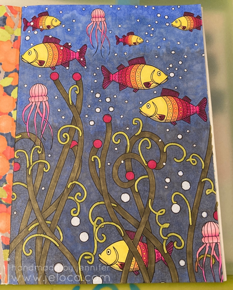
I wanted to give the background a gradient from lighter, closer-to-the-surface water up top down to murkier depths below. To achieve this I colored the background with 2 shades of gray; the first, darker one was applied to about 1/2 the page, and the second, lighter one filled in about 2/3 of what remained. I left the top 1/3 of the water area uncolored. I then went over the entire background with blue, coloring in small overlapping circles.

I outlined each bubble with a colorless blender. It didn’t remove the color completely but just enough to give each bubble a slight halo.

Finally I added highlights to the bubbles, jellyfish and fish with a Sigma Uniball UM-153 white gel pen. I don’t think the fish normally would have highlights but in my head they’re robotic just like all the people in the book. I also added some extra little white dots for oxygen bubbles coming up from each fish’s mouth as well as in the tangle of jellyfish legs.
Am I happy with it? Yes. I could have done better on blending the background and I wish my markers weren’t so old that the alcohol evaporated in patches causing the streaky look, but overall I’m quite happy with it, especially the shine on the fish. I could still use some practice though, and I think getting better at where to put the highlights will come hand-in-hand with getting better at where/how to place shadows.
Tip #4 (but actually #5 in the video/post) is to use a color palette when deciding what colors to pick. This is actually something I’ve struggled with sometimes, as I gravitate to the same colors that I like, and when I stray I can land in some weird territory (see: the slide pic above). You can find basic versions of color palettes available but Sarah offers her own and on a whim I decided to spring for it. I do so many different types of crafts, cakes, coloring, etc that having help for what colors look good together will only be an asset.
Once again I forgot to take a “before” pic until after I’d already started.
What a fantastic resource!
Her palettes are really well organized into clickable PDFs that you can search by keywords, themes or specific colors you want to use. I’d chosen this beach-looking scene as a test page, so I searched by “beach” keyword and decided to use palette #9 since it gave me options for the sand and water along with pops of color I could use for the umbrella and beach chair.
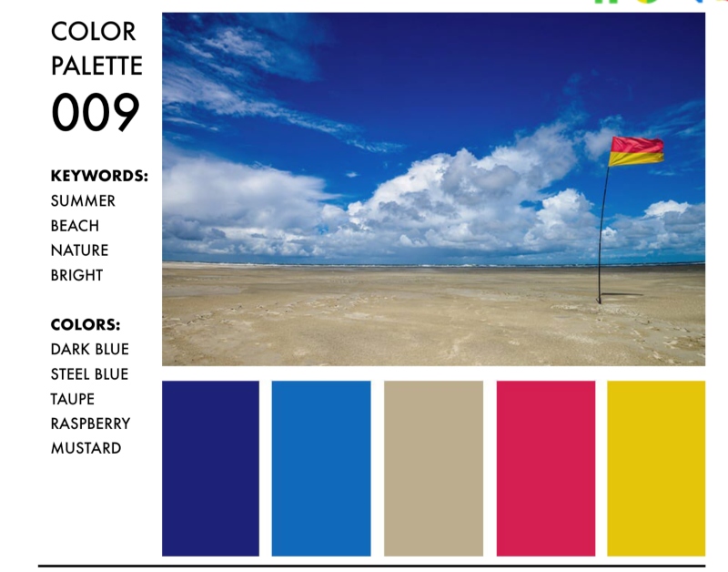
Something really fantastic about the Color Catalog is that she not only gives you the hex, RGB and CMYK color codes for each color in the palette, but there are also companion charts available that will tell you exactly which color she’s mapped to each from many of the most popular brands of pencils and markers. I was able to use the Spectrum Noir companion chart to find the exact SN color numbers and pull my markers without having to manually compare swatches to the samples. It’s really great!

This page probably took me the least amount of time to work on, but felt like the longest when coloring in each individual cell in the umbrella. Overall I’m pretty happy with this page. I didn’t add any white highlights and I’m not sure my laptop glow is in the right shape, but I am happy with the umbrella’s shadow on the ground and cutting across the stand (though looking back now I probably should have had the circle continue on the other side of the chair as well). Still further proof that my shading needs work. This seems to be a running theme!
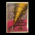
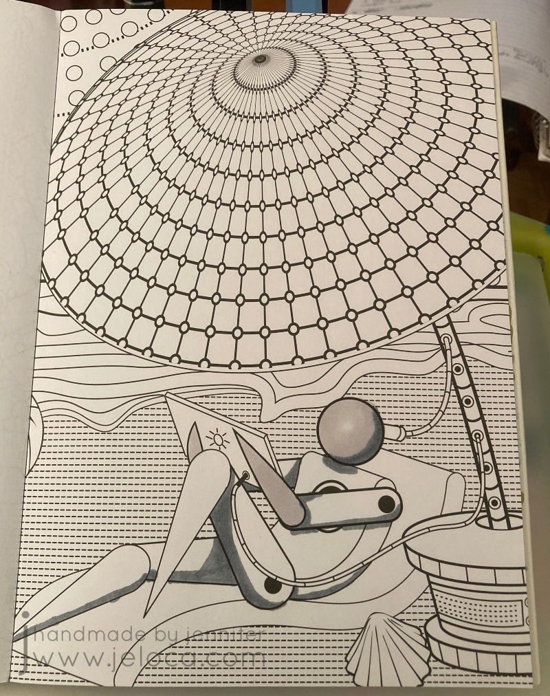
Finally, step 5 (the 4th step in the video/post) is to add textures to your page. I chose to use this telescope page for a very specific reason: it would give me a chance to practice with this texture book I bought SPECIFICALLY to help me color more realistically.
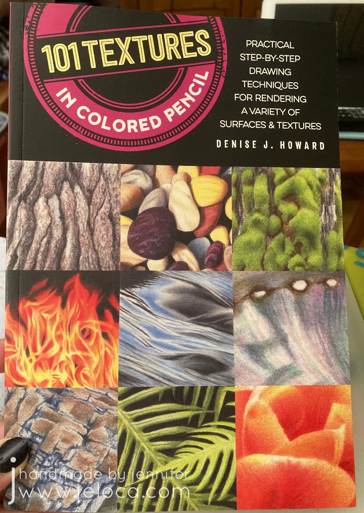
The book is fantastic, showing you how to replicate each texture in short, step-by-step blocks. The only problem was it didn’t include brass, which is the look I’d wanted for my telescope. D’oh! (It has hammered brass, but that’s not quite the same thing). I could have used the references for silver or pewter and simply changed the colors, but instead I decided to find a reference image.

I could not find any telescope images in an upwards angle like the coloring page so I made one myself! I found a sample image of the exact antique brass look I wanted to go for, and saved it to my phone.
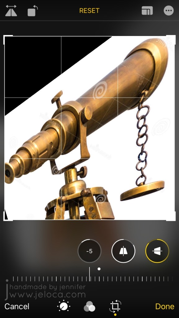
I then used my phone’s built-in photo editing tools to flip it and skew the angle until it was as close as possible to what I needed. It’s not perfect, but it’s definitely close and was a really big help as a reference.

I was really nervous about this one because I had such a specific idea in mind and I’ll admit I was worried I wouldn’t be able to execute it. I almost gave up and was going to pick a page to try out one of the other texture ideas (eye shadow) instead but I’m really, REALLY glad I didn’t. I LOVE how it turned out!
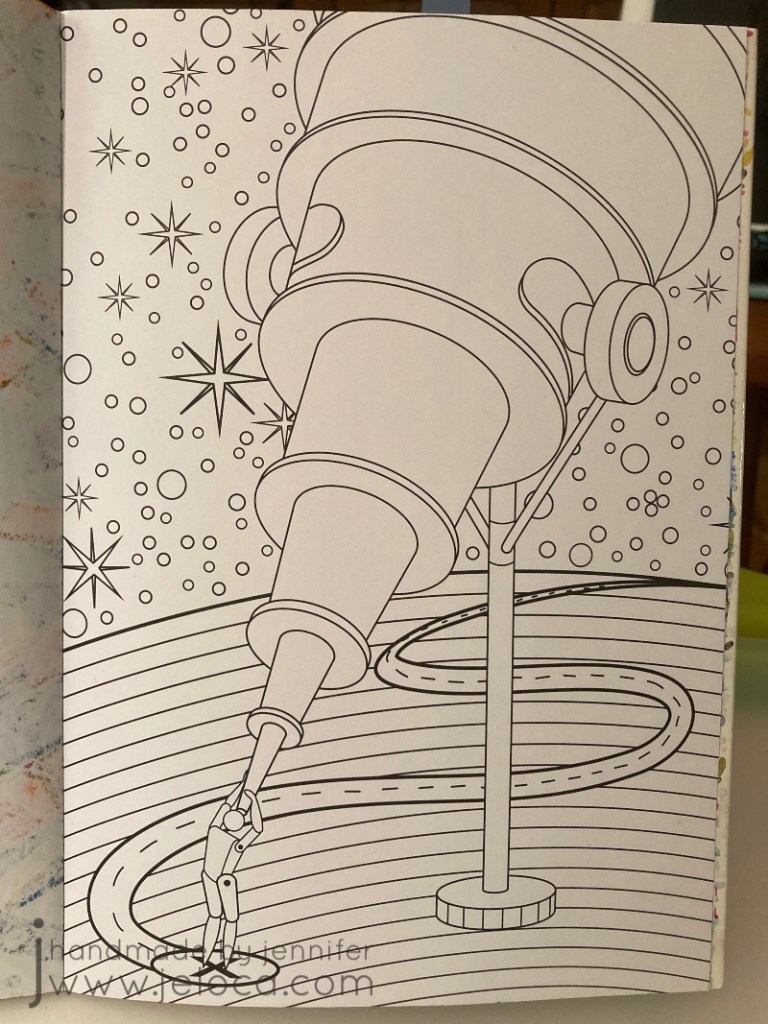
In fact, I was so happy with it that I decided to pull all 5 tips together into this one final image.
I went back to the Color Catalog to find a color palette that would work with the copper/bronze/brass colors I already had, and this one with the bright pop of pink really charmed me.

I really tried to make sure I used all 5 tips in this one. Texture? Check. Adding white? Yup- I added highlights throughout including some shine in the brightest areas of the telescope. Adding black? Oh yes – I added extra lines in diminishing circles in the planet to try and give it a sense of depth, with the lines being more concentrated closer to the viewer and moving further apart the further away they got. Color palette? Sure thing – I used only the colors listed. And finally for shadows I got creative and added the shadow from the telescope, although I wasn’t paying proper attention to the actual shape of the telescope and didn’t do the best job.
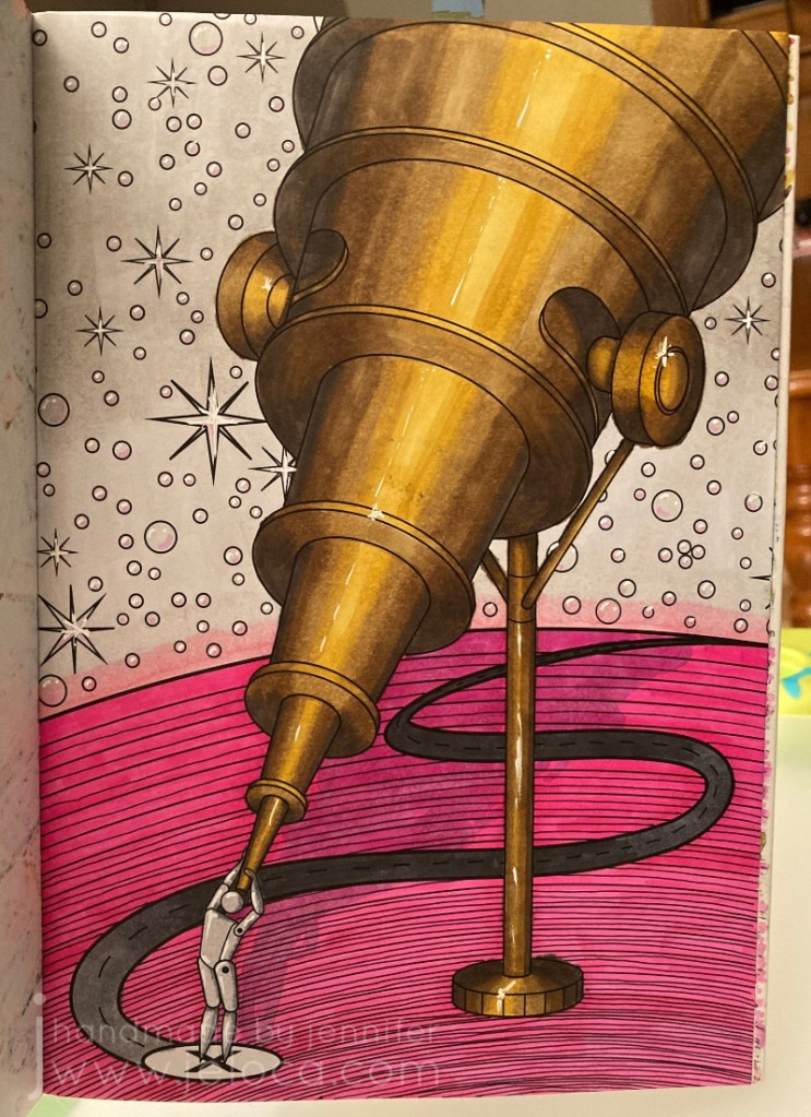
This was the finished result…and I just did not like it. I actually put it aside for a few days to think, because I was so happy with some parts but couldn’t help thinking it looked so incomplete. I debated adding some darker grays to the sky so they’d still be in the same family as the palette, but wasn’t sure I wanted that look. I was stumped. I’d followed the rules, and yet I wasn’t happy with the result. So what did that mean?
It meant that sometimes, it’s ok to break the rules. There are no coloring police! Plus Sarah’s tips are just that – tips and suggestions on how to improve your coloring results, that you are free to incorporate (or not) but they’re not hard and fast rules. She’s not saying “this is the ONLY way”, she’s saying “if you’re stuck, why not try this? It couldn’t hurt, and it might help!” And they did.
And not being limited meant I could come back to it later and add completely new colors into the background, to give it a sort of galaxy look that I didn’t even know I wanted until I’d achieved it and it was just perfect.

I went over the original gray with two shades of purple, blending them together where (I imagined) the planet’s light met the night sky. I also blended the main purple into the pink halo off the edge of the planet. I then traced over every start and (bubble? pearl?) with the white gel pen to remove their black outlines, and deepened the telescope’s shadow and refined it as best I could.
I am SO happy with the finished result! I’m really proud of this one, and really, really glad I embarked on this challenge.

I’m really glad I took the time to go back and rework something I wasn’t happy with. This makes me feel excited and hopeful about doing more coloring and testing and learning. And having gone through this exercise I can now pinpoint which areas need more refinement, and seek help for those things specifically (like improving my shading!!).
I think this was a great project to start off my year. If it’s something you might like to try for yourself, here are the links again to Sarah’s video and blog post. She’s got a TON of other videos and posts, and whether you’re a beginner, average or expert colorist, if you’re interested in adult coloring I definitely recommend checking her out.


Pingback: The Color Cube |