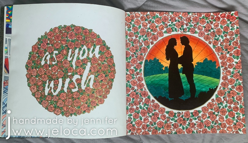
Today marks The Princess Bride movie’s 35th anniversary!* I wanted to do something special for this final post of The Princess Bride Month so I started and completed a brand new set of pages in The Princess Bride coloring book. Nothing is more iconic than Westley’s famous “as you wish” line, so when I turned the page after my current WIP in the book and saw this double-page spread I knew it would be perfect to close out this month’s theme.

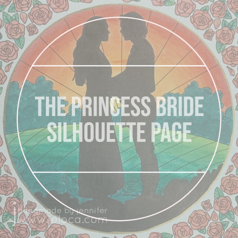
I instantly knew I wanted to put a sunset behind Buttercup and Westley and color their silhouettes in solid black. I wasn’t sure, however, if I wanted to mirror the sunset on the hills and have the lightest shades in the center, or if it would look better with the lightest greens to the front and the darker ones in the back.
I decided to pull a trick from my knitter’s handbook and swatch them! I took a clear image of the page and brought it into the Procreate app on my iPad so I could have a digital version to work with. Using the Apple pencil I roughly blocked in the black silhouettes and a quick sunset. I knew I wanted the bushes on the horizon to be dark as they would be backlit, so scribbled those in too. Then I copied the image so I’d have two to work from, and colored in the hills on each, reversing the color order. I quickly preferred the version on the left, so saved it as my reference sketch.
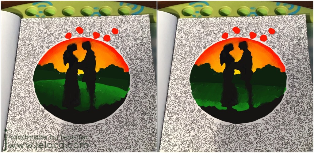
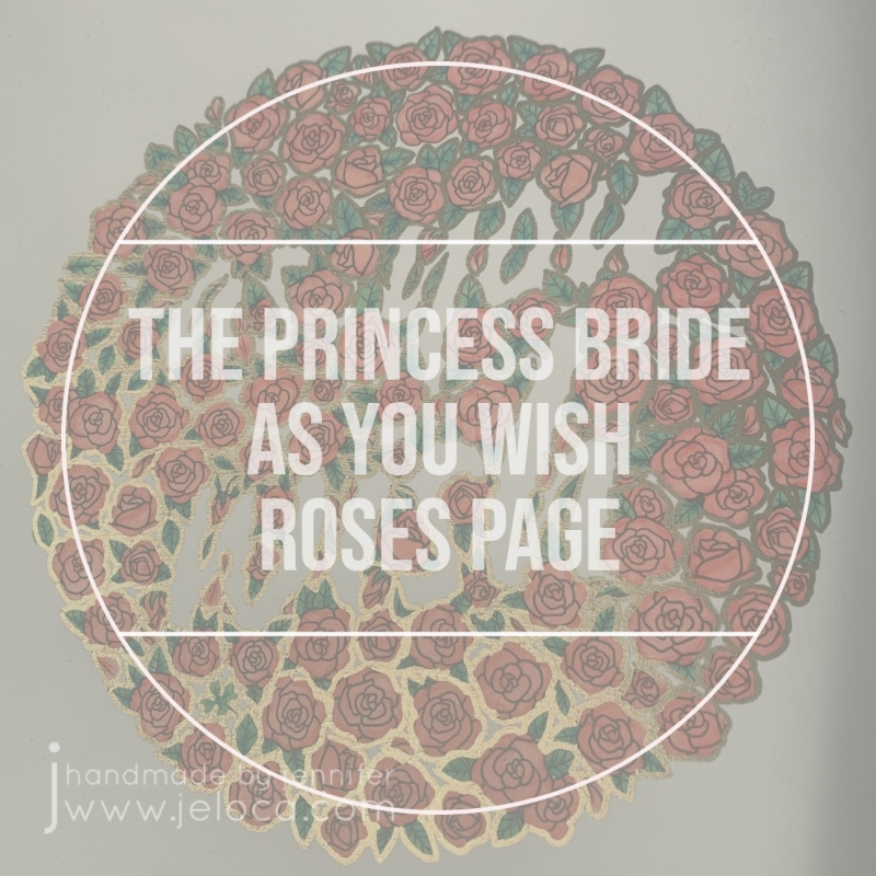
I’d also had the idea of possibly filling in the entire background of the roses page, so decided to test that too. I’m so glad I did as it would have been a TON of work and I really didn’t like the results. I’d also debated outlining the roses in gold and playing with the digital version allowed me to see that I DID like that, all without touching the original coloring page.

With the colors chosen now was the fun part- coloring the page! The entire double-page spread was colored with 12 Crayola Super Tip markers, 1 black Sharpie and 1 Pen-Touch gold metallic fine point paint pen by Sakura.
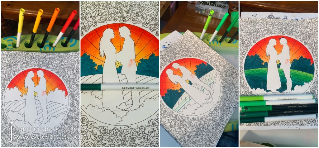
I chose 5 colors that would make a good sunset gradient and filled in the sunset first, blending the colors together.
Yes. I BLENDED the Crayola markers together! There will be a post coming up soon sharing the technique on how I did it, so stay tuned!
Once the sunset was in place I colored the horizon bushes. The same tip that allows the water-based markers to blend also allowed me to work multiple layers of marker to scribble leafy impressions into the bushes. I also used the same color on the foreground bushes just behind the couple.
Then, using 5 greens for the hills, I drafted out where each color would meet and then blended them in the same manner as the sky.

The final step for the page’s focal point was to color in Westley and Buttercup, and the remaining bit of foreground. Adding the black really made the other colors POP and I could not be happier with how the page was turning out.
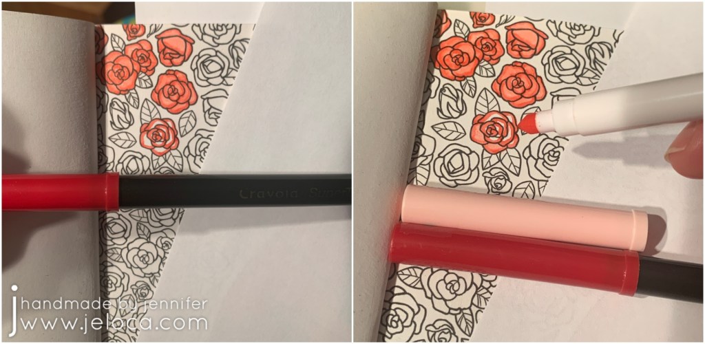
For the roses I started by using the same darkest red as for the sunset, to help tie them together. Every rose was completed in the same manner: first a quick outline over the outer edges of each petal and then filled in the rest with a paler pink marker. The end result, using the aforementioned technique, gives a result similar to that you’d get with alcohol markers, with the red and pink blending together to make a soft gradient.
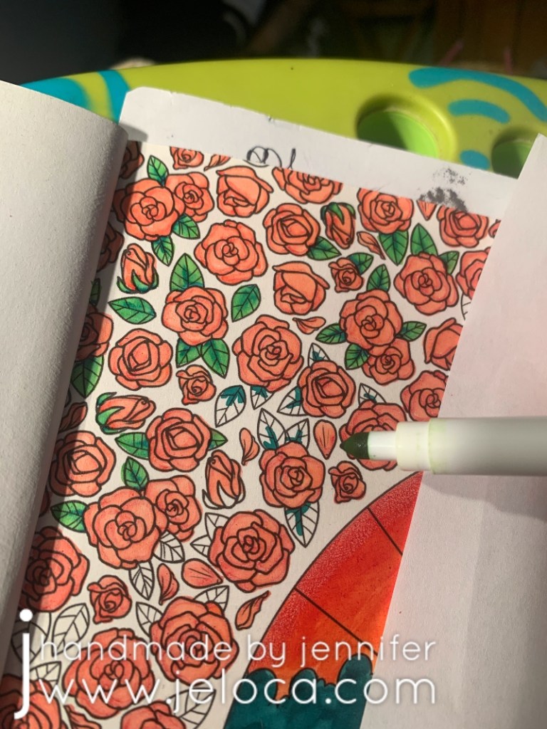
For the leaves I chose the lightest and darkest of the greens from the hills and worked in a similar way as for the roses- first a quick hit of dark green along the spine and lower edge and then blended it out with a light green to fill in the rest of the leaf.
It was repetitive, but easy, and soon enough all the roses and leaves on both pages were complete.
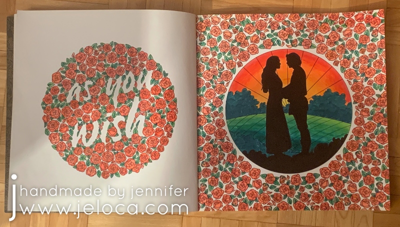
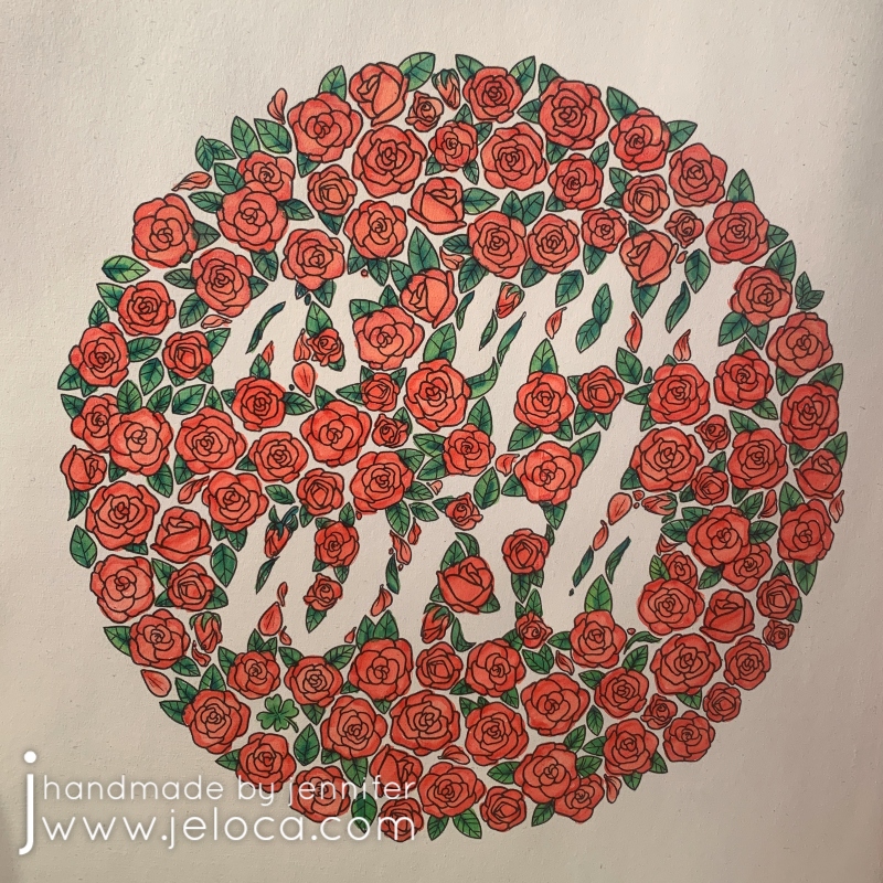
This was the spread at that point. I quite liked it but it felt a bit unfinished. My initial idea was to color the entire background of the left page in black, but as the lettering is created by the voids between the roses the words would have become black as well and I didn’t really want that.
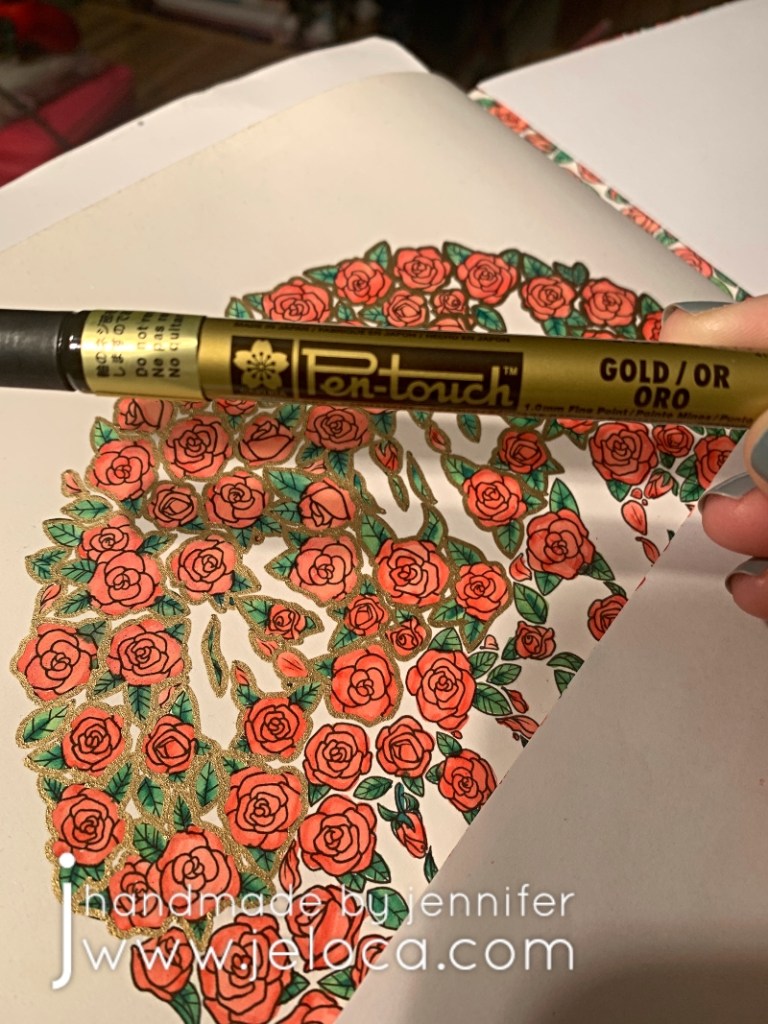
Thanks to my digital sketch I knew I liked the idea of a gold outline around each rose. It wasn’t quite filigree but gave me similar “gold-edged china teacup” vibes. I have a few sizes of Pen-Touch markers and the fine (1.0mm) point was perfect for this step.
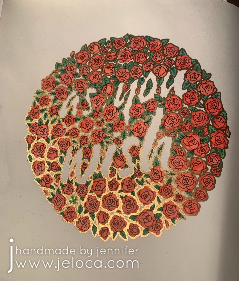
The gold outline was the exact finishing touch it needed. When viewed directly (as the upper right of the page) the outline almost looks like a bolder black, throwing the wording into higher contrast. When viewed from an angle (as in the lower left) the metallic gold really shines and gives the romantic, antique feel I was going for.

To further tie the two pages together I added a gold outline to the circle using the same marker, and then both pages were complete.
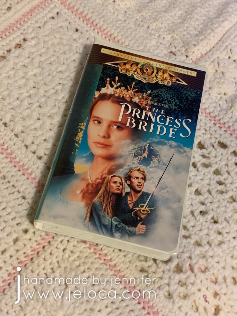
I’ve reviewed the quality of this book before but wanted to add one more time what a joy it’s been to work on. This movie has been a family classic since my childhood, with us spending many nights watching it by the fire, and all of us able to recite it nearly by heart. I’ve loved it enough to own the movie…
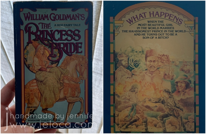
…the book…
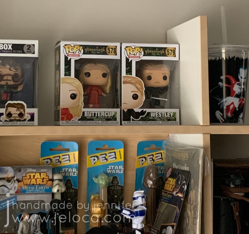
…and even the POP figures.
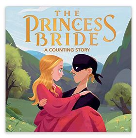
My siblings’ kids even have the baby counting book!
I hadn’t known the coloring book existed so it was a real treat to receive from my brother for Hanukkah a few years ago. Not only does it hit my nostalgic feels but the paper quality is great, the images are a great mix of stills and graphic prints, and it holds up very well to a variety of media and can support mixed media. A very high recommend!
And finally, as the final bonus Princess Bride fact: When the weather was particularly cold, André the Giant would place his giant hand over Robin Wright’s head, covering it entirely and keeping her warm. (Source)
*According to most online sources