Most popular during the height of the pandemic, Among Us is back in the spotlight again thanks to one of the opening scenes in Glass Onion – the fantastic sequel to 2019’s Knives Out. Even Game Theory is “amongst thou”* with the trend so I thought it was the perfect time to share this easy fondant DIY on how to make your own set of colorful crewmates.
As I’ve said so often before I love to start with a template. It’s best to know exactly what size you’re working with so I measured the diameter of my cupcake tin and made sure to fit my crewmate sketch into the available space.
The crewmates are distinguished by their distinct colors so this is a great opportunity to use up leftover bits of tinted fondant from previous projects! With the exception of black which I’d purchased pre-tinted, all my other colors started as white fondant and were tinted with either Wilton gel pots or Americolor squeeze gel colors.
Each piece was cut out with my fondant knife, making sure to flip the template halfway through so some crewmates would be facing the other way.
Yes- you can cut them all the same way and then flip some later. I find that there’s a slight bevel on the cut edge whereas the table-side edge is usually more sharp. Both edges are equally good as the “up” side and so I wanted to be able to use either, depending on how they looked once dried.
After cutting out all the crewmates I made a second template for the visor and cut out one for each little guy. I also cut out a little yellow Post-It to copy one of the game’s “hats”.
After the fondant pieces had air-dried for a day or so I traced the outlines with an edible-ink black marker.
This is how they all looked once traced. I let the ink dry down for a few hours so it wouldn’t smear during handling and then assembled the crewmates using a bit of water and a food-use-only paintbrush as “glue”.
Here’s how they looked complete with my hand for scale.
The little guys are now ready to go on a cake, on cupcakes, or anywhere you’d like! Henri’s 12th birthday was during the pandemic so I went the cupcake route for easy, non-shareable portions for a lunch with our family bubble at the time.
I prefer to add my toppers after the icing has crusted slightly so they won’t leech color from the fondant and risk bleeding edges. If you find the toppers won’t stay put a drop of water in the center will do the trick!
Today’s post will walk you through step-by-step on how to make this cake featuring the Master Sword from The Legend of Zelda video game series.
I’m a huge Zelda fan and the love for the series has been passed down to Henri with a vengeance! In addition to dressing as Link on Halloween and poring over game art collections he plays all the games from Link’s Awakening on my old Gameboy Color straight through to Breath of the Wild on the Switch. It’s on the BotW Master Sword specifically that he requested I use as the theme for his 11th birthday cake.
This is the Master Sword:
And this is the sword in the game:
I decided to use this image as the inspiration for my cake. The sword itself would be sculpted out of fondant and I’d expand the stone base so there would be enough cake for his birthday guests.
The cake took a total of 3 days to make. On Day 1 I sculpted the sword so it could have time to dry out to lessen the chances of the fondant dissolving under paint application. On Day 2 I baked the cakes for the base and set them aside using the methods I outline in my How to Bake a Cake and Prepare it for Decorating post. On Day 3 I painted the sword and the base. Note: you can absolutely merge Days 1 and 2 into one evening if you’d like.
Keep the excess scrap as you’ll need it to sculpt the details.
As a long, skinny piece of fondant this size would be fragile I used a clean, splinter-free wooden dowel as a support, leaving enough at the base to secure it into the cake.
Then I used the excess fondant and began blocking in the sword’s details. As you saw in the finished cake it would remain flat so I only had to sculpt the front half.
I used the template for the basic shapes and then referred to a clear online image to get the details right.
At this point I set the sword aside to air-dry.
Here’s how it looked the next day.
Here it is alongside the template. It did grow a bit as I sculpted additively but I knew the slight size increase wouldn’t matter with the final cake.
Pleased with it, and deciding it didn’t need any adjustments, I let it continue to harden and baked the confetti cakes Henri had asked for.
On Day 3 it was time to assemble and decorate!
I had 2 8″ square cake layers to work with. To achieve the triangular base I cut the first layer into two triangles by removing the center strip, ensuring that one triangle was slightly shorter than the other. I repeated the process with the second cake making each subsequent triangle shorter than the previous one. This design does leave extra cake that you can eat or make into cake balls with any leftover icing.
Note: always check your transport method! In my case I couldn’t simply cut the first square diagonally to achieve my largest pieces as the resulting triangle would have been too high to fit into my cake carrier!
I used a bit of icing to “glue” the cake to the carry board and then began to stack the cakes horizontally, icing in between to keep the layers together.
Yes- that IS Betty Crocker icing in the background. And yup- this is totally a Betty Crocker Rainbow Chip box cake. There is zero reason why a box cake can’t be done up the same way scratch cakes can. Whether you’re short on time, find the mixes cheaper or easier, or if you’re simply baking for a bunch of 11yo boys who won’t know or care about the difference then by all means go for it! I do generally doctor my cakes so the cake mix winds up more as an ingredient vs the main staple, but that’s absolutely not necessary to get great-tasting, great-looking results.
Once stacked I protected the board surface with parchment paper strips and dirty iced the cake, then covered it with more white fondant. Then came the fun part- poking, scratching and dinging it with an assortment of knives and sculpting tools to give it the texture of an old weather-beaten rock.
I put some wax paper strips down to protect the board again and then painted the “rock” with custom icing gel colors. I have a large collection of Wilton gel pots and a kit of Americolor icing colors and I like them both equally as they fill in color shades I don’t have in the other. The gel pots of the Wilton kind are great for dipping in a toothpick for a really tiny amount, while the Americolor ones are in squeeze bottles that make adding precise drops really easy – perfect for when you need to replicate a color you’d already mixed up.
I used an assortment of browns and yellow thinned with vodka for the main color, adding darker touches for shadows and age. I also dry brushed green shades around the base and edge as if grass or moss had started to encroach similar to how I indicated forest-y age on the fondant bricks in the Pitfall: the Lost Expedition cake.
Bringing up another reference on my iPad, I used the same supplies to paint the sword, adding in a bit of silver luster dust for the metallic portion.
The luster dust mixes nicely with a bit of vodka to become a metallic “paint” that dries down well once the vodka evaporates.
I used gold pearl dust in a similar manner for the gold accents and completed the rest with blues and green gel colors.
The last bit of prep is to cut out a small bit of the fondant so the sword fits nicely into place and then the cake is done!
Here’s a closeup of the cake “rock”. I love how the texture came out!
My only regret is not having smoothed the underlying cake surface better, as you can see the ridges of where the fondant curves around the cake layers…but the kids sure didn’t mind. It was a huge hit for the birthday boy and his friends.
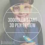
Today is National Technology Day so it’s perfectly fitting to share this product review of the 3Doodler Start 3D pen. This is not a technical review – so if you’re looking for filament info or product specs you’ll have to look elsewhere. This is strictly a child-user review and to spoil the end right at the beginning – we love it.
The 3Doodler Start + Essentials kit includes the rechargeable pen unit, a USB charging cable, as well as an assortment of filament sticks. It also includes an instruction book with a very unique feature – the paper is treated to make the softened plastic NOT stick to it. As such you can follow one of the many tutorials in the book by literally tracing the provided illustrations and your new 3D “print” will lift right off the page.
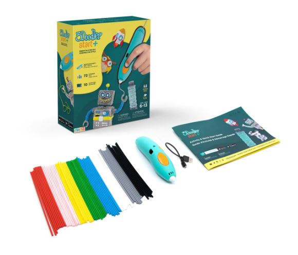
We wanted to start by trying it out on something small so Henri traced this skull’s little bow.
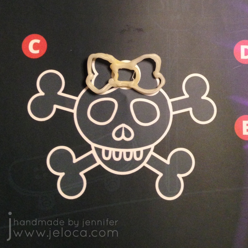
I then followed their clear, graphical instructions to write my name and turn it into a standing decor item.
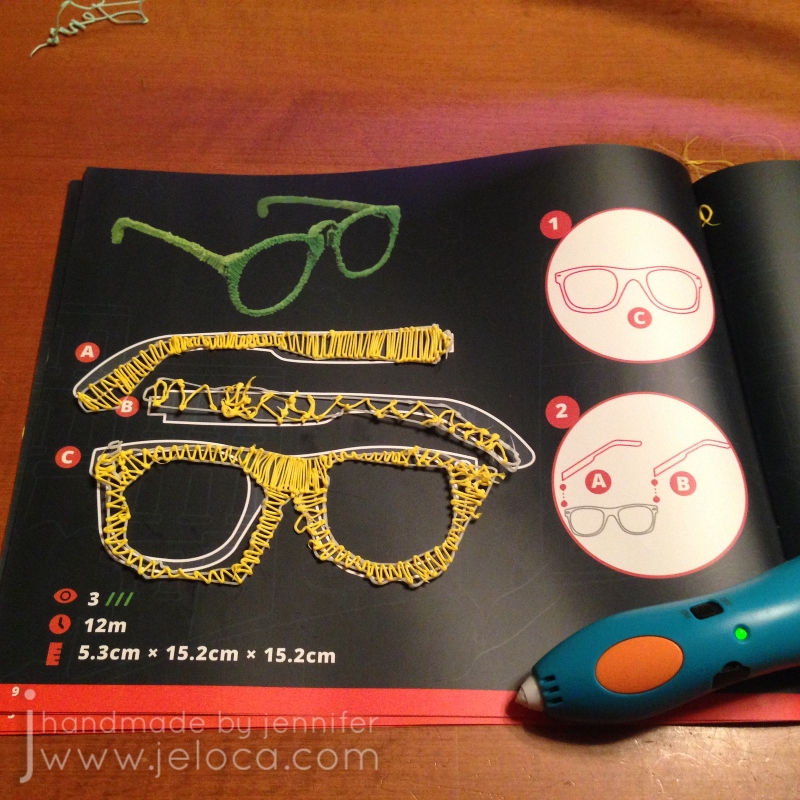
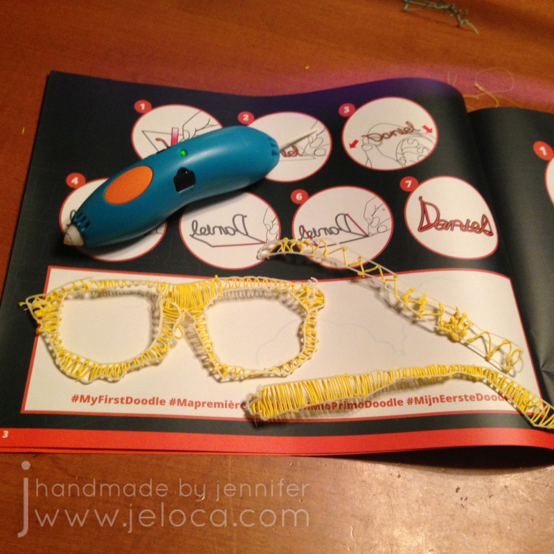
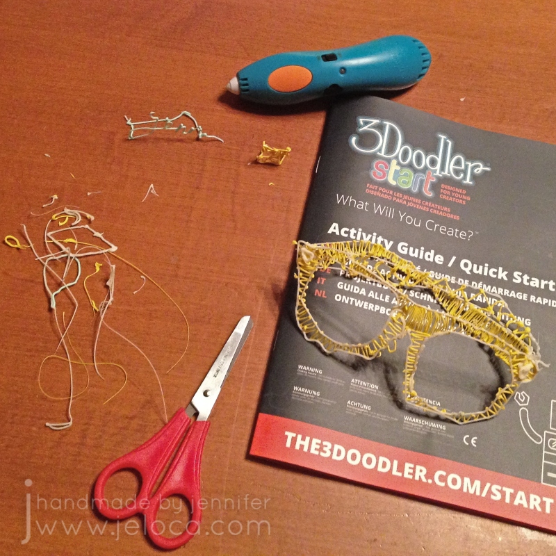
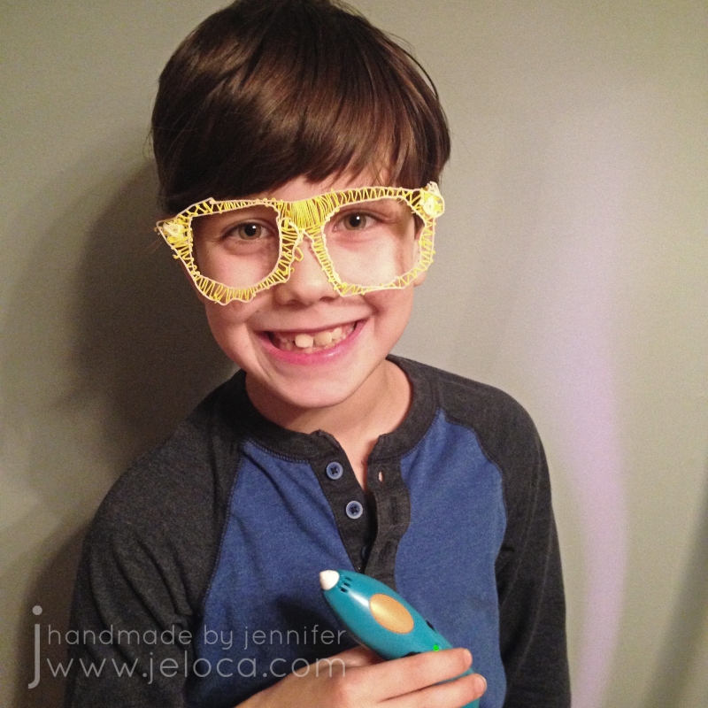
At that point we both felt confident enough to tackle one of the real projects: these 3D glasses.
I traced the outlines of each piece with the light aqua filament and then we switched to yellow and began filling it in, taking turns between Henri and myself.
Before long we had all 3 pieces traced and filled, and since they don’t stick and solidify almost instantly they were able to be handled right away.
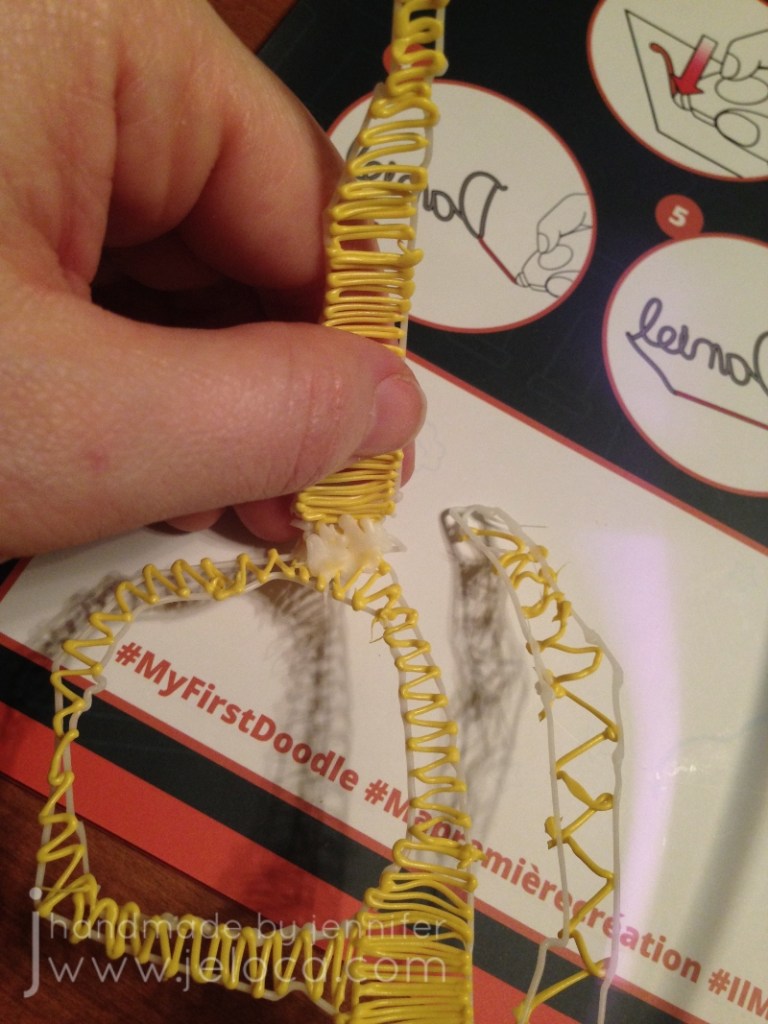
We used a bit more filament to join the arms to the front of the frame…
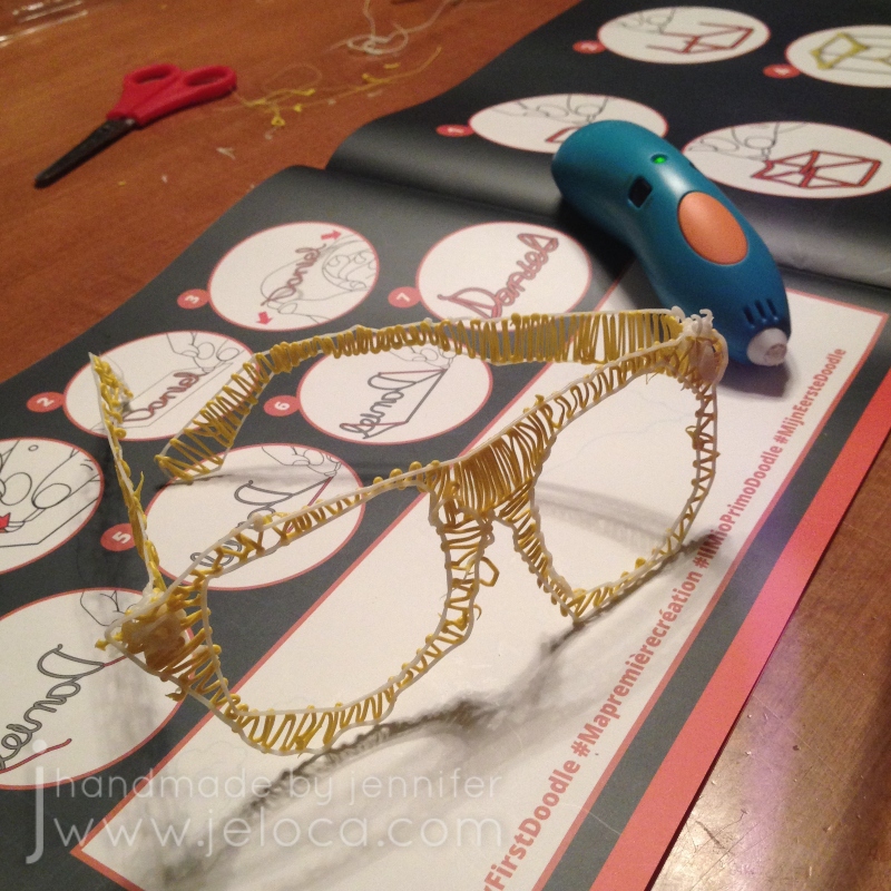
…and then we had a complete pair of glasses!
It was such a fast, easy project that really got Henri excited about the possibilities.
Just like when using a glue gun, the 3D filament can leave trails as you stop or switch colors. These trails are very easy to snip off with a regular pair of scissors and after playing around for a while on the projects we had very little filament waste.
Henri was SUPER proud of his creation and couldn’t wait to make more things.
Long-time readers of this blog might be a little confused now, since Henri looks a little young in this pic. In fact I first shared this pic in this post, back in 2017. It’s true – Henri will be 14 on Sunday and this pic was taken 6 years ago right after he received this gift for his 8th birthday. So why am I posting this review now, alllllllll these years later?
Because he still uses it and it still works JUST as good as on Day 1. It’s true! Most toys, and especially most electronic toys, don’t hold up to long-term wear and tear, but the 3Doodler start is in semi-regular rotation around here and it’s still working great. We have a bunch of 3D “printed” items around the house, from a heart that he made me for Mother’s Day 2-3 years ago to a solid 1″ cube/die to an automated vehicle he’s been working on here and there during school breaks using an add-on motorization kit. A few times now he’s even used it for some minor household repairs!
Not only is the pen still actively being sold and supported but you can also still get filament packs in all kinds of colors, including solids and variety packs. One fun thing we like to do is to use page protectors as “drawing” surfaces so we can put images or text inside to trace or use for inspiration. You can even get cases to hold your pen, charger and filaments to keep them compact and portable!
All in all we both agree that the 3Doodler Start is a great entry-level 3D pen for kids or adult beginners to allow you to experiment with 3D creations without breaking the bank. Plus, it’s durable, allowing us to use the same one without issue or repair for almost 6 years now.
This post may contain affiliate links. This means I might make a small commission on purchases made through the links, at no cost to you.
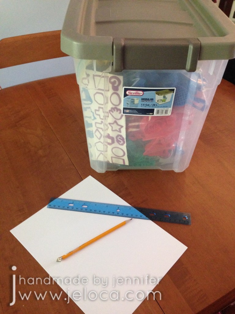
If you’re home during the holidays and are looking for a kid-friendly and fun craft activity for your family, this boredom-breaker I came up with a few years ago could be just the thing. It’s quick and easy to set up and can be done with nearly any supplies you have on-hand.
What you’ll need:
paper
Any writing surface will work: computer paper, cardstock, construction paper, even the back of all that wrapping paper from holiday gifts. We used cardstock.
something to trace
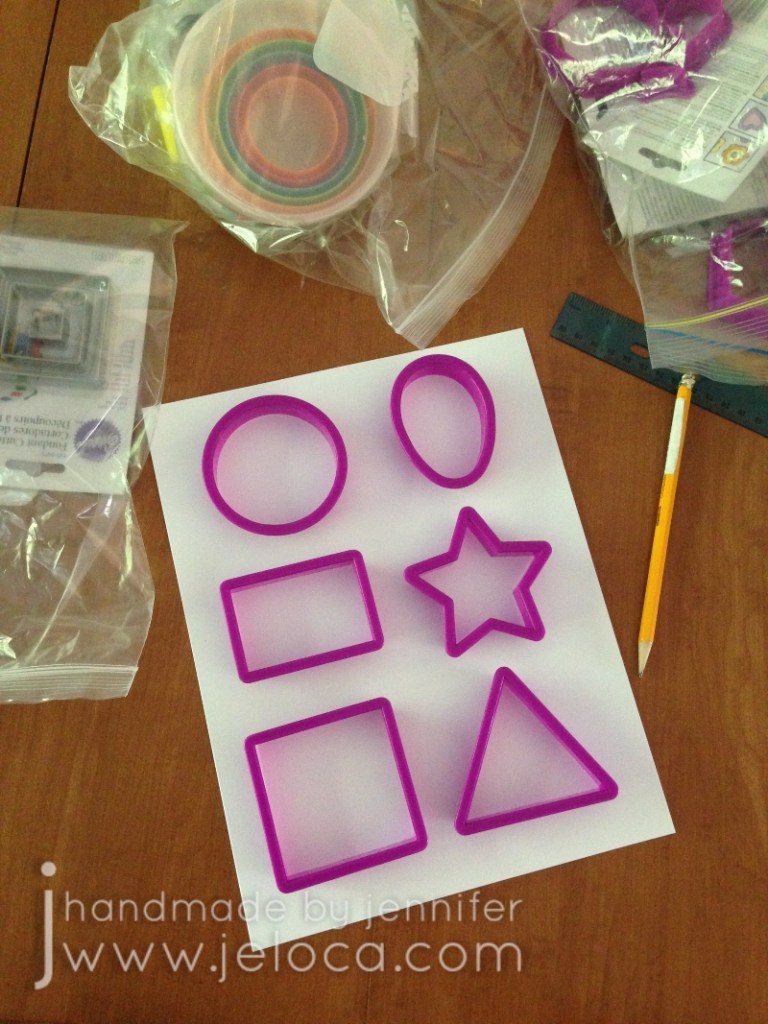
This is perfect for using the cookie cutters you pulled out to bake holiday cookies. Use simple shapes like we did or have fun and find unusual ones! If you don’t have cookie cutters you can get creative and trace tissue boxes, tape rolls, erasers, little toys, etc… We used the shapes from a large assorted set like this one.
something to trace with
Anything you have on hand! We used a pencil.
something to draw/color with
Once again anything you have handy will work. Crayons, markers, colored pencils…even ballpoint pens will work just fine. We used Crayola Super Tips.
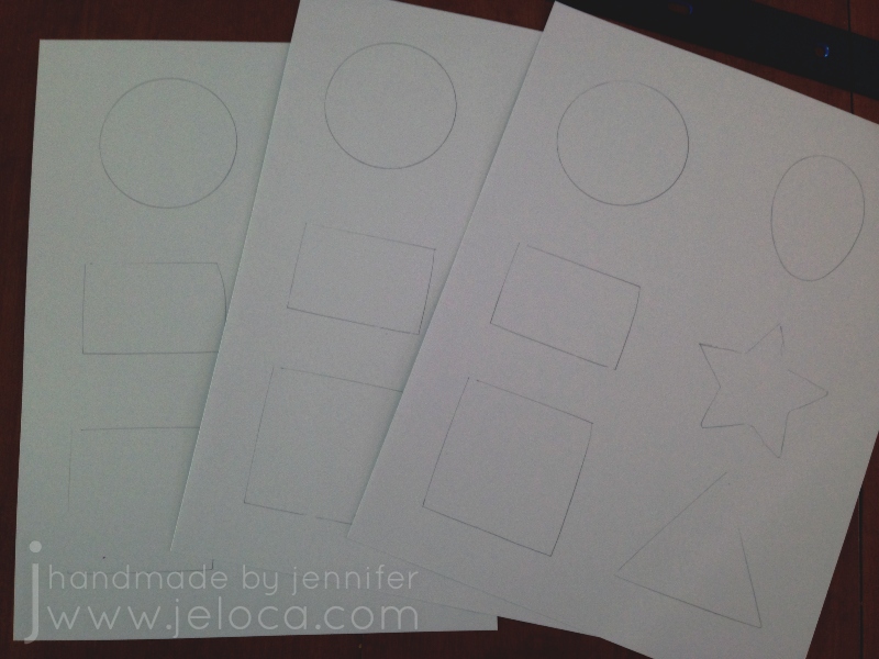
Start by assembling your materials. I used a ruler to divide our pages into even sections but that’s unnecessary.
Figure out which cutters (or household objects) you want to trace and lay them out in a pleasing manner on your paper of choice.
Trace the objects and repeat so you have one set of tracings for every child or adult participating.
That’s it! That’s all the prep work you need! The goal of the game: be creative and turn each traces shape into something new.
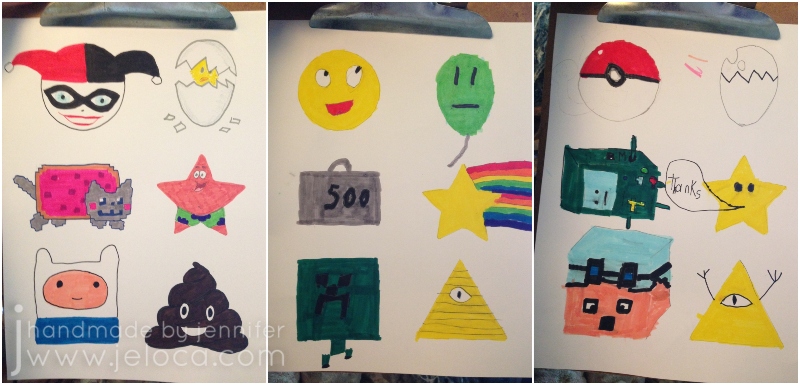
It was fun to do and kept the kids occupied for ages while they tried to “out-think” the rest of us and come up with the most unique, original ideas. (Though as you can see from our sheets they managed to think themselves right into some similar outcomes!)
There’s no desired outcome so you can have fun and see where your kids’ (and your own!) imaginations run. In our case we ended up with:
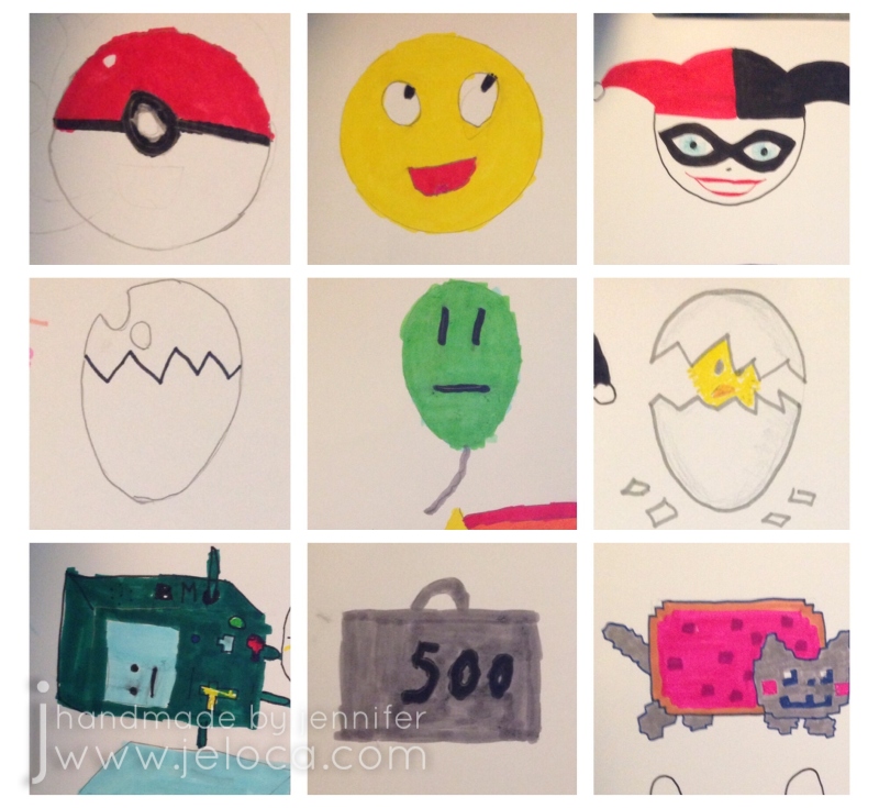
Circle – a Pokeball, an emoji, Harley Quinn Oval – an egg, an unimpressed balloon, a chick hatching Rectangle – Adventure Time’s B-MO, a 500lb weight, Nyan Cat
Star – a Mario Bros star, a rainbow shooting star, Spongebob Squarepants’ Patrick Star Square – DanTDM’s Minecraft avatar, a Minecraft Creeper, Adventure Time’s Finn the Human Triangle – Gravity Falls’ Bill Cipher, another Bill Cipher (or general Illuminati reference lol), a poop emoji
Hopefully this easy coloring “game” can inspire imagination in your family like it has in ours.
Happy holidays!
This post may contain affiliate links. This means I might make a small commission on purchases made through the links, at no cost to you.
A few months ago I posted a version of an Angry Birds cake where Red was created by shaping the cake and using icing for the different colors. Yesterday was Rovio’s Bird Day so it’s a perfect time to share this alternate version where the character is created using fondant.
This is an easier method for those who aren’t comfortable cake sculpting. I also find fondant is more forgiving and easier in fixing mistakes than icing, though that’s a personal preference.
Step one is to make the cake topper out of fondant. I use fondant toppers on a lot of my cakes (ie: Elmo, CARS, Charlie & Lola, Neko Atsume, Super Smash Bros) because I love the flexibility of being able to prep the topper in advance so I’m not rushing the day before the cake is due.
This cake uses a template to make a cut fondant topper. You can find my full tutorial here.
Once the cake is ready all that’s left is to place the pre-made fondant pieces onto the cake.
I love how simple character-topped cakes can have a big impact by giving the birthday child exactly what they want without breaking the bank on supplies or causing unnecessary stress.
Like many others, my mother got really into puzzles during the pandemic. So when Hanukkah rolled around the boys wanted to give her a custom puzzle as a gift. Being a maker I knew we could make one ourselves, and here’s how we did it. With 3 weeks left until Hanukkah and even longer until Christmas you’ve got plenty of time to make a custom gift for the puzzle lover in your life.
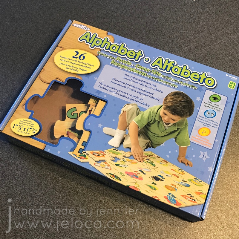
To get started you’ll need a puzzle to customize. We wanted a wooden one to be sure it would hold up to being painted then colored. We found this one at our local Dollarama but there are a number of good options on Amazon. You can get a 4-pack of flat puzzles or go for a cube style and make a custom puzzle with multiple images!
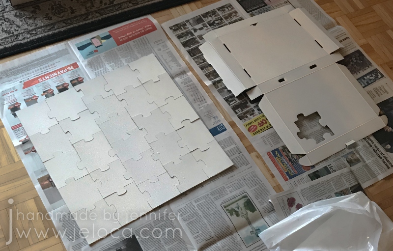
Assemble the puzzle over a drop cloth or protective surface. If your puzzle has a gift box or lid you’d like to decorate as well, open it flat. Our box simply unfolded; if yours is glued together you can ease it apart and re-glue it later, or prime it in sections.
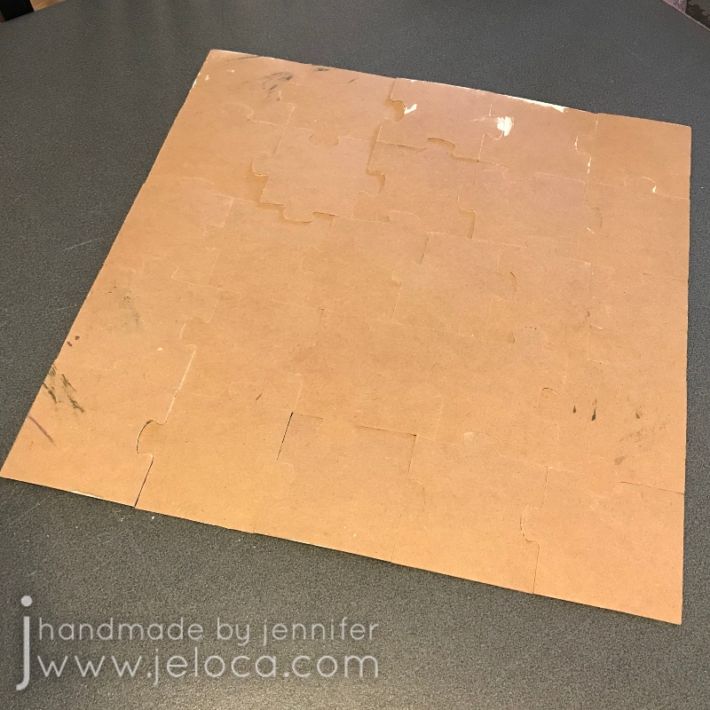
You have two options for primer – you can go with a spray primer option like we did, or you can use white gesso and foam brushes and paint it on instead.
Use light, thin coats of primer to get a solid, even coverage. If spraying indoors like I did make sure your drop cloth covers ALL nearby surfaces. (My black dining room chairs now have faint white stripes…oops!).
Once the primer is fully dry you’ll want to disassemble the puzzle and lightly sand the edges of each piece. This will ensure no primer dripped down which could prevent proper assembly later.
Put the puzzle back together and you’re done! You now have a blank, white puzzle and box ready to customize however you’d like.
From this point it’s no longer a tutorial as there are unlimited ways you could decorate your puzzle, but I’ll show what the boys did for their grandmother.
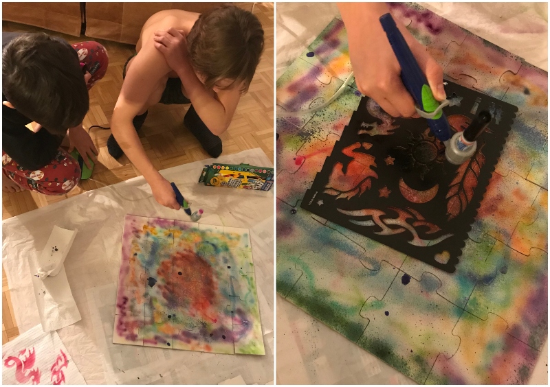
They used the Crayola Air Marker Sprayer Airbrush Kit. I’ve got a full review of the airbrush coming soon but spoiler alert – it’s great! It comes with a few markers in the box but we’ve found that it’s compatible with all Crayola markers that have the same barrel size, so I picked up this pack of 16 Crayola Pip-Squeaks washable markers so the kids would have extra colors to choose from. They worked perfectly with the airbrush and washed off all hands, clothes and my plastic protective cloth.
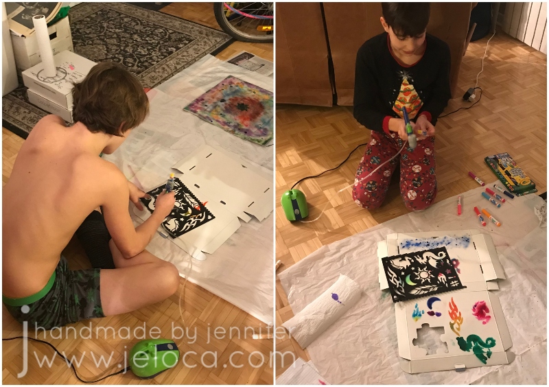
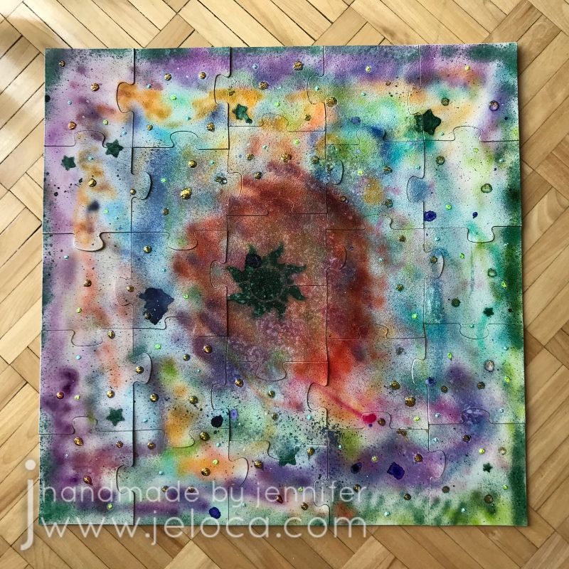
The boys took turns adding colors to the puzzle and then used the airbrush kit’s included stencils to add little details like the stars and sun.
The primer does keep the water-based marker ink from absorbing as quickly as it would into paper, so it’s a good idea to let it dry fully before handling. While ours was drying the boys took turns decorating the gift box.
They had fun testing out the different stencils and playing with color, and then we let everything dry further.
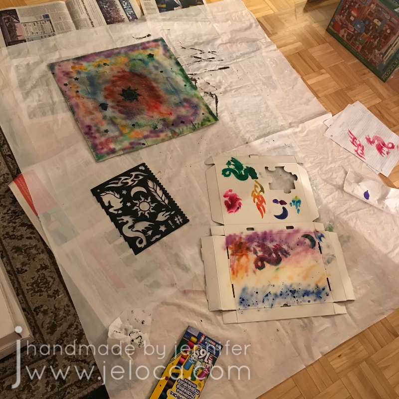
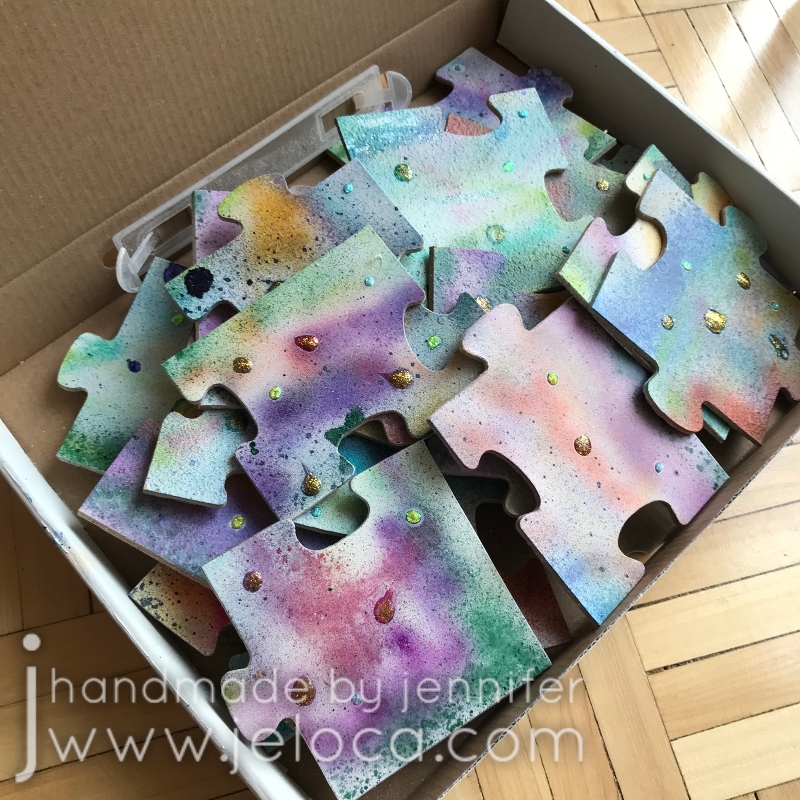
The final step for the kids was to use glitter glue to add sparkle to the puzzle, and then let that dry as well.
A combination of the puzzle fitting really well together and the primer filling any residual cracks meant that there was no bleed-through of the primer or marker spray onto the back of the puzzle.
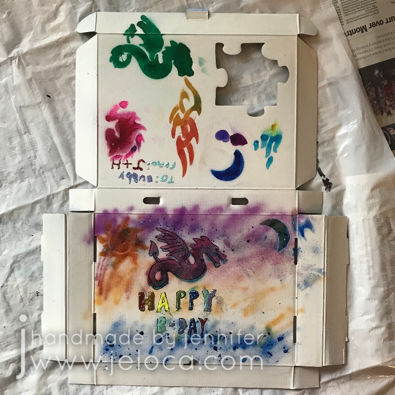
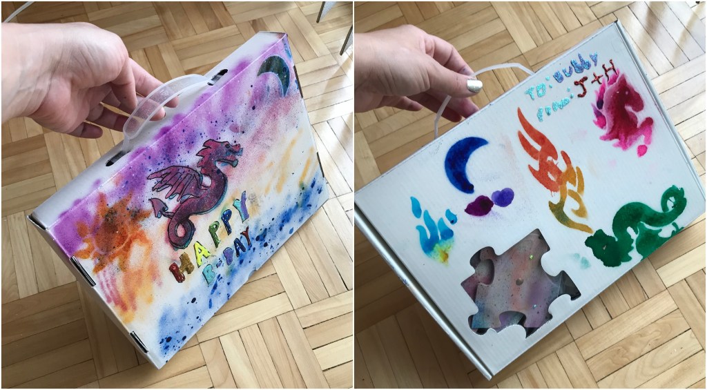
They added more glitter glue to the gift box and a few extra details like a birthday message and some outline work.
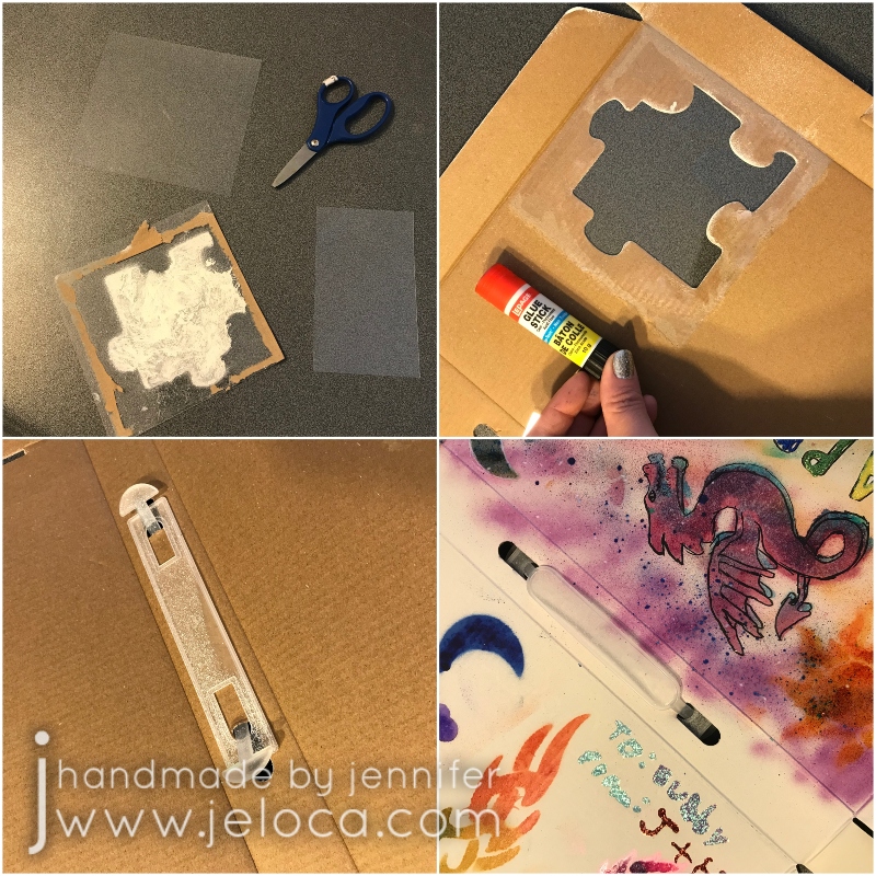
I’d accidentally left the plastic window on the box when spraying it so I cut a new square of plastic from some leftover packaging and glued it into place. Then I put the plastic handle back onto the box.
With that the boys had a completely unique gift for their puzzle-loving Bubbie.
There are SO MANY ways you can customize your own puzzle! These can be painted, colored with markers, watercolor, colored pencil, or even decoupage with tissue or thin paper (and then re-cut the puzzle shapes with a sharp blade). You can even play with the texture of the primer you use, like giving a waterfront scene sand medium for the beach and texture medium for the lapping waves. The possibilities are truly endless.
This post may contain affiliate links. This means I might make a small commission on purchases made through the links, at no cost to you.
November 15th was National Recycling Day and I thought it would be fun to share some toy accessories that you can make by recycling materials you have on-hand.
This all started back when Henri had received a Zhu-Zhu Pets toy hamster for Hanukkah one year. It wasn’t long before his “pet” needed to have its own house and so we adapted a shoe box into rooms with a garage.
Of course every home needs furnishings and that’s where these projects came in. According to Henri there was a bedroom, kitchen and living room, so I tailored what I made to that, but you can easily adapt any of these little projects to your rooms of choice.
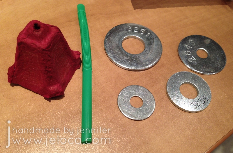
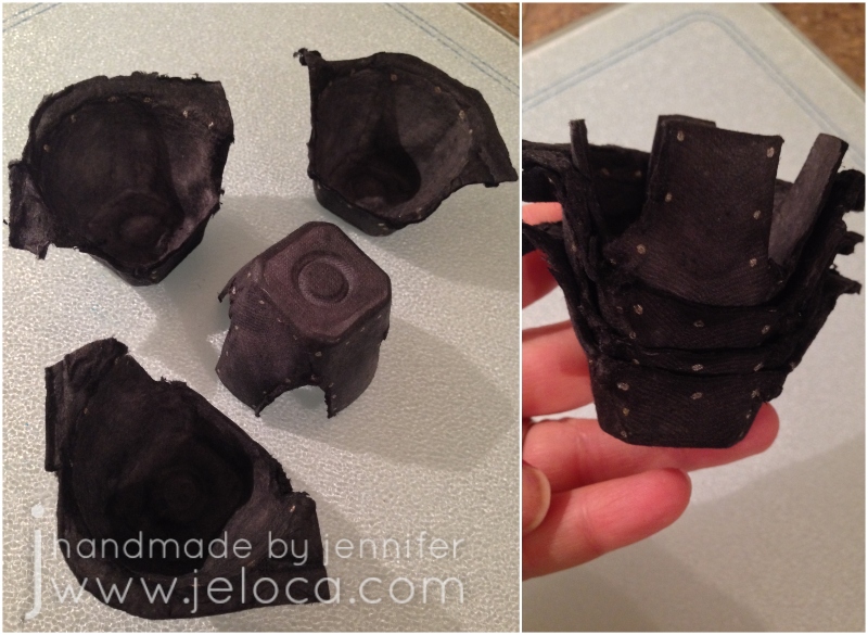
The first recycled materials to be used were an egg carton and a plastic bendy straw. Cut out sections of the carton to create different types of furniture.
The cups that hold the eggs became armchairs (when the upper rim was kept on 3/4 of the edge) and a table (when flipped upside down and trimmed to have legs).
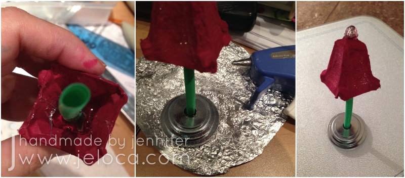
Two of the flat base of the egg cups were cut out to become vessels for food and water, and finally the divider piece that separates the eggs was cut out to become a lampshade.
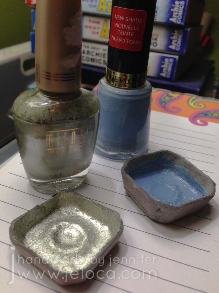
One of the cup bases was painted silver to become a serving plate and the slightly deeper one had the inside painted blue to appear like water. To make the most out of using what I had on hand (pun intended!) I painted them both with nail polish!
The lamp shade was painted Henri’s color of choice with regular acrylic paints and then set aside to dry.
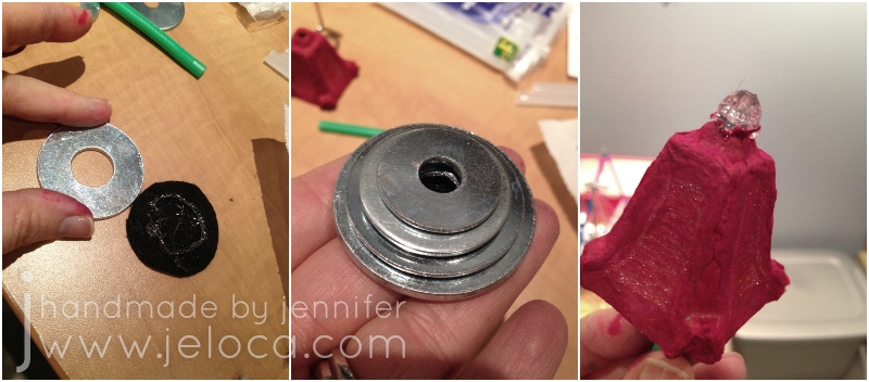
Once dry it was time to assemble the lamp. You need a base that’s sturdy and heavy enough to support the weight of the shade. You could use wood blocks, a little box filled with rice or sand, or anything else heavy enough. I used a few spare washers I found in my toolbox.
I cut a felt circle for the base and hot-glued the washers on top in descending size order, making sure to keep their holes lined up. I also glued a decorative bead to the top of the lampshade.
The shade was filled with hot glue to set the straw in place and then more glue was used to attach it inside the tower of washers.
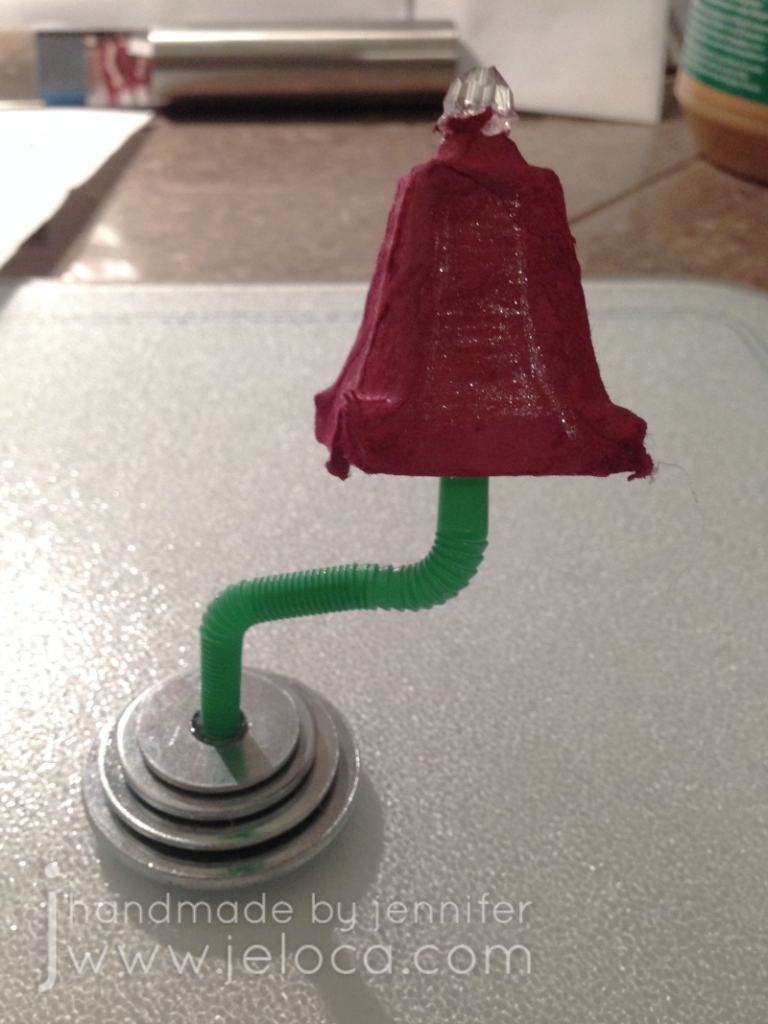
With that, the little hamster’s living room lamp was complete!
The bendy bit of the straw was a nice touch, allowing the lamp to be angled wherever the little guy needed.
The silver platter received a coat of clear nail polish to seal it and the water bowl was filled with more hot glue to look full.
To make the pretend food for the hamster takes only three supplies – a pool noodle, fabric paint, and scissors.
That’s right – all these little pretend foodstuffs are actually squishies! They’re really easy to make: simply cut pieces of the pool noodle foam into the general shape of the food item then use fabric paint to make them look like their respective foods. A toothpick comes in handy instead of a paintbrush when working at such small sizes. I scaled my foods to the size of the egg carton “plate” and made (clockwise from top right) pepperoni pizza, chocolate chip cookies, donuts, a cheeseburger, and a chocolate cake.
The food storage bin was made from plastic canvas and yarn scraps.
First I made a base large enough to hold all the food. The lid is the same size but less deep, and the faux latch is simply stitched on top. The lid was sewn to the base all along the back edge but I used the same gold yarn as the latch to embroider 2 fake “hinges”.
The living room furniture was painted black and copper “studs” were added with a paint pen. One neat thing about using the egg cups is that the furniture will stack which makes putting it away after playtime that much easier.
Finally the hamster’s cardboard box bed was upgraded to one with a full headboard and footboard, and painted with gold glitter paint.
I used scraps of white felt and stuffing remnants to make a mini mattress and pillow, and leftover sock yarn knit up quickly to make a colorful blanket.
One evening of crafting and by morning the hamster had his house completely tricked out. Henri was really excited to set everything in place and added more to the decor by painting a rug in the living room and even drawing a TV on the wall!
Bonus – I wanted to take some current pics to show how well these little accessories held up after 6 years and we thought it would be really cute to include Jakob’s REAL hamster for scale. Here’s Dusty enjoying a little nap…
…and here he is foraging in the snack box looking to see what other treats there might be.
These were such simple, quick and easy DIYs to make and became playtime accessories that were loved and used over and over, AND held up incredibly well over the years. I hope this post gives you some ideas on how you can recycle items from around the house and give them new life with a new use.
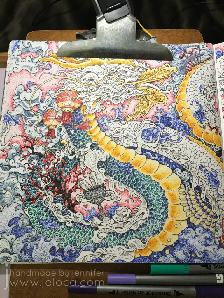
In celebration of today being “Circle Day“, I’m posting the process of coloring the Chinese Dragon page in Kirby Rosanes’ Mythomorphia coloring book.
Can you tell why I’m posting this today? Look closely – every single drop of color in this image is created with a tiny circle. That’s right- over the course of the entire month of November 2018 I painstakingly tapped markers to the page to color in the whole picture with teensy little dots.
(The glare from my mini clip light makes for a bad photo but was a fantastic way to help see all the millions of dots without going cross-eyed!)
Of course a project of this scale requires fineliners and so I pulled out my pack of Soucolor markers. Not only do they come in 100 colors but while one side has a fantastic brush tip, the other has a 0.4mm fineliner tip, making these markers great for coloring books and perfect for this attempt. (Note: I own these same markers by two different brands. The Soucolor ones only seem to be currently available in sets of 34 but they are completely identical to this 100-count set by Feela that I also use regularly.)
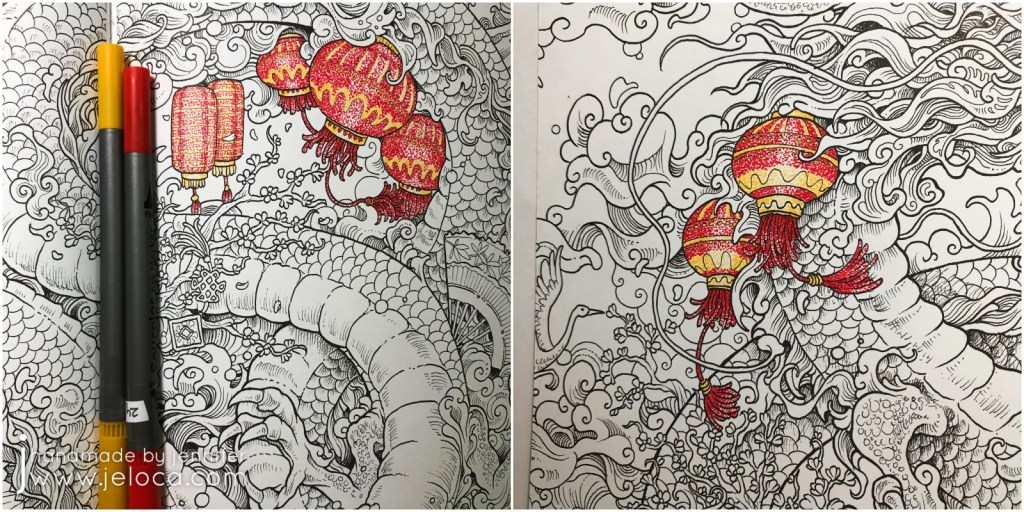
The best way to start a project like this is simply to just begin, so I found a small, contained shape in this lantern and began to tap individual dots of red and yellow, I worked tighter groupings of dots anywhere I wanted to create shading, like in the vertical ridges on the lantern above.
I then found the other lanterns in the image and dotted them with the same two colors, creating patterns and stripes for more interest.
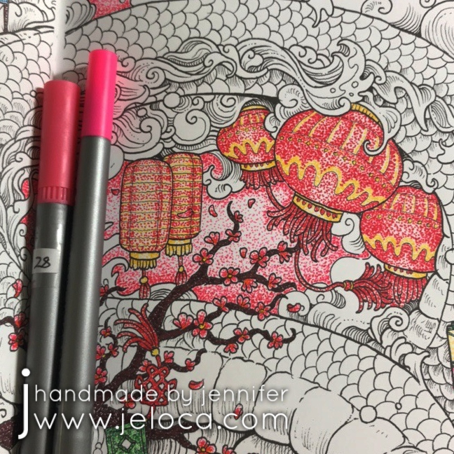
Next I used a brown marker to fill in both areas of cherry blossom branches and two shades of pink for the cherry blossom flowers and blowing petals. I completed the jade charm in the center of the above image and then used the original red and yellow to begin the firecrackers at the bottom.
It’s very peaceful to tap out little dots and then step back and have a complete shaded area of color and to then watch the whole image come together in the same way.
After finishing the fireworks I wanted a change of color so hopped over to some lotus flowers, then a koi, and then a decorative fan.
More fans followed. I’d noted what colors I’d used where so it was easy to have the fan’s cherry blossoms match those of the larger image. I then completed the little temple area in the upper right and the sword just below.
The pewter-look goblet was next, followed by the porcelain china.
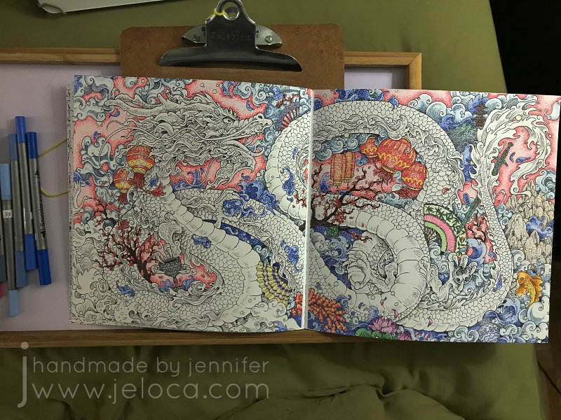
Sometimes, when pages are as busy as this, it can be difficult to tell what’s what. For example, I found myself needing to decipher if some curls were clouds or waves. To help visually distinguish individual sections I decided to begin filling in the background. I used two shades of pink and darkened the edges around each icon so that it would have a nice contract against the planned colors for the dragon, clouds and waves.
As background areas were completed and it was easier to pick out clouds vs waves I used different shades of blues and grays to fill in each section.
I moved around the page in this manner, working first the pinks, then blues and grays. If I wasn’t sure yet what a random swirl was then I would fill in the areas around it until it became clear.
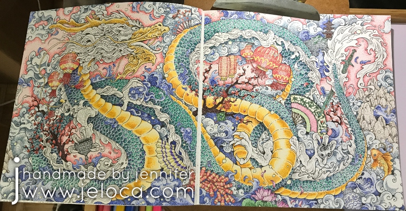
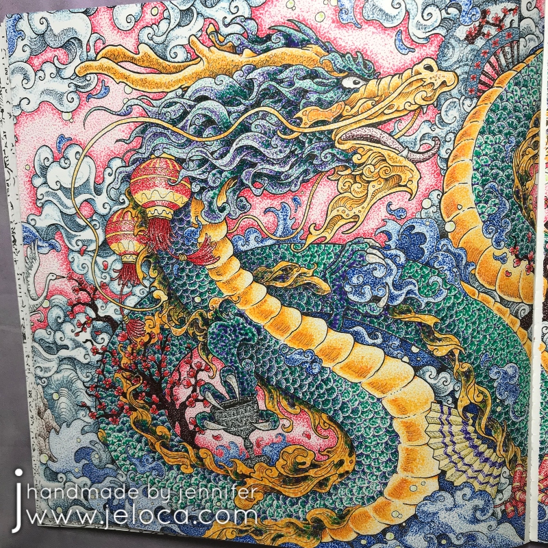
I kept going, making more itsy bitsy dots, until the entire background was complete leaving only the central, most important image of the page: the dragon.
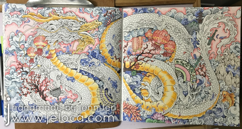
For the dragon’s belly I selected two colors that give a golden effect when worked together – a coppery-orange for the darker areas and a ocher-y yellow for the lighter. Each segment was worked with the orange first (as you can see in the upper left) and then finished with the yellow.
I took a video of the process for a closer look:
After completing the belly I used the same golden colors for the dragon’s face and whiskers.
Then I moved on to the dragon’s scales.
I wanted to give him an oil-slick look with purple reflecting to green, so used those shades in tighter and looser groupings to indicate shadow and reflection.
Here’s another video showing a close up with more detail on how the scales were done (above).
Eventually all the scales were done and the dragon was SO CLOSE to being complete! All that remained were the frilly bits along his body, tail and face.
To keep things cohesive on such a busy page I used the same yellow, orange, purples and green and filled in the sections more densely to have deeper, richer sections of color.
And with that, the coloring is complete!
This project was SO much fun to do even though it took SO long to complete. There was something incredibly satisfying about working on each small bit at a time, tapping dot after dot, and then backing up to see how the image all came together.
Kirby’s designs are great for a project like this because there are dozens of self-contained little sections and he includes just enough shading detail to give you a guide to follow.
This post may contain affiliate links. This means I might make a small commission on purchases made through the links, at no cost to you.
This award-winning horror movie came out in 2017 and featured a 90s-style game played by a gang of unassuming teens. Unlike Jumanji the consequences of playing this game are a LOT more gruesome and bloody. It also happened to be produced by one of my dear cousins, and he asked if I could make the cake for their wrap party.
This is the “Game of Death” gameboard as seen in the movie:
And this is my cake replica:
With Halloween just around the corner I thought it was the perfect time to share exactly how I made it!
The first step was to get a few good quality images of the prop that I could use for reference.
I was also asked if I could make a gluten-free option so there’d be something for those with intolerances. I was given a few reference images of the deaths and other props being used and when I saw that one character met an untimely end with a broken baseball bat I knew that would be something I could easily sculpt out of gluten-free puffed rice cereal.
While there were a lot of steps in making this cake it only took 3 days from start to finish. I’m going to break down everything but to avoid this being incredibly photo-heavy I’ve grouped the images of each step together.
The first step for all of my cakes is to sketch out an idea. Knowing I needed to transport the cake I went out and bought the largest cake board that would fit in a cake box I could find locally. That let me know what total dimensions I had to work with. That allowed me to size out my cake pans and figure out what would work best for the game cake. I then scaled a clear, top-down view of the game board to the appropriate size and traced it out so I could have an accurately-sized template.
I tried to do as much in advance as I could, as some of the parts would need time to dry or cool. The next task for day 1 was to make the gameboard’s window pane. I’d been asked to write a congratulatory message to the cast underneath, and while I could have simply written the image on a slab of fondant and set it in place I was determined to see if I could make the “glass” too. While browsing my local bulk store I noticed these clear candy mints and thought they’d be perfect!
I crushed the candies in a plastic bag using a meat mallet and then slowly melted the candy powder in the microwave until they reached a soft, pliable stage. Since I had a scale template I was able to test my cookie-cutters to find the right size and then trim off the excess with a kitchen knife. Once my “glass screen” was ready I set it aside to cool and harden.
Still on day 1 I rolled out some white fondant and made the center skull, all the minis, and the curved bits that line each player spot. I also cut out a base to put under the glass screen so I would have somewhere to write the message. Using a fondant roller and mat was really convenient as the roller has level guides so the pieces were all of equal thickness and the mat has measurements built right in.
I then made a large batch of gluten-free puffed rice treats and sculpted them into the two halves of a baseball bat, ensuring they would fit properly on my cake board. (Another benefit of having a scale template!).
The final thing I did on day 1 (not shown) was to bake the actual cake. I was given free reign on flavor and picked vanilla as it would work best with a special request I’d been asked – could I make the cake bleed when cut. I followed my usual methods and baked a bit of extra batter in a mini cake pan as I wanted to test the bleeding effect. I didn’t want to take a chance on the actual cake just in case it didn’t work so this little tester would be perfect.
Day 2 began with making edible fake blood. The best recipe I’ve found is to mix up chocolate syrup (like for chocolate milk) with clear corn syrup and a bit of red food coloring. Adjust the ratios until you get a consistency you like. In a subsequent cake I made a thicker version that is more realistic but for this cake I deliberately thinned it a touch so it would be able to be runny when cut.
I cut a well into my test cake’s bottom layer and iced it carefully so the “blood” wouldn’t soak into the cake itself. I then added the top layer and iced the whole thing and waited a few hours to be sure no red tint seeped through to the exterior. Then my kids helped me cut it and test if it worked:
It did! I was really excited knowing I could add additional wells into the real cake for an even more horrific effect.
I then painted the baseball bat treats with chocolate candy melts. Using a mug warmer was the perfect way to keep the candy warm long enough for me to get both pieces fully coated.
Then I wrapped each half with white fondant leaving the matching edges broken and torn to simulate where the wood would have splintered when the bat snapped in half. I used my fondant detail cutter to fray the edges further and add more realism, and then painted the fondant to look like wood. I’ve used this technique before and have a full tutorial on how to do it here.
With all the accessories and add-ons ready, day 3 was where it all came together!
I leveled my cake and torted it into 3 layers. These cake levelrs make it so easy to divide a cake into multiple levels evenly! The first layer was placed down on a round cake board and then iced, and the second layer was applied. I used a cupcake filler to cut a well in the center as well as add additional little surprise blood spots around the resulting ring. I was careful to not put them too close together so the cake would still have structural integrity, as I knew there would be a lot of fondant on top and I didn’t want it to collapse.
I also made sure to keep the cake bits from the corer as they’d come in handy in a minute.
I iced the middle layer, being careful to not disturb the cut edges too much while still evenly coating them in icing to provide a barrier between the blood fill and the cake itself. Then I carefully filled each well with the blood mixture leaving about a half-inch of space and then plugged the gaps with the cake pieces I’d saved. Finally, I iced the underside side of the remaining tier so when it was flipped onto the cake, the icing completely covered the plugs. This will prevent any of the blood from potentially bleeding into the upper tier.
Now that the cake was fully stacked I was able to use my scaled template to trim it to shape.
I then set the cake into place on the cake board, using a dollop of icing to “glue” it down. It was iced and then covered with gray fondant to match the game in the movie.
Then I used my template to cut out a slab of white fondant and used one of the fondant detail tools to trace each of the sections of the board, leaving imprints on the fondant that I could use as guides. I used edible food markers to color in each section, blending them with water when necessary to avoid too many streaks.
The topper was set into place and the edge trimmed with a border of white fondant. I “glued” each of the pre-made bits in place with a bit of water and then finally wrote the game’s logo on the front edge. (It went on all sides in the movie but I didn’t trust myself to write it evenly 8 times!)
The last step was to use a bit of watered-down fondant to “glue” the bats into place and then drizzle them with the fake blood mixture. I added in a few bits of fondant “gore” as an added touch. 😉
With that the Game of Death cake was complete! We delivered it to set on the final day and from the feedback I received it was a big hit!
(And it oozed “blood” perfectly when cut!)
This post may contain affiliate links. This means I might make a small commission on purchases made through the links, at no cost to you.
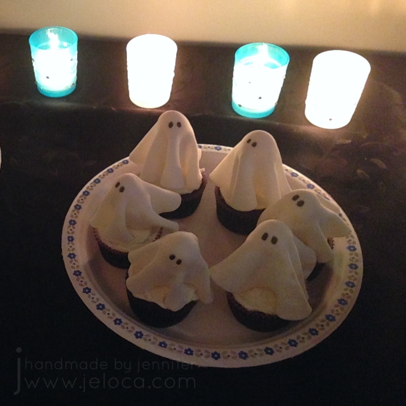
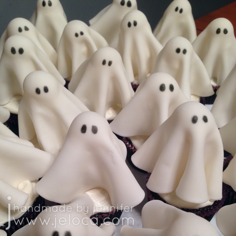
In today’s post I’m going to show you how to make these fast and easy ghost cupcakes, perfect for Hallowe’en!
The sweet treats can be prepped in advance and top homemade cupcakes or you can pick up store-bought cupcakes and throw the whole thing together last-minute.
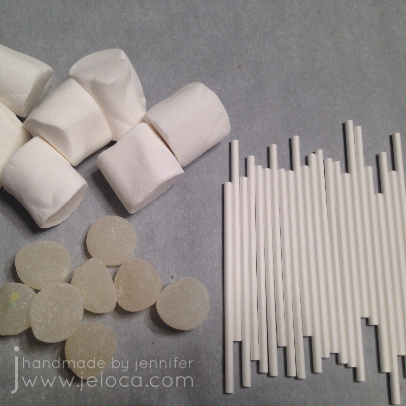
I’d seen versions of this style topper on various sites around the internet and put mine together using the features I liked from various ones, plus added my own twist. These and these have fondant over marshmallows but I didn’t like the square look it gave the ghosts. These and these achieve a more rounded look by draping fondant over lollipops, but as my cupcakes were for a party for adults I didn’t think the lollipops would end up eaten. After browsing my local bulk shop I came up with the idea of topping the marshmallows with rounded gumdrop candies.
You can place each ghost in a treat bag and hand out as-is or use them to top homemade or store-bought cake or cupcakes.
Step 1: Assemble your marshmallows, gumdrops and sticks to prepare the ghost bases
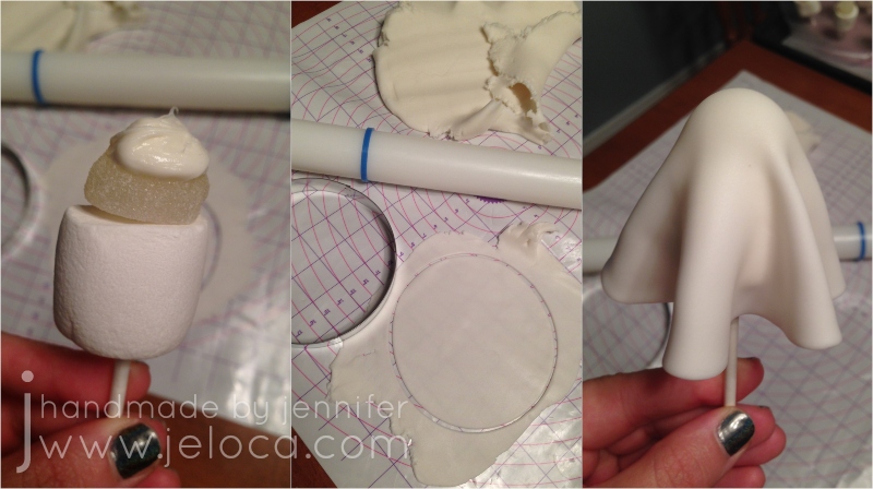
Push the lollipop stick up through a marshmallow and halfway into a gumdrop. You can wet the top of the marshmallow first with a thin smear of icing, clear piping gel or light brush of water to help the marshmallow and gumdrop adhere together, however I found that the tackiness on the stick from being shoved through the marshmallow did not make this necessary.
Repeat until you have as many ghost bases as you need, then set them upright by pressing into foam, flower foam, egg cartons, etc…
Roll out your fondant and cut out a circle with your cutter. I topped each gumdrop with a small dollop of icing so the fondant would stick, but you can also use clear piping gel or water. Apply the fondant over the ghost base, centering the circle over the gumdrop and smooth into place. Use your fingers to crease the excess into ghostly folds. Note: don’t apply too much icing/water/gel or the fondant can thin and tear if it gets too wet.
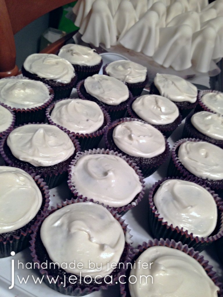
Repeat for each ghost and set them aside in your chosen support so the fondant can set up a bit. If desired prep a cake or cupcakes to be ready for the toppers. I’d baked up some chocolate cupcakes and gave them a thin layer of vanilla icing.
Once the fondant is no longer pliable you can finish off your ghosties by adding black eyes with a black edible marker. You can play around with the eye shape to give them all unique expressions!
Repeat until all your ghosts can see and then set them into your cake/cupcakes (if using). If you are placing them into treat bags to give out as Hallowe’en favors, allow them to air-dry until the fondant sets up.
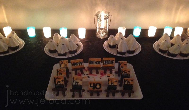
These were served along with the Paint Nite cake and cookies from my last post, and made for a really fun Hallowe’en party treat table!
This post may contain affiliate links. This means I might make a small commission on purchases made through the links, at no cost to you.