All last month I posted completed coloring pages from my 2019-19-WIP-to-FO Challenge. When I looked through the assortment of pages I’d originally posted to see what was finished, I noticed the cover of The Princess Bride coloring book.
Specifically it was the gold banner in the top corner that caught my eye. 30th anniversary hmmm? I was pretty sure I’d received the book about 4-5 years prior so did a little digging and, sure enough it was 5 years ago, meaning that THIS year will be the 35th anniversary since The Princess Bride movie was released!
The official release date seems to vary, with the majority of sites listing it as September 25th 1987, a few listing October 9th 1987, and one saying October 1st. I’m going to go with the majority on this one and officially designate this September as The Princess Bride month! I’ve got a few long-term WIPs that have finally been finished and will be shared over the month, along with a brand new double-page spread that I completed last month specifically for the 35th anniversary and will have a tutorial to go along with it.
The first of these pages (literally, as it is the first in the book!) is the copy of the title page itself.
I was pretty happy with where I’d left off but decided the page needed a background to properly look complete. I selected 4 shades of green and lightly filled in the page with small sections of each color, being sure to overlap them slightly. I then went in with the Prismacolor Colorless Blender (one of my FAVORITE tools) and blended it out. In the image on the right you can see the left half has been blended but the upper right bit has not.
The background came out exactly as I’d hoped – soft, muted and almost velvety! I’m really pleased with it, and find it gave the page the finished look I was after.
With that, at long last, my very first page from The Princess Bride coloring book was complete. All posts referencing this book can be found via the Coloring page up top, or directly here.
Bonus: Every post this month will have a fun fact about the movie. This month’s little-know detail: The R.O.U.S.s were played by grown men in rat suits! One of them got into a fight with his wife and burned down their kennel, so the film crew bailed him out of jail so he could film the Fire Swamp scene. (Source)
This post may contain affiliate links. This means I might make a small commission on purchases made through the links, at no cost to you.
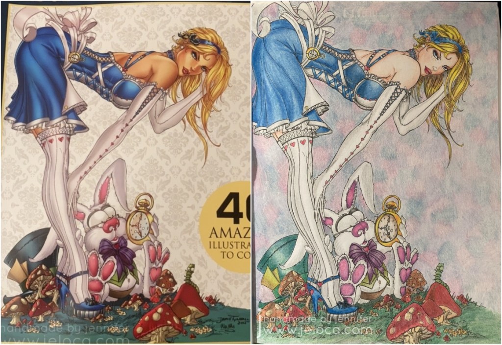
I’d started this page back in 2017(!!) using the cover of the coloring book itself as a reference.
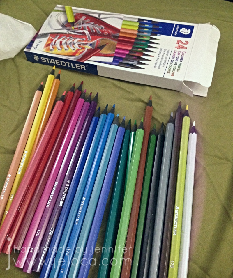
I’d found this 24-pack of Staedtler Colored Pencils at my local dollar store and was curious about how they would compare to more expensive pencils. Would I be able to get good results without paying very much?
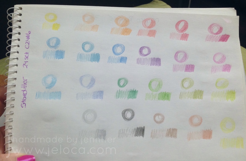
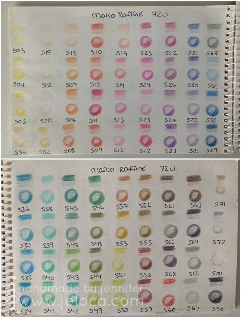
As always I swatched the colors first for my swatch book. They’re very soft and muted, and the swatches remind me a lot of the Marco Raffiné colored pencils I reviewed here.
The pencils have hard cores that hold a point well but the color payoff is not very vivid. Even with a lot of pressure they remain desaturated and soft-looking.
Using light layers I was able to build up some color depth but it wasn’t easy.
What I’d said in my previous challenge post about this page:
As the caption states, I wanted to finish this page primarily so I wouldn’t have to use the pencils any longer.
Once the image was complete I found it lacking without a background but didn’t have any inspiration for what to put. In the end I did soft swirls with pink, purple and blue to fill in the white space.
Start date: November 2 2017
Completion date: January 6 2022
Summary: can you get good results with cheap pencils? IMHO, sure. I enjoy using my other pencils more, but if you’re looking for soft colors, hard leads that will hold a point and have a decent assortment of colors, you could do a lot worse than these inexpensive pencils. I wouldn’t recommend them for professional artists but they’d be fine for kids, school or coloring books with small sections that need good points.
This post may contain affiliate links. This means I might make a small commission on purchases made through the links, at no cost to you.
I still don’t know why I lost interest. Likely it was because so many fun coloring books had come out around the same time and my attention span was fickle 😉
When I resumed working on it I filled in the remaining areas with the same fineliners as well as my set of Feela double-ended markers that have a brush tip on one end and a fineliner on the other.
I added Inktense water-soluble ink pencils at the end for the background, but clearly had not yet figured out how to apply them without leaving streaks, sigh.
I can’t say I’m super thrilled with the final image, though I am quite happy it’s done.
If I were to start it all over again I’d pick a cohesive color palette with the Color Catalog first. Ignoring the larger picture and working everything as individual motifs gives a rather chaotic look in the end that I don’t think I pulled off well.
This post may contain affiliate links. This means I might make a small commission on purchases made through the links, at no cost to you.
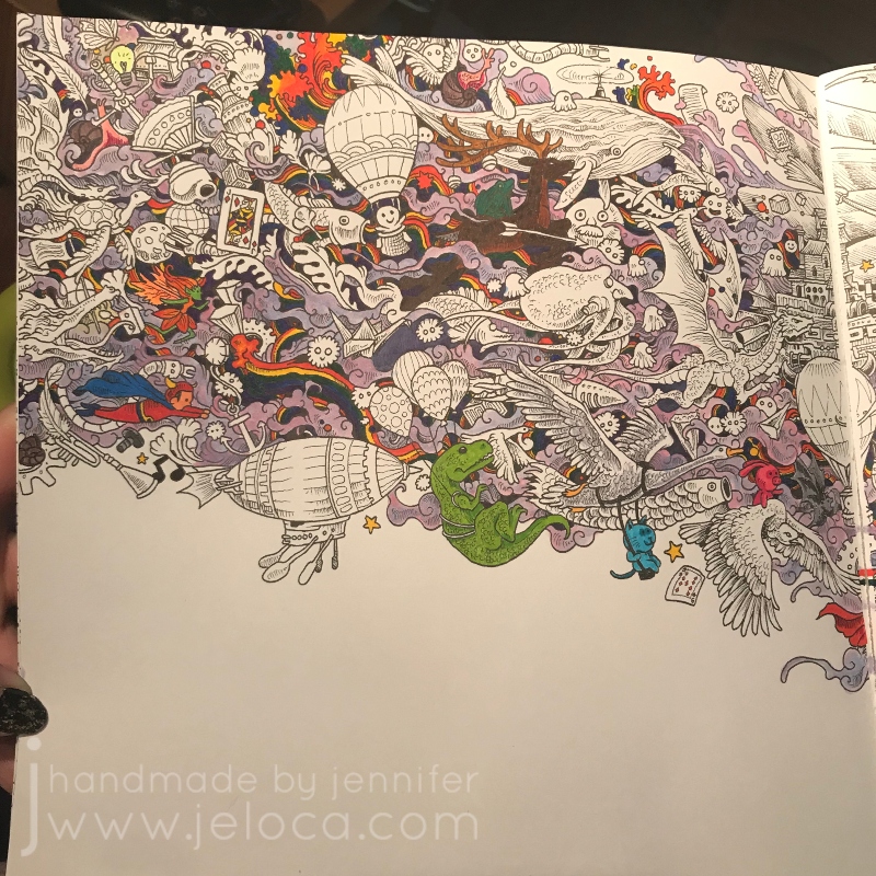
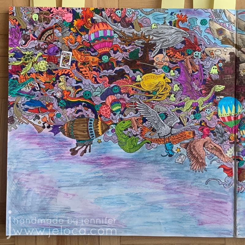
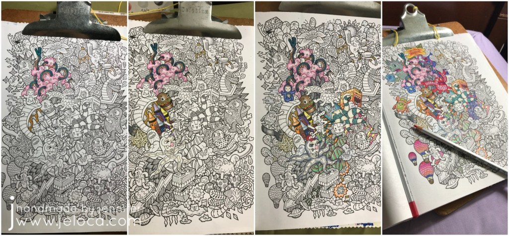
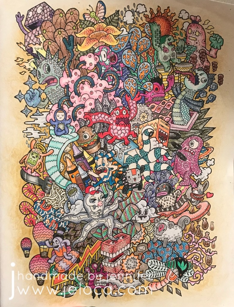
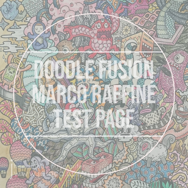
The next 2019 WIP to FO Challenge update (posted a whole 3 years later…sigh) is this page from Doodle Fusion. I love this silly book so much and have completed a bunch of pages from it (unposted), as well as prepped some in my color wash attempts. As they’re all filled with an assortment of wacky monsters it’s hard to come up with a unique name to identify some of the pages so since this one was deliberately done solely with the Marco Raffiné oil-based colored pencils, it’s become known as my test page of such.
I started this Doodle Fusion page on September 8 2019 with the intent of completing an entire page with the Marco Raffinés to really get a feel of how they work and blend.
I really like these pencils! They’re inexpensive (especially compared to the Polychromos or Premiers), and though the different pencils can’t truly be compared as oil-based vs wax-based will give different results and be preferred for different projects by different artists, they have their own unique charm and have been a joy to use. They’re less vibrant than some other brands but are no less pigmented, so while you won’t get neon brights (making them not a good choice for a fun 80s page) they’re great for softer, almost whimsical looks. They’re also slightly water-soluble, as per my tests here.
The first three images below show the lazy progress made over the rest of that month. I’d worked on the page slowly, picking out individual creatures and sections at random depending on my mood at the time.
Posting my WIP-to-FO challenge publicly spurred me to continue working on it, and the fourth picture above was done in January of 2019. I did a bit more work that month and then my attention waned again…
…until October 2020 when I finally picked it back up, determined to finish it once and for all.
I added a fading border to the outer edges in order to test the pencils’ (and my own) shading and fading capabilities. Once that was complete I finished the remaining creatures and doodles.
Overall I think these pencils work wonderfully in this book. It’s a plain-paper coloring book which can make using wet media difficult (although the pictures are one-sided so bleeding won’t be an issue if you protect the subsequent pages with a sheet of cardstock or something. There isn’t a lot of tooth to the page which isn’t the best for colored pencils generally, but these have enough “stick” to really take to the page well. After 2 years the page looks identical to the image above with no bloom (as can happen with wax-based pencils) and no apparent fading.
The only flaw I can see with the Marco Raffinés is the color payout. A number of sections above (ie: the red ball cap, the red 6-legged monster near the middle, the purple creature at the bottom center, the crayon bodies) were colored with maximum pressure to get the darkest, fullest coverage possible. As you can see there are solid, even sections of color but no real “brightness”. To me, all of the colors have a softness to them, even at full strength making them feel almost desaturated. You can see the difference more clearly in my swatches below.
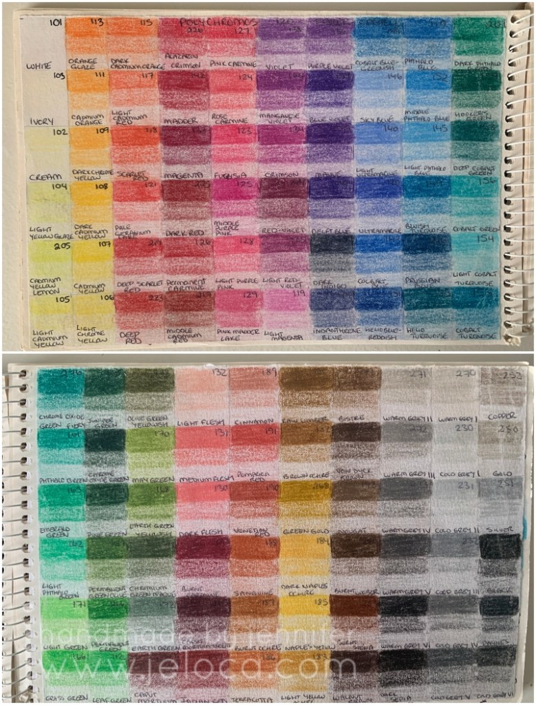
Every time I get new colored pencils I swatch them, labelling the swatches with the color name or number. The oil-based Marco Raffiné pencils (above) are lovely and soft, and very similar in tone to the Faber-Castell Polychromos (below), which are also oil-based.
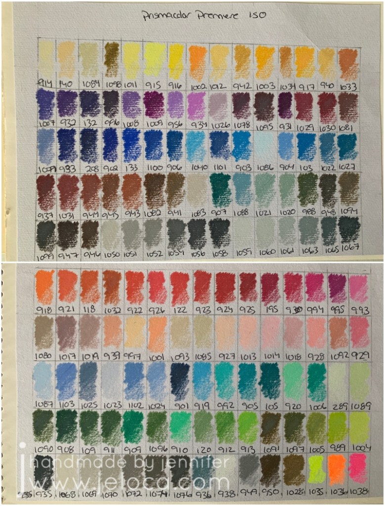
The Polys have more colors but the feeling of the individual shades is still softer, almost velvety, whereas the wax-based Primsacolor Premier pencils (below) are brighter and more vivid. (Click on any of the swatch images for a better view).
If you’re looking for deep, bright colors then you might be dissatisfied with these…but for anyone else they make a great, inexpensive option to have in your coloring toolkit.
This post may contain affiliate links. This means I might make a small commission on purchases made through the links, at no cost to you.
This past Tuesday (Aug 2nd) was National Coloring Book Day. I’d originally planned to celebrate and post by working on a new page from one of my books but I’m working on a major knitting project that is requiring my time and my hands. Therefore instead I’ll be sharing some completed pages that were part of a previous blog post series of mine – my 2019 19 WIP to FO Challenge.
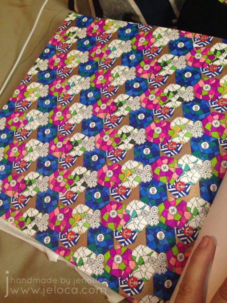
This page took nearly 3 years (!!) to complete, due to nothing but me putting it off forever. I’d started it on June 11 2016 and finally finished it on March 7 2019 making it one of the 19-for-2019 WIPs actually FO’d during 2019.
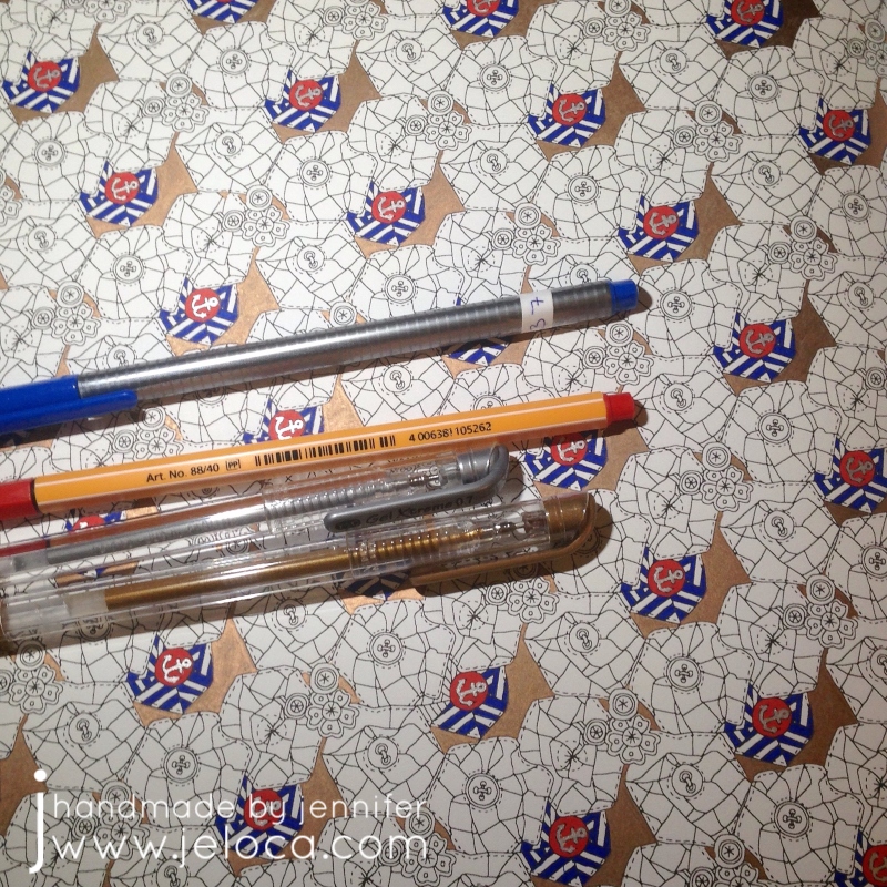
The small sections and tiny details of the page made it ideal for fineliners. Except for some metallic accents (using my favorite Gel Xtreme pens that have lasted for literal DECADES) the whole page was worked with Stabilo 88s and Staedler Triplus fineliners.
The quilt flower blocks repeat on a diagonal so I chose a different color palette for each row and worked the same 5 colors for each stripe but rotated clockwise once for each repeat. (IE: the color that was at 12 o’clock in the first repeat was used at 1 o’clock in the 2nd, and 2 o’clock in the 3rd, etc). This kept the coloring more interesting than coloring the same thing many, many times over.
And then I stopped with only one set of repeat left to go. No idea why, but as I’d kept the paper with my swatch notes it was easy to pull out the matching colors and get to work finally finishing it up.
I used the same colors for the matching quilt flowers in the main character’s hair on the facing page. I’d had the idea of coloring her the same through the whole book so left her uncolored until I was ready to tackle her on all the pages.
It’s a busy, chaotic mess but it’s finally done!
This post may contain affiliate links. This means I might make a small commission on purchases made through the links, at no cost to you.
Picking colors that go well together can be a challenge when coloring. Sometimes you have no idea where to start, spending too long staring at the blank page afraid to make a mistake that will ruin the whole thing. You might find yourself gravitating to your favorite colors, only to have all your FOs start to feel the same.
Artists of any kind can have the same struggles, whether it’s choosing the right combinations of yarns for colorwork knitting or crochet, selecting floss shades when going rogue in an embroidery pattern, or blending the right fondant color to go with your iced cake base. This problem isn’t only for artists either! Think of matching accessories to an outfit or selecting the accent color for pillows to give your living room the spark it needs.
Colors can be hard. I’ve mentioned Sarah Renae Clark‘s Color Catalog here before as a solution I’ve turned to when coloring and I’ve found myself referencing it often for various projects.
The digital catalog is easy to search and scroll on my ipad and I like to take a screenshot of my chosen reference image to keep with my project notes and refer to as I work. For digital art it even provides RGB, CMYK & Hex codes for every color palette included in Vol 1 or Vol 2.
I’d also treated myself to her Color Catalog Companion to make swatching the right colors easier – it provides the color names/numbers to match the swatches for a number of popular marker and colored pencil brands.
The only problem with the catalogs is that they’re fully digital which could be an issue if my devices were low on battery or I was working outside and couldn’t see my screens well. I love swatching and always had a scrap of paper with my color scribbles on it but more so than the colors themselves I really benefit from the reference images in the respective palettes. They really help me to see how the colors work together and the various shades and tones of shadow and light.
Turns out having a hardcopy version has been a popular request and now it officially exists! This week Sarah introduced the Color Cube!
It’s available for pre-order now and *cough* I may or may not have treated myself to the bundle of both Vol 1 and Vol 2. I love the idea that I will be able to keep my chosen palette in my project bag or tucked into my coloring book for easy, convenient reference.
I also really, really love that not only does the back of the card have the same color codes as the digital version, but that the colors run right to the edge of the card – making color matching super easy.
The Color Cube is available through Sarah’s site right here. You can get Vol 1 or 2 (or both) or get them in a bigger bundle with the catalogs and companion too. I’m really excited about adding this resource to my crafter’s toolkit!
This post may contain affiliate links. This means I might make a small commission on purchases made through the links, at no cost to you.
Today I’m going to share the steps I took to create a prop replica of this Twisted Sister record album for a Becket stage show a few years ago:
We had done a skit routine to the song “We’re Not Gonna Take It” which was released 38 years ago today, on April 27th 1984. In addition to the skit requirements of tossing the record album around, in general props are often flung out of the way during quick set changes, and we didn’t want to take a chance on damaging an actual record, even if we’d owned one. Therefore I decided to make this stage-safe replica that I could easily re-make in case of damage or loss.
The basis of the record is a piece of stiff cardboard cut to size. Standard record albums are 7″, 10″ and 12″. Unfortunately the best piece of cardboard I had was only 11″ wide but since no one would be able to tell from the audience so I cut it into a square to use. The key was cardboard that would be thick enough to not bend or warp during the multiple rehearsals and performances. If your cardboard is too thin you can layer a few sheets together with glue.
To replicate the “You Can’t Stop Rock ‘n’ Roll” album, my next step was to paint the entire surface with black acrylic paint. I will be demonstrating the steps for this specific album but the same principles can be followed to recreate any required prop for theater or costume use. You can even copy your favorite albums for wall decor!
Many of my projects involve using templates and this one is no different! Once I’d chosen my cardboard I printed a copy of the record album to the appropriate scale.
Then I used the graphite trick of scribbling along the back of my image in order to transfer the design. These days I use carbon paper as I find it faster and easier, but pencils work well too.
With the back of the image covered in graphite (or with carbon paper underneath), I placed it into the correct spot and traced over all the lines. A stylus works great for this but you can just as easily use a pencil or ballpoint pen.
It’s hard to see the transferred image. I did play with the contrast to try and show it but it’s pretty faint.
I used the same transfer method to add the album title…
…though this time I pushed a bit harder into the cardboard to give my marker ink borders. This can help contain a bit of the ink flow, if your markers are very runny. If you don’t have markers in the proper colors you can paint your album cover instead.
I had a close-enough color in my metallic markers so I used that for the band name and smaller lettering.
That’s it!
The final touch was a few coats of sealant for protection and then the album cover replica was complete!
This was a super easy and fast DIY that looks incredibly effective on stage, and because it was only cardboard and markers I didn’t have to add to our prop budget nor worry if it took some abuse and I had to remake it. That said, it was surprisingly sturdy and held up great through every rehearsal and all performances.
You can easily use the same steps to recreate any album for your own prop needs.
This post may contain affiliate links. This means I might make a small commission on purchases made through the links, at no cost to you.
It’s World Creativity and Innovation Day so today’s post is a round-up of previous posts that I feel incorporated some outside-of-the-box thinking!
Ever need to transfer live stitches to waste yarn but can’t find your tapestry needle? No problem! Here’s an easy way to “knit” the live stitches over so you can keep working on your project.
If you find standard provisional cast-ons too difficult, here’s a super easy way to get your knitting started. No extra tools required!
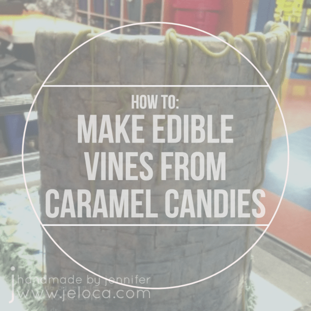
Here’s a neat trick for making thin vines/ropes for use in decorating your cakes or cupcakes. They’re flexible, stretchable, and edible!
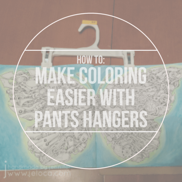
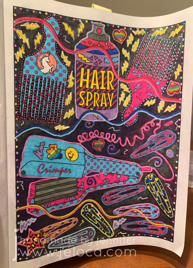
Here’s a hands-free way to hold your coloring books open!
Not getting the look you want with colored pencils in your adult coloring books? Here’s a great way to add more tooth to the paper.
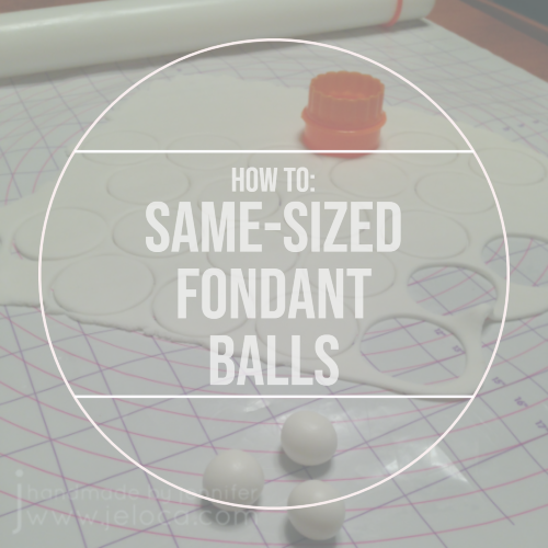
Are your fondant balls/pearls coming out all different sizes? Here’s a super easy hack to get identical ones, every time!
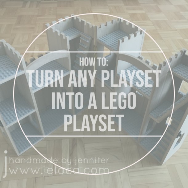
Here’s a simple way to give a plain toy new life and make it work with your LEGO pieces.
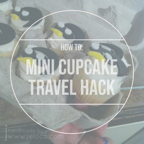
Finally, for when you want to provide homemade, individual snacks, here’s a free & easy way to transport mini cupcakes by repurposing something you’ve probably already got on hand.
Did you know that today, April 7, is National No Housework Day? As a crafter, I’m ALWAYS looking for reasons to get more time in with my hobbies, so avoiding housework to spend that time doing things I love sounds like a FANTASTIC idea.
I can’t pretend this is the only day I’ve ever put off housework in favor of a project or seven though… Most recently I took advantage of a lazy weekend afternoon to do some coloring and try out a new background technique in a coloring book page. If you’d like to celebrate the holiday today by doing the same, read on for more info!
I wanted the quick satisfaction of using markers and this page had just the right mix of small details and elements. This book is single-sided which is great as you don’t have to worry about ruining an image on the back of the page.
To make things even more mindless, I gave myself a limited color palette. I found an 80s-inspired palette of these 6 colors:
It was mindless, for sure, but I forgot that coloring is rarely quick! So I had no choice but to spend even more evenings avoiding housework.
Once all the small sections were complete all that remained was the background. It was too much to fill in with the markers so I reached for my Prismas instead.
First I filled in the entire background with a light gray (not shown). Then, using 3 colors that matched 3 of the marker colors, I went over the background again, doing large, irregular sections of color.
Next I went over the whole thing with a layer of black. My goal was to have the different shades give the black some dimension while subtly tying in the bright 80s tones.
The final step was to go over the entire background one last time, this time with my Derwent Burnisher. You can see the massive difference this makes in the image above – the background below the blue squiggle has been burnished, while the area above has not. There was no additional color applied; I merely flattened the layers of color using the burnishing pencil.
I really like how it turned out! It’s a silly, chaotic coloring book page but it was fun and I really enjoy the subtle depth the black background has by having the other colors underneath.
Looking back now I prefer the original background but at the time I’d felt it wasn’t bright enough to really SCREAM “80s”. I decided to outline everything (and also add random dots around the edge of the page for some reason…?) with a white Posca paint marker. These markers are great with colored pencils as they go over it beautifully without skipping, and once dry you can tint the paint with your markers or pencils.
To beat back the white glare I did just that. Using the same 6 Super Tips I went over the white paint to give every item an outline “glow”.
In the end I’m not mad at the final page (above), but I do prefer it pre-paint. That said, it was a lovely excuse to get out of housework for a bit and do something (relatively) mindless.
I hope you get to use today as an excuse to put down the vacuum or laundry and do something fun that makes you happy!
This post may contain affiliate links. This means I might make a small commission on purchases made through the links, at no cost to you.
For my last post of Mario Month 2022, I’m going to show you how to make these DIY Super Mario Bros-themed banners:
I used them as stage runners for a Mario-themed skit, but they can also be hung as banners to dress up the decor at a Mario-themed party, photoshoot or event.
In case it’s been a while since you’ve seen what a Super Mario Brothers game looks like, this is the setting I was attempting to recreate on stage:
I’ve already made a warp pipe set piece, but to really give the stage a “Mario-world” look I decided to make banners/runners in the style of the iconic bricks, blocks and ground texture.
If you look at the screenshot it’s clear there are 3 distinct patterns – the bricks, the “?” blocks, and the ground sections. Before I can scale and print my templates I needed to know what dimension I could work with.
I used the same roll of recycled paper as for the warp pipe, and it is 36″ wide so the easiest thing to do was to cut the roll in half lengthwise, and base my measurements around that.
On my computer I cropped out one repeat section of each of the 3 patterns and scaled them evenly to be 18″ high.
I printed the templates and taped the sections of paper together to have exactly the pieces I needed. Then I cut my strips to the proper length. The floating banner (the one Mario jumps on/under) was cut to fit 6 blocks of my template wide to best fit the width of our band’s drum riser. For the ground-level banner, I wanted to fill as much as possible of my stage width, so I divided my total stage width (about 30′) by the width of the ground template, and made sure I cut my length appropriately to fit in the maximum number of repeats that would fit my stage.
This paper rolls up nicely which makes storage of both the materials in progress as well as the final banners a breeze!
As for the warp pipe, the whole project was done with inexpensive materials, including the acrylic paint. I started with the floating segment and marked off the width of each segment, then painted the brick sections brown.
I had just barely enough room to set it aside to dry so I could move on to the stage runner.
The stage runner was given a brown base coat along the entire length.
Due to space constraints, I set up my workstation to allow me to keep moving the runner to the right, while working from the left.
Luckily by the time I ran out of room to extend the far end, it was dry enough to roll up on itself.
The ground template would be getting a lot of use as I had to trace it over and over along the entire length of the runner, so I protected it with my favorite cheap lamination method – packing tape.
Then I set about tracing it over and over and over…
Carbon paper is fantastic for this as it provides erasable marks that are dark enough to be seen but light enough to be painted over. I used a ruler to be sure my lines would be straight, and a pen, stylus or chopstick/skewer would all work equally well for the tracing.
Once all the tracing was done it was time to paint the details. This required black and white paint, along with some extra brown to fix any mistakes.
I didn’t want any color bleeding, so first I worked my way through painting the white sections…
…rolling the work up as soon as it was dry enough to move forward…
…and then once the white was complete I moved it to the other side to start over, now painting the black ones.
It’s a long process, but very relaxing and great for podcast/audiobook listening!
With the ground painted and set aside, I returned to the floating banner and added a lighter brown base to the “?” block sections.
Just as for the ground, I traced my templates and then worked in sections to paint them.
First I did all the black and the bit of white highlight on the bricks…
…and then I went back in and did the remaining brown on the “?” blocks.
I love the finished result! It’s so easy and doesn’t take too long but has such a high visual impact for the stage or as party decor.
You can see how accurate the result turns out when you use a good, scaled template.
Once all the painting was done I gave the banners a few days to air dry to be sure there was no moisture left in the recycled paper, and then I set about laminating them.
If you’re only making a banner for a party or to stage a photoshoot, this next step is optional.
Just as for the warp pipe, these banners would be used in a stage show with multiple performances and incredibly quick set changes, and it would be a waste of my time and effort making them if they ripped during rehearsal or mid-performance.
Starting with a 1-2′ strip of tape, I lay it on one of the straight edges, overlapping halfway. Then I lifted the edge of the banner and folded the free half of the tape over, pressing well. This protected the edge of the paper from any moisture getting in.
Repeat the process on all edges. For a long banner like the ground one, you can do this in sections as you go.
Then, using more packing tape, work horizontally across your piece to laminate it. Overlap your strips slightly, again to make sure no gaps are left where moisture could get in. Once done, trim up your edges with a craft knife.
I chose to also laminate the back of my banners. While this does use up extra tape and is not visible to the audience, it provides an extra layer of durability and moisture protection. Also, as we were using velcro tape to quickly hang and remove the banners during each performance, I didn’t want to take a chance on being able to pull the tape off from the paper and damaging it.
The finished banner is now durable and reliable for frequent rough handling.
I then repeated the same process on the ground-level banner.
And with that, they are complete. The banners roll up easily for storage and transport, and applied perfectly to our stage pieces with heavy duty velcro tape. We had incredibly quick, rough set changes where the stage hands slapped them into place and then ripped them off while running off stage during the blackouts, and they held up perfectly!
Here’s how they looked on stage. The original plan was to have the drum riser get the floating banner and hang the ground runner off the front of the stage, but in dress rehearsals we realized that it would be too low to be seen by anyone in the audience except the very front, so we raised it up to run the length of the full band riser instead.
It was a really cute, fun skit/dance number, and definitely an audience favorite. I was so pleased that my stage runners, warp pipe, and all the costume pieces were an important part of that, and have held up to this day (4 years later).
All of this year’s Mario Month posts are from that skit, and next year’s will include instructions on how to make Princess Peach’s wand, Toad’s hat, and the Piranha Pete costume.