Boy it’s been a hot minute since I’ve posted last. Back-to-back secret projects will do that, unfortunately, so I’m gonna try popping in with the little things I work on around the big ones, when they’re ones I can’t share.
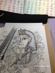
I’ve already shown a few coloring books from my collection, but those who follow me on Instagram or Twitter will have seen pages from others here and there. This is the one I’ve just started: the Egyptian-themed page from Kerby Rosanes’ imagimorphia, the sequel to his incredible animorphia (which I also own and have sadly neglected).
Ignore the dark circle in the lower corner. I forgot to take a pic of the page before beginning to color, so I had to photograph the smaller version from the hidden object answer key at the back of the book.
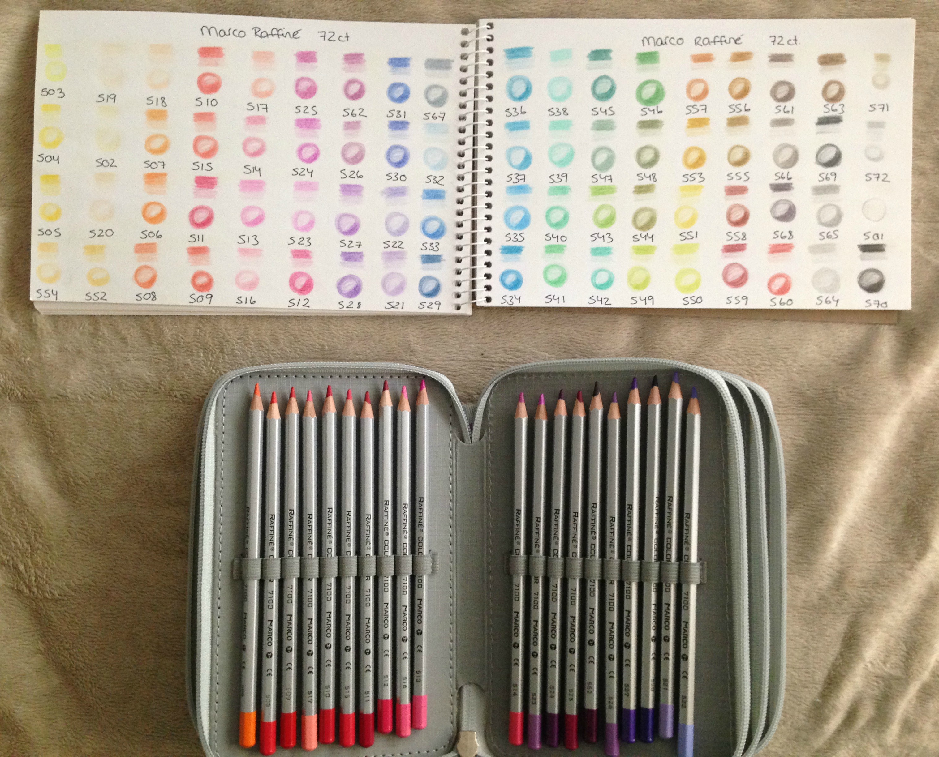
I’ve been using my Marco Raffiné colored pencils for this one. I have been using my fineliners a TON lately, and wasn’t sure if I’d enjoy going back to colored pencils. Plus, this book has all double-sided pages, and I was worried the markers would bleed through.
I did a little media test at the back of the book. The first little dude was colored with Bic Mark-Its, the next with fluorescent Sargent Art gel markers, and the third with bronze Sharpie. Fourth was the Marco Raffinés (I knew colored pencils wouldn’t show through but I wasn’t sure how they would take on the paper’s tooth.) Also Marco Raffinés are oil-based cp and not wax-based like my other ones so I need to swatch those elsewhere sometime. After the cp I have Stabilo 88 and Staedtler Triplus fineliners, then a Gelly Roll glitter pen, and finally a few assorted Gelly Roll and other-type metallic markers. In the word box I tried out my Spectrum Noir alcohol markers even though I KNEW they’d bleed, and then I doodled a flower and word up above because that was in a white area on the reverse side and I wanted to see if anything would show through where there wasn’t a drawing.
I was so pleasantly surprised with this book! Not only are there a crazy amount of pages, but almost nothing bled through. I expected the alcohol markers so I ignored that, and since the Bics are alcohol-based as well I wasn’t surprised to see they’d also bled. What really thrilled me is that none of the others did! There’s a faint bit of ghosting from the fineliners but it’s mostly only visible in the white space area. I think if I used them to color any image or sections that had a picture/patterning on the reverse, it wouldn’t even be noticeable. Yay!
I was also really happy with how the Marco Raffinés took to the paper. They don’t play nice at ALL with the paper of my swatch book (seen above, and again below), and it takes a lot of pressure to get any color to lay down. In the book, however, I could apply the barest touch and get a sheer wash of color, and was able to layer nicely. Double yay!
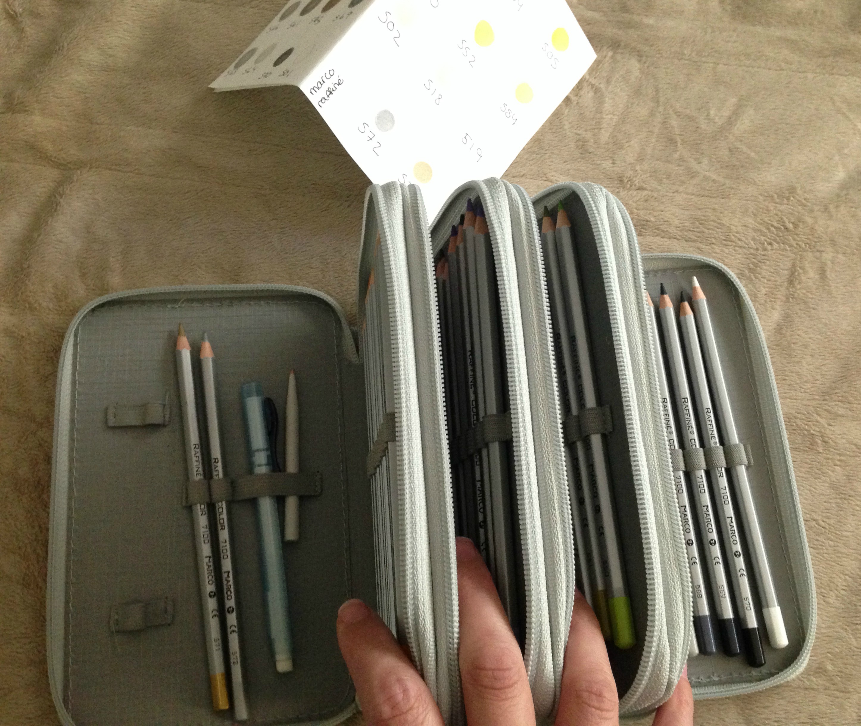
PS I’m storing my pencils in a case I ordered off eBay. I saw them in a review video that Peta (La-Artestino) did and picked up a few to try out. The largest size (4-zippers) holds 72 pencils which fits the full set of Marco Raffinés perfectly. (PS if you’re into coloring at all do check out Peta’s blog and her videos, she’s incredible!). I keep an eraser and blending tortillon inside, along with a sheet of watercolor paper with numbered swatches of the different colors so I don’t have to bring my swatch book around with me. I only wish there was some type of pencil-shaped sharpener so I could keep one inside too!
Finally, here’s the coloring in progress, where I stopped at last night. I started by lightly shading in the areas I wanted the darkest color, using my lighter blue and brown. Then, starting with the head-piece and curved staff, so far, I went back in, applying a longer fade of each color, which I then darkened up in the shadows with a darker version of each color.
This post may contain affiliate links. This means I might make a small commission on purchases made through the links, at no cost to you.
And once again, what seems to happen cyclically around here has happened again. Every time I get into a rush on secret projects that I cannot blog about, the blog itself falls into a standstill. I get so focused on the major things… a sculptural piece I’m mailing out soon, baby gifts, the props for my upcoming show… and I forget that I can also share the small things that are just as important and fulfilling, if not as fun or tutorial-able.
Here, then, are some of those moments, from the last 6 weeks.
Over March break the boys went to spend the week with my inlaws. They learned how to play UNO and have been so hooked that even after being away from consoles for a week, this ^ was their first night back home. Ignoring the systems, ignoring the tv, spending a quiet night after dinner rushing to get ‘just one more game in!’. 🙂
I’ve been doing some coloring, mentioned a bit here and there on Instagram. I’ve got big posts semi-worked up talking about markers and pencils and storage, but while all that’s been getting ready, I’ve been enjoying some quiet time of my own while the kids play or while watching tv and tackling some pages from one of my new favorite coloring books: The Time Garden by Daria Song. The wallpaper background on these two (and the subsequent 2 pages set in the same room) took about a week to complete, tucking into it here and there when my attention wasn’t needed elsewhere. I used my Staedler Triplus Fineliners in Mauve and Gray in alternating rows, and the dots in between the flowers were colored in Silver Gray. The dots within the flowers were colored with a metallic silver pen from the dollar store, and then I filled in the background itself with an old blue Bristol colored pencil I’ve probably had since I was 10.
We went out for a nice family dinner for my father-in-law’s birthday, and it proved to be a long, late night for the boys. We were driving home from the restaurant at about 9:30 at night when I peeked into the back seat and saw them, sound asleep, and cuddling.
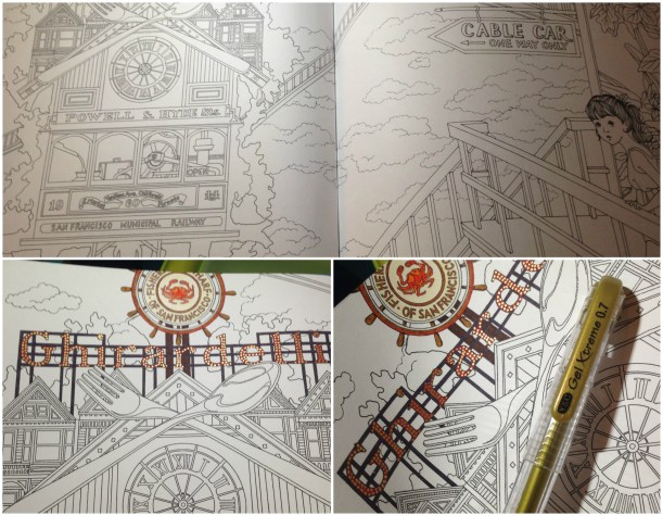
Back to more coloring. After the long spread of wallpaper I decided to tackle something equally as detailed, but with smaller sections that could feel completed as I worked on them. I jumped ahead to the Ghiradelli/Pier 39 spreads in the book. Wherever I’ve found repeating elements I’m working on them at the same time vs having to make notes on what colors I’ve used where, so I did the large sign on the above spread and then jumped immediately into the matching cable-car page that followed. The crab sign is colored to match the real one, using various Triplus or Stabilo 88 fineliners and then a light shading of colored pencil, and then after coloring the sign and its supports I suggested the myriad lights with a metallic gold gel pen.
The Yarn Harlot‘s Strung Along retreat happened this past weekend and I donated some patterns for their goodie bags. Hopefully they liked them!
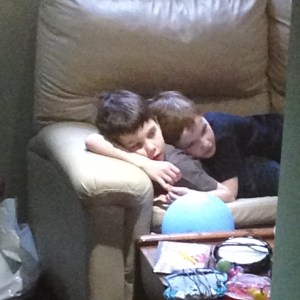
Saturday had another cute moment for the kids, when I passed by the open door to the den and noticed them watching tv like this. Go figure… they’re so close that even with a whole floor and mini futon and couch and easy chair, they still prefer to snuggle together no matter what they’re doing. I can’t imagine they’ll be this close when they’re teenagers, but it sure makes me smile for now.
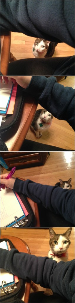
Sunday night I was working on the props for my show, making lists of everything I still needed to take care of, and a plan of action, and casually nibbling on a piece of kernatzel (pepperoni stick). Turns out my cat is addicted to them. ADDICTED. What looks like a cute little moment above WAS TAKEN OVER 2 HOURS. Each one of those photos is 30 minutes apart AND HE NEVER LEFT MY SIDE THE ENTIRE TIME. Sitting. Staring. Drooling.
Finally, a bit more coloring, this time from the cable car page. I don’t have the materials yet for one set of props, and the others were glued and clamped and drying in the garage, so I made a fresh cup of coffee and put on a YouTube channel I like and settled down to color the ice cream adorning the cable car.
I got this far when Yannick came home, and I showed him my progress, especially proud of the shading on the center cones (all done with the two sets of aforementioned fineliners and colored pencils). “The cones look great,” he said. “The pop too. But what’s the turd on the end?”
Hmph.Who says you can’t polish a turd? (Actually, you can, and not just by recoloring an ice cream pop). The markers and pencils play really nicely together and I was able to adjust the highlights so it looks more like a slightly melty Magnum bar. I also finished up the chocolate and strawberry swirls in the center, as well as the neon sign.
Any more coloring will have to be put on hold, as tonight I buy the final items needed to finish the props, and then my next few nights will be spent making same. I can’t complain, though- it’s for a really great cause.
If you want to see some incredible dancers, some amazing singers, a hugely talented band… yummy food… oh- and me… then get your tickets now and come enjoy the show!
This post may contain affiliate links. This means I might make a small commission on purchases made through the links, at no cost to you.
The more coloring I did, the more I wanted to do. I began looking for better supplies and looking up better techniques. It is impossible to be interested in ‘coloring’ and not somehow, somewhere come across Copic markers. For the uninitiated, Copics are alcohol markers, one of, if not THE premium brand, and are vastly loved by artists everywhere.
They’re also expensive as hell.
When I’d first heard of them, a few years ago, I immediately discounted them. I had no use for new art supplies that weren’t integral to my passions at the time, and that kind of investment just didn’t seem worth it. Lately, though… something was drawing me to them. Maybe I’d outgrown Crayolas, finally, or maybe it was the appeal of being able to blend and achieve digital-art-style results with something I could control by hand. I started finding reasons to justify them- I’d do more drawing, and finally open an Etsy shop… and they’re refillable, so over time the cost works itself out… and I’m an adult, and could treat myself to professional, adult supplies…
I was in. Hanukkah was coming up and the ONLY thing I put on my wish list was a gift certificate to Curry’s Art in Ontario, the place I’d found with the best prices for Canadians. The markers I wanted, Copic Sketch markers, are available locally at $8 CAD each. The cheapest US price I could find online is $5.35 but any free shipping deals were US only, and there would still be a cost conversion, and the exchange rate these days is insane, so I ruled that out. Curry’s has them for $6.50 each, and free shipping within Canada if you spend $75. Perfect! (Note: I found out about Curry’s by watching Baylee Jae’s videos on YouTube, thanks Baylee!)
Knowing I had some time to wait until we had our family gift exchange and I (hopefully) got what I’d asked for, I looked further, exploring more tips and techniques. Along the way I found a number of videos and blog posts mentioning BIC Mark-Its as inexpensive alcohol marker alternatives, stating they could also be blended, had better colors than Sharpies, and worked with Copic or other brands’ blending markers.
All my Sharpies were old and dried anyways, so I ordered myself 2 sets of BICs, the 36-pack fine and the 36-pack of ultra fine.
When they arrived I sat down with the boys one Saturday morning and we did some coloring together. They’d been watching me color lately and a few times I’d given them a ‘treat’ and let them use ‘Mommy’s good markers’. They love my colored fineliners and both were in awe of the stained glass coloring pages, so I let them pick their favorite pages to color for themselves. When I was ready to test the BICs I printed off some characters from one of our new favorite shows, Bravest Warriors, and we all colored together, with me allowing the kids to use the BICs as long as they were responsible with them.
Jakob went for speed, coloring the characters carefully, but quickly, and getting distracted here and there by the tv that was on in the background.
Henri did the opposite. He took his time, trying to color-match as carefully as he could to the original characters. He was SO thorough, in fact, that he drew in his favorite missing character – JellyKid (complete with toast!) and even added Pixel to Wallow’s glove!
I didn’t have anything in mind when I colored mine except to enjoy the markers, the lovely colors, and the flow of the ink. I didn’t attempt any blending or ‘Copic-like’ techniques, just colored and chatted with my boys.
Okay well maybe I did a teensy bit of shading… if you look carefully at Plum there’s some blue shading under her hairline and skirt. But that’s it.
I loved the BICs and I am thrilled that they’re part of my stash- uh I mean my perfectly adult and mature collection of art supplies. But my FAVORITE part of coloring with them was discovered after I was done.
The BICs, just like Copics and other alcohol markers, bleed through most papers. Alcohol markers are designed to saturate the paper to get even blending and streak-less coloring. With water-based markers like Crayolas, coloring hard over one section will leave blotchy, uneven patches of bled color. With these, however…
The bleed-through is so lovely! It looks like a watercolor illustration! I’m fascinated by how pretty the backside of this coloring looks and can think of so many ideas for deliberate reverse drawings, coloring one side while intending the back to be the later ‘front’.
Not that, but I was completely charmed by my discovery on the paper I was using to absorb the bleed-through. It looks like pointilism! Probably not really good for anything, technique-wise, but I like how it looks regardless. 🙂
This post may contain affiliate links. This means I might make a small commission on purchases made through the links, at no cost to you.
My resurgence into adult coloring began even before I picked up Zentangle. Nope, it was way back in 2013. I don’t remember quite how it started, but I do remember the annoyance of wanting to color, being too lazy to draw my own images, too indecisive to print images off the internet, and the frustration of looking at various stores for coloring books but only finding child-friendly themes. I didn’t want to color Diego or Elmo (though I would have gladly colored My Little Pony had I found one LOL)… One day I’d stopped in at Omer de Serre for something else and took a chance on asking an employee if they had coloring books for adults. He pointed me to a small turning spindle with maaaaybe 9 holders (that’s how NOT popular this was back then). I was delighted, however, and even more so when I discovered the coolest books – the pages were translucent like velum or onion skin paper, but they had black borders that were opaque. They were stained glass coloring books, and I immediately grabbed one. Afraid they’d sell out of the ONE copy they had of the other types of books (again, adult coloring was NOT a thing in 2013!) I also picked up a few others. They were nothing like the thick volumes you find today, rather they’re thin and printed on regular paper, but had cool patterns like geometrics and paisleys, and sparked something creative in me that I couldn’t wait to try out.
So I did.
I remember wanting to try and do ‘cool’ things with my coloring, not just blindly splash color onto the pages.
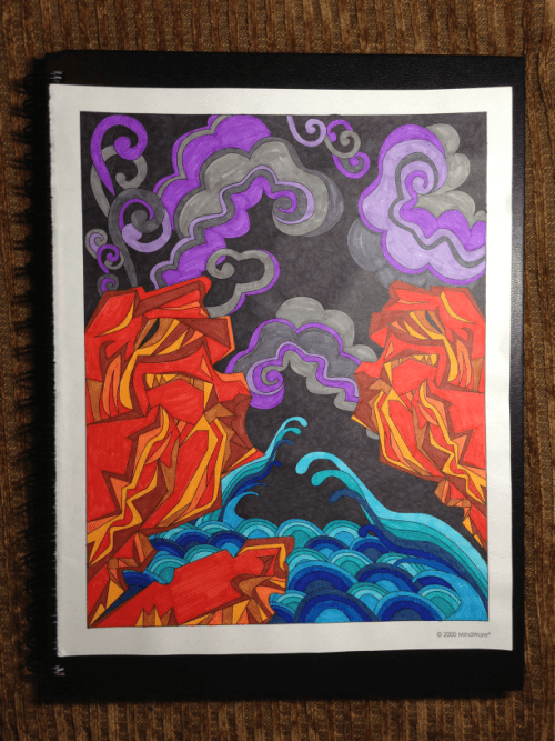
This one, for example, is from a book called Masterscapes by Mindware. The original image had no black space, but I thought it would be interesting to have the squiggles stand out, so I colored in the entire background with a black Sharpie. I had bought a pack of 50 Crayola fine-tips for the kids, and then kept it for myself, and used the range of colors to fill in the squiggles with a rainbow, beginning with yellow in the top left, and working through the colors until the grays and black in the lower right.
Again trying to be ‘artsy’ with it, I attacked another image from the same book with my black Sharpie. I decided to give it a story in my head (hush, I’m rolling my eyes at myself too haha) and colored the lion/beast things in fire colors, the lower part with water colors, and then the steam was purple and gray, because the fire and water was mixing… blue and red mixing became purple… yeah. I know. Silly. But it was more fun to think it through than merely scribble.
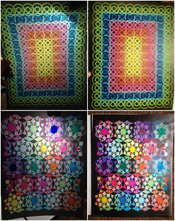
These two are both from the stained-glass book I mentioned above, which is also by Mindware and is called Tesselights. The top image with the rings was colored somewhere between 2013 and 2014, with crayola fine-tipped markers, while the lower one was colored November 22 2015 with fine and ultra-fine tip markers from the dollar store. It’s hard to show how interesting they are when a light shines through in a photograph, however for both, the image on the right is with a light overtop, and the image on the left has the light shining from behind.
This does point out one issue you need to be careful with, if you do intend to display these with illumination, like the ones my kids colored that we’ve taped to the window. I’d missed a spot when filling in one of the purple centers, so the next day, when I noticed, I went back over that section. In normal light it looks fine, however… when lit from behind the double-inked section is INCREDIBLY noticeable (the large splotch near the top of the lower left pic, if you couldn’t tell).
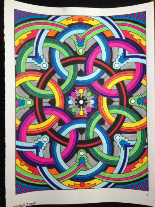
This image, colored on November 3rd, is from a book called Deco Tech. I’d gone back to Omer and bought a small pack of 18 double-ended markers, brush and fine tips, for $9.99, and used this image to try them out. Once again there were no black sections in the original image, it’s just something I like to do when coloring.
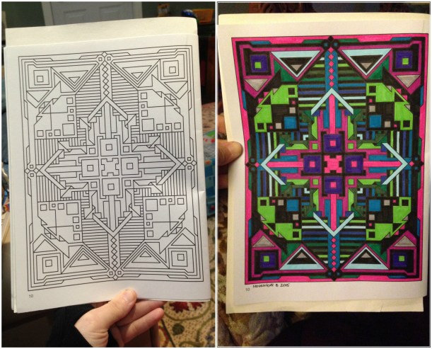
Here’s an example, colored November 8 2015, from the same book. You can see the original image as it’s published, and then my colored version. As you can tell I went through and filled in some sections with black. In some cases, like these two, the black parts were done during the coloring, but other times I go over the entire uncolored image with black first, so when I do sit down to color, I’ve only got what’s left to fill in.
One more note, about Masterscapes and Deco Tech. The images are printed double-sided, and the paper doesn’t seem much thicker than normal. Which means that not only did my Sharpies bleed through, but my water-based markers did as well, especially in areas where I made more than one pass of color. I was lucky in that for most of the images (so far) I had a clear preference for the image on one side of the page over the other, but so as to not lose your money’s worth for half the book, if you intend to use anything other than colored pencils in these books, I strongly suggest photocopying the pages, and coloring those duplicates. Otherwise I think these (and the other books I bought, whose names escape me at the moment) are lovely, inexpensive books with fun, interesting patterns to color.
This post may contain affiliate links. This means I might make a small commission on purchases made through the links, at no cost to you.
Adult coloring has become a huge, blossoming industry. In some ways it reminds me of when knitting exploded a few years back, suddenly this age-old art and craft was reaching more people and because of this, gaining new books and techniques and available options. I am fully entrenched in the adult coloring bandwagon, however I didn’t just jump on.
I never really stopped coloring, ever since I was a kid. When I was in high school I used to draw portraits for friends off of photographs to make some spare cash, and sold some hand-painted gifts to a local baby boutique. One of my degrees is in Creative Arts, meaning I got to go to school and paint and color all day, and after Yannick and I met I drew and colored a story book about us and our friends and had it copied and bound and I gave a copy to each couple for Christmas that year. Drawing, coloring and painting has always been an ongoing hobby of mine though as I took on new ones (crochet, knitting, cross stitch, weaving, cakes) it fell by the wayside, becoming something I’d only pick back up when there was a need, like drawing personalized name signs for baby gifts, or painting huge murals for seasonal window displays at work.
Until 2013, but this part of the story starts the following year.
In the Spring of 2014 I had a health scare that put me in an odd place, craft-wise. I didn’t have the energy to pay attention to anything that required my focus, like knitting something with a chart or shaping, for example, but I equally didn’t have the capacity to work on anything that didn’t require some level of concentration, as otherwise my mind would wander and think negative, scary thoughts.
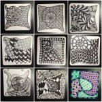
I wound up teaching myself to Zentangle. The combination of being able to doodle and zone out mixed with the zen-like aspect of carefully placing small, deliberate lines was too perfect to pass up, and I scoured every blog post and Pinterest board out there. The creators of Zentangle attempt to make the process proprietary by setting certain ‘regulations’ on their advocated method, but I was able to glean enough from watching videos and doing a lot of reading. While most of the ‘official’ Tangles were difficult to find posted (a remarkable feat, in this era) I did collect every other, user-generated tangle into a bunch of alphabetical Evernote files, and slowly began to practice in my spare time, or whenever I needed a little break from life. While I did invest in a few Micron pens I didn’t buy any Zentangle Tiles (the small square papers you draw on), preferring instead to cut index cards into the required size and rounded the edges with a scrapbook punch.
Note: for those unfamiliar with Zentangle, it’s a drawing process where you prepare your paper and then fill in the sections with established patterns (called Tangles) that typically look rather impressive or difficult once completed, but are actually comprised of easy, repetitive steps. The inked tangles are then pencil-shaded to provide depth and color variance in the image. There are certified Zentangle instructors and people often create their own tangles, naming them and posting the step-outs (the step-by-step breakdowns) so others can find/use them.
Top row:
(left)#1. May 4 2014 arckles, auraknot, arrowheads, perfs
(center) #2. May 4-5 2014 afterglo, arabel, ambler
(right) #3. May 6 2014 aquafleur, alicat, antidots, perfs
Middle row:
(left) #4. May 8 2014 Argh!, all about ‘v’
(center) #5. May 10 2014 axlexa, barberpole, amoeba, asian fans
(right) #6. June 29 2014 Bales 4 ways
Bottom row:
(left) #7. June 29 2014 slurp, tuffit, tung, auras
(right) #9. July 4-5 2014 florz, auras, chads, stubert, matt, crossroads, random striped border
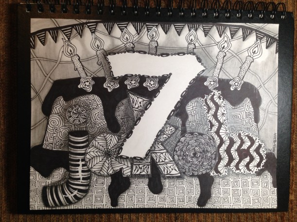
When people use the ‘tangles’ in creative ways other than the specific method-based tiles, the results are called ZIAs- Zentangle Inspired Art. I was inspired to attempt one such on my own, in honor of Jakob’s 7th birthday. I lightly sketched his name, the background cake and the foreground ‘7’ in pencil and then filled in the different sections with different patterns. Once I was done I shaded the whole thing with a pencil, blending out some with a tortillon (blending stump). May 16-18 2014 “Jakob – 7” assorted patterns and tangles
Somewhere in the beginning of the summer I decided I enjoyed the process enough to commit to purchasing a few Zentangle books, deciding I’d teach myself the ‘proper’ way to do things. I had a trip coming up that would give me a lot of travel time and I figured the tiles were small enough that I could finish a few along my journey, but they’d also be easy to pick up and put down if I had to. I packed a small drawing travel kit with some blank tiles and pen, pencil and tortillon, and worked on the first few days here and there.
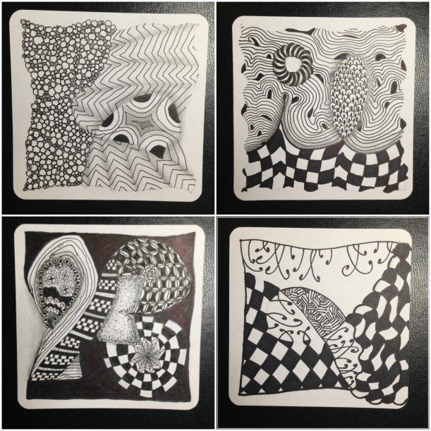
Top row:
(left) #10. July 10 2014 “One Zentangle A Day” day 1- static, tipple, crescent moon
(right) #11. July 11 2014 Tagh, knightsbridge, diva dance, random circle thing
Bottom row:
(left) #12. Assorted existing and made-up patterns
(right) #13. Sept 6 2014 “One Zentangle A Day” day 2- nekton, knightsbridge, fescu
And then life happened, and I stopped Zentangling. Other projects took precedence and my pens and books got relegated to the junk pile that was my office at the time.
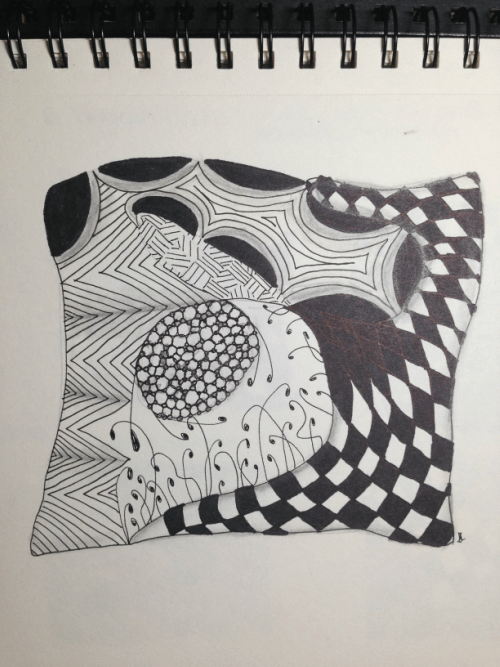
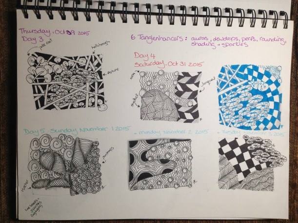
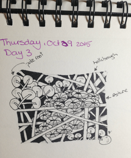
This past October I was inspired to start again.
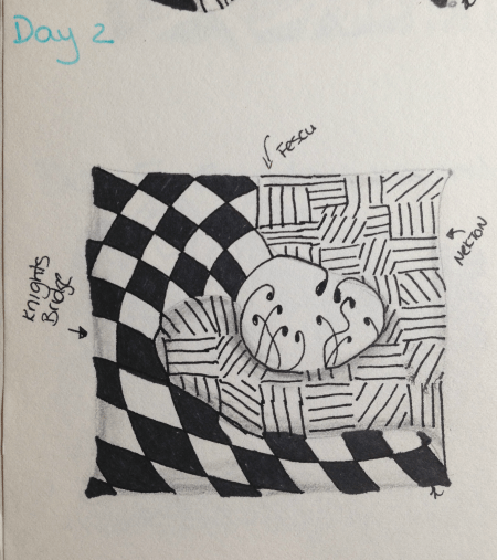
I got a larger sketchpad, my Microns and the One Zentangle A Day book worked through days 1 and 2…
…and then days 3, 4 and 5.
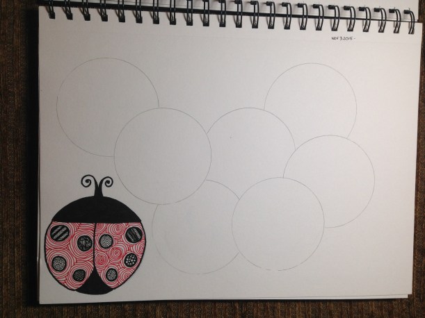
I also began a new ZIA, this time inspired by a late-season ladybug I found in my bedroom.
Unfortunately, around that time other projects began requiring my attention. The later months of the year are when I work on teacher gifts, and have a bunch of cake events come up, and some other projects with deadlines, and once again the addictive flow of lines had to be put aside. I also began to do more actual coloring again (more on that in the next post), which led to a brand new (old) hobby taking over my life.
I do intend to continue the book. I also hope to finish my compilation of non-official tangles, as there are quite a few I find incredibly soothing to draw and really like the look of. My goal with Zentangle is to get to a place where I no longer have to look up the steps, but can have a large number committed to mental muscle memory, so when I want to zone out and work on one before bed it won’t require the effort of looking up the steps for each and every tangle.
This post may contain affiliate links. This means I might make a small commission on purchases made through the links, at no cost to you.
Those who follow me on Instagram/FB got a sneak peek at Henri’s Halloween costume this year. The boys fell hard into the world of Hogwarts when we began showing them the films this year, though we stopped after the 5th one because they were getting a bit too dark.
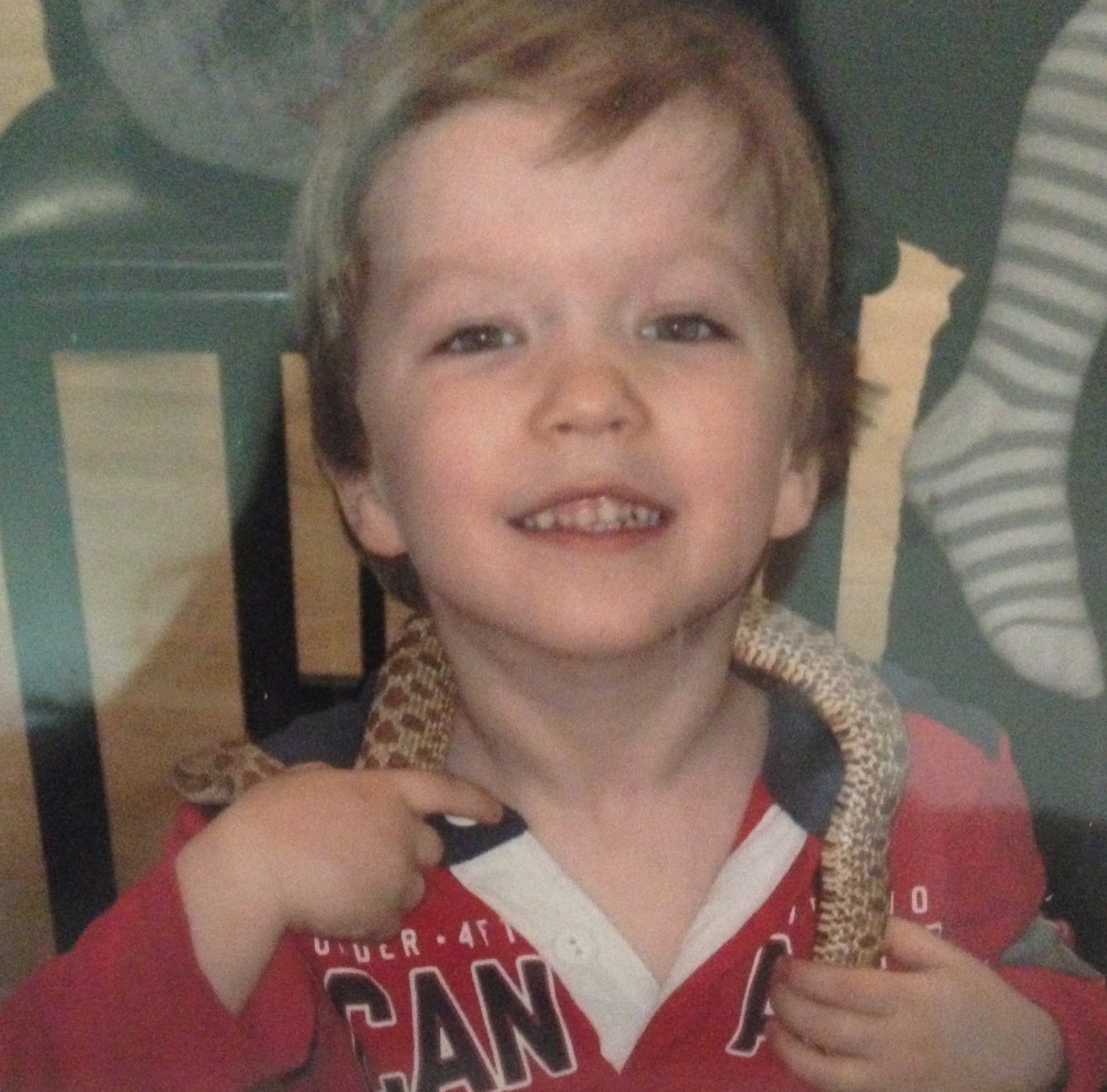
Jakob wants to be Draco Malfoy. It was his original costume choice, now possibly swapped out for a Minecraft Enderman, but in general, he wants to be a Slytherin. He thinks Harry was put in the wrong house, and that Slytherin is where it’s at. It’s less to do with the negative traits or a penchant for the color green, than it is that, as he likes to remind me, “We love snakes, Mom.“. Yes. Yes we do.
Jakob, age 4, with friend.
The Snake is my Chinese sign and a long-favored creature of mine, and that love transferred down to my oldest. In fact, we’d have a pet snake at home if it weren’t for 2 things: 1. I would be too heartbroken to feed it mice, and 2. my father-in-law would never visit again.
In any case, if ever he were to dress up as anything from the Potterverse, it would be in Slytherin colors. But Henri? He’s Gryffindor all the way.
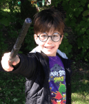
Doesn’t he even LOOK like a young Harry???
We bought those glasses and wand last weekend at the local Halloween store, and my mom lent us a black grad gown that is PERFECT for his robes. I’d like to find time to make a crest for the robe, but the main finishing touch for his costume is the scarf, so I decided to get on that last night.
The burgundy isn’t quite right, but I’m working with stash yarn and I don’t think he’ll mind too much. The pattern is my own, such as it is.
CO 30 sts with burg yarn. Work 1×1 rib for 30 rows. Change to yellow, work 1×1 rib for 30 rows. Repeat, ending after a burgundy section. Add fringe.
I decided against working stockinette because I really didn’t feel like taking the extra time to make it doubled or in the round, and a flat panel of st st would curl like crazy. 1×1 rib contracts enough to look almost like stockinette and won’t curl, making it quicker and easier for a 6yo’s Halloween costume. 🙂
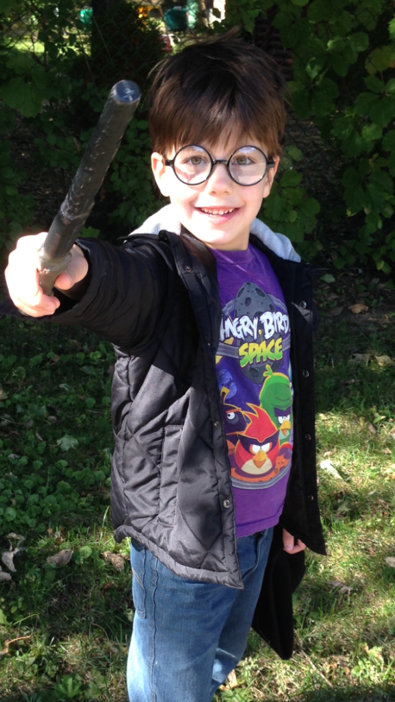
UPDATE AFTER HALLOWEEN: Here’s Henri’s final costume!
The boys keep talking about what they want to be for Halloween this year, and it has me reminiscing about Jakob’s first Halloween, and one of my very first designs.
Here’s a repost, coming to you from all the way back in 2007. Lookit how wittle he was!!
~~~~~~~
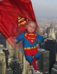
From November 2007: May I present…
SuperBaby!
SuperBaby’s special powers include drowning his adversaries in massive amounts of drool, and the ability to shove anything into his mouth. Foes are often foiled in their plots by his awesome cuteness which requires all who pass to stop, come closer, and kiss him.
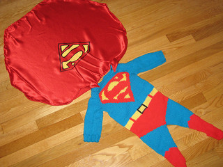
SuperBaby also managed to stand by himself (leaning on the sofa) for the purposes of taking this photo. His detachable cape is this season’s “in” accessory. No SuperBaby would be caught dead without a cape this year, and we hear that shiny red is the new black.
The pattern is my own, for both the outfit and the cape. I had Yannick’s help in creating the baby, and the Superness is all his own. 🙂
By the way, these are the pumpkins that Yannick bought for outside our house. Should I be insulted that the “Daddy” and “Baby” pumpkins are perfect, and the “Mommy” pumpkin is all lumpy and deformed?
~~~~~~~~~~~
Heh.
My brother Aaron edited that pic up there and now SuperBaby looks right at home, defending the city.
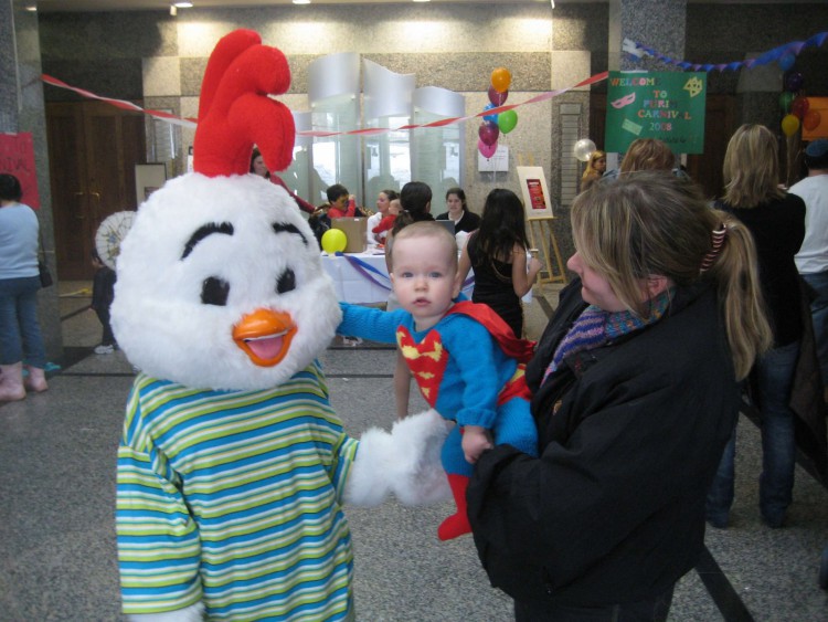
He wore the outfit again for Purim too. 🙂
A little while later I’d contacted DC inquiring about permission to write up and publish the pattern. (They, duh, refused me).
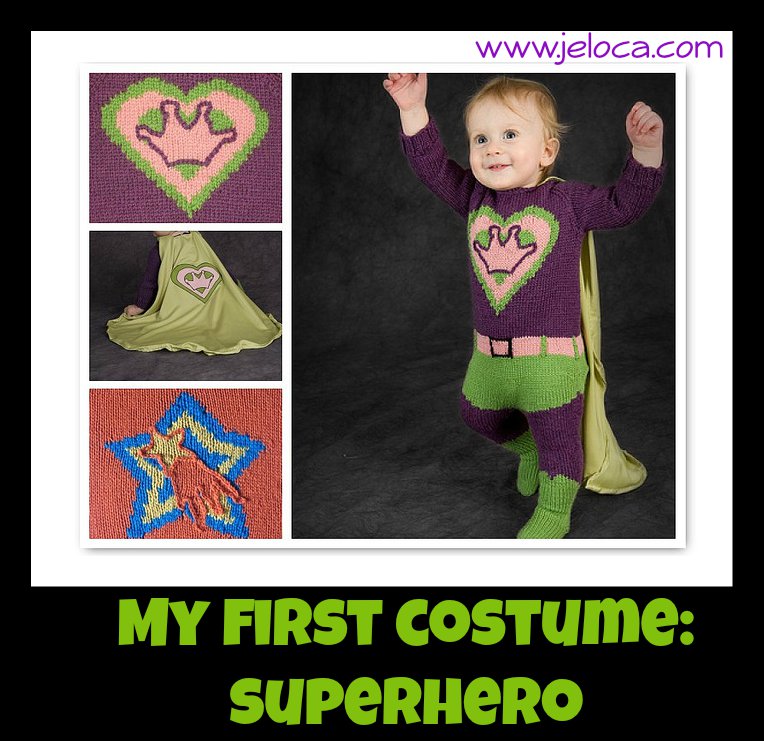
So… I modified it into a generic superhero instead, and now anyone who wants to can knit up their very own!
The pattern is written for ages 6-12 months [12-18 months], and includes full instructions and charts for the costume, the two shown chest shields, and the cape. There is also a blank chart with instructions on how to design your own shield, in case you want to personalize it with your favorite SuperBaby’s initial.
Update: This tutorial is now also available as a downloadable PDF here. More details at bottom of this post.
It’s October! That means it’s okay to start talking about Halloween, right?
It is according to Henri- when I woke him up for school this morning he gazed up at me sleepily and grinned “It’s October 1st.” When I asked why that mattered he smiled even more adorably and said “Because now it’s almost Halloween.”
‘Almost’ is relative. (He clearly gets his awareness of time from his father). However his mention of it reminded me that I never showed last year’s costume. So. Now, with plenty of time to get ready for this year’s holiday… here’s how I made the boys Minecraft Steve and creeper heads, and how you can too!
The boys decided for Halloween they wanted to dress up as their favorite Minecraft characters. They do sell ready-made cardboard heads in stores but they are expensive, and there are a ton of tutorials online. I looked at a few, then worked things out with what I had on hand, and what I was able to find at the dollar store.
What you’ll need:
square boxes (large enough to fit over the wearer’s head)
1. Yannick came home with 2 small boxes he’d found somewhere. Grocery stores often have ones you can ask for, or as a last resort you can buy boxes.
2. I used two-sided tape to tape the outer flaps to the inner ones (not shown) so the inner flaps wouldn’t drop down onto the kids’ heads. Then I used masking tape to fully tape over the top seam, both to securely close one end of the box, and to make the seams less visible once they were painted.
3. I cut the lower flaps off the boxes and then used the same masking tape to cover the exposed edges. It would gave a cleaner look, vs the rough look of cut corrugated cardboard, plus was less likely to catch and tear, which could potentially pull off the paint.
4. I divided the 4 sides and top into even grids. I looked at pictures of the characters online and mapped out roughly how many squares per color/face, and then used a ruler to divide the front (face side) into the grid. Once the face was set, I carried the markings around the sides of the boxes, and finally the top. Because the boxes are taller than wide, the top has fewer squares than the sides do. That’s not what the characters SHOULD look like, but I didn’t think the kids would mind.
5. Once the boxes were plotted I used a cutting blade (also from the dollar store) to slice out the eyehole sections. For Steve, only the dark pupil area was cut out. For the creeper it made more sense with where Henri’s face was to cut out the larger nose/mouth section. After removing those areas I covered the exposed edges with masking tape.
6. Finally it was time to start painting. The paints and brushes were from – you guessed it – the dollar store. The advantage with the Minecraft characters is that if you have to custom mix your paints to get the right colors, it doesn’t matter as much as it would in most projects if you have enough to complete your painting or if you need to mix more and risk not matching quite right. The goal is to have an assortment of shades, so blending colors works perfectly.
That said, if you prefer a more accurate version, I have compiled this tutorial into a downloadable PDF (linked at the bottom of the post) which includes full-color screen-accurate charts for both characters, including the hex codes for each color so you can color-match accurately.
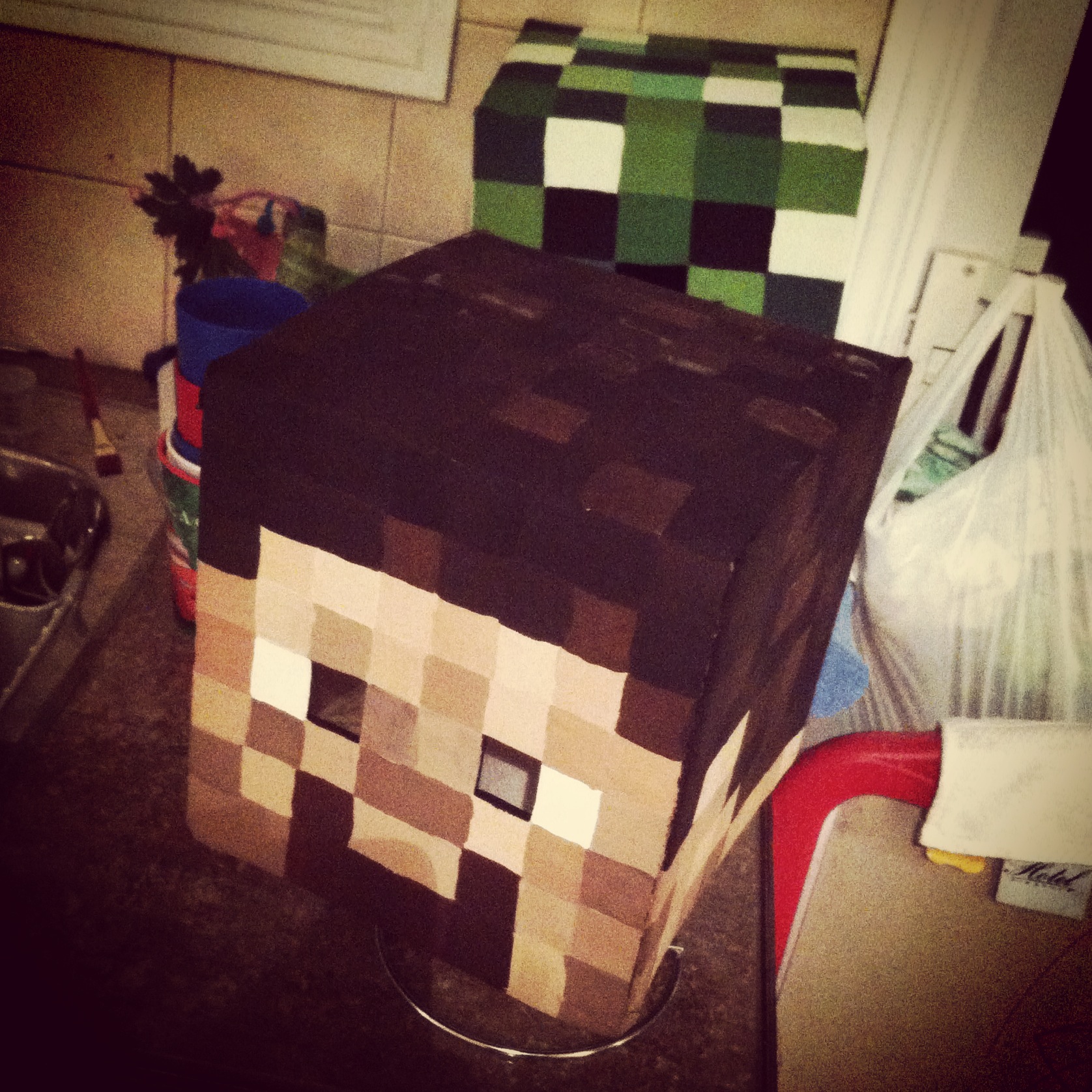
Here’s the four sides of the painted creeper head. I set the boxes to dry on a paper towel roll to hold them off my counter until the lower edge was dry. (I held them up the same way while painting too).
Same goes for our buddy Steve here. I’d only had three shades of brown paint on-hand to work with, so I blended them together with some black for the hair, and then lightened with some white and a touch of red for the face. (I’d actually done the face/neck/ears first, so then I could re-use the same paints but darken them for the hair. That avoided any waste and kept the same unifying overall color tone for the head.)
I had them both on the counter while I cleaned up the dining room table of all my painting gear. Couldn’t resist this dramatic shot. Look out! He’s behind you!
7. The next step was to seal the heads with an aerosol can of clear sealant. I didn’t know what the weather would be like on Halloween and didn’t relish the idea of my hard work being ruined by a few drops of rain or thick snow settling on the kids’ heads. I moved the heads into the garage and set them on some newspaper to protect the floor as I sprayed, and did a few coats, allowing each one to dry for about 20 minutes in between. If you have a dry, open area outside or good, even weather you could do this next step outside, but here there was nowhere I could leave them unattended, so I had my garage door open the entire time I sprayed, and then left it about a foot open during the drying time between coats. Once they were properly sealed and dry to the touch I brought them inside and allowed them to dry for a full day before the final steps.
The last bit in getting the masks ready to wear was to block out the open areas. I bought a gauzy sheer black scarf (also at the dollar store!) and cut off squares large enough to fully cover the open areas.
8. Using the same double-sided tape I secured the black fabric down around the cut areas.
9. Finally I covered all the exposed edges of the cloth with masking tape, making it doubly secure and hiding any rough, cut edges so they wouldn’t catch or fray.
With that, the masks were complete! The black gauzy fabric looks opaque from the outside but from the inside it’s so sheer that it’s quite easy to see through it, making it perfect for this project.
From idea to finished product this project took about 4 days. Halloween was on a Friday last year and Yannick brought me home the boxes on Monday night. Tuesday I did everything up to/including painting. On Wednesday night I sprayed the clear coat, and then on Thursday night I stuck the black fabric in.
They were pretty darn excited!
Halloween night they posed for a quick picture inside…
…then it was time to go trick-or-treating.
Can’t you almost hear the tick…tick…tick…BOOM? The heads held up beautifully and the boys felt like mini celebrities as they walked down the street and people from all over, even in passing cars, yelled out “Steve!” and “Creeper!” and gave them high-fives. The heads have now become part of our dress-up box and are still in great condition, and they wore them for ‘Halloween Day’ at their camp this summer.
*Update in 2020: the heads are still going strong! The boys outgrew them of course, but we keep them as nerdy shelf displays and they look exactly the same as they did back when I made them.
I hope this post shows you how easy and fast it can be to make your own Minecraft Steve and Creeper heads!
You can adapt the tutorial to make any Minecraft mob, and I’ve got an assortment compiled for you here.
As mentioned above, if you’d like an easy-to-print-and-save PDF version of this tutorial, I have made it available on Etsy here. The 9-page PDF includes full instructions with additional details, clear photographs, as well as game-accurate full-color numbered charts for all 5 sides of both character’s heads along with their hex codes for perfect color matching.
In this post: the cast of an NBC sitcom surrounding me as they hold stitched samples of their likeness. In other words, just a normal Thursday…
Ha!
First, a brief apology. After the rush and whirlwind of finishing my Sprocket costume I took a little break from crafting, and blogging. Took advantage of not needing to stay up until 3am to crash early, or do other things that didn’t involve math, or thinking. Couple that with an onslaught of weather-induced migraines, and I’ve been getting a lot more rest lately, but it means the blogging has suffered.
So. A few weeks ago I got word that I’d be able to attend a Just For Laughs panel involving the cast of Undateable.
I knew that since it would be a con-style panel, vs a stand-up-type comedy show, there was a chance the audience might be able to meet the cast. And I decided I wanted to do something for them. While I enjoy the show, I didn’t do it because I’m the ohemgee number one fan!!! nor to get a chance to potentially meet them. I just thought it would be nice. 🙂
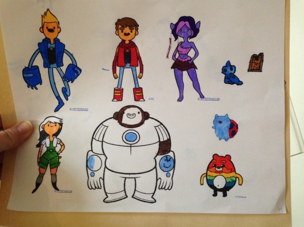
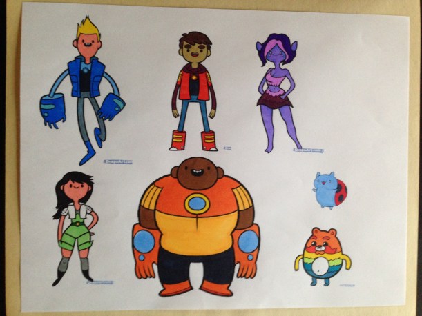
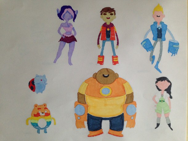
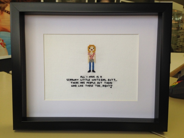
I hit upon the idea of doing something in cross stitch right away. I knew it was easy and portable and something I could likely finish in time (I had less than a week until the panel). I’ve had transactions in the past with an etsy vendor called weelittlestitches and I absolutely love her work*, and immediately I thought of contacting her to commission a custom pattern of the cast. Unfortunately I didn’t think the timing would work out, so I ended up designing them myself.
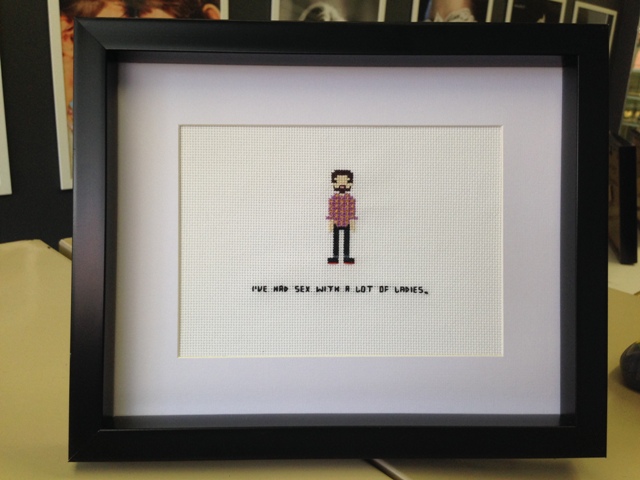
I did an image search for each character and put together a little file for each one, giving me the gist of that character’s ‘look’. At the same time I also pulled out some quotes from each episode so I could add a funny line for each character.
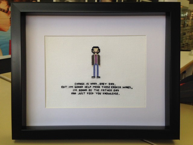
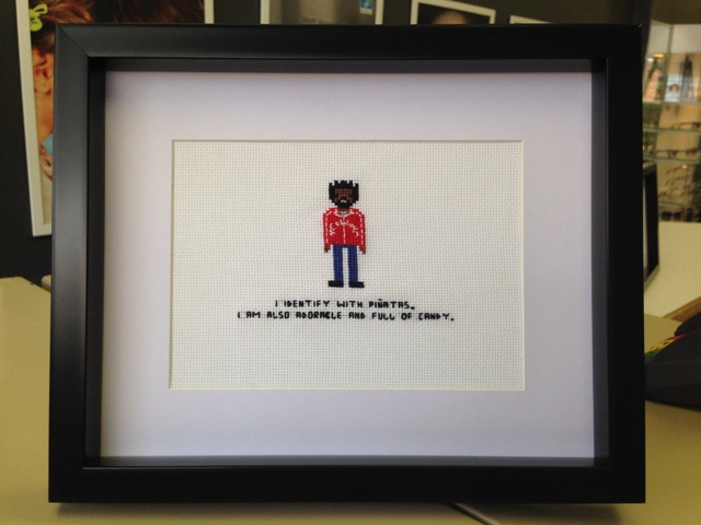
And finally “Shelly”, played by Ron Funches… who wasn’t there, but I hope his got to him anyways.
“I identify with piñatas. I’m also adorable and full of candy.”
Once at the panel my mom and I were seated pretty close. Like…
My feet were about 2 feet from the stage.
…really close. So close in fact that when the cast came out and Rick was using his phone to stream the panel for Periscope, I jokingly offered to hold it for him and he leaned over and handed it to me. (So if any of you reading this were watching the panel, I’m sorry for swinging it around and possibly making you nauseous before I realized where it was actually aiming).
Brent answering a question, possibly about the little gnome in his butt (you had to be there), while David, Rick, Bianca and Bridgit look on and feign amusement.
The other side of said gnome-butt convo, egged on by Chris and more feigned amusement on behalf of Adam Sztykiel and Bill Lawrence, along with the panel moderator (who I think was from Mashable?).
Towards the end of the panel they took audience questions and I got the last one, asking, rather awkwardly, “I, um, made you guys something. Can I give it to you?” (Not my finest moment). Luckily they said yes, and I got to give each one their framed portrait. At one point Chris asked if it was called needlepoint, and started calling out, all Oprah-esque, “YOU get a needlepoint! And YOU get a needlepoint! Aaand YOU get a needlepoint!”.
There was a funny/sad moment towards the very end when they were all looking at each others’ and then Bill put out his hands and looked around like “Where… where’s mine?” I offered him a hug instead but he didn’t take me up on it.
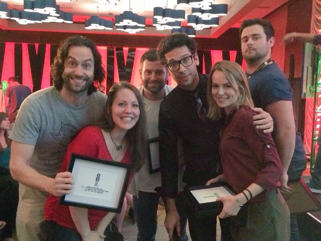
Then the panel was over, and I thought that was the end of it. Instead, however, David jumped right down and came and gave me a hug and said thanks. Bianca did too, before walking away. Brent came by, and suddenly I turned around and the whole cast (minus Bianca and the absent Ron) were standing right behind me. My mom had been taking pics the whole time, so I wound up with this:
Yep. That’s me looking all dork-tastic. 🙂
Mom and I had barely made it to the elevator when my phone buzzed, and I saw this Tweet:
Awwww! 😀
* If you’re into cross stitch, or pop culture, or any combination thereof, go check her stuff out, it’s amazing. 😀
I’m so thrilled people like the costume. I spent so much time working on it, staying up til 2-3am every night for 5 weeks… even bringing pieces to stitch while I waited at the daycare for my kids, or sneaking in a line or two in traffic. With all that work it was still 2am the night before the con and I had no gauntlets/gloves, and I was feeling so dejected, like the whole thing would be a waste because of not enough time. I ended up staying up til 4am knitting a quick set of fingerless mitts, and was so tired the following night I was asleep by 6:45. 😛 It wasn’t complete, it was far from perfect, but to see that it’s appreciated by more than just myself for my crazy efforts… it’s really awesome.
To anyone who stumbles this way and finds this: all the rest of the tutorials and step-by-steps are coming. I have all the pics and just need to put them into a cohesive order.
You can check out the write-up here. Thanks so much Laura, and thank you Danielle for posting it!
(Also thanks to Jenna at Kroon Designs for the great pic!)


 Who says you can’t polish a turd? (Actually,


 .
.


