

The more coloring I did, the more I wanted to do. I began looking for better supplies and looking up better techniques. It is impossible to be interested in ‘coloring’ and not somehow, somewhere come across Copic markers. For the uninitiated, Copics are alcohol markers, one of, if not THE premium brand, and are vastly loved by artists everywhere.
They’re also expensive as hell.
When I’d first heard of them, a few years ago, I immediately discounted them. I had no use for new art supplies that weren’t integral to my passions at the time, and that kind of investment just didn’t seem worth it. Lately, though… something was drawing me to them. Maybe I’d outgrown Crayolas, finally, or maybe it was the appeal of being able to blend and achieve digital-art-style results with something I could control by hand. I started finding reasons to justify them- I’d do more drawing, and finally open an Etsy shop… and they’re refillable, so over time the cost works itself out… and I’m an adult, and could treat myself to professional, adult supplies…
I was in. Hanukkah was coming up and the ONLY thing I put on my wish list was a gift certificate to Curry’s Art in Ontario, the place I’d found with the best prices for Canadians. The markers I wanted, Copic Sketch markers, are available locally at $8 CAD each. The cheapest US price I could find online is $5.35 but any free shipping deals were US only, and there would still be a cost conversion, and the exchange rate these days is insane, so I ruled that out. Curry’s has them for $6.50 each, and free shipping within Canada if you spend $75. Perfect! (Note: I found out about Curry’s by watching Baylee Jae’s videos on YouTube, thanks Baylee!)
Knowing I had some time to wait until we had our family gift exchange and I (hopefully) got what I’d asked for, I looked further, exploring more tips and techniques. Along the way I found a number of videos and blog posts mentioning BIC Mark-Its as inexpensive alcohol marker alternatives, stating they could also be blended, had better colors than Sharpies, and worked with Copic or other brands’ blending markers.
All my Sharpies were old and dried anyways, so I ordered myself 2 sets of BICs, the 36-pack fine and the 36-pack of ultra fine.
When they arrived I sat down with the boys one Saturday morning and we did some coloring together. They’d been watching me color lately and a few times I’d given them a ‘treat’ and let them use ‘Mommy’s good markers’. They love my colored fineliners and both were in awe of the stained glass coloring pages, so I let them pick their favorite pages to color for themselves. When I was ready to test the BICs I printed off some characters from one of our new favorite shows, Bravest Warriors, and we all colored together, with me allowing the kids to use the BICs as long as they were responsible with them.

Jakob went for speed, coloring the characters carefully, but quickly, and getting distracted here and there by the tv that was on in the background.
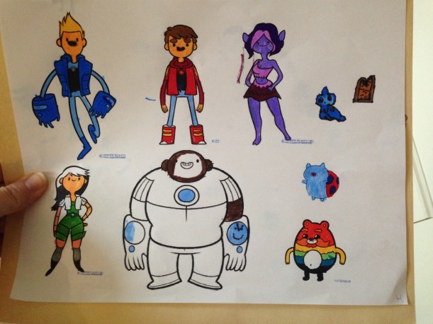
Henri did the opposite. He took his time, trying to color-match as carefully as he could to the original characters. He was SO thorough, in fact, that he drew in his favorite missing character – JellyKid (complete with toast!) and even added Pixel to Wallow’s glove!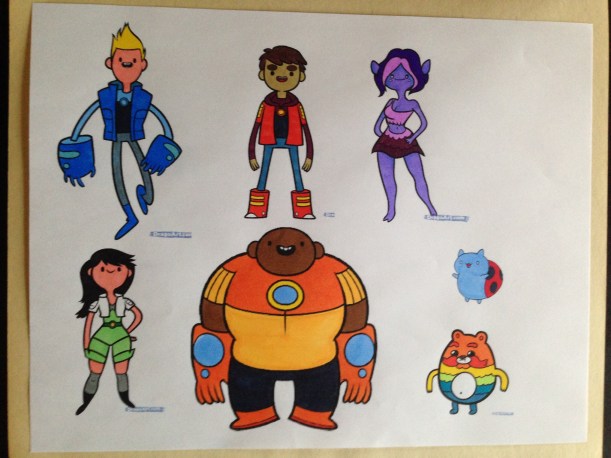
I didn’t have anything in mind when I colored mine except to enjoy the markers, the lovely colors, and the flow of the ink. I didn’t attempt any blending or ‘Copic-like’ techniques, just colored and chatted with my boys.
Okay well maybe I did a teensy bit of shading… if you look carefully at Plum there’s some blue shading under her hairline and skirt. But that’s it.
I loved the BICs and I am thrilled that they’re part of my stash- uh I mean my perfectly adult and mature collection of art supplies. But my FAVORITE part of coloring with them was discovered after I was done.
The BICs, just like Copics and other alcohol markers, bleed through most papers. Alcohol markers are designed to saturate the paper to get even blending and streak-less coloring. With water-based markers like Crayolas, coloring hard over one section will leave blotchy, uneven patches of bled color. With these, however…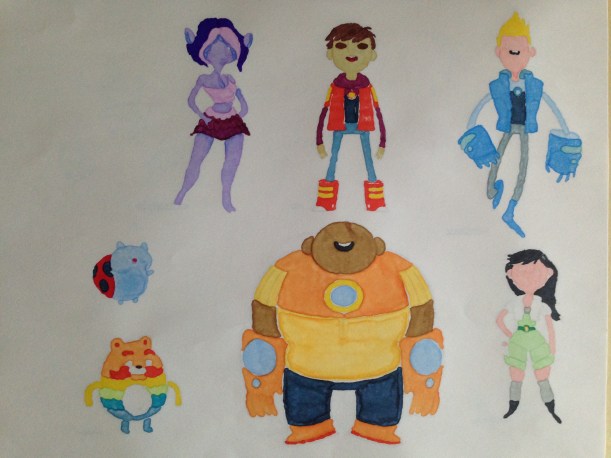
The bleed-through is so lovely! It looks like a watercolor illustration! I’m fascinated by how pretty the backside of this coloring looks and can think of so many ideas for deliberate reverse drawings, coloring one side while intending the back to be the later ‘front’.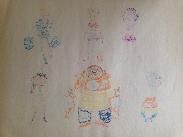
Not that, but I was completely charmed by my discovery on the paper I was using to absorb the bleed-through. It looks like pointilism! Probably not really good for anything, technique-wise, but I like how it looks regardless. 🙂

